Nonprofit annual reports are a cornerstone of many organizations’ communications strategies and there are a lot of ways to approach designing an annual report—especially if your considering designing an interactive nonprofit annual report. In nonprofit annual report design, each year brings a new opportunity to create something that shares your organization’s impact—and tells the stories that bring this impact to life. Staying on top of trends helps make sure that your nonprofit’s annual report stands out and engages your most important audiences.
One of those trends is whether creating a digital annual report is worth the time and investment for your nonprofit over designing a PDF annual report. Digital publishing for reports is hardly new, but living through 2020, with many of us working from home, has elevated the value of a digital annual report for nonprofits who need to engage their most important audiences—particularly for fundraising. Because, when you can’t easily hand an annual report to someone in a personal meeting and you’re also not sure if you can mail it to their office, the value of a digital annual report starts to make a lot more sense.
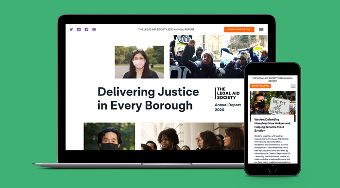
This year, we channeled our energy into designing an interactive digital annual report for The Legal Aid Society. We’ve created annual reports for them in the past. However, print annual reports were always their priority. But Covid pushed us and The Legal Aid Society to take a different approach. So, we shifted gears and prioritized designing an interactive annual report—with the PDF version taking a back seat.
A New Vision for Nonprofit Annual Report Design
As the pandemic brought most in-person interactions to a halt in New York City, The Legal Aid Society’s typical strategy for distributing their annual reports shifted. Instead of distributing them primarily in-person during their Annual Meeting, this year they would need to distribute their annual reports digitally. Instead of moving the static annual report to a digital format where it would appear as a single-page, scrolling document, we decided to use this as an opportunity to provide The Legal Aid Society’s clients and stakeholders with a more interactive experience.
We pitched a multi-page, interactive annual report to The Legal Aid Society that would be more user-friendly and provide readers with an immersive digital experience. And for the print-inclined, the digital report also includes a downloadable PDF report.
Nonprofit Digital Annual Report Design with a Content-First Approach
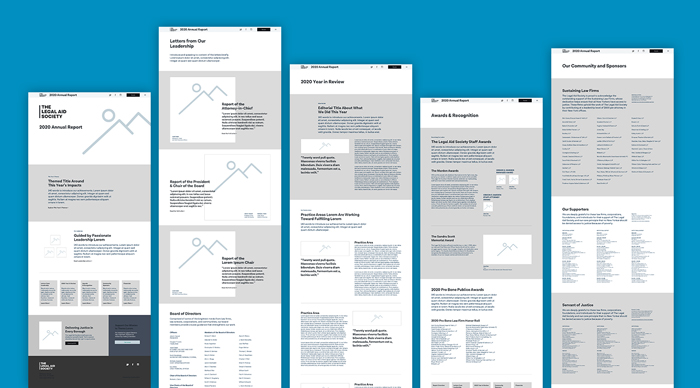
Since we were creating a multi-page digital annual report, we approached things a little differently than usual. Instead of presenting The Legal Aid Society with a site map and walk-through of how the navigation would be structured, we took a content-first approach. We went a level deeper to think about what content would be hosted on each page of the site and how we envisioned these pages being interrelated. Our wireframes, then, grew organically out of these content selection and layout phases.
UX Design That Caters to Audiences’ Mental Models
We created an HTML-based site to host The Legal Aid Society’s digital annual report. The main question that guided our design was, “how would a user flow through this information?” Since the annual report was a multi-page experience, we knew a user wouldn’t be going through it in a linear fashion, as one does when reading a static annual report, from beginning to end. Even so, we wanted to make sure that we kept users’ mental models front and center when designing this annual report so that they would still be able to progress through the content from page to page, in a logical, even if not linear, manner.
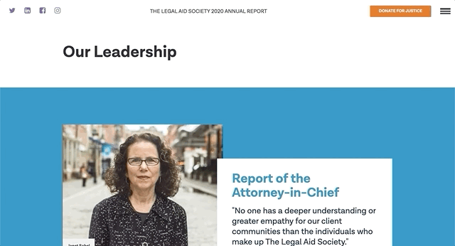
We also enhanced readability through user interface elements. For example, the annual report included letters from executive staff, but instead of just presenting them in a static format, we loaded them in elements that slid out from the side of the report. This created the experience of reading a letter on the screen for the user rather than simply reading it in-line on a page.
Interactive Annual Report Design that Drives Engagment
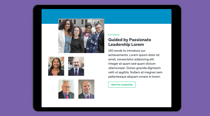
Since we previously worked with The Legal Aid Society to design the nonprofit law firm’s branding and website, as well as multiple annual report designs, we already had a design system in place. To keep brand continuity intact, we drew on the same design elements, including typography, photo treatment, and color palettes.
For typography, we used type overlaid on photos with a box, picking up on design cues from the main site. Additionally, we used bolder and larger numbers for statistics to immediately draw the reader’s attention to them, a design practice we implemented both on the main site and in previous annual reports for The Legal Aid Society.
For the digital annual report, while we continued to use the same color palette we used for the rest of The Legal Aid Society brand, we incorporated larger color fields to break things up a little and create better pacing as one goes through the report. While in one way, our use of color aligned the annual report with The Legal Aid Society brand, in another, readers also got the sense that they weren’t on their main site and were partaking of a distinct experience.
An Annual Report That Leverages the Main Website
Designing a more robust nonprofit digital annual report also expanded our opportunities to design for engagement. With more stories and information to explore—and more content to engage with—we had more places to engage audiences to learn about The Legal Aid Society. And because they have invested significantly in making sure that The Legal Aid Society website is filled with useful and actionable information—and countless opportunities to support campaigns, volunteer, and donate—we were able to piggyback on that work without having to reinvent the wheel when designing nonprofit’s annual report, which has a fraction of the budget.
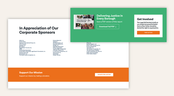
In addition to driving engagement by directing audiences to the main website to explore further, we made sure to create immediate action by emphasizing how visitors could “Donate for Justice” as they learned about the amazing things that The Legal Aid Society accomplished over the year. A ubiquitous donate call-to-action at the bottom of every page turns the annual report from a simple recounting of the year in review to an opportunity to support their work. The call-to-action then gives audiences information on different sponsorship opportunities, from individual donations to corporate sponsorships.
Delivering Results
Since releasing this nonprofit digital annual report, The Legal Aid Society’s team has undergone a strategic shift, recently adding Directors for corporate giving and foundation giving. As their team shared with us, having a digital annual report has empowered these new members of their fundraising and development team to make adjustments that would be impossible in a print annual report—and easily connect with new fundraising audiences.
Moreover, the email The Legal Aid Society sent out to all their donors and supporters sharing the annual report was viewed 22% more, compared to average communications sent out by their team, and showed a 63% increase in engagement. Want to see for yourself? Have a look at The Legal Aid Society’s 2020 Annual Report.
—————————
Explore Further
See more of Constructive’s work with public interest and social justice nonprofits or learn more about Exposition, our solution to designing engaging digital reports of any kind.
At the end of a year, nonprofits publish annual reports. They release statistics about the lives they impacted and tell stories that remind them of the importance of their mission. As for agencies—well our success each year is demonstrated by the success of our partners. Normally, we reflect on their work and on the projects we collaborated on with them. We go into each new year with a collection of design, technology, and content related insights that make us better at our jobs. And normally, that’s enough.
But this year brought lessons that went deeper than the projects we worked on. Despite the chaos and grief of 2020, a lot of personal and professional growth happened. Our team became fully-remote. We welcomed new colleagues from across the country—and Canada! And some of us made the switch from city to mountain-dwellers.
Even though we’re eager to put 2020 behind us, we don’t want to lose sight of the lessons this year offered. We asked everyone on our team to reflect on the biggest personal and professional lessons they learned this year. And since we don’t make ourselves an annual report, we felt compelled to document these lessons somehow.
So consider this insight a mini-annual report. Though it looks different than an average annual report – we know, we’ve designed dozens! — we hope this insight provides similar guidance for our team in the years to come.
Connection and Empathy Reign Supreme
Personally, the shared global pandemic experience has reinforced to me how connected we all are. 2020 has made the globe feel smaller. It also has elevated the social inequities that make this traumatic experience more difficult for many of us, so helps maintain a healthy perspective when I, who have so much, feel worn down.
Professionally, my biggest lesson this year was the importance of being mindful of how people’s personal lives are a big part of what they bring to a working relationship—and to work with greater empathy for the impact that situations beyond our control impact our performance. — Matt Schwartz
Focus on the Future and the Forest
Personally, I’ve learned the immense benefits of Shinrin Yoku (Forest Bathing). And how reconnecting with the energy of a forest may just be the key to survival – our survival and the planet’s survival. At work, I’ve learned (or have been reminded) that you should never rely on past success to guarantee future success. That is, even if you’ve been rocking the socks off of life for the past number of years, you’ve got to keep pushing, learning, and executing to continue the success! It sounds kind of obvious, but I’m grateful to have been reminded of that this year. – Corey Pomkoski
Appreciate Quality Time and Question Convention
While I can’t sugarcoat the experience of canceling your own honeymoon to quarantine with your partner for the better part of 9 months, we’ve genuinely enjoyed the opportunity to spend so much time together. This year has been all about adapting. Something Constructive has done well this year is thrown convention and norms out the window. As a creature of habit, I’m looking forward to trying to stay flexible, question the conventions of my post, and continue to experiment. — Tom Anesta
Technology Tethers Us — Even When We’re Miles Apart
The importance of connection and relationships, regardless of distance or medium. As the pandemic has forced us all to avoid social interactions in some capacity, I’ve personally experienced the ups and downs of loneliness, isolation, and boredom. Through it all, I’ve gained a newfound appreciation for those closest to me, both friends and family. Even though I made a difficult decision to move to a new city by myself amidst a global crisis, I’ve managed to maintain a good handle on my mental and emotional health, largely due to the wonders of modern technology (shoutout to Zoom) and the determination (on both sides) required to stay in touch with my most cherished loved ones. — Abel Thomas
Stay Flexible and Focus on Team Culture
Remain flexible and spend time in nature to stay sane. 2020 has been a year filled with grief and hardship for so many people, and those two principles have helped me remain positive. Professionally, focusing on team culture is more important than ever now that everyone is working remotely. Finding the right way to stay connected to co-workers, for the projects we’re working on, and socially, is something I’ve been thinking a lot about. – Lily Moaba
Boundaries are Important, and So are Dogs
Remote work is great, but boundaries are necessary. I love the flexibility that working from home provides, but it can also be a slippery slope. Without firm boundaries between work and life, they blur together. It took me a few weeks to realize how unhealthy that can be for my work and personal life!
This year, I also brought home a “pandemic puppy.” And though I’m far from the first person to make this observation, my dog Harley has taught me a lot about presence and perspective. Now 9 months old, she still amazes me every morning with her happy-go-lucky attitude — despite having no idea what’s in store for the day. Maybe a long walk in the park, maybe a trip to the vet, or maybe some unexpected emergency. Regardless, she’s happy to be here and go along for the ride. In a year of such uncertainty, she’s taught me that sometimes—actually, most times—it’s better to focus on the details of the present, not the possibilities of tomorrow. PS: Get a dog. — Allison Murphy
Develop a Positive Outlook and a Solid Process
It’s easy to spot negativity and get really down when looking through a narrow lens. You need to zoom out: like, way out! With that perspective, it’s even easier to see that people are good, the world is good, and life is all good. During these unanticipated times, work has been fraught with logistical challenges and constant inconsistencies. I’ve found it so important to have a great mission, process, and team in place to help guide you through it. I’m so honored to have experienced this chapter with my friends at Constructive. — Frank Lakatos
Growth Can Happen in Any Environment
I learned that you can grow even in the midst of a pandemic. Your growth will be greater because of the challenges you’ve faced. Professionally, I learned that even when we’re busy working on projects we can still take initiative on issues that we struggle with as a company and work even just a little bit towards it. — Leah Suter
Details are Everything
Details are everything. What can be seen as subtle differences, for example, in the words we use or the way we define concepts can actually be chasmic in their impact once you explore their differences—especially how they’re felt and understood. I’ve always valued and enjoyed learning, and 2020 has both humbled me and reminded me that there is no shortage of things to explore and learn and ways to change your thinking. From racism to my own privilege, to learning the Indigenous names of mountains that overlook the forests where I love to hike and their stories. There is no shortage of details or viewpoints.
We each have a different way of processing how the pandemic, isolation, and abrupt changes have affected our ability to show up in a professional capacity. I’m grateful to be working for brands and organizations that are directly supporting front-line workers and the millions of Americans currently unemployed. I’ve learned to give people generous amounts of grace and expect their best simply where they are today—not where they were six months prior. And that includes giving yourself some grace, too. Creating psychological safety on teams has always been an important aspect of good leadership, and 2020 has brought psychological safety back to the forefront for me—especially when asking for help, letting others know that you’re just not able to focus at the moment, asking for feedback, asking to hop on a zoom call to co-work with another human being, or expressing different viewpoints. — Paul Sternberg
Change Your Space, Change Your Mind
This year I learned that I actually like working remotely. I’m a bit of an introvert, so it has been nice to be able to work in a more controlled environment with the benefits of still having my coworkers a slack message away. Being able to adapt my working habits has made me more productive and creative. When life goes back to normal, I think we all have to take a serious look at advocating for what works best for us and not just going with the flow.
Similarly, I’ve personally found joy in reinventing my apartment. I’ve always been a practical person when it comes to interior design. My partner is more aesthetic-minded, so it’s been a collaboration. Consider painting a wall a new color or finally get rid of a piece of furniture that’s always in the way. Craigslist has been a great resource for quickly finding new homes for furniture. You will feel the weight lifted knowing your space accurately reflects who you are as a person. — Doug Knapton
Maintain Relationships with Friends and Colleagues
One personal thing I learned in this whirlwind year is the importance of staying connected to people, even while isolating. You need to take care of your own mental health, as well as reach out to people to make sure that they are okay. Professionally, I’ve refined my client presentation skills and learned how to get clients really excited about the work we are doing! — Kevin Ng
Action is the Antidote to Fear
I read recently about how action is the antidote to fear, and I think that summarizes a lot of the lessons I’ve learned this year both personally and professionally. If I’m afraid of something or feeling anxious about something, I have to remember to acknowledge it and then do something with it—do the task I’ve been putting off because it scares me; direct my anxious feeling into an activity that’s stimulating or soothing (an activity that’s just distracting works too). For me, that has been cooking or baking, reading, or finding something small to work on around my apartment. It takes work, especially if like me, your brain’s default state is anxious. But the uncertainty and chaos of 2020 really emphasized behaviors and reactions that weren’t helping me live the life I wanted, and I’m grateful for the space and support systems I have that allowed me to learn this kind of lesson. — Kate Styer
It’s hard for me to believe, but October marks Constructive’s 20th anniversary. It’s a significant milestone and one we’re really proud of. And, in reflecting on who we are, what we’ve accomplished, and why it matters, we’ve come a long way!
I believe that a company’s tagline is the most succinct expression of its reason for being. For probably 15 of our 20 years, Constructive’s has been “Designing a New Way Forward.” It is as much about designing solutions for clients as it is designing ones that contribute to creating a world more like the one we’d like to live in.
I think this speaks well to who we are. Constructive is a culture built by people who know that the work we do is important and that we are fortunate to be able to do it—both with each other and with our clients. To me, that’s special.
So, looking back on 20 years since I started up shop in my living room with one computer, a bunch of ambition, and a lot to learn, we’ve been using this moment both for reflection and to help design our own new way forward. After all, isn’t that what anniversaries are for?
We’ve seen a lot of changes over the years. We’ve learned, grown, and gotten better. While a lot of this has to do with continuously challenging ourselves to be better and learning from our mistakes, it’s Constructive’s clients that are perhaps our single greatest source of personal and professional growth. The people we partner with raise our level of awareness and understanding every day, sending us on pathways of discovery as we work together to help make the world a better place. And because of our clients’ expertise and dedication to social impact—and because of our shared values—we’re more informed citizens and, I believe, better people.
That’s not fluff. Every person who joins Constructive does so because they want to do this work. Had we spent 20 years developing strategy and design for consumer products, financial services, or hospitality brands, not only would what we do be very different, the way we think about the world would also be immeasurably more narrow. And, speaking for myself, the actions I take, including how Constructive is run, would probably be different as well.
Our work is the opportunity to live our values every day. Not everyone gets to say this and it’s something we never take for granted. So, in reflecting on 20 years in business, one thing is clear—we owe a debt of gratitude to our clients for providing us with opportunities to learn about issues we care deeply about and live our values by helping them be more effective in the vital work that they do.
The opportunity to understand the world through a richer diversity of perspectives and expertise is one of the greatest rewards I could have ever imagined when starting a design firm. A culture of continuous learning is a core value at Constructive, and we are incredibly fortunate to learn from inspiring experts who are hard at work addressing some of the world’s greatest challenges. We also get to build on what we learn from them through exciting research and ideation.
This is why I like to say that the best part of being a social impact strategy and design firm is that we get paid to take an ongoing graduate-level course called “How the World Works.” And I think it’s fair to say that everyone who’s worked at Constructive has deepened their understanding of issues like climate change and the environment, social justice, health equity, and education—just to name a few.
Of course, being in true partnership is a two-way street and, when it comes to raising awareness and understanding, I believe we also bring a lot to the table. As much as we love learning from our clients, we equally enjoy sharing our ideas and teaching them what we know. Our people are passionate and they bring a pretty deep reservoir of expertise that makes a difference for the organizations who choose to partner with us.
We named our company Constructive for a reason. It’s about these ideas of working with shared values, a mutual commitment to active listening and learning, and a collaborative approach to problem-solving—whether this means a simple solution that improves the work we produce, or something far more significant in society that our clients are at the forefront of advancing. Our ability to live our values is directly connected to the passion and commitment of our clients—organizations filled with people from whom we’ve learned so much over the years and who have allowed us to live more meaningful lives as a result. And I’d like to think that, along the way, Constructive’s people have taught a few clients a thing or two about the power of their brands and how to use it to engage and acticate audiences.
So on our 20th anniversary, from everyone at Constructive, I’d like to extend deep and heartfelt “thank you” to our clients, both past and present, to our colleagues who’ve helped us along the way, and to everyone who’s found interest or inspiration in our agency. There’s a lot of work to be done in this world, and we’re even more excited about what’s ahead than anything we’ve accomplished so far.
In the design field, we often hear the word “empathy” thrown around a lot. It’s especially important when designing nonprofit brands and designing nonprofit websites, because to be effective, nonprofit design has to connect with people’s hopes and aspirations. But what does design empathy actually mean with regards to achieving our project goals? By definition, “empathy” is the ability to be aware of and sensitive to the feelings, thoughts, and emotions of another. The ability to be empathetic is an innate quality we all possess. And when it’s employed in an office or team project, it can greatly improve the harmony of a group dynamic. However, while the essential need for design empathy might seem like a no brainer, putting it into practice with design work is often easier said than done. My experience designing the website for The Vermont College of Fine Arts drove home some lessons in best practices for design empathy for nonprofit brands.
As designers, the solutions we create cannot be self-serving, but instead must meet the challenges and goals of the client and end-user (e.g., the person or group of people who use the final product). Empathy holds us accountable throughout the design process. It forces us to evaluate and measure the effectiveness of the solutions we’re creating. When Constructive teamed up with the Vermont College of Fine Arts (VCFA) to redesign their website, the relationship had a comfortable fit from the start. We’re a team of brand strategists and designers, so working with a higher education art institution felt like a match made in heaven—after all, most of us were once art and design students ourselves! But as we soon learned, shared experience doesn’t give us cart blanche to make assumptions about their users.
While empathy is something I’d like to think comes naturally to me, sometimes we all need reminders and wake up calls. When we’re working with clients in industries less familiar to us—like education, law, or policy organizations—it’s easy to be empathetic. We need to test our assumptions because we know we’re not the experts in these issue areas. Working with VCFA gave me the opportunity to stretch my “empathetic muscles” and challenge my own art and design school biases and assumptions.
Along the way, our team (re)learned valuable insights about designing with empathy that Constructive has since woven into our design process. Here’s are 5 takeaways that really made a difference.
Tips & Tactics for Designing with Empathy
1. Keep an Open Mind
You might come into the room with a lot of knowledge and experience, but when you’re starting a design project it’s important to enter the conversation with an open mind. While we were working with VCFA, this was something I had to be acutely aware of because the start of a project is often the most exciting time for me. However, during this stage, it can be easy to get carried away with the magnitude of knowledge you want to contribute. Having received my BFA in Communications Design and Photography, I had a lot of my own thoughts about the “ideal” user experience and design system for VCFA. Yet while I could relate to the needs of the site based on my own experiences, I still needed to empathize with VCFA’s needs by asking the right questions and taking a backseat in conversation. By allowing the client to navigate the conversation with their expertise, needs, and desires, our team was able to begin developing UX and visual directions that started to fit what VCFA was hoping to accomplish.
2. Adopt Humility
During our early ideation and prototyping phases, our design team found itself spinning our wheels with a design direction that simply put wasn’t working. Sometimes it’s good to push the envelope, but in the midst of the prototyping phase, we were beginning to go down paths that weren’t on-brand for the client. We created systems that were more in line with how we defined “art school” or proposing unique ideas just to be “different.” In theory, these abstract design directions sounded strong, but in moving past the mood board and ideation phase these design systems began to fall apart. It took a heavy dose of humility to admit we needed to rethink where we were headed. This vulnerability ultimately instilled greater trust between VCFA and our team.
As cliche as this sounds, achieving great design is a process. It’s a lot of trial and error, and accepting that sometimes you’re going to be wrong or reach a dead end. When moments like this happen in the design process, it’s important not to get discouraged or be too steadfast in your initial approach. While unconventional to popular belief, my experience as a designer and working with VCFA has taught me failure is not always bad. It’s what you take away from those lessons and create in the future that matters more. After all, it’s better to fall forward than to stay stuck where you are.
3. Don’t Make Assumptions
While trial and error is inevitable, learning ways to avoid making assumptions creates an easier design process. In a 1990 study conducted by Elizabeth Newton at Stanford University, the phrase “curse of knowledge” was coined to explain the phenomena that happens when individuals unwittingly assume that other individuals can piece together and understand their logic and way of thinking. For example, a designer might assume their client knows how to use a program like InVision, which is a platform we use to review and annotate wireframes. Since the designer uses this program every day, it can be easy to overlook some basic functions that could be confusing to an unfamiliar client. Continuing with this example, if the designer never fully communicates the difference between a static (non-clickable) page layout and one that is interactive, the client might begin to formulate their own understanding of how interactions will function on their new site. As you can imagine, this could lead to major miscommunications and headaches down the road.
To avoid this, it’s important to test assumptions through user testing or prototyping. In other words, as you create design elements or aspects of the website, you should test your assumptions and interview your client (and/or end-users) to make sure every design decision is meeting their needs. Taking this approach allows us to keep healthy checks and balances on our ideas in relation to the overall health of the project. After all, when all the information is on the table there’s no more room for assumption because everyone understands the end goals and together can work on meeting them.
4. Actively Listen & Observe
When things weren’t working with our original designs for VCFA, we took a step back to revisit our notes from past conversations with their team. Sometimes going down the wrong path in a design project is the result of not listening well. But sometimes, as in this case, it’s because we’re following through on the wrong observations.
Moving past our assumptions, we realized that in many ways VCFA’s existing brand and design system were a solid foundation for us to build from. And before you ask “wait, why didn’t you start with that?!” We did. But at first glance, the brand was not modern and not communicating the vibrancy of their school’s experience. When we took a closer look at the intent behind their current brand, we found elements of a design system that could be emphasized in their new identity. It was hard to tell on their existing site, but VCFA had started to turn these elements into a design system of colored transparencies, overlapping images, and elements that broke out from a grid layout. It took time to realize we didn’t need to reinvent the wheel. But once we did, we had a much stronger foundation from which to build a brand that ultimately helped VCFA reach their larger goal: to effectively reach out and communicate with prospective and current students.
When empathy enters our design process it becomes easier to actively listen and observe because understanding the client’s needs becomes our sole focus. VCFA came to us seeking a design refresh that provided a better reflection of their growing student and faculty needs, as well as a more effective way to promote their programs and navigate their site. In addition to managing the client’s expectations, our final benchmark of success was our measurement of how well we understood the end-users’ needs. In an empathy-driven process, when the client is working to serve the end-users, the end-users become the “other client” in the room. By actively listening and observing what both parties have to say, we can create solutions that more effectively meet everyone’s needs.
5. Genuinely Care
At the end of the day, our team was committed to creating the best product for VCFA, and VCFA was committed to collaborating with us to get there. When you genuinely care about solving your client’s challenges, you’re able to invest more time and energy in getting through the inevitable highs and lows of a project. It’s important to remain patient with the process because genuine and vested interest might not happen right away. It takes time to build trust and create a mutual understanding between a creative team and a client. In order for this to happen successfully, a designer should spend time to get acquainted with the client’s work, who they are, their missions, values, etc. When a project is approached from this angle, you’ll naturally find impactful solutions are the ones that keep empathy in mind.
Designers, It’s Your Turn to Put Empathy into Practice
Practicing authentic empathy and then utilizing it in your workflow takes time. Luckily, there are a lot of great resources and tips out there on how to cultivate empathy on your teams, in your projects, and in your workflow. There’s no algorithm for practicing design empathy—that’s what makes it so great. With enough practice, you’re bound to find the strategies that work best for you.
Internet connections keep getting faster and faster, allowing sites to load almost instantly. In spite of these higher speeds, there can be instances where a page takes nearly a minute *gasp!* to fully load. Page load time is still a crucial aspect of your website’s build. If your page loads slowly, you’re guaranteed to lose visitors from your site.
Imagine this scenario: after months of hard work, your communications team is ready to launch your organization’s new website. It’s well thought out, ticking off all of the boxes from good UX to being accessible to users with disabilities. You’re excited (and maybe a little bit nervous) to see your colleagues’ reactions throughout the organization. You get lots of positive feedback, and everyone compliments the new design and structure. The launch is a success!
For a couple of months, things seem to be going well. You track visitors to your site and the numbers are up. Sooner or later, however, the honeymoon period ends. You start to notice the numbers drop off. You return to your beautiful site with critical eyes and realize that it loads pretty slowly.
Startled as you may be, slow load times are not inevitable! Everything from the images on your site, to the way it was built have an impact on your website’s performance. Here’s how to address the issues that might be slowing down your site, and ultimately, drive traffic numbers back up.
5 Ways to Boost Site Performance: From Crisp Images to Stray Javascript
1. Set a Performance Budget for Your Site
When it comes to page load time, think of a user’s connection like a pipeline. Only so much data can flow through the pipe before it becomes clogged. A bigger pipeline, or better connection, allows more information to flow through and for a page to load faster and vice versa. This is how your performance budget should work. Like a financial budget, a performance budget is the baseline maximum amount that you set for a page’s total content size. It is the highest amount of information you are willing to let pass through any given pipeline.
Since load time varies widely depending on different pipeline sizes, you should try to optimize your site so that the data can fit through the smallest pipeline that users may be taking. These days, more and more users browse mainly using their phones, therefore we should optimize websites for a 1.6 Mbps connection, or Mobile 3G Fast connection.
Your site should take about 10 to 15 seconds to fully load. This performance budget tool helps you to calculate what your budget is for line items such as images, CSS, and Javascript. This will give you a max file size to work toward when making adjustments to your site.
2. Use the Right File Types for Your Images
Now that you’ve determined how much budget you have to work with, you can review the images that you are using. There are many ways that you can save an image: JPEG, PNG, SVG, GIF, but which do you use?
- PNG: Vector-focused, simple photos with less colors
- GIF: Text-heavy images
- JPEG: Anything with a lot of photos or colors
- SVG: Text (If not live-coded), logos, icons
- MP4: Screen recordings & video
- WEBP (optional): WebP is an image file format that is smaller than regular JPEG and PNG files and can help you save on your bandwidth budget, but are not compatible with some browsers. If you do use them, you’ll also have to ensure that JPEGs and PNG files are available for browsers that do not support WebP images.
[contentupgrade id=”5606″]
3. Reconsider Redundant Images
Do you have lines, circles, or squares on your site that are loaded as SVG images? Samples of typography that are loaded as JPEGs? Laptop or tablet mockups to show how an app works? Background colors added as an SVG?
HTML, CSS, and Javascript can be used to create a log of these design elements. By eliminating the use of image files, you can reduce the amount of information that needs to flow through your pipeline in order for your page to fully load. As a result, you’ll significantly reduce load time. In turn, you can make your website feel more dynamic since coding these visual elements allows you to add animation to them.
To make this feel more real, check out this case study for our work with Unbounded. See the colored quote boxes throughout? We’re in the process of changing those elements from static images into live text boxes built with code.
4. Incorporate Flex & CSS Positioning
When using HTML and CSS to create elements of your website, Flex and CSS Positioning are powerful tools that allow you to create interesting layering and parallax effects without the need to load heavy images. Flex is a CSS property that defines how elements of different sizes stack and align. CSS Positioning is a set of CSS Properties that manipulates how elements on a page are positioned, relative to each other.
Let’s imagine you were designing a portfolio site. Without Flex and CSS Positioning, you might be forced to export a large full-width image to show a group of three overlapping objects. Flex and CSS Positioning allow you to improve load time. It does so by first breaking the larger image down into three smaller sized image files. Then, it uses the available CSS Positioning properties to place the images relative to each other and skew them to the left, right or any other direction.
5. Inspect Your Site for Faulty Code
It’s great that you have started utilizing more HTML, CSS, and Javascript to create your site. Things function smoothly and still look great, but under the hood, you have to make sure the machine is well-oiled. In the same way that images are loaded and take up some of your budget, we need to allot some of our performance budget to loading code.
Work together with your web developer to make sure there is no erroneous code floating around. For example, a lot of people build websites using a WordPress template builder. These templates allow you to create a site rather quickly but sometimes they create multiple CSS and JQuery files in the process. Some of these builders will also add miscellaneous white space in the code that increases file size. The good news is you can work with your developers to identify these files and minify them, or combine multiple files of code into one file. Minifying the files will reduce the file size, decreasing the chances of your pipeline getting clogged up.
There’s Nothing Stopping You Now!
Follow these steps and you will be able to keep the data flowing quickly through the pipeline. Images are both a blessing and a curse. By knowing how to set the images up and serve them to your users, you can create a rich experience that will bring visitors back to your site and keep them there.


