The most valuable agency partners don’t just deliver what’s in scope—they anticipate future needs and unlock new opportunities.
In recent years, Constructive’s client partnerships have grown from standalone web design projects into long-term, multi-year initiatives spanning strategy, branding, digital, and communications. As these projects evolve and relationships deepen, they’ve required strategic leadership to not only manage current priorities but also chart the best path forward.
Cecilia Portillo has been central to this growth. Her consultative guidance, both short- and long-term, has been essential in delivering value beyond immediate scope while helping us and our partners maximize the fullest potential of our collaboration.
With this in mind, we’re thrilled to announce Ceci’s promotion to Client Services Lead! In this role, she’ll continue to support our clients on what we’re building together now and what comes next.
We sat down with Ceci to learn more about her vision, approach, and priorities for this new chapter.
Can you share a bit about your background and experience?
I studied Global Food Security at McGill University, which led me to work with the UN World Food Programme and co-design projects with Indigenous communities in North and South America. From there, I moved into social entrepreneurship, where I founded two startups.
These experiences have shaped how I approach projects by collaborating and co-designing without imposing my or an ‘expert’s’ perspective and being open to iterating, adapting, and meeting people where they are.
I joined the Constructive team at a pivotal time when projects were becoming more complex. These projects required someone who could not only focus on the present but also envision, plan, and strategize for what comes next.
With our clients, this approach starts by encouraging them to think strategically, embrace iteration, and foster creativity. As a result, many of our client partnerships have evolved into multi-year relationships. Ultimately, this allows us to create deeper impact and deliver greater value to our clients’ mission and audiences.
What is your philosophy or approach to working with partners?
Social impact, collaboration, and co-design have consistently been at the heart of my work. Last year, I thought a lot about human-centered design as it applies to project management.
Recently, I’ve been thinking more about design ontology—how design shapes the world. For example, think about holding a coffee mug. Some mugs require you to use one finger; others need multiple fingers or your whole hand. So it’s designed a certain way and designing your behavior in return. Dive a bit deeper, and you realize that creating the mug not only influences behavior but also shapes the entire supply chain behind it.
I started thinking about how I was designing the client experience and wondered: how does this design impact our partners, their audiences, their mission, our team, and even myself in return? And how might I craft an experience that fosters collaboration, openness, creativity, strategic thinking, happiness, and excitement among all stakeholders? This is something I will explore as the Client Services Lead.
I’d say my philosophy is always evolving, but it’s firmly rooted in finding ways to make a positive impact on the lives, missions, and organizations of our impactful partners.
What does a successful partnership look like?
In my experience, my most successful partnerships (you know who you are!) are with organizations led by passionate, mission-driven individuals committed to creating impact. These partnerships are built on mutual respect, with each party bringing their expertise to collaboratively create something entirely new.
The people involved are creative, enthusiastic, and prioritize the project because they understand the value of a strategic brand. They are also accountable and reliable, which makes the collaboration both meaningful and effective.
What are you looking forward to most in this new role?
I’m excited to help design our client experience—from the first email to the project conclusion. I’m ready to keep building on the positive momentum with our team and help Constructive become well-known for its exceptional service.
I especially look forward to the opportunity to keep collaborating with our current partners (a lot of exciting things are coming!) while also meeting and working with new partners eager to make an impact.
More about Ceci
Active listening, collaboration, creativity, and reciprocity are infused into everything that Ceci does—core values that she brings to relationships with Constructive’s partners and our teams. Inspired by her work with Indigenous communities in Canada and Mexico, Ceci helps identify and deliver on opportunities with partners to create value focused on their needs and aspirations—and Constructive’s ability to make a meaningful impact supporting them.
Ceci’s cross-disciplinary expertise spans social entrepreneurship, service design, project management, interactive, and communications strategy—skills that she applies to keep everyone focused on mission-aligned goals, to provide project leadership so that execution delivers on strategy, and to identify new areas of opportunity.
Before joining Constructive, Ceci co-founded a social impact design studio, Mutual Design, supporting clients such as the UN World Food Programme, One Drop Foundation, and Makivik Foundation. She also founded a regenerative social enterprise, Masara Foods, in her native Mexico. Ceci loves to cook and holds a BSc in Global Food Security (Systems Thinking) from McGill University.
Work with Constructive
For nearly 25 years, Constructive has partnered with leading nonprofits and social impact organizations, combining the insights of a brand strategy consultancy with the creativity and technical expertise of a digital agency. Learn more about our mission, our work, and our thinking.
Many corporations have climate commitments, but commitments don’t always stack up to action. To bridge the two, the Environmental Defense Fund and its corporate-focused group, EDF+Business, have worked for decades to find common ground between a business’s bottom line and climate action.
Since 1967, EDF has championed climate, conservation, water, and air protections. Starting in 1990, EDF has tapped into the potential of the business sector, now spearheaded by its EDF+Business group. And throughout the organization’s three decades of creating corporate climate solutions, EDF has compiled or created hundreds of data points, research documents, tools, and roadmaps that could help bring businesses to net zero.
With a wealth of resources and a planet at stake, EDF wanted to aggregate their tools and deliver them to corporate decision makers as part of their continued efforts to transform the business sector’s role in addressing climate change. To make that possible, EDF+Business partnered with us to transform their library of resources into the Net Zero Action Accelerator, a website that gives business leaders customizable, actionable climate plans.
We were beyond excited to get started with EDF+Business, and so were they—the team had a plan to launch by Climate Week NYC in September. The only challenge? We’d need to build this complex, information rich website, which would normally take about 14 months, on an eight month timeline. It would mean moving up deadlines, gathering all hands on deck, and getting creative in our solutions and in our processes.
Aligned Around Our Shared Goal
We’re both passionate about environmental sustainability, about addressing the climate crisis, and about building a habitable planet for generations to come. Right now, we’re living through the consequences of climate change, but we’re also living through a renaissance of climate action. Every day we see new nonprofits, businesses, and citizens take on climate action—in and outside of our work at Constructive.
In our personal and professional lives, we’re interested in our climate impact. In the context of the Net Zero Action Accelerator, one statistic made starkly clear the potential impact of our work: Industry and agriculture account for 33% of total greenhouse gas emissions in the U.S., we see tremendous potential to improve businesses’ carbon footprint. With this knowledge in mind, we began to fully appreciate the potential impact of the Net Zero Action Accelerator for reducing industry and agricultural emissions to bring us closer to a habitable planet.
I (Ceci) am a project manager first. I also happen to have my B.S. in Environmental and Agricultural Studies. And no matter the project, I try to keep the bigger goal in mind. For this project, our bigger goal is getting businesses to net zero. As a Senior Project Manager, i know that the surest way for partners to achieve that goal is to ensure that our project setting sets every person involved in the process up for success.
And as a UX Designer, I (Kevin) know that in order to help EDF+Business reach their goal, we needed to not only make sure that the site’s actionable and accessible, but we also need to ensure that we give users the information they need so that they can unlock their potential. My fascination with the process, with the paths you create for users, helps them find information they want, and beyond that, it also helps them uncover information that they didn’t know they needed until EDF+Business helped them chart their path to unlocking their climate potential.
EDF is an organization with decades of experience in the business of climate action and the climate actions of businesses. They have an unparalleled library of custom, science-backed resources to share, and their readiness to turn their supply chain solutions into a tool to accelerate businesses toward net zero made them the perfect partner for the challenge.
With just months to go until our Climate Week NYC launch target, we dove in together to build the knowledge mobilization resource that would put these essential resources at business leaders’ fingertips.
Digging Into the Net Zero Action Accelerator
Given the expedited timeline, we quickly immersed ourselves into interviews, workshops, and research to learn more about the soon-to-be accelerator’s audience, goals, and content. We learned that the audience was quite specific. We were reaching sustainability implementation specialists and business leaders, so our website would have to reflect the digital spaces that they visit every day.
Also as part of our research and discovery, our strategists deeply immersed themselves in the world in which the accelerator would need to exist. That meant learning about environmental industry issues ranging from the three scopes of emissions to best practices of fleet electrification. Plus, we needed to get a deep understanding of the dozens of documents and resources that EDF already had.
In this strategic phase, we discovered two priorities for the Net Zero Action Accelerator:
- The accelerator needed to make information accessible
- The accelerator needed to be customizable
In terms of information, we sought to make sure business leaders could benefit from EDF’s expertise in the space. Research that doesn’t reach anyone can’t make a difference for our climate. If we made the information highly accessible and comprehensible—with a diversity of downloads, videos, articles, and more—we knew that we could serve people the content with the highest leverage to reach their climate potential.
Of course, people using the website will hail from different industries and roles. The tool also needed to help users create their own unique pathways. The user-friendly nature of the tool is best represented in its 25 pathways. The pathways for the accelerator represent a critical element of its customizable nature. The pathways section of the website greets users by asking them to identify their goals, and from there, it helps guide users through the action steps and resources.
Action steps aren’t one-size-fits-all either. A variety of filters embedded into the pathways helps guide users based on their role, their goals, and their sectors. Together, the pathways, action steps, and filtered resources can be saved to users’ dashboards in order to give decision makers clear steps they can take on their custom paved road to net zero.
From a UX design perspective, these dashboards were fascinating to build. When you think about some of the steps that go into building a dashboard—saving something, downloading another—it seems like those are steps we all take everyday online. But when you drill down into it, there’s a lot of variety and a strict set of best practices that we implemented to make sure that users had the best experience and access to resources.
In this case, a better user experience means a better chance for meaningful climate action.
Throughout every step of the process, our close collaboration with EDF+Business strengthened the quality of our work. Not a day went by that we weren’t communicating or workshopping to bring this tool to life.
User testing and iterative development played a pivotal role in building this site not to meet but to exceed expectations. With such profound potential at stake, we wanted to leave it all on the court. So, we were beyond proud to see the site launch in time for Climate Week NYC.
Now, we’re excited to see the Net Zero Action Accelerator give businesses the roadmap they need to reach net zero and realize their potential in our work to address the climate crisis.
A huge thank you for your trust and partnership to the EDF+Business team!
Learn more about the creation of the Net Zero Action Accelerator in our case study.
For designers working with clients and collaborators, Figma is a must. And Figma plugins are complete game changers. As an agency that specializes in nonprofit design, we know that our brand’s missions are much more than words on a page. Figma plugins for inclusive design help us stay true to those missions. We also know that when you’re solving big societal problems, every minute matters—so collaboration and efficiency are key. If you’re a designer interested in more inclusive, collaborative, and efficient design, we’ve got the top 10 of the top Figma plugins for you.
When you’re designing on a team, integrating perspectives and feedback is a critical part of the creative process. And if you’re totally new to Figma, it’s one of the best ways to share work, ideas, and designs. Plus, you can do it all asynchronously or synchronously. It’s a surefire way to streamline design collaboration, and with the right set of plugins, you’ll be able to bypass some slow, tedious tasks. Take removing a background for example. Back in the before times (pre-plugins), if you wanted to remove a background, you could spend somewhere in the ballpark of 30 minutes on Photoshop. With new AI tools like Background Removal, you can make background-free images in a matter of seconds.
Beyond boosting efficiency, with the right plugins, you can also increase the accessibility of your designs. We’ve written about website and design accessibility, and there are tools to help you streamline your accessible design to ensure that you’re designing for people with visual impairments. But there’s more—so let’s explore 10 of the best Figma plugins for inclusive design, collaboration, and efficiency.
10 of the Best Figma Plugins for Inclusive Design, Collaboration, and Efficiency
Lorem ipsum
This handy plugin allows you to fill text boxes with “dummy text.” You can choose whether you want to generate text in characters, words, sentences or paragraphs, and the quantity of each. You can even choose “auto-generate.” It’s super useful for visualizing how design will look with copy.
Html.to.design
This magical plugin lets you convert any website into a fully editable Figma design. So, if you find a website you want to use for design inspiration, Html.to.design will copy the site design so you don’t have to start from scratch.
Contrast
One of the best plugins for inclusive design and accessibility is Contrast. The plugin will scan and check pages to generate a report of all element contrast issues that might inhibit people with visual impairments from seeing a design. The handy plugin will also display passing and failing levels from the Web Content Accessibility Guidelines (WCAG). You can even check the contrast as you work, not just at the end of your design.
Text Resizer
To design for every user in mind, we have to make sure text is responsive and resizable for users with visual impairments. Another great Figma plugin for inclusive design is Resizer, an accessibility checker that lets you resize your text to see what the design will look like once a user sizes up or down. All text has to be adjustable as a WCAG requirement, and Resizer will demonstrate what resized text will look like for users with impairments or users who just adjust text size based on their preference.
Iconsax
This plugin contains a library of more than 6,000 highly useful icons. There are six styles of useful icons and they are fully vector, which means you won’t have to worry about resolution, and are able to scale, size and shape with no issue. You can simply drag an icon from the library onto the project page of your design and customize it to your liking.
Ghost
The Ghost plugin quickly converts mockups and pages into “skeleton” screens which are placeholder layouts for loading screens. This is a great way to represent a loading state for a specific component or simply to deconstruct a design in order to generate a wireframe or lo-fi shape only design.
Coolors
This cool plugin is a must for generating color palettes. It will generate random palettes for you of up to 10 colors. And as you go, you can lock the ones you like so they stay put when you hit generate again. When you find a color palette you’re happy with, you can save it and even add the colors to the document.
Icons8 Background Remover
Want to silhouette or mask an image without dragging yourself over to Photoshop? Icons8 is an extremely helpful plugin that lets you mask or silhouette images right in Figma. You can select one or multiple images or multiple and the background will be removed in moments.
Unsplash
Unsplash is a universal go-to for free stock images. The Unsplash plugin allows you to bring in photos from the Unsplash site directly into your project within seconds, letting you populate random or filtered images into shapes or elements.
Blush
If you want to create cool and customizable illustrations, Blush is where it’s at. There are numerous styles of illustration—like expressive characters and patterns—and you also have the option to change the character’s state, expression, clothes, accessories and more.
Closing Thoughts
From designing websites to logos or landing pages, here at Constructive, we know that brands and sites need to meet the moment—and quickly. In order to design accessibly and efficiently, plugins are critical additions to boosting your design workflow and your site’s inclusivity.
We hope these plugins help, and if you’re looking to boost your own website’s design and want to learn more about all of our work, you can check it out here.
A lot has changed since I first joined Constructive back in 2018. I’ve seen workplace changes, like I used to go in person to our office—every day. I’ve seen our team grow in size, scope, and responsibility. I’ve also seen industry changes as nonprofits take leading roles in solving the crises of climate, racial injustice, and healthcare.
It’s safe to say that through these past five years at Constructive, I’ve seen a lot, but I’ve learned a lot too. Working with amazing people and partners—like the impact-driven teams at St.David’s Foundation and the Serious Illness Messaging Toolkit— has taught me so much about the social impact space. The projects I’ve worked on, from rebuilding the American Forests website to creating the Drug Pricing Lab’s website, have amplified organizations’ impact and transformed their ability to connect with core audiences.
I’ve also learned that visual design is one of our best tools for telling the story at the heart of social impact organizations. As a Senior Designer, I’ve combined graphic design with visual storytelling to advance our partners’ solutions to some of the most pressing issues of our time. Working with our partners to communicate their core message is a huge part of my job, but they’re not my only collaborators. Here at Constructive, I work alongside expert designers, UX designers, and web developers.
These people and experiences have helped me grow as a designer, as a storyteller, and as a professional interested in advancing social change. With every project and every partner, through the ups and downs, I’ve learned so much more than I could cover in one article—but I’m in the business of making the impossible possible. So, I’ve summed up five of the most important learnings from my five years at Constructive.
1. Have a Plan
I’ve been in countless meetings in my career, worked on hundreds of projects, and collaborated with dozens of partners. Through all of that, I’ve learned that preparing a plan is essential. When I think about a project’s success, one quote comes to mind: “The will to succeed is important, but what’s more important is the will to prepare.” So when it comes to presenting something to clients, I like to make sure I have an agenda with discussion items and goals established. Then, at the top of a meeting, I’ll make sure to review our plan and keep everyone on the same page. Building a solid plan is the first step to success in any project.
2. Really Listen
When you work in an industry with so many creative and brilliant people, there are a lot of ideas and questions to consider. When I communicate with clients and colleagues, I like to slow things down and really listen. I think it’s important to take a moment, digest everything, and then you can respond thoughtfully. If you’re answering a question, back it up with facts and take the time to really hear the question instead of rushing to a response. I also try to keep an open mind. Really listening to people means you have to be willing to hear things you might not like or disagree with. It’s important to hear people out. And finally, really listening, for me, means that you need to listen to yourself too. Take the time to critically interact with your work, question its quality, and be willing to listen to your instincts or that voice in your head pushing you to go the extra mile.
3. Write It Out
When you’re juggling different projects, presentations, clients, brainstorms—you name it—I’ve learned that documentation is absolutely essential. Sometimes, I can come up with a dozen different ideas on one call, and at the end, nothing is more frustrating than forgetting those ideas. One key to documentation, for me, has been taking the stress off of perfection. I try to remember, they’re just notes. I’m not writing a novel. So I try to write simply, take quick notes, and keep the ideas rolling.
4. Have Fun
At Constructive, we work on a lot of large projects. Rebuilding a website or rebranding an organization can be daunting, but when you’re excited about a project, your clients are excited too. It’s important during these long projects to stay positive, lighten the mood, and keep everyone on the same page—and when you do, people will not only enjoy working with you, but they’ll also have fun!
5. It Takes a Village
No one works well in a bubble, and that’s especially true in such a collaborative, creative business. I’ve learned that you can’t put everything on yourself, and teamwork really does make the dream work. It’s important to cherish your coworkers and clients, and beyond that, you should take the time to get to know them. What makes people tick, what makes them thrive? When you’re driving big projects, it takes a village, and you should get to know your fellow villagers!
Thanks to these learnings, the past five years have been filled with fun and growth for me. Looking ahead, I can’t wait to see what the next five years hold.
“Climate change has a branding problem.”
As a member of Generation Z, climate change has been a constant in the back of my mind for my entire life. I remember back in grammar school, logging the daily weather and seeing the average rise in temperature compared to previous years. Later, in high school, I visited Iceland. I remember standing on top of a glacier that had been encased in ice only a few years ago and boating across a lake that used to be solid snow. In my college near the Hudson River, my friends and I felt shocked when we saw a sea-level predictor map that showed where we were standing would eventually be underwater.
In those moments as a child, a teenager, and a young adult, I felt scared and hopeless, like nothing I could do mattered. And still today, when I listen to news headlines about rising temperatures and unbridled corporate emissions, I feel myself slipping back into that fear and hopelessness.
But fear is the antithesis of climate action, because fear is immobilizing.
And that’s why, “climate change has a branding problem.” This is just one quote from Rutgers Media and Communications Professor Melissa Aronczyk from Comnet’s Communicating Climate Change webinar that I attended in February. I keep thinking about that quote. It’s stayed with me, as did the rest of Professor Aronczyk’s talk.
During the webinar, she presented what she calls the three realities of climate change:
- Climate change affects everything.
- Climate change is something everybody needs to talk about.
- Climate change is very hard to talk about.
That third reality is the one that she focused on in her discussion. It’s an idea that we’re well acquainted with here at Constructive, since we partner with some of the leading organizations on climate change communications.
Climate change is indeed hard to talk about. Negative communications framing–albeit realistic–can exacerbate fear and hopelessness. Professor Aronczyk presented multiple different ways that climate change communications can utilize positive framing to instead encourage hope and increase action.
Intrigued by what I learned and knowing that I could discover more, I dove into climate narrative framing techniques after the webinar. And what I learned from several of our partner organizations is that positive framing can make a world of difference in how we talk about (and listen to) climate change information.
So here are some of the lenses you can use to positively frame your climate communications to increase effectiveness–and this is just the tip of the iceberg!
We should focus on a climate imaginary, rather than a climate emergency
Like I said earlier, fear is extremely immobilizing, as is defeatism. This is why Professor Aronczyk suggests reframing the “climate emergency,” and instead considering a future where our society and our planet strike a sustainable balance: the “climate imaginary.”
We need to use our communications to bridge the gap between people’s individual lives and the state of our planet. Once we do, we can increase people’s understanding of the crisis as well as their commitment and willingness to act for the Earth.
Research conducted by the leading research nonprofit and one of our partners, The FrameWorks Institute, certainly echoes this idea. Their research report on the ways we can change hearts and minds about climate change explains how to meaningfully demonstrate a reciprocal relationship between humans and the Earth. A changing climate has health consequences for humans, and humans are negatively affecting the climate’s health.
People can feel very psychologically disconnected to the climate, believing that it is not something that affects their day-to-day lives. But phenomena like extreme weather and flooding are real, observable manifestations of our changing climate with consequences for all of us. Our communications can help people to see just how deeply connected we all are to the planet. They can also help people imagine what a future working with our climate rather than against it looks like.
We can reduce polarization by centering scientific consensus and collective action
Many members of the general public see climate change as a “problem” that should have “solutions,” while others don’t even agree that climate change is happening at all.
Professor Aronczyk wonders what would happen if we frame climate change not as a “problem,” but as a reality, and our responses as “actions” rather than “solutions.” This framing shifts focus toward increasing understanding, clarifying climate change’s scientific consensus, and discussing collective, effective actions.
It’s easier to focus our communications on audiences that already believe in and understand climate change, but we need to mobilize far more than existing believers. More than 97% of scientists agree that human-caused global warming is happening, but in a 2018 poll by the Yale Program on Climate Change Communications, members of the public guessed that only between 44%-84% of scientists believed in global warming.
When YPCCC conducted a study to try and bridge the gap between the public and scientists, they learned that by simply sharing the correct scientific consensus percentage (97%), people across the political spectrum were receptive and demonstrated increased understanding of the overwhelming scientific consensus.
Once we frame climate change as a reality, we can then focus our messages on collective action to bring people together. FrameWorks also suggests that by normalizing smaller climate actions and demonstrating that many people are already working in climate, we can encourage climate action without overwhelming or dividing people. We can also avoid partisan clues (more about this here) to create a feeling that we’re all in this together.
Communicating abundance and equity rather than scarcity is key
Consider framing a carbon offset initiative. You could describe the work as “reducing harm and greenhouse gas emissions,” or, you could frame it as “protecting forests, creating cleaner air, and making Earth more resilient.” Which statement is more inspiring to you?
A lot of our current climate change communications are written with a scarcity mindset, focusing on how our actions deplete resources and our quality of life may be decreasing soon. Simply put, this framing of information causes panic. It also downplays the important work of many climate organizations through their own communications.
Focusing on abundance for all is key, especially for organizations with commitments to equity initiatives. In a FrameWorks Research Report, experts found that communicating climate change through a fairness lens was the most effective approach. It shifted public thinking and increased support for more climate health funding.
Frameworks’ fairness lens told members of the public that, “Americans, regardless of where they are in the country, deserve to live within environments that support positive health outcomes.” The public tended to agree. Respondents’ commitment to better environmental health discipline and public funding increased in a statistically significant way. This is positive framing at work.
And this is also exactly the type of equity lens American Forests uses for their Tree Equity Score tool, which shows the lack of tree cover across many socioeconomically disadvantaged neighborhoods in the United States. The campaign very effectively communicates that all Americans deserve access to trees, clean air, and the health benefits of greenery regardless of their socioeconomic status. In its first year, the initiative has completely transformed local municipalities by mobilizing lawmakers and members of local communities while bringing national attention to urban forestry. Another example of positive framing at work.
My parting thoughts
At the beginning of the ComNet webinar, Professor Aronczyk showed attendees some photographs depicting climate change consequences. Polar bears on melting icebergs, cars stuck in flood waters, energy plants emitting black smoke into the air. I once again felt how I did when I was a teen standing on top of a melting glacier (this was the effect she was going for). But by the end of the webinar, after learning about the power of positively framed climate communications, I was energized enough to do some more research and to write this article.
The way we talk about everything matters, and the way we talk about climate change has existential consequences. Climate change doesn’t have a branding problem. Climate change has immense branding potential.
Resources
In our day-to-day lives, we know how to make greener decisions (like recycling or shopping sustainably), but when it comes to our websites, the solutions aren’t so clear. Here at Constructive, we’ve compiled six steps you can take to make your website a little more eco-friendly this Earth Month.
Did you know that more than 61 million people (approximately 26% of people) in the United States have some form of impairment? This can include anything permanent, such as visual or auditory impairments, or temporary and evolving disabilities. No matter their permanence, impairments can affect how people access and interact with vital information online.
Website accessibility is the practice of making your site usable by as many people as possible. We traditionally think of this as being focused on people with impairments, and while that’s a critical piece of website accessibility, it can mean much more. When we design with as many users as possible in mind, we build sites for people on mobile, people with slow network connections, people with cognitive learning disabilities, and more.
For businesses that are new to developing accessibility standards, it’s important to recognize this immediate tie-in with your brand’s goals, commitments, and priorities. We should all aim to build organizations and sites that are accessible to as many people as possible.
The content strategy you develop for your organization’s digital tools, brand standards, and website development should give your users an easy way to gather information, as well as engage with simplified brand messaging for inclusivity.
We’ve compiled some simple tips for how to begin auditing your organization’s content and design work to boost accessibility and inclusivity through what we call the THRIVES framework. Because when you implement these starter tips, you can help ensure that your site—and every user that visits—has the opportunity to thrive.
Text Size (THRIVES)
Do: Make sure your text is responsive in sizing on both desktop and mobile.
Why: People with low visibility need a minimum size of 12-point font to view the information easily.
Hyperlinks (THRIVES)
Do: Ensure that your link text describes where users are going (i.e. “View Our Case Studies”).
Why: People using assistive technology to navigate your site need to know if they want to go to that destination.
Readability (THRIVES)
Do: Create high contrast between headings, text, and backgrounds through accessible colors.
Why: Low contrast makes it difficult to view websites and even more so for those with sight impairment.
Tip: You can see how your website looks to users with visual impairments by installing this Chrome extension.
Imagery (THRIVES)
Do: Add alternative (alt) text to your website images.
Why: People with sight impairment listen to your alt text to hear what the image represents. You can learn more about writing alt text from this Harvard University guide.
Videography (THRIVES)
Do: Add closed captions to your videos that include audio.
Why: People with hearing impairments use these subtitles to read what is being said or sounded. It also may benefit people with neurodivergence who prefer captions to improve focus and engagement.
Examine (THRIVES)
Do: Examine your website’s structure and include different ways to navigate the site, such as having dropdown navigation or search options.
Why: People use websites differently. Designing unique paths creates a more intuitive website.
Structure (THRIVES)
Do: Organize your website canvases and hierarchy of text styles in your design settings.
Why: People will be quick to leave if your website’s structure isn’t intuitive or if it makes their research more difficult.
Closing Thoughts
Website accessibility means much more than broadening your brand or organization’s audience. Designing accessible websites means that you’re making the internet a friendlier, more inclusive place. Everyone deserves to have access to vital information or resources online. When you make your website as inclusive as possible, you’re playing a role in making online spaces more open to people with impairments, people with slow or poor internet connection, and people who can only access the internet on mobile devices. Where the internet has become known for its polarizing effects, even the smallest step toward improved and positive inclusion helps turn the tide.
The THRIVES framework will help set you up for accessibility success. Now, if you’re ready to go even further on digital accessibility, we’ve got some resources for you to take your website to the next level.
The first thing everyone noticed about me was my height. After living in their computer screens for three years, my arrival in the lobby bar for our retreat in Downtown Austin was an event. Getting there last and being six feet tall probably helped. Besides, an in-person retreat is for these moments. The ones when you can’t capture someone’s vibe through a Zoom call. Or guess how tall they actually are!
The last retreat I got to attend was before the pandemic in 2019. Back then, we still had an office, the team was based in New York, and I knew the little things about people from just walking to their desks. But three years, a remote team, and plenty of new coworkers later, it was great to be able to reconnect with the people I worked with in-person and meet the ones I only saw through Zoom to share those moments that I used to take for granted.
The weekend was full of those smaller conversations. The watercooler moments. Asking your coworkers what shows they’re watching and how their families are doing. We have coffee chats at Constructive (coffee optional!) and happy hours, but scheduled time is different than shooting the breeze because you saw a cool mural together or want to try a new place for lunch. It was funny when we slipped into talking about work while in Austin, but for the most part, we didn’t.
Beyond more spontaneous conversation, we saw different sides of each other. You really don’t know how competitive people are until you put them on a scavenger hunt! Our Project Manager Ceci put it together and—as a fellow Texan—the destinations were perfect. Do a TikTok in front of the Texas Governor’s Mansion. Or go take a photo in front of your favorite mural. The first team was competitive and raced around downtown to find everything. The other took their time, spent some time at the Texas Toy Museum, and enjoyed the day. Funny how things like that seem to work out.
Feeding that competitiveness with some collaboration, we did a school-themed escape room. It felt a bit like a bad dream. You know the ones, where you walk into a test unprepared? Imagine that times 10 for the 10 subjects we had to pass to win. The first clue was difficult and we definitely overthought the puzzles, but we got into the groove and it was smooth sailing! Except we didn’t finish in time, so I guess we got an F.
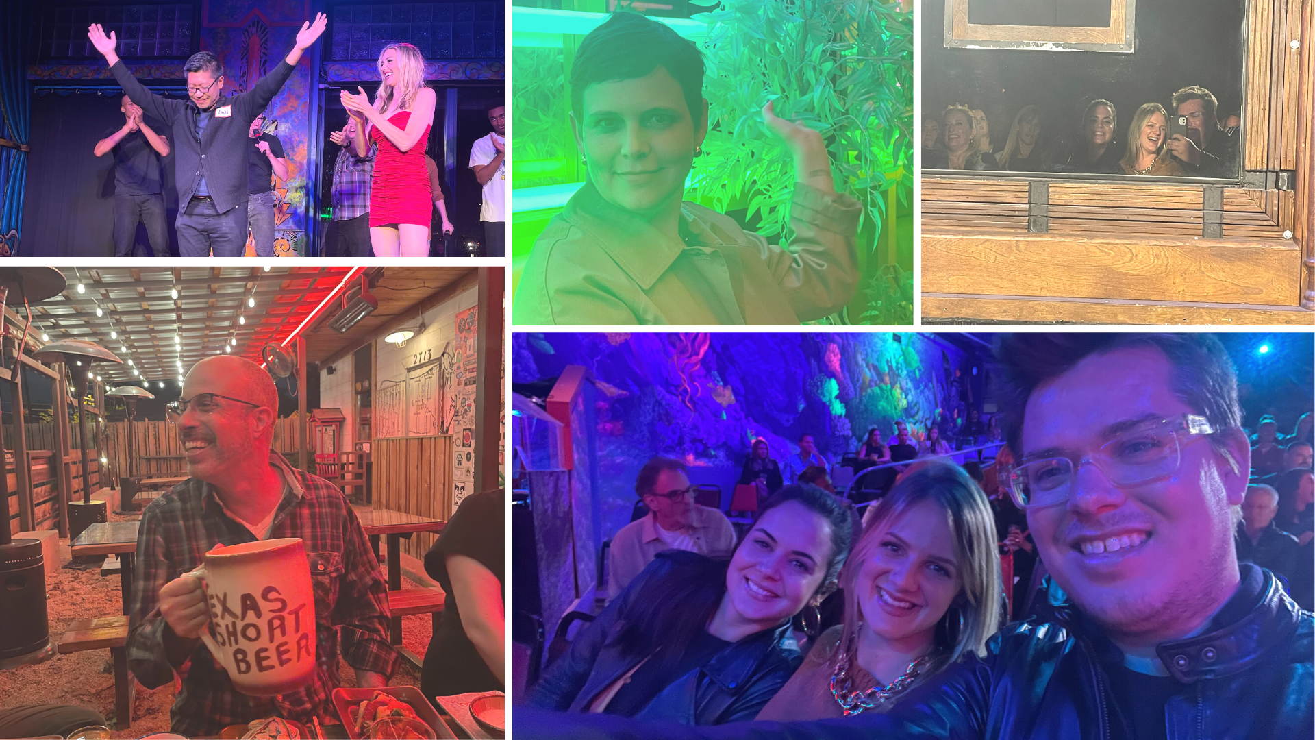
In between our group activities, we took trips to shows, bars, and record stores. At Esters Follies, our other senior designer Kevin got called up for one of the magic acts: he still hasn’t told us how the magician made a dog appear. As for bars, we visited the Coconut Club and 6th Street Speakeasies. We even got to meet one of our clients, Holly and Natalya from the St. David’s Foundation, at one for happy hour.
In a way, they also lived in my emails and Zoom calls, so getting to meet them in person and have our own casual moments was great. Though the bar refused to serve me an Espresso Martini and I had to make due with a cold beer, it was nice to sit down and talk about the little things–and of course big things like their first-ever digital impact report and community update alongside other projects.
By the end of our retreat, I had realized a few things. On many levels, I know the people I work with. We talk constantly: about projects, over Zoom and Google Meet, on Slack, in our emails. But as a remote company, we just don’t share space together all that often unless we live in the same city or visit each other. This retreat gave us the chance to see each other and experience things together. Sometimes a few days is all you need to put heights, vibes, and the personalities behind the work ethic in perspective.
All in all, I’d give our retreat in the Lone Star state 10/10 stars. As I used to joke with my Houston friends, Tejas means friend. I think we’ll remember this retreat for a long time. Or at least until the next one.
Recently, the reDirect Foundation partnered with Constructive to develop their brand strategy and messaging platform, and then translate this work by creating content for a website that they were having created. reDirect is an unusual capacity-building foundation, in that they take on the roles of funder, consultant, and researcher. Their mission is to share and advance a particular academic framework that helps nonprofits bring out the best in their people by building more supportive environments. If that unique positioning wasn’t challenging enough, they also describe themselves as “pointy-headed academics.” In other words, the nature of their work and framework they created to advance that work is riddled with jargon. And while their message may resonate with expert audiences, when it comes to the broader community of nonprofit professionals that they are trying to engage? Well, not so much.
By the time we finalized their brand messaging, I was confident that we could tell their story in a clear and compelling way—despite the complexity inherent in their academic work. But as we moved into site design and content development, I quickly remembered that writing for the web is far less forgiving than writing brand messaging. The word counts are shorter and you need to grab peoples’ attention faster. Add in the challenge of turning jargon-heavy, academic content into user-friendly content and, well, yikes.
The challenge of developing user-friendly web content for organizations whose work is inherently academic or otherwise complex is by no means unique to reDirect. And while it’s true that different audiences can handle different levels of complexity depending on their familiarity with the issue, it’s generally best practice to use more simple and engaging language on the main pages of your site.
Since we’ve finalized reDirect’s brand strategy and messaging, I’ve been reflecting on the strategies that our team used—consciously and unconsciously—to help me turn jargon-heavy content into user-friendly content for their website.
1. Collaborate with Designers During Wireframing
In my opinion, the person writing a website’s content needs to be involved to some extent during the wireframing phase. After all, people primarily visit websites for their content. At Constructive, collaboration between strategists and designers is essential to our process. Part of this stems from my personal background as both a designer and a strategist/writer. It’s important for both aspects of a website to be co-created together if we want the result to be holistic and harmonious.
For reDirect, our brand strategy team worked with their web design team during wireframing to solidify the purpose of each page on the site, what content needed to be there, and what didn’t. Collaborating like this before getting into the actual website copywriting was helpful in two ways. First, it ensured every content block on the page was intentional. It was there for a reason, and designed with that reason in mind. Second, it gave us a head start on writing because we understood in advance the purpose of each page in conveying the brand’s narrative and the ways the content blocks needed to work together to convey that message.
TLDR: When copywriters are involved in wireframing, their job becomes easier. Instead of focusing on fitting content within a pre-existing structure, they can focus on what actually matters—writing content that engages and informs audiences about who an organization is and why their work matters.
2. You Don’t Have to Explain Everything—Right Away
When developing brand messaging for reDirect, our team had to go deep into heady academic literature and research to truly understand what they do and why it matters. This level of familiarity can be a blessing and a curse. And when it comes to writing website content for a website’s top-level pages, it’s mostly a curse.
During the digital strategy and wireframing process, we established reDirect’s homepage as the page that would provide a bold vision of what reDirect’s work helps nonprofits achieve—rather than use it to explain the details of their academic framework. The structure of the page set us up for success, since there was no real opportunity to provide any more context than was useful. Even still, our team found themselves wasting words trying to explain complex ideas that would be better suited on another page of the site. Only when we stripped back each content block to the essentials, without worrying about the extra fluff, were we able to land on something effective and engaging.
TLDR: Complex issues require a lot of explaining! Resist the temptation to provide too much information on the top-level pages of your site—particularly the homepage—and lead with the most compelling/thought-provoking ideas. That way, audiences become organically interested in engaging with your more complex content.
3. Outcomes are More Memorable than Challenges or Details
This may be the simplest strategy for making complex content more engaging: lead with positive outcomes instead of challenges or wonky details. One of the trickier pieces of content on reDirect’s site for me to write was a block on the homepage labelled “challenges we help solve” in the wires. We knew this block needed to demonstrate how exactly reDirect could help nonprofits, which hadn’t yet been mentioned on the homepage. So, we lead with describing the problems nonprofits face that reDirect can help with. But this didn’t feel right. It felt like we were explaining problems to nonprofits who had a much better understanding of them. Plus, it felt like a bit of a downer—a goal of our brand strategy was to be uplifting and inspiring to help nonprofits meet complex organizational and capacity challenges.
One day, we had a revelation. Instead of talking about the problems nonprofits face, we’d try talking about the outcomes reDirect could help them achieve. A header that read “Preventing burnout” became “Supporting & uplifting staff.” Leading with outcomes is a more aspirational, and optimistic approach. It’s also a better way to engage with audiences, who might be more in touch with their goals for their organization than the problems they’re facing.
TLDR: It’s easier to grab audiences’ attention when you lead with positive outcomes. Then you can dig deeper into the true nature of the problems and how to solve them.
4. Use Your Voice
As we were writing website content for various pages on reDirect’s site based on the brand strategy our team had created, we stumbled upon a slightly weird and incredibly helpful strategy—imagining that each page was a mini conversation we were having with someone unfamiliar. How to turn that experience into website content? We read each page to people on our team who weren’t working on the project to see how it resonated. This helped us answer the following questions: What’s the most important information someone should lead with? What context needs to follow? What examples might we provide to illustrate their work? Using this simple communications strategy hack, we found that turning each page into a brief conversation makes content gaps abundantly clear, and helps simplify language choices.
TLDR: Imagining each major website page as a conversation with an unfamiliar person will help simplify your language and structure the information in an organic and useful way.
Final Thoughts
At times it can feel like there’s no way to make complex content clear and effective—especially online. But writing content for reDirect’s website reminded us that it’s both possible and essential to develop content that meets your audiences where they’re at. More times than not, that means presenting clear and engaging copy on the main, top-level pages of your website. In the case of reDirect, doing so was essential to encourage audiences to dive deeper into the more academic content. And with the four methods outlined above, you’ll be equipped to start making your jargon-heavy content more user-friendly.
As more nonprofits and foundations make storytelling a centerpiece of their communications strategy, our collective understanding of what makes a “good” story continues to evolve. Most recently, ethical storytelling for nonprofits has gained in importance, including systems storytelling and the ways in which our stories can avoid reinforcing harmful stereotypes and assumptions. Ethical storytelling is more than just a way of writing, it is a movement and a platform to help nonprofit communicators be more respectful, responsible, and effective when telling other people’s stories. Ethical storytelling has roots in important nonprofit communications strategies such as asset framing (pioneered by Trabian Shorters) and in lived experience.
As with both of these practices, our focus in ethical storytelling must be to remember that as communicators, we are often telling a person’s story for them. Where important trends like systems storytelling focus on the way the story is told and the organization telling the story, a new approach to storytelling makes us think about the person who’s story is being told. How has this been overlooked for so long?! And if we are going to be more ethical in how we share stories of other people’s lived experiences, then what are the questions that we must ask ourselves to ensure that we’re using best practices for ethical storytelling and make sure that we’re doing so responsibly?
How do we ask for consent to tell someone’s story?
Ethical Storytelling challenges us to think about the inherent power dynamics that exist between a nonprofit or foundation and the person who is telling them their story. In most cases, the stories nonprofits look to share are from people or communities who have benefited directly from that nonprofit’s work. It’s not a stretch to say that some might owe their life or livelihood to the nonprofit’s services, funding, or support.
So, when a nonprofit or foundation provide a platform for someone to share their story and lived experience, it can be empowering.—but it can also be difficult for someone to feel comfortable saying “no.” What does this mean for ethically gaining consent as storytellers? Is someone consenting to share their story authentically? Or could they feel pressured to consent because of the power dynamics? Falling into the trap of acting as a savior to help others is a real concern that nonprofit communicators need to fight against if we’re going to do our work ethically.
How does life change after a story goes public?
Because social impact storytelling remains such a hot topic in the nonprofit sector, there’s a risk of conflating communicators’ excitement with the realities of publicly sharing a personal story. For a lot of people, sharing their personal stories traumas isn’t all good. The #MeToo movement is a good example that demonstrates this point—sharing an experience with sexual harassment, assault, or rape opened women to online trolling, personal threats, and potential loss of employment or support systems. But even in less public cases, going public with your story can have far-reaching impacts on your day-to-day life.
So, remember that the stories we tell have a life far beyond after we write them—and that life can come with serious consequences. Is the person or people who you’re sharing a story of aware of those implications? Have you been very clear about what that might look like? If not, makje sure you have been before sharing the most personal aspects of someone’s life—even if it is in service of your nonprofit’s mission.
Why does a nonprofit want to tell this story? Are there other ways to achieve that goal?
This is the most important question for nonprofit communicators to think about before interviewing someone for a story. When someone consents to an interview, there is a great deal of trust involved because they are sharing something of themselves. It’s our job as nonprofit communicators to make sure that we honor this trust—starting by asking why we’re telling the story in the first place.
What will the story that someone is sharing with you help your nonprofit accomplish? Is a story the best and/or the only way to achieve that end? If not, then think twice about whether using another person’s story for your own ends is the right thing to do. It can be a tricky balance—to be in service of the mission often means to be in service of the person whose story you’d like to help tell.
Much More to Learn in Ethical Storytelling for Nonprofits
At Constructive, leaning into ethical storytelling as part of our practice is a journey we’re on like many others. It’s so important that we get it right. There’s a lot we’re still learning about ethical storytelling and the ways we can put it to use for the nonprofits that we work with. And as a design agency, we’re always thinking about not just the written words, but how visual storytelling is an important part of ethical storytelling. The experiences we design play a central role in how those stories are shared. So, as we learn more about this and other ethical communications strategies, we’ll share the ways our thinking and processes evolve.
For the last 5 or 6 months, I’ve been collaborating with The Sephardic Foundation on Aging to create new branding and a new website that shares their story—and the stories of the community that the nonprofit’s work supports. Before I began thinking about design, our brand strategy team created a messaging platform that expresses SFA’s mission, vision, values, and history. This foundation for nonprofit brand storytelling gave me the insight and energy I needed to design the brand identity and website that now represent them. And as I learned more about SFA’s work and the communities that the philanthropic foundation supports, I found that design empathy for nonprofits became a strong force in how I approached my work—and a new lens through which to view the work I do.
SFA’s history goes back 60 years. Designing the brand for a nonprofit with such a long and rich history meant it was especially important for us as designers to understand who they are, where they’ve been, where they’re going—and most importantly, who their audience is. A big part of this nonprofit storytelling is the story of the people that the Foundation has supported for decades. These are personal stories that are essential to the nonprofit storytelling that our team needed to do through design. So we made sure to find opportunities in our design research process to practice design empathy.
A quick summary of The Sephardic Foundation on Aging’s story: SFA began in 1951 as a nursing home in Brooklyn for New York’s community of Sephardic Jews. The home was a sanctuary where Sephardic people could grow older with others who held similar values. Looking to grow their impact, SFA reimagined their mission in 2015, moving on from direct care to become a philanthropic organization that makes a diversity of grants in areas that benefit older people (with an emphasis on the Jewish community). This shift in strategy was a somewhat complicated story to tell and it was important that we got it right.
Design Research for Design Empathy
As part of our brand strategy, Constructive’s strategy team visited the Center for Jewish History in Manhattan to learn more about SFA’s history by exploring their extensive archive of photos and documents. They returned with tons of inspiration for us to reframe SFA’s history and re-imagine their historic brand identity in a contemporary way. During our research, we learned that handshake symbols were a prevalent seal for historical Sephardic organizations around the United States. It reflects a key belief within the Sephardic community that we are all a part of the collective humanity and we should embrace everyone with compassion. The handshake resonated and the symbolism connected with me in a way that I hadn’t expected—and provided a jumping-off point for how to visually connect the brand to the history, culture, and narrative of the Sephardic community.
When it came time to design SFA’s website, I had to use our new brand identity to design a website that brought The Sephardic Foundation on Aging’s mission, history, values, and work to life with greater richness. A big part of that focus was to make sure that our use of imagery strengthened the nonprofit’s brand and reflected their values. SFA’s work is all about human connections—about our shared humanity. So, I jumped at the chance to visit the archives and immerse myself in what this meant. I had two goals during my visit: get a better understanding of SFA’s history to inform our digital strategy, and to select photos and documents that could be used in my design to tangibly connect to the Foundation’s history.
At the archives, I was amazed by how much there was to look through. Almost seventy years of meeting notes, annual reports, financial docs, construction specs—and hundreds upon hundreds of photos. The photos were mostly of the residents in the home doing everyday things: cooking meals together, doing chores, and spending time together and with the staff. Though these photos were engaging, I struggled initially with deciding which ones I should choose as part of our digital storytelling strategy for the nonprofit. I wanted to show and share the lives of the residents to really communicate how well the home cared for them. But with so many options, deciding which images should represent SFA’s history to the public felt like an awesome responsibility.
I’ve always found the act of archiving to be somewhat problematic. It requires a certain amount of subjective curation that ultimately influences how a story gets told. And since not every event, person or experience can be properly documented, when tasked with storytelling, it’s important for designers to consider who is responsible for deciding what gets remembered and what gets lost to the sands of time. Since we didn’t know what the History page’s narrative would be yet, my hoarder mentality kicked in. I figured that having too many photos would be better than not having enough—especially given that this page would only be able to capture a small fraction of SFA’s history. I selected as many photos as I could that were both aesthetically pleasing and captured SFA’s brand and spirit.
One of SFA’s board members joined us at the archive later to help us comb through the photos. He had grown up around SFA when it was first founded as the Sephardic Home for the Aged by people who were concerned that Sephardic people didn’t feel culturally accepted in Jewish nursing homes. He had a picture-perfect memory of who was who in the photographs. He knew everyone’s names and he pointed out friendships, families, and rivalries. His perspective altered how I was choosing photographs because the photos became less about my personal aesthetics and more about which ones were actually important. I began to get a better sense of the organization through the people. History literally came alive when he pointed out someone and told us their life story.
What I Learned About the Importance of Design Empathy
I learned a lot by visiting the Center for Jewish History and I’m glad I did. Not only did I gain an understanding of the history of the organization I was responsible for designing a brand and website for, I gained new empathy and appreciation for the lives of a community of Sephardic New Yorkers that I never would have had I not visited. It gave my work more weight and depth—and as a result, I feel made it possible for me to both get the brand’s history right. Which I hope means a brand experience and brand story that resonate deeply with SFA’s audiences today.


