While often viewed through the lens of nonprofit communications, impact reports are more than just an exercise in visual and verbal storytelling. They also serve a vital purpose in supporting nonprofit leadership in mission implementation by demonstrating accountability, fostering transparency, and connecting stakeholders to a nonprofit’s arc of change. As with nonprofit annual reports, impact reports are a key brand touchpoint that strengthens relationships with everyone—from funders to strategic partners—by reminding people why they believe in an organization’s mission and inspiring greater support by demonstrating progress and connecting to tangible outcomes.
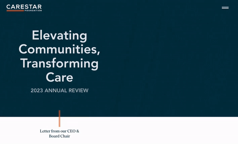
It’s with this thinking in mind that the leadership of CARESTAR Foundation reached out to Constructive to create their first-ever impact report at a pivotal time in their history. Following six years of learning and growth advancing racial equity and community-led action, CARESTAR was ready to share what had been learned and accomplished along the way and to communicate its vision and strategy for the future.
Founded in 2017, CARESTAR is a systems change philanthropy that partners with community-based organizations across California to re-imagine emergency and pre-hospital medical care so that it is more equitable, integrated, responsive, and centered on equity. With an approach rooted in trust-based philanthropy, the healthcare foundation employs both grassroots and grasstops strategies to advocate for changes that are informed by and respond to the true needs of Californians and then codified into policies that advance innovation in community-centered care.
Narrative Strategy: Crafting a Story That Elevates Brand Values
When creating an impact report, there are three key components in telling a story that successfully communicates this impact: proven strategies, substantiating statistics, and community-driven stories. To quickly uncover these essential perspectives and center our storytelling strategy on them, we began with a staple of Constructive’s research and discovery process: the Learning Conversation. This critical step in stakeholder engagement is a facilitated dialogue that makes space for each person involved in a project to share their unique perspectives. By fostering open dialogue, it helps clarify the project’s goals, value, and definition of success, ensuring a shared understanding among all stakeholders.
Through our conversations with Tanir Ami, CARESTAR’s Chief Executive Officer, and Linda Wendel, CARESTAR’s Head of Marketing Communications, Constructive’s strategy team narrowed focus on who the priority audiences were for the impact report, defined the meaningful goals and outcomes the report could generate to support CARESTAR’s mission, and shaped our narrative strategy. Not surprisingly, what continuously kept rising to the top of the conversation as the focal point for the project were CARESTAR’s four brand values:Equity, Compassion, Unity, and Hope.
By building the narrative structure of CARESTAR’s impact report to the organization’s core values, we laid the foundation for connecting every brand storytelling element—focus areas, grantee stories, research, and resources—to establish strategic content pillars that tangibly demonstrate the learnings and results of CARESTAR’s first six years. This looked like:
Equity is the foundation of CARESTAR’s work and is woven throughout. To make this idea more quantitative and tangible, impact statistics and references to funded studies set the stage for meaningful conversations about systemic change in California’s emergency response system.
Compassionis connected to the Foundation’s operational strategy through CARESTAR’s approach to trust-based philanthropy and grantmaking, reinforced with testimonials from grantees to demonstrate the screen of values through which CARESTAR collaborates with its community partners.
Unity is reflected in CARESTAR’s systems approach, a core value that’s lived through the Foundation’s network of community partnerships with grantees—and amplified each year through its annual partner summit, celebrating the collaborative efforts that drive meaningful progress.
Hope is the core value that carries CARESTAR’s narrative strategy forward, closing out the philanthropy’s vision for the future with a moment of reflection and encouraging readers to consider their role in advancing equity within the EMS and pre-hospital care systems.
With these four strategic pillars, CARESTAR’s narrative strategy connects to both the head and the heart, uniting quantitative and qualitative storytelling through a combination of impact statistics, storytelling, and philanthropic strategy that paints a complete picture of the current state of pre-hospital and emergency care in California—and how CARESTAR and its community partners are advancing equity and improving outcomes to improve the healthcare system.
UX Design: Walking Audiences Through CARESTAR’s Six-Year Journey
We then turned our focus to designing the framework for how audiences would engage with CARESTAR’s narrative, using a UX design strategy that’s familiar to anyone who has spent time scrolling on a social media platform—and is highly effective for keeping audiences engaged online. A linear, single-page experience reduces friction and progressively delivers CARESTAR’s story through compact pieces of content that keep users engaged.
Needing to walk audiences through a six-year journey from inception to impact, we structured content as a progressive, guided narrative that effortlessly delivers CARESTAR’s originating ideas, their learnings and impact, the voices of their grantee partners, and their collective vision for the future.
When it comes to the reach, visibility, and impact of nonprofit communications, digital-first annual reports create significant advantages over PDF and print reports. They are easily accessible on any device, flexibly adapting to any screen size to engage audiences wherever they are. They are more findable by search engines, especially when best practices in SEO are used to target valuable keywords. And they provide measurable insights into performance and content engagement when integrated with Google Analytics and behavioral analytics platforms like Crazy Egg.
This being said, there are still stakeholders who prefer a PDF or printed impact report and it’s important to make sure that they’re engaged effectively as well. So, while directing most of our time and effort towards designing a standout interactive experience for CARESTAR’s impact report, we added a companion print/PDF version that makes a tangible impression on important audiences at in-person meetings and events.
Visual Design: Expanding the Brand’s Visual Language for Greater Impact
Designing their first impact report also provided a significant opportunity to evolve and expand the branding to change how it was seen. With CARESTAR’s logo and core orange and blue palette as our foundation, we transformed the Foundation’s branding with a new visual language that’s more vibrant, engaging, and nuanced—just like their grantees and network of community partners.
A new palette of bright, complementary colors adds vitality and expresses CARESTAR’s optimism. A new serif typeface, Ivar, perfectly complements the precision of the brand’s geometric sans-serif, Avenir, adding a more human element and making long-form content more readable. And background textures add depth and emotion to CARESTAR’s branding and activate the Foundation’s library of field photography.
Adding it All Up: Tangible Results and Impact
Six years in the making, CARESTAR’s impact report combines strategic storytelling, engaging design, and authentic imagery, creating an asset and resource to engage stakeholders, authentically represent CARESTAR’s mission, and inspire community-led action. Once ready, we partnered with CARESTAR to make the most of publishing their first impact report, executing a lean, multi-channel marketing strategy to raise awareness and drive engagement through email and social media.
As Linda Wendel, Head of Marketing Communications, explains, “When it came out, we unveiled it as an opportunity to get to know CARESTAR. It includes not just what we did in the year prior, but it showcases what we’re all about, while being centered around our values. Publishing this report was our first huge public-facing document, and so I certainly noticed a big jump in engagement on the website and social media—and it’s nice when you put something out into the world that you know people enjoy.”
The report didn’t just resonate with their audience—it earned praise from their board as well. As Linda explains, “The report was super well-received by the board. They love seeing all of our work put into one place that they could point to as they talk to people about their involvement with CARESTAR and who we are as an organization. Websites are nice, but you still need to visit 5 or 6 different pages to see the complete picture of who we are and what we do. Our impact report condenses this even more for people who want to hear and see our story in one succinct experience.”
Nonprofit annual reports are a cornerstone of many organizations’ communications strategies and there are a lot of ways to approach designing an annual report—especially if your considering designing an interactive nonprofit annual report. In nonprofit annual report design, each year brings a new opportunity to create something that shares your organization’s impact—and tells the stories that bring this impact to life. Staying on top of trends helps make sure that your nonprofit’s annual report stands out and engages your most important audiences.
One of those trends is whether creating a digital annual report is worth the time and investment for your nonprofit over designing a PDF annual report. Digital publishing for reports is hardly new, but living through 2020, with many of us working from home, has elevated the value of a digital annual report for nonprofits who need to engage their most important audiences—particularly for fundraising. Because, when you can’t easily hand an annual report to someone in a personal meeting and you’re also not sure if you can mail it to their office, the value of a digital annual report starts to make a lot more sense.
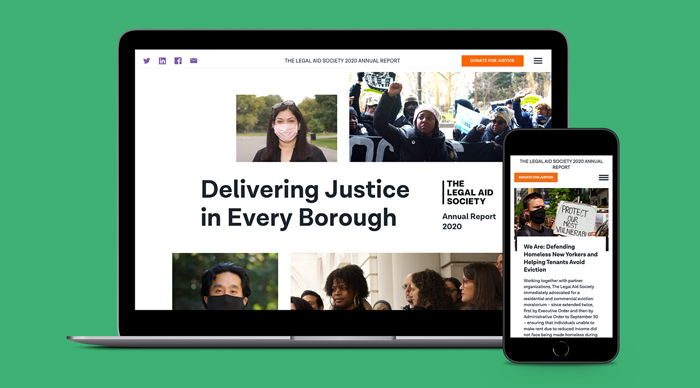
This year, we channeled our energy into designing an interactive digital annual report for The Legal Aid Society. We’ve created annual reports for them in the past. However, print annual reports were always their priority. But Covid pushed us and The Legal Aid Society to take a different approach. So, we shifted gears and prioritized designing an interactive annual report—with the PDF version taking a back seat.
A New Vision for Nonprofit Annual Report Design
As the pandemic brought most in-person interactions to a halt in New York City, The Legal Aid Society’s typical strategy for distributing their annual reports shifted. Instead of distributing them primarily in-person during their Annual Meeting, this year they would need to distribute their annual reports digitally. Instead of moving the static annual report to a digital format where it would appear as a single-page, scrolling document, we decided to use this as an opportunity to provide The Legal Aid Society’s clients and stakeholders with a more interactive experience.
We pitched a multi-page, interactive annual report to The Legal Aid Society that would be more user-friendly and provide readers with an immersive digital experience. And for the print-inclined, the digital report also includes a downloadable PDF report.
Nonprofit Digital Annual Report Design with a Content-First Approach
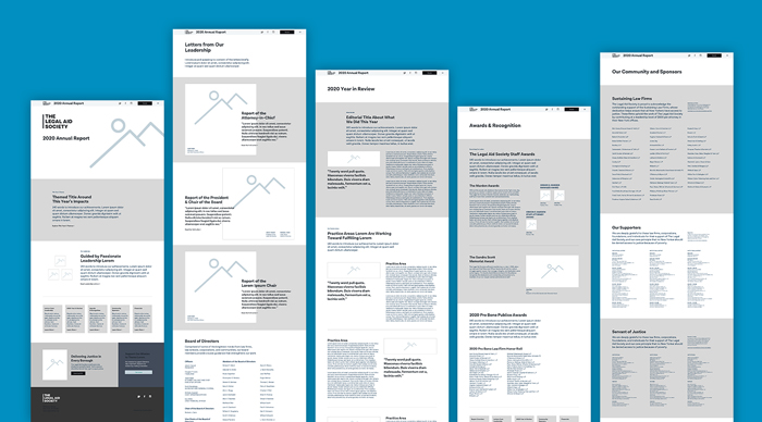
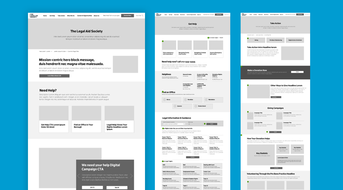
Since we were creating a multi-page digital annual report, we approached things a little differently than usual. Instead of presenting The Legal Aid Society with a site map and walk-through of how the navigation would be structured, we took a content-first approach. We went a level deeper to think about what content would be hosted on each page of the site and how we envisioned these pages being interrelated. Our wireframes, then, grew organically out of these content selection and layout phases.
UX Design That Caters to Audiences’ Mental Models
We created an HTML-based site to host The Legal Aid Society’s digital annual report. The main question that guided our design was, “how would a user flow through this information?” Since the annual report was a multi-page experience, we knew a user wouldn’t be going through it in a linear fashion, as one does when reading a static annual report, from beginning to end. Even so, we wanted to make sure that we kept users’ mental models front and center when designing this annual report so that they would still be able to progress through the content from page to page, in a logical, even if not linear, manner.
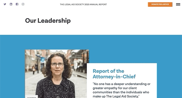
We also enhanced readability through user interface elements. For example, the annual report included letters from executive staff, but instead of just presenting them in a static format, we loaded them in elements that slid out from the side of the report. This created the experience of reading a letter on the screen for the user rather than simply reading it in-line on a page.
Interactive Annual Report Design that Drives Engagment
Since we previously worked with The Legal Aid Society to design the nonprofit law firm’s branding and website, as well as multiple annual report designs, we already had a design system in place. To keep brand continuity intact, we drew on the same design elements, including typography, photo treatment, and color palettes.
For typography, we used type overlaid on photos with a box, picking up on design cues from the main site. Additionally, we used bolder and larger numbers for statistics to immediately draw the reader’s attention to them, a design practice we implemented both on the main site and in previous annual reports for The Legal Aid Society.
For the digital annual report, while we continued to use the same color palette we used for the rest of The Legal Aid Society brand, we incorporated larger color fields to break things up a little and create better pacing as one goes through the report. While in one way, our use of color aligned the annual report with The Legal Aid Society brand, in another, readers also got the sense that they weren’t on their main site and were partaking of a distinct experience.
An Annual Report That Leverages the Main Website
Designing a more robust nonprofit digital annual report also expanded our opportunities to design for engagement. With more stories and information to explore—and more content to engage with—we had more places to engage audiences to learn about The Legal Aid Society. And because they have invested significantly in making sure that The Legal Aid Society website is filled with useful and actionable information—and countless opportunities to support campaigns, volunteer, and donate—we were able to piggyback on that work without having to reinvent the wheel when designing nonprofit’s annual report, which has a fraction of the budget.
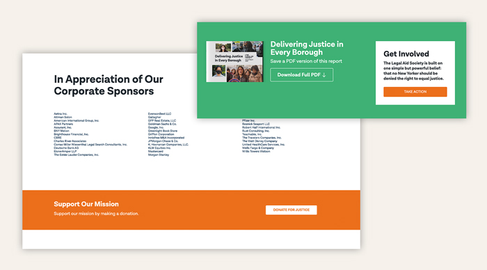
In addition to driving engagement by directing audiences to the main website to explore further, we made sure to create immediate action by emphasizing how visitors could “Donate for Justice” as they learned about the amazing things that The Legal Aid Society accomplished over the year. A ubiquitous donate call-to-action at the bottom of every page turns the annual report from a simple recounting of the year in review to an opportunity to support their work. The call-to-action then gives audiences information on different sponsorship opportunities, from individual donations to corporate sponsorships.
Delivering Results
Since releasing this nonprofit digital annual report, The Legal Aid Society’s team has undergone a strategic shift, recently adding Directors for corporate giving and foundation giving. As their team shared with us, having a digital annual report has empowered these new members of their fundraising and development team to make adjustments that would be impossible in a print annual report—and easily connect with new fundraising audiences.
Moreover, the email The Legal Aid Society sent out to all their donors and supporters sharing the annual report was viewed 22% more, compared to average communications sent out by their team, and showed a 63% increase in engagement. Want to see for yourself? Have a look at The Legal Aid Society’s 2020 Annual Report.
Among the first private foundations started by a woman in America, Anna M. Harkness, The Commonwealth Fund is a leading healthcare research nonprofit whose mission is to ensure a high-performing health care system that achieves greater access, quality, and efficiency of care for all Americans. Looking to strengthen their brand, Commonwealth’s team asked Constructive to update their historic brand and redesign their communication design by conduct a branding and design audit; then lead development of a comprehensive design system to increase the cohesion and quality of the nonprofit’s communications.
Understanding the Current State of the Brand
We kicked off the rebranding process by asking questions and conducting research. We first established strategic goals, collecting and evaluating years of Commonwealth’s print and digital communications, and discussing the nonprofit’s production design workflows. The resulting brand communications audit identified issues and solutions to improve communication design quality, consistency, and effectiveness—insights were used to then prioritize needs and develop an execution plan to redesign the healthcare nonprofit’s branding and communications.
Expanding the Existing Visual Identity: Healthcare Research Nonprofit Rebrand
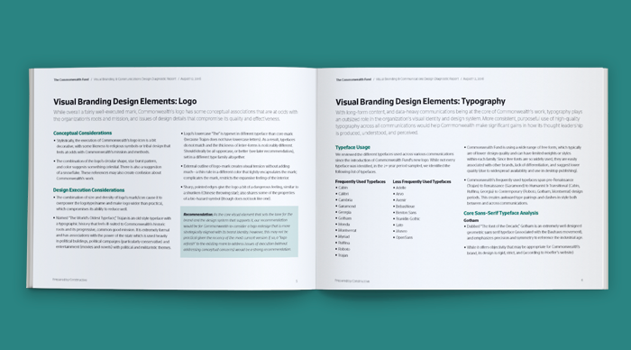
While Commonwealth wanted to improve their branding, they were reluctant to change their recently redesigned logo. In order to be more strategically and functionally sound, however, we recommended a slight refresh. After making subtle improvements to the mark and choosing a more effective core brand typeface, we developed a design system of colors, typefaces, imagery, and iconography to support Commonwealth’s content-heavy communications. As we continued extending into communication design, we documented Commonwealth’s new design system in brand guidelines that provide detailed specifications for designing across digital and print media.
Digital Strategy & User Experience Communication Design
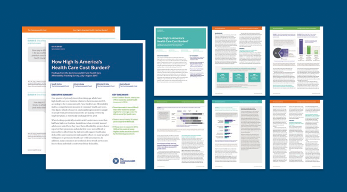
Strengthening the healthcare system by producing research and analysis for policymakers, business leaders, and experts in the NGO sector is integral to The Commonwealth Fund’s strategy to advance its mission. We improved the effectiveness of the nonprofit’s knowledge communications and their ability to produce them with a suite of templates for their frequent Issue Briefs and White Papers that provides structure, increases readability, and elevates top-level takeaways for the complex issues Commonwealth dives into with its long-form content.
Visually Engaging Audiences With Complex Issues
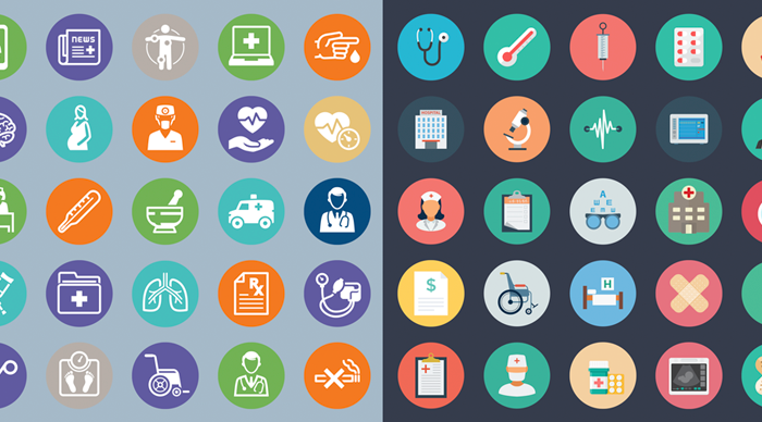
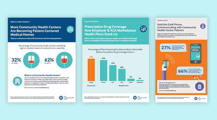
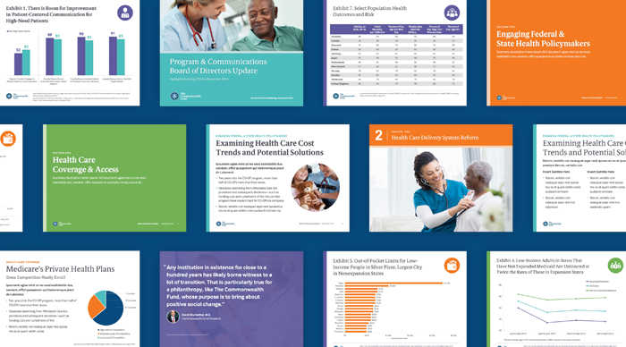
The Commonwealth Fund works on complex issues in an opaque healthcare sector. So, to successfully advance their work and reach a more broad audience, an essential part of the nonprofit’s strategy is to communicate by using infographics and data visualizations that can engage and educate expert and non-expert audiences alike. We created a flexible, scalable system for producing both types of visual communications into Commonwealth’s design system—designing styles and templates for print and digital media that clarify the issues and deliver impact for the nonprofit’s reports, briefs, presentations, and social media.
Providing a Platform for Public Speakers
It can be challenging for research-driven, policy-focused nonprofits like The Commonwealth Fund to distill the findings of their work into presentations for live audiences. While they know more than anyone else about the issue area they’re presenting on, the experts responsible for creating such presentations often know little about how to design effectively. We solved this problem for Commonwealth by designing a suite of presentation templates and data visualizations to help their team turn detailed research into communications with effective communication design that educate and influence audiences.
—————————
If you would like to explore a more visual case-study for our work with The Commonwealth Fund, click here.
If you’d like to explore more of Constructive’s work with healthcare & social services nonprofits, case studies are available here.
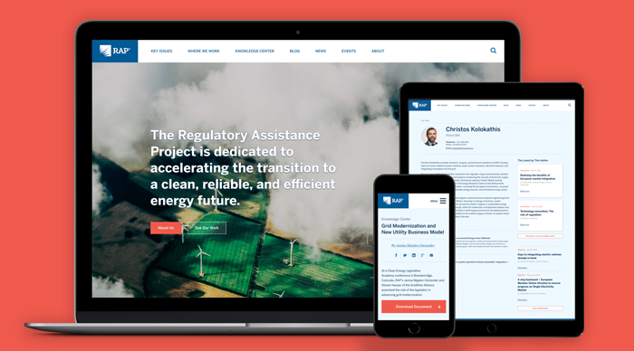
The Regulatory Assistance Project (RAP) is a global coalition of specialized energy and regulatory experts who develop and support strategies that accelerate the world’s transition to a clean, reliable, and efficient energy future. Looking to strengthen their brand, and website, and deepen engagement across government and industry, RAP asked Constructive to develop integrated communications strategy to transform how they engage audiences online, in print, and at events. Together, we created a cross-media communications design system that helps RAP and stakeholders around the globe address the challenges across energy policy, regulation, and markets.
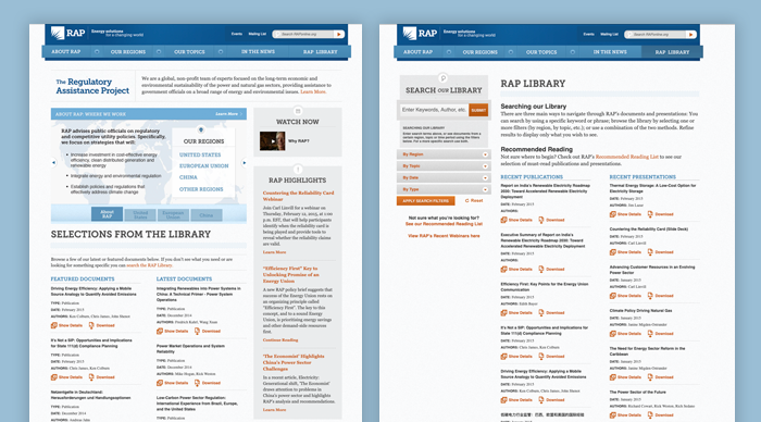
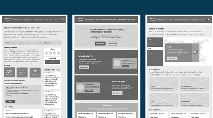
A Dense Website Making Insights Inaccessible
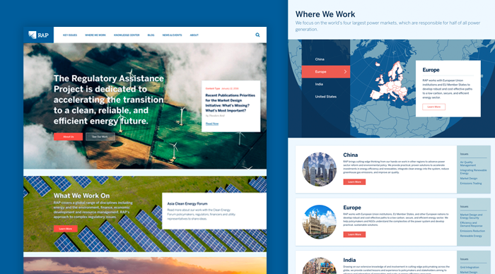
When RAP reached out to us, their website was loaded with incredible content. The problem was that it felt more like a stoic government archive than a website for an innovative global leader. Text-heavy pages were crammed with content, making it impossible to focus. A lack of imagery made RAP’s work feel theoretical and disconnected from the real world. And buried beneath all of RAP’s expert research was a story about who they were, what they do, and why it matters—if you could find it. The result was a website that failed to present RAP as the global leader they are, inspire audiences with their mission and impact, or make RAP’s valuable research accessible to their audience.
Connecting Audiences to Regulatory & Policy Expertise
RAP operates at the intersection of global energy regulatory policy, industry practices, and the environment—providing leadership and publishing research to reduce carbon emissions around the world. Their work is complex and their audiences are a cross-section of experts from across the private and public sectors, and the specialized press. Given the complexity and implications of RAP’s work, we developed content strategy that articulates RAP’s story, elevates their expertise, and explains the issues. UX design connects areas of expertise, geographic focus, and published research, giving users flexible pathways to explore based on their interests. To ensure RAP’s valuable research would be as accessible and useful to audiences, we conducted user research to identify goals and needs. The resulting UX design connects RAP’s history, expertise, and content to help industry, government, and the press both navigate and improve global energy regulatory policy.
Designing for Global Credibility
RAP’s reach is impressive—they work with governments across the globe and the industry sectors that represent the totality of the energy production, storage, and delivery value chain. As a result, success depends on making sure that the organization’s research and perspective is seen as credible and valuable to a diverse, international audience. We designed a content-centric website that focuses on research and speaks using the classic “universal style.” The result is a brand experience that makes RAP’s research, policy analysis, and industry practices accessible; positioning them to increase influence around the world.
Providing Audiences with Global Insights
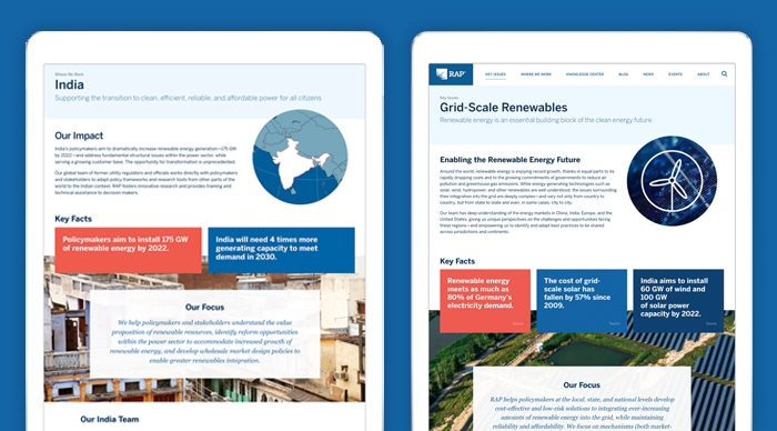
Energy issues and policies differ in every country—and RAP’s presence and expertise in key regions of the world is a core part of their mission strategy. To RAP’s reach and influence, regional hub pages educate audiences with narratives that highlight areas of focus and impact. Spotlights of RAP’s regional teams elevates expertise in navigating the challenges of local energy and regulatory issues. And region-specific research, analysis, and resources provide audiences with valuable content from RAP’s knowledge library.
Focusing on Interconnected Climate, Public Health & Energy Issues
Energy is the biggest global industry sector and is inextricably tied to climate and public health issues. Not surprisingly, then, RAP’s expert research, analysis, and best practices reflect this complexity. To educate audiences and demonstrate RAP’s expertise, we developed an editorial content strategy that delivers top-level takeaways and a deeper understanding of the key issues. Quick takes, key statistics and facts, and a carefully designed editorial rhythm encourage exploration of RAP’s long-form content so that RAP can deliver clear perspective, actionable recommendations, and proven best practices that facilitate sector and market transitions to clean energy systems.
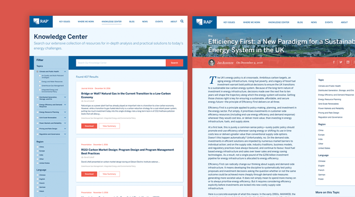
Making a World of Research Accessible
To maximize the value that RAP offers governments and the global energy sector, a robust Knowledge Center makes the organization’s research insights and expertise easily accessible. Advanced filtering lets audiences quickly locate research by topic, region, language, type, and date. And throughout the site experience, the website’s taxonomy system delivers related content—elevating reports, articles, presentations, and more based on each visitor’s interests.
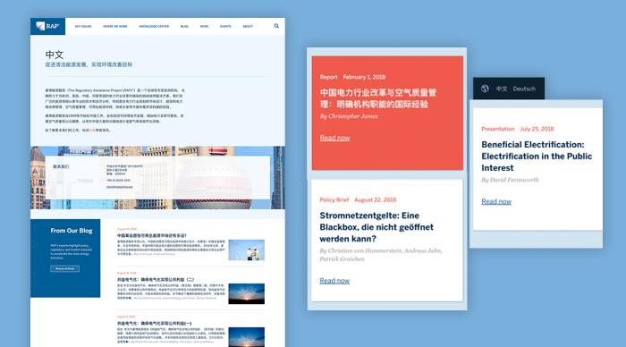
A Fluent Multilingual User Experience
The universal design of RAP’s user experience visually addressed its global audience. And to engage leaders and gain traction in countries on four different continents, RAP’s content also needed to speak in a language people could easily understand. So, we designed a multilingual, multi-character set website that supports English, Mandarin, and German— with scalability to easily add new languages anytime.
Research & Presentations That Resonate
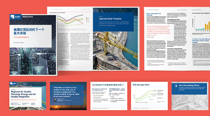
Digital engagement is only one part of the equation in RAP’s formula for impact. Research reports and presentations at influential events are also an important component in the organization’s strategy to move to a clean energy future. As part of our redesign, we created a new communications design system for RAP’s team that increases the quality, impact, and influence of research by giving them the tools and templates they need to produce stand-out reports, issue briefs, and presentations and data visualizations.
A Communications Design System to Accelerate Systems Change
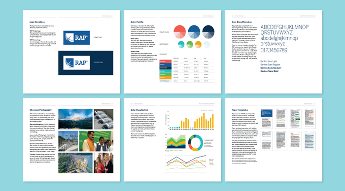
Once RAP’s new branding, website, and research communications design process was completed, we then formalized everything to make it sustainable. Comprehensive brand standards document the details of RAP’s new identity communications design system, providing specifications and guidance for the proper use of their logo, type, color, imagery, and data visualization. And a gallery of communications templates for reports, presentations and other communications makes it easy for staff to consistently produce high quality on-brand communications.
—————————
If you would like to explore a more visual case-study for our work with The Regulatory Assistance Project, click here.
If you’d like to explore more of Constructive’s work with climate & environment nonprofits, case studies are available here.
The National Constitution Center is a non-partisan nonprofit established in 1987 with the mission of increasing awareness and understanding of the U.S. Constitution among the American people. It does this through its landmark museum in Philadelphia and its flagship online product, the Interactive Constitution—a first of its kind digital interactive learning platform. We partnered with NCC to magnify the Interactive Constitution’s impact by redesigning the experience to incorporate extensive audio and video content from live events, and make it an even more powerful tool by adding a robust teacher development and classroom component to be rolled out to millions of middle-school students and high-school students preparing for the AP U.S. history exam across America.
Creating a Collaborative Vision
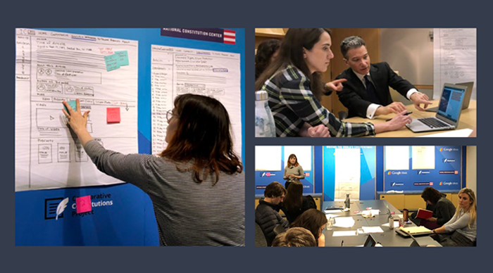
As the most visible and visited website of its kind, the Interactive Constitution yields enormous potential to reach and engage millions of Americans in conversations about the document’s history, its interpretations, and how they’re relevant today. We kicked-off digital strategy with staff surveys and interviews to prioritize goals and opportunities, surface pain points and challenges, and understand the implications of adding an online curriculum. We then dug deeper through collaborative workshops to develop a strategy to reach a wider audience, engage and empower educators, and broaden appeal to the wider general public while retaining the Interactive Constitution’s impeccable scholarly reputation.
A Structure That’s Faithful to the Text
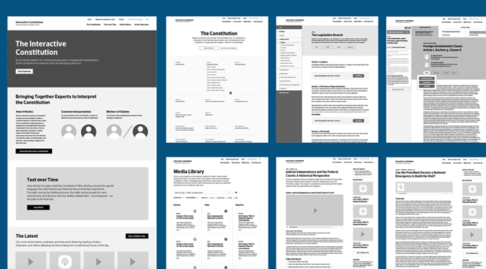
The Interactive Constitution is a content-rich site by nature that serves the needs of diverse audience groups, all of whom bring different needs and levels of understanding of the Constitution. Our challenge was to balance designing a user-centric experience while remaining fully focused on the text of the Constitution. To better understand people’s reactions to and understanding of the site’s navigational flow, content relationships, and on-page content, we conducted usability testing on both the existing site and on new prototypes. The result was UX/UI with a strong content hierarchy that makes each page clear, digestible, and actionable—guiding users and retaining the scholarly integrity of the text.
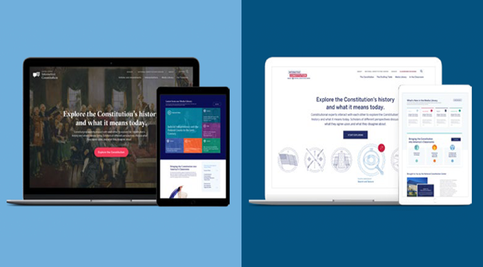
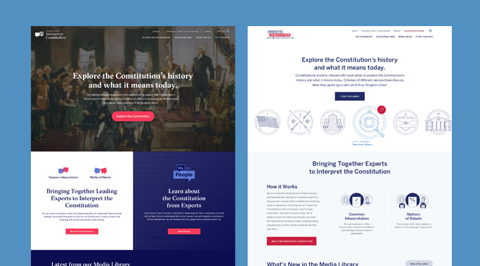
Providing Two Different Interpretations
Redesigning the Interactive Constitution was also an opportunity to strengthen a distinctive sub-brand of the National Constitution Center. We offered two different approaches—interpretations, if you will—to the Interactive Constitution’s visual identity. One design is a bold take on history, leading with imagery and rich colors that create a more emotional connection to the Constitution and what it means. Our other design concept delivers a fast, web application-like experience by using minimal imagery, ample white space, and vibrant colors so that audiences can quickly navigate and focus on the text.
A Narrative Flow to Share The Interactive Constitution’s Story
The Interactive Constitution is unique in that it complements the full text of the U.S. Constitution with insights from leading scholars, an extensive multimedia library, and interactive features to deepen understanding of America’s foundational document. It also appeals to a wide range of audiences, from students, teachers, and Constitutional experts, to lawyers, the media, and the interested public. To develop a homepage that would effectively introduce the breadth of the Interactive Constitution and engage its many audiences, we workshopped digital strategy to collaboratively design content priority. We then designed two distinct approaches that give users the context they need to understand, appreciate, and engage with the Interactive Constitution—providing a variety of entry points for audiences to jump in.
Remaining True to the Text
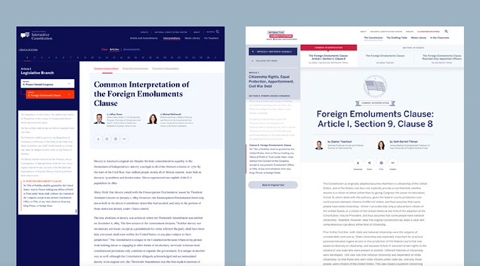
Interpretations of the Constitution can hinge on the addition or exclusion of particular words and punctuation—with significant consequences for American life as a result. Not surprisingly, it was therefore a priority for the National Constitution Center to present the full, original text of the document with minimal distractions. We designed the Constitution’s Articles and Amendments to create a great reading experience that encourages exploration. Clean text is complemented with minimalist navigation that makes it easy to access Articles, Amendments, and Sections or to print, share, or embed content. And understated calls to action highlight the IC’s scholarly interpretations for added perspective.
Adding Additional Perspectives
The Interactive Constitution is much more than just a digital version of America’s founding document. It’s also an interactive experience that invites audiences to explore perspectives from leading Constitutional scholars and justices on its interpretations and their consequences. With a mandate to remain non-partisan, we designed an experience that highlights what unites Americans by leading with common interpretations, and then ensuring equal time to conservative and liberal voices that explore what’s up for debate.
Enriching the Experience with Digital Web Design
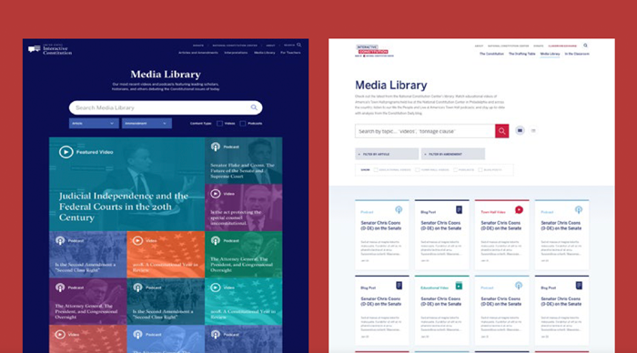
The new Interactive Constitution includes a robust Media Library that makes The National Constitution Center’s events and thought leadership content easily available. The Library provides advanced search and filter functionality that makes it easy for audiences to quickly and easily sort information by Article, Amendment, or topic. We designed a rich repository of resources that provides videos, podcasts, and articles to expand people’s understanding of the Constitution in relation to current events and historical context.
Bringing Live Events to a Wider Audience
A key differentiator of the IC is that it is an initiative of The National Constitution Center—America’s preeminent institution for engaging citizens with America’s foundational document. Highlighting this vital connection, the IC includes recordings of NCC’s live events—providing audiences around the world with access to insightful interviews and panel discussions. The result keeps the Constitution relevant in today’s civic discourse while providing the NCC with a bigger platform for showcasing their thought leadership and contributions to American civic engagement.
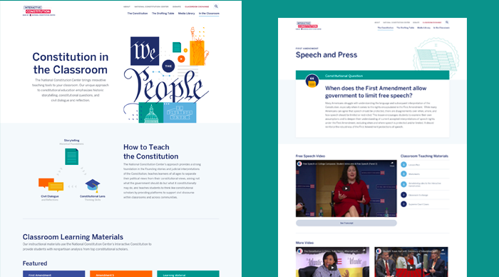
A Better Way to Teach the Constitution
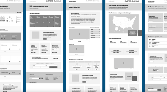
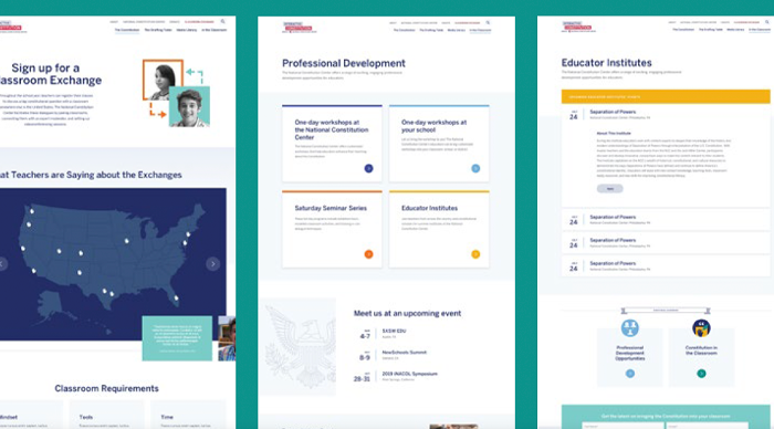
A key objective of the IC redesign was to create a dedicated teaching and learning experience for millions of advanced placement classrooms across America. To make sure what we designed would meet the needs of teachers and students, we conducted audience research, interviewing educators to hear their challenges in teaching the Constitution and exploring ideas to support them. We then architected an educator portal that pairs the Interactive Constitution with lesson plans, videos, and worksheets to make it easier for teachers to incorporate lessons into their curriculum. An online classroom exchange and professional development opportunities then expand opportunities for educators to enrich exploring the Constitution for millions of students across America.
Bringing the Constitution Alive in Classrooms Across America
The IC’s “Classroom Edition” provides a vibrant place for students and teachers in classrooms across the nation to come together and engage deeply with the content, history, and relevance of the Constitution. An expanded design system adds color and character to the core Interactive Constitution, positioning the brand for teachers and students while also providing visual cues that make it easy to navigate and access content.
Supporting Educators Around the World
The IC does more than just provide access to education resources, it also proactively engages educators and students. Professional development workshops and seminars bring teachers together to sharpen their skills and curriculum plans. Facilitated classroom exchanges give students across the country the opportunity to debate interpretations of the Constitution. The result expands the National Constitution Center’s reach and impact, providing opportunities to empower teachers and engage students to understand and appreciate the Constitution more holistically—sparking new conversations about the text and what it means with a younger generation of Americans.
—————————
If you would like to explore a more visual case-study for our work with The National Constitution Center, click here.
If you’d like to explore more of Constructive’s work with public interest and social justice nonprofits, case studies are available here.
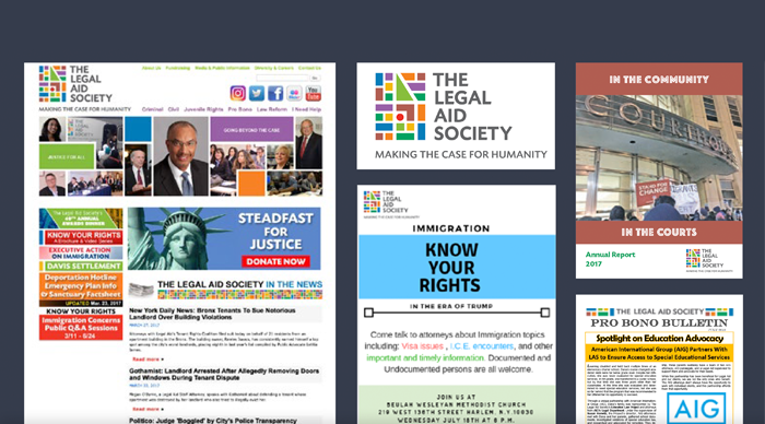
For nearly 150 years, The Legal Aid Society has fought to ensure equal justice for all New Yorkers. The oldest and largest social justice law firm in America operates in every borough of New York City, providing unparalleled breadth and depth of legal services. Facing challenges in focusing its brand and uniting over 2,000 staff across 26 offices with a common vision and shared purpose, The Legal Aid Society asked Constructive to help rebuild from the ground up. Their goals? Develop strategy and messaging that communicates their mission, values, expertise, and impact; then redesign every facet of their branding and communications. In the three years since, we partnered with The Legal Aid Society to deepen understanding of what unites them and then design the experiences and communications that embody it.
A Cluttered Brand Looking to Find its Voice
When The Legal Aid Society reached out to Constructive, their brand and communications were scattered and poorly executed— seriously undermining the organization’s reputation as one of America’s most respected social justice law firms. Messaging was unfocused and failed to clearly tell The Legal Aid’s story and impact. The foundation of the brand’s visual identity, its logo, was more appropriate for an urban preschool, failing to project the organization’s strength as a fierce advocate for justice. Despite the volumes of communications produced, there were no brand guidelines or a design system in place to create cohesion. And without clear standards, a DIY design culture across offices, departments, and programs resulted in chaotic communications of questionable quality across digital, print, and events.
Diving Deep Into Culture, History & Impact
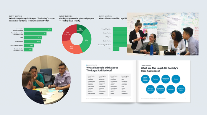
During the first few months, we focused on gaining perspectives from inside and outside The Legal Aid Society. After a communications audit, we lead brand and fundraising communications workshops, working with a representative leadership group to ensure that diverse voices were included. Interviews and a staff-wide survey sent to all staff added even greater depth to our understanding of the organization. To get direct, unfiltered feedback on external perceptions of the brand and audience relationships, we conducted independent interviews with clients, partners, government officials, and others. We then rounded out our understanding of the situation by analyzing the branding, messaging, and websites of peers and partners—gaining insight into ways to strengthen The Legal Aid Society’s positioning and differentiation.
Crafting a Compelling Brand Narrative
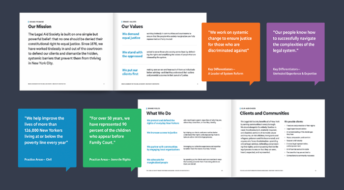
With research complete, we got to work on strategic analysis; identifying patterns and trends across our research. We first developed preliminary findings and recommendations, organizing ideas into key themes and adding insights and questions to expand everyone’s thinking. We then finalized a new brand strategy with The Legal Aid Society’s team, creating the framework needed to inform brand language and design. To tell The Legal Aid Society’s story, we translated brand strategy into a brand narrative that articulates who they are, what they do, and why it matters. Included in the process was a survey across the organization to make sure that language was values-aligned and inclusive, describing clients, communities, and populations in ways that were respectful and culturally appropriate.
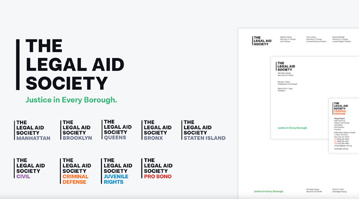
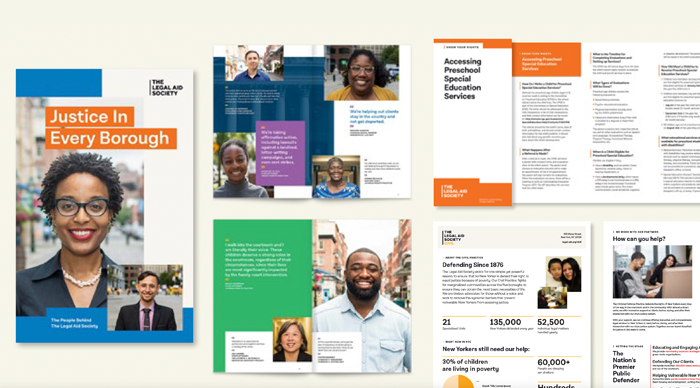
Boldly Demanding Justice in Every Borough
For brand identity, we focused our design strategy on The Legal Aid Society’s top strategic priorities. First was to present a strong, straightforward brand. Second was to emphasize the Society’s all-borough community presence. Third was to highlight individual practice areas while expressing unity. And fourth was to reflect New York City’s diversity. The Legal Aid Society’s master logo is black-and-white, just like the law should be—boldly making the case, avoiding unnecessary decoration, and getting right to the point. Borough and practice-area sub-brands establish a clear brand architecture. Typography is strong and easy-to-read. And the brand’s color system references NYC’s iconic subway lines—an equitable, connecting force that resonates with every New Yorker. Along with the tagline, “Justice in Every Borough,” The Legal Aid Society’s brand identity spans boroughs and practice areas to literally and figuratively represent all of New York City.
Architecting an Engaging & Useful Experience
Alongside brand development work, our digital team developed a digital strategy to create meaningful online experiences with The Legal Aid Society that advance their organizational priorities. After auditing the existing website, we conducted research with staff to understand the role the site played—and could play—in supporting and streamlining operations. We then conducted field visits to offices and courthouses to help us better understand how the website could better support client and community experiences. We then developed personas that focus on audience needs and led collaborative workshops to identify website content needs and features. The result was a blueprint that tells The Legal Aid Society’s story online, advances their goals, and provides valuable information, resources, and services that help people in need.
Bringing the Brand to Life Online
Website design provided our biggest and most valuable opportunity to extend The Legal Aid Society’s new design system. We designed an experience that boldly represents the brand, deepens content engagement, and embodies both The Legal Aid Society’s social justice mission and New York City roots. Strong design grids and large headlines make a statement, focus the eye, and make content scannable. Best practices in usability design make navigating The Legal Aid Society’s volumes of content easy. And a rich tapestry of colors and inviting imagery throughout the website adds vitality to The Legal Aid Society’s brand and makes it welcoming—a key strategic priority for an organization that stands as a beacon to those who are overwhelmed by an often unfair and impersonal system of justice.
Making Justice in Every Borough More Accessible for All New Yorkers
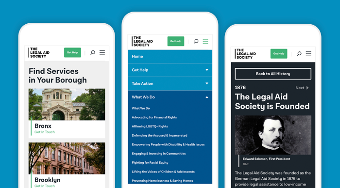
The Legal Aid Society operates in a complex justice system that is designed to make the communities they serve feel intimidated and overwhelmed. Given their size and scope of services, the organization itself is similarly complex and can feel confusing. 26 offices and countless practice areas across all five boroughs meant that navigating how to engage with The Legal Aid Society could also be a challenge. Building off our brand strategy blueprint, which structures how The Legal Aid Society explains their network of offices, departments, and initiatives, we designed a website that makes it easy for people to find the right services for their situation and who to contact, based on borough, practice area, and situation. The result makes the complexity of the justice system and a 2,000-person organization working in it for all New Yorkers more accessible—demonstrating The Legal Aid Society’s breadth of expertise, services, and locations available to communities.
A Website that Delivers Direct Support to People Who Need it
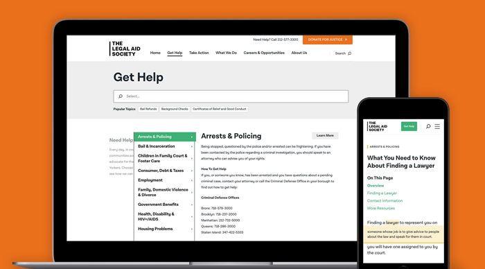
A top priority for The Legal Aid Society’s new website was to make it more useful and valuable to the clients and communities they serve—empowering people caught up in the justice system and reducing the burden of excessive helpline calls. To get this right, we performed extensive design research, learning what information communities needed and what the priorities were, and visiting courthouses and offices to learn about their experience. The resulting “Get Help” section uses service design principles to deliver the support communities need—including an interactive glossary that makes confusing jargon more understandable, and the legal system more accessible as a result.
Sharing Authentic Stories & Connecting to Values
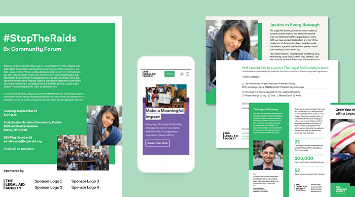
A key pillar of our brand strategy was to unite The Legal Aid Society’s staff with a shared vision and elevate the voices of their passionate and dedicated staff of 2,000 people. So, we created a digital storytelling strategy called “A Day in the Life” that gives staff a platform to share what “Justice in Every Borough” means to them and generates pride in the mission. In addition, The Legal Aid Society’s commitment to diversity and inclusion are given a spotlight, elevating one of their core values and attracting top talent to join the organization. And to make the brand more accessible, a full staff directory makes it easy for audiences to get in touch with The Legal Aid Society’s experts.
A Scalable Design System That Supports the Entire Organization
The Legal Aid Society produces a tremendous volume of communications across its offices in support of dozens of programs and initiatives. We left no stone unturned in designing a comprehensive system of marketing and fundraising collateral, community information resources, forms for operations, and internal branding. In addition, staff needed to be able to quickly produce brochures, flyers and other communications for campaigns and community engagement. To meet their needs while maintaining brand cohesion, we created a system of templates that make it easy for different offices, departments, and programs to create the communications they need right when they need them.
Social Justice Web Design That Drives Fundraising & Action
Community engagement and mobilizing are essential to the Legal Aid Society’s work to take on the injustices that hang over oppressed communities. Central to these efforts is elevating advocacy work and connecting fundraising to issues—especially when they dominate the headlines. Leveraging our brand strategy to focus messaging, we designed a flexible system of communications to drive audience support for The Legal Aid Society, whether that’s by lending their voice, volunteering their time, or making a financial commitment.
Our Client’s Take
“The Legal Aid Society is an extremely large, complex organization that works across policy, advocacy, and direct service, impacting millions of New Yorkers. We came to Constructive with the ambitious goals of focusing our message and strengthening our brand to better tell our story, engage our diverse audiences, and unite our practice areas, offices, and people. Their team embraced our complexity and helped us make sense of it to craft new strategy, branding, and communications that resonate and truly represent who we are—highlighted by our new website, an invaluable resource that demonstrates our expertise, delivers service to our clients, and drives our advocacy and fundraising.”Sharon Kleinhandler, Director of Development.
Founded by the Hewlett, Packard, and Oak foundations, ClimateWorks Foundation is a global climate philanthropy that develops, implements, and evaluates strategies and investment portfolios targeting the world’s largest carbon-emitting regions and sectors. Following a five-year revision to their operating model and in the midst of a complex strategic transition, ClimateWorks asked Constructive to translate their new strategy into a new brand strategy, messaging platform, and design system that would help them communicate their bold vision to a global network of partners, and accelerate large-scale climate action.
A Brand Lacking the Boldness of a Mission
The resulting changes to ClimateWorks’ strategic model called for equally dramatic shifts to its brand strategy and the designed experiences they created for audiences. The Foundation’s existing communications strategy and website reflected the organization’s early stages, when it had quickly set out to address the threats of catastrophic climate change. Their content expressed important ideas, but was long on words and light on impact; their visual identity was restrained and lacked vibrancy; and their website, while organized and polished, lacked the visual punch necessary to communicate the urgency of ClimateWorks’ mission, the boldness of their vision for the future, and the impact they and their partners were having around the globe.
Focusing the Mission & Articulating the Strategy
To re-imagine ClimateWorks’ communications, we needed a focused strategy. We started by digging into the Foundation’s new strategic plan for climate action; then engaged leadership to gain perspective and deepen our understanding of their complex work. With firm footing, we led strategy workshops, bringing everyone together to explore the ideas driving ClimateWorks’ mission, vision, and values—and how they create value for global partners, their roles as the backbone of a collective impact effort, their areas of expertise, differentiators, and more. We distilled these insights into a new theory of change and messaging framework that gives voice to the foundation’s work; designed into a brand handbook that provides ClimateWorks’ staff and board with a valuable resource to clearly communicate their story, whatever the context.
A Visual Identity to Support Complex Communications
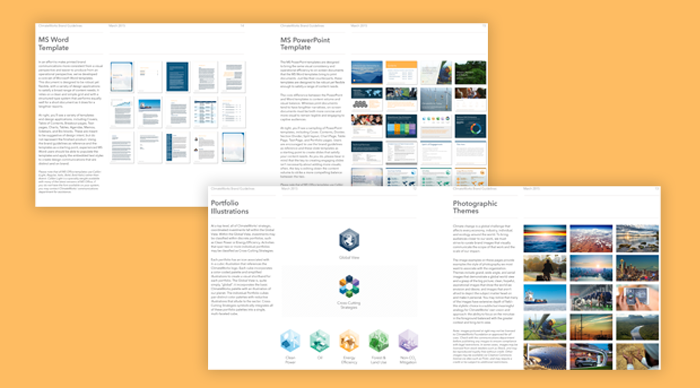
ClimateWorks’ logo remained an effective visual for the organization. What the brand lacked, however, was a design system that had the visual vibrancy needed to represent their global reach, excite audiences, and support the complex functional needs of the Foundation’s portfolios and data-heavy communications. We created a robust system of brand colors, typography, custom illustrations, and photo guidelines to anchor communications design; then extended ClimateWorks’ new visual identity across print and digital communications in the coming months. And once the rebranding was complete, we documented everything in comprehensive Brand Guidelines and suite of design templates that makes it easy to consistently produce cohesive, high-impact communications in every medium.
Creating a Climate Action Platform for Systems Storytelling
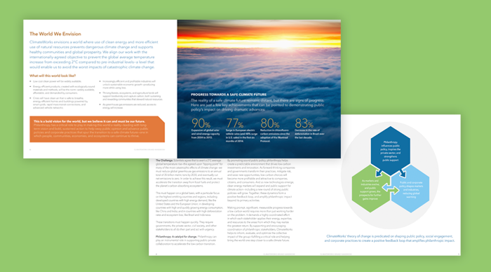
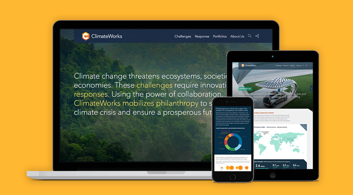
For their website, ClimateWorks needed to make sure that the complexity of the interconnected systems that influence climate change was clearly communicated—and that their response was articulated at a top-level to quickly capture the imagination, and with enough substance to speak to a sophisticated audience of experts in the climate philanthropy sector. To help them get there, we developed a narrative “challenge & response” framework that combines narrative and data to paint a picture—then relied on powerful imagery to bring audiences closer to climate action and impact.
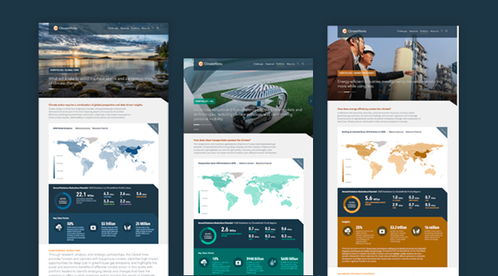
Bringing the New Portfolio Strategy to Life
We had clarified the goals of ClimateWorks’ seven impact investing portfolios and how they tackled climate change from multiple angles. To translate these complex concepts online, we created focused portfolio pages that lead with bold imagery to draw audiences into ClimateWorks’ vision; quickly outlining their portfolio strategy and providing interactive data visualizations and insights that make the case for climate action. The result is an engaging experience that deepens the knowledge and commitment of those already involved in climate action, while expanding the field to draw in new players.
Our Client’s Take
“When ClimateWorks engaged Constructive, we were finalizing a complex strategic transition to a new operating model. With an approach rooted in design thinking, their team brought a sophisticated understanding of the role branding plays in support of organizational strategy—as well as a deep interest in, and commitment to, our mission. They are well organized and results-driven, bring tremendous project management skills, and remain a flexible partner as our priorities shift.”Jean-Louis Robadey, Former Director of External Relations.
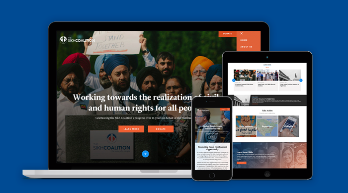
The Sikh Coalition is a national movement-building organization that stands up for Sikh Americans, and as a result, the civil and human rights of all people. Needing to strengthen their brand and website, the Coalition asked Constructive to develop a design strategy to better inspire their community, strengthen support for their advocacy platform and legal support work, increase donations and strategic partnerships, and generate concrete action. Together, we created new branding as bold as the Coalition’s mission and an online presence that connects with the Sikh community—strengthening the civil rights organization’s national leadership to realize a world where Sikhs are free to practice and enjoy their faith.
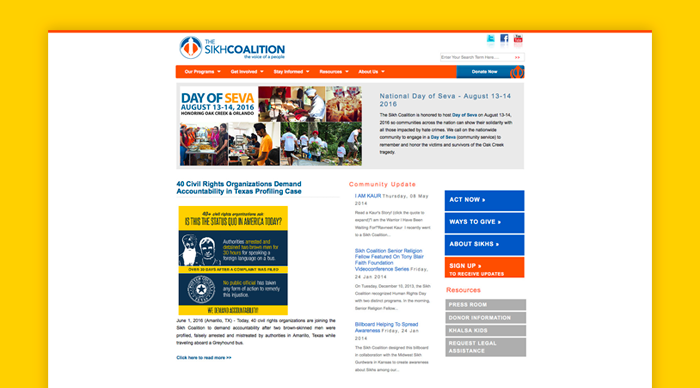
A Brand & Website That Failed to Resonate
When The Sikh Coalition engaged Constructive, they were stuck with an uninspiring website that was difficult to navigate, that failed to engage their community, and was not achieving online fundraising goals. Making the problem worse, the Coalition’s branding lacked energy and didn’t resonate with and excite their activist base, making the brand feeling flat. On the backend, the Coalition suffered with a complicated, glitchy CMS that made managing their content a chore and sub-par security left them prone to malicious hacks. Taken together, the result was a generic, text-heavy website that was difficult to manage and lacked the visual punch to emotionally connect audiences to the mission, activate audiences, and convey the Coalition’s commitment to its community.
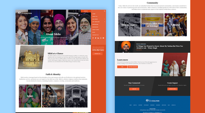
Connecting Audiences to the Coalition’s Advocacy Mission
Similar to other civil rights nonprofits like the NAACP and the Anti- Defamation League, The Sikh Coalition is engaged in a wide range of work—from legal services, education, and advocacy to media outreach, organizing, and community empowerment. To meet the needs of diverse audiences, we developed integrated content strategy and information architecture that strengthens the Coalition’s brand and advances their mission by placing their organization’s efforts into greater social and cultural context. The result is a user experience that deepens understanding of Sikh culture and the key issues, that connects audiences to The Sikh Coalition’s programs, campaigns, and impact, that provides information and resources to help their community, and directs users towards action within a comprehensive advocacy platform.
A Bold Brand That Reflects its Community
Brands belong to the audience—they’re not what you say you are, they’re what they say you are. So, a movement-building organization, The Sikh Coalition’s branding needed to resonate with their community. We dramatically changed the Coalition’s look and feel, creating a new system of typography, colors, image treatments, and illustrations that embody the Sikh community’s strength and pride. Site design leads with bold imagery that demonstrates the civil rights nonprofit’s commitment to action and engagement. And subtle textures and design treatments complement a strong design, adding nuance, softness and an emotional connection.
Empowering Coalition Staff
While designing a great experience for website visitors was a top priority, The Sikh Coalition’s team was very clear that they desperately needed a CMS that didn’t make their lives a nightmare when managing their website. We customized a WordPress backend with user-friendly workflows and automation that make it easy and intuitive to create content-rich pages, automatically connect related content by issue area and program, and maintain a strong, cohesive design system.
Our Client’s Take
“We needed a partner who knew how to communicate social impact, elicit support, and generate action. We also needed flexibility—but with guardrails to preserve the integrity of our brand and website—so that we wouldn’t have to ask our agency to make every little change. And we wanted a stable, friendly CMS to make it easy for more people on our team to update content. Everyone at Constructive was deeply invested in the work we do and in our success. The results have made a major difference and, most importantly, have blown away our audiences!”Satjeet Kaur, Executive Director.
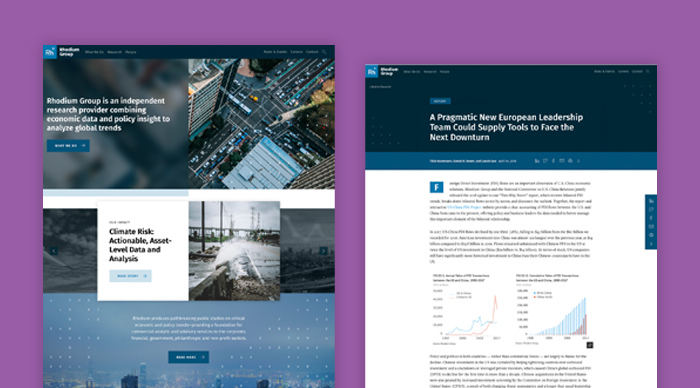
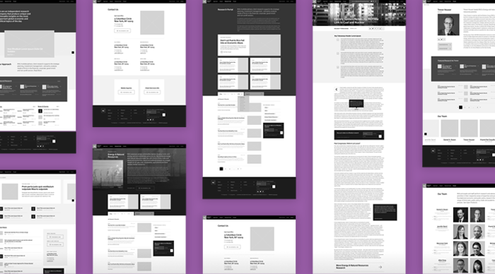
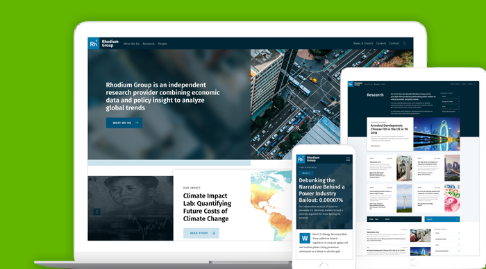
Rhodium Group is a leading, independent research firm that combines economic research and policy expertise to provide governments, businesses, and the NGO sector with valuable insights into global trends. Looking to rethink their communications and digital strategy, Rhodium’s leadership asked Constructive to refresh their brand identity and create a new website and publishing system so that they would reflect the firm’s expertise, make their sought-after research more accessible, and deliver actionable insights to an audience of experts and leaders across the private and public sectors.
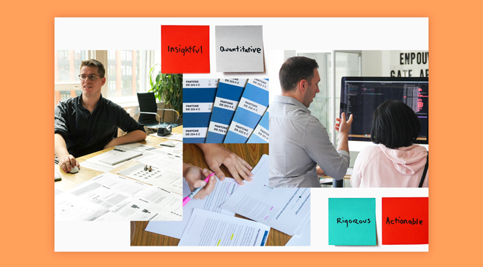
We started with stakeholder research, engaging Rhodium’s research and policy experts to understand the different ways the firm’s work impacts governments, businesses, and nonprofit associations around the world. A recurring theme was Rhodium’s combination of rigorous economic research, unique methodology, and big-picture economic insights. Our resulting strategy focused on developing a new brand and website that strengthens Rhodium’s positioning as a leading independent agency that delivers high-value quantitative insights and actionable analysis for influential audiences.
A Bold Brand Built on Insights
Alongside digital strategy, our design team got to work redesigning Rhodium Group’s visual identity. A logo refresh and new design system of typefaces and colors are ideally suited to communicating long-form research and data-driven communications. Condensed sans-serif type with a diversity of weights are highly effective for bold headlines and smaller spaces in data visualizations. An elegant serif typeface increases legibility for Rhodium’s long-form content. And a robust palette of vibrant colors and tints supports the complex data visualizations Rhodium produces to help leaders in the public and private sectors make more informed economic and policy decisions.
Delivering a Brand Narrative & Economic Research
Rhodium Group’s website is, first and foremost, a platform for distributing its economic and policy research to influential leaders across the private and public sectors. It also speaks for the brand, helping to raise awareness of the agency to increase their reach and influence. To create the blueprint for advancing these and other priorities, we partnered with Rhodium’s leadership in a collaborative prototyping process to design a content-rich website that tells Rhodium’s story and gives audiences multiple ways to access and explore their research. The result helps audiences easily find content by topic, regions, and practice area, adding filtering tools that make it easy for audiences to find the research they’re most interested in.
A Website That Embodies Objective Expertise
To build a shared vision through our design process, we produced concept boards that gave Rhodium’s team different design concepts to evaluate. Visually, Rhodium’s new website embodies expertise and objectivity with a restrained color palette that’s focused, not flashy; using transparent color overlays that express Rhodium’s ability to objectively see through complex data and trends. Animated numbers and currency symbols demonstrate speak to the rapid pace of change in the global economy. And images of environments ground Rhodium’s global economic research in the real world.
Designed to Deliver Economic Insights
Rhodium Group’s website is visually understated to reflect the objective expertise that its brand is built on. However, we made this choice for another important reason—to place the focus on the firm’s economic research. By placing Rhodium’s reports, notes, testimonies, and data visualizations in a more restrained context, attention is placed where it should be—on delivering valuable online experiences that help audiences access, understand, and make use of Rhodium’s research.
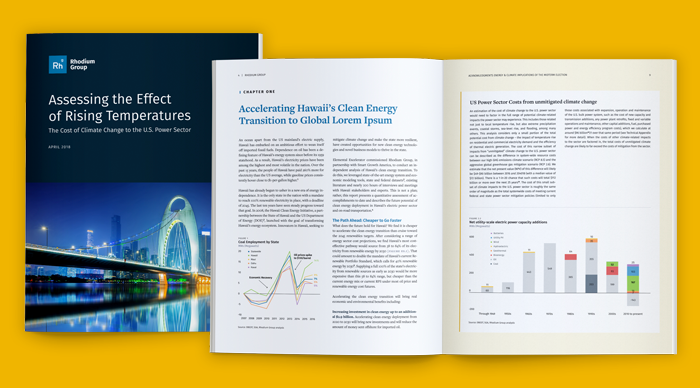
A System for Producing Premium Publications
Rhodium’s work and the value in their brand is heavily driven by the agency’s highly sought-after research publications. To empower their research experts to quickly produce polished reports, briefs, and presentations we created a publication design system with flexible editorial grids, editorial styles, and data visualization templates. The results provide polish and precision for Rhodium’s work, making it easy for the agency’s experts to deliver high-value research in person and industry events.
The Yale Program on Climate Change Communication (YPCCC) is the preeminent climate change nonprofit exploring the science behind climate change awareness, attitudes, policy, and behavior. To build the public and political will for climate action, YPCCC conducts pioneering research from surveys, experiments, and interviews to statistical models and participatory GIS mapping. Looking to strengthen their brand, rethink their strategy for publishing research reports, and create a climate change website design that would increase their reach and influence, YPCCC asked Constructive to connect the dots between their mission and how their brand delivered on it.
A Climate Change Website Design Failing to Communicate
The YPCCC’s existing website was designed much more like a blog than the online home of the leading nonprofit dedicated to delivering climate change communications research and data. The climate research institute’s website design was confusing and lacked the structure and level of depth or detail needed to empower people to explore YPCCC’s diverse activities and issues. Focused more on posts than on the mission, the website failed to tell the nonprofit’s brand narrative or increase people’s understanding of the critical context into YPCCC’s mission to raise awareness of how the public understands and acts on climate change.
For a content-heavy nonprofit website, YPCCC has a major flaw that made it too difficult for people to engage with content—ineffective website search and navigation that stopped visitors from quickly finding what they were looking for. And of the biggest concern to Yale’s team was that YPCCC’s volumes of pioneering climate change communications research were trapped in large PDF reports that were difficult to access, limited search engine optimization, and were not mobile-friendly.
Taken together, the nonprofit research institute’s website design failed to present the YPCCC as the leader in climate change communications that it was.
Climate Change Branding that Speaks to Strategy
One of the most common misconceptions about The Yale Program on Climate Change is that they are a research nonprofit that is focused on climate change science. While their work is dedicated to addressing climate change and creating a more sustainable planet, they are focused exclusively on the science of communications related to climate change, which is essential to how we understand and address it.
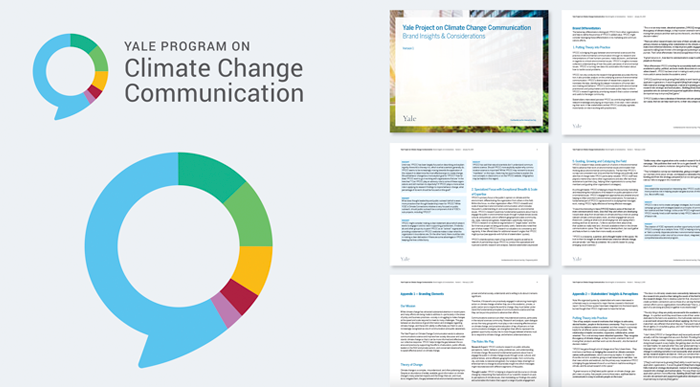
To make this distinction clear and build the brand around what makes it so different and interesting, we started with a participatory brand strategy process. Working with YPCCC’s leadership, we explored the nonprofit research institute’s mission, brand values, vision for the future, audience relationships, and the differentiated ways the brand delivered value. We then developed a Brand Assessment that synthesized insights and provided recommendations for the strategic direction of the nonprofit’s brand; then created a brand positioning and messaging platform that tells the YPCCC’s story with clarity and impact. Then, to make strategy tangible, we explored logo design concepts that communicate the YPCCC’s unique intersection of communications science, climate change, and data.
The resulting brand strategy and visual identity effectively captures the spirit and value of YPCCC’s commitment to scientific rigor in the climate awareness and communications field—eliminating brand mis-perceptions and clearly positioning the research institute in its space.
Effective UX Design for a Content-Heavy Research Nonprofit Website
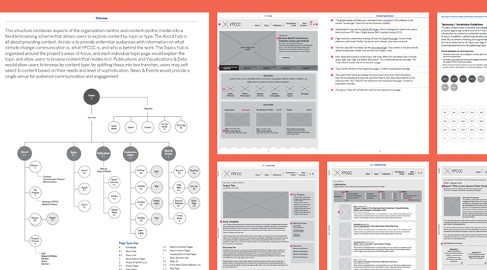
YPCCC’s existing website was filled with thousands of pieces of content that were organized by topics, programs, types, and more. Unfortunately, the website’s information architecture failed to connect them in ways that would drive content engagement. To surface insights from YPCCC’s data-heavy, long-form research content—and encourage audiences to spend time reading it—we needed to focus on designing simple, clear navigation for the user experience.
To do so, we started at the content level, restructuring the nonprofit website’s content taxonomy to better communicate YPCCC’s mission focus, providing a framework of issues and topics that structure the database architecture and site navigation, making it easier for audiences to access and explore content. We then designed information architecture that both provided the diversity of page layouts needed to support the wide range of content and functionality that research institute nonprofit websites need. To deepen content engagement and encourage longer website visits, we then designed dynamic content relationships throughout the site experience—automatically surface related research, resources, and experts throughout the experience.
Designing the Website that a Climate Change Communications Deserves
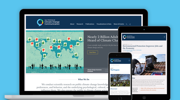
With the nonprofit brand strategy, branding, and UX design in place, we were now ready for the exciting work of transforming everything into a standout website that would strengthen YPCCC’s position as the leader in its field. When designing websites for nonprofit research institutes, it’s essential to emphasize credibility and expertise because leadership to advance the mission depends on always maintaining an objective focus on the work.
The new nonprofit website design works within Yale’s broader brand ecosystem while standing out. Color, typography, and imagery are focused on engaging with YPCCC’s influential research and insights as the central focus— with clear navigation and clean layouts that make content easily accessible. Strong typographic hierarchies and editorial design techniques emphasize legibility for longer reads, and robust related content relationships elevate insights and encourage longer visits.
On the back-end, Yale needed a good CMS for content-heavy website. We customized WordPress making publishing easy for their small team. A combination of component-driven design, flexible content fields, and master page templates give site admins great flexibility in designing pages based on their content, while maintaining brand consistency and integrity.
A Publishing Strategy to Drive Publishing Digital Research Reports
Because the YPCCC is a nonprofit research institute, similar in ways to a nonprofit think tank, publishing extensive, long-form research reports is essential to their work. When it comes to digital publishing strategies, there are two main approaches that nonprofits can take—a PDF-first approach to publishing research reports or publishing digital-native research reports. In YPCCC’s case, it was important to them that they do both, so we set out to design a new system and workflow that gave them the ability to publish digital-native reports and also deliver PDFs for every digital report they published. They also needed to streamline their cumbersome PDF-only report publishing process to make it easier for them to get their work out.
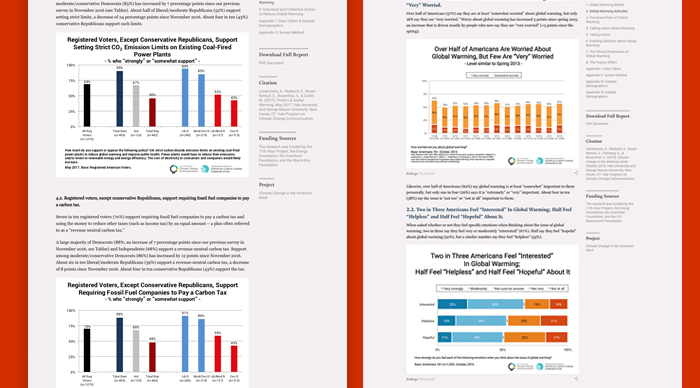
YPCC’s new publishing system deliver insights on important issues like International Public Opinion on Climate Change, leading with HTML-first reports that have executive summaries, interactive footnotes, embedded data visualizations, and more to make it easy for people to engage with the research.
The resulting hybrid online publishing system adds flexibility and efficiency by supporting both HTML and PDF publishing workflows. Report summary pages deliver at-a-glance takeaways while full HTML reports make Yale’s long-form content more accessible and shareable for audiences online. And for those who still prefer, PDF reports remain available to support offline reading and printing.
The Results
“We needed a website that was more effective in engaging multiple audiences and which would integrate a wealth of legacy content with our ongoing publishing. Constructive’s team achieved all our goals and has worked for years to support our growth since. Flexible, responsive, creative, forward-thinking: all traits you hope for in a partner, and Constructive has them all.”
Anthony Lesierowitz, Senior Research Scientist at Yale School of the Environment