


For designers, presenting lots of content clearly on a webpage can be challenging. In many situations, it’s simply impossible, since no one wants to scroll forever. People want a way to quickly find the information they are looking for, without too much stress. However, often without realizing it, digital users form very strong expectations of how website tools will and won’t act. These expectations, along with their own needs and preferences, are called mental models. Designers can tap into these mental models to create usable, functional search interfaces that feel “natural” to their users.
A Few Design Scenarios
As designers and content specialists, our job is to make sure the resources and content we offer work seamlessly with our users’ expectations. Here are a few different situations that can benefit from a well-considered approach to faceted navigation and filtering:
You have lots of packaged data to present: this can be in the form of executive summaries, interactive datasets, or longer pages of published research.
You have lots of constantly updated features: content feeds are a powerful reason to have faceted navigation, as readers have different topic, date, and browsing preferences.
You want to provide a path to action: for many nonprofits, options like downloading reports or booking training sessions are examples of content that requires action.
Though they are all scenarios requiring faceted navigation, each of these calls on a slightly different mental model. Let’s look at how to break the scenarios down and design a faceted navigation that works for each one.
Define Appropriate Mental Models
There are 3 key design patterns we can design around: searching, filtering or sorting. Each matches a specific mental model that web users have created around the process of finding things, so we need to be careful to design interfaces with animations and functions that fit those models.
Let’s look at them in a bit more detail.
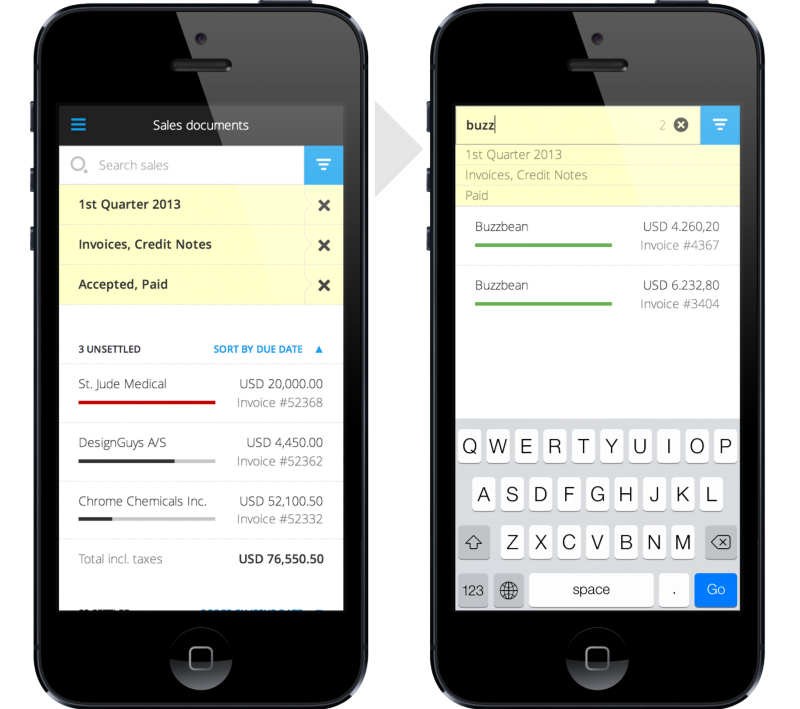
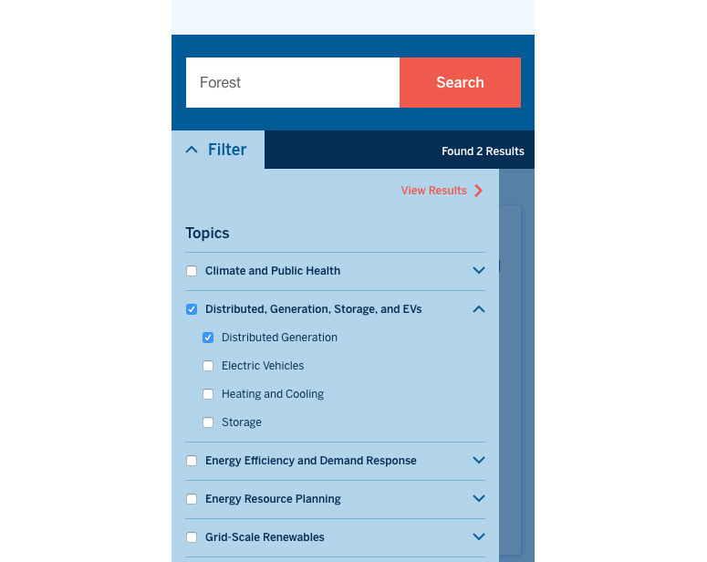
Searching is when users want to find the options that match their own defined keywords. Imagine a user saying to the website “OK, out of everything you have, show me only the widgets named Forest.”
Filtering is when users make choices that reduce the number of items available to them. Imagine a user saying to the website – “OK- out of everything you have, show me only the green widgets.
Sorting is when users choose the order of the items available on the website. Here, imagine a user saying to the website – “Ok, out of everything you have, show me all the widgets from newest to oldest.”

With these concepts in mind, we can start to extend the 3 mental models to encompass all the actions our users will take while looking for content on our site.
Design the Navigation around the Mental Model
We want the interface to feel natural and responsive to our users. A great way of doing that is to design it around a spoken statement or command from the user. Here’s an example, containing all the statements we need – “OK. I want to download a climate and environment report for my next office meeting. Show me only the reports with the word Forest in them. Now, put the newest published ones on top.” That is a clearly stated mental model that describes, verbally, what your audience expects from an search/filter interface. As with any web interaction, remember to be “be forgiving to mistakes” and allow for things like plurals, alternate spellings, and the general messiness of natural language.
Matching an interface to mental models also has a physical dimension. It should always be put where the audience expects to see it. It is rare for faceted navigation to go in the bottom-right of a page, just as it is uncommon for a search bar to go in the bottom left of a page. After decades of these patterns being used online, a clear design consensus has emerged. To think even more broadly, a mental model of the internet itself is steadily emerging, an idea I think is fascinating. Designers should absolutely use that to our advantage. If this is how our audience views the web, we can design with that in mind.
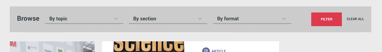
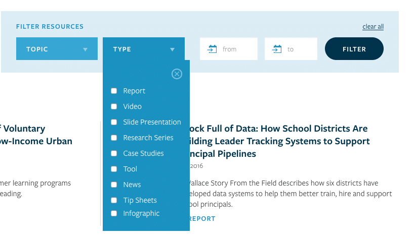
If we go with a horizontal faceted navigation, it’s a bit easier to make it feel like a natural sentence or mental model. Also called filter bars, they often resemble a pattern users are familiar with from desktop programs like MS Office and mobile apps like Instagram.
Conclusion
The need for clear and logical options for sorting, searching, and filtering content is a common issue for knowledge-driven organizations. They produce a lot of material with the intention of it being found and consumed, but often audiences struggle to find what they are looking for on content-heavy websites. This is where designers can make a real difference and logical mental models come in handy. After defining them, we can design user interfaces that support, rather than hinder, them. Of course, I recommend starting every project like this with usability testing and research, but I hope this is a solid start.
