


Interested in reading the latest round-up? Check out our 2026 nonprofit annual report inspiration!
When I think about the potential of a nonprofit annual report, I imagine trying to fill a bucket with raindrops: the trickling in of droplets, sporadic splashing, the slow rise of water. Now imagine, instead, taking that bucket to a river, lowering it in, filling it up almost instantly as flowing water rushes in. This image, for me, serves as a reminder that when something is continuous—when it flows uninterrupted—we can experience its full power.
Every day, nonprofits share emails, social media posts, videos, and letters to connect with their audiences. While these communications are strategic, thoughtful, and important for strengthening relationships with your base, there’s an inherent problem with them: they get interrupted. They exist in what I call a “context jungle.”
When I read a post, a newsletter, or a piece of mail, I’m reading it, and in a matter of seconds, I’m switching contexts to another piece of content, from a different organization or author, on a different topic. It’s not that these communications are ineffective; they just tell a fragmented story.
Your annual report is different, though.
There’s so much more to your brand and your impact than these fragmented stories can tell, and your nonprofit’s annual report marks a once-a-year opportunity to tell the uninterrupted story of your brand, your impact, and your people. It invites key audiences to engage more deeply with your work and to understand their role as stakeholders in advancing the social change you bring about.
Your annual report also marks an excellent opportunity to strengthen trust in your nonprofit, bolster your base’s affinity, and demonstrate to your audience the role they played in advancing social change with your organization. And a digital annual report (while not essential) enhances those opportunities by making your brand story more accessible—and for your team, it makes engagement more measurable.
No matter the medium, as a Director of Brand Experience with two decades of work in nonprofit design, branding, and storytelling, I’m taking a look at six digital annual reports that meet the moment and use their annual report to tell the full story of their organization over the past year. While we’ll only take a look at digital reports, every nonprofit annual report can follow the storytelling and design principles that work in these reports to deepen engagement with their brand. Let’s dive in.
6 Great Examples to Inspire Your Nonprofit Annual Report
- Google: 2022 Diversity Annual Report
- Malala Fund: 2021-2022 Annual Report
- Global CCS Institute: 2022 Global State of CCS Report
- DigDeep: 2022 Annual Report
- Arup: 2022 Annual Report
- The American Clean Power Association’s 2022 Report
Google’s Diversity Annual Report: A Focused, Content-Rich Brand Experience That Connects Values to Action
Everyone knows Google, and most people have a fairly good sense of their brand. But what I wasn’t familiar with—and others may not be as well—is Google’s Belonging initiative. It’s no secret that being intentional about how diversity, equity, and inclusion show up through a brand has been a big point of emphasis for organizations in recent years. No surprise, then, that Google has directed its ample resources into a significant effort to turn its DEI commitments into tangible action.
While I’ll admit to always having my “Virtue Signaling Radar” active when it comes to social justice marketing content from corporate behemoths, Google’s commitment to DEI action shines through in their 2022 Diversity Annual Report. I’ll let people qualified in evaluating DEI programs evaluate the quality and impact of Google’s DEI efforts. My goal is to evaluate effective annual reports and impact reports to help nonprofits leverage them more effectively in their communications. And as an interested, non-expert in DEI issues, what I can say for sure is that Google does an excellent job communicating and connecting me to this important facet of their brand.
So, what’s working well?
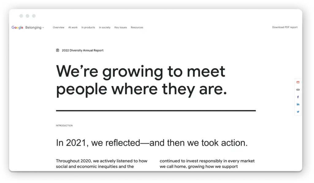
Google’s report starts with a quick statement on the values that have framed their DEI efforts. And to be authentic, a brand’s internal identity and actions must be aligned with how it is understood and expressed externally. Given Google’s reach, influence, and impact being greater than perhaps any other brand, what I appreciate about Google’s Diversity Annual Report is that it creates a strong, connective thread between their values, their actions within the company, and their ubiquitous products and services (for example, I’m collaboratively writing this article with my team in Google Docs).
Visually and interactively, Google’s Diversity Annual Report is minimalist, focused on the content, and extremely fast-loading. Very on-brand. It quickly delivers crisp, engaging, action-oriented copy, so I’m drawn to actually read what they have to say rather than have my eye wander all over the place. Not only is this content design good for engagement, from a brand perspective and for inspiration for nonprofit annual reports, but it also reinforces the idea of focused DEI action without excessive spin. Exactly the kind of thing that sets off my Virtue Signaling Radar.
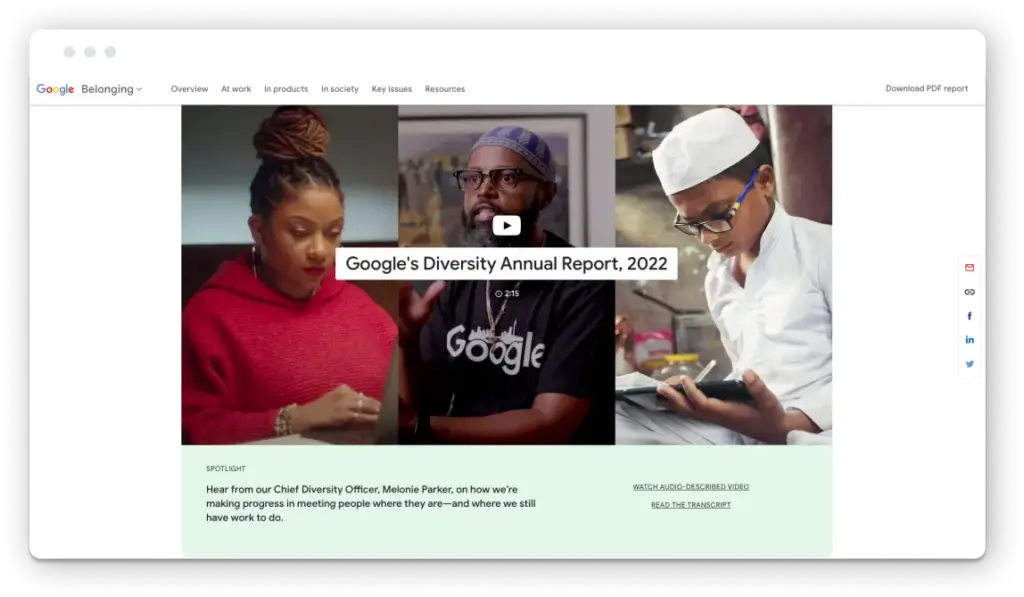
A big theme of Google’s Belonging initiative is a promise to “meet people where they are,” which also resonates with many people’s experiences with their products and services. And Google’s 2022 Diversity annual report subtly follows through on this idea by leveraging what makes digital storytelling so compelling: a choose-your-own-adventure experience.
Instead of being forced into a linear narrative, Google provides five action areas that they’ve worked through to advance DEI—Hiring, Retention & Progression, Representation, Flexibility, and Belonging & Innovation. A quick, one-sentence overview on each allows me to explore whichever piques my interest. And within each area, I can similarly choose the brand experience I want by reading written content, watching videos, exploring the data behind the results—or doing all three.
As mentioned, Google’s report delivers a very on-brand mix of the rich diversity of content they put at the world’s fingertips—high-quality written, photographic, video, and data content. The visual content, in particular, feels authentic and advances visual asset framing. The content is also heavily cross-referenced to offer further avenues for exploration outside of Google’s annual report narrative—again, very on-brand for the leader in online search, while adding depth, rigor, and credibility to their brand’s DEI narrative.
And lastly, because they’re Google, the data gets more than a passing mention. Along with interactive charts that highlight quantitative measures of progress, Google’s DEI data is an active part of the story that they’ve made publicly available for researchers, community organizations, and industry groups to access and analyze in BigQuery, their open-source data warehouse. And, in doing so, once again connect their brand actions on the inside and the narrative they’re communicating about it to their products and customer experiences.
Again, while I’m not an expert in assessing DEI initiatives, there’s no doubt that Google’s 2022 Diversity Annual Report is a compelling example of great interactive design and brand storytelling—one that convinces me of Google’s honest efforts to live up to their DEI commitments with meaningful, tangible results.
Malala Fund: A Storybook Structure with Ethical Narrative Framing
Surviving an assassination attempt in 2012 at the age of 15 for speaking out on the Taliban’s ban on the education of girls, Malala Yousafzi overcame oppression to become the youngest Nobel Peace Prize winner in history as a leader for girls’ rights. And the Malala Fund she founded has since become a global force in working for a world where every girl can learn and lead.
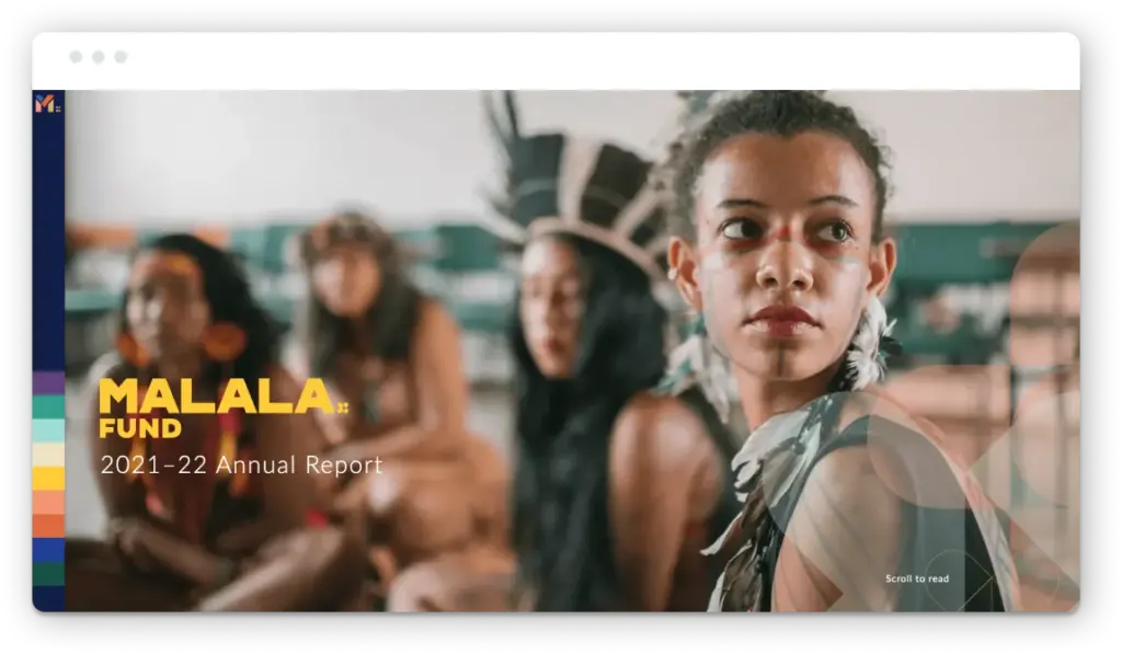
The Fund’s digital 2021-2022 Annual Report is a focused, linear brand narrative that starts with words from Malala that immediately set a tone of solidarity—recapping recent fights for equality by women around the world and then walking us through dark, daunting challenges while still sharing an uplifting story of overwhelming empowerment and action in the face of adversity.
This tension between challenges and solutions is threaded throughout the nonprofit annual report, and it proves that a simple design twist can make content feel fresh and engaging. As mentioned, the report is linear—not unlike many vertical-scrolling annual report websites. What sets Malala Fund’s approach to this familiar approach is that on a desktop, the horizontal scrolling experience uses screen real estate more effectively while also creating a storybook feel that carries you through as Malala Fund shares its global activities and impact.
I also really appreciate how the nonprofit annual report’s design strategy to deliver content reinforces the cultural diversity that Malala’s brand represents and which the Fund’s visual identity is built on. The annual report is organized into nine sections, each with its own distinct color and iconography, which, taken together, create a compelling visual pattern that feels connected to the cultures that the Fund elevates.
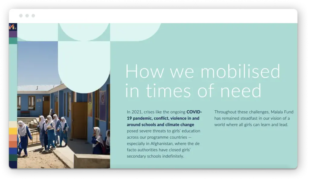
The design is also open, spacious, and has oversized type that creates an effortless reading experience (which I appreciate given that it’s a linear, narrative story with nine sections). As I move through sections, I’m compelled forward, with each section’s unique design scheme creating anticipation, and a diverse range of written, visual, and quantitative content being continuously served up without feeling overwhelming. When the goal is to have us engage with the brand’s full story, from opening letter to closing words from Malala Fund’s CEO, they’ve done a fantastic job keeping me along for the ride.
And, as is the case with most of the world’s most effective social impact brands who work on issues with direct human impact, Malala Fund’s digital annual report leads with beautiful, authentic imagery and advances ethical verbal and visual storytelling principles. We’re treated to high-quality photography of girls and women working together to build a better future for themselves and each other. Framed with their assets, Malala Fund’s brand presents girls and women connected to their mission with an emphasis on strength and resiliency—and the smiles and open books all feel real.
This all makes for a nonprofit annual report that lives up to Malala Fund’s values and that is both visually consistent and innovative with the brand’s visual identity to tell a compelling story on what the Fund does to empower these already-powerful girls on their road to get the education and opportunities they have every right to.
Global CCS Institute: A Content-Rich Research Report That Respects the Reader to Carry Us Forward
I’m writing this article as COP28 has just wrapped up—surprisingly with the necessary commitment by world governments to completely transition away from fossil fuels. Climate change is probably the issue I’m most passionate about (and along with environmental sustainability, it’s the one that Constructive has worked on the most extensively). And while I’m hopeful the world will live up to this commitment, not only is it a seriously difficult global challenge to meet—along the way, we’re going to need to throw every bit of innovation at reducing the amount of carbon that makes its way into our atmosphere as the world gradually phases out the use of fossil fuels.
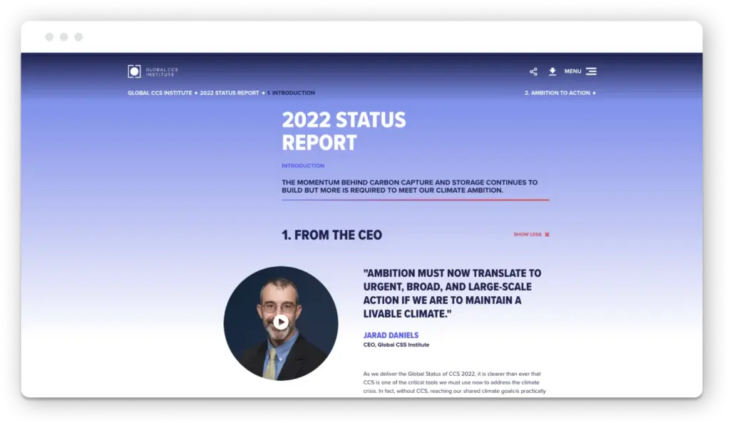
This is where innovations like carbon capture and storage technology come in. The Global CCS Institute is a leader in building momentum to accelerate the effectiveness and adoption of carbon capture and storage. And for 2022, CCS created its first-ever digital version of its widely read “Global Status of CCS Report.” As someone who’s worked with a lot of climate action brands, particularly in the research and policy arenas, where content can get a bit…dry—I have to say that CCS Institute’s 2022 report lives up to their reputation for innovation and their forward-looking brand.
The Institute’s report takes a completely different visual approach than its branding typically presents. While I’m a big believer in brand consistency, I do also believe that things like signature publications are an opportunity to change things up. There’s a rich history of annual reports having their own visual aesthetic, usually connected to a brand theme for the year. And CCS Institute’s “Ambition to Action” theme leans forward. It’s contemporary and feels fresh—and at the same time, is rational and respects its rigorous content, which is critical for any think tank or research institute that wants to embody an evidence–based brand.
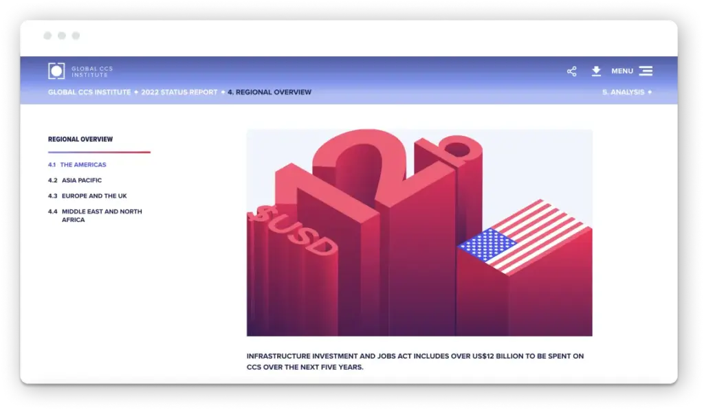
When it comes to the content, Global CCS Institute’s report stands out among the others we’ve reviewed this year because it’s not an annual report. It’s a “state of the sector” report. As a result, it is seriously content-rich. I love a great editorial experience, and while I might like a bit more typographic polish, The Global CCS Institute’s 2022 Status Report delivers the research publication design experience I expect—and it does so with a sophistication that reinforces that they’re at the front of their field. Each of the report’s 6 sections contains a wealth of qualitative and quantitative information, including interactive data visualizations that let me take a closer look at the research. Exactly what we’d expect from a leading think tank that’s helping to steer a sector towards better solutions.
And one other simple design solution that’s effective and appropriate for this content-rich research report: The 2022 Global Status of CCS Report makes it easy to quickly scan the sub-sections within each section. Highlights of sub-sections deliver a quick, top-level takeaway of what’s contained within each, and a simple “read more” expanding accordion feature allows readers to dive in more deeply if they’re interested. Given how much content is contained within sub-sections, this click-to-expand option makes content scannable, elevates the highlights, and allows audiences to choose which details they want to immerse themselves in.
Taken together, the 2022 Global Status of CCS Report projects an ambitious forward-facing Global CCS Institute brand, provides a comprehensive accounting of the carbon capture and storage sector, and respects the reader by turning a dense, technical report into a highly readable and visually delightful experience that makes sure even the shortest visit is meaningful.
DigDeep: Brand Storytelling that Connects on a Deeper Level
In America, we can sometimes take for granted that our homes provide easy access to clean water—but that’s not the case for everyone. DigDeep is meeting this challenge by working with communities and its partners to work toward ensuring that every person in the United States has working taps and toilets.
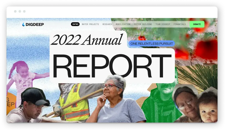
I learned about DigDeep when I profiled their 2020 Annual Report, and in their latest annual report for 2022, they’ve again shared a story that connects us to their progress. This year, DigDeep’s theme is “One Relentless Pursuit”—and it’s a great encapsulation of how DigDeep’s Annual Report moves us from their “simple” mission to the array of interconnected strategies, projects, initiatives, stories, and results (there are loads of statistics) that are moving them, their partners, and the communities they work with forward.
Let’s start with the vertical scrolling annual report website experience that we’re all familiar with. Is there a brand for which this format is more appropriate? The very act of engaging with DigDeep’s content online reinforces the hard work that they and their partners do. Talk about aligning a design decision with a brand’s purpose!
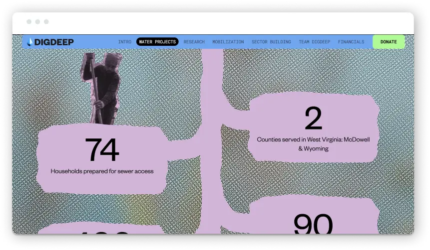
DigDeep’s content strategy helps us understand how they’re executing their strategy by organizing the experience into the four focus areas that their impact model is designed with (which they introduce quickly right after their mission statement): “Water Projects,” “Research,” “Mobilization,” and “Sector Building.” What I love about this is that instantly, we understand exactly how DigDeep goes about its business.
The next thing you’ll notice is how immersive and authentic the experience is. The design is smart, innovative, and it takes chances, deviating from their core brand aesthetic to create a scrapbook experience that makes me feel like I’m on a journey with them. While some deep scrolling experiences can cause fatigue, in DigDeep’s case, I’m hungry to see what happens next in every section.
Lastly, DigDeep has also clearly committed to capturing their work photographically, because their imagery is high-quality, beautiful, and, in keeping with their scrapbook theme, not too polished. The people and places not only feel real, they’re like snapshots from a great road trip that brings DigDeep’s passion, commitment, and impact to life.
The result is a narrative journey and a designed experience with DigDeep’s brand that’s relatable, engaging, immersive, and compelling. In my book, it’s so much of what every great brand experience—and every great annual report should be.
Arup: Fostering Exploration with a Boundary-pushing Annual Report
Arup is a firm of engineers, consultants, designers, and architects working together to create a truly sustainable built environment. And boy, does their latest annual report demonstrate their commitment to innovative design. Their 2022 recap is anything but your everyday annual report. To me, it pushes the thinking and potential of digital annual reports—but even more critically, it cements Arup’s thoughtfulness about design, engagement, and innovation to instill trust in their mission.
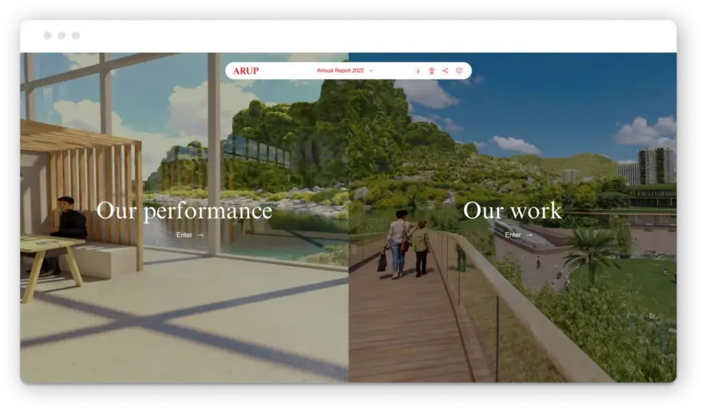
The opening, while great, is truly just the surface. Arup keeps it simple with two main sections for exploration: “Our performance” and “Our work.” The report orients you into what’s clearly a virtual-first engagement tool, but the real magic begins when—with one click—you’re immersed in a fully designed, panoramic space, almost like you’re on a virtual tour.
Arup’s sections quickly start to feel less like an annual report and more like a video game landscape, open to self-guided exploration. I started with their performance section, and I was delighted to find the immersive, detailed landscape balanced with clean graphics and crisp data visualizations. With just a few clicks around the beautiful room, I’m briefed on their headline financial figures, their commitment to gender balance, and their carbon footprint.
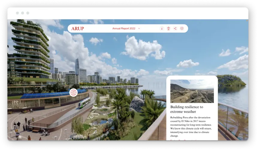
The whole annual report balances work and play. You get to explore, feel like you’re moving through a game, all while taking in the most important stories and statistics behind Arup’s year in review. I love the “Our work” section because it’s equally—perhaps even more stunning—and offers more layers for exploration. The content structure presents six themes to explore, and when you “enter” one of the themes, you travel to yet another unique space in a digital landscape sprinkled with further opportunities for engagement, with stories, quotes, maps, and more. The structure of this report gives us a master class in enhancing engagement—can you imagine years ago, from flipping black and white pages and jumping to this?
Of course, the richness of this experience comes at a cost. Any user might notice that the website is slow to load at times, and that likely means it’s not the most energy-efficient website. That said, if the immersive experience compels people to advance sustainable design, then that action likely far offsets (no pun intended) the energy consumption of the site. Overall, this report tells a full, compelling, engaging story. It’s easy to navigate, immersive, and highly interactive, with multiple click and hover states that let you access key information and travel deeper into any area that might interest you. I love this report for its boundary-pushing design and user interface—one that lives up to the brand’s commitment to innovative design.
The American Clean Power Association’s Report: Clean Energy Meets Crisp Design, Data Visualization & Aesthetics
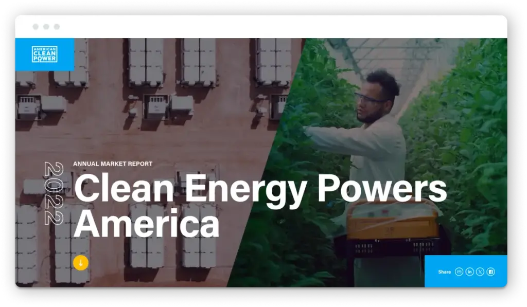
We need all hands on deck to curb the worst consequences of climate change. And clean energy can play a huge part in that effort. But transitioning the United States off of fossil fuels and onto clean energy will require more than any one nonprofit or firm. In fighting climate change, we’re all in this together—there’s no mobilization without coordination. That’s where the American Clean Power Association (ACP) comes in. The association uses a membership model to represent solar, wind, and other green energy organizations in service of advancing clean, reliable, domestic energy. And while their report looks a little buttoned-up or stiff at first glance, its crisp design makes it stand out.
For starters, one thing I love about this report is its ability to place you right into their world of hard data without overwhelming you. They have a tight color palette that they stick to, which makes it easier on the eye when you’re taking stats on megawatt energy capacity and operating battery storage. Their consistency in color and type is great for bolstering trust and credibility. But these visualizations don’t just convey trustworthiness, though—they also invite engagement, they’re interactive. When you’re exploring the report, their data visualizations—some animated—tastefully (free of in-your-face pop-ups) respond to hovers and clicks. What could be a snooze fest (a chart on state-to-state clean energy capacity) is animated, engaging, and easily comprehensible.
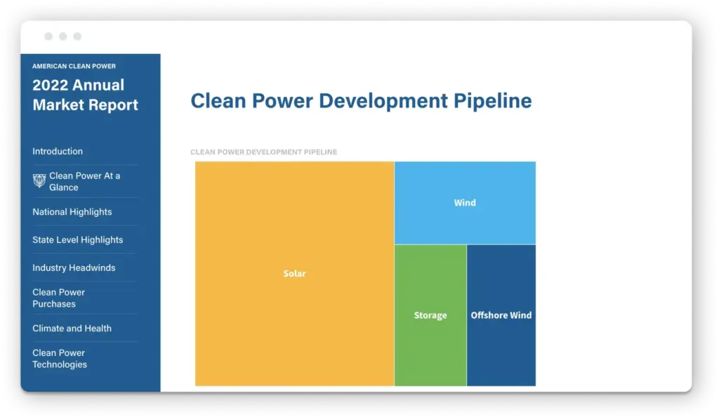
The next strength is this report’s content structure. With eight clearly delineated sections, the report invites visitors to see a bird’s eye view (“Clean Power At a Glance”) or get into the weeds with sections on clean power purchases as well as state and national highlights. But in a nonprofit annual report, you can’t rely on your content structure alone to build a good viewing experience. The navigation—guiding users clearly and quickly from section to section while also offering a sidebar table of contents—makes sure that the reader has the opportunity to explore any chapter in the report without necessarily forcing them to go through every section.
And I’d be wrong not to call out the report’s imagery. It’s no easy task to visually capture these systems—windmills, solar panels—in a way that feels more authentic and less like everyday stock photography. The image choices made by the team at ACP balance beauty and authenticity. They don’t feel like I’m looking at a brochure on clean energy 101. Instead, they evoke the expertise and professionalism of ACP’s brand.
Together, their top-notch data visualizations, animations, imagery, structure, and navigation tell a full story. They reflect an organization interested in not just sharing but actually engaging their audience with their digital annual report.
Honorable Mentions
Boston University
In 2023, Boston University’s annual report takes a minimalist, clean approach to its homepage. We’ve called out the university’s report in years past, and this year they’ve again delivered an approachable, accessible update. With a crisp graphic design for the page’s hero, the report’s main page utilizes a diverse range of strong images to showcase different issues and topics for exploration. With options to explore the university’s work on issues ranging from climate change to LGBTQIA+ student communities, the report’s structure invites readers to explore their interests. I appreciate that the report doesn’t necessarily ignore the rest, though: once you click on a topic from the homepage, you’re prompted to engage with other chapters in the report.
Toms
Three years ago, Toms moved away from its “one for one” retail model and embraced a different philanthropic approach: investing and partnering with organizations that address poverty and other injustices. In their 2022 review, the company elevates this new approach and progress with a strong balance of transparency and levity. A video to orient us to the tone of the report, strong responsive infographics, and playful illustrations and textures throughout make it both an informative and fun experience.
Girls Who Code
We’ve covered the Girls Who Code’s previous reports before, and for good reason. Girls Who Code has a strong brand and mission as is, and each year, their annual report makes both shine. There are coding elements, 8-bit components, video game motifs—but it doesn’t pigeonhole girls into any one aesthetic. To me, it communicates the organization’s interest in celebrating diversity of interest and empowering girls to pursue their own individual passions. It’s Girls Who Code, but the report’s design isn’t necessarily girl-coded.
Interested in Exploring More for Your Nonprofit’s Annual Report?
If you want to see other great reports and why we loved them, you can check out our 2022 and 2021 roundups.
And if you want to explore the potential of building a great report for your organization, reach out anytime.
