I was talking with a friend recently about the upcoming election and how much I had volunteered in the lead up to 2020. How, in 2019, I canvassed around town in the freezing cold. And then when life moved online, how I phone banked for candidates, fundraised, and remotely helped people navigate mail-in voter registration.
Even though I’m a little out of practice this election cycle, I’m interested in getting back into the swing of things with a slight tweak: I want to narrow the focus of my volunteering to voter registration. So, I took to Google and I looked up organizations that might have volunteer opportunities within that niche.
Where did my search take me? Nonprofit websites.
My experience isn’t unique. When someone’s curious about a cause, they likely take to their search browser and interact with a nonprofit’s website. But my perspective, as someone who works on nonprofit websites everyday, is unique.
I notice little things, like a nonprofit’s navigation bar, its call-to-actions, the mission statement section. Websites are more than a means to an end—they communicate your organization’s values and beliefs in content and in essence. So when those little things are done thoughtfully and designed with your unique audience in mind, you can take your website from good to great. You can turn your website and brand from a stranger to a trusted ally on an issue.
What are some of the ways we can make implement these trust instilling best practices for nonprofit websites? Well, the answer might lie in a strange place: in the for-profit sector.
What Nonprofits Can Learn from B-Corps’ Best Website Practices
Right now, the public trusts for-profit companies more than nonprofits. This, of course, isn’t great news for us in the social impact space. But I like to think that wherever there’s bad news, there’s great opportunity.
We have the opportunity to earn back trust in our space and strengthen trust in our brands. One of the best ways to do that is to fortify our websites with trust signals.
And it seems, given that people trust businesses more than nonprofits, that we could learn from some of the most trustworthy businesses out there: Certified B Corps.
B Corps have earned their designation for their commitment to social and environmental impact, their transparency, and their accountability to all relevant stakeholders. Non-B Corps could likely learn a thing or two about social impact from B Corps, and in the nonprofit space, we can learn from the trust signals they’ve instilled on their websites.
So, I’m partnering up with Constructive’s Digital Strategist Kaylee Gardner who’s spent years breaking down everything from on-page traffic signals to broader industry trends for nonprofits. Together, we’ve identified some of the best practices and trust signals used by B Corps to serve as inspiration for your nonprofit website.
Five best practices for nonprofit websites:
- Demonstrate your connection to an issue
- Consistently express your values, mission, and vision
- Clearly explain your approach
- Draw a connection between money and impact
- Strongly encourage action
Let’s look at some examples that follow these rules.
Rule No. 1: Demonstrate your connection to an issue.
Why is your organization working on a specific issue? And what makes you uniquely equipped to tackle that issue? These are two questions that you can answer off the bat on your website to earn a user’s trust, their attention, and potentially their time or money.
For many nonprofits, our websites are the first touchpoint that people have with our brand. Messaging that operates on the assumption that people are new to your brand and issue area will help orient new users to your work. A good nonprofit website will introduce your work in an issue area, but a great nonprofit website will demonstrate why you’re uniquely equipped to work within that issue area—be it your organization’s experience, physical proximity to, or community-led relationship with an issue. We can see this in the for-profit world too, when organizations are discussing their activism efforts.
Stonyfield Organic
For instance, it’s not intuitive that an organic yogurt company is committed to reducing pesticide use on playing fields. But Stonyfield Organic, our first B Corp example is, and they don’t just assume you know that about them. Their website presents a great example of how your organization can explain your special connection to your commitments.
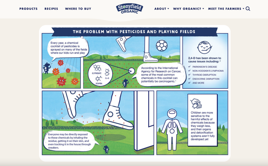
Stonyfield describes their commitment to reducing pesticides on fields children play on in a StonyFIELDS initiative page on their website. They use written content to quickly answer the “why” and “what” questions expressing their belief that all, not only cow fields, should be organic. They connect the work that they do in creating healthier organic options for people to eat, to their activism work: creating healthier environments for all people. And they demonstrate their unique qualification for addressing the issue since they’re in the business of keeping cow fields pesticide free every day. While not immediately intuitive, Stonyfield’s reason behind advocating for clean playing fields is compelling.
After this explanation, Stonyfield then begins to explain the project’s impact through a map and invites users to take action to submit their own community’s pesticide usage to be surveyed. But without the earlier sections, users would be at a loss for this initiative’s connection to the organization’s other work.
Whether it is your organization’s legacy, your physical proximity to an issue, or your community ties that connect you to your goals, you can follow best practices for nonprofit websites by expressing that connection in clear and uncertain terms.
Rule No. 2: Express your values, mission, and vision
At Constructive, we believe that a strong brand strategy communicates who you are, what you do, and why it matters. Your values, mission, and vision of course then all stem from the answers to these questions. And as a best nonprofit website practice, you can communicate these elements of your brand clearly and consistently throughout your site.
Now, it might seem like it’s easier for a for-profit organization to communicate their mission and vision because it might not be as lofty. Take TJ Maxx for example. Their mission is to, “Deliver great value to our customers every day.” It’s clean and intuitive for anyone who’s familiar with the brand. However, nonprofits often have more than one primary stakeholder—there’s a constellation of donors, advocates, staff, communities, volunteers and more. The through line between any one stakeholder’s engagement and your organization’s impact might not be as intuitive or one-size-fits-all.
So we found a for-profit B Corp brand that takes a product that’s usually not associated with social impact and still draws a clear connection between the company and its social commitments.
Ben & Jerry’s
When we want someone to sign onto our mission, we need to make sure they quickly understand our values and our vision. Ben & Jerry’s is a brand that has built a solid reputation as a socially responsible organization. In their “Activism” page, you’ll see the brand elevate their values, activism, and mission—all of which is anchored by their professed belief that “ice cream can change the world.”
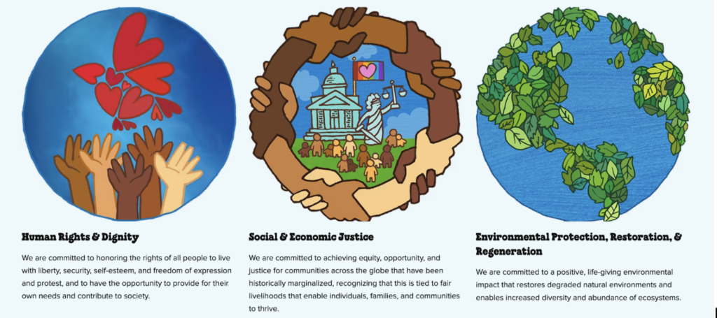
The Ben & Jerry’s Activism page does a few things excellently that fall in line with best practices for nonprofit websites. For starters, it shares its mission to invite engagement and avoids any potentially polarizing language, which might not work for every nonprofit, but works well for a consumer brand and could work for larger national nonprofits. It also employs a compelling visual and verbal language to share its three primary values. The visuals paint a clear and memorable picture of the world Ben & Jerry’s wants to build—a world that prioritizes human dignity, justice, and environmental protection.
The page expands on its values and invites visitors to engage with its three mission pillars: its product mission, its social mission, and its economic mission. And throughout the page, users are invited to engage more deeply with any elements of their mission, activism, vision, and issues they care about. We leave the site with a clear understanding of the brand’s commitments to people, justice, and our planet.
Rule No. 3: Explain Your Approach
We only have a few seconds to capture a user’s attention before they leave for another page. So, once you’ve demonstrated your connection to an issue as well as your mission and values, you need to show people how you actually make a difference for your cause. That means elevating your theory of change so that a new visitor can quickly understand your nonprofit’s approach to social impact. Your website can walk a new visitor through the basics.
- What’s the problem?
- What are you doing to address it?
- What is the impact of your work?
Oftentimes when we’re working with nonprofit clients, we hear things like: People have said that they don’t know what we do from our website, or, Visitors don’t see how we’re creating impact. To gain people’s trust we have to earn it by giving them this information quickly and clearly. Of course, avoiding jargon and complex descriptions when communicating with more general audiences helps. But there’s something to learn from B Corps’ expressions of their approaches to social impact—especially those that are widely recognized for doing good, like the shoe company Allbirds.
Allbirds
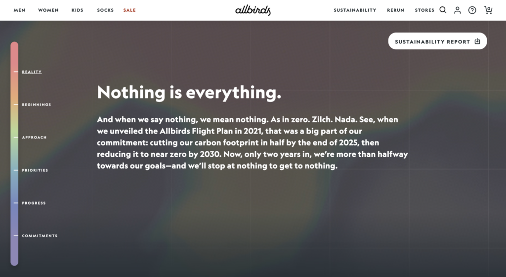
Allbirds very effectively speaks to their approach to environmental consciousness on their sustainability strategy webpage. The page opens with a bold commitment: they’re on a mission to cut their carbon footprint in half by 2025 and reach near zero by 2030.
The web page then visually walks users through their beginnings, approach, priorities, progress, and commitments. The narrative and visual approach are strong, making the page into more of a textured journey than something flat. Allbirds also defines their commitments and measurements of success through familiar climate concepts, like carbon footprints, renewable materials, and clean energy. They make their sustainability commitments easily comprehensible, and more importantly, catchy. We left the site with the takeaway that, in several years, Allbirds will be a net zero company.
Rule No. 4: Connect money to impact
One key takeaway from the authority on public trust in 2023: People distrust institutions until they see evidence demonstrating an institution’s trustworthiness. It’s untrustworthy until proven trustworthy for organizations right now.
Proving trustworthiness in the nonprofit space requires drawing a clear connection between money spent to impact. When people give donations, they want to understand where their money or time goes and how it makes a difference.
As more and more large for-profit companies center their social impact in their positioning, many of them connect consumer’s purchasing dollars with that impact. And they do this especially well on their websites, in ways that we in the nonprofit world can learn from and adapt to communicating about donation dollars.
Bombas’ Giving Back Page
Bombas is a retail B Corp known for its high quality socks. The company also draws a strong connection between money and impact. Bombas keeps it simple on their web page about giving back, letting users know that one pair of socks purchased equals one pair of socks donated.
The website moves from highly impactful visuals to a video that explains Bombas’ approach to giving back from your purchase point to the point of impact. The video elevates the voices of people who have previously experienced homelessness to emphasize the importance of clean, donated clothing. (Extra credit for Bombas’ ethical storytelling as they avoided exploiting people currently experiencing homelessness in their marketing).
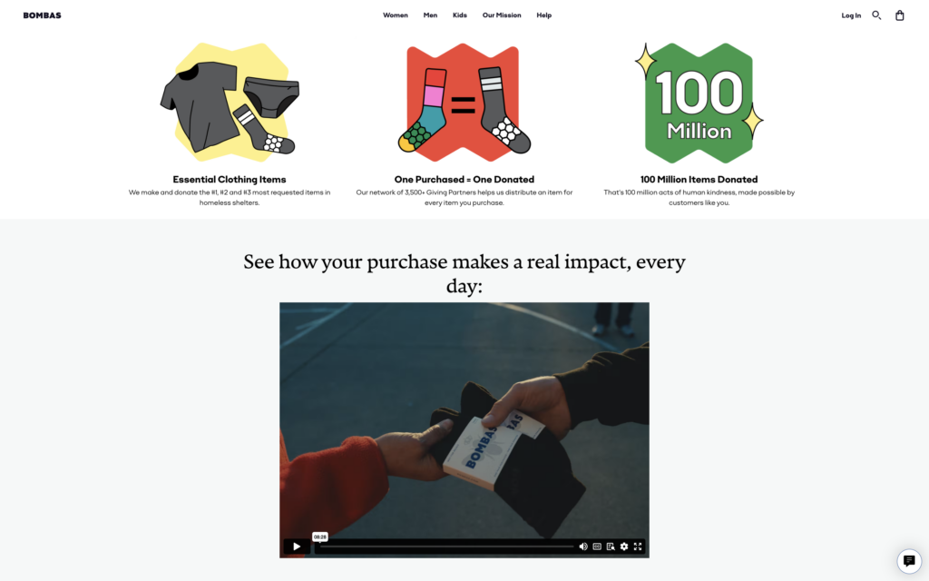
This video and this page immediately connect users to their potential impact. Bombas succinctly demonstrates the need for their work, your role in that work, and, most importantly, the impact of your partnership as consumer and brand.
Disclaimer: We know the restrictions that come with collecting unrestricted funding. But the principles we see Bombas using still apply. Be transparent. If the personal contributions made to your organization go towards your organization’s overhead, tell people that! You will be surprised how convincing it is to an individual to hear that their donation ensures that the employees at your organization are paid for their work. And if it is not even possible to speak at this level of detail, try to leverage communications about your organization’s impact generally as much as possible, calling out how vital donations are.
So while communicating a one to one purchase to donation program is often very effective, when it is not the case that one purchase or donation can be connected to a data point of impact, it is still very possible to connect money to commitments and outcomes.
TOMS’ 2022 Impact Report Page
One B Corp that we see doing this effectively is TOMS. While TOMS built its brand on a “One for One” retail model, after criticism about its actual impact, the organization pivoted to instead partner with organizations working to address poverty and other injustices. Since 2019, TOMS has taken a more democratic approach to philanthropy.
So while TOMS no longer promises to donate one pair of shoes for each pair purchased, in their 2022 impact report the company clearly connects your purchase to real impact.
The report starts with a high quality video that walks you through TOMS’ theory of change. It highlights the percentage of TOMS’ profits that goes toward nonprofits, some of TOMS’ impact partners and their missions, as well as a number counter of the number of lives TOMS has been able to impact since 2006 because of purchases (which is >105,123,038).
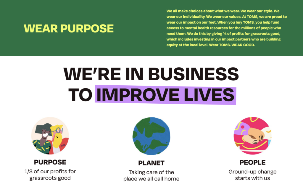
The report is broken up into three main categories: purpose, planet, and people, all with accompanying interactive information. As far as annual digital impact reports go, it’s a highly successful one, due to its strong and playful visual design, its content strategy, and its dynamism and interactive nature. It is certainly one that your organization can look towards for inspiration in building your own report this year.
Rule No. 5: Strongly Encourage Action
The success of a call-to-action can be the crux of our organization’s presence online. Of course, actions can come in all shapes and sizes for nonprofits. A philanthropy might steer you to its newsletter while an advocacy organization might direct you to a petition.
No matter your website’s primary call-to-action, for nonprofits, driving visitors to this action is especially critical because, unlike a user on a for-profit website, users aren’t coming to make a purchase. If a visitor is at the decision phase of their user journey, they’re considering whether they share your vision of the world and whether they’re willing to help you build that world. That could mean making a donation to you, signing a petition, or a host of different actions, all taking place on your website.
Because this is one of—if not the—most important part of your user journey for your nonprofit website, we’re taking a look at one of the best advocacy B Corp brands in the business: Patagonia.
Patagonia
While Patagonia technically rescinded its for-profit status in 2022, even before that, the B Corp redefined what it means to be a consumer brand with a political stance. Since 1986, the company has made environmental pledges, but in 2016, its advocacy arm really took off. As the Trump administration rolled back environmental protections, Patagonia pushed back, suing the administration for its rollbacks and gutting of regulations. Along the way, the B Corp invited its followers, customers, and fellow environmentalists to join in on the action.
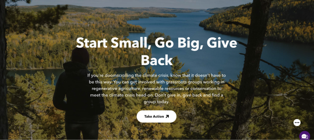
Today, Patagonia’s Activism page does an excellent job of centering opportunities for users to take action. The call-to-action stands out on the page and is clearly marked with a button and an upward trending arrow (a political trend that caught fire).
Then, to really draw you in, we love that Patagonia has a carousel of geo-targeted engagement opportunities. There are events, volunteer opportunities, and petitions. Now, I could scroll past a dozen national volunteer opportunities without batting an eye, but when I saw the names of local rivers and events in towns near me, I immediately stopped to further investigate.
This action hub does a great job of providing a breadth of action types—we of course know that not everyone wants to donate upon first visit—and it does so in a visually engaging way that clearly steers you to their main call-to-action and provides off ramps for other ways to take action. Nonprofits looking to drive engagement through their calls-to-action can utilize elements like this, geo-targeting, and make their action buttons clear and the lead ups compelling.
Interested in learning more about ways you can improve your nonprofit website? Learn more about our services or reach out to us anytime.


