


Interested in reading the latest round-up? Check out our 2026 nonprofit annual report inspiration!
Annual reports are a staple of nonprofit communications strategy—an invaluable opportunity to connect with supporters, partners, staff, and others who make an organization’s work possible. Each year, nonprofits use their annual reports to tell stories of social impact, celebrate their people, and share bottom-line results on financial stewardship. And each year, innovation in annual reports inspires nonprofit communicators and designers to reach for new ways to communicate impact—especially online. The trend toward digital annual reports is nothing new, but the last two years of remote work have elevated the importance of creating a great digital annual report for nonprofits. Not only because asking to send a print copy to people’s homes is, well, awkward, but also because supply chain issues have caused printing delays around the world.
There are many reasons to create a digital annual report if you’re a nonprofit. Probably at the top of the list is increased reach, visibility, and impact. Shareable content and greater search engine optimization mean more people will see impact stories in digital annual reports than print ones. They’re also more measurable. Website analytics provide clear insight into the effectiveness of your nonprofit’s annual report as a communications tool and make clear what content audiences are most interested in. Integrating direct-response marketing opportunities like donations, newsletter subscriptions, and digital annual reports for nonprofits can both drive revenue and build long-term relationships with your nonprofit’s brand.
Last year, Constructive created a round-up of some of our favorite annual reports from 2020—a year that saw lots of nonprofit communications teams still adjusting to the pandemic. For our research this year, Senior Designer Doug Knapton and I scoured the internet and found more inspiration from some great digital annual reports for nonprofits. And if you’re looking for new ideas and best practices for a great annual report to recap your nonprofit’s impact in 2021—from digital storytelling to interactive infographics—there’s a lot to love and learn from. So here’s our list of annual reports for 2021 (not a ranking, mind you) that Constructive’s design team drew inspiration from. I hope you’ll find them equally as inspiring.
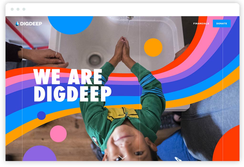
1. Dig Deep’s Annual Report
I had never heard of Dig Deep before coming across their digital annual report. Charity: Water may be the most well-known nonprofit brand in the water equity and access space, but Dig Deep has really impressed me with how strong their brand identity comes through in their annual report. Having gone through it, there’s so much to love that it’s hard to know where to begin. This single-page report gets a lot right—starting with me walking away with a great understanding of their mission and so impressed by their work.
I love a carefully designed brand that brings together color, typography, and imagery to present a nonprofit at its very best and to connect people to its mission, and this annual report is as beautiful as it is strategic. The layout, content rhythm, customizing of the photography with branded illustrations, and the visual variety are intentional, created with care, and above all, effective. It’s not easy to keep readers moving down such a long page and engaged as well as Dig Deep’s digital annual report does.
From a content perspective, Dig Deep does a great job introducing the brand (“We Are Dig Deep”), explaining what “The Water Gap” is, diving into projects and impact, and smartly leveraging content on its main website and external websites to give people jumping-off points for exploration. And when you get to the very end, Dig Deep lets you know that they’re a brand that values diversity, equity, and inclusion with one simple statement: “This report was built with input from every member of Team Dig Deep.” Bravo!
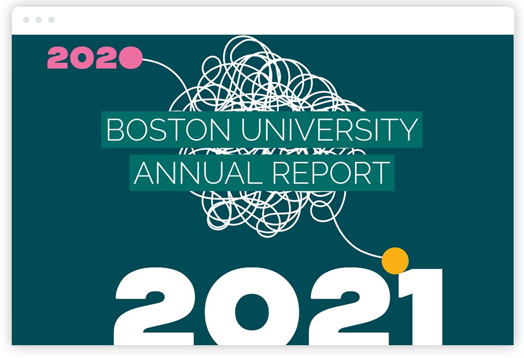
2. Boston University Annual Report
We love what Boston University did with their digital annual report for 2021 (and kudos to them for getting something so polished done before we even got to January of 2022!). This is a nonprofit annual report that’s filled with great storytelling and expertly balances the head and the heart. It’s both emotional and smart, just like a brand experience for an iconic educational institution should be. Acknowledging what was a particularly difficult year for schools and universities, the annual report sets the tone with a table of contents that has an understated, handwritten “See how we made it through” at the top. It then follows through with sections on serious issues like “Diversity Equity & Inclusion” and “Fortifying Our Community.”
Boston University’s annual report content strategy is smart and does an excellent job of breaking up content into digestible chunks and key takeaways that are easy to scan. But that doesn’t mean it’s light on content. As a full website (versus a single-page annual report), it’s also got depth. Sections are filled with digital storytelling and offer lots to explore, which also means that it should perform well in search engine optimization. The design has a ton of spirit. It’s fun, engaging, and with lots of personality, especially the use of typography and illustration. Page layouts are smart and sophisticated, which is impressive because they work so well on mobile.
Lastly, I’d be remiss if I didn’t also give Boston University major props for their outstanding photography in their digital annual report. Theirs really highlights what high-quality photography does for a brand. This annual report is just the kind of report I really want to spend time with, which says a lot about the quality of Boston University’s brand.
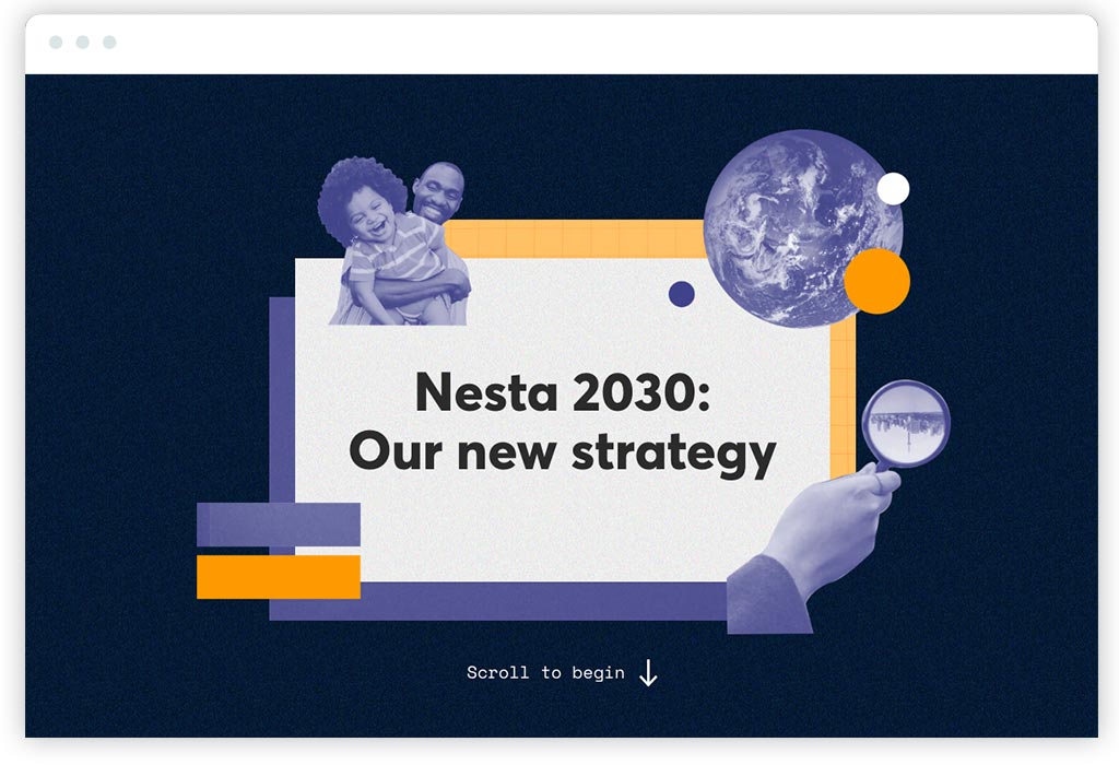
3. Nesta 2030: A 10-Year Strategy Report
So, this interactive nonprofit report isn’t exactly an annual report, but Nesta 2030 does too many things well to not include in a list of examples to draw inspiration from. Nesta is a social innovation philanthropy in the UK that I’ve admired for years. Their work is expansive and focused on systemic transformation. And their strategic plan report makes their transformative vision accessible and inspiring—creating confidence in their ability to succeed in their mission.
It’s another single-page scrolling microsite, which is very popular. Why? I believe it’s because they’re an effective format for digital storytelling that keeps audiences focused on a narrative. This being said, they can leave audiences who are looking for a deeper dive to evaluate a nonprofit (such as a major funder) wanting more. They also will not perform well in search engines because unless you do some advanced coding tricks, they’re, well, just a single page.
This said, Nesta’s strategic plan report is beautifully designed. It’s cohesive with its brand identity but takes chances and stands out. The use of subtle textures and photo collage/illustration (a technique I personally love) make the philanthropy’s report special—just like a strategic plan report should be. Where Nesta’s interactive report design shines is in its use of animation and interactivity. It’s fast and crisp, so it keeps me feeling energized and active. This makes me feel equally optimistic about their social innovation work. It keeps content light and scannable, so it keeps me engaged. The interactive report then invites audiences to read more with calls to action like “Read more about our reasons for optimism” that elegantly expand new sections within the page.
As I mentioned, from a content perspective, Nesta’s interactive report does an excellent job of making its ideas and content accessible to new audiences. Simple explanations make clear what Nesta does, what their vision for the future is, what their programmatic areas of focus (or “innovation missions”) are, and most importantly, how they plan to deliver on those missions. Taken together, it’s an inspiring read that adheres to a rule in nonprofit communications I believe in strongly: delivering valuable, high-level takeaways for people looking for an introduction and encouraging deeper dives for audiences who demand more.
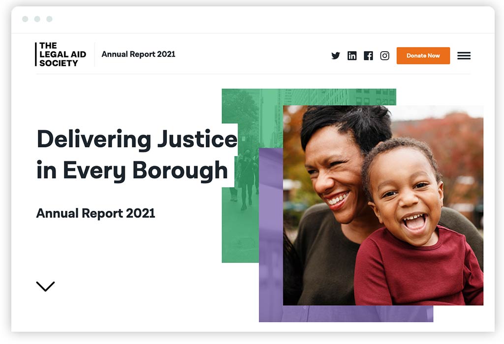
4. The Legal Aid Society Annual Report
I hope you’ll excuse me for highlighting an annual report that we created with one of our favorite clients, but we are pretty proud of the results. Constructive has worked with The Legal Aid Society to create the nonprofit’s annual reports for four years, usually in both digital and print. I won’t evaluate the design or content of The Legal Aid Society’s annual report—others should decide if we’ve done our jobs well there. The reason I’ve included it is because of a new approach in digital publishing that we implemented this year that creates meaningful long-term value.
Since annual reports are usually not updated much (if at all), it’s common to create them without a content management system to save budget on back-end web development. The thinking is that it’s just not worth it to do back-end engineering for a microsite that’s mostly a snapshot in time. This has always been the case with The Legal Aid Society—until now. For 2021, rather than creating a standalone digital annual report, we built The Legal Aid Society’s annual report directly within the content management system of the website we created with them.
“Why,” you might ask. Simply put, for sustainability and scalability, and to make an annual report that’s a more holistic part of the nonprofit’s brand—both visually and technically. By leveraging a robust design system and CMS that’s been built over time to meet the needs of The Legal Aid Society’s brand and communications, we’ve created more than just their annual report for 2021. They now also have a scalable, efficient publishing strategy that will drive down costs over time and maintain great cohesion with their branding.
Working within the existing design system and web development environment allows us to leverage design components that have been carefully created as part of the atomic design structure of Legal Aid Society’s website. By leveraging existing components and layouts, both our design and development teams saved a lot of time, making it possible to complete the project in just over a month while reinforcing their brand identity. And by setting up this infrastructure for digital annual reports in 2021, both The Legal Aid Society and we will be miles ahead when it’s time to tell their story for 2022—saving time and money so we can focus on innovation in design and digital storytelling.
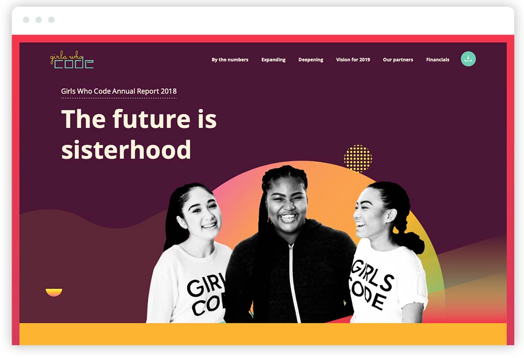
5. Girls Who Code Annual Report
Girls Who Code has been creating digital annual reports for years. This is strategically on-brand, considering they’re a nonprofit whose mission is to advance the skills and careers of women in technology! All of Girls Who Code’s annual reports also take the single-page, scrolling narrative website approach—which, as I mentioned, delivers a focused experience but does hurt search engine optimization. And while their 2020 digital annual report and their one for 2019 are really nice, the one we’re featuring, created for 2018, is special and stands out.
Why do I think it does such a great job presenting their brand and accomplishments for the year? Start with a beautiful design and real attention to craft. The execution of design details is fantastic, and the annual report has an emotional quality and richness that connects audiences to the human aspect of the nonprofit’s mission. There’s subtle, restrained animation that adds energy to the experience and doesn’t distract.
From a content perspective, the nonprofit’s annual report does a great job briskly walking through the annual narrative—leading with Founder, Reshma Saujani’s vision, elevating impact statistics and key data, focusing on programmatic achievements, and then painting a vision for the coming year (which too few nonprofit annual reports do to energize supporters for what’s next).
Taken together, you’ve got a strategically on-brand digital annual report for a nonprofit that connects emotionally, engages the audience, and focuses on its progress to implement its mission.
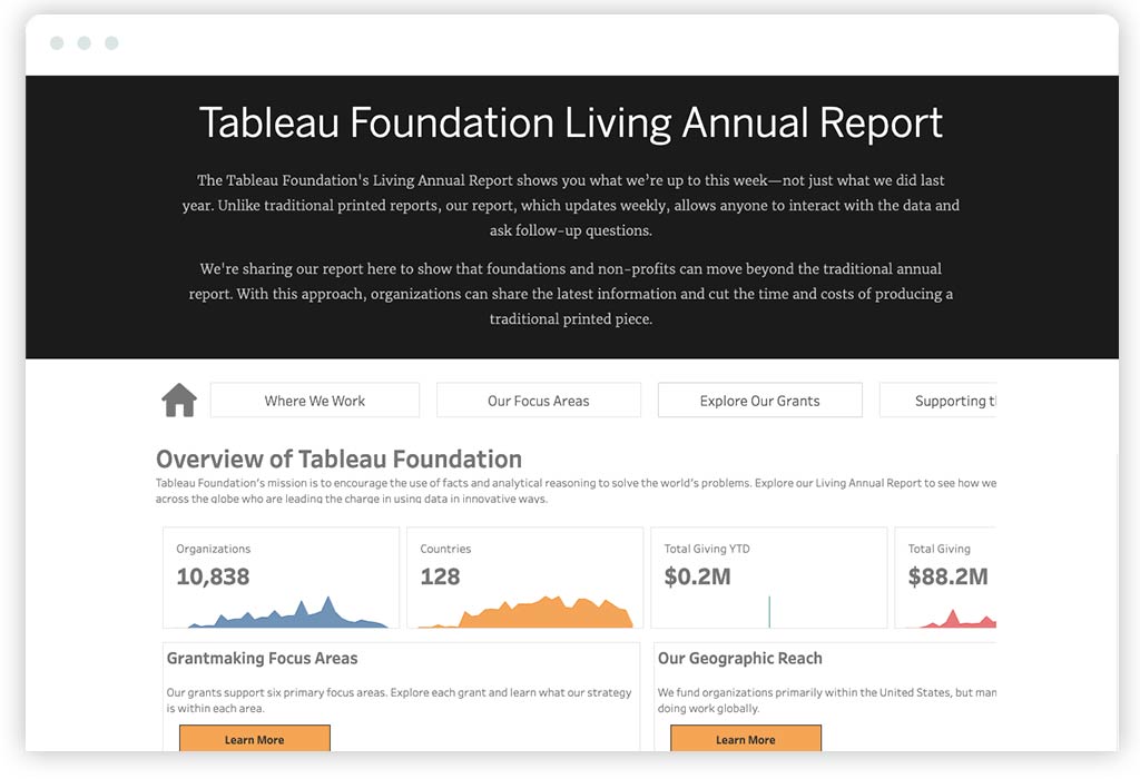
6. Tableau Foundation Living Annual Report
It’s exciting to see a foundation do something so different. As someone who believes that things like websites and annual reports must be strongly aligned with a nonprofit’s brand strategy, I love what The Tableau Foundation does with its digital annual report. It’s an atypical, innovative approach that’s built on smart strategy and reinforces what their brand is all about. While the design could be better (which may send a bad message about the quality of the product for people like me who care about data visualization), the concept perfectly reinforces who Tableau Foundation is, what they do, and why it matters.
The secret to its success can be found in the name. As the Foundation explains, its “Living Annual Report” shows audiences what they’re up to this week—not just what they did last year. Emphasis on “shows” and not “tells,” and here’s why. Because Tableau is a data visualization tool many nonprofits use. So, their Foundation smartly chooses to go extremely light on the words and let the data do the talking. The result in their digital annual report is an interactive dataviz dashboard that quantitatively breaks down where Tableau Foundation works, their focus areas, and their grants. Reinforcing the power of their platform, the annual report empowers audiences to explore the data (even if it isn’t the deepest dive).
While it might miss some of the storytelling aspects of a traditional annual report, Tableau Foundation’s annual report is innovative—and, most importantly, 100% aligned with what their brand stands for.
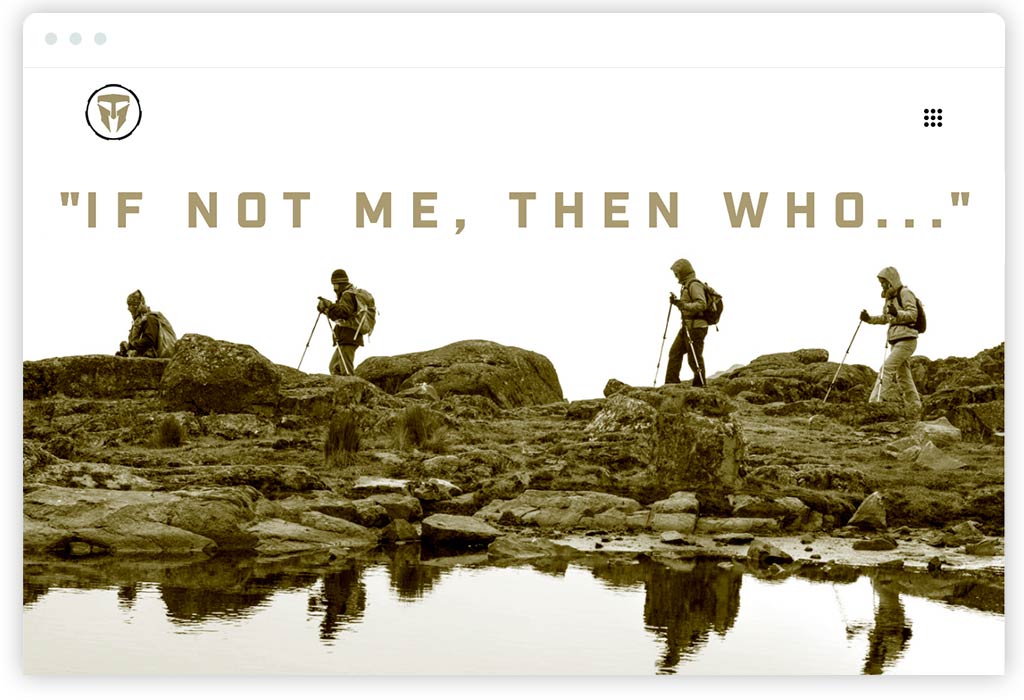
7. Travis Manion Foundation Annual Report
Here’s another nonprofit that I hadn’t heard of until we started doing our research—and another example of a strong, single-page digital nonprofit annual report. Travis Manion Foundation partners with and supports veterans by leveraging their unique leadership abilities to make a difference in communities.
The design stands out (as does their brand) for having a pretty hard-edged aesthetic that combines technical and gritty. It’s differentiated and creates a good feel for their brand that’s aligned with the veteran community that they stand with. It’s also not flashy, which also feels appropriate. While I might like to see a bit of animation to bring the experience to life, there is something direct and to the point that resonates with me for a nonprofit brand that’s dedicated to veterans.
From a content perspective, the Travis Manion Foundation’s digital annual report does a great job telling the full arc of the nonprofit’s story. It’s another single-pager, and the content has good pacing that’s balanced by thoughtful visuals throughout. There’s a nice mix of statistics, programs and initiatives, impact stories, and more. I particularly like how the navigation at the top is numbered 00 – 09, reinforcing the brand’s military roots. It’s smart details like this that immediately say a lot about a nonprofit’s brand and what it stands for. As a result, I get a great feeling for the Travis Manion Foundation’s brand, an understanding of their work, and most importantly, a strong belief that they’re making a difference.
2021 Nonprofit Annual Reports Summary
Annual reports are an essential part of a nonprofit’s communication strategy. And as you can hopefully see, there’s a lot of exciting stuff going on in digital annual reports—all of which can help nonprofits make the most of their once-a-year opportunity to engage their most important audiences. It is important to say that doing this work well is not inexpensive. Like most website design projects, they are an investment. The key is to make sure that investment is put to good use.
Approached strategically and with great respect for your nonprofit’s brand, the examples we’ve researched this year reaffirm that a digital annual report drives engagement. And when the strategy is to encapsulate what you stand for and where you’re going by recapping a nonprofit’s year of impact, getting your annual report right will likely translate into increased support and action. While we’ve focused on digital, it’s not always a fit for every nonprofit. There is a place for print, and we’ve done (and continue to do) plenty of print annual reports over the years that have done an excellent job for the organizations they represent.
So, as your nonprofit is thinking about ways to design an annual report that’s up to the moment, I hope the innovation and best practices in our roundup have you thinking big. From great storytelling and imagery to interactivity and data visualization, there’s a lot that can be done to demonstrate your impact in ways that are strategically aligned with your brand. And, of course, if you’re looking for help creating your nonprofit’s next great annual report, we hope you’ll get in touch!
Want more annual report inspiration? Read last year’s review of some of the best nonprofit digital annual reports for 2020.
