When it comes to social impact data visualization design for the environment, the Yale Environmental Performance Index (EPI) sets the standard by which others are measured. A joint effort between two leading university organizations: The Yale Center for Environmental Law & Policy and The Earth Institute at Columbia University, The Yale EPI ranks 180 countries on environmental health and ecosystem vitality—helping scientists, policymakers, and other experts measure how well the world is meeting established environmental policy targets. Looking for new perspective on nonprofit data visualization design, Yale asked Constructive to rebuild the EPI so that its environmental research would be more accessible, engaging, and useful to a wider audience. More than just a wonky, data-rich tool-set for experts, they wanted the new Yale EPI to transform its social index website design into a powerful tool for communicating complex environmental issues—and for accelerating the international movement towards global sustainability.
A Social Index Website Design That Wasn’t Measuring Up
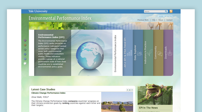
Yale’s Environmental Performance Index is a website built on big data environmental research. Over the years, Yale had designed the social index to be more of a traditional website—a step up from it being purely a collection of big data sets that were made available to environmental scientists. And while it contained all of the data on environmental performance, it was not accessible and failed to engage audiences by making the data come to life.
Confusing navigation and data visualization design made Yale EPI’s key content and insights difficult to find. The social index design lacked infographics that could make its complex research more understandable to a wider audience. And while the Yale EPI website had data visualization tools that allowed users to work with EPI data, functionality was extremely limited. The result was an environmental website design that failed to live up to the quality of its research—and was falling short in inspiring audiences to action.
Applying Best Practices in Data Visualization Design & Data-Driven Storytelling
Digital data visualization websites like the Yale EPI have a big challenge when it comes to generating social impact at a global scale. They need to do more than just share information. If they are to maintain their credibility with research experts, business leaders, and policymakers, social index websites must both maintain an objective, evidence-based approach when making data available and they must also use best practices in data-driven storytelling to inspire greater action so that leaders across the public and private sector use the research to take meaningful action.
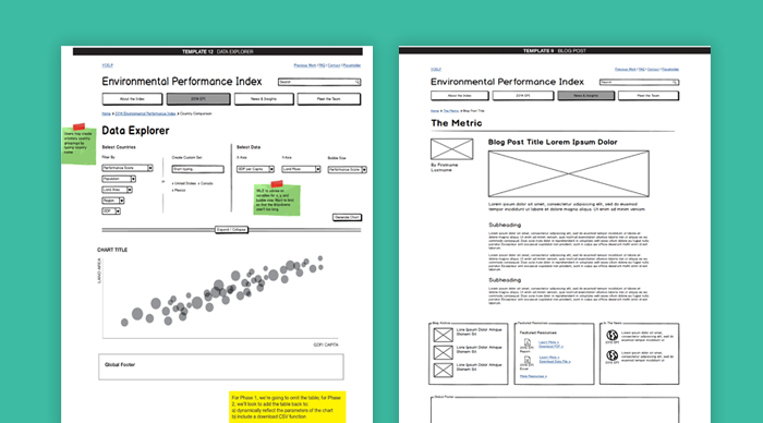
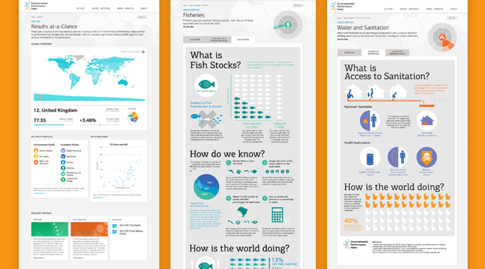
In redesigning the Yale EPI, Constructive’s UX design team collaborated with Yale’s research experts to turn their big data, processed in The R Project into a human-centered experience. Together, we developed rapid prototypes using Balsamiq, allowing everyone to see how we could present the EPI’s environmental research in different ways. After weeks of iterating, we designed a data-driven user experience for the social index design that delivers information and the issues from multiple perspectives. The new Yale EPI leads with data, creates context by explaining complex environmental issues, and offers interactive tools to explore the information—elevating ideas and follow throughs with facts to increase understanding and impact.
 Environmental Nonprofit Branding With Rigor and Vitality
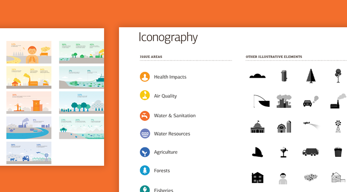
While the focus of the Yale EPI is on making data accessible and understandable, we knew that the key to it delivering a strong brand experience required creative thinking and effective design. To differentiate the EPI from other academic exercises in its field, help it connect with a wider audience, and support its data-heavy content, we created a design strategy that’s both emotional and functional. The EPI’s logo is its visual anchor, setting the tone for a comprehensive visual identity system of typefaces, colors, and iconography that gives life to the brand and supports communicating EPI data. The result is a brand experience that creates both a rational and emotional connection with audiences—making it easy and enjoyable for them to engage with the EPI.
Website Design & System Development
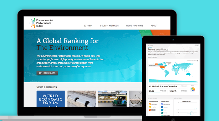
Visually, we designed a website that embodies the innovation, integrity, and impact of the Yale EPI. A vibrant user experience pushes the boundaries of traditional academic initiatives— delivering objective, industry-leading research with visual impact. Clean, contemporary design emphasizes usability and legibility; united with an engaging style that maintains focus on the content while inviting audiences to stay a while. The result is an experience that expands the EPI’s influence by reaching beyond a narrow audience of policy wonks and research experts.
Visual Storytelling
Educating lay audiences on complex environmental issues and science is critical to the EPI’s goal of reaching a broader audience of engaged non-experts. We collaborated with Yale to transform the EPI’s research into a high-impact narrative, developing a system of infographics that explain what the EPI tracks, what it means, and most important, why it matters. The result is an unexpected approach to visual storytelling that makes critical environmental issues more accessible by providing memorable takeaways and deepening audiences’ understanding of what’s at stake.
Client’s Take
“We engaged Constructive with the enormous undertaking of rethinking the EPI. They were successful for several reasons: The new website is beautiful, which keeps our users engaged. It’s also highly usable, with tools that give unprecedented access to EPI data. Most important, the infrastructure they built provides a scalable foundation for the years ahead. We couldn’t be happier with the result.” Josh Galperin Associate Director (Former), Yale Center for Environmental Law & Policy.
—————————
If you’d like to explore more of Constructive’s work with climate and environment nonprofits, case studies are available here.
Heart disease touches each one of us at some point in our lives. The statistics on heart disease in America are staggering. It is the leading cause of death in the United States and globally. In America, 26.6 million people are diagnosed with heart disease each year. Every 34 seconds, an American will have a coronary event and over 600,000 will die from one each year. Enter The Cardiovascular Research Foundation (CRF), the leading healthcare research nonprofit dedicated to helping doctors improve the lives of people suffering from heart and vascular disease. In need of a digital transformation strategy and a new website design for the healthcare nonprofit’s flagship online presence, The Cardiovascular Research Foundation needed a web design firm that specialized in research-driven, content-heavy website design for healthcare nonprofits.
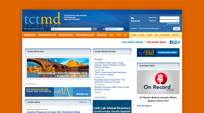
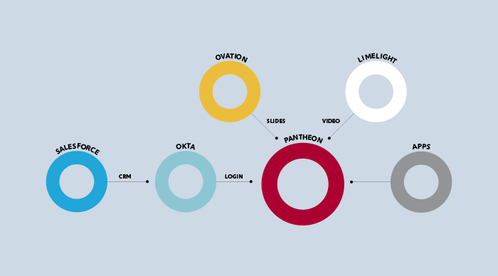
CRF had a tough challenge ahead of them. TCTMD is an enormous nonprofit website filled with thousands of pages of specialized healthcare content—healthcare research, videos, conference slide presentations, cardiovascular healthcare news, and more. While it was filled with valuable content, the site’s infrastructure was complex, complicated, and out-of-date. A paid member-driven website, TCTMD required deep integration with multiple platforms like Salesforce, Okta and Britecove, meaning making sense of the technical terrain would be tough before any website design work could begin. And everything had to be done in 6 months for CRF’s largest annual conference.
So, with no time to waste, both of our teams jumped in with two feet to remake the nonprofit healthcare leader’s website—and, in doing so, transform how it advanced its mission.
Before Redesign: A Nonprofit Healthcare Research Website in Need of Serious Treatment
With just one significant redesign in its 16-year history, TCTMD was a healthcare nonprofit website from a bygone era. On the back-end, CRF’s data was stuck on an expensive, proprietary Ektron CMS that made it impossible for the healthcare research nonprofit’s editorial team to publish and manage content on their website. TCTMD’s system failed to support the complexity of its content relationships, site search was ineffective, and integration with Salesforce for gated member-only content was clunky and error-prone. To users, the content-heavy website suffered with a confusing taxonomy and navigation that made finding content a chore, visual design made scanning pages and long-form reads uninspiring, and the TCTMD brand failed to embody front-of-field interventional cardiology news and education.
A New Digital Strategy to Drive Engagement With Specialized Healthcare Research Content
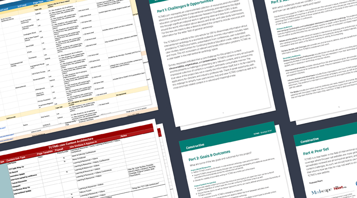
TCTMD is truly an encyclopedic website, with tens of thousands of slide presentations, news articles, and videos. The key to success in designing content-heavy nonprofit websites starts with digital strategy and content strategy. And with thousands of pieces of content to make sense of, we quickly got to work understanding the nonprofit website, from multiple perspectives. Discussions with TCTMD’s leadership and editorial team informed goals, pain points, and priorities. A content audit showed how volumes of content were organized. Focus groups, user surveys, and user profiles clarified what was most important to audiences.
An in-depth analysis of CRF’s digital ecosystem detailed the network of connected systems in the nonprofit’s technology infrastructure—and opportunities for us to improve both the user experience and operational efficiencies. Peer analysis placed TCTMD in context to competitors in its space. After learning from CRF’s team, we developed a digital strategy that provided our roadmap for uniting branding, content, design and technology into an nonprofit website that would make a meaningful difference for how The Cardiovascular Research Foundation advances healthcare.
Architecting a User Experience That Delivers Greater Value and Drives Revenue
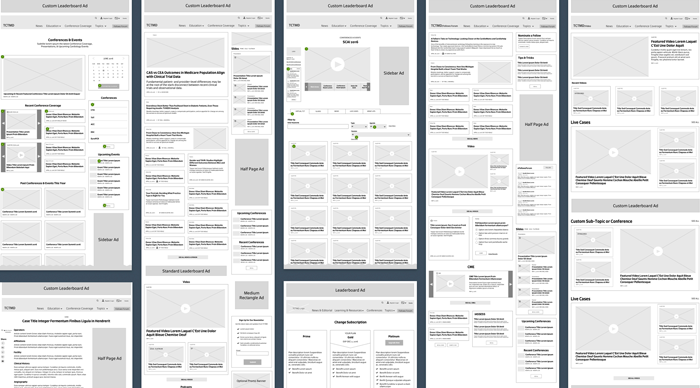
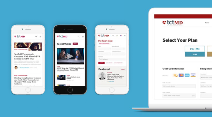
When it comes to designing research-heavy nonprofit websites, there are best practices to driving content engagement. And in designing the user experience for TCTMD, one of our top priorities was to expose readers who typically visit for one type of content to the volumes of valuable, related content that The Cardiovascular Research Foundation has to offer healthcare experts from its other departments. In particular, TCTMD is a rare membership and community nonprofit website that relies on paid advertising to drive the revenue that supports its programming. Given the volume of news and educational content in TCTMD, this meant developing a content taxonomy that supported existing content and planned for growth, displaying a breadth of relevant options in every view, and not over-stuffing pages and bombarding users to ensure a great reading experience across devices.
With thousands of pieces of specialized content for audiences to engage with, making sure that TCTMD’s website search was exceptional at delivering the results that people were looking for was critical. To ensure content accessibility, we rearchitected the nonprofit website’s search with powerful faceting and filtering search tools powered by SOLR, delivering rapid, accurate results search results.
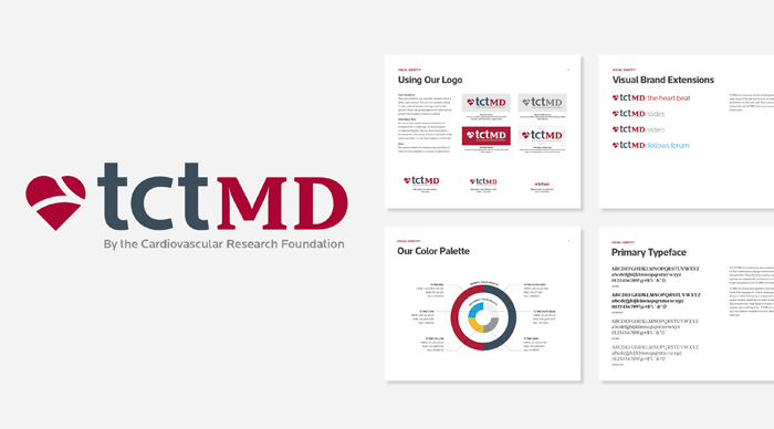
Designing a Logo & Branding That Resonates With Healthcare Experts
Like most major website redesigns, designing TCTMD for The Cardiovascular Research Foundation was both an opportunity to design a great nonprofit website for the healthcare sector and to strengthen the TCTMD brand so that it would stand out among it’s peers like TheHeart.corg by Medscape. Working within CRF’s master brand guidelines for the parent brand, we collaborated with CRF’s team on a rebranding for TCTMD that provided the visual foundation we needed. Two key considerations for designing effective nonprofit branding for The Cardiovascular Research Foundation were ensuring that TCTMD worked within CRF’s master brand, and that its new visual identity would support a brand architecture for TCTMD sub-brands and departments. The resulting design modernizes TCTMD’s brand, while a color and typography system and sub-brand identities provide the structure needed to support brand consistency across all communications in different media and venues.
Designing a Nonprofit Healthcare Website that Strengthens Connections to the Brand
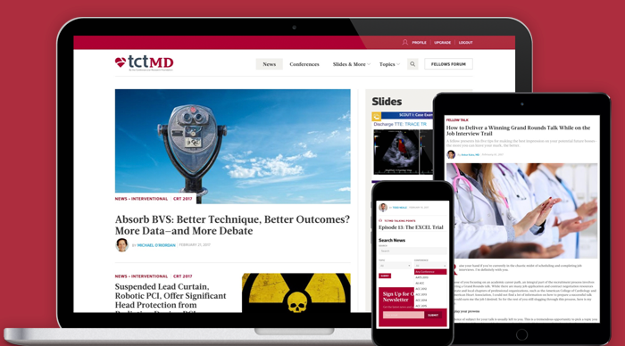
With TCTMD’s new logo and branding in place to guide website design, we transformed our wireframes and technical specifications into a a content-driven nonprofit website experience that ensures legibility, accessibility, and deeper engagement with everything that The Cardiovascular Research Foundation has to offer. In keeping with TCTMD’s status as a leading nonprofit website for interventional cardiology news and education, design emphasizes best practices in news and media website design so that TCTMD stands up, stands out, and stands for something among it’s peer set of other healthcare nonprofit websites.
Because of its volumes of long-form content, in particular, Constructive’s team designed TCTMD with a careful, structured typographic hierarchy that makes content scannable, elevates top-level takeaways, and encourages readers to go deeper into the nonprofit website’s extensive content on cardiovascular healthcare. A clear and clean design that establishes a strong visual hierarchy increases usability by making clear what TCTMD’s different editorial departments, topics, and formats are to guide users through the website’s content-heavy pages. And videos and presentations, two of TCTMD’s most valuable types of content, are elevated with calls-to-action that focus attention on member-only content to help drive subscriptions.
Designing a Robust Infrastructure for Digital Transformation
Digital transformation may be all the rage in business settings, but the truth is that digital transformation for nonprofits is an enormous opportunity to streamline service and improve the brand experience. We built TCTMD in Drupal to ensure that the system could handle the large number of complex integrations with The Cardiovascular Research Foundation’s external technology infrastructure. The website makes it easy for subscribers to login using Single-Sign-On, providing tiered member accounts based on the level of subscription and centralized user management control for CRF’s staff. On the content side, TCT provides public content and members-only content access, extensive multimedia content—from video and streaming to automated presentation processing from annual conferences, SOLR search, and custom application APIs.
As one of the top-rated websites in the cardiovascular healthcare sector, TCTMD is also a website that’s visited by thousands of people every day—meaning it needed to effortlessly push all of its media content without slowing down. To meet the need, Constructive’s technology team worked closely with TCTMD to select hosting and complementary technology partners to architect a cloud-based infrastructure to handle the load and evolve with their needs—creating a highly-available, scalable infrastructure with automated deployments, elastic scaling, healing, notification, and more.
The Results
“Constructive completely understood the challenges we were facing in our space. Instead of only having one person be familiar with our project, it seemed that the entire Constructive team was fully invested in making our success be theirs, and vice versa. Their entire team made itself fully available to us, often going above-and-beyond to make our launch successful. We didn’t feel like we hired a company to perform a website redesign, but rather found a partner to work with us and bring our vision to life.”
Stephanie Gutch, Sr. Director of Digital, Cardiovascular Research Foundation
Learn More About Our Work
Get an up-close and detailed look at this project in our visual case study or explore Constructive’s design for healthcare & social services nonprofits.
The Paraprofessional Healthcare Institute (PHI) is the leading direct care policy and advocacy nonprofit in America, transforming eldercare and disability services by fostering dignity, respect, and independence—for all who receive and provide care. In a workforce that is represented by a majority of women and people of color, PHI works as a tireless advocate for equity for direct healthcare workers. They also promote economic opportunity by increasing high-quality direct care jobs. And having just completed a strategic planning process, PHI needed to center the nonprofit’s policy and advocacy website design on its new brand strategy.
Specifically, PHI wanted their new digital strategy to help the nonprofit raise awareness of the key issues, engage a diversity of audiences, create unity across their work streams and engage a diversity of audiences to increase PHI’s policy leadership, raise issue awareness, make their research and support tools more accessible.
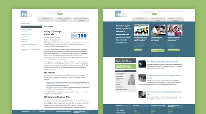
A Content-Heavy Nonprofit Website Design Creating Confusion
PHI’s existing website had several key problems that were holding them back. First was that the nonprofit’s website design no longer reflected their new strategic model. Rather than making it easy to understand the issues and PHI’s strategy to address them, it forced people into old, disconnected organizational silos. Second, PHI had just completed a rebranding, leaving them with a website design at odds with their identity. And third, like many content-heavy nonprofit websites, PHI’s had become cluttered. Confusing navigation and poor website search made it hard for people to find what they want and overly text-heavy pages failed to keep users engaged. And because they are a policy and advocacy nonprofit working in a specialized sector, PHI’s website used jargon rather than communicating in accessible terms.
Starting With Discovery to Design a Strategic Nonprofit Website
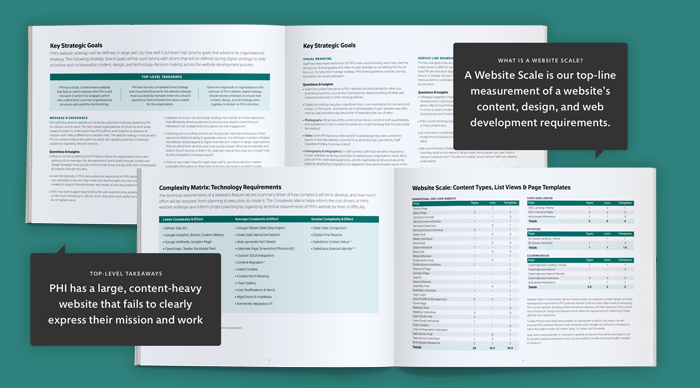
The nonprofit’s team, of course, had a long list of things that they wanted to change, improve, and add so that their new policy and advocacy website design would make a bigger difference in their mission. They just didn’t know where to start or what accomplishing their goals would entail. To help everyone make sense of it all, we started with a dedicated strategic discovery phase to understand the current website, establish clear goals for a new website design, and create detailed requirements to achieve them.
First, we audited the nonprofit’s website, content, and technology systems. We then led digital strategy workshops with PHI’s leadership to understand their operations, identify pain points, explore solutions, and prioritize needs. We then developed a strategic plan for policy and advocacy nonprofit website design that focuses on what matters most—detailing the strategic, creative, and technical requirements with a roadmap and budget that aligned PHI’s team and ours to support their new brand strategy.
Nonprofit UX Design That Eliminates Organizational Silos and Supports Brand Strategy
PHI is a complex healthcare policy and advocacy nonprofit, providing a wide range of services that support and strengthen the direct care sector. Unfortunately, PHI’s fragmented website was siloed and failed to support their breadth and depth of services. The nonprofit’s website is also content-heavy with resources that need to be accessible and engaging to support their policy and advocacy work.
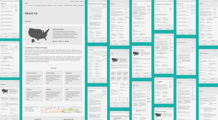
We also needed to make sure that the design of such a content-heavy policy and advocacy website made sense to real people. To design a more useful experience, we started with user research to give us valuable perspective we can’t have on our own. Analytics analysis deepened our understanding of how people were using PHI’s website, giving us an evidence-based foundation to design a new user experience.
As with all nonprofit websites, our UX strategy stayed focused on raising issue awareness. We designed a site structure that bridges PHI’s silos—organizing ideas by issues, geography, and services; and framing the issues within broader social context to focus on the mission. The result paints a clear picture of who PHI is, what they do, and why they matter—and makes their volumes of policy and advocacy resources readily available.
Nonprofit Policy and Advocacy Website Design That’s as Engaging as it is Useful
Designing brand experiences for certain research-focused policy and advocacy nonprofits presents an interesting challenge. By definition, they rely on research that’s often wonky and technical. They speak to subject matter experts and policymakers who are looking for evidence-based expertise. At the same time, every policy and advocacy nonprofit’s work is about social impact. It’s driven by values, and is ultimately about the impact on real people and the planet.
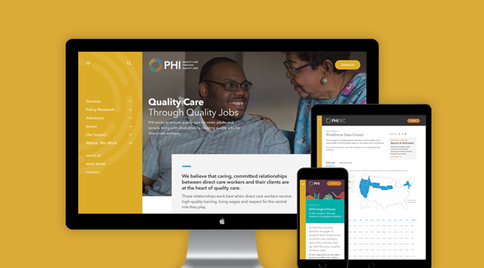
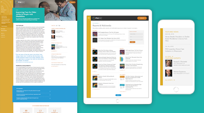
To help PHI balance these two essential aspects of their brand, we designed a website that’s both structured and dynamic. Bold brand colors set the tone within rhythmic grids that keep PHI’s long-form research content engaging. It uses authentic, representative imagery that embody the dignity and compassion that are the heart of the direct care workforce. The results are a website design for a policy and advocacy leader that both creates emotional connections to the direct care issues and people and communicates the rational rigor needed to lead on them with great credibility.
Policy and Advocacy Nonprofit Website Design That Elevates the Issues and the Experts
Central to PHI’s digital strategy is helping audiences understand complex issues facing the direct care workforce. To advance the nonprofit’s leadership at the national, regional, and state levels, we designed PHI’s website with a combination of editorial design techniques and best practices in digital storytelling for nonprofits.
Design engages both expert and lay audiences by delivering top-level takeaways and inviting deep dives into PHI’s content. PHI’s website follows through on our goal of by elevating PHI’s expertise with a library center of PHI’s reports, briefs, and multimedia—and a dedicated National Direct Care Workforce Resource Center that makes it easy for experts to leverage PHI’s research.
The result positions PHI as the leader of one of the fastest-growing sectors of the healthcare industry, delivering a wealth of expertise, insights, resources, and results. It also embodies a tireless advocate and educator for the direct care workforce, a rigorous policy research expert, and a strong voice who raises awareness.
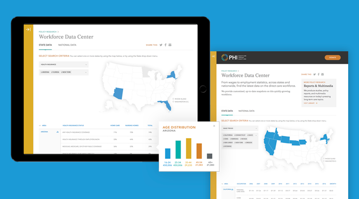
Designing Data Visualization to Deepen Understanding of the Direct Care Workforce
As the leading national expert of the direct care sector, PHI supports the work of policy and advocacy efforts with large-scale, data-driven research on wages and employment statistics for every state and nationwide. Drawing on our team’s expertise in designing data visualization indexes for nonprofit issues such as health equity, the global environment, and the economic impacts of climate change, we turned PHI’s tabular data sets into a dynamic Workforce Data Center.
The new digital data visualization tool contains one of the most comprehensive data sets in the world on the direct care workforce. The interactive data tool empowers users to create customized, comprehensive, up-to-date snapshots that explore issues from race, gender, age, and employment status, to earnings, wage trends, and insurance at the state and national levels.
The Results
“Constructive is fantastic to work with, and our entire collaboration process reaffirmed that we had chosen the right partner. They’re personable and bring a team of experts in different aspects of branding and website development to our relationship. They ask hard questions that force us to think through things we wouldn’t have otherwise. They’re thorough and solutions-oriented. They’re able to both answer high-level strategic questions and focus on executing the details. And they met our deadline, which is rare in website redesigns!” – Robert Espinoza, Vice President of Policy
—————————
Learn More About Our Work
Get an up-close and detailed look at this project in our visual case study or explore Constructive’s design for healthcare & social services nonprofits.
Despite how important reading is to college and career readiness, literacy rates for K-12 students in America lag behind other western nations. The Carmel Hill Fund Education Program is an innovative education technology nonprofit that’s reversing this decline to close the education equity gap and increase opportunity for students in America. Carmel Hill combines teacher training and education technology to help schools increase literacy rates for over 40,000 American students. Unfortunately, the education technology nonprofit’s branding and website design were far less innovative and effective than their work on child literacy.
Having seen our work to launch another education technology nonprofit pioneer, UnboundEd, Carmel Hill reached out to Constructive to design branding and a website for the education nonprofit that would help them in their mission to support more teachers and make a difference in the lives of more students.
An Innovative Education Nonprofit With a Failing Brand
When Carmel Hill’s team reached out to us, they were stuck with a brand and website that hardly presented them as the nonprofit education technology innovator that they are. However, Carmel Hill’s team agreed that effective nonprofit branding helps increase impact. So we set out to make sure that Carmel Hill’s new branding would equal the education technology nonprofit’s reputation for innovation. They also knew that their website needed to do a much better job serving the schools they partner with if they were going to achieve their goals. Taken together, the nonprofit’s leadership wanted to leave behind a brand they felt was drab and that failed to express their innovative. And online, Carmel Hill’s website needed to be bold, focused on results, and be more connected to the classroom experience.
Designing Uplifting Education Nonprofit Branding to Take Flight
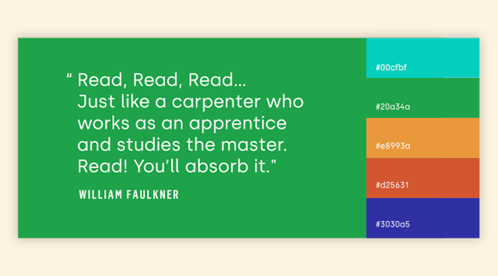
Carmel Hill wanted their nonprofit’s brand identity design to be friendly, welcoming, and trustworthy. This meant making it both familiar to early childhood educators and sophisticated to reinforce credibility to lead. We brainstormed logo concepts until we created something everyone loved—an open book taking flight—inviting audiences into the brand and how Carmel Hill’s nonprofit literacy programs helps unlock opportunities for a lifetime.
Carmel Hill’s new color system takes a traditional early education palette and adds vitality with saturation and brightness. And for the brand’s type system, we chose three typefaces for specific content needs and create visual variety. Flama Condensed makes key numbers and facts stand out; Silka creates bold headlines and statements bold statements; and Museo Slab is references classic schoolbook type for Carmel Hill’s core content.
A New Framework for Digital Brand Storytelling
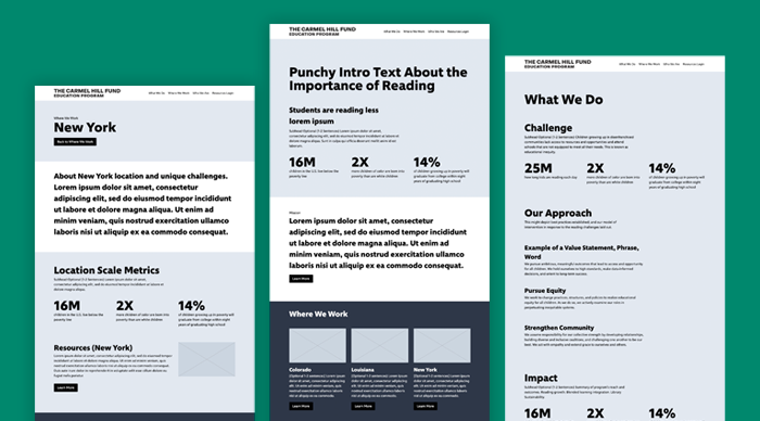
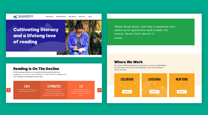
Like many nonprofit websites, Carmel Hill’s needed content strategy and information architecture to better articulate their mission, explain their programs, and demonstrate results. Because of their work in different states, it also needed to support the independent work in Colorado, Louisiana, and New York much better.
We first designed the user experience to make sure that the nonprofit’s website design was structured to both tell its brand story and educate audiences on the issues. Content strategy places Carmel Hill’s work in the context of both national and state-specific literacy trends. And to support teachers in each state, a private resource hub makes Carmel Hill’s proprietary implementation tools easily accessible to educators with their public school partners
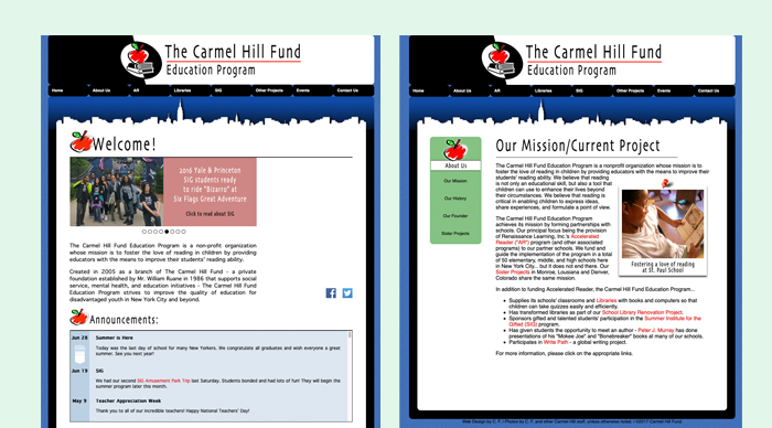
Creating a Colorful and Structured Education Nonprofit Website Design That Tells a Story.
Educators in public schools can sometimes feel overwhelmed, so Carmel Hill wanted their website to feel open and empowering. We strategically used the brand’s bold typography and vibrant colors to create an uplifting experience that creates confidence. Color supports specific content, with yellow for locations; blues to indicate positive trends, red for negative trends, and green for resources, quotes, and stories. And carefully selected, representative images reflect the classroom experience and embody Carmel Hill’s mission to advance education equity and child literacy.
At its core, Carmel Hill’s website is a storytelling platform—one that shares who they are and elevates the stories of the educators and children they exist to serve. Carmel Hill’s social impact strategy and state-based programs are detailed, with success stories celebrated throughout. And central to Carmel Hill’s vision is the life of their founder, Bill Ruane, providing an origin story that adds vital history to the organization they are today.
Empowering Educators to be Local Leaders
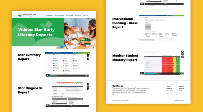
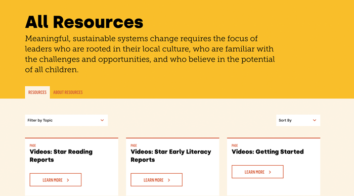
Critical to Carmel Hill’s work is providing professional development and program implementation support for its proprietary tools and technology. We created a private workspace for educators to access geographically-tailored resources and training videos—putting the tools they need to successfully implement Carmel Hill’s child literacy programs and make a dramatic difference in the lives of their students.
Learn More About Our Work
Get an up-close and detailed look at this project in our visual case study or explore Constructive’s branding and design for education nonprofits.
The National Head Start Association (NHSA) s an iconic education nonprofit and tireless advocate for education equity. Established as part of The Great Society, NHSA is the leading voice for the Head Start community, supporting hundreds of schools, a membership of thousands, and countless families across America. They are a vital force in improving teaching practice and education policy that increase education equity. After developing a new strategic plan that re-organized its practice areas, NHSA needed a design firm with expertise in branding and website design for education nonprofits to design a new way forward for their brand.

An Education Nonprofit Brand Stuck in the Past
Rebranding an iconic organization like NHSA is a big responsibility. It’s also an exciting challenge, and our team saw a lot of opportunity to transform the nonprofit’s image with a more effective brand strategy and brand architecture. The education nonprofit’s branding made NHSA look dated—much more like a 20th-century laggard than a progressive leader for education quality, and education equity in the 21st century. As a result, NHSA’s leadership and credibility to solve the education challenges facing families today were being undermined.
Online, the situation wasn’t any better. Websites for nonprofit associations and member-driven nonprofits have a bigger responsibility than those of most other nonprofits. That’s because the value of membership to the community—and so, the brand’s value itself—is heavily based on the quality of the experiences nonprofit association websites create for members. In the case of NHSA, they were stuck with a cluttered, decade-old website that violated best practices in content-heavy website design and was built on a clunky CMS with poor Salesforce integration.
Education Nonprofit Branding That Changes Perceptions
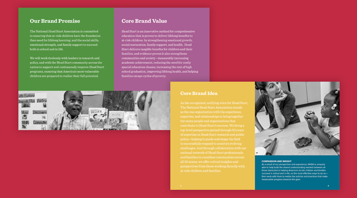
The NHSA’s history gave their brand strengths and some weaknesses. Their pioneering legacy of improving education equity was unquestioned. But after 50 years, NHSA was challenged to be seen as a modern innovator among other k-12 education nonprofits. We set out to develop a unified brand message and identity for NHSA that would retain and amplify the nonprofit’s history of innovation that made it a respected leader, while reinventing the brand to spoke to education in the 21st century education.
We started with brand strategy, partnering with NHSA’s leadership in workshops to explore their history, mission, and values—and then place their new strategic plan within this important context. Framing research on K-12 education complemented this strategy by re-centering everyone on the intersectionality of education equity and social justice—and in doing so, provided the relevant issue we needed to connect with NHSA’s legacy.
When it came to designing a new branding for the education nonprofit, our priority was the same—retain what makes NHSA’s brand part of the American landscape while updating it for a new era. We refreshed NHSA’s iconic logo with a more streamlined, contemporary design, more sophisticated colors, and a new brand typeface—retaining the nonprofit’s substantial brand equity while positioning them to lead the future of education equity.
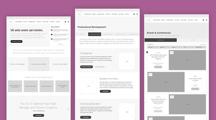
UX Design for a More Valuable Nonprofit Association Website
NHSA’s website was seven years old and, not surprisingly, was difficult to navigate, filled with confusing content, and made it painful for people to find what they were looking for. With many of these people being members of the National Head Start Association, this meant that the nonprofit’s website was failing to serve the people that it is most responsible to.
By leveraging our brand strategy in our UX design, our digital team and NHSA’s had clear alignment on who the nonprofit’s audiences were and what was most important to them. We audited the nonprofit’s website to catalog content and assessing it for quality. Then, we conducted user research and testing to understand how well community features were working for the association’s members.
With our UX research done, we then designed integrated information architecture and content strategy that both NHSA’s brand story, makes it easy to explore their different areas of work, and makes sure that members and non-members have easy access to content and resources.
A New Website Designed to Honor the National Leader in Education Equity
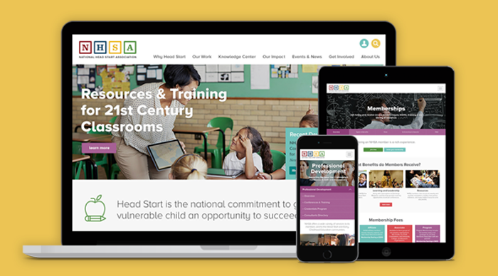
It was finally time to turn our brand strategy, visual branding, and user experience design into a vibrant nonprofit association website that would create a true sense of community. The NHSA’s new website is designed with a colorful vibrancy that embodies the endless potential in every child with a smart, clean, and structured design system that that reinforces NHSA’s evidence-based, results-driven focus.
The NHSA’s new color palette hints at classic education colors, but gives them a new look that feels more in line with contemporary education brands. photography places a central role—celebrating the educators that NHSA represents and bringing the work of their community to life online.
Most important, because NHSA is a nonprofit member association, their new website needed to not only support teachers in its network, it also had to invite in new educators. We created membership pages that represent NHSA’s diverse community and elevate membership benefits to grow the network.
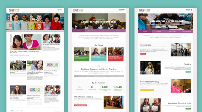
A Nonprofit Association Website Experience that Delivers Greater Value to Members
For NHSA, their website represents much more than a marketing presence. It’s also the central destination for thousands of NHSA members across the nation. NHSA members turn to the nonprofit association website not just for information, but also to interact with association, register for important events, get professional development resources, and access other member benefits.
To make sure that NHSA’s website created great experiences for their members, our web engineers architected a Drupal CMS that’s integrated with Salesforce. The integrated system makes it easy for NHSA’s national membership to access their website with single sign-on. Customizable profiles allow members to keep their information current and access information that they previously had to contact NHSA directly to get. And custom publishing workflows make website management easy for NHSA’s staff, increasing efficiency while they keep their website current.
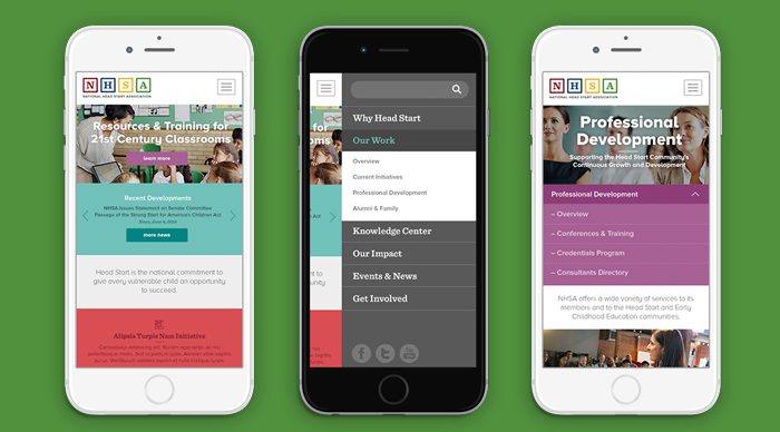
A Responsive Nonprofit Website, Designed for People on the Go.
To make sure that NHSA members, educators, and parents are well-supported however they visit the education nonprofit’s new website, we paid extra attention to responsive design best practices to deliver a great mobile experience. Teachers, school leaders, and families on the go are better served by a more accessible, more inclusive website that’s customized for mobile screens.
The resulting nonprofit website design gives users full access to NHSA’s content, events, and more so that educators, families, and NHSA work together more effectively to make a difference in the lives of children across America.
Learn More About Our Work
Get an up-close and detailed look at this project in our visual case study or explore Constructive’s branding and design for education nonprofits.
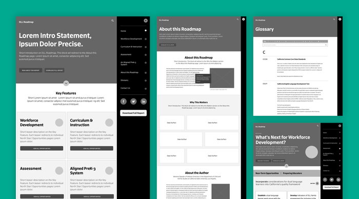
While dual-language learners are a large and growing part of California’s young student population, tests and state assessments reveal that dual-language children are at a greater disadvantage in the state’s education system. Seeking to understand why, Heising-Simons Foundation developed a groundbreaking education advocacy framework and toolkit to increase education equity for dual-language learners. Once the nonprofit’s research was ready, Heising-Simons asked Constructive to design a print and nonprofit digital report design with an interactive toolkit to help educators could put their work into practice.
Together, we created California’s Gold— a groundbreaking digital education equity toolkit for educators that uncovers the issues driving education inequities in California and provides a novel framework of solutions to help it and other states both learn from and overcome them.
Starting with Brand Identity Design
California’s Gold was a nonprofit research report that would stand alone as its own brand, separate from the philanthropy that funded it. And while it’s a serious report and an important framework for maximizing the opportunities of dual-language learners, California’s Gold also needed to capture the spirit of the children who it helps make a difference for.
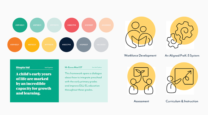
So, we started our process by designing strong branding for the advocacy framework that would feel at home in the K-12 nonprofit education equity space and also resonate with educators and policymakers that it needed to engage. Our visual identity for California’s Gold combines colors that express the optimistic exuberance of young learners, includes custom illustrations that add rhythm and personality, and uses a structured design system that reinforces the framework’s evidence-based approach.
Designing a Nonprofit Research Report That Keeps Audiences Engaged
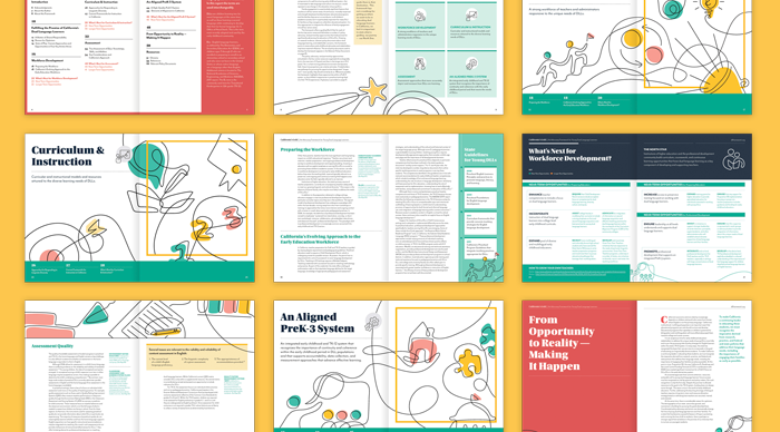
Since we were designing both a print and digital nonprofit report for California’s Gold, we decided to start with the print version. Like most nonprofit research reports, California’s Gold is content-heavy and filled with expert content. Our challenge was to balance designing a report that had the vitality and optimism that Heising-Simons wanted while making sure that the research itself was presented as rigorous and credible.
Our design strategy prioritizes best practices for Print and PDF report publishing—establishing an strong structure, yusing editorial design techniques to maintain an active reading rhythm, and making sure that typography maximized legibility. The resulting nonprofit research report design system is built with grid system that structures information and provides space for call-outs and key takeaways. Bold headlines attracting attention and elevate key themes, while the supporting typography creates a clear information hierarchy that makes content scannable. And the brand’s vibrant colors and illustrations complement the research to establish a strong brand identity for California’s Gold.
Designing Toolkit Tearsheets That Make Research Actionable
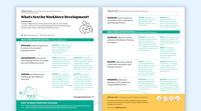
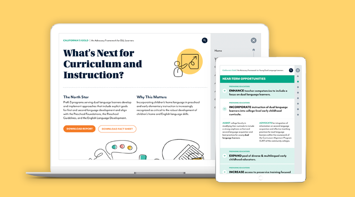
California’s Gold is an education advocacy toolkit designed with four key action areas. To complement the depth of detail for each area that’s covered fully in the report itself, we worked with Heising-Simons’ team to design complementary “Toolkit Tearsheets” for each action area.
Each tearsheet is designed for accessibility to make it easier to put the education framework into action—quickly delivering key information with sequenced information and data visualizations that quantify important information to give teachers, policymakers, community members, and activists the information they need.
Building the Blueprint for a Digital Nonprofit Report and Advocacy Toolkit
While Heising-Simons Foundation’s communications strategy for California’s Gold lead with a print report that would be distributed to policymakers and education sector experts, they also knew that digital report design was an important part of engaging a wider audience. We started the digital strategy process by focusing on best practices for digital research reports that would create a rich and useful experience for people reading California’s Gold.
Our UX design team then translated the linear print report experience into a dynamic digital report that empowers audiences to explore the nonprofit’s research through different pathways. The result makes it easy for education experts to explore the research content, learn about California’s Gold‘s education advocacy framework, and use the toolkit resources to put the ideas into action.
A Nonprofit Digital Report Website Design That Stands Out
To make sure we designed a cohesive brand experience for audiences on any platform, visual design for the digital version of our nonprofit research report stayed closely aligned with the print version. Where we made the digital report design experience stand out was through animation and interactive elements and animations that bring the information to life.
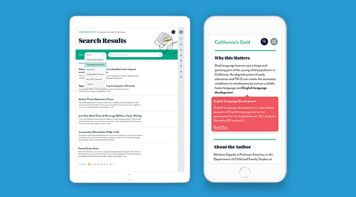
The advocacy toolkit is designed to deliver a great experience on desktop and mobile, with responsive design prioritizing legibility on small screens. And to increase usability, we added way-finding navigation that makes it easy for audiences to know where they are within the larger research report on any page. Website animations add a bit of delight, embody the optimism of California’s Gold and capture audiences’ attention by bringing the report’s illustrations to life online.
Increasing Accessibility for Expert and Non-Expert Audiencees
Nonprofit research reports like California’s Gold that address complex social issues are notorious for being dense and filled with jargon and acronyms that can alienate readers. But when the research is specialized and academic in nature, that jargon is important.
To make California Gold’s jargon-heavy content more accessible to a wider audience—and as a result, increase the reach and impact of the education advocacy framework—we added an interactive glossary that explains unfamiliar terms as people are reading. And to satisfy issue area experts who expect rigor and a proper method when evaluating research, we added on-hover footnotes that cite and link to the source material in California’s Gold.
Learn More About Our Work
Get an up-close and detailed look at this project in our visual case study or explore Constructive’s branding and design for education nonprofits.


