


It’s been a few years since our last deep dive into the best data visualization tools for nonprofits to communicate their impact. A lot has changed. The responsive design revolution that’s swept the internet has become standard fare. It used to be hard to find a charting tool that scaled its charts to fit the screen size. Today, it’s rare to find one that doesn’t. Features that could make a tool stand out like animation and advanced styling are par for the course today.
But with all that’s changed, some things have stayed the same. A few years ago, we wrote, “Wow, D3.js is cool!” And that’s still true today. If anything, it’s gotten even cooler as users have contributed more and more example visualizations. Unfortunately, D3’s learning curve hasn’t changed either. We also said, “You’ve got to be an accomplished Javascript, JSON, and math person to get D3 to jump through hoops,” and that’s still the case today.
While D3 itself hasn’t gotten any easier, a new crop of libraries have appeared that are built on D3 but provide an easy entry for people who want to leverage its power without getting caught on its learning curve. In this article, I will explore three of these libraries: dimple, Plotly, and D3Plus.
dimple
The dimple website doesn’t explain the origin of its name, but after spending some some time with the library, I suspect that it’s a portmanteau of “D3” and “simple.” Using dimple, you can pull data from a json feed and turn it into a chart in just 11 lines of code.
dimple provides some nice features by default: tooltips that appear when you mouse over the chart and intelligent rendering of bar labels—if there isn’t enough room to display them horizontally, it will automatically display them vertically. But there’s also a fair amount of DIY involved. You have to tell it to leave enough room for the labels by specifying margins, and if you want colors besides Boring Blue, you have to specify them yourself.
But what dimple lacks in polish, it makes up for with its ability to produce charts that can communicate complex data relationships with a minimum of effort.
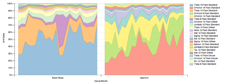
- Visualization Types Supported: Pie Charts, Bar Charts, Line Charts, Area Charts, Scatter Charts, Bubble Charts, Ring Charts, Step Charts, in any combination
- Data Input Sources: JSON, CSV, TSV (tab separated values).
- Data Output: HTML, SVG
Pros
Ease of Use
dimple makes it easy to create charts from json data retrieved from APIs, CSV files and TSV (tab separated variable) data. It automatically creates configurable tooltips, and it’s easy to add common features like legends. Styling can be added the D3 way, by adding colors, borders, etc to elements, but you can also add classes to elements and style them with CSS.
Extensibility
dimple exposes its elements as D3 objects, so anyone who wants to dive into D3 can modify them as they like.
Animation
dimple boasts ‘storyboards,’ which make it easy to animate a chart over some series, usually time. And while additional coding is needed to add user-friendly controls, the animation itself can be implemented in just a few lines of code.
Cons
Default Styling
dimple lacks some of the out-of-the-box polish of other data viz libraries. Legends, behaviors, and stylish tooltips are all easily available, but you’ll have to add them yourself. You can see an animation example and play around with a simple dimple chart.
Plotly
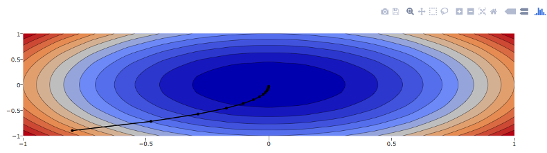
If dimple is too bare-bones for your taste, Plotly may be a good alternative, combining D3 with stack.gl for an extra shot of 3-d goodness. Plotly is an online charting platform with paid and free tiers, and it boasts all the slickness and bells and whistles you’d expect from a commercial product. Plotly’s online platform makes it easy for anyone to turn spreadsheet data into a slick graph, and in November of 2015, they open-sourced their javascript core. If you want to add some nice charts directly to your website and don’t mind getting your hands dirty with some coding, the free and open-source plotly.js might be right for you.
- Visualization Types Supported: Pie Charts, Bar Charts, Line Charts, Area Charts, Scatter Charts, Bubble Charts, Error Bars, Box Plots, Wind Rose Charts, Heatmaps, Bubble Maps, Choropleth Maps, 3D Scatter Plots, Ribbon Plots, the list goes on and on.
- Data Input Sources: As with other javascript libraries, any data can be added to the graph structure, but data bundles aren’t imported automatically.
- Data Output: HTML, SVG, WebGL (for 3d)
Pros
Interactive Goodness
Every chart you build with Plotly includes a raft of interactive features. Users can zoom and pan the chart, choose which data to display through its clickable legends, and even save the chart as a png image.
A Multitude of Visualization Types
I would have listed everything Plotly offered in the “Visualization Types Supported” section, but my fingers were getting tired. Suffice it to say, if you can think of a chart or map type, chances are, Plotly’s got it.
Maps
Plotly’s got maps! And with the geodata included in plotly.js, you don’t even have to create map yourself. Just choose your continent (or the whole world), the projection you want to display, and then attach your data. You can use lat-long to pick a specific point or ISO A-3 codes to target entire countries. As with charts, users can zoom and pan maps and download them as png.
Cons
Resource Heavy
All that interactive goodness doesn’t come for free. In my experience, Plotly charts make more of a demand on system resources than other libraries. In most cases, it’s worth it for the improved user experience, but if you plan to put a lot of charts and maps on a single page, or you’re targeting a user base with less than powerful hardware, you may want to consider something else.
You can play around with a simple Plotly chart here.
D3Plus
Like D3, D3plus doesn’t restrict itself to charts and maps. It has many additional features and utilities like SVG text wrapping that makes it easy to format text to fit into a rectangle or circles, svg forms, and legible colors that adjust text colors so that they’ll still be readable against the selected background.
But don’t let the similarity to D3 fool you. It’s easy to get up and charting. D3plus offers simple settings to let you create attractive visualizations with a minimum of effort. Like dimple, makes it easy to create charts from a variety of sources. Setting values is as easy as assigning field names to an axis or color.
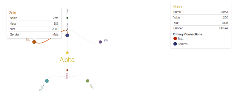
- Visualization Types Supported: Pie Charts, Bar Charts, Line Charts, Bubble Charts, Network Charts, Ring Charts, Scatter Charts, Sankey Diagrams, Tree Maps, Boxes, Paths, and Tables
- Data Input Sources: JSON, CSV, TSV (tab separated values).
- Data Output: HTML, SVG
Pros
Intelligent Rendering
All of the charts we’ve looked at try to keep themselves legible at different sizes, but D3plus goes that extra mile. It fits itself automatically to the height as well as the width it’s given and makes sure the axis tick labels never overrun each other. It makes good use of that color utility I mentioned above, by adjusting the brightness of its tooltip and legend text so that it always remains readable.
Colors, Colors, Colors
The default color pallette is rainbow bright, but if that doesn’t fit your style, it’s easy to override it with your own palette. But D3plus is more than just a pretty face. You can set the colors to vary based any field in your data set.
For example, you could create a bar chart from the following data, displaying the 2014 population for each city.
| City | State | 1980 Population | 2014 Population |
|---|---|---|---|
| Abilene | TX | 98315 | 120958 |
| Allentown | PA | 103758 | 119104 |
| Amarillo | TX | 149230 | 197254 |
| Anaheim | CA | 219494 | 346997 |
| Burbank | CA | 84625 | 105368 |
By default each bar (city) would have its own color. But you could set color to “State”, and all cities in the same state would have the same color. Or you could set the color to “1980 Population”, and the legend would become a choropleth with each bar shaded according to its 1980 Population.
Loads of Goodies
D3plus doesn’t have as many types of charts as other libraries, but it includes some that it might be hard to find elsewhere, such as network and ring charts and Sankey diagrams to visualize connections. It also offers a CSV function that makes it easy to add a “Download as CSV” button, and a ‘timeline’ for animating your chart over time.
Cons
Making Numbers Numbers
JSON wraps content, including numbers, in quotes. Most data-viz libraries have no problems with this, but D3plus requires you to “coerce” these number strings into real numbers before you feed them into the chart. This only takes a few lines of code, but it’s kind of annoying. You can play around with a simple D3plus chart here.
