


Data is an essential part of how nonprofits communicate the impact of a program, grant or donation, or campaign. At the most basic level, data visualization and information design aim at making data and concepts quickly intelligible by creating visual relationships. But data can do much more: it can strengthen an organization’s story and message, make a solid case for its work, and be a powerful tool for strengthening audience engagement. At its best, information visualization does much more than communicate something quantitative; it surprises and delights, creating something audiences actively seek out and share.
As with any design challenge, when you’re considering the tone and approach for data visualization and information design, it’s always a good idea to view it from your audience’s perspective. Effectiveness hinges on how meaningfully your message resonates. When it comes to visualizations, this means appreciating your audience’s comfort level and interest in things like the hard numbers and complex processes. For example, if your audience loves what you stand for, but isn’t inclined to dig too deeply into facts and figures, you’ve just wasted space and missed an opportunity to persuade them.
When approaching design projects for our non-profit clients that include visualizations, we consider three key factors that may help you select an approach to information graphics and data visualizations that’s right for you and your audience.
1. What’s the goal, and what would you like your audiences to do or think?
Are you trying to persuade someone to donate on your site? Are you trying to impress a foundation grants manager with your track record? Think about the kind of data that might tilt your audience to your side. All a prospective donor may want to see is a single, inspiring statistic that suggests to her what her dollars can accomplish. If so, offer a simple visualization and make sure she doesn’t miss it. A foundation grants manager, however, may expect comprehensive data about impact over time.
Sometimes you might strike a balance between the two. In a website for Columbia University’s Office of Alumni & Development, we present six strong, yet simple points about donor impact—each a testament and promise of what more donations can do. No complex visualizations or comprehensive data needed, but enough information to tell a complete story without distracting them from the goal of persuading audiences to become a donor.
2. What are your audience’s wants and needs, and what would they find useful or memorable?
Audiences are more likely to remember and share data they find interesting and useful. Numbers can often be a bit dry, and if you’re trying to explain a complex process that’s vital to the mission, spelling it all out in agonizing detail probably isn’t a great idea. So find an interesting angle to your data—the aspect that audiences always wanted to know but never thought to ask.
Although people may not be familiar with the World Cocoa Foundation (WCF), many love chocolate and have some interest in how it’s produced. In redesigning the WCF’s website, we created a process diagram that walks visitors step by step through the different stages of chocolate-making with images, illustrations, and mouse-over areas that reveal even more information about the process. The end result creates a visual shorthand for explaining the entire cocoa value chain, while bringing audiences closer to the critical issues and people involved in bringing chocolate from farm to table.
3. What level of complexity can your audience handle?
If you’re trying to educate an audience about a complex issue, perhaps with serious policy implications, consider your audience’s level of familiarity with your subject. This will dictate not just how comfortable they feel with the data and concepts, but also how much of an incentive they have to want to know more. While designing data visualizations for casual audiences might take a more simplified approach, if you’re trying to persuade policy wonks or economic experts, a deep dive might be just what the doctor ordered.
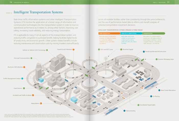
For Securing America’s Future Energy (SAFE)’s 2012 Congestion Report, we created a concept diagram that takes the complex, myriad existing technologies that would need to be applied to the transportation system in order to reduce congestion and energy consumption. Created for an audience of policy makers and technology experts in the smart-grid and clean-tech industries, the visualization delivers the depth of interaction between numerous different technologies, quickly painting a picture that’s comprehensive, detailed, and helps SAFE’s audience envision what the future of transportation can be if they support the non-profit’s initiatives.
While there’s a lot more that goes into designing effective dataviz, adopting an audience-centric approach is a great first step in creating visualizations that are appropriate, useful, delightful, and persuasive—that harness the persuasive power of data and information visualization to make your case. Information design is, after all, a form of communication, persuasion, and marketing.
