It takes great focus and clarity for brands to rise above the din of the crowd and be heard in today’s information-saturated world. And for nonprofit brands, the challenge is even greater. Because when the message is about a better future, possibly somewhere far away, mission-driven brands have an extra challenge that for-profit brands usually don’t—creating urgency to act on issues that may seem far removed from our lives. The issues can be complex and difficult to understand or embrace. And when the size of the lift seems so big, nonprofits need to use communications effectively to demonstrate tangible progress and results if they are to sustain our engagement.
Fortunately, new thinking in nonprofit brand experience in recent years offers both the insights and motivation needed to take on these intertwined challenges. The continued growth of digital communications, the maturation of the design field as an essential problem-solving discipline, and a recent awakening within many nonprofits about the value of their brand have combined to provide new opportunities to increase the effectiveness of the nonprofit sector. The challenge, then is to understand the environment in which social change brands exist and apply this understanding to help us design nonprofit brand experiences that deliver greater value and maximize impact.
The Rise of Brand in the Nonprofit Sector
It’s no secret that over the years, brand has had a bit of a tortured existence in the nonprofit sector. However, more nonprofits are getting past their brand skepticism (if not outright resistance), and have thankfully been re-examining their relationship with “The B-word.” By making smart adaptations to traditional business-centric brand principles, organizations such as The Harvard Kennedy School of Government, Stanford Social Innovation Review, and The Communications Network have contributed to help evolve the role of brand within nonprofits; developing a mission-driven, participatory framework more in keeping with the sector’s values.
This new way of thinking, articulated in Nathalie Laider-Kylander’s and Julia Shephard Stenzel’s landmark book, The Brand IDEA: Managing Nonprofit Brands with Integrity, Democracy, and Affinity, is perhaps summarized best in its introduction by Christopher Stone, President of Open Society Foundations: “A brand is a powerful expression of an organization’s mission and values, that can help engineer collaborations and partnerships that will better enable it to fulfill its mission and deepen impact, and it’s a strategic asset essential to the success of the organization itself.”
Understood this way, a nonprofit’s brand offers the potential for far more than just good messages and visuals. It’s the DNA of a social change organization’s ideas, expertise, relationships, resources, and experiences, and guides organizational culture by bringing people together around a shared vision to make it easier to create shared value.
If we accept this idea—and we should—then we must also consider how social change organizations can most effectively translate brand nuance and complexity into something more tangible. How can we create experiences that make it easier and more enticing for people to participate in creating this shared value? And more important, how can we make sure that our solutions continuously maintain the integrity of our brand and deliver meaningful experiences that sustain audience engagement?
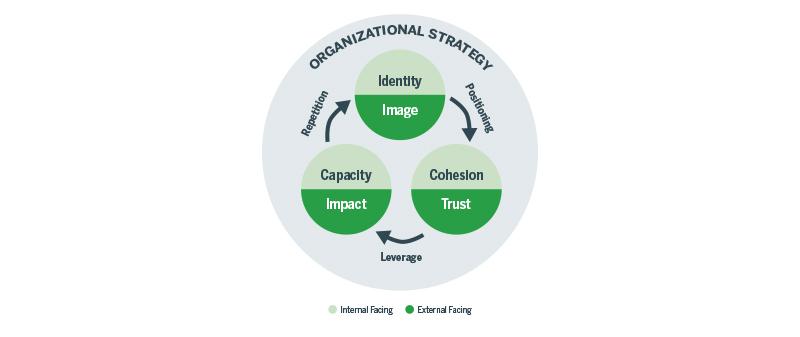
Translating Organizational Strategy
It can be daunting to fully understand what some nonprofits do—not just for the outside world, but sometimes even for those who work inside them! Countless activities and moving parts all work together to advance a mission. But how do they relate to one another, and to what ends? Brand strategy has long been a useful tool for helping organizations increase clarity and focus to help an organization better understand itself and its audience. Done right, it provides an important foundation for expressing mission, vision, values, and key messages with greater consistency.
For social change organizations, many of whom take on complex, systemic challenges where progress may be more difficult to see, brand strategy has an even bigger role to play. It must also connect people more deeply to how change actually happens. It must help social change brands educate us on the nature of the challenges, detail the different roles they play in addressing them, and explain how we can work together and what to expect along the way. This calls for a brand narrative that creates a strong through-line from mission success all the way through to engagement.
The benefits of a process that creates a clear brand strategy to articulate a narrative this nuanced are profound when it comes to organizational strategy. The risk is that months of discovery and self-analysis produce useful strategy that sits on a shelf and is not properly integrated into an organization so that it is felt at every level of experience people have with the brand.
So how do brands make these abstract concepts and processes more tangible, meaningful and valuable? Well, as branding expert Marty Neuimeir says, this means “you gotta design.”
Design, Value, and Meaning
Think about how much of our existence is built on design. There’s a reason humans live in such a thoroughly designed world—we’re highly visual creatures and design is how we make sense of it! Countless designed experiences every day, many of which we are barely aware of, create context and connect with our emotions, greatly affecting our perception of value, and therefore meaning. And design—both its process and its outcomes—is all about relationships and context.
Brands themselves are one of these designed constructs. Dating as far back as our use of heraldry to self-identify with a tribe or clan, brands are powerful concepts that help give greater meaning to our lives. In many ways, they encapsulate what we value, and conversely, what we do not value. And as the design discipline is all about working in context, for modern brands to design experiences that connect with these deeper feelings of value and meaning, the people who contribute to designing them must first understand the many contexts in which the brand exists.
An effective design process accomplishes this by making makes sure that the outcomes of our collective efforts are aligned with what we believe will effectively engage people to help them realize the value they seek. But what kind of value exactly are we referring to? Modern brand theory organizes brand value in three categories, which every brand has its own mix of depending on the type of brand it is:
Tangible value is the easiest to understand: Things we can see, touch, or empirically quantify such as how a brand works and its measurable results,
Intangible value is of course, less tangible: How a brand makes us feel or what meaning it adds to our lives, and
Aspirational value is the most abstract: Projections of who we hope to become or what we’d like to make possible as a result of our relationship with a brand.
As the theory goes, the more tangible a brand’s value, the more easily it can be understood. Conversely, the more intangible the value, the less easy it is to define and the more outside of a brand’s control it is. For social change brands, who often deal in large amounts of intangible and aspirational value, the challenge then is to use the power of design to consistently deliver value on all fronts and create tangible experiences that deepen our engagement to their missions.
Designing Better Brand Experiences
Design has often been described as “strategy made visible.” It’s what helps makes the value in an organization’s brand able to be experienced—online, in print, and in person. As brands are not static things, these experiences occur across time, which means that to consistently deliver value across the lifetime of a person’s relationship with the brand requires, we must fully understand where, how, and why value is created—as well as the context in which experiences happen between the audience and the brand, physically and conceptually.
Which is exactly where a well-articulated brand strategy provides enormous benefits.
For social change organizations to consistently design experiences that bridge the gap between mission and motivation, a well-articulated strategy is not just an ideal starting point to think about brand, it is also an essential through-line of the design process. This is because since design is a highly collaborative, co-created process, brand strategy greatly improves the ability of designers and non-designers to more effectively frame challenges, opportunities, and projects. By translating organizational strategy into a clearly articulated positioning and messaging framework, brand strategy helps stakeholders make better decisions to advance the strategy throughout the design process and more objectively evaluate its outcomes.
Nowhere is this more apparent than in the world of digital communications, where the entirety of people’s interactions with a brand occurs through a screen. To create these experiences, cross-functional teams of content strategists, user experience designers, visual designers, content creators, and technologists must all work together to translate a brand’s value through things like content taxonomies, interfaces, and system architecture. By designing through a clearly-defined brand strategy that articulates the kinds of experiences we’re trying to create, people with different perspectives are more able to have productive conversations in a shared language about what such an experience might be like. We’re also likely to be more collaborative in applying our collective experience, expertise, and opinions to create it, resulting in a better working relationship and better outcomes.
Putting Theory into Practice
Ultimately, every organization engaged in helping to bring about social, economic, and environmental change has its own combination of beliefs, culture, methods, and more. And each of these unique brands stands for something bigger than itself; something which has different meaning and value depending on who’s receiving it.
When the brand strategy and design processes are united, they provide a powerful lens through which to understand the complexity and nuance of these dynamics and articulate them with greater clarity, meaning, and empathy. Together, they help a social change organization better understand itself so that its efforts are more focused and aligned; then more effectively apply design’s ability to translate ideas, concepts, and value into tangible experiences so that when audiences engage with their brand, it stands up, stands out, and stands for something.
For designers, presenting lots of content clearly on a webpage can be challenging. In many situations, it’s simply impossible, since no one wants to scroll forever. People want a way to quickly find the information they are looking for, without too much stress. However, often without realizing it, digital users form very strong expectations of how website tools will and won’t act. These expectations, along with their own needs and preferences, are called mental models. Designers can tap into these mental models to create usable, functional search interfaces that feel “natural” to their users.
A Few Design Scenarios
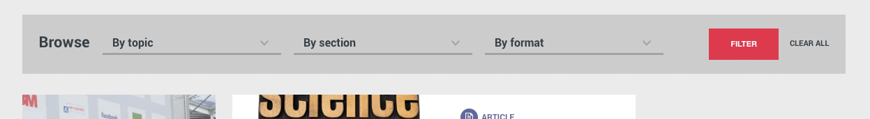
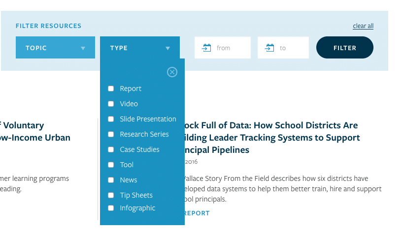
As designers and content specialists, our job is to make sure the resources and content we offer work seamlessly with our users’ expectations. Here are a few different situations that can benefit from a well-considered approach to faceted navigation and filtering:
You have lots of packaged data to present: this can be in the form of executive summaries, interactive datasets, or longer pages of published research.
You have lots of constantly updated features: content feeds are a powerful reason to have faceted navigation, as readers have different topic, date, and browsing preferences.
You want to provide a path to action: for many nonprofits, options like downloading reports or booking training sessions are examples of content that requires action.
Though they are all scenarios requiring faceted navigation, each of these calls on a slightly different mental model. Let’s look at how to break the scenarios down and design a faceted navigation that works for each one.
Define Appropriate Mental Models
There are 3 key design patterns we can design around: searching, filtering or sorting. Each matches a specific mental model that web users have created around the process of finding things, so we need to be careful to design interfaces with animations and functions that fit those models.
Let’s look at them in a bit more detail.
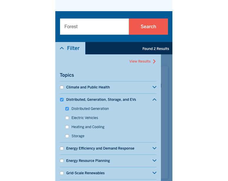
Searching is when users want to find the options that match their own defined keywords. Imagine a user saying to the website “OK, out of everything you have, show me only the widgets named Forest.”
Filtering is when users make choices that reduce the number of items available to them. Imagine a user saying to the website – “OK- out of everything you have, show me only the green widgets.
Sorting is when users choose the order of the items available on the website. Here, imagine a user saying to the website – “Ok, out of everything you have, show me all the widgets from newest to oldest.”

With these concepts in mind, we can start to extend the 3 mental models to encompass all the actions our users will take while looking for content on our site.
Design the Navigation around the Mental Model
We want the interface to feel natural and responsive to our users. A great way of doing that is to design it around a spoken statement or command from the user. Here’s an example, containing all the statements we need – “OK. I want to download a climate and environment report for my next office meeting. Show me only the reports with the word Forest in them. Now, put the newest published ones on top.” That is a clearly stated mental model that describes, verbally, what your audience expects from an search/filter interface. As with any web interaction, remember to be “be forgiving to mistakes” and allow for things like plurals, alternate spellings, and the general messiness of natural language.
Matching an interface to mental models also has a physical dimension. It should always be put where the audience expects to see it. It is rare for faceted navigation to go in the bottom-right of a page, just as it is uncommon for a search bar to go in the bottom left of a page. After decades of these patterns being used online, a clear design consensus has emerged. To think even more broadly, a mental model of the internet itself is steadily emerging, an idea I think is fascinating. Designers should absolutely use that to our advantage. If this is how our audience views the web, we can design with that in mind.
If we go with a horizontal faceted navigation, it’s a bit easier to make it feel like a natural sentence or mental model. Also called filter bars, they often resemble a pattern users are familiar with from desktop programs like MS Office and mobile apps like Instagram.
Conclusion
The need for clear and logical options for sorting, searching, and filtering content is a common issue for knowledge-driven organizations. They produce a lot of material with the intention of it being found and consumed, but often audiences struggle to find what they are looking for on content-heavy websites. This is where designers can make a real difference and logical mental models come in handy. After defining them, we can design user interfaces that support, rather than hinder, them. Of course, I recommend starting every project like this with usability testing and research, but I hope this is a solid start.
In my former life (B.C., or “Before Constructive”), I ran a nonprofit in New Zealand that raised awareness and funds for cancer research. Like a lot of nonprofit leaders, I wore many hats and had a wide scope of responsibilities, including the organization’s communication strategy and a major overhaul of our website. I found the latter experience both fascinating and terrifying — and, believe me, the learning curve was steep. Despite my initial trepidation, however, I was gradually bewitched by the process — and the meeting of minds that was our partnership with the agency we eventually selected. It was magic: our mission and vision, their creativity and expertise, all of it leading to something that looked great and truly had the power to change lives.
On returning to the U.S., I made the leap to a brand strategy and design firm with the intention of participating in and experiencing that magic on a more frequent basis. These days, I’m often the first point of contact between Constructive and social sector organizations that reach out to us for assistance. I get to chat with many people like my former colleagues about their challenges and how we can help them better advance their missions.
With half a year under my belt here, I often find myself wishing I could do more to share the agency viewpoint with all the fantastic social change organizations out there. I daydream about time-traveling to tell my past self how to find an agency partner that would not only do a great job on my project, but also bring a perspective to the work that I didn’t know was missing and add value I didn’t know existed.
So, if you’re beginning a search for a branding or digital agency and are struggling to develop an effective RFP, here’s a little helpful guidance (I hope) from a former nonprofit leader who’s moved to the agency world and is deepening her understanding of both sides of the nonprofit-agency equation.
1. Clarify your Goals (But Don’t Be Prescriptive)
If you’re issuing an RFP for a website redesign or rebranding project, you’re already familiar with the pain points that brought you to this stage. Of course, the first thing you’ll want to do is to clarify the likely challenges and strategic goals for the project. But don’t get carried away!
As someone responsible for selecting a partner for an important project, it’s tempting to create an RFP that includes everything you might need in painstaking detail. If nothing else, you may tell yourself, it will make it easier to evaluate the proposals you receive in response to the RFP. But there’s a fine line between articulating your goals for a design/rebranding project and being prescriptive about how you expect to achieve those goals. And time you and your colleagues spend “designing” your ideal solution now is likely to be time, as the process unfolds, that’s not well spent.
According to business development expert Blair Enns, the vast amount of information easily accessible on the Internet has led to a dramatic rise in the number of organizations that approach agencies, of all kinds, with entrenched ideas about the solutions needed to solve their problems. And that often leads to unfortunate consequences. You don’t have to be a genius to appreciate Einstein’s observation that “it’s unlikely that [a] problem will be solved from within the context it was created.” While proactivity in a client is something every agency welcomes, it can be a problem when experts in a domain are not allowed to exercise that expertise. A good partner will be equally effective in combining the expertise of the client with its own unique expertise to create something greater than either could achieve on their own. And if there’s one thing agencies bring to the table that clients are unlikely to develop on their own, it’s an “outside” perspective and new thinking.
So, if you’re issuing an RFP, yes, absolutely, make sure you know what your goals for the engagement are. But before you spend valuable time adding painstaking detail to your RFP, remember that you want to leave room for good ideas that aren’t necessarily your own to flourish. Then go find a partner who is willing to ask challenging questions and can help shape, not simply implement your vision.
2. Know (and Be Willing to Share) your Budget
Many social change organizations are hesitant to share their budget with potential design or branding partners. Believe me, I get it — I didn’t share my budget with firms that were looking to do business with us, and, at the time, I “had my reasons.” Despite the due diligence we had done, I wasn’t confident about what a design project “should” cost and was looking to firms to put a price on it. And, yes, I was also afraid that agencies in the hunt for our business would try to pull the wool over my eyes and raise their price to match the budget we had shared with them. But now that I’m on the other side, I see things differently.
Trying to estimate what your project “should” cost is time well-spent. Do you need a basic brochure website that can be built on SquareSpace, or do you have ambitious goals that require the skills of a partner with serious technical chops? How heavy is the lift? Unless you have carte blanche from your board and bottomless funds, establishing realistic budget expectations for a project is essential. And once those expectations have been established, you need to share them with potential partners.
I understand why people don’t like to discuss money up front. But open and honest conversations around budgets are critical if you hope to create a project plan that will achieve your goals. Budget is a design consideration, and good design firms should be able to work with you to prioritize and/or scale back features, identifying must-haves from nice-to-haves. Think of the design firm as a consultative partner advising you on how to get the biggest bang for your buck and offering a menu of options customized to your needs. If you refuse to share or discuss budget, you will be cheating yourself of the opportunity to have those kinds of conversations, and at the end of the day that’s lousy for everyone involved.
3. Have a Realistic Timeline
Shifts in branding or digital strategy often are driven by changes in a strategic plan or other time-sensitive initiatives. And website redesigns have been a pain point for nonprofit leaders, well, forever. But in my experience, what often pushes an organization to commit to a website overhaul is something they see happening “down the road.” Unfortunately, the future almost always arrives much faster than you expect it to.
The majority of RFPs I see propose completion dates for projects based on egregiously optimistic “project kickoff” dates. Organizations habitually underestimate the time it takes to choose a partner and get started on a project: by the time key stakeholders have met with all the agencies under consideration, compared cost estimates, and come to a decision, they are already well into their timeline. Of course, this almost always creates panic and affects an organization’s ability to make smart decisions.
Given the strategic importance to an organization of branding and its website, you really don’t want to rush through the strategy, design, and implementation process. Because you’re investing valuable time and money, you want to do it right the first time, and cutting corners almost always will come back to haunt you. So do yourself a favor and avoid a lot of panic, stress, and regret by establishing a realistic timeline that includes a cushion for unforeseen contingencies.
4. Narrow the Field
After you’ve determined your goals, requirements, and budget, it’s time to identify potential partners. Use Google and whatever tools you have at your disposal to find websites you like, and don’t be shy about reaching out to those organizations to ask who designed and built their site. Next, spend some time looking at various agencies’ work to determine whether it resonates with you, and check out rating resources like Clutch that speak with former clients and publish detailed agency ratings.
In my former life as a nonprofit leader, I tended to approach the RFP process in a “more the merrier” spirit. I mean, who knew, maybe a superstar firm would come out of the woodwork. But while it’s natural to want to have as many options as possible, studies have shown that having too many options can paralyze a decision-maker or group of decision-makers and can even lead to people making a decision that isn’t in their best interest. I experienced this firsthand and can say without hesitation that you are doing yourself, and the design firms you are thinking about working with, a disservice by not limiting your pool of candidates. Reading and assessing proposals submitted in response to a well-crafted RFP requires a significant amount of time — time that could be drastically reduced by engaging in candid conversations with potential partners that give you an opportunity to determine whether there is even the possibility of a good fit between the firm and your organization.
So once you’ve identified a handful of firms, reach out and try to meet or speak with them before issuing an RFP. Through these discussions, you should be able to narrow your list of potential partners to an exclusive, qualified few.
5. Decide Whether you Really Need an RFP
Lastly, before you issue an RFP, consider whether you really need to. Are you doing it because you’re bound to a procurement process? Is it because that’s how you think clients and agencies find one another? There’s increasing resistance out there to the RFP process from agencies and social change organizations alike who recognize it may not be the most efficient or effective way of identifying a partner.
Having been on both sides of the equation, I’m officially anti-RFP. (Stay tuned for a future rant…) Social organizations spend far too much time creating RFPs and feeling compelled to explain the entire background of the project and every lofty goal they hope to achieve. And, as I’ve noted, good agencies are likely to challenge your assumptions and want to dig deeper to develop their own understanding of the big picture. So is it really a good use of your time to develop a detailed list of needs and requirements, only to have your eventual partner put it aside?
Summing it Up
Regardless of your position vis-a-vis RFPs, be sure to focus on the quality of the conversations you have with potential design partners. Speak with them before you request a proposal — and after you receive it. Ask questions, invite questioning from the firms themselves, and try not to play your cards too close to your vest. After all, it’s the experts you end up working with and the process they bring with them that will determine the ultimate success of your project!
If you’ve never been a project manager, the world of project management may seem vague and maybe even unnecessary. Perhaps you think of project management as an endless stream of excel sheets and budget chatter. But in fact, project management is crucial to the success of a project and a good project manager can be the difference between a tumultuous project fraught with risk, and a project that runs like a well-oiled machine.
Let’s first break down what project management is and best practices of a qualified project manager. At its core, project management is really about risk mitigation. It’s about setting up a plan at the onset of a project for how it can run successfully, foreseeing any possible road blocks, and finding a way through or around them. Potential problems often arise in any complex project, be it a missed milestone that will impact the next phase of the timeline, a key stakeholder being unavailable for a crucial design review, or a minor request during the user experience phase that may impact technical requirements. Without a project manager’s careful eye every step of the way, these issues can easily derail the project’s timeline and budget and jeopardize its success.
Budget Watchdog
A good project manager constantly checks the health of a project and alerts the team when a maximum timeframe or budget allotted for each phase is nearing a close. Adept project managers will set up a detailed timeline at the onset of a project and will clearly outline the dependencies between milestones and risks associated with missing milestones. They will also make sure that the project is staffed appropriately, scheduling time for each strategist, designer, and developer to be available to work on the project when the time comes. Beyond availability, project managers need to carefully schedule team members with sufficient time to be onboarded to the project strategy, but not so much time that the budget becomes inflated. They are constantly balancing the demands of project success and project budget, ensuring both are met to a client and agency’s satisfaction.
Communicator Extraordinaire
In addition to tracking budget and timeline, successful project managers spend their time keeping clear lines of communication open throughout the project. Besides being the main point of contact, they are the glue that holds all information together and dispense it to the right people. In the case of a website project, distinct phases require different expertise and personnel, but the project manager is present at every step to communicate to the rest of the team. A digital goal or technical requirement may be mentioned at a kick-off meeting and the project manager will flag it and ensure the tech team is made aware. Perhaps a new template is introduced during user experience which will affect the design, it’s the project manager who ensures that adding this new template won’t affect the design timeline and budget. Without a proactive project manager, important communications can easily be overlooked, but first-rate PMs prevent any issues from falling through the cracks.
Choosing Wisely
Organizations should consider a firm’s approach to project management when choosing strategic and creative partners for an engagement. A lot can go wrong if a dedicated project manager isn’t present every step of the way to hold information, maintain timelines and perform budget health checks. Targets can be missed, key milestones may be sidestepped, and launch dates could be delayed. Without someone keeping a strong hold on budget, investment in the project can spiral unnecessarily. And most importantly, strategic goals can be forfeited.
Fearing such risks can naturally make a client wary to relinquish control of the process, but for a project to run smoothly, trust between a project manager and client is essential. Confidence must be built early on, and clients should feel they can comfortably pass the baton to a project manager whose process alleviates their concern and diminishes risks. When assessing potential partners, clients should seek agencies that emphasize the value of their approach to project management, in addition to their creative thinking and technical acumen—for each strength is essential to a successful project outcome.
Writing for the web can be a daunting task. Even experienced writers need to learn how to effectively convey information on their website for an audience with different needs and expectations than those reading print content. This article will focus on structuring and formatting your content to capture and retain your online audience’s attention.
Content Strategy and Structure
Structuring content for a website is much different than for an article or print piece because people tend to read much differently on the web. Online, for the most part, people are scanning for keywords that match the information they are looking for, only reading further if they come across something that matches their expectation. You cannot rely on your audience reading as deeply on your website as they would with a long-form document, so it’s important that your content is properly structured to promote reading on the web. Breaking up, or “chunking” your content into shorter sections also helps readers retain information. Proper content strategy includes both how your writing is presented on a page and how you write individual pieces of content such as headlines, subheadings, and captions.
Formatting Your Text
Using a typographic hierarchy is one of the most effective ways to ensure that your content is structured correctly on your website. Typographic hierarchies establish an order of importance for your content by using different text formatting such as size, color, and/or emphasis. This system makes it much easier for your readers to skim, find the information they are looking for, and comprehend your content.
This example shows how powerful typographic hierarchy can be for structuring content:
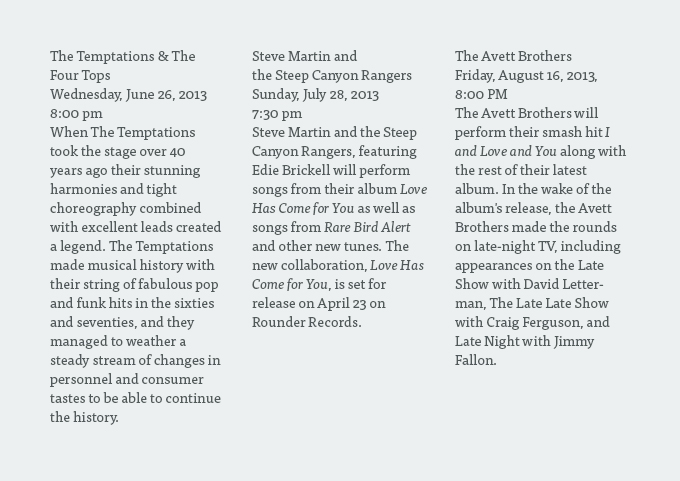
This list of bands is very difficult to scan quickly. Imagine trying to find your favorite band’s upcoming concert on an entire page of listings like this! Via TutsPlus.
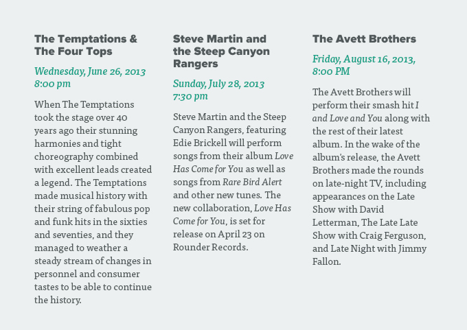
Here we can see the power of typographic hierarchy. Readers can easily understand that the names of the bands are in larger bold text and the date and time of the concert is in green italic text, which helps them scan the list and find the information they need.
Proper text formatting not only helps readers find the information they need on the page, it can help encourage longer reads and deeper engagement with your text. But text formatting can only take you so far. Structure also extends to the content itself. In all likelihood, your organization uses a content management system (CMS) to store the content on your website. Your CMS will have various content fields defined as areas to enter specific types of content that will be displayed in a certain way on your website. Following a few simple guidelines for your content fields can help ensure that your content is optimized for display on the web.
Structuring Your Text Fields
While most websites will have templates designed to accommodate special content layouts, the following guidelines can be considered best practices that work for a wide variety of web copy, especially text heavy pages.
Page Name and Navigation Title
- Page name is the heading used for a page. The navigation title is how that page is named within the navigation.
- These fields do not necessarily need to be identical matches, but keep in mind that page titles will be truncated in search engine results after 55 to 60 characters. If you can’t fit your title perfectly in the space provided, at least make sure the most important keywords are visible.
- Use a straight-forward descriptive term to communicate to your reader what they will find in that section of the website (e.g. Communications Office vs. Welcome to Communications!). Using language your users are familiar with eliminates their need to guess.
Headlines
- Make sure headlines are descriptive, and short (5-10 words) for easy scanning and comprehension.
- Readers may not encounter your headline in context (they might see it in a social media post or on a newsfeed, for example), so make sure it makes sense out of context.
- Front-load your headline with keywords that grab readers attention and capture what you want your reader to take away from the article. This not only helps readers get to your content quicker, it also helps drive traffic to your site.
Intro Paragraphs
- Introductory text, usually found at the head of a page below the title, should provide a basic description of the page’s content, which provides context for readers and helps them decide whether or not the page has the information they are looking for.
- Text should be one paragraph (two at most) and around 20 – 30 words in length.
- These paragraphs can help with SEO, so be sure to use keywords that you want people to discover you through.
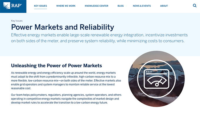
In this example from our client, the Regulatory Assistance Project (RAP), we’ve included introductory text under the page title that concisely explains why RAP focuses on this topic. Readers get the gist of the content, and can read further if they want to learn more. (Also notice the clearly defined heading in the body content!)
Body Copy
- Body copy for a typical page should be around 300 – 700 words in length, if it’s longer, make sure to break it up into multiple sections on the page.
- Use subheadings on your sections to help readers scan. You should be able to set a style in your CMS for your headings that will make it easier for you to be consistent.
- Provide in-page navigation for very long pages with multiple subsections. This will help your users get to the section that is relevant to them in addition to providing a model of your content.
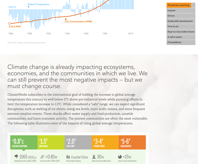
This example from the ClimateWorks website shows how in-page navigation can break up a very long page. Each of the links on the left lead to a different section within the page. To provide further context, the orange bar fills the section as the user scrolls, showing how far into the section they are.
Images and Captions
- Images can help reinforce the ideas in your web copy and enhance readability by breaking up long blocks of text.
- Previously, we outlined some general guidelines for ways to make the images you select more powerful.
- Captions should briefly describe the image itself and provide any additional context that is needed to understand it (for example, the creator’s name).
- Make sure to include an <alt> tag on the image that is descriptive, so that readers who cannot see the image for any reason (slow browser, using a screen reader, etc.) they will know what the image is supposed to mean. Using keywords here also has SEO benefits.

This example shows how to create alt text that accurately describes the displayed image. A reader who couldn’t see the image for whatever reason would be able to easily understand what is being illustrated. Via University of Leicester.
Conclusion
Proper structure is just one component of content strategy and writing effective web copy, but these basic components can be very powerful when it comes to the effect they have on your audience and how they engage with your content.
By the time you read this insight, the idea of atomic design will probably be commonplace. But right now, in 2014, atomic design is fundamentally changing how we conceive of and create websites. So, what is atomic design, and if you’re not a web designer or developer, why should you care? Atomic Design is the concept that when we create website, we are no longer designing “pages.” We’re creating a design system that is made up of a variety of different parts, or components, that can be reused, remixed, and repurposed to create an infinite variety of design options for a website.
In short, we start with atoms, such as a headline, a block of text, a button, an image—and ultimately a combination of these things. From those atoms we can create what web designers and developers call molecules and organisms (i.e. an article preview within a page or a row in a list of publications in a resource center). And those inflexible page tempaltes we’re no longer creating? We’re building them out of these different combinations of molecules or organisms.
Sounds more complicated, right? Well, it is a lot to manage, especially for web developers. And that’s where the idea of Atomic Docs comes in. Atomic Docs are a new tool that manages your design system’s components (and their underlying code)—and automatically generates a front-end style guide. We’ve been putting the idea to the test put it to the test to see how it would impact my workflow. Here’s what we learned
Atomic Docs are Easy to Set Up
Atomic Docs was very easy to get started with. I set up a WordPress site with our distro and starter theme. Then, I downloaded the source files from github and moved them into the root of my theme. That’s pretty much it. I simply needed to change the destination CSS file path in our gulpfile.
Atomic Docs Makes Naming Things Easy
One of the hardest and most important tasks of a frontend developer is naming things such as classes, IDs, field names, filenames, etc. The names we choose must convey meaning to other developers, designers, and site admins and the choices are endless. Atomic Docs makes this task much simpler. The user interface is intuitive and easy to use and you can easily rename your components and categories, saving you from needing to go into many different places in your project to manually change names. The best part is, it generates all the SCSS and PHP partials you need for development, and puts them in organized folders and in the proper order. The extra head space Atomic Docs provides allows you to focus on what your components will be called, rather than where they will live and if they’re in the right place in your folder structure.
Atomic Docs Encourage Design-Driven Development
As the name suggests, Atomic Docs is a great tool for the Atomic Design process or Style Guide Driven Development. Atomic Docs isn’t limited to these processes though. The practice of developing and designing your user interface separate from backend technology can benefit any team. You can also deliver a living style guide to your client and design team for future use.

BEMr’s Beware
When using Atomic Docs, it’s important to remember to name categories and components the same way you would manually. Most importantly, do not use spaces, as filenames with spaces are obviously invalid. This is not a major fault, however, it wasn’t clear initially that there was a one-to-one correlation between the generated filename and the name you assign it in the tool. This is also worth noting if you use BEM naming conventions. Filenames have the potential to get a little confusing when you get down to the Modifier level as you can see in the screenshot above.
As we’ve been working atomic design into our design and development process, all we can say is that having something like Atomic Docs to help manage the process awesome! It delivers a great developer experience for creating and managing SCSS partials and makes it easy to create a living style guide. Curious to learn more about how to incorporate atomic design into your nonprofit’s website strategy? Get in touch!
If you’re a nonprofit leader looking to redesign your website, you’ve no doubt been thinking a lot about thinks like CMS, CRM, donation platform, hosting—you know, all the things that made you want to work in the social impact sector in the first place! Yes, it can be seriously confusing and stressful trying to figure out what your nonprofit website cost should be if web technology isn’t your area of expertise—especially because the choices you make now are ones that will be felt for years after your new website is launched.
Given the importance of website technology to a nonprofit website’s cost, it’s important to be informed about what it actually takes to build and maintain your site. But what’s a person to do if they are confused—or flat-out turned off by—technical jargon? And how on earth can you possibly evaluate the cost of building your website if you don’t understand all this technical stuff?
Well, there are a lot of technology factors that impact both the quality and cost of a nonprofit website. And when we talk about nonprofit website cost, we mean more than the financial impact. Website cost also includes your time and effort. After all, time is money, right?!
It’s important to consider a website’s “total cost” — how our technology choices will impact both operations and the user experience. That’s because everything from your choice of CMS and how your website is built, to the systems that will be integrated into it impact nearly everyone in an organization. So, it’s critical that when assessing your nonprofit’s website cost, you understand technology choices. As a design-driven development web development firm, Constructive’s approach is to approach (and help explain!) technology from a human-centric perspective.
So, if you’re considering a nonprofit website redesign and are having trouble navigating the technology playing field and setting an appropriate budget, what do you need to know to make smart choices?
The Technical Hurdle
Similar to the medical industry (and a lot of nonprofits), the biggest barrier to understanding web technology is often the over-reliance on jargon in technical discussions. All those acronyms, weird phrases, foreign concepts, and inside jokes like the ID10T error—they almost seemed purposefully designed to keep non-technical folks on the outside looking in!
When people try to explain how the internet works to the non-expert, one analogy is that it’s like “a bunch of tubes.” Now, while this may be passable, it’s also a gross oversimplification that limits how we understand the web. For example, a pipe implies, from everyday experience, continuous flow and permanent connection. But that’s not how the Internet works.
The internet is a distributed network of wires, radio waves, machines, and software. It’s governed by standards and protocols. Information transmission may seem continuous, but in fact is broken up, sent to travel across many paths, and then reassembled as needed. There are machines and software that route and filter these broken up “packets” of data to their destination (which like your home, probably has an address). And at that address, you’ll find some kind of server (not the restaurant kind), which may be a dedicated machine in a physical location, or may be in “the cloud.”
And then we finally get to your actual website—a combination of a database that stores all your information, and HTML, CSS, and Javascript, a programming language like PHP, and controlled by a CMS (Content Management System).
If you’re nontechnical, your mind may be spinning right about now—and that’s OK! The point is to understand the basics.
So, What Do I Need to Know?
You don’t need to understand things like network protocols, code, or deployment scripting to understand how web technology impacts the quality and cost of your nonprofit’s website. You should, however, understand the basics of what a website is and what it takes to build one. Otherwise, you run the risk of a website and a bunch of connected systems like a CRM or Grants Management platform that don’t work well together. So, for example, which CMS is right for you? We’ll explain a bit more later, but, unless you’re using an expensive closed-source CMS like Ektron/Episerver, (pro tip: don’t!) you’ll likely be choosing between free, open-source CMS’s like WordPress or Drupal. Curious which of these is the right choice for you? This webinar we gave a while back, WordPress vs. Drupal may help.)
What’s Actually Being Built?
You’ve probably heard of user experience (UX) design (or information architecture), but what is it? Combined with the functional requirements of your website (written descriptions of how it needs to work), they’re the blueprints to your website. If you think of your website as a house with plumbing and electricity, this is the foundation of what you’ll be building. When it comes to technology, through code and configuration of the server and content management system, web programmers take “UX and specs” along with design comps and style guides to assemble the pieces needed to meet the design. Some web programmers focus on the stuff behind the scenes (the backend) while others on how the site looks when delivered through a browser (the frontend).
Which End is Up?
You may have heard people refer to the “backend” and “frontend” of a website. What’s this mean? Simply put, the backend includes all the things you don’t see when visiting the site: mostly how your database(s), CMS, and any other systems running your website that users can’t see. The frontend is what everyone sees when they visit your website. Why does this matter? Because very often, people may judge a website by how it looks (remember what they say about books and covers…), and as a result, overlook that how well the backend is structured and designed cmakes a major impact on the quality and cost of a nonprofit’s website—not to mention how easy it is for staff to update. There is tremendous value in spending time crafting a user-friendly CMS, detail that can sometimes be overlooked by nonprofits when evaluating website proposals
Of course, choices in features and functionality have a major impact on how much work needs to go into designing and building both the frontend and backend. And sometimes, what seems like a simple change can actually significantly drive up development costs. That’s why it’s a really good idea to make sure to have answers to a lot of the questions about website features and functionality before finalizing a budget for your nonprofit’s website. And the discovery process is invaluable to helping everyone understand the costs and trade-offs between different choices.
Does My Choice in CMS Matter?
Absolutely! Programming for one content management system over another makes a huge difference—not only in how much time, effort, and cost it will take to build your website, but also in the impact it will have on your organization’s operations. For example, there are big differences across CMS’s in what’s offered out-of-the-box (think of this as what comes “standard” when buying a car) vs the extras via third-party modules (or plugins) that add all those advanced features you want. And your choice in CMS especially matters for the people who are going to be using the CMS every day—your site administrators. A CMS that’s hard to work with is a long-term drain on costs and productivity that’s often a demoralizing burden on your people.
The choice in CMS can also determine how easy or difficult it can be to integrate other systems into your site. Need a newsletter signup? What about your CRM needs, like Salesforce or Zoho? Do you have or are you going to allow users to login to your site? What about Single Sign On? Your website is an epicenter of your organization’s digital strategy that’s connected to systems that significantly impact operations. Getting the choice of platforms right matters!
Where Will My Website Live?
Your site will run (be hosted) on servers and infrastructure I mentioned earlier, and that has to exist somewhere. That somewhere must meet the technical needs of your website, and there are many hosting options to choose from. Your budget and capacity to manage the infrastructure (or not) should be factors in any decision—but long story short, for most websites, a solid shared hosting plan or cloud-based solution that leaves server administration and maintenance to your host provider (so you only need to worry about your website and CMS) is the best way to go.
OK, What Else?
While choice in technology can impact nonprofit website cost significantly, the impact of non-technical decisions about things like functionality and features should not be taken lightly—especially at the start, where choices can have cascading effects on other areas of your website. Success is won and lost in the details. Uncertainty and unknowns about technology are also risk factors for blowing your nonprofit’s website budget.
So, if your organization uses other platforms such as CRM or grants management software, before initiating a major website redesign consider the value of undergoing a technology audit (also known as a digital ecosystem analysis) to understand your technology landscape. A website redesign is an ideal time to make sure your different systems work well together and deliver the best possible experience with your brand.
Also, having a clear sense of your goals and functional requirements bridged with technical insight can help understand the bigger picture in what it will take to execute. For Constructive, this means a thorough Strategic Brief that details a nonprofit website’s goals and requirements. Focus on what’s important for you, your users, and your organization—and use this process to give your website the budget it deserves! And if you don’t have the budget you need, rather than trying to fit in every feature and wish-list item into a redesign, consider about using a phased approach. While it’s tempting to try and solve every problem in the first go-around, it’s much wiser to build a solid foundation that’s designed to scale and last for the long term; then add intelligently over time as more resources are available.
What Can I Do to Learn More?
Yes, web technology is confusing (and constantly changing!), and this makes determining nonprofit website cost. But you don’t have to become a technologist to make better decisions when it comes to your website. If you have a technical expert in your organization who can help you bridge the knowledge gaps for you—great. Bring them into the conversation and rely on their expertise to inform the decisions you make. If you don’t, we’d love to talk with you about how Constructive can help you better use web technology to strengthen your organization and your brand.
ven·dor
/ˈvendər,ˈvenˌdôr’/
Noun
- a person or company offering something for sale, especially a trader in the street.
- a person or company whose principal product lines are office supplies and equipment.
Synonyms: retailer, seller, dealer, trader, purveyor, storekeeper, shopkeeper, merchant, salesperson, supplier, peddler, hawker; scalper, huckster, trafficker
Over the last sixteen years I’ve learned that if there’s a word folks in the nonprofit community love to use to describe design firms, it’s vendor. Maybe it’s me, but every time I hear it used in conversation or read it in an RFP, the “V-word” brings with it the soothing sound of nails on a chalkboard.
“What’s the big deal?” you might be thinking. “Why should I care?”
Both good questions. The short answer is that if you work for a nonprofit and need to research and choose a design firm to lead your organization through a design engagement, “vendor” is symptomatic of a bigger problem. It suggests a misunderstanding of what design is. It shortchanges the value of good design and the value social change organizations can get from working with design firms. And it can damage the kind of relationship any client would want to build when working with one.
Sounds serious! But if I’m overstating the case, I’m only overstating it slightly.
To understand what’s so troubling about putting the “vendor” label on design firms, it’s helpful to deconstruct the term. Take a look again at the definition at the top of this article. Pretty uninspiring, right? By definition, a vendor doesn’t provide insight or strategic value. Vendors have customers, not clients. (Does anyone want to be transactionally treated by a strategic partner as a customer?). At best, vendors are trying to sell you something—usually a commoditized product or service. At worst, the thing they are trying to sell you is a lemon.
So why is vendor so often used in the nonprofit sector to describe the companies that play such a critical role in translating organizational strategy into tangible experiences?
I don’t believe it’s because anyone is intentionally minimizing the value that design firms bring to the table. (If anything, the case for strategic communications in the sector is on the rise.) I believe it’s a subtle sign of a more widespread misunderstanding that can lead to missed opportunity.
Why is Design So Misunderstood?
There’s a certain twentieth-century quality to vendor (postwar America’s twist on the nineteenth-century purveyor). It’s a convenient catchall for any company that provides a good or service. For much of the twentieth century, concepts like “brands” and “brand value” were still in their infancy, choices were fewer. Our ability to access choices was more limited. And strategic differentiation was therefore much less critical to success. In this world “vendor” was good enough to describe any company in the “posters & toasters” business.
It’s in this context that the traditional client/design firm relationship evolved. Clients had things that “needed designing” and reached out to design firms for help. Design firms were asked to add “beautification and decoration” to the ideas for products, advertising, and communications brought to them.
And for a while that worked just fine (well, fine enough).
In the twenty-first century, this simplistic view has been supplanted by a deeper understanding of what design is and what it can do. An increasingly complex world requires a greater ability to understand, empathize, synthesize, and translate ideas and systems into meaningful experiences that help us make sense of it all. At their best, brands are an integral part of strengthening our sense of identity and understanding. (Think tribes). In this context, design is a powerful, multi-faceted discipline that offers a unique combination of skills to connect us more meaningfully to the world. This paradigm shift is exemplified by the field of design thinking—now embraced by many as one of our best tools for solving “wicked” problems.
Change is Hard!
Despite this shift in the client/design firm relationship, when it comes to branding and communications it’s my experience that the nonprofit sector lags the business world in understanding design’s role in achieving organizational goals. Without question many forward-thinking nonprofits—particularly social innovation organizations—have bucked the trend (If you’re with one, I’d love to meet…). But the sector’s historic aversion to the “B-word,” its tendency to underinvest in strategic communications, its reliance on consensus-driven processes, and the challenges faced when confronted by a major disruption in thinking all contribute to the glacial pace of change.
One tell-tale sign (you guessed it!) is the widespread characterization across the nonprofit sector of design firms as “vendors.” Another sign is the mystifying RFP process that keeps prospective partners at arm’s length and prescribes solutions before a design firm is engaged. Both are symptomatic of a mindset that emphasizes design’s more easily understood outcome (design as a noun), while underweighting the less tangible, more valuable problem solving process (design as a verb).
Unfortunately, a not-insignificant percentage of design firms reinforce this dynamic by either: 1) not having developed a mindset, culture, and practices that position them as a partner capable of thinking beyond deliverables; or by 2) not educating potential partners who may be less informed about the strategic value that design firms can provide. The result is mis-aligned expectations that lead to missed opportunities—and, in worst-case scenarios, flat-out frustration.
Now the good news!
Always Partners, Never Vendors
As I’ve discussed before, design firms and social impact organizations share a unique bond. And hopefully it’s clear what kind of relationship I believe we should have to create the greatest benefit, for each other and the world.
While there’s much we can do to develop more effective ways of working together, it’s my aim, with this article, to create one small behavioral change to help the process. As strong a signal as that single word vendor sends, I believe that simply replacing it with another word will put the the relationships between nonprofits and design firms on much more solid ground.
And that word, of course, is partner.
Partnership implies a relationship based on shared interests and mutual respect. It acknowledges that each party has something of value to share to learn from the other. And it embraces that the two parties are in it together.
And isn’t that what we all want and are looking for when we work with someone?
Kicking vendor to the curb and eliminating it from our lexicon is essential to changing the terms of engagement between nonprofits and design firms. And to creating a framework for collaboration that increases the social impact we can achieve together. So won’t you join me? Next time a colleague refers to a design firm as a vendor, politely correct him or her and explain that there’s a much better way to describe the people who help them advance social impact work.
I will thank you. And, more importantly, the world will thank you.
How good a nonprofit website looks and feels from the public-facing side (aka: “the front-end”) is important. It’s something design firms, of course, think about a lot. And when you envision your website in your mind, you may naturally think of how it works and looks. Now think about the backend—the stuff working behind-the-scenes to deliver those great user experiences for audiences, like your content management system (or “CMS”). What comes to mind? Is it a frustrating, time-consuming mess or is it as easy as a walk in the park?
Well, when it comes to the world of websites, what’s under the hood matters. All CMS’s are decidedly not created equal. And depending on how thoughtful a web design agency is, this could mean winding up with a website that delights your audiences, but creates nothing but headaches for you and your staff. Based on the feedback we hear from organizations looking to redesign their current websites, far too many nonprofit website CMS’s are cluttered and unnavigable, leaving site managers with more questions than answers. How do I create a new page? How do I change the layout without breaking things? Is the “Featured Image” really a” Featured Image”? What is a “Featured Image”?! What goes where?!
But it doesn’t have to be this way! In fact, it shouldn’t. It’s our philosophy that website admins are users too. In fact, site managers spend way more time on a nonprofit’s website than most users. So, if you believe in user-centric design like we do, then you should take the time to plan and design an intuitive CMS with logical publishing workflows that make it easy for people to visualize, create and edit content. Unfortunately (at least judging by the level of frustration with nonprofits when they ask us about redesigning their websites), not enough agencies do. The result is clients who are left holding the bag with a clunky, frustrating CMS that is a constant source of pain for staff.
Well, fear not! We’re here to help fix this problem by starting a dialog on what goes into creating a great CMS (in this case, WordPress, though we also work in Drupal) that people will absolutely love to use.
Impact on Content Curators
The most important people around the web are the ones who make web content. When it comes to content creator workflow, time equals money, and in the case of websites with a constant flow of new content, the speed and simplicity of their workflow is paramount. Using buckets or fields for content is a straightforward way to enable consistent results. In addition, you’re also reducing training burden, complex formatting rules for content entry, and cognitive load. Reducing the cognitive load leaves more room for creating and editing rather than figuring out how to use the site. If you’ve ever tried to learn a new version of Microsoft Word or Excel after a major update, you know exactly what a high cognitive load feels like.
Impact on Website Maintenance
Backend layout semantics can also have a significant effect on maintenance costs. When documentation is scarce and a new developer or administrator is brought on to maintain or enhance the site, hunting for options and how they relate to one another takes valuable time and can lead to confusions and ultimately misconfiguration.
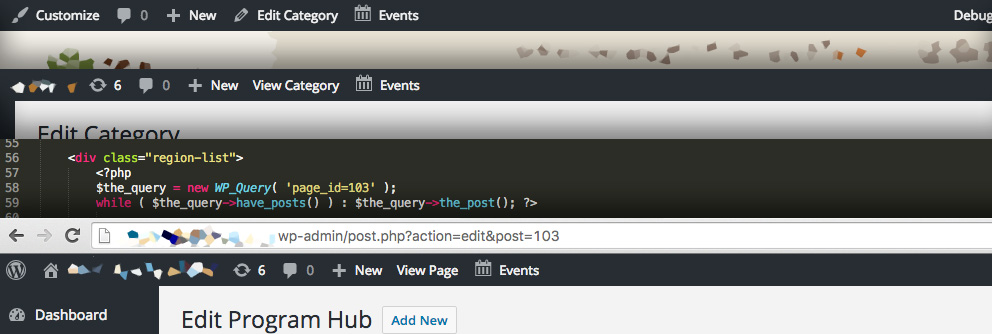
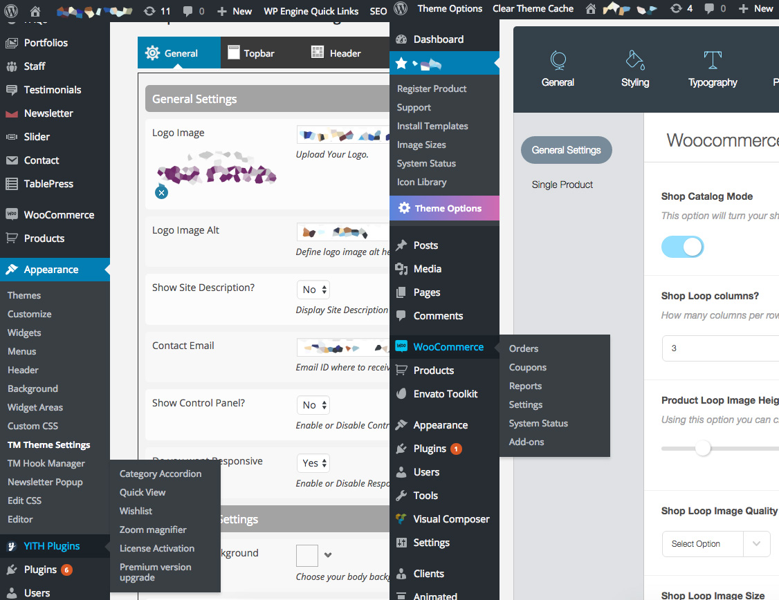
Nothing is worse than not being able to find where you edit a page without digging into code to discover where something is linked up. In the example below, the way to edit this page is in a seemingly unrelated part of the backend compared to the frontend. It looked as if one would be editing a category, but that wasn’t the case—we had to go digging into code to find where to edit the target content. Frustrating for site managers and frustrating for content creators.
Planning a User-Friendly CMS Backend as a Complete Thought
The best policy when planning how the backend works is…do what feels right? Well, sort of. What we’re trying to say is that options for the blog section of a site should be filed under the Posts section for your blog posts or perhaps a theme options page that clearly categorizes blog-related options and features. Extending the WordPress experience is preferable to stacking on another layer.
As with shopping for a new car, you’re expecting controls to be where you’d suspect they should be in the interior. It might drive great, but if the A/C, Heating, and Vent controls are under the passenger seat, your expectations for an easy to use ride are not being met. For developers—as the car designer and manufacturer in this example—it’s their responsibility to make an enjoyable and user-friendly ride.
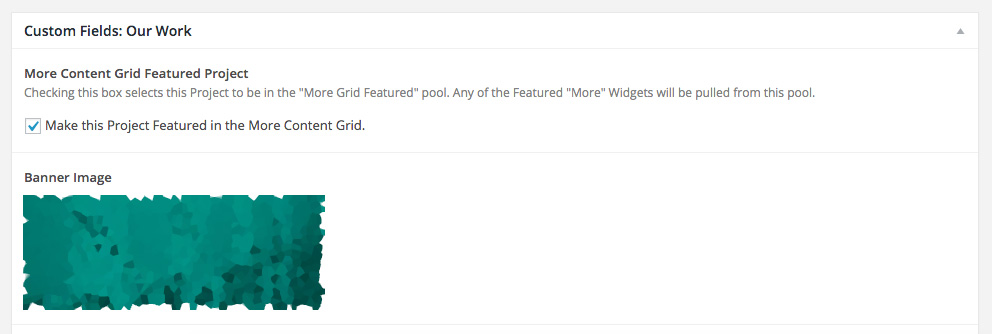
Semantic Organization: The hallmark of any smart visual design, UX design or development is semantic organization – or categorical and top to bottom semantics to be more precise. This goes here and that goes there because it makes sense, right? Make it easy to use and understand. Categorical organization in the backend should be easily understood right when you log in to WordPress. Here’s where we go to create a new blog post. There’s the place to add another staff member. Easy peasy!
Top-to-bottom organization should be a logical flow from top to bottom when editing any type of post or page. Page title for WordPress. Check! Second the custom heading, then the banner image. Maybe after that some introductory copy. Perhaps there’s a section for teaser content used through the site below that. Afterward, you should see the main body content. Other options like SEO customizations? We think those might go great up top for this client, but maybe the next client needs those down below. Either way you look at it, it’s a meaningful client-oriented design that makes sense to those crafting and entering the content.
Iconography: To tie into the concept of easily finding relevant content controls: relaying a quick message can be as simple as representing section or content type with an icon cue. It’s not a secret at all that icons are powerful communicators. Better yet, WordPress makes it easy to implement these for Custom Post Types (Insights, Reports, Projects, Blog Posts, etc) or any major menu section with their dashicons. The icons help guide users in the right direction with visual cues. Paired up with a concise label, it’s easy to find exactly what you’re looking for. In the case of a complex site architecture, iconography can make an even bigger difference.
Naming Conventions
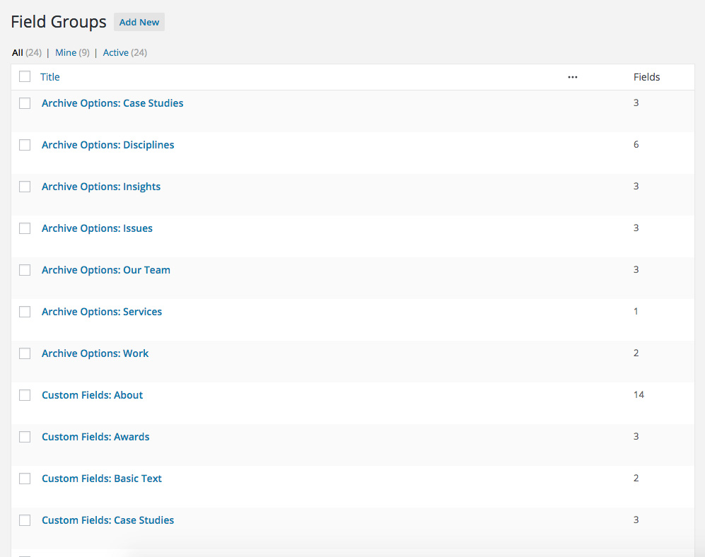
We like to stay organized and aid developers and content creators by leveraging tools like Advanced Custom Fields to make creating and editing content, as well as software development, more straightforward. Names of any sort, code, scripting or template files should be sorted logically and labelled to aid finding what you need. Take this list of custom field groups for content created in Advanced Custom Fields for example.
When it comes to updating or adding visual rows of content on our own site, they’re organized by row to allow us to focus on one template file and one set of files instead of getting lost in fields or files we don’t need. This translates to content entry in the same regard. New rows of content are added and organized as the author wants to present them on the frontend. They’re easy to find and the names of each row make sense as to what they do.
Documentation: When all else has been done to create a user-friendly journey through the CMS backend, there is one more tool that can make or break an experience: documentation. While it should be standard practice to document how to use a piece of software, even a simple reference guide can make a tremendous difference.
However, the trick is getting people to actually read directions. To make content entry easier for creators who are not tech savvy, don’t read documentation, don’t follow the rules, or who are coming back and just need a quick refresh, inline directions or tips that assist content entry should be included.
3rd Party Software Minefield: WordPress plugins can aid in developing a great site with little work, but they can really trash up a backend. A couple of good examples of confusing backend layout would be two off-the-shelf WordPress themes we recently had the “pleasure” of evaluating. Both are built to work with a popular WordPress Ecommerce plugin. Options for common elements of the public facing website can be strewn across multiple parts of the backend. Required plugins clutter up the site with way too many menu options and panels.
Unfortunately, not everyone believes in less being more. It’s common to see this kind of “menumania” in off-the-shelf super themes and bloated plugins. If the authors had been watching Good Eats with Alton Brown, they’d know they should have better ‘multi-taskers’ in the kitchen.
You have a voice and we should make it easier to be heard
I hope this increases the awareness for how important a user-friendly CMS backend architecture is to WordPress users. If a website were to be held up by legs as on a tripod, one leg would be content, another presentation, and the last the content entry workflow. Each are important to holding up the message a website is projecting.
Don’t take the design of a good CMS backend for granted. It takes time and effort, and should be created with the same TLC as the website your audiences visit. And it should make it easy and intuitive for site administrators and content creators to understand how the work they are doing will live when published. Putting in the time up-front will save countless valuable hours of staff struggling with a frustrating, poorly designed CMS (not to mention headaches!).
Have questions about how we’d approach creating a CMS that works for you instead of against you as part of a website redesign? Just let us know by getting in touch here!
If you’re a nonprofit looking for the best data visualization tools to communicate things like research data or social indexes, then welcome to Part 2 of our two-part series diving into data visualization tools. In Part 1 we took a close look at dimple, Plotly, and D3Plus. In this article, we’ll give you a closer look at three other great options: morris.js, NVD3, and vis.js.
morris.js

I didn’t think it was possible to get much simpler than dimple, but Morris manages to do it. Morris is pretty limited—aside from donut charts, it supports bar charts, times series, line, and area charts—but what it does, it does well. Based on Raphaël, Morris creates attractive interactive charts with a minimum of coding. For most charts, you just need to grab some data, tell it which field to use for the x axis and y axis, and line or area labels, and, voilà! You’ve got a chart.
You can customize your charts, setting colors, line widths etc, but even without any customization at all, you’ll get a good-looking chart.
- Visualization Types Supported: Pie Charts, Bar Charts, Line Charts, Area Charts
- Data Input Sources: JSON
- Data Output: SVG
Pros
Ease of Use
If you need something easier than Morris, you should probably be looking at SaaS tools like Plotly or Tableau. It’s hard to imagine that any downloadable javascript library could be simpler than this.
Attractive Charts
The default colors may be a little dull for some tastes, but they’re easy to change. And the charts are appealingly rendered by default, with nicely formatted tooltips.
Cons
Limited Options
Morris only offers a handful of charts, and its option list is less extensive than others.
NVD3
Yet another child of D3, NVD3 has closer ties to its parent than any chart we’ve looked at so far. It was inspired by an article by D3 developer, Mike Bostock on Reusable Charts, and while NVD3 charts aren’t all that difficult to implement, the D3 syntax may be off-putting.
NVD3 has some nice features built in, like clickable legends for line and bar charts that let users show or hide individual data elements, but there are also some gotchas.

For example, discrete bar charts let you stagger bar labels for a better fit, but too many bars on too small a screen can turn them into an unreadable mess.
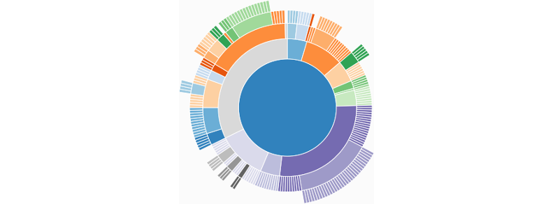
NVD3 has some charts that not even Plotly can offer, like the sunburst chart (shown above), and interactive sparklines. And thanks to myriad configuration options, even standards like donut charts can get a new look. If you’re willing to put in some extra time and effort, NVD3 will reward you with unique and beautiful charts.
- Visualization Types Supported: Simple Line, Scatter, Stacked, Area, Bar, Pie, Bullet, HTML Indented Tree, Monitoring, Sparkline, Parallel Coordinates, Candlestick OHLC, Sunburst, Box Plot
- Data Input Sources: JSON, CSV, TSV, anything D3 can process
- Data Output: SVG
Pros
Many Visualization Types
Besides the types listed above, NVD3 offers plenty of combinations and specializations such as scatter plus line charts, and time series bar charts.
A Multitude of Options
NVD3 offers a lot of built-in options for each graph type, including some nice features like noData, to add a message if data isn’t available — especially useful when users can filter data, or you’re using data from an external source which may not always be available, and id, which adds a CSS id to customize the appearance
Cons
Weak Documentation
Part of the reason that NVD3 is more difficult than similar libraries is down to poor documentation. The docs for some options simply say “No info for this option yet…”, so you may have to look at the example code to find out how they work. As of this writing, the docs aren’t on the main site (nvd3.org), but you can find them on Github, here.
A Work in Progress
The library is production-ready and most pieces are fine out of the box, but some areas still need some work, like the label issue I mentioned above. The good news is that this is a popular, actively maintained open-source project, so we can expect to see more improvements going forward.
vis.js
And now for something completely different…
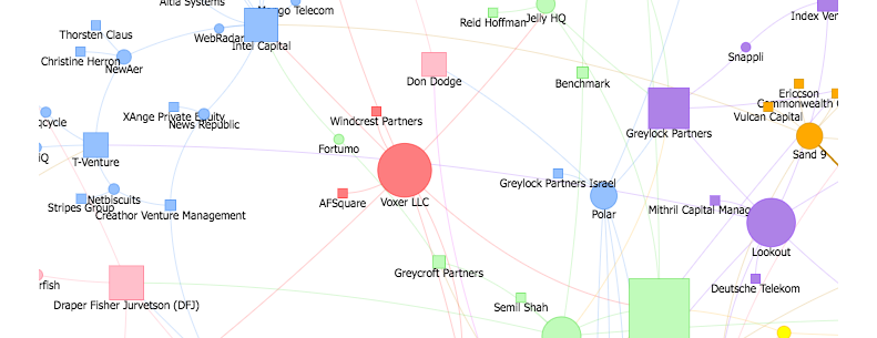
Vis.js does some of the basic charts we’ve seen in other libraries (line, bar, etc), but it also does a few things that are hard to find elsewhere: network diagrams and timelines.
vis.js isn’t very impressive when it comes to appearance. As with other packages, you can tweak and style them into good-looking charts, but it’s hard to justify the extra time and energy, when there are so many other libraries that give you a polished look out of the box. But while I can’t recommend vis.js for general charting, it’s worth a look for its network diagrams alone, so that’s what I’ll examine here.
Network diagrams are great for making connections, whether for hierarchical data like genealogy or organizational charts, routes such as airline maps, and interdependencies — the sky’s the limit. For more real-world uses, see vis.js’s own showcase of projects built with its library.
Like other members of the vis.js family, network charts are a bit plain-looking out of the box, but its features make it worth the extra time it can take to spruce them up. The network library lets you create groups, which make it easy to visually separate nodes by shape or color, and clusters, which expand or collapse a group of nodes and extensive event hooks for adding your own behaviors.
- Visualization Types Supported: Simple Line, Scatter, Stacked, Area, Bar (all regular and 3-D), Networks, Timelines
- Data Input Sources: JSON, DOT (for networks)
- Data Output: HTML5 Canvas
Pros
Built-in Behaviors
Network diagrams have some useful behaviors out of the box, like labels that grow, shrink, or disappear altogether, depending on the space available, and highlighting of connected edges when a user clicks a node.
Plenty of Options
vis.js also lets you choose from a variety of shapes for particular nodes or node groups, or replace them altogether with icons or images. You can add tooltips or use HTML in the node labels, making it easy to style and add links.
Choice of Date Formats
You can use json to import and/or calculate data, or use the DOT format to access Graphviz data or easily layout your own if you have a small dataset. For example, to create a triangle in DOT format you can write something like this:
A — B; B — C; C — A
where A, B, and C are the points of the triangle.
Cons
Slow Load Time
For networks with a lot of nodes, users have to wait a few seconds before the network appears. You can mitigate this by using clusters, but if you want to display all the nodes from the start, you’ll probably need some sort of ‘Loading…’ message, so users will know that there’s something there.
Conclusion
In this insight I’ve presented a set of libraries that cover a wide variety of chart types for a wide range of skill levels. But in terms of free charting libraries available, we’ve only scratched the surface, not to mention commercial libraries and SaaS products.
It’s also worth mentioning D3, which provides the basis for so many of these libraries. It still takes a fair bit of up-front investment in time to get a handle on the D3 language, but the library has gotten cleaner and more manageable over the years, so if you’ve found D3 too difficult in the past, it may be worth another look.
And of course, if you’re looking for someone to build you a website with attractive, user friendly and informative graphs, be sure to get in touch.


