


Let’s face it: content development is a pain in the web-development butt. Although seemingly a straightforward task, anyone who has broached the task knows how both nuanced and broad you must be, how provocative and affable, how articulate and modest. Selecting images to accompany written text is equally challenging, and often greatly underemphasized to the website’s ultimate peril—because nothing forges an emotional, empathic connection or imbues a site with credibility better than a well-chosen, well-placed image.
Nonprofits often face an especially uphill challenge in this realm. While they are often very active in their fields, they seldom have documentation that successfully tells the story of their efforts, or their mission is more often related to abstract policy and systems than to tangible situations. And let’s be honest: photos of strategy meetings can only be so interesting, regardless of how interesting the actual meeting may have been.
In an ideal world, you would commission an expensive professional photographer to shoot photos of employees active in the field, in perfect lighting, capturing the comprehensive diversity, process, and impact of their work.
In the real world, the practical alternative (and one which we recommend to many clients out of respect of budget and logistics) is to develop a spec sheet and invest in a mid-range camera that any employee with a decent eye can execute. Even then, companies of all scopes need to use stock imagery to fill the gaps, and can do so with terrific impact.
No matter your particular situation, you can manage the image selection process with more finesse and greater impact if you approach it through three clear perspectives: honoring the larger concept and brand; considering visual design and functionality; and embodying the perspective of a potential visitor.
1. Honoring the Company’s Brand
Before you even begin searching, consider what kinds of images and situations will best convey both the overarching message of the site and the specific message of each individual page.
Content (people versus objects or context)
- Photographs of a person, object, or environment each communicate different emotions, so select carefully.
- When describing a function of an object or idea, show the object being put to use by a person to provide context and relatability.
- Photos of environments put readers in more meditative and passive states, thereby drawing more attention to the written content on the page, so apply these when the content is most important.
- Get creative, especially when trying to convey an idea or emotion. Think in metaphors, what kind of allusion will activate viewer’s attention and really resonate with them, and remember that like a Greek tragedy, action is often best off-stage. When an image inspires a viewer to imagine the emotions and sensory feeling of the story you’re telling, they’ll be more engaged.
NewsCred provides this helpful example:
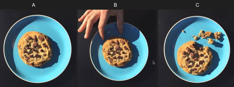
Image A offers a fine shot of a cookie but tells no narrative; image B shows some function, but ultimately doesn’t evoke a strong emotion around what it’d be like to eat the cookie; image C puts the viewer into an imaginative mindset, wondering what it was like for the person off stage to have enjoyed that bit of cookie. It creates a human element to the photograph that the viewer can relate to.
Brand Relevance
By customizing photographs through color adjustments, gradient overlays, and cropping, you can recall the company’s logo, tone, or messaging. Images also help build a snapshot of the size and demographic of an organization, and offer an authentic depiction of where and how the company works. Decide what kinds of photos best convey the feeling of your cause, and indeed whether most of them are actually photographs, or another type of visual, such as illustration.
Consistency
Be intentional about the content of the photographs and how you customize them by repeating particular customization choices. This symmetry can help create cohesion previously unconnected photos.
And between the repetition and consistency, be sure to shake things up when called for. Disrupting the flow of a site will draw attention to itself, which, when executed tactfully, can successfully give dynamics to a particular part of your website and your message overall.
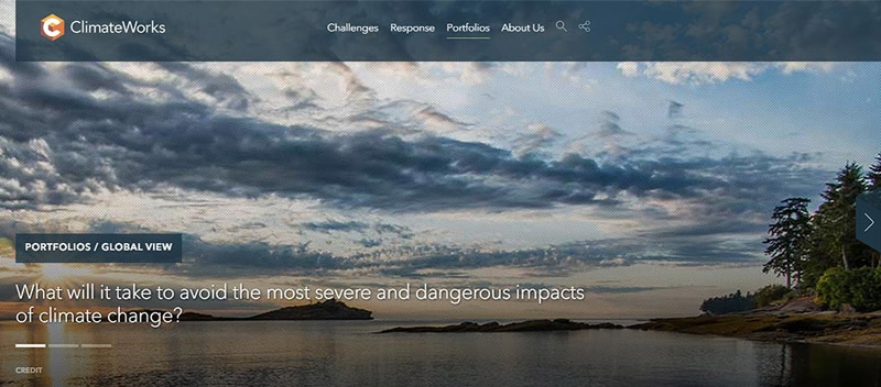
When creating the website for ClimateWorks, for example, our team overlaid a gray texture atop images of vast, natural landscapes at the top of the page, providing a comment in and of itself related to climate change; overtop, viewers simultaneously read blurbs about the organization. The Constructive team consistently selected captivating images of natural scenery to keep the focus on the environment and a diverse groups of workers to visually connect the dots between how the environment affects real people worldwide. This textured treatment of carousel images and textual information appears on nearly every branch of the website. By breaking from the consistency in just a couple of sections, the website becomes an information-rich hub about ClimateWorks and its impact on an important topic that viewers can easily relate to, while also conveying a distinguished brand presence.
2. Considering the Design
A designer’s job with regards to photo selection is to integrate the graphic elements of a site to effectively and efficiently relay a larger idea to the audience. With our clients, we aim to use design solutions to inform viewers about the organization via references to their portfolio, process, and logo; and equally importantly, to inform them about the larger cultural issue they address.
Quality of the Photo
It matters. Even with a winning set-up, a subpar quality photo will always ultimately flop.
Watch out for:
- Color Quality
- Cropping
- Exposure
- Focus
- Composition
- Perspective
Some of these elements can (and often should) be adjusted with Photoshop with consideration to the photo’s function, content and purpose. But there’s no magic wand to turning a mediocre quality photo into something great. To help filter out subpar shots, use photography terms in your search field; images tagged with this taxonomy are more likely to have been taken by professionals and meet a base minimum of quality.
Helpful terms:
- Low/wide/High Angle
- Defocused
- Depth of Field
- Motion Blur
- Long Exposure
- Selective Focus
- Silhouette
- Portrait / Panoramic / Full Frame / Close-Up
- Still Life
- Copy Space
Customization
In addition to customizing photos to help brand a site, you can do so to create visual design anchors on your pages. If the color of an element in the shot can be adjusted to visually guide the viewer’s eye, or if blurring or using masks can interact with the typography on the page, then photographs can become not just placed images, but designed graphical elements; offering subtle cues that enhance the narrative of the written copy as well as the navigation.
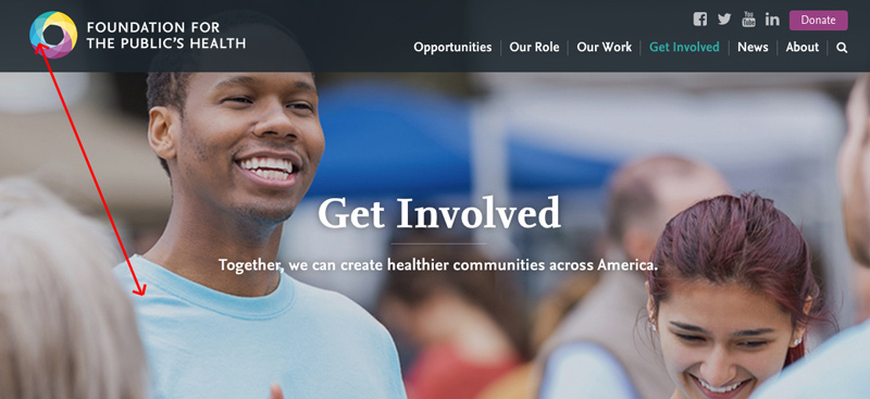
While selecting images for The Foundation for the Public’s Health, we darkened the color of this person’s t-shirt to match TFPH’s logo, helping create a call and response between visual identity and image.
Be Specific
As mentioned, one of the challenges for many nonprofits and mission-driven organizations is how to communicate abstract ideas about their ethics and the systematic and cultural issues it aims to address. That’s a tall, intangible order for photographs to deliver. But keeping things simple and specific can help.
- identify a feeling you want to relay;
- identify where and through what interactions such feeling transpires;
- determine what kinds of photographic qualities could most powerfully achieve such a story
- get specific and minimal with both the subject and backgrounds of photos. Although someone won’t pay conscious attention to the background of an image or a small detail in the foreground, he/she will be affected by it.
Responsive Abilities
Enlarge each photo selection to 4 times its size, and then reduce it by 4 as well. If the resolution suffers on the bigger perspective or you lose focus and impact on the smaller, the photo may not work in today’s world of myriad screen sizes. This practice can also help ensure that your selections are indeed simplified to allow their impact to resonate.
Typography is Visual
Consider what written content will be displayed and in what dimensions or placement while searching for images in case they can relate to one another, as if in a creative magazine spread. You can use the term “copy space” in your search box if you want to overlay typography with the image.
3. Considering Your Audience
When a photo seems to hit all the marks within the designer and branding realms, that’s when the true test comes to play: look at the photo, and its use in the website overall, from the perspective of the audience you are trying to target.
Your Potential Visitors
If you were part of your site’s target audience, would you relate to the images you’ve chosen? Be mindful of what kind of demographic you are reaching out to, and what kinds of subtle cues in a photograph will help them create a particular bond with the image, or break that potential. For example, a medical services website geared toward residents in a young, diverse community in South L.A. will not have an emotional response to the following photograph, but middle-income older professionals in the Midwest might.

Emotions
Ultimately, you are choosing photographs that will be seen and experienced by a busy human being, passing through your site searching for the quickest route to their desired content. So, aiming for the guttural, human chord will ultimately trump any of the more intentional guidelines you set for yourself. After all of that focused and exacting hunting, stepping into the role of the user requires you to wipe the slate clean, and approach your photos thoughtlessly, just how (admit it!) we surf through websites. Put your selections in your dummy site and scroll through the page as naively as possible. Do you feel anything? Is what you feel helpful to the message you want to convey on that page? If not, keep searching.
Lastly, it’s important to remember that while brand, design, and audience orientations are critical to achieving effective individual images, narrative context is perhaps the most important consideration of all. It’s never about just one picture; it’s about how all the pictures relate and come together to create an experience that communicates deeper meaning and connection to the people and mission of the organization.
