A website is one of, if not the most important strategic assets a nonprofit has in representing itself to the world. Given its value, it’s also important to make sure that the strategy and execution of a website are deeply informed by and closely aligned with another vital strategic asset—an effective brand strategy. Get these two things right and get them “talking” with each other, so to speak, and a nonprofit has about 80% of what it needs to support both its organizational strategy and its strategic communications.
The truth is that brand strategy is the essential foundation for all design and communications, whether this means a visual identity or website. And when it comes to a website, the value of an effective nonprofit brand strategy really shines. That’s because the breadth of things that a website can do and must do well to support a nonprofit make deep alignment with the brand strategy that guides the organization vitally important.
What are some of these important things that a nonprofit’s website must do and how are they connected to brand strategy?
Of course, a nonprofit’s website is essential to brand communications. It’s often the first place people go when they learn about an organization. It remains the epicenter of digital communications, with marketing channels and external media continuously directing people there—kind of an “all roads lead to Rome” in communications strategy. This makes a nonprofit’s website its ultimate brand ambassador, remaining ready to welcome audiences in and engage them 24 hours a day, 365 days a year. It’s a platform for articulating the who, what, when, where, why, and how of a nonprofit’s impact strategies—a powerful window into a nonprofit’s world and the ecosystem in which it exists. And through the many choices made in a website’s content, design, and functionality, it becomes an expression of a nonprofit’s values and a connection to the value the organization has to offer.
For some nonprofits, particularly research institutes, think tanks and nonprofits who deliver service online, a website is much more than just a platform for brand storytelling. It’s also a primary channel for advancing the work—whether this means knowledge mobilization to address climate change, providing resources and professional development for teachers, or increasing access to vital mental health care services. For associations and member-based nonprofits, websites are invaluable to building and connecting community. For advocacy nonprofits, a website often drives support for campaigns. And, of course, for organizations who fund their programs through individual donations, their website is a vital fundraising channel.
That’s a lot of heavy lifting! And it doesn’t stop here because a nonprofit’s website is about more than these essential external-facing roles that it plays for the brand. It’s also integral to operations—a tool that staff often rely on to do their daily work. For some nonprofits, staff may be some of the most heavy users of the software that the website is built on. If there’s an intranet involved, even more so. Modern nonprofit brand strategy theory emphasizes its ability to increase capacity, and the same holds true for websites, which empower teams working on community building, grants management reporting, research publishing, and more. And just like the quality of the experiences that a website creates for external audiences says a lot about its brand, so does how well the workflows and integrations empower staff to connect with the work.
The Power of Brand Strategy in Design
What makes brand strategy so valuable to creating a website that expresses what a nonprofit stands for and engages people inside and outside the organization in the mission? The way I think about it is that design (in the most encompassing sense of the word) is all about context. Anything that is designed (which is to say, everything that is not part of the natural environment) is designed for a specific use, for a specific person or group of people, to be used in a specific place or way, and for a specific goal or goals. In short, to design successfully, you must understand context—and you must design for context.
Design is also inherently done for someone other than the designer. When design is successful, it can almost become secondary—an intuitive experience that is fully about the activities it makes possible and what we think and feel about the experience. That’s why the best design takes a human-centered approach to meeting these needs. So, to design websites that do all of the important things mentioned above, the more deeply we understand a nonprofit and the context in which it exists, the more effective we are likely to be at uniting design, content, and technology that are aligned with the organization’s purpose and people’s positive perceptions of the brand. And, as a result, the greater the value a nonprofit’s website is likely to deliver for the audiences it’s created for.
The place where you find all of this invaluable context is in a brand strategy. Which is why it is so important that a nonprofit’s website be built on a foundation that includes it. As someone who has been a designer and a brand strategist throughout my career, I’ve felt the power of this connection first-hand. When teams that collaborate on a website design have a deep understanding and appreciation for what the brand truly stands for, and the value it creates for different stakeholders and the world in pursuit of its mission, the better they are at translating these ideas into brand engagement online.
When Website Redesigns Come Up Short
When nonprofits initiate a website redesign, the problems in need of solving inevitably include things like “confusing navigation,” “not user friendly,” “content hard to find,” “not engaging or visually appealing,” and, perhaps most most telling of all, “does not represent who we really are,” or “fails to clearly communicate our mission and work.” These are all the basics of an effective website, so it’s surprising how often nonprofits feel that their websites fail to succeed on these measures.
But perhaps not. As explained earlier, websites can be really complex. A lot goes into them and they require the collaboration of interdisciplinary teams of strategists, content strategists, UX designers, visual designers, writers, engineers—and of course, multiple stakeholders from the nonprofit itself. All of these experts need to work together with a clear vision for how a website with both represent an organization and deliver on its brand promises. They must make sense of an incredibly complex set of tangible and intangible ideas that represent what a nonprofit stands for and translate it into a cohesive online experience that engages, informs, and activates people to participate in the mission.
Remember, a nonprofit’s website is its 24/365 brand ambassador—one that must anticipate all of the needs and wants of visitors so that it can successfully meet them. It is one of the key conduits for audiences to connect to the value a nonprofit has to offer. As the saying goes, execution follows strategy. And when we try to clearly communicate the who, what, when, where, how, and why of a nonprofit’s work, if we limit the lens we use in design is limited to digital strategy, then the solutions we come up with are almost certainly going to be website specific. We might end up with better looking, better functioning, more “user-friendly” websites. But we are also less likely to create websites that are the embodiment of a nonprofit’s brand and active contributors to mission implementation.
Forget About User Experience!
User experience design (UX) is the foundation of website design. It’s impossible to design a great website without great UX design. But nobody visits a website looking to have a great user experience. They visit for the opportunities that a website creates for them to interact with an organization. A person may not think to themselves that they are visiting a website for a brand experience, but that’s what’s happening
So, while UX design is an essential discipline to successful website design, I think it should be reframed to go further than some of its limiting definitions of success (e.g., “user-friendliness,” “aligning user and business goals”). Again, if the lens through which we plan is a website-specific discipline, then the solutions we design are very likely to also be website specific. When our goals are much loftier than “online conversions” or “page views”—when we are working to address a significant social and environmental issues and hope to empower an organization and its audiences to work together towards significant impact, there’s a lot of value in understanding the deeper underlying dynamics about why the brand matters.
Consumer brands have focused on the principles of customer experience design for some time. For social change organizations, this means creating an experience that is more ambitious than the “buying cycle”; it means creating experiences with the specific objectives of educating our audiences, deepening their engagement with our cause, and, ultimately, helping people from different backgrounds and with different skills and resources to contribute to solving a serious problem—often one that requires sustaining engagement for the long-term despite the difficulty inherent in measuring progress toward our goal. In this, the experiences a website creates are significantly about building a brand relationship rather than being transactional.
Build Brand Experiences
So, if your organization is looking to redesign its website and has never taken the time to develop a brand strategy, now would be a good time to do so. Yes, it will require time, money, and patience. But it is an investment well worth making—and one that will pay you back many times over. What’s more, not only will your team be energized by the process, you’ll be amazed by how much easier decision making about things like website structure, navigation, content strategy, and design is when it’s clear to all what the real value of your organization to its audiences is.
However, it’s not always possible to undertake a significant brand strategy process—and that’s OK! That’s because it’s very possible to integrate elements of the brand strategy process into the research, strategy, and design phases of a website redesign. While your nonprofit won’t gain the organization-wide benefits that flow from defining an effective brand strategy, integrating brand strategy thinking and exercises into a redesign absolutely will ensure that your website is more effective at communicating and connecting people to your nonprofits value.
Whichever approach you take, before you jump into the website redesign, be sure to pull your key stakeholders together and engage them in the kind of thoughtful strategic exploration that should inform every branding process. Doing so will enable you to build your website—and the brand experience—around the deeper, underlying values that do so much to energize audiences to believe in your brand and support your mission.
I like to define branding as “the visual, verbal, and experiential expression of who you are, what you do, and why it matters.” When you think of the word branding, one of the first things that may come to mind is how messaging and design project what a nonprofit stands for to its external audiences. Of course, a big part of having a strong nonprofit brand depends on how effective these external expressions are. The image that each person has in their mind of a nonprofit—their reputation—is largely made up by the totality of language, design, and experiences that connects people to it. However, as the saying goes—and as I discussed in a previous article on internal branding—it’s what’s on the inside that counts. That’s because a nonprofit’s brand ultimately represents the organization and its people. Brands are created from the inside-out and, if a nonprofit brand is to be authentic, then what’s expressed and experienced on the outside must be closely aligned with what’s understood and embodied by everyone on the inside.
Nonprofits who want to strengthen their brand strategy and branding may typically focus on things like positioning, messaging, and visual identity. And those who want to maximize the value of their brand in driving social impact look beyond what’s shared with the outside world. Or better said, they turn their gaze inward, leveraging branding as an asset to strengthen organizational cohesion and capacity—using it to align people with a nonprofit’s mission, vision, and values, and to cultivate a strong, shared identity and culture. They weave their brand into things like organizational culture, operations, and HR. And for nonprofits engaged in strategic planning work, internal branding shines in its ability to help close the gap between leadership’s vision for change and gaining the traction among all staff needed to get staff aligned with the ideas and concepts behind the strategy.
Of course, going from brand deliverables like a positioning and messaging platform or visual identity to changing culture takes commitment and hard work. For some, it may require reframing what branding is to move past limiting ideas of “words and pictures.” Because, by committing to and being purposeful about how staff understand and experience the brand, nonprofit leaders can use internal branding to translate mission, vision, and values into something tangible and exciting—something that “lives and breathes” for staff and stakeholders alike. Branding then becomes a springboard for strategically and creatively weaving a nonprofit’s strategy into staff’s everyday life.
So, if you’re working on strategic nonprofit branding and are considering whether going further than developing the positioning, messaging, and visual identity design to add an internal branding initiative, what will success look like? Here are five benefits of internal branding for nonprofits that highlight its value.
1. Internal Branding Improves Mission Focus.
Any nonprofit looking to create significant impact needs to start with a focused mission. Strategic planning and brand strategy are the primary ways to create that focus. Internal branding acts like a catalyst that translates this work into action by making it more accessible and tangible to a nonprofit’s staff. Through strategic communications, dense brand strategy documents that most people have little time for are turned into designed experiences that engage staff with your core brand ideas—which, in turn, are then projected out to everyone they interact with.
Think of internal branding as a platform that enables your people to embody the core ideas driving your brand and the specific ways in which you deliver value, both to your different audiences and the world at large. Just make sure your internal branding is consistent with the expectations and experiences created by your external branding.
2. Internal Branding Deepens Employees’ Connection to the Organization.
Work is a big part of who we are and how we see ourselves — especially for people in the social impact sector. By weaving the ideas an organization stands for into the employee experience, you can actually deepen the work-life connection — and make staff feel more connected to the values, attitudes, and beliefs your organizations stands for.
The platform for cultivating this connection is a brand strategy that has been developed through an inclusive process. This helps ensure that your brand has buy-in from staff and that they will be more willing to embrace it. It’s also the best way to turn static documents into meaningful brand experiences. By being thoughtful and creative about how you integrate core ideas into your organizational culture, your brand becomes a deeper part of that culture — and something staff are empowered (and will want) to contribute to.
3. Internal Branding Breaks Down Organizational Silos.
Silos are damaging in any organization, but particularly in nonprofits, where partnerships and collaboration are critical to success. When people don’t understand what their colleagues do or how their work fits together, initiatives tend to become disjointed and less effective. In the worst-case scenario, distrust and resentment set in.
Internal branding — both the process of developing it and the results it can produce — is an effective way to “un-silo.” The key is to articulate how change happens — both in terms of your organization’s operations and its aspirations. Clarifying the different roles your organization plays in its ecosystem helps staff contextualize their contributions to the work and makes clear how everyone’s efforts work together to advance the mission.
4. Internal Branding Improves Hiring and Retention.
For any nonprofit, finding the right people — people who contribute to the desired mix of skills, values, and personalities — is a never-ending challenge. Of course, people who feel passionate about an organization’s work and are happy in their roles are more likely to be, and stay, committed to the organization — and to share that enthusiasm with others. This creates a magnetic force that keeps teams together for longer, increasing continuity, cohesion, and performance.
Also known as “employer branding,” internal branding helps hiring and retention by reinforcing your brand value among the people most likely to feel passionate about it: your staff. And when your organization’s core values are woven into its culture in a way that makes “living the brand” second nature, it becomes much easier to identify and attract people who will fit right in — and stay with you longer.
5. Internal Branding Strengthens Organizational Leadership.
Everyone knows that strong organizations need strong leaders to succeed. But to succeed, leaders need a strong brand from and through which they can draw inspiration and channel their efforts. There’s a symbiotic relationship between the two that, when embraced and approached thoughtfully, is mutually reinforcing.
As noted above, it’s essential you develop your brand from the bottom-up through an inclusive process. It’s equally important that leadership proactively drive that brand-building effort. Articulating and helping to build a brand that your people believe in will earn you the trust and confidence of your staff, not to mention valuable political capital. By being visibly engaged in the process (and reinforcing it), you signal to staff that the organization’s brand is a priority, that living it is everyone’s responsibility, and that you applaud and support their commitment to being good brand stewards.
Adding it All Up
These five benefits are, of course, only some of what makes internal branding so valuable for nonprofits. Achieving the results, however, requires a significant, ongoing commitment to make brand building a core part of a nonprofit’s strategy. In a future article, I’ll go into the keys to an effective internal branding process that generates traction.
If you’ve ever been responsible for creating content for a nonprofit website, you likely appreciate how much work it takes to do well. Even in the best of circumstances, writing great website content for something as big as a website redesign is a serious lift when there are dozens or hundreds of pages to write for. And if there isn’t a clear content strategy in place to inform writing or if content goals on different pages is unclear, then writing effective content for a nonprofit website is more than a lot of work. It’s a more like a high-stakes guessing game.
Between supporting your nonprofit’s communications strategy and creating ongoing, fresh content that strengthens technical SEO, creating great website content can bring a lot of pressure. Unfortunately, when pressure and deadlines mount, one thing that can fall by the wayside is creating content that your nonprofit’s audiences both want and need—and as a result, deepens their connection to your brand.
Fortunately, there’s a solution that can help you produce mission-aligned content that your audience wants and that search engines reward for meeting their needs. It starts with centering on why we’re writing all this content in the first place—and, even more importantly, who we’re writing for. This is where the notion of human-centered content comes in. Not surprisingly, it’s a practice that’s rooted in the principles of human-centered design. And by embracing these principles, the knowledge that we mobilize and the narratives we create are more meaningful and useful to our audiences—and, as a result, more true to our mission and values.
What is Human-Centered Content?
Not that it’s a new thing, but “human-centered” has become a bit of a buzzword in recent years. It’s at the center of Constructive’s design philosophy and deeply woven into our ethics and practices. Without going too deeply into the foundations of it (which you can read more about here), human-centered content is based on the principle that—just as with everything we create as designers—by placing the needs, motivations, and concerns of our audience at the center of content creation, we ensure that we focus on creating narratives and information that is meaningful and valuable to them. In doing so, we think of our content—both in the big picture strategy and individual content elements—as meeting the need of a “job to be done” that our audience has.
Getting Started with Human-Centered Content
Not surprisingly, centering our content process around people starts by understanding them well. It starts with asking ourselves some important questions before we begin to write. These questions may seem basic—and some of the answers may be obvious. But being clear on these important things before diving into writing is exactly how we make sure that our nonprofit’s content strategy is grounded in delivering value to audiences—and that this value is created in direct service of the social impact we seek to have. It also helps you avoid a serious headache later when you realize that your content feels like it’s written for thee wrong audience. Start by asking yourself these questions to determine whether you know your audience and your own goals well.
- What are your audience’s needs, goals, and values? Your nonprofit’s content should have deep meaning and value for your audience, so you need to be able to answer this question about them. It’s as much about what a person needs as it is about how they see themselves, the world, and how your organization fits into this. If you’ve developed a clear brand strategy for your nonprofit or detailed user archetypes as part of UX design, then your content strategy will be off to a great start.
- What are the issues that your audience is facing or should be aware of? Whether your audience has lived experience with the issue you’re looking to address in your written content, or you’re aiming to educate them about what the issues are and their impact on others, the issue and its relevance should be clear from the very start.
- What is the goal of your content? Once your audience’s goals are clear, you can determine the correct scope of your organizational goals for written content both holistically and for any specific piece of narrative. Good content aims to educate, inform, and engage your audience.
- What job is your content doing or what problem is it solving? We ask this question that is rooted in human-centered design because it reframes content into something that’s actionable. If you think of your content as a specific way to help your audience get a specific job done or solve a relevant issue, then your nonprofit’s content will be likely to generate tangible results. You can then take the value your content has created for your audience and make it even more actionable by deciding what job your nonprofit would like it to do for you (so, a conversion goal).
The Content Creation Process
With answers to the questions above you’re hopefully clear on how the content in your nonprofit’s website is going to be more meaningful and valuable. Assuming so, you’re now ready to start writing and gathering the images (remember, images are content too!) that your audience is looking for. As you do, there are several questions to keep in mind to help you write content that’s relevant and useful. Here are three questions (and a few tools) that guide our content creation process.
- Is our content useful, usable, and relevant? If there’s one thing I’ve seen countless times over the years, it’s nonprofit website content that speaks with what I call “an inside voice”—that is, with an overwhelmingly organizational point of view. Every brand experience is about creating value between your nonprofit and your audiences, and to do that, we need to make sure our content is meaningful to them. Continuously extend the thinking you put into aligning your content with your audience’s interests and then take a fine-tooth comb to it. Everything from the information your sharing to how it’s structured and the voice of the brand should be viewed through the eyes of your audience.
- Are you speaking in a clear and accessible manner? Accessibility for nonprofit websites is about more than just design. For a nonprofit’s website content to be effective, it, too, must be accessible. Because speaking in a language that your audiences understand makes a major difference in them understanding the issues you’re focused on and taking action. Reducing or eliminating jargon that is confusing to non-experts is a challenge for lots of nonprofits—especially ones who focus on research and policy. One of the best ways to get this right is if your nonprofit has a brand messaging platform or editorial guidelines on voice and tone that prioritize clear language.
- What design tools can support this process? Content development is often a collaborative process that can be supported by proven techniques from human-centered user experience design that help us gain deeper understanding into our audiences and our content. Here are just a few great ones we rely on that you can consider working into your own process.
Audience Engagement
Lastly, while we know we’re focused on what;s important to our audience so that the content we create is relevant to them and to our mission, it’s important to remember that content is only as effective as it is usable. To make sure that your content creates deep engagement with audiences, consider these five important questions.
- Is your content accessible to your audience? If you create content but no one can find it, does it have an impact? Usability and accessibility are critical to digital content, so always think about how the audience will find the content they’re looking for on your website. You have a lot of competition on the web and you have only seconds to grab your audience’s attention before they move onto another website that may help them find the information they need faster. So make sure everything is intuitive and easy to find.
- How well does your content support visual learners? Speaking of accessibility, visual design is a great tool to make information more accessible and digestible. People learn in different ways, and images and infographics to data visualization are ideal complements to long-form text to engage visual learners. And in addition to comprehension, visual content and storytelling can also evoke interest and emotion in your audience by inviting them in in a much more personal way.
- How is your content being curated for your audience? A lot of organizations tend to take a quantity over quality approach to publishing content, which can result in a large overabundance of information that actually makes it harder for their audience to find what it is they need! Take the time to curate exactly what you want to express. This is a way to encourage human-centered activities in your organization rather than product-centered activities.
- What makes the content worth remembering and retelling? In order to build connection, create engagement, and develop audience trust and loyalty, your content must be memorable and worth sharing. The more you incorporate your audience members into the creation process above, the more likely it is that the content you develop is worth retelling and sharing.
- How can the content motivate people to think, participate, act? At the end of the day, social impact organizations need to create rolling stones that gather moss (the moss in this metaphor being active excitement and participation from an audience of individuals to change an injustice in our society). So the content we develop needs to encourage people to take tangible action, whether that action be sharing a story, making a donation, or pledging to a cause. More importantly, our content should make it easy for them to do so.
Ultimately, brand storytelling, narrative, and messaging are just different ways for nonprofits to help audiences understand the work they do to advance their missions. Human-centered content creation makes social impact more likely by ensuring that organizations better serve their audiences by being helpful and by empowering them. It’s about creating social impact value by focusing on why your brand matters to the mission and to the audiences who are interested in it. And by taking a human-centered approach to creating nonprofit content, you’ll not only make it clear to your audience exactly how you can help them, you’ll also demonstrate it by delivering content that is more relevant, useful, relatable, and accessible.
Define orchestra.
Many of us may imagine classically-trained musicians playing masterpieces in grand concert halls.
Now… redefine orchestra.
That’s exactly what renowned Scottish conductor Paul MacAlindin asked himself to do when he embarked on a journey to help create the National Youth Orchestra of Iraq with then 17-year-old Zuhal Sultan in 2008. With no formal music schools in the country, a lack of funding, and a host of logistical challenges to overcome in order to bring self-taught musicians together, MacAlindin and Sultan had to think differently. Instead of copying the strategy of other youth orchestras — many of which were well-established and attracted elite players — this talented duo adopted what is called the Blue Ocean Strategy to achieve something never done before.
By eliminating traditional big-name soloists, reducing the cost of training by hosting auditions and lessons over Skype, and raising partnerships with established players to increase funding and support, they created a new type of orchestra — one that played the cultural music of Kurdish and Arab composers and embraced both the culture and passion of the youth musicians.
The outcome? The “Bravest Orchestra in the World” proved that music could unite Sunni, Shia, Kurdish, Arab, Turkomen, Assyrian, and Armenian youth to present a new face of Iraq that told the story of peace-building, reconciliation, and communication — not just war. The National Youth Orchestra of Iraq built a brand that hinged on bravery and diplomacy, not competition against other orchestras. And in doing so, they gained international acclaim.
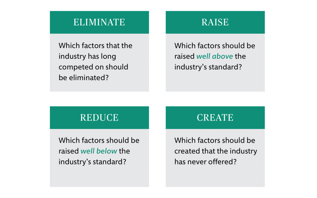
Developed by Renee Mauborgne and W. Chan Kim, Blue Ocean Strategy helps leaders differentiate their brand and service offering through a focus on developing new markets instead of competing in the current landscape. Tools like the Strategy Canvas — a visual way to map the strategic landscape of organizations against industry peers — and the Eliminate-Reduce-Raise-Create (ERRC) Grid (that MacAlindin and Sultan used above) can guide users through effective ways to redefine and reposition their businesses by exploring what they should do more of and less of in order to stand out.
These tools and phrases like “uncontested markets” may feel like they only apply to businesses, but the authors also demonstrate how nonprofits — organizations that are not competing for size, scale, and profit — can use these methods to differentiate themselves and, as a result, better serve the people and solve the issues they care most about.
Building Nonprofit Strategy with the Blue Ocean Shift
At Constructive, we often apply the Blue Ocean Strategy methodology to our brand strategy work. In a recent project for an organization focused on academic mentorship, we used the Strategy Canvas as part of our peer analysis. We looked at similar organizations in order to see where there were overlapping services, focus areas, and groups being served. Nonprofits can use the Blue Ocean Strategy to ask “how can we meet an unmet need?” and have a major impact on the outcome.
We discovered that our client had opportunities to serve a population of students often overlooked among academic support programs and differentiate themselves in ways that would resonate with school districts, donors, mentors, and mentees.
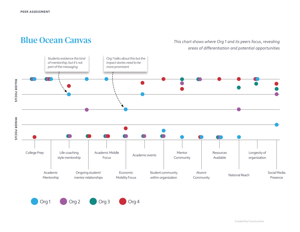
From this exercise, we chose to elevate their focus around three key areas of differentiation:
- Economic mobility as the north star rather than finite goals like high school graduation
- Students who would have no trouble graduating high school but would be in danger of not applying to college for a range of different reasons — financial, family, culture, etc. — instead of a broad range of students
- And the depth and style of the mentor/mentee relationships — many lasting for years and falling well outside the realm of academic mentorship and wading into life-coaching, championing, and developing deep bonds of friendship and respect — instead of mentorship relationships that end after graduation.
These key differentiators identified how this organization stood out from its peers, but more importantly, this exercise unlocked new insights and opportunity. By pinpointing what makes them unique, we were able to help this organization more clearly articulate their mission, values, and vision for future expansion so that more students can experience lifelong mentorship and ultimately achieve economic mobility and opportunity. These results bolstered the need for a new organizational name that better represented the nonprofit’s almost 30-year legacy — and kicked off a rebranding process to carry their vision forward in meaningful ways for the next 30 years of impact.
Redefining Your Organization
Even if some nonprofits and most foundations do not look at their brand as a means to differentiate themselves in competition with their peers, the reality is that even in a collaborative ecosystem, there is important competition. While nonprofits and foundations don’t need to compete for profit in the same way as businesses, there is still a clear need for growth, talent, and funding.
As countless organizations work tirelessly at solving similar problems in their respective issue areas, it can be difficult to discern what makes them different from one another. When the time comes then to engage with funding, donors, participants, or volunteers, each organization runs the risk of fading into the background as opposed to standing out as unique and essential contributors to their field. By using a brand to carve out a niche, a nonprofit can show people exactly what their organization does, why they should care, and how their time and resources will help solve the problem that they care about.
Good leaders are constantly thinking about how to evolve their organization to meet the ever-changing needs and demands in today’s digital world. Whether leaders are considering organizational expansion, a new campaign for donations, or a total rebrand, Blue Ocean Strategy is a defined and effective tool that, at the very least, kick starts important conversations in both small and large organizations. In our practice, we’ve found that this unique methodology can successfully help organizations refine their value proposition, positioning, focus, messaging, and branding in order to speak deeply to the hearts and minds of donors and funders, volunteers, partners, and grantmakers.
Blue Ocean Strategy is a reminder that when we break outside of the bounds of our own definitions and assumptions of how nonprofit strategy “should” or usually works, the result often drives more compelling stories of impact and genuine connection with the people we serve.
So, be brave. Redefine orchestra. Read Blue Ocean Strategy. And unlock your organization’s unique value by reimagining the possibilities… In the end, you may get exactly that.
Since 2016, Constructive has operated a paid apprenticeship program that is a core plank in our commitment to increasing opportunity, learning, and growth for young people eager to build careers in social impact strategy and design. Our “DEI-first” apprenticeships span disciplines and place high emphasis on cultivating careers for BIPOC professionals looking for mentoring, skill-building, and exposure to the experiences that classroom settings can’t offer.
Mentoring, building up the skills and experiences of young professionals, and trusting relationships are essential to career growth and to team success. And as has been well-documented, doing this well during the pandemic has been a challenge for many companies. Remote work has hurt Generation Z because they are given far fewer of the opportunities they deserve to engage in the ways we need to learn and grow. It’s harder to observe and learn by osmosis when you’re not in the room where it happens.
It’s against this backdrop that we’ve been really fortunate to have a structured apprenticeship program in place that gives our team opportunities to mentor—and our apprentices plenty more to learn, grow, and contribute. So, how did we do?
With 2021 in the books, we interviewed our most recent apprenticeship cohort—three outstanding individuals—so that they could share their reflections on what the year meant to them. What were their experiences, where are they headed in 2022, and how has their time with Constructive set them up for the future? Here’s what Molly Fowkes, Queenie Sukhadia, and Felitasari (Tata) Rekso have to say about their year working with Constructive.
Who Are Constructive’s 2021 Apprentices?
Molly Fowkes
Molly joined Constructive as a UX Design Apprentice after graduating with a B.S. in Product Design from Stanford University and an M.A. in User Experience Design from Loughborough University. She loves trail running, film photography, and binge-watching seasons of the Amazing Race.
Queenie Sukhadia
Queenie joined Constructive as a Content Strategy Apprentice with a BA in English and Psychology from Dartmouth and an MA in English from Georgetown. She is currently pursuing a PhD in English at the Graduate Center, CUNY, and she is also a fiction writer herself, having published a collection of short stories called A City of Sungazers in 2017.
Felitasari (Tata) Rekso
Tata joined Constructive as a Branding and Design Apprentice after graduating this past Spring from Parsons School of Design with a BFA in Communication Design. In addition to also dabbling in illustration, Tata loves drinking tea, photography and gaming.
What attracted you to joining Constructive?
Just like our team, Molly, Queenie, and Tata have very different histories, experience, and aspirations. And within this spectrum of differences, there’s a common theme that binds us— a mission, higher purpose, and values that were a common thread for our apprentices.
Molly: “I was really attracted to Constructive’s mission and their commitment to social impact. I’ve often found that companies’ actions don’t align with what they say they’re doing, but with Constructive, this group is really committed to solely working with clients in the social impact space, which was really exciting to me. As part of the apprenticeship program, I valued the emphasis on the learning within the role; and moreover, greatly appreciated that fellow employees went out of their way to teach me and our apprentices.”
Queenie: “One of the big things that attracted me to Constructive was its mission and the kind of work that we do. That aligned very well with what I wanted to learn more about and with the background I came from. I was already thinking about social justice and equity questions more broadly through my graduate work and I was really interested in content strategy. Constructive represented the nexus of all of those things for me, which is why I felt it would be a great place to apprentice at.”
Tata: “I was really interested in Constructive because of the causes we work for—it was pretty cool to find a design agency that focuses on social impact and nonprofits. I had also been participating in non-profit, student-run organizations, so Constructive’s goals connected with me. As for the apprenticeship, I was interested in it because I didn’t really have much work experience, and wanted the mentorship and guidance aspect so I could grow into a better and more well-rounded designer.”
What are the most valuable things you gained or learned as a Constructive Apprentice?
Because they worked in different disciplines, Molly, Queenie, and Tata each worked in different teams and on different parts of our process. They also worked together, growing alongside each other throughout the year. The result was a combination of personal and professional growth that provided opportunities to put theory into practice.
Molly: “Coming out of school, I had all these skills that I hadn’t applied to or utilized within a work setting. Having the opportunity to start in UX Design, then transition into strategy, and apply much of what I learned in an academic setting to a work setting was really rewarding. When you graduate, you hopefully feel confident in what you’ve learned, but it’s difficult to know whether or not those skills will fully translate when starting out as a young professional. Seeing that I could apply my skills was both validating and exciting.”
Queenie: “Speaking specifically as someone who is getting a doctoral degree, one of the big things for me was seeing an impact. I do a lot of theoretical work and I engage with these concepts in a very abstract way in my program, but at Constructive I could put these things into action and see the results of that which was huge for me. I also learned about all these different functions that go into social impact design and how they come together. For instance, thinking about design and how different stakeholders may engage with a website or a specific narrative that an organization is putting forward; then combining that thinking with thoughts about how content is arranged and ideas are communicated through that website. Seeing how it all comes together to make an impact was really valuable to me.”
Tata: “During my apprenticeship, the Constructive team didn’t treat me like a separate entity because I was just an apprentice, instead I was treated like a full-time member of the team, which helped me to learn a lot. It was really hands-on, and I got to work on a bunch of projects, offer support and work on marketing. I learned how to design faster while also maintaining the quality. I also got to refine my design taste and skill through ongoing feedback from Karla and the rest of the design team, which was also really great and insightful.”
What was a stand-out moment during your apprenticeship?
Molly, Queenie, and Tata were tasked with various client project involvements and internal work during their time with us, and each new involvement meant a chance to be exposed to something new or deepen understanding. Among all of their work, Molly, Queenie, and Tata all remember a moment that stood out to them as a highlight of their learning experience— what some might consider an “aha! moment”.
Molly: “I think the first project I had an opportunity to work on was supporting the Child Mind Institute website redesign, which definitely stands out for me. When I came on, the project was in the wireframing process, and the scope and timeline of the work were far more ambitious than anything I had previously experienced. Reflecting on where we started with those initial wireframes, to working with Doug to build them out—and then to see where it is now and how happy the client is with the work we produced for them is really rewarding.”
Queenie: “Two things stand out in my mind. I think one was learning about content strategy from members of the team. I was really immersed in that work and I walked away with so much. And then also just learning about the field of narrative framing and asset framing. I had worked with narratives but I didn’t know that narrative framing was its own entire research discipline. Really diving into that topic as part of our work was fascinating. I had to think about the different ways in which people think and will be called to action, and I really enjoyed that part of my apprenticeship.”
Tata: “I think being given a lot of responsibility on a project working alongside Karla was definitely a standout moment for me. I designed the cover and all the inner pages for the Institute of Coaching Leading with Humanity Report. It was a great way for me to learn how to create a design based on a client’s needs and feedback, which I rarely had done before. Also just seeing all the different skill sets people on our team possess and how they work together was really inspiring throughout my whole apprenticeship.”
What stood out for you about the culture at Constructive?
The pandemic has created both challenges and opportunities for building culture for every company. Culture is something we’ve always been intentional about—and something we’ve leaned into even more the last two years to keep us connected. From what we heard from Molly, Queenie, and Tata, it sounds like the culture we all create together is doing that and more.
Molly: “One thing that I immediately noticed is that not only is Constructive’s team productive and efficient, there is also a genuine interest in getting to know one another. In our weekly Design Team standups, it always feels like there’s a prioritization of people’s mental health and general well-being—especially with regard to inquiring how people are actually doing in the pandemic. There’s a level of care and interest at Constructive that I would guess doesn’t exist in a lot of other workplaces. That was a wonderful surprise.”
Queenie: “I would describe Constructive’s culture as very collaborative, very explicitly equity oriented, and very focused on lifting each other up and lifting up our clients. I always felt supported during my time at Constructive, like I could reach out and talk to people and they would always be willing to work together and lend me a hand. I think Constructive’s culture really fed into my enjoyment of my time with Constructive.”
Tata: “I think Constructive’s culture is very tight-knit, open and unique. That was surprising to see in a fully remote company, like we’ve had to be. I don’t really know how Constructive does it, but I think the team-based approach, strong communication, and also just the genuine interest in getting to know one another, makes Constructive a really enjoyable place to work and to grow in.”
What’s next for you now that you’ve completed your apprenticeship?
Over the years, apprentices have started long-term careers with Constructive and others have used their experience to move into new and exciting things. And while we’d love to be able to have every one continue to grow with and contribute to our team, one of the best rewards is knowing that our apprentices feel well set-up to take their careers and lives in the direction they want to.
Molly: “I’ve always been really interested in the healthcare space, and next I will be joining a company called Blue Note Therapeutics who focus on mental health in cancer patients, specifically cancer related distress. They’ve created digital prescribed therapeutics specific to cancer related distress, and they’re doing really cool work here so I’m excited to join them.”
Queenie: “I’m currently working on finishing up my dissertation and I’m hoping that will be done by the end of the summer. And then I’m joining Linkedin as a content designer. So I’ll be bringing a lot of those same principles of thinking about how people read and interact with content and how to communicate with words in clear and succinct ways into this new role.”
Tata: “I’m currently packing for my trip back home, and I’m moving back to Jakarta, Indonesia! I’m also in the process of honing my CV and portfolio, and applying to jobs right now, hopefully I will get a job with a similar setting as Constructive.”
What’s your advice for other Constructive Apprentices?
With their time with us now finished, and a new class of Constructive apprentices on the horizon, Molly, Queenie, and Tata offered some advice to the next group of young professionals that we’re eager to welcome into Constructive in 2022.
Molly: “I think the advice I would give is to just ask a lot of questions and take advantage of Constructive’s commitment to teach each other and learn from each other. I know that reaching out to people can feel intimidating because you don’t want to feel like you’re bothering someone, especially in a remote setting. But my experience was that everyone is beyond willing to help out and answer any questions. Time flies by in this role, so I’d definitely focus on taking advantage of every opportunity to learn from those around you.”
Queenie: “Something a team member had me do right when I joined was write down my goals for the apprenticeship which I think really helped me. I identified what I wanted to learn and what I was most excited about. That way we could both find ways to nurture the desires and skills that I wanted to build on. So the advice I would have is to be very clear and explicit about what you want to learn and take away from the experience. That way you can incorporate those things into your time at Constructive.”
Tata: “I would say just be really open to all the projects given to you during your time at Constructive, even if it seems like something you haven’t had much experience in or aren’t necessarily good at. You can always speak up and ask for help, so don’t be afraid to ask questions! And definitely stay engaged with the team and participate in everything Constructive offers too to take full advantage of your time here.”
What did we learn from our 2021 apprentices?
Of course, apprenticeships are a two-way street and the best mentorships help both people grow. For 2021, we so appreciated the commitment and resilience of our apprentices as they start their careers in truly challenging times. How you show up matters in this world, and Molly, Queenie, and Tata showed up like caring professionals and great teammates like people with far more years of experience under their belts than their resumés indicate. That deepened our trust to give each more opportunities to stretch. That’s really rewarding when your goal is to build skills, provide meaningful opportunities to contribute, and advance career trajectories.
We also really appreciated how eager and committed to learning Molly, Queenie, and Tata were. That makes mentoring rewarding because it reinforces what each of us has to share–whether it’s a specific skill or just a professional experience—and that small things we now take for granted are valuable learning for someone else.
And the difference in age between our younger team members and our older ones provides something even more special—the opportunity to connect across generations. It may sound a bit corny, but for a few of us with a bit more gray hair, working closely with Generation Z gives us perspective it would be hard to get any other way. Not only does it add to our own experience and perspective, it gives us an opportunity to see where things are headed. And if we are to continue on our mission to design for progress and a better planet, then we need as much of that as we can get.
A big, heartfelt thank you to Molly, Queenie, and Tata for being an important part of our culture, our work, and our mission. You’ll be missed, but we know we’ll be in touch! And everyone at Constructive is excited to see where your lives and careers take you!
If you would like to learn more about our current open apprenticeship opportunities or just let us know you’d be interested in the future, check out our UX Design Apprentice and Web Development Apprentice openings. Or email us at [email protected] and we’ll save your information for when we have an opportunity that’s a fit for you.
Interested in reading the latest round-up? Check out our 2025 nonprofit annual report inspiration!
Annual reports are a staple of nonprofit communications strategy—an invaluable opportunity to connect with supporters, partners, staff, and others who make an organization’s work possible. Each year, nonprofits use their annual reports to tell stories of social impact, celebrate their people, and share bottom-line results on financial stewardship. And each year, innovation in annual reports inspires nonprofit communicators and designers to reach for new ways to communicate impact—especially online. The trend toward digital annual reports is nothing new, but the last two years of remote work have elevated the importance of creating a great digital annual report for nonprofits. Not only because asking to send a print copy to people’s homes is, well, awkward, but also because supply chain issues have caused printing delays around the world.
There are many reasons to create a digital annual report if you’re a nonprofit. Probably at the top of the list is increased reach, visibility, and impact. Shareable content and greater search engine optimization mean more people will see impact stories in digital annual reports than print ones. They’re also more measurable. Website analytics provide clear insight into the effectiveness of your nonprofit’s annual report as a communications tool and make clear what content audiences are most interested in. Integrating direct-response marketing opportunities like donations, newsletter subscriptions, and digital annual reports for nonprofits can both drive revenue and build long-term relationships with your nonprofit’s brand.
Last year, Constructive created a round-up of some of our favorite annual reports from 2020—a year that saw lots of nonprofit communications teams still adjusting to the pandemic. For our research this year, Senior Designer Doug Knapton and I scoured the internet and found more inspiration from some great digital annual reports for nonprofits. And if you’re looking for new ideas and best practices for a great annual report to recap your nonprofit’s impact in 2021—from digital storytelling to interactive infographics—there’s a lot to love and learn from. So here’s our list of annual reports for 2021 (not a ranking, mind you) that Constructive’s design team drew inspiration from. I hope you’ll find them equally as inspiring.
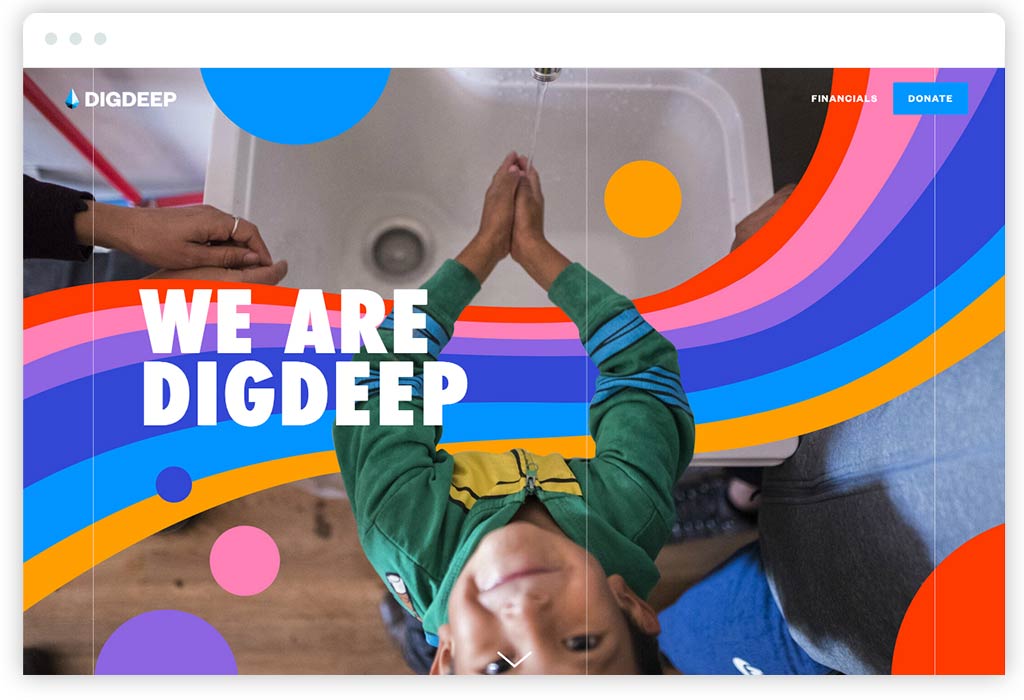
I had never heard of Dig Deep before coming across their digital annual report. Charity: Water may be the most well-known nonprofit brand in the water equity and access space, but Dig Deep has really impressed me with how strong their brand identity comes through in their annual report. Having gone through it, there’s so much to love that it’s hard to know where to begin. This single-page report gets a lot right—starting with me walking away with a great understanding of their mission and so impressed by their work.
I love a carefully designed brand that brings together color, typography, and imagery to present a nonprofit at its very best and to connect people to its mission, and this annual report is as beautiful as it is strategic. The layout, content rhythm, customizing of the photography with branded illustrations, and the visual variety are intentional, created with care, and above all, effective. It’s not easy to keep readers moving down such a long page and engaged as well as Dig Deep’s digital annual report does.
From a content perspective, Dig Deep does a great job introducing the brand (“We Are Dig Deep”), explaining what “The Water Gap” is, diving into projects and impact, and smartly leveraging content on its main website and external websites to give people jumping-off points for exploration. And when you get to the very end, Dig Deep lets you know that they’re a brand that values diversity, equity, and inclusion with one simple statement: “This report was built with input from every member of Team Dig Deep.” Bravo!
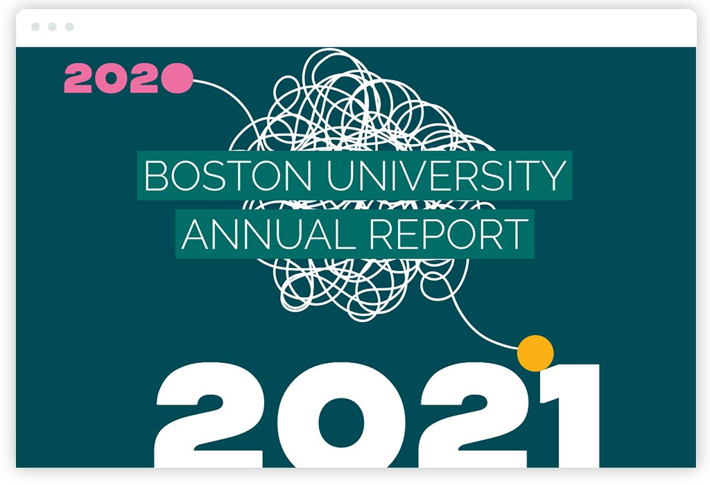
We love what Boston University did with their digital annual report for 2021 (and kudos to them for getting something so polished done before we even got to January of 2022!). This is a nonprofit annual report that’s filled with great storytelling and expertly balances the head and the heart. It’s both emotional and smart, just like a brand experience for an iconic educational institution should be. Acknowledging what was a particularly difficult year for schools and universities, the annual report sets the tone with a table of contents that has an understated, handwritten “See how we made it through” at the top. It then follows through with sections on serious issues like “Diversity Equity & Inclusion” and “Fortifying Our Community.”
Boston University’s annual report content strategy is smart and does an excellent job of breaking up content into digestible chunks and key takeaways that are easy to scan. But that doesn’t mean it’s light on content. As a full website (versus a single-page annual report), it’s also got depth. Sections are filled with digital storytelling and offer lots to explore, which also means that it should perform well in search engine optimization. The design has a ton of spirit. It’s fun, engaging, and with lots of personality, especially the use of typography and illustration. Page layouts are smart and sophisticated, which is impressive because they work so well on mobile.
Lastly, I’d be remiss if I didn’t also give Boston University major props for their outstanding photography in their digital annual report. Theirs really highlights what high-quality photography does for a brand. This annual report is just the kind of report I really want to spend time with, which says a lot about the quality of Boston University’s brand.
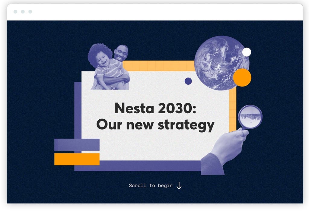
So, this interactive nonprofit report isn’t exactly an annual report, but Nesta 2030 does too many things well to not include in a list of examples to draw inspiration from. Nesta is a social innovation philanthropy in the UK that I’ve admired for years. Their work is expansive and focused on systemic transformation. And their strategic plan report makes their transformative vision accessible and inspiring—creating confidence in their ability to succeed in their mission.
It’s another single-page scrolling microsite, which is very popular. Why? I believe it’s because they’re an effective format for digital storytelling that keeps audiences focused on a narrative. This being said, they can leave audiences who are looking for a deeper dive to evaluate a nonprofit (such as a major funder) wanting more. They also will not perform well in search engines because unless you do some advanced coding tricks, they’re, well, just a single page.
This said, Nesta’s strategic plan report is beautifully designed. It’s cohesive with its brand identity but takes chances and stands out. The use of subtle textures and photo collage/illustration (a technique I personally love) make the philanthropy’s report special—just like a strategic plan report should be. Where Nesta’s interactive report design shines is in its use of animation and interactivity. It’s fast and crisp, so it keeps me feeling energized and active. This makes me feel equally optimistic about their social innovation work. It keeps content light and scannable, so it keeps me engaged. The interactive report then invites audiences to read more with calls to action like “Read more about our reasons for optimism” that elegantly expand new sections within the page.
As I mentioned, from a content perspective, Nesta’s interactive report does an excellent job of making its ideas and content accessible to new audiences. Simple explanations make clear what Nesta does, what their vision for the future is, what their programmatic areas of focus (or “innovation missions”) are, and most importantly, how they plan to deliver on those missions. Taken together, it’s an inspiring read that adheres to a rule in nonprofit communications I believe in strongly: delivering valuable, high-level takeaways for people looking for an introduction and encouraging deeper dives for audiences who demand more.
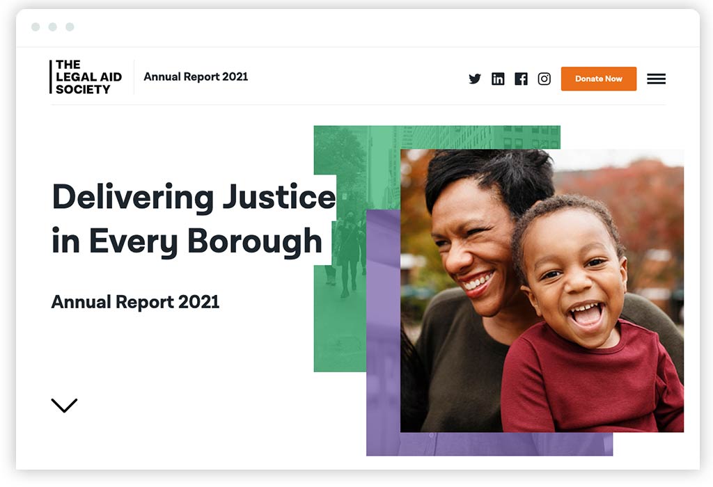
I hope you’ll excuse me for highlighting an annual report that we created with one of our favorite clients, but we are pretty proud of the results. Constructive has worked with The Legal Aid Society to create the nonprofit’s annual reports for four years, usually in both digital and print. I won’t evaluate the design or content of The Legal Aid Society’s annual report—others should decide if we’ve done our jobs well there. The reason I’ve included it is because of a new approach in digital publishing that we implemented this year that creates meaningful long-term value.
Since annual reports are usually not updated much (if at all), it’s common to create them without a content management system to save budget on back-end web development. The thinking is that it’s just not worth it to do back-end engineering for a microsite that’s mostly a snapshot in time. This has always been the case with The Legal Aid Society—until now. For 2021, rather than creating a standalone digital annual report, we built The Legal Aid Society’s annual report directly within the content management system of the website we created with them.
“Why,” you might ask. Simply put, for sustainability and scalability, and to make an annual report that’s a more holistic part of the nonprofit’s brand—both visually and technically. By leveraging a robust design system and CMS that’s been built over time to meet the needs of The Legal Aid Society’s brand and communications, we’ve created more than just their annual report for 2021. They now also have a scalable, efficient publishing strategy that will drive down costs over time and maintain great cohesion with their branding.
Working within the existing design system and web development environment allows us to leverage design components that have been carefully created as part of the atomic design structure of Legal Aid Society’s website. By leveraging existing components and layouts, both our design and development teams saved a lot of time, making it possible to complete the project in just over a month while reinforcing their brand identity. And by setting up this infrastructure for digital annual reports in 2021, both The Legal Aid Society and we will be miles ahead when it’s time to tell their story for 2022—saving time and money so we can focus on innovation in design and digital storytelling.
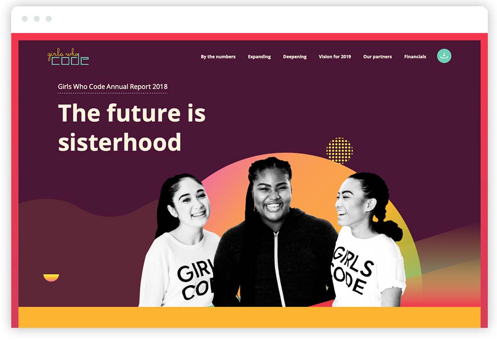
Girls Who Code has been creating digital annual reports for years. This is strategically on-brand, considering they’re a nonprofit whose mission is to advance the skills and careers of women in technology! All of Girls Who Code’s annual reports also take the single-page, scrolling narrative website approach—which, as I mentioned, delivers a focused experience but does hurt search engine optimization. And while their 2020 digital annual report and their one for 2019 are really nice, the one we’re featuring, created for 2018, is special and stands out.
Why do I think it does such a great job presenting their brand and accomplishments for the year? Start with a beautiful design and real attention to craft. The execution of design details is fantastic, and the annual report has an emotional quality and richness that connects audiences to the human aspect of the nonprofit’s mission. There’s subtle, restrained animation that adds energy to the experience and doesn’t distract.
From a content perspective, the nonprofit’s annual report does a great job briskly walking through the annual narrative—leading with Founder, Reshma Saujani’s vision, elevating impact statistics and key data, focusing on programmatic achievements, and then painting a vision for the coming year (which too few nonprofit annual reports do to energize supporters for what’s next).
Taken together, you’ve got a strategically on-brand digital annual report for a nonprofit that connects emotionally, engages the audience, and focuses on its progress to implement its mission.
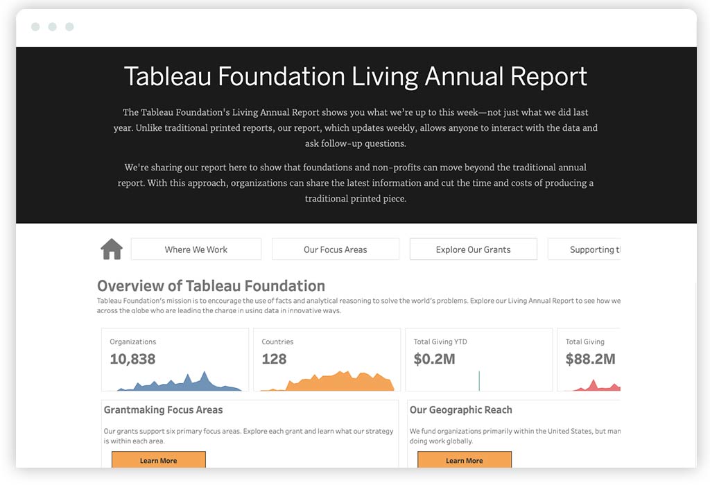
It’s exciting to see a foundation do something so different. As someone who believes that things like websites and annual reports must be strongly aligned with a nonprofit’s brand strategy, I love what The Tableau Foundation does with its digital annual report. It’s an atypical, innovative approach that’s built on smart strategy and reinforces what their brand is all about. While the design could be better (which may send a bad message about the quality of the product for people like me who care about data visualization), the concept perfectly reinforces who Tableau Foundation is, what they do, and why it matters.
The secret to its success can be found in the name. As the Foundation explains, its “Living Annual Report” shows audiences what they’re up to this week—not just what they did last year. Emphasis on “shows” and not “tells,” and here’s why. Because Tableau is a data visualization tool many nonprofits use. So, their Foundation smartly chooses to go extremely light on the words and let the data do the talking. The result in their digital annual report is an interactive dataviz dashboard that quantitatively breaks down where Tableau Foundation works, their focus areas, and their grants. Reinforcing the power of their platform, the annual report empowers audiences to explore the data (even if it isn’t the deepest dive).
While it might miss some of the storytelling aspects of a traditional annual report, Tableau Foundation’s annual report is innovative—and, most importantly, 100% aligned with what their brand stands for.
Here’s another nonprofit that I hadn’t heard of until we started doing our research—and another example of a strong, single-page digital nonprofit annual report. Travis Manion Foundation partners with and supports veterans by leveraging their unique leadership abilities to make a difference in communities.
The design stands out (as does their brand) for having a pretty hard-edged aesthetic that combines technical and gritty. It’s differentiated and creates a good feel for their brand that’s aligned with the veteran community that they stand with. It’s also not flashy, which also feels appropriate. While I might like to see a bit of animation to bring the experience to life, there is something direct and to the point that resonates with me for a nonprofit brand that’s dedicated to veterans.
From a content perspective, the Travis Manion Foundation’s digital annual report does a great job telling the full arc of the nonprofit’s story. It’s another single-pager, and the content has good pacing that’s balanced by thoughtful visuals throughout. There’s a nice mix of statistics, programs and initiatives, impact stories, and more. I particularly like how the navigation at the top is numbered 00 – 09, reinforcing the brand’s military roots. It’s smart details like this that immediately say a lot about a nonprofit’s brand and what it stands for. As a result, I get a great feeling for the Travis Manion Foundation’s brand, an understanding of their work, and most importantly, a strong belief that they’re making a difference.
2021 Nonprofit Annual Reports Summary
Annual reports are an essential part of a nonprofit’s communication strategy. And as you can hopefully see, there’s a lot of exciting stuff going on in digital annual reports—all of which can help nonprofits make the most of their once-a-year opportunity to engage their most important audiences. It is important to say that doing this work well is not inexpensive. Like most website design projects, they are an investment. The key is to make sure that investment is put to good use.
Approached strategically and with great respect for your nonprofit’s brand, the examples we’ve researched this year reaffirm that a digital annual report drives engagement. And when the strategy is to encapsulate what you stand for and where you’re going by recapping a nonprofit’s year of impact, getting your annual report right will likely translate into increased support and action. While we’ve focused on digital, it’s not always a fit for every nonprofit. There is a place for print, and we’ve done (and continue to do) plenty of print annual reports over the years that have done an excellent job for the organizations they represent.
So, as your nonprofit is thinking about ways to design an annual report that’s up to the moment, I hope the innovation and best practices in our roundup have you thinking big. From great storytelling and imagery to interactivity and data visualization, there’s a lot that can be done to demonstrate your impact in ways that are strategically aligned with your brand. And, of course, if you’re looking for help creating your nonprofit’s next great annual report, we hope you’ll get in touch!
Want more annual report inspiration? Read last year’s review of some of the best nonprofit digital annual reports for 2020.
We live in one remarkable time, where advancing technologies and access to information are increasing opportunities and empowering people like never before. But as innovation moves faster and faster, we face a challenge—how to ensure that these advancements empower everyone equally. Specifically, what are our responsibilities when it comes to accessible website design? For nonprofits, a strong commitment to digital accessibility in website design should be a priority—an opportunity not only to demonstrate an organization’s commitment to values of equity and inclusion by designing accessible nonprofit websites, but also to amplify their social impact through their digital strategy.
Let me use a real-world example. While commuting on the bus to the office one morning, an announcement came on over the intercom notifying passengers that another bus was disabled on the road, causing delays. The majority of people on the bus groaned and proceeded to take out their phones and notify their employers of their delay. That wasn’t true for the man sitting next to me; in fact, he didn’t react at all. After he noticed that the people around him looked concerned, he politely tapped my arm and said “I’m deaf. What happened?”
Similar situations happen all the time online—while digital experiences often do take into account user experience, the vast majority don’t pay as much attention as they should to the unique abilities of its diverse sets of users. And for nonprofits who care deeply about equity and inclusion, failing to design accessible experiences for people online not only makes it harder to advance the mission and be of service, it can also be in direct conflict with their values.
The good news? Digital accessibility design has made tremendous strides in recent years. The bar has been raised and accessible website design is expected, not a nice-to-have. the more organizations that commit to accessibility online, the more we’ll be able to make progress towards an equitable Web. But before we understand how we can ensure online equity, it’s probably a good idea to start by making sure we understand the history of web accessibility standards (or the lack thereof).
A Brief Legal History of Accessibility
In 1990, America’s focus on accessibility was officially ratified with the Americans with Disabilities Act (ADA). By establishing a framework that prohibits discrimination and enforces protections for the disabled, this Act ultimately helped pave the way for occupational and resource-access equity for all Americans, regardless of their physical or mental limitations.
Since then, several new laws and amendments have emerged to broaden the scope of rights for disabled citizens. In 1997, a redraft of Section 508 of the Rehabilitation Act was enacted into law to specifically regulate the accessibility of electronic and information technology produced by the federal government. In 2010, the United States Department of Justice released a notice stating that Title III of the ADA, which covers “public accommodations,” is being revisited to determine whether Internet-based properties should be covered under its umbrella. In 2017, the government withdrew their inquiry, stating primarily that they required more input from the general public.
While these government milestones were occurring, it was the individuals and organizations that understood the importance of creating an equally accessible Internet for all and took the lead creating the frameworks that shape how we think of web accessibility, today. Some dominant areas of focus are web site design and development standards and best practices, establishing quantifiable inspection metrics, and creating testing software to gauge how well your site is working.
Why Your Nonprofit Should Make Website Accessibility a Priority
When it comes to creating a truly impactful web experience, your number one priority should always be effectively delivering information to the visitor: whether you’re raising awareness about your cause, educating them about initiatives, or encouraging participation. However, when attempting to engage your target audience, you need to be sure you aren’t isolating anyone in the process. Ask yourself: “How will my website be experienced by users that may be hard of hearing, blind or low-vision, as well as users with restricted mobility or learning disabilities?”
Just as probing at our client’s assumptions helps us understand “why” they’re committed to their mission, implementing accessibility standards can help drive home “how” you execute your mission. The principles and workflow you establish for your website should mirror the inclusionary principles that support your organization. Fortunately, the World Wide Web Consortium (W3C)—the leading web standard’s organization—has established the Web Content Accessibility Guidelines (WCAG), which has the most robust set of rules and guidelines for achieving the highest level of accessibility.
[contentupgrade id=”5807″]
Getting Your Nonprofit Started with Web Accessibility
In an attempt to make the massive scope of an accessibility initiative a bit more digestible, WCAG breaks down the steps you can take into four main categories:
Perceivable — Whatever you are presenting on your website, whether it is information or visual components, must be done in such a way that it is perceivable for the user. For instance, if you have an audio embed, you should offer a text alternative for the hard of hearing.
Operable — All user interface elements and navigation controls need to be operable by all. A great example of this is with regard to a dropdown menu: If you need to use a mouse to activate a dropdown menu, be sure you can also use your tab key to navigate it for users with limited mobility.
Understandable — It should be intuitive for the user to understand how to use the website. This could be something as straightforward as providing a way for screen readers to determine the current language of the website.
Robust — The information on your website should be available to a wide range of devices, particularly those designed to accommodate users with accessibility concerns. Much of the effort here pays specific attention to how the website is built, especially regarding the code.
Each one of these categories is divided into guidelines — Level A, AA, and AAA — each with requirements to achieve conformance to each guideline. The levels generally correspond to the level of effort to implement the requirement with AAA being the most involved.
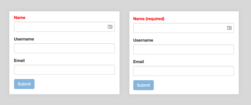
For instance, Guideline 1.4 under the Perceivable category is the category “Distinguishable,” and it helps you ensure your visitors can see and hear your content properly. An example of a Level A technique would be to include the text “(required)” in the label for required form fields, in addition to coloring the label red to designate it as required. This will ensure that the color blind can distinguish the requirement. Here’s what we mean:
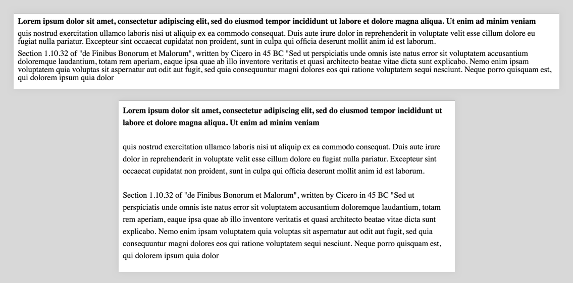
A Level AAA technique of Guideline 1.4 would be using prescriptive standards for your text blocks, such as 80 characters per line limits, enforcing line-heights of at least 1.5 times of the font size a separating paragraphs by 1.5 times the line-height. An example:
A Note about Legal Obligations
It is important to note that there are circumstances where you are required by law to meet accessibility standards, as is the case when your organization receives funding from the federal government. Additionally, there’s been a large focus on organizations that have physical locations and the website is seen as an extension of it. Such is the case with a legal dispute that the Domino’s restaurant franchise is currently challenging. It’s always a safe bet to consult with your legal team to identify any obligations.
How to Test Your Nonprofit’s Website for Accessibility
While the topics governed under accessibility guides may seem a little overwhelming (and truthfully, they can be), fortunately, there is a myriad of tools at your disposal to help you diagnose, test, and refine your accessibility efforts.
Regarding diagnostics, tools such as the Web Accessibility eValuation Tool (WAVE) or the Audits tab in the Chrome Developer Tools do a really great job of providing you with the big, Level-A compliance takeaways, and more. From there, your team can start to address changes like tab orders, color contrast issues, and proper document heading hierarchy. These tools will pinpoint the exact locations on your pages where the issues exist, provide some description into the issue and the WCAG category it pertains to, and offer up suggestions to help boost your accessibility score.
After working your way through these diagnostics, your next step should be to start with actual accessible interface testing. For instance, to test the consumption of your content, you can employ the use of screen readers such as ChromeVox or NVDA to see how accessibility devices are able to function on your website. For folks who use switches for navigating your site, performing a simple keyboard accessibility test by using your “tab” key will allow you to see how well people with limited mobility can traverse the information.
Lastly, nothing will educate you better as to how accessible your site is than some good old-fashioned user testing. Being able to see firsthand how various audience types access your website provides crucial insight into how your accessibility efforts are tracking. Not to mention, it also helps build a little empathy for the people you are working to accommodate.
Moving Forward
Ultimately, the values that are reflected in your nonprofit’s website also reflect the values that guide your organization. And to deliver a truly equitable Web, accessibility design must be about more than just ticking the boxes to meet requirements. It has to be about an ongoing pursuit to make the world more open, inclusive, and compassionate. Does it cost more and take more time? Absolutely. But it’s also an example of living your values—an opportunity to lead by example and promote the change online that your nonprofit puts at the center of its mission in the physical world.
A healthy relationship with your team is critical to the success of any project. Healthy team dynamics keep teams motivated, make room for creativity, allow for transparent and honest communication, and ultimately help produce great work. When two teams come together from different environments , like an Agency and a Client nonprofit team, it’s that much more important to focus on cultivating healthy relationships as a key component to ensuring project success. When looking back at some of the most successful agency-client relationships we’ve had over the years at Constructive, common themes quickly emerge.
Honesty & Transparency
The starting point to any successful agency-client relationship is honest and transparent communication. A clear and open communication strategy creates an environment of trust where teams are encouraged to ask questions, offer up different viewpoints, and voice challenges or concerns from the very beginning of the project. We relish opportunities to hear from our clients about how we’re performing and delivering because it allows us to adjust our process or course correct before major issues arise. It can sometimes be challenging to find opportunities to talk openly with clients about what’s working and what’s not when you’re focused on delivering and meeting deadlines. But we’ve found that when you make the space to reflect on how effectively teams are working together, great insights are uncovered that can be integrated into the project and relationships flourish.
Collaboration
Creating a working environment that is collaborative is also important to ensuring successful agency-client relationships. We can’t do the work we do without our clients’ expertise and input, and we know that our clients engage us because we bring our own expertise.
Collaboration is embedded into every activity and process that we engage in with our clients, and we believe the benefits are profound. A participatory process ensures we’re gathering insights from stakeholders with different goals and perspectives to co-create effective solutions. The end result of such an open, collaborative environment means a plethora of ideas are uncovered, teams are held accountable for the WHY behind their work because they are asked to explain their intentions, and the end product of what we’re creating together is strategically sound because it’s been tested through a collaborative process.
Workshops are perhaps the best example of how collaboration is embedded into our process. Since Constructive operates remotely, and most of our clients are still working remotely as well, we gather teams on Zoom and use collaboration tools like Miro to brainstorm ideas, identify common themes, and problem solve.
Accessible
A collaborative process is not possible, however, unless it is accessible for everyone, so we also see this as paramount to building effective relationships. We try our best to avoid industry jargon, break down complex technical concepts, train our clients on the tools we use, and always allow space for questions and conversation.
We are lucky in that we’re always learning from our clients about their issue areas which are complex and multi-dimensional. One day, we might be digging into the complex dynamics of drug pricing with our clients at Memorial Sloan Kettering’s Drug Pricing Lab, learning why the system is not designed to deliver low cost drugs to patients. Another day, we’re learning about the justice system and the systemic barriers that prevent all New Yorkers from thriving with The Legal Aid Society.
We know our clients are busy working towards a more just and equitable world so the least we can do is ensure our work together is accessible so that we can spend more of our time problem solving, identifying solutions, and co-creating impactful work to advance their goals.
Ownership
One sure-fire way to erode trust in any relationship is lack of ownership. To avoid this, we prioritize communicating early and clearly about commitments so that everyone on a project team knows when things are happening and who is responsible for doing them. While proactive and consistent communication support an environment of ownership, not every project goes as planned and sometimes original commitments can’t be kept. When things do go awry, like a delivery deadline that won’t be made or feedback that won’t be delivered on time, it’s important to own up to the challenge quickly and lay out clear next steps for resolving.
In Conclusion
Everyone has their story of a great project they worked on professionally. While a big part of that story is the end product of whatever was created — a new website that increased donations and reached wider audiences or a new service offering that benefited your constituents — most of the time what is remembered about the project is the people you worked with. You remember the creative energy and collaboration that made the project possible. That’s why we put so much of our focus into cultivating successful relationships with our teams and with our clients.
So in summary, when a project environment is built on trust, communication is honest and transparent, teams are successfully collaborating because processes are accessible, and there’s a culture of ownership, teams thrive and can accomplish great things.
Do you ever feel like your nonprofit’s branding doesn’t accurately represent the organization? That it either doesn’t reflect the culture and values that drive it? Or somehow doesn’t present your nonprofit as the accomplished and impactful leader that it truly is? It’s a common challenge—and one that’s easy to understand. After all, a nonprofit’s brand is the sum of many parts, and effectively communicating them through branding and design takes a great deal of strategic focus and creative innovation to get right. And effective nonprofit branding and design helps build successful brands by connecting a clear strategy and visual expressions that effectively represent that strategy.
These “on-brand” expressions must be cohesive and consistent over time if they are to create brand experiences that stand for something that attracts and resonates with audiences. As designers, we focus on using the power of design to build relationships that stand for something meaningful, creating strategic design systems that scale across an organization to guide every application of the brand. Design systems are complex things with many different parts that work together to point back towards a brand strategy. Successfully creating them is an intentional process. How can you create this alignment in your nonprofit’s branding if you don’t already have it? You need strategic roots, in the form of Design Principles.
What Are Design Principles?
Creating Design Principles is a practice that has guided for-profit brands for years. They are concise, actionable, value statements that distill the core ideas of a brand’s strategy to guide the creation and implementation of branding across an organization. They’re also what help maintain brand cohesion through a design system that reflects the core ideas and values that a brand stands for.
When it comes to designing branding for nonprofits, think of Design Principles as a combination of vision and values translated into crisp, strategic statements that clearly define an organization’s social impact value. They are the handbook for how a nonprofit’s brand truths will be brought to life. They use clear language to guide strategists, designers, and anyone who contributes to creating brand experiences. Since design’s role is to make strategy tangible, Design Principles remind us what those experiences should be about—what the brand stands for and why it matters.
Think of Design Principles as a brand strategy that is condensed and made actionable for design execution—a checklist to reference when creating, evaluating, and implementing design. To make the idea more tangible, here is an example of Design Principles that we recently established for a nonprofit while developing their design strategy. They may not make as much sense as they would with more context about why they were appropriate, what you’ll hopefully see is how Design Principles start to paint a picture of what a brand stands for:
- To be successful, the brand must be a leader of innovation in its field.
- To be successful, the brand must be bold, dynamic, and proud.
- To be successful, the brand must embody scientific certainty.
- To be successful, the brand must lead with a commitment to social equity.
- To be successful, the brand must invite partnership and collaboration.
It seems simple—and it is. That’s the idea! What makes Design Principles powerful for nonprofits is that they articulate an organization’s vision for the future, how they’ll realize that vision, and the values that they bring every day to realizing that vision. They include some of the tensions that great branding must navigate to authentically embody the nuance of complex organizations. This combination is invaluable to design teams because our work makes this vision of a nonprofit’’s brand a tangible reality.
Understood this way, Design Principles are a perfect way for us to ensure that the branding and design that we create results in audience experiences that are aligned with a nonprofit’s brand strategy. By remaining front-and-center in our minds throughout the strategic design process, Design Principles give everyone working on a nonprofit’s brand—both inside the organization and at an agency like Constructive—a unified vision to focus on.
How Do Design Principles Empower Teams?
Starting with Design Principles makes branding and strategic design accessible and actionable for everyone involved throughout the process. The more clear and direct Design Principles are, the better they are in giving design teams the inspiration and the flexibility they need to bring a nonprofit’s brand to life and stay “on-strategy.” Design Principles also make the design process more accessible and inclusive for non-designers, which is really important because, branding often includes many stakeholders—especially in nonprofit work.
By centering nonprofit branding on strategic Design Principles and using accessible language, design teams make it more comfortable for everyone who is part of the process to contribute to it. We help everyone understand and evaluate how well (or not well) design is translating the brand’s strategic goals. We facilitate productive conversations. And, by returning to our Design Principles, we ensure that everyone stays focused on the right things, especially when subjective opinions can get in the way of strategic execution.
As designers create design systems for nonprofits, Design Principles provide guidance on the many subjective decisions they must make. How does a typeface express a “compassionate ally for children’s mental health”? What colors represent a “tenacious protector of democratic government”? What shapes and styles make “complex social issues more accessible and inclusive”? How can a user interface reinforce an “objective expert on climate research”? These are the kinds of questions that designers ask themselves and apply their skills to every day.
And while there’s no single right answer to these questions, there absolutely are better and worse choices when designing a nonprofit’s brand. Design Principles make these decisions—and as a result, the design process—faster and more effective because they make it easier for designers to evaluate how well what they are creating reflects the brand’s strategic imperatives.
Design Principles move our work forward by helping everyone move forward together. As a result, we create branding and communications that more accurately represent what a nonprofit’s brand stands for. And since Design Principles are rooted in the core ideas that guide a nonprofit’s strategies for change, they provide a guiding framework to evolve the brand as the organization grows and changes. Not only can Design Principles help audiences better understand an organization, they also help the organization better understand itself.
How to Add Design Principles to Nonprofit Branding
It’s important to say that no single design element (a typeface, a color, a logo) can encapsulate every Design Principle in a nonprofit’s list. Brands are complex things that are filled with nuance and healthy tensions. Evaluating a color or a typeface on whether it successfully embodies 5-7 design principles would be impossible! Rather, successfully realizing a nonprofit’s Design Principles is achieved through all of the elements in its design system. Taken together, this design system embodies the nonprofit’s brand and represents the totality of its priorities and promises.
As mentioned earlier, the key to creating effective Design Principles is an inclusive design process. The reason Design Principles are central to our work at Constructive is that they are a great foundation for cross-disciplinary collaboration—and collaboration with diverse stakeholders is essential both to nonprofit branding and to human-centered design. Different people in an organization have different priorities, needs, and concerns. So when creating Design Principles, be sure to use the opportunity to gain diverse perspectives on the current state of a nonprofit’s brand and its hopes for the future.
Ideally, you already have a clear brand strategy in place to reference—that’s the best place to start. If you don’t, then turn to your strategic plan. With the strategic priorities of the brand clearly understood, everyone can work together to decide what the non-negotiable aspects of your strategy are that design must translate.
How many Design Principles should a nonprofit declare? There’s no set number. What’s important is to speak to the totality of an organization’s social impact value without over-complicating things. For me, I like to define between 5-7 Design Principles when working with clients. That’s usually enough to articulate the most important imperatives of a nonprofit’s brand to guide our work, but not so many that things get confusing or impossible to reconcile.
Best Practices for Creating Nonprofit Design Principles
Agree On Your Roots
The success of Design Principles starts with uncovering truths of the brand by asking two fundamental questions: “who are we?” and “what are we promising to the world?” These are the roots from which the future of your brand will grow, so everyone must on them. Most importantly, when defining your strategic roots, make sure the process is inclusive, participatory, democratic—and that reflects your organization’s diversity of perspectives.
Carve a Wide Path Forward
The success of Design Principles is keeping them focused without being prescriptive. They should provide designers with a clear path forward, while keeping it wide enough to innovate. The idea is to provide purpose so that design is intentional, focused on vision and values, and keeps a nonprofit’s brand focused on achieving its goals.
Focus on the Audience
Successful Design Principles can be clearly seen through the eye of the audience. Of course, every design principle is saying something about the nonprofit brand for which it stands, but what matters most is what the audience values in the brand—that combination of vision and values. And, as a result, your nonprofit’s branding and the experiences you create will resonate with audiences based on what they value most.
Choose Your Words Wisely
Use descriptive language when creating Design Principles. The goal is to create a picture in people’s minds of what the brand experience stands for. Also, I like to lead into our Design Principles with “To be successful, the brand must…” and then list them out in priority order. Using “must” reinforces that Design Principles represent non-negotiable aspects of the brand, and a priority list makes clear which strategic imperatives should be emphasized most.
Stand the Test of Time
Design Principles can offer guidance to your nonprofit’s stakeholders and design teams now, as well as for people in the future that will be responsible for growing the brand. This makes them a great tool for change management and continuity—providing a North Star for strategists, designers, and stakeholders to ensure that a nonprofit’s branding continues to embody its highest strategic imperatives.
Taking Design Principles Further
If the value of leading your nonprofit’s branding efforts with Design Principles resonates with you, there are lots of ways to take this work further. Of course, if you’d like to speak with me or Constructive about how we can help, please get in touch. And if you’re looking to explore concepts and practices more on your own, probably the best place I can recommend to visit is Principles.Design, which is an amazing, open-source library of Design Principles resources and methods to learn from.
I love design. Design is all around us. Every part of our built environment is an act of design, an act of creation—and an act of human expression. Design is an act of giving—it is done to be of service to others. This is because it is through design that we navigate and make sense of our world. There are reasons, benefits and consequences in every design decision that we must consider. Who are we designing for and why? What outcomes do we want to achieve? Should we prioritize immediate needs or do we focus on long-term thinking? What are the trade-offs? These questions are at the heart of human-centered design, which is at the center of Constructive’s strategic design practice.
For nonprofits, foundations, and social impact organizations, their implications go far beyond how something looks, how it can be interacted with, or how it’s experienced. They are fundamental questions about how an organization can be of greater service to its mission and to the people that it serves. And when designers think about how to approach the problem solving that is design, we create more inclusive, equitable, and sustainable design when we include diverse perspectives throughout our human-centered design process. And in doing so, we attempt to answer not only the question of how should I design? But rather, how should I be as a designer? This is our Higher Purpose.
Because it is all around us, design is, of course, multifaceted. And that’s what makes it so exciting—and an endless pursuit of human experience. As a designer, I love all of it! I love typography, industrial design, user experience, and visual design. I love sound design, landscape design, architecture, service design, information design, organizational design, ikebana, interaction design, trail design. The list goes on and on. And it’s my belief that every designer owes it to themselves and to the people they design for to explore understanding (if not performing) multiple design practices as possible. The more, the better.
Why? Because all of the designed world—and this means literally everything but the natural world—makes up a tapestry of products, services, and experiences that become our lives. They are the things that we use every day. Design is about living our values. What does their design tell you about the designer and how they thought of you when designing these things? Is there great care and attention, or does the design feel like an afterthought? What does their design help you understand about society, the zeitgeist, or the attitude and outlook of business, government, NGOs? What about the state of the world? What does a designer’s work tell you about yourself? How does it make you feel? These are more of the fundamental questions that human-centered designers must continuously ask themselves.
The Responsibility of Human-Centered Design for Social Impact
Being a designer is an awesome responsibility. The designer’s perspectives, agendas, blind spots, and biases are directly reflected in everything we see around us. This is why a focus on learning, perspective, and understanding of the lived experience of others is so important. Look closely and you can see the painstaking lengths to which the devoted designer will go in order to create a thing of wonder—a thing that makes a true difference in your life in some way. They have accepted their role and responsibility as the creator of that experience. They will bring something into this world, where, before there was nothing. It is these painstaking lengths—and the perspectives and influences on design—that interest me the most. It’s the deep and perpetual work that excites me about design—no matter what it is that’s being designed. Design is both a verb and a noun, and this work is the design behind the design.
And so it’s these perspectives that inspire me to further examine what drives design decisions, their place in the greater ecosystem, and the designer’s ability to go beyond simply what they’re asked to do and to instead create what is needed. Because, when our goal is social impact—to design for change and to design for a better world, then we owe it to everyone in this world to bring our best in creating what the world needs right now. Whenever that now is.
John O’Donohue, quoting the thirteenth-century mystic Meister Eckhart in an interview said: “So many people come to me asking how I should pray, how I should think, what I should do. And the whole time, they neglect the most important question, which is, ‘how should I be?’”
If we were to explore one question about design, it would be exactly this: As designers, how can we be? It’s an important question because, just as society does, design firms can emphasize short-term design processes: Thinking in general terms, building quickly, testing, learning, and iterating. It’s a practice that I use all of the time as well, but I’m mindful to always keep one eye always on the long-term and its impact on the wider system. The perspective is by no means foolproof. The more perspectives you can have guiding the outcome the better. Design processes that prioritize short-term, isolated thinking prevent designers from anticipating the larger impacts of their work. They simply produce work. They’re kept on the surface.
But excellence in human-centered design is only partially a product of talent and training. Today, it’s much more of an exercise in thinking, listening, confronting biases, exploring perspectives, and nurturing a growth mindset. Again, in social design—in the work of designing experiences that help nonprofits, foundations, and social impact organizations truly move the needle on important things—maintaining this mindset is essential. I’d say it’s non-negotiable. This is especially important when we look at the democratization of the technology used in design and how much of these decisions can be made for us by that software. Soon it will soon enough be able to do much of the work for us. So where does that leave the designer?
Going Deeper into Human-Centric Design for Nonprofits
The real magic happens when we go deeper as designers. A passionate designer will be able to split their thinking into the short- and long-term in order to design better products, better brands, better experiences, and better relationships. A better world. They are able to pull in perspectives from all over. They are able to see both the whole and its parts—and act accordingly. This is why exploring so many design practices is so important. That’s what makes it possible to put holistic, heuristic , human-centric thinking at the center of our work. Every designer of every kind needs their own methods and perspectives if they intend to make a greater impact on the world through their work. They need to study those things that captivate them—whether it’s art, baking, architecture, music, history, philosophy, religion, justice, or the like. This kind of study allows us to open the lenses through which we can experience, interpret, and create the world around us. When we consciously choose to add competing perspectives into the mix of our understanding, we challenge ourselves to question what we think we know. The 16th century philosopher Michel de Montaigne had a motto: “What do I really know?”
One perspective I’ve found as an inspiration is that of Sōetsu Yanagi. Writing about Mingei in Japan—a folk craft movement similar to Arts & Crafts—he believed that the ordinary craftsperson should be able to produce large quantities of simple, useful, everyday objects. Objects that were local to the region in which they were produced, affordable to most, useful, and durable. No amount of blind and selfless repetition was too much in the creation process. Interestingly, this was exactly what the industrial revolution and machines and factory workers were doing around the exact same time: Mass production of useful, durable goods, with adequate levels of craftsmanship to satisfy the consumer. We’re also faced with a similar philosophical dilemma as designers.
Before joining Constructive, I worked on an internet-connected washroom technology product for high-traffic public spaces, the majority of my field research was centered around reducing waste, providing clean and ready facilities for patrons, and helping custodians spend less time in the washroom. In most instances, that’s enough to be considered a success. But in all of my reports and analysis, I included notes on additional value that the technology could provide. In the process of observing custodians throughout their shifts, I noticed they would help travelers find their gate, translate English into Spanish to help someone find an exhibit hall, or really get excited by the technology. It became apparent that opportunities existed for custodians to contribute to higher value work and explore their own unique contributions. The technology would tell them when something needed to be addressed in a washroom, and outside of that, the sky was the limit.
Understanding Human-Centered Design’s Role in Breakout Social Innovation
In doing this important work, I was reminded of a Stanford Social Innovation Review article titled “Creating Breakout Innovation” very beautifully describes one of its core principles for perspective building: “Legitimizing all ways of knowing.” The author could have easily made this point in a less philosophical way, but they decided to go all-in. They could have simply said, “Include different viewpoints.” And that may have been sufficient. But to legitimize all ways of knowing is a different thing entirely. It means suspending judgment and taking in everything as it is—not how we believe it should be. Similar to meditative practice, it means approaching problem solving with the child’s mind so that we are truly listening, learning, and understanding how our design will make a difference for the people for whom we create it. In the case of my public washroom project, maintaining this mindset gave me insights into how custodians could further benefit from the technology we were working on by taking in as much of their lived experience so that I could understand, reflect upon, and respond to it.
Empathy, compassion, flexibility, and self-discovery can be developed over time and contribute to the meaningfulness of a designer’s work. This is a durability that never goes away. Designers can learn to practice silence and deep listening. They should spend time reflecting. They should debate the role of the rational mind being the only source of their observation of the world. They should question their intent, and ultimately their own design work. They should explore their craft in greater detail, their processes, and the mindsets that move them as creators and makers of wonder. This emphasis on mindsets—how we determine what to put into our work—will drive the future of design. This is what will separate the designer from the producer.
Marketing’s emphasis on storytelling gets consumers to the point of trust or purchase, but it doesn’t do much to remind them of the bigger picture. And that’s where the designer’s perspective comes into play. Thomas Berry, a cultural historian and religious scholar said that “We are in trouble just now because we are in between stories.” The old stories—mythology, one of my many fascinations—helped people understand the meaning of life, their place in it, and it’s purpose even in spite of life’s trauma and suffering. These stories sustained cultures for hundreds of years. Today’s stories, however, have a much shorter shelf life. And our design methods may be contributing to this phenomena. For example, digital projects are rarely complete. They are fluid and always evolving. We don’t design for digital experiences in the same ways that we produced things in the past. We live in a short attention span world. And the impact of this transience of design has the potential to make our connection to our world and to each other more shallow. So, as human-centered social impact designers, we must always resist this and design for deeper meaning. We must also adhere to the principles of ethical storytelling if we are to design for an ethical world.
Embracing Our Role as Human-Centered Designers for Social Change
In reflecting on design and why I love it so much, I’m reminded of my grandfather. He had peripheral vision loss with advanced glaucoma later in life. He described what he could see as if he were always looking through a straw. He had to sit right up next to the screen when he watched boxing on cable, and he’d scan the television for the action. But he could still point out where we were whenever we’d drive around town—even though he couldn’t see anything past the hood of the car. If we can only see, experience, and interpret the world through a narrow opening, then our work will be limited to that as well. So, as designers with an awesome responsibility to the world, we have a duty to open these lenses wide. We have a duty to take the time to see through the eyes and experiences of others. Because, only then can we design a world that lives up to our values and our most lofty ambitions.


