As political rhetoric and uncertainty ramps up, nonprofits face pressure to show (and not just tell) how they’re making a difference in the world. Supporters, funders, and even your own team are looking for transparency that connects the dots between your values and actual results.
Enter: The annual report. This still remains one of the most essential tools in your nonprofit communications toolkit. It’s your chance to zoom out, celebrate your community, demonstrate your impact, and make the case for continued support—with clarity and conviction.
Our team explored a variety of digital annual reports and impact reports that rose to the challenge. If you’re planning your next impact report or are looking to sharpen your approach, we hope this roundup gives you some fresh perspectives to learn from. Here are the reports from 2023/2024 that stood out to our team (in no particular order).
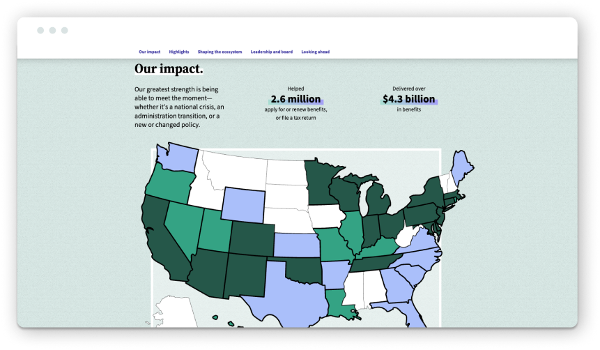
Code for America’s 2024 impact report immediately signals that it’s not just recapping the year. The opening letter from CEO Amanda Renteria sets the tone: “2024 was a year marked by change—some of it exhilarating, some of it daunting, but all of it underscoring the urgency and importance of Code for America’s mission.” Acknowledging the challenging ecosystem grounds the report and shows how the organization is responding to the times, not just reporting on the numbers.
The report uses vibrant colors, illustrations, and subtle motion to guide users through the experience while keeping it engaging. The scroll experience is super smooth (if you want to read from start to finish), but we also appreciate that the report includes a table of contents with jump links at the top so readers can navigate to specific sections based on their needs.
Bold headlines bring the narrative to life and showcase their highlights at a glance, such as “modernizing government services to deliver better for all.” The report also does a nice job of breaking content into digestible bites to reduce cognitive load and improve readability. Code for America weaves a compelling story throughout and reinforces itself as a leader in the civic tech space. It ends strongly with the final CTA, inspiring readers to take action: “Now, our charge is to keep the momentum going even as the world around us changes.”
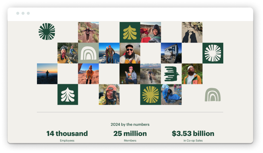
Nonprofits looking to elevate their annual reports shouldn’t just turn to other nonprofits for inspiration. We also highly recommend taking a look at B-Corp and socially responsible businesses. REI Co-op’s 2024 impact report is proof of why! And yes, while organizations like REI most likely have a heftier production budget for their reports, there is still plenty to learn from how they structure content and create immersive experiences.
From the start, the report pulls you in. A full-width hero video brings us right into the fold (literally) by showing REI team members gathering in a huddle. This makes it feel like we’re also part of the community and shared purpose. Instead of opening with a letter from their CEO, this bold statement sets the tone for the report: “We’re on a mission to get everyone outside. And every single one of us plays an essential part. The proof is right here in this report. It’s a living, breathing tapestry of individual stories that make up our collective drive onward and upward as a co-op.”
That sense of collective impact is reinforced throughout. Candid photography sourced from REI team members at events and enjoying the outdoors adds a feeling of authenticity. Design elements like fonts, colors, and iconography are cohesive and rooted in REI’s outdoor aesthetic.
We also really appreciate the report’s structure. While many digital reports opt for the simplicity of a long-scroll microsite, REI uses a multi-page approach to allow deeper exploration. Readers can jump from impact stats, community work, and sustainability milestones or dive into stories that bring the data to life. The navigation—guiding users clearly and quickly from section to section while also offering a sidebar table of contents—ensures that the reader can explore any chapter in the report without necessarily forcing them to go through every section.
The report also does a great job of balancing narrative and numbers. Clean charts and infographics make the data digestible, and curated stories give readers a sense of the people behind the impact. At the end of the report, they include a content block that links to past reports going back to 2006. It’s a simple but effective way to provide historical context and transparency, which we don’t often see done well in annual reporting.
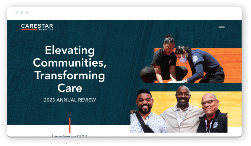
We’re proud to include this report in the roundup, and not just because we had the privilege of working on it! CARESTAR’s first-ever impact report is an excellent example of what it looks like when brand, strategy, and storytelling align.
CARESTAR Foundation came to Constructive at a pivotal moment. After six years of learning and growth advancing racial equity and community-led action, they were ready to reflect on their progress and share a vision for what comes next. The goal: create an impact report that honors where they’ve been and outlines where they’re going.
We began the process with a staple of Constructive’s research and discovery process: the Learning Conversation. This facilitated dialogue brings all stakeholders together to share perspectives, align on goals, and define what success looks like. In those early conversations, CARESTAR’s four brand values emerged as the foundation for the report content strategy: Equity, Compassion, Unity, and Hope.
From there, we built the narrative structure around those brand values. Each content section connects directly to one of the guiding principles and features tangible stories of impact with grantee highlights, research insights, and community resources.
Visually, the report is warm, vibrant, and expressive. A new palette of bright, complementary colors adds energy, while introducing a serif typeface adds legibility and a human touch. Background textures and field photography add depth and emotion, rooting the design in real stories and CARESTAR’s community.
As you can see with this example, impact reports are essential for organizations of all sizes and stages to consider, even if they aren’t created annually. We designed this report to be a reflective report capturing 6 years of progress and a forward-facing tool to engage funders and inspire grantees in the months and years ahead. An annual report does more than look back—it builds momentum for the future.
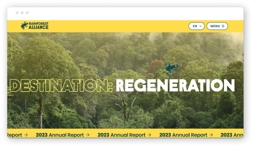
Did we include this report because of the animated jumping tree frogs? (Maybe). But that’s not the only reason it made the list. You’re brought right into the rainforest when you land on this landing page. The scrolling “2023 Annual Report” banner at the top also catches your attention.
What’s working well on the design front: A rainbow of colors reflects the organization’s global biodiversity work, playful animation adds personality, and oversized type creates an easy reading (and scanning experience).
From a functionality standpoint, one feature that’s helpful for this report (as it references a whole host of other reports and case studies) is a simple expanding accordion so that content is nested and doesn’t clutter the experience, but users can expand to read more if they’re interested in the topic. This click-to-expand option makes content scannable, elevates the highlights, and allows audiences to choose which details they want to immerse themselves in.
From the name of the report (Destination: Regeneration) to the copy throughout and the colorful design, the whole experience feels hopeful. We often see organizations in the climate space lead with doom and gloom, so we appreciate that the Rainforest Alliance takes a different approach here by focusing on progress and regeneration. This positive framing inspires the audience to take action instead of becoming immobilized by anxiety.
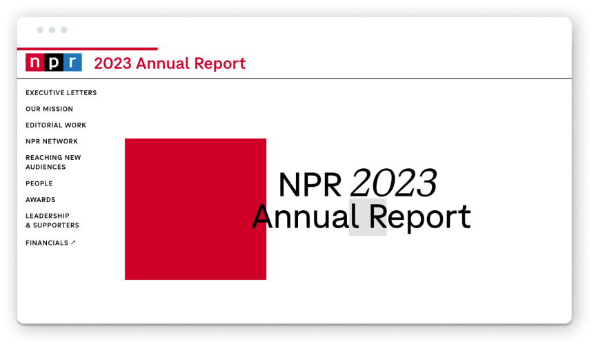
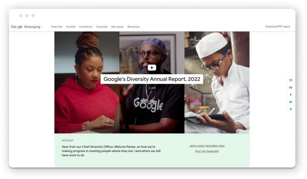
This one from NPR is fun—and we don’t usually say that about annual reports! It’s as engaging as it’s informative and substantive. They do a great job of balancing editorial polish with interactivity. The report is structured like a well-crafted editorial feature with body copy, pull quotes, and multi-media content to guide the reader.
We enjoy the on-brand (and intentional) use of color throughout the report, along with subtle motion as you scroll (both vertically and horizontally). A nice touch: photography features local reporters and Member Stations, grounding NPR’s national presence in local communities. From a messaging perspective, there’s a strong emphasis on what’s made possible with public support. Readers learn their contributions helped the team serve 42 million readers weekly, produce 12,000 newscasts, create 120 tiny desk concerts, and publish over 14,500 podcast episodes. There’s a sense of shared accountability and success.
And, of course, it aligns with what NPR is known for: high journalistic standards, public service, and storytelling. In our books, this report lives up to their reputation.
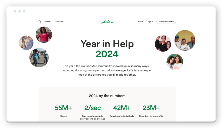
“Let’s take a deeper look at the difference you all made together.”
This report example from GoFundMe isn’t an organizational annual report per se but more of a celebration of community impact. And it works. It’s an interesting approach for platform-based organizations that operate to help their audience take action through fundraising, volunteering, or advocacy. By shifting the spotlight on the community by saying, “You made a difference,” GoFundMe shares the collective impact.
The report jumps right into 2024 by the numbers, showing just how widespread the impact is (with two donations happening every second, on average). That momentum sets the stage for the stories to follow. Yes, the big performance numbers are impressive. But what stands out is the report’s ability to zoom in and balance individual stories of neighbors stepping in to help one another when tragedy strikes.
A few design moments stand out: Branded graphics of maps show the most generous states and cities. Clean, modular content blocks and card-like modules break sections into digestible bites. Images of real people from real fundraisers, short videos, and quotes bring the community stories front and center. It’s a long page, but it doesn’t feel like one.
“In moments of uncertainty, there was generosity.” It’s a powerful theme, and the report delivered on it.
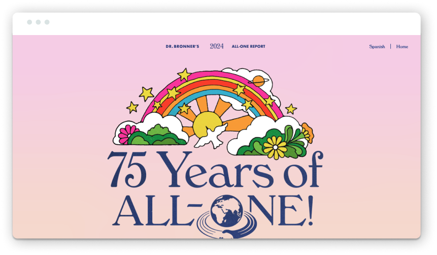
If you’ve ever picked up a bottle of Dr. Bronner’s soap and read the label, you know exactly what to expect from their report. It’s just as detailed and eccentric (maybe not as wordy).
Can we say a soap brand’s annual report is … refreshing? Vibrant color, whimsical illustrations, collages, subtle animation, and joyful photography all come together in a design that’s as bold and values-driven as the brand itself. It feels like a uniquely Dr. Bronner’s experience through and through.
The report structures its content around the company’s Cosmic Principles, a set of guiding values that drive the entire business. Each principle anchors a report section, paired with real stories and measurable impact. (It’s a structure that reminded us of how we approached CARESTAR’s annual report).
Every design and content decision feels intentional. Copy blocks are expandable, letting readers skim or dive deep. They decided to present stats and charts in carousels, which invites users to scroll through without overwhelming them. And in a particularly on-brand move, their revenue breakdown is visualized in the shape of a soap bottle. Delightful.
Underneath all of the creativity, this report is radically transparent. We need more storytelling and accountability like this.
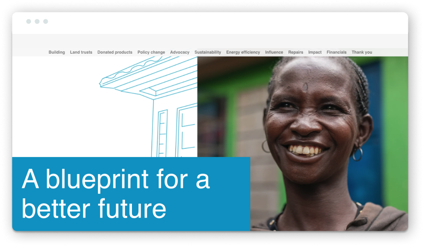
We’ll start by saying that this report from Habitat for Humanity doesn’t check all of our best practice boxes, but we think it’s worth spotlighting what it does do well. There’s no such thing as a “perfect” annual report, and this one gets plenty of the essentials right.
The report is rich with stories, program updates, and performance numbers. And maybe it’s a little bit too content-rich. A few sections could be trimmed a bit to make the content more digestible and less dense. That said, at its core, the messaging effectively communicates organizational progress and centers the people it serves.
The interactive map at the end stood out to us the most from a functionality standpoint. As you scroll, the map displays data by region and shows the scale of the organization’s impact worldwide. Helper text and table labels provide additional clarity without cluttering the screen. And the use of motion while you scroll makes it feel immersive.
The title of the report and the blueprint-style linework and background textures all tie together nicely to ladder back up (sorry, pun intended) to Habitat’s work and mission. The connection between building together and collective impact comes through both in their messaging and their photography.
Interested in Exploring More for Your Nonprofit’s Annual Report?
Check out our past annual roundups with inspiration from 2020, our favorites from 2022, and standout examples in 2023. You might recognize a few repeat appearances, which speaks to these organizations’ ongoing commitment to creating reports that are both tailored to each year and aligned with their long-term brand strategy.
And if you want to explore the potential of building a great report for your organization, reach out anytime to work together. Maybe your report will make this list next year?
Kaylee Gardner, Digital Strategist at Constructive, contributed to this roundup!
Crafting the right nonprofit brand messaging can be especially challenging for organizations working on climate communication and knowledge mobilization, where urgency, scientific complexity, and polarization collide. But for some further hope and creativity in our approaches, I know one place we can look to for inspiration: up North. The Arctic is a particularly interesting region for discussing climate change, cooperation, and degradation. As a result, the region is rife with examples of effective—and ineffective—climate narratives used by politicians, leaders, academics, and organizations alike to change minds and move agendas.
At Constructive, I’ve spent years helping mission-driven organizations, including those in the climate sector, shape meaningful narratives and digital strategies that drive impact. In 2024, I took a sabbatical from my role as Digital Strategist to dive deeper into a topic I’ve long been passionate about: The Arctic. I moved from Hoboken, New Jersey, to Reykjavík, Iceland, where I enrolled in a semester-long graduate program at Háskóli Íslands (The University of Iceland), studying the intersection of climate, cooperation, and policy in the world’s northernmost capital.
Through my coursework and attending the Arctic Circle conference, I realized that many of the insights I gained about climate communication and cooperation in the Arctic have broader relevance across the climate space. I found invaluable lessons on how storytelling, framing, and trust-building can shape public perception and policy across continents. In this article, I’ll share some of those takeaways and explore what they might mean for nonprofit communicators and practitioners in their corners of the world.
Cultivate Unity: Frame Climate Action as a Shared Purpose
Something that became immediately clear to me from reading scholarly work and attending the Arctic Circle conference was that climate change—and the need to tackle climate change—is a real unifier in Arctic geopolitics. For instance, one of, if not the most important facets of Arctic governance and cooperation today is The Arctic Council. Established in 1991 with a focus on environmental protection, the Council includes representatives from the eight Arctic states, Arctic Indigenous Peoples, and various observer representatives. While the original environmental protection strategy that started it all has since evolved into a council that discusses an ever-widening number of issues, the environment and climate change work remains a central concern of the forum’s working groups. In this way, a commitment to the climate has brought together the Arctic states into much wider avenues of research and resource cooperation, as well as providing an essential forum for Indigenous voices to be heard.
The foundation for such cooperation can, in part, be traced to the deep connection between the Arctic Peoples’ climate and their identity. In the Arctic, the climate isn’t something that’s ignored or disregarded societally—it’s a piece of Arctic Peoples’ identity and something that people from different nations or Indigenous groups share. The ice, Aurora Borealis, long dark polar winters, Arctic flora, and fauna are unique in nature, and as Arctic scholar Ingrid A. Medby puts it in an academic article on Arctic identity, it’s “not about owning the Arctic, but about being Arctic.” Indigenous people have lived on the ice for generations, relying on their understanding of the environment for survival, with some surviving on subsistence hunting and living nomadic lifestyles. In the Arctic, the climate is the way of life, and people from various Arctic states and Indigenous communities feel kinship with each other because of their shared environment.
Often in climate change communications, we discuss avoiding polarizing ideas or language—we just assume that the climate is a topic that may pull people apart. While it’s important to consider how climate change can be a polarizing topic, we see in the Arctic that it has an intense capacity to bring people together. Climate communicators can remind people of this by referencing examples of impressive climate collaboration that have already taken place (like I just did in the Arctic) to overcome the often-encountered hesitations that climate change is too large or insurmountable an issue for us to tackle.
And it’s not only Arctic Peoples that must live in harmony with their environment, so climate communicators can take on the vital role of reminding everyone, including city dwellers, people living in tropical locations, or other non-Arctic locations, that the unique aspects of their climate directly impact their lives and their community. While the Arctic may have especially strong links between identities and the climate, these links are ever-present worldwide.
Demystify Complexity: Communicate Climate Science with Clarity
For Arctic Peoples, the effects of climate change are often not distant concepts. Instead, they are real effects that are both seen and felt. However, this doesn’t mean that communicators can make blanket assumptions about the knowledge levels of any audience, because climate change is intensely complex.
Consider Greenland, where the glaciers have been melting, and the climate has been changing at rates that are perceptible to Greenlanders. A recent study showed that while around 89% of the largest Greenlandic Inuit people group, Kalaallit Nunaat, agree that climate change is happening, only 52% percent of the population in the survey indicated they knew climate change is primarily caused by humans. Even among Arctic Peoples and Arctic policymakers, scholars, and students, there are still varying degrees of climate knowledge and understanding.
Take another example. On the last day of the Arctic Circle conference, I listened to a plenary session titled “Is the AMOC Shutting Down?.” In this session, Stefan Rahmstorf, a Professor of Physics from Potsdam University, spoke about the Atlantic Meridional Overturning Circulation—a water circulation pattern along the Atlantic Ocean. He presented proof that scientists have seen that the AMOC is weakening. The proof shows the circulation pattern has been slowing over recent years, creating a “cold blob,” a section of water in the Northern Atlantic region that’s cooling significantly, as well as causing significant warming of waters off the Eastern United States Coast. Professor Rahmstorf discussed this evidence as well as future tipping points and potential climate consequences of an AMOC shutdown, including significant surface temperature changes and changes in rainfall patterns regionally and globally.
As the talk ended, I remember looking around the large conference hall full of Arctic professionals and seeing a number of faces with the same degree of shock I was feeling. While there were undoubtedly some who were intimately familiar with the AMOC, I spoke to multiple scholars and my fellow students at the conference who were also either unaware of the AMOC entirely or had only a vague idea about its functioning and the potential consequences of changes. Even among regional experts, there’s still much to learn about the various and complex phenomena related to climate change.
As climate communicators, we need to always remember this. It’s our job to break down complex topics without assuming any knowledge levels (while treating our audiences with respect and recognizing and relating to audience members with lived experiences). We can connect the real experiences of climate change to the more complex science and consider when and how much complex information is needed in each scenario.
For me, the information presented on the AMOC built a bridge to a better understanding of a phenomenon I already knew was taking place: the warming of the Atlantic off the Eastern coast. As a lifelong New Jersey resident, I was very aware that there were discussions about the waters off the beaches warming every season. While I knew this was caused by human-induced climate change, I was unfamiliar with the slowing of the AMOC. Once again, this drives home that while Arctic Peoples may be more intensely feeling the effects of climate change right now, there’s not one human on Earth who has not experienced some type of climate disturbances. We are responsible for building the bridges between these experiences and the information about them that our audiences need to take informed action.
Recognize Economic Realities: Reframe Incentives for Climate Degradation
While there already are—and there will be—more negative consequences to climate change in the Arctic region, this isn’t the only regional narrative that’s been at play for the last few years. At the beginning of my university program, as I was introduced to the Arctic region across various courses, there was much talk of “A New Arctic.” The “New Arctic” has “New Drivers” of action and economic reward. As the Arctic ice melts, new, potentially lucrative opportunities have arisen in the region. This includes new polar shipping routes that could potentially be faster and cheaper, as well as further extraction of precious resources from Arctic lands and oceans.
This is an apt time to mention a very topical development in Arctic geopolitics: Trump’s attempt to purchase Greenland. While security is one factor here, an arguably larger reason for Trump’s interest is economic: the belief that as Greenland’s ice melts, new opportunities for drilling rare materials will present themselves. While a lot of these opportunities are still just hopes for the future, undoubtedly, their possibilities are affecting Arctic geopolitics right now. There are a number of questions being raised over who “owns” polar routes, how and where extractive activities should be completed, the effects of these new industries on the climate, people, and more. While there is still steadfast commitment from regional actors to stop Arctic ice from melting, one could argue that there are also significant incentives at play for some to keep the ice melting (or even to accelerate its melting).
This was eye-opening for me to learn. It got me thinking about our approaches to climate communications, specifically our tendency to focus on why climate degradation needs to stop while often not addressing some of these potential incentives for the climate to continue to change. We cannot just ignore these motivations. Rather, we need to explain them and explain why this talk of embracing climate change and giving up the climate fight is not the answer.
Unfortunately, we must consider how enticing some of these “embracing” climate change ideas can be. Shorter shipping routes leading to faster shipping of items at cheaper rates sounds great on the surface. But when we present these potential positives with the adverse effects of Arctic sea ice loss (such as more extreme weather, sea level rise, permafrost melting, releasing more greenhouse gasses into the air, etc.), now our audiences can see the full picture.
We can also use our communications to stray away from the binary. Luckily, in the Arctic, the interests in these new economic opportunities have not yet meant less focus on the climate. We need to communicate that the choice that’s often presented between a strong economy and a strong climate isn’t the only option; rather, we can continue to consider the climate in discussing how we can grapple with economies in a rapidly changing world.
Prioritize Transparency to Build Trust in Your Organization’s Impact
Arctic geopolitics may seem full of impressive and perhaps unprecedented cooperation, but to say only this would be ahistorical and untruthful. Like any other area of the globe, there are a host of actors with various goals at play, and as a result, we see some tensions between states and other actors involved in the region. Especially with the recent changes in the Arctic, some Arctic specialists have been suggesting that security in the region is ever-increasingly unstable. The Arctic Circle conference I attended was widely regarded as the most security-focused event in its 12-year history.
One of these areas of tension within Arctic geopolitics comes from the participation in Arctic affairs of non-Arctic states—states that do not possess any Arctic territory. Non-Arctic states, such as China, Japan, and many others, often make their case for being involved in Arctic work on the basis of climate change. Arctic leaders in such states suggest that because the Arctic is so important to our climate, it makes the region the concern of all nations, not only those directly possessing Arctic land. As may be expected, not all leaders from states with Arctic territories agree with this notion. Some leaders fear that non-Arctic states may be only using climate change as a pawn to gain more power in the Arctic region, a place that may become an economic powerhouse in the future if the ice continues to melt.
We see the same types of hesitations from a number of actors in the climate space; donors need to be skeptical about the organizations they are entrusting with their money. As social awareness grows, so does greenwashing—the act of organizations misleading the public about how much environmental work they accomplish. Arctic leaders are largely concerned that non-Arctic countries are doing essentially this—greenwashing their intentions in the region.
As communicators, we need to lay out the facts of exactly what our organization is working on and where, showing our impact clearly in numbers, words, visuals, and more. We all know the value of transparency, but it’s worth reiterating here. Consider keeping track of questions your organization often gets and finding ways to answer them on your website or in your other marketing channels (such as social media, newsletters, etc.). You can never offer too much information to reassure your audiences.
To Wrap Up
There’s a global idea that Arctic collaboration is “exceptional,” and this type of climate work just cannot be done outside the region. This idea has specifically thrived in global geopolitics ever since the creation of the Arctic Council, which functions without any comprehensive legally binding nature even today. And it’s true, the Arctic represents a unique region of transnational collaboration among people with strong shared identities who see climate change happening in their homes. But, just because this is all true doesn’t mean we should write off the lessons that Arctic work can teach us more widely as activists, nonprofit workers, and communicators.
Something I noticed throughout my coursework and the Arctic Circle conference was that the way forward in the Arctic is still unclear, and so room in the sector is being made for discussions of all possibilities. During the Arctic Circle conference, I heard a number of voices and dissenting voices (often even in the same room). People asked hard questions. People agreed. They disagreed. One of the most notable aspects of the conference is that anyone of any status can ask a question to any leader, even figures as prominent as NATO Admiral Rob Bauer. As a new Arctic student, I was allowed into every room and every conversation. The open communication astounded me.
For me, the Arctic represents hope. Hope for continued and further climate commitments more globally into the future. I’m excited to continue to learn more about what the future of the Arctic may hold, and I’m excited to apply all of these communication takeaways with our clients here at Constructive.
In Arctic geopolitics, you will hardly go a day without hearing a few familiar catchphrases. While these terms may be industry clichés, I will end with one that particularly resonates.
“What happens in the Arctic doesn’t stay in the Arctic.”
As the saying goes, “your brand isn’t what you say you are, it’s what they say you are,” which is why audience research is essential to brand strategy and design work. Social impact organizations do their best to influence people’s perceptions of their organization, and every brand expression and experience they create is connected to their brand strategy. After that, it’s up to the people who engage with them—inside and outside the organization—to decide what they think and feel.
It’s a complex, multi-faceted dynamic with a pretty simple calculus: your brand is only as strong as how well you understand your audience, how effective you are in meeting people where they are, and if you deliver the value they’re looking for. If the goal is to have what audiences say you are become aligned with what you say you are, then how you show up in the world better be aligned with what matters to them.
There are a lot of ways to gain the insights needed to define and design a successful social impact brand. At a high level, one is through direct experience, and the other is through research.
On the direct experience front, everyone who works at an organization understands its audience to a degree based on their interactions and how open their eyes and ears are. Brand strategists and designers understand an organization’s audience based on how much they’ve worked in their sector or issue areas (which accumulates experience with similar or the same audiences).
On the research front, there’s a mix of scale and style to the approach. First is more qualitative and intimate: things like interviews, workshops, and questionnaire-style surveys. These are invaluable to gaining individual perspectives and nuanced understanding. Second is large, quantitative research: primarily statistically valid brand surveys that paint a picture at scale.
In my experience, qualitative research accomplishes a lot: it’s lean and effective for most nonprofits working on their brands. Experienced internal stakeholders are a good proxy for understanding audiences and what matters to them, targeted external interviews and questionnaire surveys build on that knowledge, and agency experts complement this with their accumulated experience.
Quantitative brand research, though, is a science. Instead of relying more on our experience and intuition, we’re after statistically valid data to inform our choices as we shape the brand to meet audiences where they are and deliver the value that they’re looking for. As with all things data, the quality of the evidence depends on the methods for collecting it.
Enter: the art and science of survey design.
When doing brand research at scale, it’s not enough to just ask good questions. How a survey is structured determines how effectively it will engage audiences and generate reliable evidence. Poorly designed surveys—ones that are too vague, too long, or unintentionally biased—can lead to flawed insights and misinformed decisions. A well-crafted survey provides nonprofits with trustworthy data on audience perceptions, needs, and motivations that are invaluable for understanding brand equity and creating effective brand messaging, design, and experiences.
Again, for most nonprofits working on their brands, I firmly believe that a combination of stakeholder expertise in the sector and issues plus thoughtful, small-scale research is appropriate and effective. For large organizations, membership nonprofits, associations, publishers, some foundations, and others, large-scale surveys designed with scientifically sound best practices can be invaluable to empowering people to make informed decisions about how to shape the brand.
I’ve worked closely with my friend and strategic planning consultant, Professor Ann Murphy, who is an expert in survey design, to shape Constructive’s approach to quantitative survey design. It’s built on 6 steps that ensure organizations ask the right questions, in the right ways, and in the right order to effectively engage audiences and deliver the insights needed to make informed decisions about a nonprofit’s brand.
Step 1. Define Your Nonprofit Brand Survey Strategy
It sounds obvious, but to guarantee that your survey adds value, start by defining your objectives. Without a clear purpose, a survey can become a simple checkbox exercise to satisfy stakeholders rather than a strategic tool that drives informed decision-making. At a high level, here’s what this looks like:
Outline Objectives and Outcomes
Before you write a single survey question, clearly define its higher purpose and what you specifically want to learn from the results. By doing so, you’ll strategically guide every decision, from survey design to analysis, made by the people working on it. For example:
Are you looking for general brand health feedback or initiative-specific insights?
How can your survey complement and build upon other research methods?
What type of data do you want to gather? Are you looking for qualitative feedback, sentiment analysis, or demographic trends?
How will the survey support and inform your strategy going forward?
Once you’ve established your survey’s purpose and priorities, you can now focus on which audiences you will engage with it.
Identify Core Audiences
To generate valuable survey results, it helps to ask the right people the right questions! This can look like one survey for all audiences, or, depending on your organization’s size, survey segmentation allows you to target different questions to different audiences. Either way, you’ll want to ask yourself:
Who will participate in the survey and what demographic mix do we need?
What is their relationship to or familiarity with the brand? Have they participated in previous surveys, and if so, how can we build on that experience?
What are their motivations? How can you incentivize responses to increase participation?
The more intentional you are about survey audiences, the more relevant the results—which drives higher participant engagement and creates more accurate data.
Consider the Broader Potential
Yes, the primary goal of a brand research survey is to inform how the brand shows up in the world and the experiences it creates for people. It also has the potential for broader application in strategic communications and knowledge mobilization that can benefit a nonprofit’s partners or the field. You’ll be putting a lot of time and effort into your brand survey, and it will generate a lot of information. Are there ways you’d like to use this to benefit more than your brand?
For example, can your research shape a case study or white paper that helps similar organizations understand how they can more effectively engage their audiences? Can it be used to create a research report that can help strengthen the sector your organization works in, bring in new players, or foster cross-sector collaboration such as public-private partnerships? Would sharing results through strategic communications and directly with your audiences deepen understanding and build greater trust and engagement?
You’ll be putting in the time, so plan in advance for how you and others can get the greatest amount of good from it!
Step 2. Draft Questions and Test Your Survey
Much like there is a thorough testing and QA process during website design to make sure that what you’ve created will work as intended, it’s a good idea to make sure that you get initial feedback on your brand survey in a controlled setting so it’s clear and usable to your audience and delivers the results you’re looking for. From the questions you create to a test run of the survey, you’ll want to:
Develop Strategic and Well-Structured Questions
There’s a science to designing effective brand surveys that provide results you can rely on—which, not surprisingly, is determined by the questions you ask. The sum is greater than the whole of its parts, and your combination of questions—and the order in which they are asked—work together to deliver a more complete picture of audience beliefs, perceptions, and preferences.
Quantitative data is structured, numerical, and measurable. It’s collected through closed-ended questions like multiple-choice, Likert scales, or rankings. Qualitative data is generated by open-ended questions and text responses, allowing respondents to share their thoughts in long-form writing or via interviews. And beyond the style of question, most important, is to make sure that your work does not create unintentional bias or skewed results.
To start, there are a few best practices:
Avoid leading questions that can create bias or suggest the answer you’re hoping for.
Diversify the question structure to create a rhythm that keeps participants engaged with each question.
Create a mix of open and close-ended questions to generate quantitative and qualitative data.
If you build it, will they come? Not necessarily. Any time you create a survey, you’re asking people to take time out of their day to give you information. Depending on their relationship with your brand, that may or may not be important to them, so how can you make sure that your audience is willing to participate and properly engage?
According to HubSpot, 47% of consumers say they’re most likely to abandon a survey if it’s taking too long, so prioritize essential questions to respect people’s time and prevent drop-off. Constructive’s best-practice target to maximize engagement is a survey that takes 10-15 minutes to complete. To avoid survey abandonment, you can also consider the following ethical survey design best practices:
Respect privacy and anonymity (disclose if you’re collecting emails)
Disclose survey length or time commitment at the beginning
Include a progress bar or question #s to show progress
Consider a multi-page design over continuous scrolling
Only make the essential questions required
Make It Accessible
Designing with accessibility in mind ensures your survey is clear, concise, and usable for all respondents. Beyond applying standard ethical design principles, it’s essential to consider your target audience and their individual needs. This accessible survey design checklist is a helpful starting point:
Device Compatibility: Is the survey accessible across mobile phones, laptops, tablets, or other device types?
Format:Is the survey available digitally and in person to accommodate preferences or access to technology?
Clarity:Is the survey written in a way that is clear and does not intentionally mislead or confuse the respondent?
Legibility: Is the content easy to understand in your audience’s language and reading level?
Conduct a Pilot Survey
A pilot survey is your opportunity to test your design and make any adjustments. Before launching your survey to your entire audience, start with a representative group of 15-20 respondents. This allows you to gather feedback or implement changes before rolling the survey out to everyone.
When testing your survey with a smaller group, you’ll want to look for patterns in incomplete responses and ask participants to note any confusing or unclear questions. This will help refine your survey and avoid misinterpretations. Based on the pilot survey feedback, you can fine-tune and finalize the survey as needed before the big launch.
Step 3. Distribute & Monitor Your Survey
How you share your survey is just as critical as the survey design itself. How people receive your survey can significantly impact its effectiveness, so having a thoughtful strategy is key to collecting meaningful responses.
Choose Appropriate Distribution Channels
Getting your survey in front of the right audience at the right time requires strategic planning. Some respondents may be easily reachable via mobile or personal devices, while others have limited internet access. Whether print, digital, or a combination, it’s essential to keep your audience in mind when planning your survey rollout. Potential channels include:
Email
Social media
SMS
Website embedding
Printed material with QR codes
By strategically distributing your survey across the right mix of channels, you can increase audience participation and collect a more representative sample of feedback.
Monitor to Drive Engagement
If you’ve ever received continuous emails from a brand to complete a survey, you know first-hand how vital frequency is for the overall user experience. Monitoring responses will help determine if you want to send reminders or offer different incentives to encourage higher participation. It’s all about balancing timing and frequency—sending too many reminders can alienate your audience, while too few may result in low participation.
Step 4. Clean Data & Analyze Results
Before jumping straight into analysis mode, data cleaning is a must! Cleaning data is a crucial step to ensuring that the results generated by your survey meet your organization’s brand research needs.
Verify Data Integrity
Verifying data integrity includes checking for missing or incomplete data, removing duplicates, and addressing outliers. Assessing the reliability and validity of the data ensures that it accurately represents the audience that completed the survey. These techniques include:
Factor analyses: Simplifies complex datasets with multiple variables.
Cronbach’s Alpha: Assesses how closely related a group of items are as a whole.
Synthesize and Contextualize Findings
Now comes the fun part! After closing the survey and cleaning the data, you can begin analyzing the results. The survey analysis phase will uncover how audiences interact with and perceive your brand now, brand themes to pay close attention to during the strategy phase, and what the results suggest for the future of your brand’s messaging and positioning.
Step 5. Document Your Findings
A survey is only as valuable as the analysis that follows it. Once your results are in, it’s important to present the findings succinctly to inspire ongoing discussions about your nonprofit brand.
Just like you designed your survey with UX in mind, you’ll want to consider your audience when deciding how to best present the results. Maybe your management team would prefer a dynamic slideshow presentation. Maybe they only have time to read a one-page summary. Regardless of format, aim to blend a mix of text-based summary and data visualization to highlight key takeaways succinctly, with the option to dive into more details.
Once you present the objective documentation of the results, a third-party partner can add insights into what the findings may suggest for the brand’s future, what topics to explore more fully, and any actionable recommendations based on the results.
Depending on the degree of rigor that your organization would like for its brand survey—particularly if the results will be communicated externally—it may make sense to perform more sophisticated regression-based analyses that allow the team to examine relationships between variables, like responses by audiences such as grantmakers depending on their size, type, or areas of focus.
Depending on how individual stakeholder research in the broader brand research work answers any open questions that survey results present, your team may also want to conduct a small set of targeted interviews with survey participants to increase understanding of unexpected results.
Step 6. Optimize Future Nonprofit Brand Surveys
Surveys aren’t a one-and-done but should be a regular check-in with your nonprofit community. After your initial survey is sent, you can revisit this process to get updated data from your audience on their experience with your brand and what they’d like to see more of in the future. This continuous feedback loop helps you stay in touch with your audience’s needs and can adapt your brand strategies accordingly.
To Wrap Up
Whether it’s brand research or UX research for your website, investing time into designing a thoughtful, targeted survey and relying on scientifically proven methods that generate reliable results, you can better understand your nonprofit’s audiences and what’s important to them, deliver greater value that strengthens relationships, and ultimately create a greater impact in support of your mission.
The value of a survey goes beyond the results themselves; it’s also about creating an ongoing dialogue with your audience. With careful planning, your survey will not only provide answers to short-term questions but also unlock opportunities for long-term success.
Our Founder and Executive Director Matt Schwartz was recently invited for the second time onto The Real Leaders Podcast. Below is the transcript of his and host Kevin Edwards intriguing conversation on Constructive’s current goals and organizational values, Matt’s personal leading style, and his priorities now 26 years after he first started Constructive.
Kevin Edwards: Welcome everyone to this episode of The Real Leaders podcast. I’m your host, Kevin Edwards and beside us today folks, we have Matt Schwartz, the Founder and Executive Director of Constructive Matt Schwartz. How are you doing today? Thanks for coming on the show.
Matt Schwartz: I’m doing well, thanks. Thanks for having me again. Appreciate it.
Kevin Edwards: Of course, this is your second appearance on the show, setting a new record this year. Of course, last year, the most listened to episode of the year, so we’re back again in 2024. Now Matt, for those who didn’t listen to the first interview, tell us a little bit more about your background and the founding story of Constructive.
Matt Schwartz: Sure. So Kevin, growing up just I was one of those kind of English and Fine Arts kids, and as I talked about in my last podcast, I grew up as kind of a punk rock kid with a big focus on social impact and values and a bit of a DIY culture. And so that led me after I graduated college to do a couple of jobs.
I spit out into the advent of the commercial internet, if you will. I graduated in 93, so a little bit of the right time, right place, and I just worked as that medium was evolving itself and started my job as a designer. And at some point, after a good number of years, I just decided to start my own thing.
I was always entrepreneurial as a kid, I did a bunch of different things to make money and test out ideas and so I just decided to start doing my own thing and I started Constructive in my living room. I was in a 525 square foot rent-stabilized apartment on Prince and Lafayette Street in Manhattan and I was just doing the hustling and building things up. It brought together my passion for doing meaningful work, focusing on social impact, focusing on issues and making society a better place, and bringing together the two areas that I really love focusing on. That’s designed experiences and strategic brand building.
Kevin Edwards: And of course your motivation can change over the years, but when I think of motivation, the Latin word for its motif, it’s the reason for doing something. What was the initial reason you started Constructive?
Matt Schwartz: Probably in a simple way because I wanted to do my own thing as somebody who was always a bit entrepreneurial. I’ll say maybe, and a lot of people might be able to relate to this, when I was younger I thought I could probably do a little bit of a better job listening and I probably had wanted to do things my way.
My motivation was to start to do something where I could decide the direction that the work I was doing would go in. I did have a sense that it would be a company of some kind, what that would be, I didn’t really know, but I wasn’t just expecting to be a freelancer. My thought was I’ll start something and try to build it out. So I think wanting to be self-directed that way and create something meaningful and that has changed a lot as you’ve alluded to. If you had told me the things that are meaningful to me now would be really meaningful and that’s where I would get the greatest satisfaction as a leader and just as a person—I wouldn’t have thought that that would be where my attention was. So it’s changed over time, but that was the original seed.
Kevin Edwards: Go into that a little bit more. What are the things to you that are meaningful?
Matt Schwartz: So one thing that folks I think Constructive folks will say for me and this remains true no matter what for me, first of all it is always about the quality of the work and being really good at what we do. I don’t want to be fourth, fifth, or sixth best at what we do. I’m always striving to be in that top three. And so the quality of what we work on always matters and that still drives me. And I’m somebody who is self-taught in a lot of the areas that I did practice and grew expertise in, and I was always really hard on myself and I like to say beat myself up along the way about how good I was at what I was doing was because I had really high standards. And so focusing on really high standards was always the thing.
And I think when you’re younger, sometimes you can let that get in the way of understanding what it means to build a team and a culture that can do that both with you and autonomously. And what your responsibilities are as a leader to provide people who come with really varied backgrounds and experiences and skill sets and levels of knowledge. You hire folks in your career who are experts and come with a lot of pedigree and you have folks who may start with you as an apprentice or intern or who are just really early on in their careers.
The way that you show up and the things that are your responsibility as a leader to make sure that those folks who entrust a bit of their professional trajectory to you or your company—at least being aware and mindful of that and really focusing on that at the same time is one of the keys to that quality and great work. I think that is all part of the hallmark of, at the end of the day, we are what we produce. It’s balancing those things and realizing how fulfilling it is when folks grow and learn and realize that being part of our team is something meaningful to them and that they’re better off for it.
Kevin Edwards: Balancing that act is such a difficult thing and delicate thing to do for leaders. It seems like you put a lot of responsibility on yourself to create that culture, to set those standards, not just for the work, but for the culture itself. Where do you land right now on how you balance? How do you like to show up? How do you perceive your role in the company right now?
Matt Schwartz: Well, as I’m sure Kevin, you talk to a lot of leaders, so there’s no doubt you’ve heard some version of this, right? It’s multifaceted and the way you show up depends on the thing you’re having to do. I think the first thing to say is that a woman who worked for us for a good number of years in a recommendation she wrote about me on LinkedIn that I thought was very nice, said that I bring my full self to work—and actually our first core value at Constructive is be your full self or bring your full self.
That’s because I think being authentic and being true to who you are, that’s really important. And so I always like to show up that way. I’m a bit of an open book and I think it’s important for people to see me as a person who’s trying to do the things that I’m trying to do well on behalf of others and what I care about.
I think the other thing is to say that I think folks have described me as a lead from the trenches type of person, and that can be a bit of a delicate balancing act. I really do feel like there shouldn’t be to some degree anything that I’m not willing to take on if it needs to get done. And at the same time, I have to be careful with my time and do the things that I uniquely can do perhaps. So I like to show up being hands-on in the work. I still am close to the projects that we work on to provide guidance and support and feedback and inspiration. And at the same time, the other facet of it is to be an inspirational leader, to try to be visionary, to help folks to see who we are as a group because everyone sees a lot of what they do through the work, maybe they’re focused on and being really strong at that. So a big part of my job is to help people understand how do we connect all those things and why. So because I do a lot of brand strategy work, the sense of our brand is as important as anything because that’s what unites us as a group.
Kevin Edwards: I love that. So important to start with core values, really building that into the brand. And for folks who aren’t aware of what Constructive does, could you give just a quick description about the services you provide?
Matt Schwartz: Sure, yeah. So we’re a brand strategy and experience design firm. So again, we work exclusively with social impact organizations, primarily nonprofits and some educational institutions. We do work with social impact businesses in the core issue areas that we’re deeply focused in.
We do basically brand definition, brand assessments, strategy, positioning and messaging, defining what I would say are the visual, verbal and experiential sides of what a brand is. So how does the brand show up in the world? What does it sound like? What does it look like? Creating design systems that support the varied types of communications that folks do across print and interactive and in person for event related stuff. And then on the digital side, we do some fairly complex and large scale website work. So everything from content strategy to user experience design and of course engineering and site design. And we work on marketing work and looking at things like search engine optimization and other areas.
Kevin Edwards: That makes a lot of sense. And when you describe yourself as someone who leads from the trenches, that tells me you’ve really bootstrapped this company from the ground up. I mean you’ve done every single job in every single area. You know this company like the back of your hand, when you hire someone, you can focus on something else if they leave or they quit, you can take their roll up and make sure that you can land the plane or take care of things during transitional times.
That can be of course very time consuming And anyone listening to this right now is probably like, yep, been there, done it. What is something that you are prioritizing right now when you think about your main priorities as you go throughout the week, what are they and how did you arrive at that conclusion?
Matt Schwartz: Well, I think I might look at it a couple of different ways, Kevin. I mean I think there’s always like, what are you prioritizing and focusing on at a high level that sustains throughout the year? And then of course there are things that go on in the ebbs and flows and so maybe I’ll start with that high level stuff.
A big focus for Constructive over the last couple years has been focusing on how the leadership team works. I’ve invested a lot in leadership coaching, both I’ve had my own for many years and then have expanded that to all the Directors at Constructive so that they have access to that and we then do planning sessions to gather, help guide the company, and allow each of the directors to connect the work that their teams are doing to that vision. So that’s always a work in progress, but focusing on that has been a big and I think fruitful area of focus.
Another is process. I’ve done a lot of the things and when you’re a founder who has started something by himself as I have, as opposed to maybe having a partner, a lot of things can live inside your head or within a team, and if someone leaves, they bring some of that with them.
We’ve been working a lot on a thing we call Working Constructively, which is laying out what clients can expect about the process, about how they work with us, because a lot of our clients don’t know the ins and outs of the things that we do. Documenting what they need to know, what’s important, how we need them to collaborate with us—so we can guide them. And then looking at the other side of that coin, which is what are the steps to the various things that we do.
Everything from when a new inbound comes from someone who wants to talk to us through to launching a great new project with them and what’s next. There are a lot of steps that go into all the different disciplines and there are ways of thinking about what you do within that, not just, oh, do this, then do that, but why?
We’ve been focusing a lot at the leadership level on aligning on company vision, aligning on priorities per quarter, and then documenting and building out processes both for client experience and for ourselves. And those are the big ones.
Then of course you mentioned how am I figuring that out on my day to day? I mean, maybe I just won’t bother getting into that. As I’m sure people can imagine it’s a lot of things from business development to helping support folks to reviewing work and giving feedback to meeting with clients, all those things.
Kevin Edwards: Sure, it makes a lot of sense. And of course documentation is a great pathway to scale. Any recommendations for tools, apps, programs that have been helpful with this documentation process?
Matt Schwartz: We’re using Notion right now. I mean I would talk to Paul Sternberg, who’s our outstanding Director of Strategy and UX and is a planner in the extreme. He’d probably have a lot more to say about this than I do. He’s the one leading that project and Notion is a good space for documenting and building out that kind of documentation. I know other people like Confluence, but I think that the best tool you can have is someone to support project management of it and treat it like a real project. That, and as for any internal project, treating it with the respect it deserves as you would your most important client project. At the end of the day, probably the most important work you’re going to do is for yourself so that you can show up well for the folks who trust you with their budgets and their brands. That’s key. Having someone who is shepherding that and we do have someone that assists Paul with the coordination and all the meetings that need to be scheduled.
Kevin Edwards: Well, thanks for sharing that, Matt. And two core values, you mentioned core values earlier, two core values that are in our community are folks are impact-oriented, but they’re also growth-minded. So maybe fill us in on a couple growth secrets or growth strategies that have been helpful for you when you think about what’s really been growing your business. You mentioned that outbounds are really not something you focus on. What’s been a great source of revenue generating opportunities for Constructive?
Matt Schwartz: The first has been content marketing. Kevin, when you and I started just before we hit the record button and we talked about what kind of matters to me, that is putting something of value out into the ecosystem. To me it’s critical. And so when I’m posting on LinkedIn or writing any articles, I take it really seriously for it to not be fluff and to be thoughtful and to do it in the spirit of sharing what I’ve learned or what my team is doing and has learned. Not puffing out our chest, but actually sharing with the intention of this might be helpful. And if it is, you might think well of us. And so for me it starts with that focus on delivering brand value and content marketing that follows through on that. Our newsletter is really focused on delivering good content. We get a lot of folks emailing back. I get them personally sometimes saying this was a great newsletter from folks that I know, which I really appreciate.
So that’s a big one. And the other is intentional internal skill building around complimentary services. We do not want to be full service. You will never hear me say we are a full service agency because we want to be specialized and focused in the areas in which we excel. And so I think being intentional about what services you naturally have the ability to deliver on that you might connect really well to the work that you’re already doing. So for example, we are doing a lot more work on UX analytics, user testing, user research, search engine optimization, things of that nature because we build a lot of websites and we can help people understand what’s happening in them and bring more people into them. So we’ve invested in that. So I think those two things are the keys for us.
Kevin Edwards: It’s so crucial by providing value first. I think that that’s something that people miss, right? And that’s what really good companies do.
Matt, one of the threads or just perplexing questions that I think is going around the impact space right now is, what is the brand? And it’s a basic question, but it’s not really a simple question. And the reason I ask is that some companies in this space, they want to be very inclusive, they want to serve everybody, but at the same time, brands really do have to be intentional about who they serve. In my experience, when you think about that question of how can I be an inclusive brand but still be very intentional about the products and services, how do you thread that needle as a brand?
Matt Schwartz: That’s a great question, Kevin. I love it because it’s top of mind. And actually it’s funny, you asked about what’s a focus. Our focus right now is we’re working on our own brand right now, and website. It’s been a good number of years and we’ve evolved and changed and have some thoughts about where we want to go and we want that to be reflected. So that is a project we’ll be working on.
And what I’ll say is, I mean, first of all, we work in the social impact space and as you might imagine, there is a lot of focus on everything from DEI in how it shows up for our clients and their work and the actual missions they have to what diversity of opinion and of thought looks like in your partners. And I do think when we talk about the nonprofit space, it gets painted with a somewhat broad rush in a way that I think is actually unhelpful.
And maybe this is a sign of the maturity of the sector, which has been one of the largest growing sectors over the last 20 years actually. That is that nobody says, oh, where do you work? And you go, oh, well I work for an S corp and we do X. But a lot of people say like, oh, well I work for a nonprofit and a nonprofit is just a tax filing status. And this idea that if you work for nonprofits somehow you are a good fit for all of them is as foolish as saying we are an agency that focuses on businesses.
So for Constructive, what that means right now is that we really show up, I think particularly well for specific types of clients and you can see it and I know it because when we get these inbounds from folks reaching out to us, because from the type of work that they are and the kind of work that they want done, we can quickly identify whether it seems to be a good fit.
And I boil it down to what I call “style box” of organization and then issue areas. And so what that means at a high level is Constructive, for example, I think is really good at working with nonprofits who are in the knowledge mobilization space. They are capacity building organizations. They do sector strengthening. They might provide professional development within a space such as education. They are research oriented. They might be a think tank, they’re a research institute, they work with data. That type of stuff is very different from a nonprofit that does community-based programs, for example. And you probably are looking for a different type of partner in that case.
And then there are issue areas. We will work on a range of them, but they’re ones that we’re particularly strong on. We do a ton of work in climate change and sustainability. It’s one of our deepest areas of focus and has been for a long period of time. The same goes with education equity and education systems. And the same goes with healthcare and health equity. So any organization that is in this sort of knowledge mobilization or research or sort of even policy advocacy space and works in some of those areas or maybe public interest law, those are going to be really good fits for us. And if there’s an organization that’s focused on something that’s a more direct service nonprofit or a community program or such, maybe a bit less.
Kevin Edwards: And what’s that conversation? I mean, if they come to you and say, Hey, I’ve got a hundred thousand dollars I want to spend, but I’m not really in your style box, what are those conversations like?
Matt Schwartz: Well, so that’s where the issue areas help Kevin. And sometimes for us that’s really exciting. So for example, we have an organization that is a business and they are actually, one of the questions they have is they’re curious about how we would apply things to a business setting, but they happen to be in the sustainability space.
We bring a lot of expertise and understanding of their audiences, the issues, what they’re motivated by, and so there’s a good connection there for us. So that would be the first thing. If there’s that kind of alignment, great. But if it’s in an issue area where we’re just not going to be able to bring the kind of expertise and be that consultative thought partner and practitioner that they want, quite frankly, I’m likely to suggest that say, look, I’m really glad that you reached out to us, but we might not be a great fit for you. Fortunately, I think we’re in a position where we have enough of the types of clients, both existing and new ones coming in who are in those spaces that we can graciously and gratefully decline. And I might recommend them to someone if I know someone who does particularly good work in that space.
Kevin Edwards: Interesting. And I’m just fascinated to learn a little bit more about your own brand reconstruction right now as it’s going on, as it’s taking place. Are you having an outside agency come in and say, Hey, you’re in the inside of the bottle, you need to have someone read the label on the outside? Or is it more internal work with the leadership team? Is it everyone in the company? Tell me a little bit more about your experience.
Matt Schwartz: Part of me might wish that I would bring someone in from the outside. I think that that could be a little bit freeing in a way, but I don’t think for us that’s a good fit given what we do. I think it’s just important that we do it. We are a brand strategy and experienced design firm, and I think we should focus our attention there and I think we can do a good job of that as long as we treat it like a real project. As I mentioned. I also think it’s really important to our people, and when we announced that it was time, I know members of the team were really excited and it’s a good opportunity too.
I think an important thing to say on this is that we talked earlier about this idea, how do you get the stuff and the ideas that are inside your head out so other people can really understand and appreciate and kind of take them and run with them? Well, this kind of project is an ideal setting for that because we can focus on the strategic underpinnings of our brand and who we want to be and why. And then we can focus on the different practice areas of the way it sounds, the way it’s going to look and what the site’s going to be like that’s going to bring all that to life. And then as far as the team, it will be a handful of folks. It’s not everybody. Leadership is involved at a certain level. We’ve done a lot of work on developing our core values, developing things about the vision for the company over the next few years. There’s some discussions to have about how much we want to narrow our focus and some of the areas of the sciences and research and other issues that I mentioned.
Of course the design team’s going to be involved, and we’re going to have our strategy team doing writing and messaging. I’ll be really heavily involved. And then of course our engineering team will be doing building. The only way we will bring folks in addition to that is if we get to a point where we’ve gotten a critical mass of the important decisions made and the foundational stuff in place, and we have a capacity crunch because we have a lot going on and we don’t want to lose velocity on it, I would bring in a production partner in one or more of the areas to just help us get it finished.
Kevin Edwards: Sure, that makes sense. Matt, throughout this conversation, you’ve continually reminded me, Hey, I’ve got a lot in my head. I need help. Have a lot going on. It’s a lot of pressure. But before the show, you had mentioned something, and I want to preface this to say it’s a very positive thing, and that is you have ADD and that Simon came on our show and we asked him what’s your superpower? And he said, ADD. And so I’ve come to a realization that I want to say about probably 60 to 70% of the members in our community, CEOs, impactors, they all have ADD in various different forms. How has that been an advantage, but also maybe a challenge throughout your process?
Matt Schwartz: Oh man, have I lived this while I walked this walk? ADD is absolutely a superpower for me in that my brain’s pretty active and I’m a very fast processor, so things can come to me quite quickly. I think I can see things sometimes with some clarity quickly. And as a lot of folks say, there are different types of leaders. The sort often using the traction model, a lot of your listeners and readers are probably familiar with the book Traction, and then you’ve got your visionary leaders and then you’ve got your integrator types. And I’m definitely more the visionary leader where I might come up with 20 ideas on any given week and you should probably ignore 18 of them, but my brain’s going to keep churning them out. And I think when combined with enthusiasm and optimism, that can be a real boost for clients because I really like to help clients and our teams see what’s possible.
And I think your integrator types make people believe that what you think is possible is actually going to get done. And that’s the really important key. So it’s been a boost for me to have a very active brain that can juggle a lot of different things and kind of keep all the plates spinning when I’m on my game to do what you need to do as you’re growing a company, especially as a sole founder, where it’s a drawback or a thing to work on is about sticking within process.
And I think what I’ve learned to really appreciate is that the process impacts other folks and that the way you communicate and document things and help them understand and then they tell you what they need—you need to stay on track with those things. And for anyone who has ADD in a significant way can attest, sometimes you can just get a little overwhelmed and you have to take a step away from your desk because you almost don’t know where to start.
I’m not a planner. I have an Eisenhower Matrix I keep to organize things and I regularly don’t look at it, so I try and then I walk away from it. So I think it gets in the way of good planning and that’s where I’ll say my leadership team comes in, if I were to give folks a tip. I have been blessed to both learn from and just have folks on our leadership team and in other spots who are heavy planners, very process oriented, really good in integrating stuff and structuring it and moving it through. And if you had two people with my mental model in a company of our size, you’d probably have more problems than solutions. And I think that having more people who focus on integrating, carrying through who are behind you and see or believe in what you’re looking to do, that’s a big help for that flaw because it does happen. There’s no doubt about it for me.
Kevin Edwards: Well, I think one thing I’m also gathering from your answers is that you’re also very self-aware, I think really. And you also have some humility with that too. So knowing thyself, that’s kind of the key, and I think that’s really important. And living your values of showing up as you are wearing it on your sleeve, it’s really important. Where do you go for an outlet when you try to get away, step away, get some space for some thoughts for you, where do you go?
Matt Schwartz: Well, there’s getting away just to get away and then for thought. I think for thought, I mean honestly, I find walking is probably one of the better ones, and sometimes getting to the gym, but walking is a good one because getting to a gym, you’re going through routines or you’re getting your sets of this and that in, and you kind of get a little focused on that.
Walking gives your body and your mind room to roam, so that’s one of them. I think reading, which I don’t do nearly as much as I would like to, but reading is a good place to get away. So there’s that. Then there’s just for me, because my brain is often really active, getting away sometimes for me, a lot of it is just like my wife and I are in a bowling league with a neighbor and I love going bowling and I have two pinball machines in my house. I love pinball and pinball makes you be in the moment, right? It’s a great game that way. So I think activities like hanging out with friends, those things just matter a lot for me. The ideas come fast and furious all the time, or not all the time, but a lot. So the best place to get clarity for me is walking and just sort of being away from the desk.
Kevin Edwards: Look, I get it. I started doing a challenge this year. It’s the 75 hard challenge, like two exercises a day, 45 minutes each. I won’t go into the specifics, you can look it up, but I’ve been walking each day for 45 minutes. It’s just been an absolute game changer. So definitely recommend it for anyone that’s listening out there, man. I’m going to ask you four questions if I can to close this episode out. Very simple questions. First, when you’re at your best what emotion are you experiencing?
Matt Schwartz: Ooh, man, I like that question. Just joy, just unbridled joy, because that covers so much—there are so many words I could use—but if I were to pick one, it would be that just excitement and there’s a feeling of, as my brother likes to say, sometimes you’re the pavement and sometimes you’re the steam roller, and when you’re really feeling good, you just like feel like you can do it all and you have a great amount of excitement and just joy in taking that on. If you love what you do. Joy, fulfillment, uncapped, excitement, exuberance.
Kevin Edwards: When you’re at your worst, what emotion are you feeling?
Matt Schwartz: When I’m at my worst, despondent. Despondent, distant and irritable/ Not good enough. Yeah, irritable, but that’s not at my worst. I’m way harder on myself than being irritated at somebody else. Maybe I’m irritated with myself, and that’s a good way to say it, because being irritated with somebody else is a mask for avoiding being irritated at yourself, quite frankly. I think often, I’m just overly focused on inadequacies, right? When I’m at my worst, I’m feeling like I need to focus on what I’m not good at versus the things that I’m good at.
Kevin Edwards: Hyper fixated. Yeah, despondent. Okay. Now I want you to think of one state of being that would completely negate being despondent. What comes to mind?
Matt Schwartz: Partnership. Comradery.
Kevin Edwards: What emotion comes to mind?
Matt Schwartz: Connection. Being connected. Mutual appreciation. Appreciation. Yeah, because it’s not just respect. You can respect someone and perhaps not really appreciate them. There’s just, to me, partnership almost is an emotion. I get that it’s not, but there’s just the collaboration and appreciation which is the best way for me to say it, because when it’s going great, I have such appreciation. Let’s say the leaders on our team or a really great client that we work with (I always call the folks who work with partners). You are just so appreciative of what they’re bringing to the process and you appreciate that they see you for who you are and what you are bringing to the process too. And when that is there, boy, you can do just about anything.
Kevin Edwards: I love that. Well, that right there, I think is your superpower. That’s what I want you to focus on this year. When you feel despondent, try to get into that mindset of gratitude, the mindset of appreciation. These are the things people don’t talk about. When you get into the role of being a CEO, being a leader the path forward is for you clearly appreciation and gratitude. It’s been a pleasure having you on the show day in all of this.
Matt Schwartz: Yeah.
Kevin Edwards: What’s your definition of a real leader?
Matt Schwartz: My definition of a real leader? I am curious about what I said last year when I was asked this very same question. For me, a real leader is somebody who first and foremost shows up by putting the priorities of the whole and often others ahead of themselves. Sometimes you can’t put someone else’s individual priorities ahead of your own because you’re focused on the whole, but I think an effective leader is always focused on what is good for the organization, those who show up for it and trust her or him to lead. And you always show up with the best interests of the folks who work with you in mind, those who entrust you with their budgets and their brands in mind. And that you both listen and speak. Uncomfortable truths, which is one of Constructives core values that you listen, lead with intention, and speak uncomfortable truths when you have to so that everyone can hear hopefully what is in the best interests of the project or the company that you’re leading.
Kevin Edwards: Yeah, well said, Matt, another great episode here on the Real Leaders podcast today from Matt Schwartz and Kevin Edwards asking you to go out there, prioritize others over self. Thanks, Matt.
Matt Schwartz: Thanks Kevin.
If you would like to explore Matt’s first interview with Real Leaders, you can explore the transcript here.
Did you know that kids born today could be just 16 years old when all of the ice in the Arctic has melted? It doesn’t surprise me. The amount of carbon dioxide in the atmosphere is 50% higher than pre-industrial levels, so anything goes in 16 years I guess—well anything goes for whatever species we have left. We’re in the middle of the sixth great extinction, with more than 1 million species on the brink of disappearing forever. And the outlook for one species—ours—is bleak, too: For the first time in decades, world hunger is increasing and will worsen with climate change; in 70 years a predicted 200 million people will live below sea level; and the WHO predicts an additional 250,000 deaths from climate change per year between 2030 and 2050.
It’s too late. Anything we do on climate change from here is just rearranging the deck chairs on the Titanic.
Now stop. Take a step back. Having read those first two paragraphs, how do you feel? Do you feel hopeful? Inspired to take action? Ready to make a difference? I don’t.
What I wrote above is a master-class in ineffective climate communications. Fearmongering doesn’t work, but still, in my research on climate branding and climate communication, I see hungry polar bears, overwhelming statistics, and fear tactics abound.
The good news is that there are research-backed, tried-and-tested climate communication frames and messaging that make people feel inspired, informed, and empowered to act. I’m a climate optimist, and that’s not because I think things look good for the planet (I don’t right now). I’m an optimist because, in everything from my copywriting to door-to-door canvassing, I’ve seen people take up the call to act on climate. I know that together, our voices and our actions on climate can resonate everywhere from the ballot box to corporate boardrooms.
We just have to ensure those voices compel as many people as possible. When we’re tackling an issue as sweeping and (I’ll say it) scary as climate change, we can’t waste time on ineffective messages. We need to use the best, research-backed frames and tactics to bring as many people into the fold as possible. Thankfully, researchers, organizers, academics, and communicators have dedicated their careers to this exact conundrum: How do we change hearts and minds to mobilize people on climate?
Rules for Effective Climate Communication Framing & Messaging:
Inviting concern and urgency on climate change is important for effective messaging, but trying to scare people into action is not an effective approach. As we mentioned in the introduction, research actually shows that fear is extremely immobilizing for many people. Our communications need to encourage learning and inspire action, not petrify people with fear. As it stands, climate change communications could benefit from a bit of optimism—which is just what The Climate Optimist Newsletter provides.
The Climate Optimist Newsletter is a monthly newsletter created by The Harvard TH Chan School of Public Health Center for Climate, Health, and The Global Environment. The newsletter focuses on climate progress that has been made (rather than what has yet to be achieved)—and it does so without downplaying the need for further action and future commitments. For instance, in last year’s February issue, writer Marcy Franck checks in on the progress of new climate laws, focusing on celebrating all of the almost unprecedented progress that has been made in the last four years. The newsletter also looks to the future, including where we can and should focus our efforts.
The Climate Optimist is the first positive climate communication example because it offers a breath of fresh air in a sea of depressing headlines. It invites hope, using real stories on meaningful climate progress and research. And it’s just one example of the many organizations that are moving away from negative framing techniques and toward optimism to inspire action.
Unite, Don’t Alienate
Climate change can be a very divisive topic. And to solve the climate crisis, we need to draw on the old adage: there is strength in numbers. To achieve that strength, we can prioritize bringing people together with non-polarizing climate communication. One organization that consistently does a great job of bringing people together is The National Parks Conservation Association (NPCA).
People from all parties with different political priorities agree: the parks are worth protecting. In fact, 65% of voters believe in strengthening the national park system. The NPCA uses this sentiment to draw a critical connection: the connection between climate change and the conservation of our national parks. When the NPCA refers to additional funding for climate change projects, they write that, “these projects not only respond to the pressing need to prepare for climate change, but also curb climate change impacts on the cultural and natural resources within America’s most treasured places.” This emotional appeal is a great example of finding common ground to unite people around a polarizing issue. It also emphasizes the urgency of coming together to solve these problems together.
Similarly, in another blog, the NPCA speaks about the consequences that Congress’ budget cuts could have on climate change and other compelling issues. They explain how budget cuts mean staff reductions, under-resourced trails and roads, and failure to adequately protect vulnerable animal species. This framing turns a nebulous “budget cut” into concrete consequences. It also critically focuses on common-sense issues to unite and mobilize audiences.
No matter what actions we take on climate, we’re all in this together. When we lean into issues that unite and tap into our collective power, we can build a more resilient world for future generations.
Be Solutions-Oriented & Provide Paths for Action
We’ve established now what doesn’t encourage action (using fear-based messaging), but what does encourage audiences to change their personal choices or join larger efforts to combat climate change? Well, we can start by demonstrating a path forward—by clearly providing information on solutions and potential action paths in our communications. This research-backed approach is called “solutions-oriented framing,” and you can put it into action by clarifying your organization’s approach on our website or outlining action opportunities in your newsletter. Two of my favorite solutions-first climate messages use the power of video. Let’s explore.
SELC (Southern Environmental Law Center) believes that solutions for a healthy environment start in the South. In the primer video on their website, they explain how they’ve defended our environment through “securing clean air and water protections for communities across our region, defeating repeated attempts to bring offshore drilling to our coast, and enforcing the removal of over 250 million tons of toxic coal ash.” In two minutes, SELC clearly outlines how they’ve worked toward solutions but promises that they’re not done yet. This is an especially effective approach given the widespread stereotype that the American South does not have the same commitment from citizens and politicians on climate change as the North and West Coast. The SELC website also directs users to a Get Involved page giving them options to donate and take actions such as emailing their local politicians/leaders about urgent environmental issues.
We also love the Rainforest Alliance’s ”We’re All In” campaign video, which tells us that pessimism is out, they’re all in on tackling climate change, and we can join in the alliance to be all in too. In the fun and whimsical video, audiences are presented with a split screen juxtaposing the negative rhetoric around personal sustainability’s futility with positive framing around how, together, we actually can make a difference.
A young woman attempts to make her daily tasks more sustainable but is constantly bombarded by a man telling her how minimal the impacts of her efforts are. Then, the young woman flips the rhetoric and tells the man all about the progress being made partially by her individual actions. The video demonstrates the power in messaging that lifts people up rather than puts them down—and it’s fun. It certainly inspires me to continue making responsible daily choices like composting more and buying more products with the Rainforest Alliance Certified seal on them.
And bonus points for how effective their website is at encouraging action. Under the For Individuals section, you can look at a full list of the actions you can take right now to support the rainforests and our climate as a whole.
Make it Local, Urgent, and Personal
Another proven way to inspire action is to show people how they are affected by climate change. It may sound simple, but climate change may feel like a vague and far-off concept for many people. When we can connect its consequences to people’s everyday lives, we can make climate change feel much more real and urgent. From here, we can encourage people to learn more and take action.
The Sierra Club, a large grassroots climate organization, does a strong job of making it local, urgent, and personal on the homepage of their website. As you scroll down the homepage you see a call to action to Get Involved in your own city or town’s movement. You will also see a call to action to learn more about your state’s local Sierra Club chapter. Using location information provided to them by your IP address, Sierra Club shows us local information and CTAs. Then, if you follow the CTA to your state chapter’s page, you can learn more about local campaigns, events, and action opportunities. This hierarchy reduces barriers to action and increases the tailored feeling of Sierra Club’s broader messages.
Another great example of an organization presenting local information is Climate Central’s Surging Seas: Risk Finder tool. You can use this tool to search any coastal area in the U.S., and you’ll find a wealth of information on the area’s risks for rising sea levels. You can see a map of areas that are the most vulnerable, graphs for when these areas are at risk, and historical flood days. You are also presented with information about flooding risks to people, buildings, infrastructure, and land. The tool doesn’t shy away from communicating the urgency of working towards protecting our communities from rising seas, but it also doesn’t leave you in a lurch, feeling anxious about what may happen either. The bottom of your communities’ page has ideas for ways you can take action to help reduce flood risk, along with further resources to explore.
Use Data and Cite Scientific Consensus
With rampant misinformation and climate denialism, we can’t expect people to take our claims at face value. But when we pair our headlines with clear data points and visualizations, we can engage people and establish trust.
The Washington Post Climate desk does a great job of this on their Instagram page. The Washington Post Climate Instagram is visual, inviting, and fun—but all climate headlines are accompanied by evidentiary data points and data visualizations. Each of the Post’s Instagram carousels begins with a headline and an accompanying striking photograph or fun illustration, but as you slide through, the following slides elevate data visualizations and further substantiating details. Their social media profile allows audiences to quickly absorb the key parts of their long-form articles without presenting claims that lack evidentiary support.
And if your organization needs to choose just one piece of data to drive home again and again in your communications, let that be the scientific consensus on climate change. Reiterating that more than 97% of scientists believe in climate change is a message that reaches and resonates with people across the political spectrum. Whether your organization calls back to this fact in your email marketing, on your website, or your social media, it’s a great place to start or return to when appropriate. Also, it’s a great place to find common ground with partner organizations, like the example we’ll discuss next.
In 2016, 30 leading science organizations came together to send Congress a letter elevating the scientific consensus on climate change and the urgent need to reduce greenhouse gas emissions. The letter partially reads, “Observations throughout the world make it clear that climate change is occurring, and rigorous scientific research concludes that the greenhouse gasses emitted by human activities are the primary driver. This conclusion is based on multiple independent lines of evidence and the vast body of peer-reviewed science.” The letter reiterates the agreement among scientists on climate change’s reality, as well as the independent nature of all of the supporting research. Citing scientific consensus can help us reach all audiences, including not only climate denying policymakers but the general public as well.
Leverage Narrative Storytelling
Statistics and graphs are great for bolstering credibility, but our ancestors didn’t gather around the first fires to discuss data. Narrative storytelling is an important part of building an effective message on any topic, but when the stakes are as high as they are on climate, we can’t miss out on the opportunity to leverage the power of narrative storytelling. Because, after all, the brain loves a story. It craves a good story, actually. And while authors and marketers have been working on leveraging a narrative story in their work for as long as they’ve both existed, narrative storytelling on climate can turn nebulous concepts into compelling stories.
In many ways, storytelling is how we can make climate change local, urgent, and personal. When we read someone else’s stories, we’re inherently putting ourselves in their shoes—we’re crossing an empathy bridge. And when we read about how someone dealt with a hurricane, volunteered at a beach clean up, interacted with an endangered species, we put ourselves in closer contact with the issues and solutions at hand.
I say solutions because stories of doom and gloom won’t inspire people to act (see above), but stories that allude to progress and solutions are positioned to motivate. That’s why we love the story of this climate denier turned climate activist. When we think about bringing people into the fold who are anywhere from disinterested to doubtful on climate change, there are effective messaging tips like “Don’t talk down,” and “Start with non-polarizing issues,” but none feel as compelling as seeing someone take the journey you yourself could make. In that story, John Kaiser’s interview with Yale Climate connections, you see a deeply personal portrait. You see a conversion story. And to change in this way is to be vulnerable, to admit defeat, and the story masterfully does that all while mobilizing readers with several key takeaways on how they can bring more people in on climate action.
If you’re past the point of conversion story with your audiences, though, another great example of narrative storytelling on climate is The National Parks Conservation Association’s articles. A personal favorite of ours is “The Long Haul,” which follows Jill Baron, a conservationist who’s studied air and water quality in Rocky Mountain National Park for more than 40 years. Honestly, it’s hard to read this article for its messaging and framing techniques and much easier to get lost in the story. But that’s the best lesson we can learn about narrative storytelling in climate—elevate the story, and you’ll leave readers with a longer, more lasting impression than any chart could have.
Elevate Marginalized Voices
Climate change disproportionately affects marginalized communities. People in these communities will experience the consequences first and worst. No one thing we do can remedy this injustice, but we can make a difference by elevating voices and solutions from historically marginalized communities.
The Nature Conservancy does an excellent job of this by partnering with Indigenous tribes on conservation projects. What we love about the way they’ve framed this work is that they’re not just telling the stories of these people for them, they’re elevating a commitment to building a relationship with them and learning from the tribes: “Lasting conservation must actively involve people and partners linked to the natural systems we seek to protect, and their voices must be at the center of what we do.” The Nature Conservancy also emphasizes a true commitment to being partners with Indigenous communities, to “continually learning and growing in how we show up as an authentic, ethical and effective conservation partner.”
This climate communication framing is great for its humility, acknowledging the need to learn from these communities and not treating them as a beneficiary of any sort but a true partner whose experience can inform a best path forward. But what I love most of all from this effort on behalf of The Nature Conservancy is that they go the extra mile and share their learnings with other conservation groups to spark a virtuous cycle of elevating historically sidelined voices. On their website, you can access resources for engaging Indigenous communities on issues of conservation.
Make it Accessible
The basics of climate change are just that—basic. Many people understand the correlation between burning fossil fuels, increased carbon dioxide in the atmosphere, and a warmer climate. However, when we get into Climate 102, things get hairier. Wonky or inaccessible scientific principles can confuse and turn people off. In fact, confusion is the No. 1 reason why Americans and Europeans underestimate the climate crisis. Since we’re already fighting an uphill battle against climate misinformation and disinformation, we can’t afford to confuse the curious with credible but inaccessible science-backed environmental messages.
Enter: The UNDP Climate Change Dictionary. This dictionary is an excellent example of translating climate concepts like “overshoot” and “climate mitigation” into highly accessible definitions for audiences. The language is simple, but the impact can be profound. When you mitigate confusion, you pass the first hurdle of earning a skeptic’s buy-in. Of course, not every nonprofit needs a dedicated dictionary to explain the terms they use on climate change, but if you want to see an example of weaving in and demystifying terms that may be more practical, we like how environmental nonprofit The Climate Trust includes “Common Terms” at the bottom of each of their program pages.
Building a shared language and understanding around climate is critical, but I think we can still take climate action accessibility one step further. This brings me to the fact that time spent in nature is strongly correlated with holding pro-environmental attitudes and behaviors. Messaging and initiatives that encourage engagement with our natural environment can actually play an important role in mobilizing people on environmental issues. There are several nonprofits and organizations that encourage time spent outdoors, but the mission of one nonprofit, Nature Bridge, stands out to me. The organization focuses on connecting young people to nature so that they can “discover themselves and develop a lasting relationship with the environment.”
Another example I love is my own local nonprofit, Mass Audubon, which has a program dedicated to “equitable access to nature.” The framing is simple: “Everyone deserves to enjoy nature’s benefits—from clean air and water to shade and recreation.” And the message is powerful: “Yet many families face barriers that make it difficult for them to access greenspaces: few community parks, limited transportation options, and a lack of available nature education programs.” These initiatives and messages to connect people with nature, to create understanding, and to make climate topics accessible can help demystify and mobilize people to act.
Use Ethical Verbal & Visual Storytelling Practices
Ethical storytelling across your written and visual content is a helpful framework for nonprofits, in that the framing encourages you to respect the subjects of our stories by elevating their lived experiences, their strengths, and their voices in our communications. We’ve written before about the rules for ethical verbal and visual storytelling, but we want to look at two examples that put the framework into practice.
On climate change, it’s easy to show visuals for their shock factor—mud slides, flooded streets, heat exhausted people—but these aren’t effective, and they’re not aligned with ethical storytelling best practices. The organizations Climate Visuals and Ted Countdown partnered together to create “Enduring and surviving the climate crisis – in pictures.”
“Solutions-oriented” framing is effective for its ability to elevate desired outcomes over current crises. And in this photo series, the groups showcase images that don’t shy away from the consequences of climate change or unsafe working conditions—but critically, these stories still demonstrate the resilience and resourcefulness of the photos’ human subjects. It shows both the consequences of climate change and solutions hand-in-hand.
Another organization that practices ethical storytelling in its visuals and content is Heifer International’s Empowering Women Farmers program. Heifer is a group that seeks to end poverty through sustainable farming practices. When you scroll through their page on Nepalese women farmers, you’ll see the ethical storytelling practices in that the group both elevates the voices of the story’s subjects, but throughout, you’ll see joyful images of empowered women, showcasing their strengths rather than showing any of the deficits they may face. Again, positive framing—showcasing resiliency and solutions above deficits and defeats—paints a more compelling picture and bolsters a theory of change.
Conclusion
Take another step back. How do you feel now? Having explored problems, solutions, examples and resources, do you feel better equipped to speak to your audiences on climate? I do.
This feeling of being prepared, informed, and having access to actionable solutions is exactly how we want our audiences to feel this month and every month.
Effectively communicating on climate change takes work, and we know that climate communicators are up to the task. Of course, if you’re looking for further exploration of your organization’s storytelling and messaging, our team of strategists is here to help. Don’t hesitate to get in touch, and really don’t hesitate to put these principles into action.
When I first started working in marketing I knew little about search engine optimization. Like many others, I assumed it must just be a largely technical endeavor. I never thought that SEO actually related closely to branding. The two practices operated in far away universes in my brain. One is a right brain activity and one is a left brain activity, right?
I was wrong.
As I learned more and more about search engine optimization I kept seeing experts refer to it as an “art not a science.” And it’s true, there are clear best practices for SEO and some mostly agreed upon techniques, but SEO is not cut-and-dry. It’s largely subjective and it requires concerted effort, just like branding. When you’re building a brand, you start by looking at your larger organizational goals, mission, and vision, and you let these ideas turn into strategies and eventually tactics. And to build an SEO strategy, you follow the same path, but with different ultimate strategies and tactics. The two—your SEO strategy and your brand—are deeply intertwined. Strong brands build strong SEO foundations, and strong SEO practices eventually strengthen your brand.
As somebody who’s spent years working at a branding agency and leading our SEO practice for nonprofit clients, I know that the branding process often produces clarity around who your audiences are, what they want to hear, and how they want to hear it. But let’s push our thinking one step further: How do you actually reach those people?
For many nonprofits, we reach them through our websites. And in my years of digital strategy in a design agency I’ve learned that your website is an extension of your brand. Of course, all the work you’ve done to make branded content, design, imagery, and messaging present on your website will only connect with audiences if they actually land on your website. That’s where Google and its algorithm come into play.
When you integrate the two strategies, your branding can inform your keywords, your metadata, and of course, your content—creating consistency across every step of a potential visitor’s journey to your website. Taken together, your branding and your SEO strategy can strengthen each other, and in turn, further accelerate your organization’s goals for engagement and brand cohesion. Let’s explore how your brand strengthens your organic search, your metadata, and your content publishing—and vice versa.
1. SEO strategy lets us reach the audiences we define in our brand strategy
At Constructive, our brand strategy process involves identifying your key audiences and building the messaging that will define how you’ll talk to them through your brand’s voice, personality, and tone. In this phase of work, we define how nonprofits connect with audiences on a higher level. And in a robust brand process, you also ID audiences’ needs — what do they come to you for, and what questions do you answer for them?
But on a practical level, one of the most common ways we actually reach our audiences is through online organic search traffic, which is informed by our keyword strategy. For each piece of content we publish to our website, we choose a dedicated keyword. This keyword tells Google what our content is about, from there, Google determines when to serve someone the content depending on their search query. Keywords allow us to ensure that we’re not shooting in the dark when it comes to reaching our audiences. Instead, we’re showing up (literally, in the search engines) for the people that we need to connect with, offering them what they’re looking for.
An SEO strategy that’s aligned with our brand lets us meet our audiences where they’re at, and that means not only knowing who our audiences are, but also what our audiences are looking for. Quite literally: what are our audiences looking up on Google to find the information they’re seeking? Once we know what our audience members are searching, we can set SEO keywords that will help them to us. Otherwise we may be bringing a lot of people to our website through SEO, but whether those are the right people or not is anybody’s guess—that is until you find you’re not getting enough engagement from your target audiences.
Let’s think about an example: let’s say our organization publishes robust climate research downloads for PhD professionals and we’re trying to improve the number of our audience members who come upon our web pages with these downloads from organic search. We’re not going to set our SEO keywords to target very introductory search queries such as “what is [climate change topic we’re publishing on]?”
Instead, we should choose keywords that from our research seem more aligned with what an individual highly educated on the topic may search to learn more or discover new research. While these types of queries and keywords may have much smaller search volumes, they make sure that we’re actually reaching our target audience. When you align your brand and keyword strategy, you’re prioritizing quality engagement over quantity (and potentially increasing quantity too).
2. SEO metadata is branded material, and we should treat it as such
Now that we’ve talked about how aligned brand and SEO strategy can help you reach audiences, it’s time to shift our focus to: what our search results look like for our audiences in their search browser.
Even if it’s subconscious, brand consistency across an organization’s materials and channels is critical for building brand trust. Our website, the posts across our social media channels, our newsletters, our printed materials, are all extensions of our brand. But so are our search engine results. When one of your pages appears in someone’s search results, the first thing they’ll see is the metadata that you set—the SEO title, meta description, and URL. It might not be as design-forward as an Instagram post, but its appearance and content are just as important for getting your audience to engage with your website. And, for new visitors, it’s possibly the first branded experience someone has with your organization.
If your page lands in a user’s search results, the little bit of metadata and content you include will determine whether or not they engage with your brand.
Thinking about your metadata through the same brand lens that you’ve used to create content can help you turn your audience’s curiosity into content engagement. When you write SEO titles and the meta description blurbs, it’s important to make sure that they’re both aligned with your brand’s voice, tone, and personality while accurately representing the content they link to.
For example, if the value proposition of your web page is that it provides healthcare resources for patients, make that extremely clear in your title and blurb. When writing your title and blurb, ask yourself the question “If I were a patient looking for healthcare resources, would I click on this search result? Would I think this would answer my questions?.”
And finally, do not let Google choose these pieces of information for you. More often than not, Google will determine the metadata using snippets of content that are unclear, incomplete sentences, and without strategic positioning. When you pay attention to these pieces of content as you would any other branded assets, you can strengthen your brand’s consistency not just across channels, but across the layers of those channels. It’s an investment of time and effort upfront when uploading content, but investments have returns and this return manifests in your brand’s consistency.
3. With brand and SEO alignment, we can establish a strong content topic strategy
What do your audiences need? What do they get from your organization? What can they learn from you? These are all audience attributes that we explore when we define a brands’ audiences. And they can play a huge part in producing and publishing the content that actually engages and activates your audiences to convert them in whatever way you define a conversion.
For many nonprofit organizations, publishing content on a regular basis to their website is an integral part of disseminating their research or promoting their work. Whether those publications are blogs, research pieces, articles, news, or any other type of content, the content you’re publishing represents another important reason that your brand and SEO strategy must be in alignment to reach the right audiences with the right content.
Of course, all of the content that your organization publishes presents another opportunity to strengthen your brand cohesion. The content should align with your voice and tone as well as the topics you’ve agreed to speak about as an organization. And, to make sure people actually engage with the content, these pieces of content need to be tailored for organic search. For that reason, we recommend that at the beginning of the content creation process you think about your audiences and their needs as defined by your branding process, while keeping potential SEO keywords and metadata top of mind. To create brand-aligned, strategic content we need to consider both our audiences at a higher level (what topics are we writing on) and our SEO strategy at a more granular level—the two considerations need to work together, not against each other.
For example, let’s say your organization is trying to reach teachers to offer them open-source history education resources. We need to learn what teachers are searching for in order to determine what topics we should cover to meet their needs. If we try to reach history teachers with the proper content but discover we’re trying to reach them in the wrong places, we might be thinking about our brand the right way but not our SEO. And if we successfully reach teachers, but with content that has a high bounce rate, we need to turn our head back to focusing on our brand and creating content that meets audiences’ needs or answers their questions.
If your brand is in alignment with your SEO strategy, you’ll have a strong sense of both what to publish and how to get it to the right readers.
Some Closing Thoughts
Between your keyword strategy, your metadata, and the actual content that you publish, your brand can inform every step of your SEO strategy. I like to think of your SEO strategy as a sort of extension of your branding, and eventually, your branding may be altered by what you learn through your SEO strategy and results. When these practices aren’t siloed off for the more creative or more technical folks to handle separately, we can build cohesion across one of your most important channels: your website. And don’t get me wrong, there is a more technical and less branding focused side to SEO that is also important, but that’s only one part of it. When it comes to your content, SEO and brand must work together to get your organization speaking to the right people where they’re at right now.
And ultimately what does alignment here look like? Well it may look like your organization more successfully reaches your audiences and engages them online. You’re reaping the benefits of all the work you have put towards building out your brand and you’re letting your audiences help steer your work since after all, it’s for them.
Interested in learning more about how to align your brand with your SEO strategy? Get in touch to connect with our brand and digital strategists.
When I think about the potential of a nonprofit annual report, I imagine trying to fill a bucket with raindrops: the trickling in of droplets, sporadic splashing, the slow rise of water. Now imagine, instead, taking that bucket to a river, lowering it in, filling it up almost instantly as flowing water rushes in. This image, for me, serves as a reminder that when something is continuous—when it flows uninterrupted—we can experience its full power.
Every day, nonprofits share emails, social media posts, videos, and letters to connect with their audiences. While these communications are of course strategic, thoughtful, and important for strengthening relationships with your base, there’s an inherent problem with them: they get interrupted. They exist in what I call a “context jungle.”
When I read a post, a newsletter, or a piece of mail, I’m reading it, and in a matter of seconds, I’m switching contexts to another piece of content, from a different organization or author, on a different topic. It’s not that these communications are ineffective, they just tell a fragmented story.
Your annual report is different, though.
There’s so much more to your brand and your impact than these fragmented stories can tell, and your nonprofit’s annual report marks a once-a-year opportunity to tell the uninterrupted story of your brand, your impact, and your people. It invites key audiences to engage more deeply with your work and to understand their role as stakeholders in advancing the social change you bring about.
Your annual report also marks an excellent opportunity to strengthen trust in your nonprofit, bolster your base’s affinity, and demonstrate to your audience the role they played in advancing social change with your organization. And a digital annual report (while not essential) enhances those opportunities by making your brand story more accessible—and for your team, it makes engagement more measurable.
No matter the medium, as a Director of Brand Experience with two decades of work in nonprofit design, branding, and storytelling, I’m taking a look at six digital annual reports that meet the moment and use their annual report to tell the full story of their organization over the past year. While we’ll only take a look at digital reports, every nonprofit annual report can follow the storytelling and design principles that work in these reports to deepen engagement with their brand. Let’s dive in.
6 Great Examples to Inspire Your Nonprofit Annual Report
Google’s Diversity Annual Report: A Focused, Content-Rich Brand Experience That Connects Values to Action
Everyone knows Google and most people have a fairly good sense of their brand. But what I wasn’t familiar with—and others may not be as well—is Google’s Belonging initiative. It’s no secret that being intentional about how diversity, equity, and inclusion show up through a brand has been a big point of emphasis for organizations in recent years. No surprise, then, that Google has directed its ample resources into a significant effort to turn their DEI commitments into tangible action.
While I’ll admit to always having my “Virtue Signaling Radar” active when it comes to social justice marketing content from corporate behemoths, Google’s commitment to DEI action shines through in their 2022 Diversity Annual Report. I’ll let people qualified in evaluating DEI programs evaluate the quality and impact of Google’s DEI efforts. My goal is to evaluate effective annual reports and impact reports to help nonprofits leverage them more effectively in their communications. And as an interested, non-expert in DEI issues, what I can say for sure is that Google does an excellent job communicating and connecting me to this important facet of their brand.
So, what’s working well?
Google’s report starts with a quick statement on the values that have framed their DEI efforts. And to be authentic, a brand’s internal identity and actions must be aligned with how it is understood and expressed externally. Given Google’s reach, influence, and impact being greater than perhaps any other brand, what I appreciate about Google’s Diversity Annual Report is that it creates a strong, connective thread between their values, their actions within the company, and their ubiquitous products and services (for example, I’m collaboratively writing this article with my team in Google Docs).
Visually and interactively, Google’s Diversity Annual Report is minimalist, focused on the content, and extremely fast-loading. Very on-brand. It quickly delivers crisp, engaging, action-oriented copy, so I’m drawn to actually read what they have to say rather than have my eye wander all over the place. Not only is this content design good for engagement—from a brand perspective and for inspiration for nonprofit annual reports, but it also reinforces the idea of focused DEI action without excessive spin. Exactly the kind of thing that sets off my Virtue Signaling Radar.
A big theme of Google’s Belonging initiative is a promise to “meet people where they are,” which also resonates with many people’s experiences with their products and services. And Google’s 2022 Diversity annual report subtly follows through on this idea by leveraging what makes digital storytelling so compelling: a choose-your-own-adventure experience.
Instead of being forced into a linear narrative, Google provides five action areas that they’ve worked through to advance DEI—Hiring, Retention & Progression, Representation, Flexibility, and Belonging & Innovation. A quick, one-sentence overview on each allows me to explore whichever piques my interest. And within each area, I can similarly choose the brand experience I want by reading written content, watching videos, exploring the data behind the results—or doing all three.
As mentioned, Google’s report delivers a very on-brand mix of the rich diversity of content they put at the world’s fingertips—high-quality written, photographic, video, and data content. The visual content, in particular, feels authentic and advances visual asset framing. The content is also heavily cross-referenced to offer further avenues for exploration outside of Google’s annual report narrative—again, very on-brand for the leader in online search, while adding depth, rigor, and credibility to their brand’s DEI narrative.
And lastly, because they’re Google, the data get more than passing mention. Along with interactive charts that highlight quantitative measures of progress, Google’s DEI data is an active part of the story that they’ve made publicly available for researchers, community organizations, and industry groups to access and analyze in BigQuery, their open source data warehouse. And, in doing so, once again connect their brand actions on the inside and the narrative they’re communicating about it to their products and customer experiences.
Again, while I’m not an expert in assessing DEI initiatives, there’s no doubt that Google’s 2022 Diversity Annual Report is a compelling example of great interactive design and brand storytelling—one that convinces me of Google’s honest efforts to live up to their DEI commitments with meaningful, tangible results.
Malala Fund: A Storybook Structure with Ethical Narrative Framing
Surviving an assassination attempt in 2012 at the age of 15 for speaking out on the Taliban’s ban on the education of girls, Malala Yousafzi overcame oppression to become the youngest Nobel Peace Prize winner in history as a leader for girls’ rights. And the Malala Fund she founded has since become a global force in working for a world where every girl can learn and lead.
The Fund’s digital 2021-2022 Annual Report is a focused, linear brand narrative that starts with words from Malala that immediately set a tone of solidarity—recapping recent fights for equality by women around the world and then walking us through dark, daunting challenges while still sharing an uplifting story of overwhelming empowerment and action in the face of adversity.
This tension between challenges and solutions is threaded throughout the nonprofit annual report, and it proves that a simple design twist can make content feel fresh and engaging. As mentioned, the report is linear—not unlike many vertical-scrolling annual report websites. What sets Malala Fund’s approach to this familiar approach is that on a desktop, the horizontal scrolling experience uses screen real estate more effectively while also creating a storybook feel that carries you through as Malala Fund shares its global activities and impact.
I also really appreciate how the nonprofit annual report’s design strategy to deliver content reinforces the cultural diversity that Malala’s brand represents and which the Fund’s visual identity is built on. The annual report is organized into nine sections, each with its own distinct color and iconography, which, taken together, create a compelling visual pattern that feels connected to the cultures that the Fund elevates.
The design is also open, spacious, and has oversized type that creates an effortless reading experience (which I appreciate given that it’s a linear, narrative story with nine sections). As I move through sections, I’m compelled forward—with each section’s unique design scheme creating anticipation, and a diverse range of written, visual, and quantitative content being continuously served up without feeling overwhelming. When the goal is to have us engage with the brand’s full story, from opening letter to closing words from Malala Fund’s CEO, they’ve done a fantastic job keeping me along for the ride.
And, as is the case with most of the world’s most effective social impact brands who work on issues with direct human impact, Malala Fund’s digital annual report leads with beautiful, authentic imagery and advances ethical verbal and visual storytelling principles. We’re treated to high-quality photography of girls and women working together to build a better future for themselves and each other. Framed with their assets, Malala Fund’s brand presents girls and women connected to their mission with an emphasis on strength and resiliency—and the smiles and open books all feel real.
This all makes for a nonprofit annual report that lives up to Malala Fund’s values and that is both visually consistent and innovative with the brand’s visual identity to tell a compelling story on what the Fund does to empower these already-powerful girls on their road to get the education and opportunities they have every right to.
Global CCS Institute: A Content-Rich Research Report That Respects the Reader to Carry Us Forward
I’m writing this article as COP28 has just wrapped up—surprisingly with the necessary commitment by world governments to completely transition away from fossil fuels. Climate change is probably the issue I’m most passionate about (and along with environmental sustainability, it’s the one that Constructive has worked on the most extensively). And while I’m hopeful the world will live up to this commitment, not only is it a seriously difficult global challenge to meet—along the way, we’re going to need to throw every bit of innovation at reducing the amount of carbon that makes its way into our atmosphere as the world gradually phases out the use of fossil fuels.
This is where innovations like carbon capture and storage technology come in. The Global CCS Institute is a leader in building momentum to accelerate the effectiveness and adoption of carbon capture and storage. And for 2022, CCS created their first-ever digital version of their widely read “Global Status of CCS Report.” As someone who’s worked with a lot of climate action brands—particularly in the research and policy arenas, where content can get a bit…dry—I have to say that CCS Institute’s 2022 report lives up to their reputation for innovation and their forward-looking brand.
The Institute’s report takes a completely different visual approach than their branding typically presents. While I’m a big believer in brand consistency, I do also believe that things like signature publications are an opportunity to change things up. There’s a rich history of annual reports having their own visual aesthetic, usually connected to a brand theme for the year. And CCS Institute’s “Ambition to Action” theme leans forward. It’s contemporary and feels fresh—and at the same time, is rational and respects its rigorous content, which is critical for any think tank or research institute that wants to embody an evidence–based brand.
When it comes to the content, Global CCS Institute’s report stands out among the others we’ve reviewed this year because it’s not an annual report. It’s a “state of the sector” report. As a result, it is seriously content rich. I love a great editorial experience, and while I might like a bit more typographic polish, The Global CCS Institute’s 2022 Status Report delivers the research publication design experience I expect—and it does so with a sophistication that reinforces that they’re at the front of their field. Each of the report’s 6 sections contains a wealth of qualitative and quantitative information, including interactive data visualizations that let me take a closer look at the research. Exactly what we’d expect from a leading think tank that’s helping to steer a sector towards better solutions.
And one other simple design solution that’s effective and appropriate for this content-rich research report: The 2022 Global Status of CCS Report makes it easy to quickly scan the sub-sections within each section. Highlights of sub-sections deliver a quick, top-level takeaway of what’s contained within each, and a simple “read more” expanding accordion feature allows readers to dive in more deeply if they’re interested. Given how much content is contained within sub-sections, this click-to-expand option makes content scannable, elevates the highlights, and allows audiences to choose which details they want to immerse themselves in.
Taken together, The 2022 Global Status of CCS Report projects an ambitious forward-facing Global CCS Institute brand, provides a comprehensive accounting of the carbon capture and storage sector, and respects the reader by turning a dense, technical report into a highly readable and visually delightful experience that makes sure even the shortest visit is meaningful.
DigDeep: Brand Storytelling that Connects on a Deeper Level
In America, we can sometimes take for granted that our homes provide easy access to clean water—but that’s not the case for everyone. DigDeep is meeting this challenge by working with communities and its partners to work toward ensuring that every person in the United States has working taps and toilets.
I learned about DigDeep when I profiled their 2020 Annual Report, and in their latest annual report for 2022, they’ve again shared a story that connects us to their progress. This year, DigDeep’s theme is “One Relentless Pursuit”—and it’s a great encapsulation of how DigDeep’s Annual Report moves us from their “simple” mission to the array of interconnected strategies, projects, initiatives, stories, and results (there are loads of statistics) that are moving them, their partners, and the communities they work with forward.
Let’s start with the vertical scrolling annual report website experience that we’re all familiar with. Is there a brand for which this format is more appropriate? The very act of engaging with DigDeep’s content online reinforces the hard work that they and their partners do. Talk about aligning a design decision with a brand’s purpose!
DigDeep’s content strategy helps us understand how they’re executing their strategy by organizing the experience into the four focus areas that their impact model is designed with (which they introduce quickly right after their mission statement): “Water Projects,” “Research,” “Mobilization,” and “Sector Building.” What I love about this is that instantly, we understand exactly how DigDeep goes about its business.
The next thing you’ll notice is how immersive and authentic the experience is. The design is smart, innovative, and it takes chances, deviating from their core brand aesthetic to create a scrapbook experience that makes me feel like I’m on a journey with them. While some deep scrolling experiences can cause fatigue, in DigDeep’s case, I’m hungry to see what happens next in every section.
Lastly, DigDeep has also clearly committed to capturing their work photographically, because their imagery is high-quality, beautiful, and, in keeping with their scrapbook theme, not too polished. The people and places not only feel real, they’re like snapshots from a great road trip that brings DigDeep’s passion, commitment, and impact to life.
The result is a narrative journey and designed experience with DigDeep’s brand that’s relatable, engaging, immersive, and compelling. In my book, it’s so much of what every great brand experience—and every great annual report should be.
Arup: Fostering Exploration with a Boundary-pushing Annual Report
Arup is a firm of engineers, consultants, designers, and architects working together to create a truly sustainable built environment. And boy does their latest annual report demonstrate their commitment to innovative design. Their 2022 recap is anything but your everyday annual report. To me, it pushes the thinking and potential of digital annual reports—but even more critically, it cements Arup’s thoughtfulness about design, engagement, and innovation to instill trust in their mission.
The opening, while great, is truly just the surface. Arup keeps it simple with two main sections for exploration: “Our performance” and “Our work.” The report orients you into what’s clearly a virtual-first engagement tool, but the real magic begins when—with one click—you’re immersed in a fully designed, panoramic space, almost like you’re on a virtual tour.
Arup’s sections quickly start to feel less like an annual report and more like a video game landscape, open to self-guided exploration. I started with their performance section, and I was delighted to find the immersive, detailed landscape balanced with clean graphics and crisp data visualizations. With just a few clicks around the beautiful room, I’m briefed on their headline financial figures, their commitment to gender balance, and their carbon footprint.
The whole annual report balances work and play. You get to explore, feel like you’re moving through a game, all while taking in the most important stories and statistics behind Arup’s year in review. I love the “Our work” section because it’s equally—perhaps even more stunning—and offers more layers for exploration. The content structure presents six themes to explore, and when you “enter” one of the themes, you travel to yet another unique space in a digital landscape sprinkled with further opportunities for engagement, with stories, quotes, maps, and more. The structure of this report gives us a master class in enhancing engagement—can you imagine years ago from flipping black and white pages and jumping to this?
Of course, the richness of this experience comes at a cost. Any user might notice that the website is slow to load at times, and that likely means it’s not the most energy-efficient website. That said, if the immersive experience compels people to advance sustainable design, then that action likely far offsets (no pun intended) the energy consumption of the site. Overall, this report tells a full, compelling, engaging story. It’s easy to navigate, immersive, and highly interactive, with multiple click and hover states that let you access key information and travel deeper into any area that might interest you. I love this report for its boundary-pushing design and user interface—one that lives up to the brand’s commitment to innovative design.
The American Clean Power Association’s Report: Clean Energy Meets Crisp Design, Data Visualization & Aesthetics
We need all hands on deck to curb the worst consequences of climate change. And clean energy can play a huge part in that effort. But transitioning the United States off of fossil fuels and onto clean energy will require more than any one nonprofit or firm. In fighting climate change, we’re all in this together—there’s no mobilization without coordination. That’s where The American Clean Power Association (ACP) comes in. The association uses a membership model to represent solar, wind, and other green energy organizations in service of advancing clean, reliable, domestic energy. And while their report looks a little buttoned-up or stiff at first glance, its crisp design makes it stand out.
For starters, one thing I love in this report is its ability to place you right into their world of hard data without overwhelming you. They have a tight color palette that they stick to, which makes it easier on the eye when you’re taking stats on megawatt energy capacity and operating battery storage. Their consistency in color and type is great for bolstering trust and credibility. But these visualizations don’t just convey trustworthiness, though—they also invite engagement, they’re interactive. When you’re exploring the report, their data visualizations—some animated—tastefully (free of in-your-face pop-ups) respond to hovers and clicks. What could be a snooze fest (a chart on state-to-state clean energy capacity) is animated, engaging, and easily comprehensible.
The next strength is this report’s content structure. With eight clearly delineated sections, the report invites visitors to see a bird’s eye view (“Clean Power At a Glance”) or get into the weeds with sections on clean power purchases as well as state and national highlights. But in a nonprofit annual report, you can’t rely on your content structure alone to build a good viewing experience. The navigation—guiding users clearly and quickly from section to section while also offering a sidebar table of contents—makes sure that the reader has the opportunity to explore any chapter in the report without necessarily forcing them to go through every section.
And I’d be wrong not to call out the report’s imagery. It’s no easy task to visually capture these systems—windmills, solar panels—in a way that feels more authentic and less like everyday stock photography. The image choices made by the team at ACP balance beauty and authenticity. They don’t feel like I’m looking at a brochure on clean energy 101. Instead, they evoke the expertise and professionalism of ACP’s brand.
Together, their top-notch data visualizations, animations, imagery, structure, and navigation tell a full story. They reflect an organization interested in not just sharing but actually engaging their audience with their digital annual report.
Honorable Mentions
Boston University
In 2023, Boston University’s annual report takes a minimalist, clean approach to its homepage. We’ve called out the university’s report in years past, and this year they’ve again delivered an approachable, accessible update. With a crisp graphic design for the page’s hero, the report’s main page utilizes a diverse range of strong images to showcase different issues and topics for exploration. With options to explore the university’s work on issues ranging from climate change to LGBTQIA+ student communities, the report’s structure invites readers to explore their interests. I appreciate that the report doesn’t necessarily ignore the rest though: once you click on a topic from the homepage, you’re prompted to engage with other chapters in the report.
Toms
Three years ago, Toms moved away from its “one for one” retail model and embraced a different philanthropic approach: investing and partnering with organizations that address poverty and other injustices. In their 2022 review, the company elevates this new approach and progress with a strong balance of transparency and levity. A video to orient us to the tone of the report, strong responsive infographics, and playful illustrations and textures throughout make it both an informative and fun experience.
Girls Who Code
We’ve covered the Girls Who Code’s previous reports before, and for good reason. Girls Who Code has a strong brand and mission as is, and each year, their annual report makes both shine. There are coding elements, 8-bit components, video game motifs—but it doesn’t pigeonhole girls into any one aesthetic. To me, it communicates the organization’s interest in celebrating diversity in interest and empowering girls to pursue their own individual passions. It’s Girls Who Code, but the report’s design isn’t necessarily girl-coded.
Interested in Exploring More for Your Nonprofit’s Annual Report?
If you want to see other great reports and why we loved them, you can check out our 2022 and 2021 roundups.
And if you want to explore the potential of building a great report for your organization, reach out anytime.
As a Digital Strategist, every day I look at nonprofit website data on GA4 and Google Search Console, and every day, I observe similar problems across nonprofit websites.
The nonprofits I work with are diverse, varying in size, scope, and issue area. Still, they share some interesting website trends. For the most part, the recurring themes I see the most represent similar problems in reporting and engaging. Problems that I want to share with you so you can assess whether or not these website trends are affecting your organization, too.
No matter how much we optimize, strategize, and maintain our websites, nonprofit analytics will always present opportunities to improve. I focus on these opportunities every time I’m reviewing the analytics on a website for the first time. I have to confess: It’s a bit exciting when I see the same trends occur in different nonprofit website data sets. What can I say, I like patterns! But I also get excited because I’ve encountered these issues enough times to know exactly how to diagnose them and resolve them.
As a Digital Strategist, these are the top five most common website problems I see across nonprofit websites:
High amounts of direct traffic
Many new users, but low user retention
Poor mobile website performance
High page load speeds
High bounce rates
Let’s explore those metrics and what they what might mean for your organization.
5 Common Website Problems We Found by Analyzing Nonprofit Analytics
1. High amounts of direct traffic
To fully understand our website’s visits, we need to know where the visitors are coming from. Are people coming to our website from Google’s organic search? Or are they coming from our Linkedin page? Well, a conundrum we often see when we look under the hood of Google Analytics is that a website’s highest traffic acquisition channel is “direct”.
“Direct” traffic is basically Google’s way of saying, “sorry, we don’t know where this traffic came from!” Google knows that this traffic is not from organic search and can’t properly track a referral source, so the traffic is clumped in with other confusing data points into a bit of an “everything and the kitchen sink” category. Traffic labeled as “direct” could be the result of:
Someone typing your URL right into the search bar
Someone utilizing a bookmark
GA configuration problems failing to track an organic search or a referring website
More often than not, when I’m assessing our clients’ website data, I see very high rates of direct traffic. And this is important because it means that despite your SEO or digital marketing efforts, your understanding of who is interacting with your website and from where is obscured. Sometimes, high amounts of direct traffic make sense for nonprofits—like ones with speaking engagements or conferences because in these environments, you might give out your URL to large groups of people. But for nonprofits who don’t do this, high amounts of direct traffic can be very confusing.
We always recommend checking your GA4 tagging and configurations, as well as consistently documenting events that you anticipate will cause a direct traffic spike. If you have already seen a spike and are now trying to make sense of it, one easy way to do this is to take a look at the specific web pages users from direct traffic are viewing. From here you can consider what may have sent them here.
2. Many new users, but low user retention
Constantly attracting new users is a key goal for many nonprofits who use their websites to fund their work and share their research. But time and time again, I see nonprofit websites who have first time users making up 70%+ of website sessions and pageviews. Of course, new users are extremely valuable too, perhaps more valuable than returning users when it comes to building your brand recognition and engaging with new audiences. But at its core, having very few returning web users means that your website is not engaging people enough for them to come back. And this is a super common problem with big consequences if you’re seeking to build long lasting relationships with your audience.
No matter how many resources and how much time we allot to search engine optimization, if people leave our website never to come back after getting there, our work has been futile. If you see that your website has very few returning users we often suggest moderated usability testing: an approach where a UX researcher facilitates a number of sessions with live participants, asking and watching them complete tasks on your website in real time. This research process allows us to gain a better understanding of how people are engaging with your website and what pain points may be stopping users from coming back.
A mix of moderated usability testing interviewing live participants, and passive usability testing using a software tool like Crazyegg is a strong plan to get to the bottom of what may be happening. But usability testing will not always give you a complete answer for why so few people are returning to your website. It is just one very useful tool. You need to consider your audiences and their habits, the usefulness and relevance of your website’s content, and your digital marketing approach to bring people back after their first interaction with your website.
3. Poor mobile website performance
Another very common trend I see is simpler: poor mobile website performance and usability scores. While for many or maybe even most nonprofits, desktop traffic makes up the vast majority of website visits, we still have to consider our website’s mobile performance for multiple reasons.
Firstly, a strong mobile website is important for our brand consistency. Simply put, we want the quality of interaction with our organization to be the same regardless of what piece of technology a user accesses our website with. We already exist in a culture of mistrust and skepticism, so consistency is key.
Another case for strong mobile performance is the fact that Google has declared their use of mobile-first indexing. What mobile-first indexing means is that Google crawls your website’s mobile version to determine your page indexing and rankings. While your organization may be focusing on optimizing your desktop user experience, even if the vast majority of your users access your website on desktop, prioritizing desktop can hurt your SEO rankings.
We recommend taking a look at your PageSpeedInsights report for mobile, as well as your Google Search Console Mobile Core Web Vitals report. These reports provide scores as well as diagnoses and suggestions for improvements to make to your pages. These improvements will pay off in both user experience and SEO.
4. High page load speeds
High page load speeds are another problem I see across many websites regularly, especially more content heavy nonprofit websites, like those of research institutes. No matter how strong the content on your web pages is, if it is not loading correctly or in a timely manner, very few users will see or engage with it.
Page load can be both a technical and a design problem that may require collaborative solving. Here again, we recommend taking a look at PageSpeedInsights and your Core Web Vitals to identify if page load is presenting a problem for your website. If necessary, you can also consider how to design your pages in a leaner fashion, reducing unnecessary content that is helping to slow down your load.
5. High bounce rates
When we look at our website sessions, it’s tempting to just take the numbers you see on GA4 at face value. But we need to consider whether these pageviews actually represent instances of meaningful engagement or not. This is where bounce rates and engagement rates (the inverse of bounce rates) come in.
Website “bounces” as reported by GA4, are when users leave your website after less than 10 seconds without triggering any events and without viewing multiple pages or screens.
When reporting session traffic levels to our clients I like to report two numbers: the original sessions number as reported from GA4, and an engaged sessions number (which is original sessions number multiplied by the engagement rate). This is incredibly important because if for instance over the past year your website garnered 100,000 sessions, you might assume that you had an extremely strong year without further analysis. But if during this time your reported bounce rate is 75%, then only 25,000 of those website sessions actually represent valuable traffic on your site.
Bounce rates between 50% and 80% are what I see most frequently in analyzing many nonprofit websites. And more often than not, this information is really surprising (and alarming) to clients. But the thing about bounce rates is they help to paint a picture of people’s interactions with your website that also help to explain other metrics, like those mentioned above. For instance:
Bounce rates help to explain why your website has so many more new users than returning users. If people bounce off your website immediately after entering it, there is close to no likelihood they will return to the site.
Bounce rates also explain why you may see that all of the most trafficked pages on your website are those performing well in organic search. If users are bouncing right off the page they enter upon, they are not exploring any other pages on your site.
And bounce rates really go hand in hand with usability and performance issues like poor mobile performance or high page load speed. If you enter a web page and it does not load within a few seconds, are you staying?
There’s no quick answer to improve bounce rates, but there certainly are different avenues to explore what is causing your website’s high bounce rates. Moderated usability testing is one option, and examining your website’s load speed are both good steps.
When it comes to a page’s design, we recommend thinking about how you can make your pages immediately interesting and actionable above the average fold (the average place across devices where the initial page view ends). You need to grab people’s attention before they have to scroll further down the page.
Some final thoughts
The struggles we’ve explored are just a few indications that your organization can make improvements on your website that will significantly increase its performance, but they are of course not the only metrics to consider. If your organization is not seeing any of these problems at this time, great, but keep a close eye on other metrics and maybe take a deeper dive into some of your key web pages to focus optimization efforts there. If your organization is seeing one or more of these problems, know you’re in good company. These are trends for a reason. Consider some of our recommendations for what to do next and keep a close eye on these metrics as you begin to make changes. I like to think of our websites as a live document of our brand. They’re never done and they can always use improvement.
If you’re interested in exploring more ways to improve your noprofit website, you can also always reach out.
I was talking with a friend recently about the upcoming election and how much I had volunteered in the lead up to 2020. How, in 2019, I canvassed around town in the freezing cold. And then when life moved online, how I phone banked for candidates, fundraised, and remotely helped people navigate mail-in voter registration.
Even though I’m a little out of practice this election cycle, I’m interested in getting back into the swing of things with a slight tweak: I want to narrow the focus of my volunteering to voter registration. So, I took to Google and I looked up organizations that might have volunteer opportunities within that niche.
Where did my search take me? Nonprofit websites.
My experience isn’t unique. When someone’s curious about a cause, they likely take to their search browser and interact with a nonprofit’s website. But my perspective, as someone who works on nonprofit websites everyday, is unique.
I notice little things, like a nonprofit’s navigation bar, its call-to-actions, the mission statement section. Websites are more than a means to an end—they communicate your organization’s values and beliefs in content and in essence. So when those little things are done thoughtfully and designed with your unique audience in mind, you can take your website from good to great. You can turn your website and brand from a stranger to a trusted ally on an issue.
What are some of the ways we can make implement these trust instilling best practices for nonprofit websites? Well, the answer might lie in a strange place: in the for-profit sector.
What Nonprofits Can Learn from B-Corps’ Best Website Practices
Right now, the public trusts for-profit companies more than nonprofits. This, of course, isn’t great news for us in the social impact space. But I like to think that wherever there’s bad news, there’s great opportunity.
We have the opportunity to earn back trust in our space and strengthen trust in our brands. One of the best ways to do that is to fortify our websites with trust signals.
And it seems, given that people trust businesses more than nonprofits, that we could learn from some of the most trustworthy businesses out there: Certified B Corps.
B Corps have earned their designation for their commitment to social and environmental impact, their transparency, and their accountability to all relevant stakeholders. Non-B Corps could likely learn a thing or two about social impact from B Corps, and in the nonprofit space, we can learn from the trust signals they’ve instilled on their websites.
So, I’m partnering up with Constructive’s Digital Strategist Kaylee Gardner who’s spent years breaking down everything from on-page traffic signals to broader industry trends for nonprofits. Together, we’ve identified some of the best practices and trust signals used by B Corps to serve as inspiration for your nonprofit website.
Five best practices for nonprofit websites:
Demonstrate your connection to an issue
Consistently express your values, mission, and vision
Clearly explain your approach
Draw a connection between money and impact
Strongly encourage action
Let’s look at some examples that follow these rules.
Rule No. 1: Demonstrate your connection to an issue.
Why is your organization working on a specific issue? And what makes you uniquely equipped to tackle that issue? These are two questions that you can answer off the bat on your website to earn a user’s trust, their attention, and potentially their time or money.
For many nonprofits, our websites are the first touchpoint that people have with our brand. Messaging that operates on the assumption that people are new to your brand and issue area will help orient new users to your work. A good nonprofit website will introduce your work in an issue area, but a great nonprofit website will demonstrate why you’re uniquely equipped to work within that issue area—be it your organization’s experience, physical proximity to, or community-led relationship with an issue. We can see this in the for-profit world too, when organizations are discussing their activism efforts.
Stonyfield Organic
For instance, it’s not intuitive that an organic yogurt company is committed to reducing pesticide use on playing fields. But Stonyfield Organic, our first B Corp example is, and they don’t just assume you know that about them. Their website presents a great example of how your organization can explain your special connection to your commitments.
Stonyfield describes their commitment to reducing pesticides on fields children play on in a StonyFIELDS initiative page on their website. They use written content to quickly answer the “why” and “what” questions expressing their belief that all, not only cow fields, should be organic. They connect the work that they do in creating healthier organic options for people to eat, to their activism work: creating healthier environments for all people. And they demonstrate their unique qualification for addressing the issue since they’re in the business of keeping cow fields pesticide free every day. While not immediately intuitive, Stonyfield’s reason behind advocating for clean playing fields is compelling.
After this explanation, Stonyfield then begins to explain the project’s impact through a map and invites users to take action to submit their own community’s pesticide usage to be surveyed. But without the earlier sections, users would be at a loss for this initiative’s connection to the organization’s other work.
Whether it is your organization’s legacy, your physical proximity to an issue, or your community ties that connect you to your goals, you can follow best practices for nonprofit websites by expressing that connection in clear and uncertain terms.
Rule No. 2: Express your values, mission, and vision
At Constructive, we believe that a strong brand strategy communicates who you are, what you do, and why it matters. Your values, mission, and vision of course then all stem from the answers to these questions. And as a best nonprofit website practice, you can communicate these elements of your brand clearly and consistently throughout your site.
Now, it might seem like it’s easier for a for-profit organization to communicate their mission and vision because it might not be as lofty. Take TJ Maxx for example. Their mission is to, “Deliver great value to our customers every day.” It’s clean and intuitive for anyone who’s familiar with the brand. However, nonprofits often have more than one primary stakeholder—there’s a constellation of donors, advocates, staff, communities, volunteers and more. The through line between any one stakeholder’s engagement and your organization’s impact might not be as intuitive or one-size-fits-all.
So we found a for-profit B Corp brand that takes a product that’s usually not associated with social impact and still draws a clear connection between the company and its social commitments.
Ben & Jerry’s
When we want someone to sign onto our mission, we need to make sure they quickly understand our values and our vision. Ben & Jerry’s is a brand that has built a solid reputation as a socially responsible organization. In their “Activism” page, you’ll see the brand elevate their values, activism, and mission—all of which is anchored by their professed belief that “ice cream can change the world.”
Credit: Ben & Jerry’s, benjerry.com/values
The Ben & Jerry’s Activism page does a few things excellently that fall in line with best practices for nonprofit websites. For starters, it shares its mission to invite engagement and avoids any potentially polarizing language, which might not work for every nonprofit, but works well for a consumer brand and could work for larger national nonprofits. It also employs a compelling visual and verbal language to share its three primary values. The visuals paint a clear and memorable picture of the world Ben & Jerry’s wants to build—a world that prioritizes human dignity, justice, and environmental protection.
The page expands on its values and invites visitors to engage with its three mission pillars: its product mission, its social mission, and its economic mission. And throughout the page, users are invited to engage more deeply with any elements of their mission, activism, vision, and issues they care about. We leave the site with a clear understanding of the brand’s commitments to people, justice, and our planet.
Rule No. 3: Explain Your Approach
We only have a few seconds to capture a user’s attention before they leave for another page. So, once you’ve demonstrated your connection to an issue as well as your mission and values, you need to show people how you actually make a difference for your cause. That means elevating your theory of change so that a new visitor can quickly understand your nonprofit’s approach to social impact. Your website can walk a new visitor through the basics.
What’s the problem?
What are you doing to address it?
What is the impact of your work?
Oftentimes when we’re working with nonprofit clients, we hear things like: People have said that they don’t know what we do from our website, or, Visitors don’t see how we’re creating impact. To gain people’s trust we have to earn it by giving them this information quickly and clearly. Of course, avoiding jargon and complex descriptions when communicating with more general audiences helps. But there’s something to learn from B Corps’ expressions of their approaches to social impact—especially those that are widely recognized for doing good, like the shoe company Allbirds.
Allbirds
Allbirds very effectively speaks to their approach to environmental consciousness on their sustainability strategy webpage. The page opens with a bold commitment: they’re on a mission to cut their carbon footprint in half by 2025 and reach near zero by 2030.
The web page then visually walks users through their beginnings, approach, priorities, progress, and commitments. The narrative and visual approach are strong, making the page into more of a textured journey than something flat. Allbirds also defines their commitments and measurements of success through familiar climate concepts, like carbon footprints, renewable materials, and clean energy. They make their sustainability commitments easily comprehensible, and more importantly, catchy. We left the site with the takeaway that, in several years, Allbirds will be a net zero company.
One key takeaway from the authority on public trust in 2023: People distrust institutions until they see evidence demonstrating an institution’s trustworthiness. It’s untrustworthy until proven trustworthy for organizations right now.
Proving trustworthiness in the nonprofit space requires drawing a clear connection between money spent to impact. When people give donations, they want to understand where their money or time goes and how it makes a difference.
As more and more large for-profit companies center their social impact in their positioning, many of them connect consumer’s purchasing dollars with that impact. And they do this especially well on their websites, in ways that we in the nonprofit world can learn from and adapt to communicating about donation dollars.
Bombas’ Giving Back Page
Bombas is a retail B Corp known for its high quality socks. The company also draws a strong connection between money and impact. Bombas keeps it simple on their web page about giving back, letting users know that one pair of socks purchased equals one pair of socks donated.
The website moves from highly impactful visuals to a video that explains Bombas’ approach to giving back from your purchase point to the point of impact. The video elevates the voices of people who have previously experienced homelessness to emphasize the importance of clean, donated clothing. (Extra credit for Bombas’ ethical storytelling as they avoided exploiting people currently experiencing homelessness in their marketing).
Credit: Bombas, shop.bombas.com/pages/giving-back
This video and this page immediately connect users to their potential impact. Bombas succinctly demonstrates the need for their work, your role in that work, and, most importantly, the impact of your partnership as consumer and brand.
Disclaimer: We know the restrictions that come with collecting unrestricted funding. But the principles we see Bombas using still apply. Be transparent. If the personal contributions made to your organization go towards your organization’s overhead, tell people that! You will be surprised how convincing it is to an individual to hear that their donation ensures that the employees at your organization are paid for their work. And if it is not even possible to speak at this level of detail, try to leverage communications about your organization’s impact generally as much as possible, calling out how vital donations are.
So while communicating a one to one purchase to donation program is often very effective, when it is not the case that one purchase or donation can be connected to a data point of impact, it is still very possible to connect money to commitments and outcomes.
TOMS’ 2022 Impact Report Page
One B Corp that we see doing this effectively is TOMS. While TOMS built its brand on a “One for One” retail model, after criticism about its actual impact, the organization pivoted to instead partner with organizations working to address poverty and other injustices. Since 2019, TOMS has taken a more democratic approach to philanthropy.
So while TOMS no longer promises to donate one pair of shoes for each pair purchased, in their 2022 impact report the company clearly connects your purchase to real impact.
The report starts with a high quality video that walks you through TOMS’ theory of change. It highlights the percentage of TOMS’ profits that goes toward nonprofits, some of TOMS’ impact partners and their missions, as well as a number counter of the number of lives TOMS has been able to impact since 2006 because of purchases (which is >105,123,038).
Credit: TOMS, toms.com/us/impact/report.html
The report is broken up into three main categories: purpose, planet, and people, all with accompanying interactive information. As far as annual digital impact reports go, it’s a highly successful one, due to its strong and playful visual design, its content strategy, and its dynamism and interactive nature. It is certainly one that your organization can look towards for inspiration in building your own report this year.
Rule No. 5: Strongly Encourage Action
The success of a call-to-action can be the crux of our organization’s presence online. Of course, actions can come in all shapes and sizes for nonprofits. A philanthropy might steer you to its newsletter while an advocacy organization might direct you to a petition.
No matter your website’s primary call-to-action, for nonprofits, driving visitors to this action is especially critical because, unlike a user on a for-profit website, users aren’t coming to make a purchase. If a visitor is at the decision phase of their user journey, they’re considering whether they share your vision of the world and whether they’re willing to help you build that world. That could mean making a donation to you, signing a petition, or a host of different actions, all taking place on your website.
Because this is one of—if not the—most important part of your user journey for your nonprofit website, we’re taking a look at one of the best advocacy B Corp brands in the business: Patagonia.
Patagonia
While Patagonia technically rescinded its for-profit status in 2022, even before that, the B Corp redefined what it means to be a consumer brand with a political stance. Since 1986, the company has made environmental pledges, but in 2016, its advocacy arm really took off. As the Trump administration rolled back environmental protections, Patagonia pushed back, suing the administration for its rollbacks and gutting of regulations. Along the way, the B Corp invited its followers, customers, and fellow environmentalists to join in on the action.
Credit: Patagonia, patagonia.com/activism/
Today, Patagonia’s Activism page does an excellent job of centering opportunities for users to take action. The call-to-action stands out on the page and is clearly marked with a button and an upward trending arrow (a political trend that caught fire).
Then, to really draw you in, we love that Patagonia has a carousel of geo-targeted engagement opportunities. There are events, volunteer opportunities, and petitions. Now, I could scroll past a dozen national volunteer opportunities without batting an eye, but when I saw the names of local rivers and events in towns near me, I immediately stopped to further investigate.
This action hub does a great job of providing a breadth of action types—we of course know that not everyone wants to donate upon first visit—and it does so in a visually engaging way that clearly steers you to their main call-to-action and provides off ramps for other ways to take action. Nonprofits looking to drive engagement through their calls-to-action can utilize elements like this, geo-targeting, and make their action buttons clear and the lead ups compelling.
Interested in learning more about ways you can improve your nonprofit website? Learn more about our services or reach out to us anytime.
Imagine you are a person who has never tasted coffee before, and a friend takes you to a trendy coffee shop in the middle of the city. You walk up to the counter, and they order their favorite coffee drink with additional sugar, a spritz of vanilla, and some other ingredient you don’t hear.
Now it’s your turn, and you look up at the menu, and your eyes glaze over. Where do you even start? You look behind you at the impatient shuffle of others in the line. Perhaps you panic, so you say, “Can I get a plain coffee?” The attendant asks, “Anything else?” You shake your head and quickly move away.
Now imagine we are talking about website metrics and not coffee. Some communicators might not know where to begin when setting website metrics that matter to them. As a result, they might choose generalized nonprofit website metrics that mean nothing to them and, ultimately, have no real impact on the work they are driving in the real world.
Traditional, generalized metrics may tell us how many people visited a site, but do they reveal why they came or what they truly care about? In the world of social impact, where connection and engagement are vital, personalizing your website’s metrics can transform mere numbers into meaningful insights, turning digital interactions into real-world change.
Furthermore, when you set better nonprofit website metrics—when you personalize them—you can strengthen brand engagement. By tracking metrics that matter to them, social impact organizations can better understand and engage with their target audiences, ultimately promoting brand awareness and loyalty.
So let’s begin with a bit of definition.
What Are Website Metrics, Anyway?
Website metrics are measurements of website performance that are used to evaluate and improve the effectiveness of a website. These metrics can include things like website traffic, bounce rate, conversion rate, and user engagement. In this document, we will discuss the importance of personalized website metrics for social impact organizations and provide actionable steps for transitioning toward personalized (and therefore more valuable) metrics.
Personalized nonprofit website metrics are measurements of website performance that are tailored to an organization’s goals and the needs of its target audiences. By focusing on personalized metrics, social impact organizations can better understand and engage with their target audiences, ultimately driving more effective and impactful work in the real world.
Here are four actionable steps to guide you on the path toward personalized nonprofit website metrics. And perhaps the next time you are at the metaphorical coffee counter, you actually order a drink you really like, and maybe it’s still plain coffee, but it is very likely it might not be.
Broadly speaking, the four steps to personalized website metrics are as follows:
Identify and understand your target audience(s).
Align your website metrics with your organizational goals.
Implement the right website tracking analytics tool.
Track your data at the right cadence.
How to Set Better, Customized Nonprofit Website Metrics: Four Steps
Step One: Identify and Understand Your Target Audiences
Setting nonprofit website metrics that matter to your organization can be challenging, especially if you don’t know where to begin. But the good news is that the first step is one that falls deeply in line with the everyday work of most social impact organizations, and it involves taking the time to understand the people in your ecosystem: the people whom you serve with your work, the people you wish to impact, the people you partner with, and the people who fund or fuel your work. Take a moment to outline all the people who are in your work’s sphere of influence.
For the family foundation that provides human rights and environmental grants, this might include current grantees, potential grantees, philanthropic partners, and journalists.
For the national education policy organization, this might include teachers, parents, funders, peer organizations, and policy partners.
Once you have identified your audience, the task is to understand them. In order to learn more about your audience, you can employ a number of strategies. Two strategies you can use in this process of discovery are interviews and surveys.
Using interviews and surveys to understand your target audience can provide a wealth of information about their needs, preferences, and behaviors. Most importantly, the process of reaching out to your target audiences in this sort of process can help foster a sense of community and engagement.
Here are some questions you can ask your target audience to learn more about them:
What are your biggest challenges or pain points related to the issue our organization is working on?
What are your goals and aspirations related to this issue?
How do you currently seek out information or resources related to this issue?
What do you think are the most effective ways for our organization to communicate with you?
Are there any specific features or functionality you would like to see on our website?
What are your thoughts on our current website? What do you like and dislike about it?
Have you ever taken any action as a result of visiting our website? If so, what did you do?
What other organizations or websites do you follow or engage with related to this issue?
Getting a better sense of how your audience engages with your work through the website and outside of it enables you to have the building blocks needed to develop personalized website metrics that are based on how your website is meeting the needs of your particular audiences.
Step Two: Align Your Website Goals with Your Organizational Strategic Goals
Creating personalized website metrics is not simply about meeting the needs of your audiences. Meeting the needs of audiences but not meeting the needs of your organization is ultimately unsustainable. Most social impact organizations have a sense of their mission, their vision, and often their theory of change. But even more importantly, for our purposes, most social impact organizations should have a clear sense of how they aim to achieve the work they set out to do every year. Websites are or can be an important part of how social impact organizations achieve their goals.
For instance, a national education policy organization might have the following goals:
Increase access to quality education for all students
Improve educational outcomes for marginalized or underserved communities
Advance evidence-based policy solutions to education challenges
Build partnerships and collaborations with other organizations and stakeholders in the education field
Increase public awareness and understanding of important education issues.
These goals can then be translated into specific website goals, personalized KPIs, and tracking metrics to ensure that the organization’s website is effectively supporting its mission and driving impact in the real world.
For instance, personalized website metrics that align with the goals of a national education policy organization can include:
Number of unique visitors to the website who identify as teachers or parents
Percentage of website visitors who engage with the organization’s policy solutions page
Number of website visitors who sign up for the organization’s newsletter
Percentage of website visitors who share the organization’s content on social media
Number of website visitors who donate to the organization’s education initiatives
These personalized website metrics align with the organization’s broader goals of increasing access to quality education, improving educational outcomes for marginalized or underserved communities, advancing evidence-based policy solutions, building partnerships and collaborations, and increasing public awareness and understanding of important education issues. By focusing on these personalized website metrics, the organization can now align online activities with real-world impact.
Ultimately, leveraging one’s online presence can be a powerful tool for achieving social impact goals.
Step Three: Implement the Right Website Analytics Tracking Tool
Now that you have an idea of who you are and what you want, you might be wondering how to track the metrics we mentioned in step two. One way to gather the data you need is by using web analytics tools.
Web analytics tools are used to track and measure website performance and user behavior. They provide data and insights on website traffic, user engagement, conversion rates, and other key metrics.
There are several analytics tools on the market, with the most well-known tracking tool being Google Analytics.
Google Analytics is a web analytics service that provides comprehensive statistics and analysis for websites and mobile apps. It offers a range of features such as data visualization tools, customizable dashboards, and segmentation for deeper analysis of user behavior. With Google Analytics, organizations can gain insights into their website’s performance, such as the number of visitors, page views, bounce rates, and conversion rates.
While Google Analytics is ubiquitous in the market, some organizations might want to explore alternatives if privacy is an important value in their organization.
Plausible is a privacy-focused alternative to Google that tracks the usage of a website without collecting any personal data or personally identifiable information (PII), without using cookies, and while respecting the privacy of your website visitors.
Other organizations might be interested in going deeper and investing in tools that give them insight into how people are interacting with their site’s pages. In these scenarios, an organization might take a look at something like Crazy Egg.
Crazy Egg is an online application that similarly to the tools above helps organizations monitor and analyze their website’s traffic and user behavior. In addition to gaining insights into how their users are interacting with their website, including which pages are most popular, which links are most frequently clicked, and where users are dropping off. Crazy Egg offers heat mapping tools that allow website owners to visualize user behavior on their site, making it easier to identify areas that require optimization and improvement. You can learn more about how to use Crazy Egg for your nonprofit website in our guide, here.
As you can see, even the decision on which tool to choose to track data boils down to not only your personalized website goals and metrics but your needs and even your values as an organization.
Is privacy a value for you? Do the metrics that matter to you go beyond the click? Is it important for you to know about their behavior on the site?
Once you know what metrics you want to track. Take the time to research which tool will get you the best answers. Push yourself to go beyond what is easy and ask yourself what is needed.
Step Four: Track Your Data at the Right Cadence
The benefit of personalized metrics is that they are primed to be useful for the real-world impact you have every day. However, there is still a bridge to be crossed between what you collect and what you decide to do with it.
A cadence of data collection needs to be established. As an organization, a decision needs to be made about whether you will be reviewing data on a weekly, monthly, or quarterly basis.
Having an important report that simply collects dust is of no use to anyone.
One helpful way to avoid this is to build in the cadence of reviewing analytics with major strategic pushes.
As a philanthropic organization, you might want to align your reviews with your grant calendar.
As a national education policy organization, you might have several key moments, such as donation campaigns, policy campaigns, or even academic milestones like the beginning and end of the school year.
Aligning your reviews with your real-world calendars can allow you to see how your website is helping you be successful in key moments of your work.
At the end of the day, finding the right cadence for the review of your data helps ensure your data drives decision-making and strategy.
Conclusion
Nonprofit website metrics can feel intimidating to those of us who don’t spend all our time looking at data. The good news is that focusing on personalized website metrics is ultimately about lifting up quality data over quantity.
What is important in developing website metrics is coming up with metrics that will help improve your work and the experience of your website visitors. Doing this means taking the time to know your organization’s and audiences’ needs well. It means taking the time to use the right tools and ultimately reviewing data in the moments it matters most for your organization.
Making this shift allows you to cut through all the noise and focus on the few numbers that can make your work and ultimately brand even better.
So what will your cup of metrics be?
Only you can decide, but with the right approach and a willingness to experiment and iterate, you can create personalized website metrics that can help you engage more authentically with your audience, measure success more effectively, and drive your brand forward in more impactful ways.