The coronavirus pandemic sure feels like a watershed moment that’s permeating just about every facet of society. Things have been escalating rapidly and we’re living it together, simultaneously around the globe. As I write this, over 330,000 people have been diagnosed positive and nearly 15,000 people have lost their lives. Millions more lives have been completely upended in a matter of weeks, if not days. The ground feels like it’s shifting beneath our feet—for many people more than just a bit—and it’s a lot to absorb and process. None of us knows what the future holds, but one thing we can say for sure is that when we get through this, the world will be a different place. We will be changed, in ways both small and profound.
As I continue to think about what this all means, two words that keep coming to mind are “partners” and “partnership.” When you break it all down, a healthy civil society depends fully on partners and partnerships, at every level. The unwritten social contracts that guide every society and that help shape cultures are built on the concept of partnership. For institutions and organizations to work well together depends on partnership. The employee/employer relationship is a partnership. Our friendships are partnerships. And, of course, families are created by partners. In every instance, the common theme of partnership is people working together with shared values toward common goals.
When I think of the philanthropies and larger nonprofits that have engaged Constructive over the years, I’ve been reminded how many bring people together in partnership through approaches that leverage collective impact. As one of our clients in the environment space who works through a collective impact model rhetorically asked last week, “How do you advance your mission in such overwhelmingly uncertain times?” She shared, and I agree that it starts with solidarity. Finding common ground. If ever there were a time to put aside petty differences and work together in partnership, the coronavirus pandemic is it.
“Partner” also shares its roots with “participation.” Almost every nonprofit is built on core values that require some form of participation. It’s not possible to have true diversity, equity, and inclusion without it. At Constructive, our approach is deeply rooted in a participatory process. Because we understand that to find new solutions—as Herbert Simon said, taking “existing situations and turning them into ones that are preferred”—we must collaborate and co-create. This is not possible without good partners. Looking back at Constructive’s many clients and projects, our best work is invariably the result of a great relationship.
And these relationships are always grounded in a strong sense of partnership.
Four years ago, I wrote an article called “Design Vendors are Destroying Nonprofits!” I did so to share perspective on a framing problem that I saw in the nonprofit and education sectors. The gist of it was that what we call things matters. Too often, nonprofits use the term “vendor” to describe a branding or design agency in RFPs and conversations. And it’s my belief that the “v-word” undermines the value that partnerships can create.
“Vendor” unwittingly signals that a limit is being placed on a relationship of what each party should expect from the other. Vendors are purely transactional. They’re certainly not strategic. And no one should be under the illusion that they and their vendor are “in this together.” None of this is done with malice, of course. Nonprofits don’t want transactional vendors to help improve their brand strategy, create more effective communications, or design a new website. They want partners who will bring all of their best to the relationship every day.
On the flip side, pretty much every agency talks about being partners of their clients, especially when you read our proposals or websites. These are certainly the kinds of relationships Constructive likes to cultivate. But this sentiment can be challenged in an environment that’s heavily defined by fixed-bid projects. Projects almost always have a start-date and end-date. To make sure they are profitable, agencies must keep their time spent within what was estimated—especially if every new project a client needs help with is put out to RFP, making it very hard to know if there will be more to do together once the current project is over. It also means you need to continuously stay focused on winning new projects instead of delivering greater value through existing relationships.
Which brings me back to partners and partnerships—and why now, when we’re all living through a global pandemic (did I actually just say that?!), I’m so glad to both have and contribute to them. Things are scary right now. The world has been turned upside-down. That’s when you need partners the most. In Constructive’s case, we’re fortunate that about one-third of all of our work is done through our Partner Services agreements—annual retainers in which both we and our clients commit to being there for one another. This predictability is a beacon in unsettling times like these, both for us and the organizations we work with. And never has this been more apparent to me than now.
For the nonprofits we work with, while it may feel like the world’s on pause, there are important things related to their branding, communications, and websites that need to get done. In many cases, social sector organizations have even more to do because of the crisis. Lives may actually be on the line. Some organizations are scrambling and situations are changing by the day, sometimes the hour. Now is a time when nonprofits need nimble partners that are ready to act and adapt with them.
For me personally, and for our team, this is where I’m so thankful for the long-term relationships we’ve cultivated over the years. Because of Partner Services, our clients know that Constructive’s team is here for them—and will continue to be here. They know they have our full attention. And through our partner network, we have colleagues that we trust to add expertise and capacity when we and our clients need it. As a result, everyone engaged has greater trust, knows what to expect, and understands how to work together effectively—increasing certainty of execution and reducing risk. We all also know that, because of our commitment to one another and our history together, everyone is willing to going above-and-beyond when the stakes are high. Like they are right now.
Partnerships make us a stronger company in these incredibly uncertain times. And in Constructive’s case, our team is extremely grateful for them. So, on behalf of all of us here, thank you. We deeply appreciate the opportunities to work with you and your trust and support—and we are here, ready and always eager to help. The coronavirus crisis is testing us all—and it will continue to test us. And when we overcome it, those individuals, organizations, communities, and nations that have strong partners are likely to be the ones that will best be able to rise to the challenges, whatever they may be, and come out stronger on the other side.
In the design field, we often hear the word “empathy” thrown around a lot. It’s especially important when designing nonprofit brands and designing nonprofit websites, because to be effective, nonprofit design has to connect with people’s hopes and aspirations. But what does design empathy actually mean with regards to achieving our project goals? By definition, “empathy” is the ability to be aware of and sensitive to the feelings, thoughts, and emotions of another. The ability to be empathetic is an innate quality we all possess. And when it’s employed in an office or team project, it can greatly improve the harmony of a group dynamic. However, while the essential need for design empathy might seem like a no brainer, putting it into practice with design work is often easier said than done. My experience designing the website for The Vermont College of Fine Arts drove home some lessons in best practices for design empathy for nonprofit brands.
As designers, the solutions we create cannot be self-serving, but instead must meet the challenges and goals of the client and end-user (e.g., the person or group of people who use the final product). Empathy holds us accountable throughout the design process. It forces us to evaluate and measure the effectiveness of the solutions we’re creating. When Constructive teamed up with the Vermont College of Fine Arts (VCFA) to redesign their website, the relationship had a comfortable fit from the start. We’re a team of brand strategists and designers, so working with a higher education art institution felt like a match made in heaven—after all, most of us were once art and design students ourselves! But as we soon learned, shared experience doesn’t give us cart blanche to make assumptions about their users.
While empathy is something I’d like to think comes naturally to me, sometimes we all need reminders and wake up calls. When we’re working with clients in industries less familiar to us—like education, law, or policy organizations—it’s easy to be empathetic. We need to test our assumptions because we know we’re not the experts in these issue areas. Working with VCFA gave me the opportunity to stretch my “empathetic muscles” and challenge my own art and design school biases and assumptions.
Along the way, our team (re)learned valuable insights about designing with empathy that Constructive has since woven into our design process. Here’s are 5 takeaways that really made a difference.
Tips & Tactics for Designing with Empathy
1. Keep an Open Mind
You might come into the room with a lot of knowledge and experience, but when you’re starting a design project it’s important to enter the conversation with an open mind. While we were working with VCFA, this was something I had to be acutely aware of because the start of a project is often the most exciting time for me. However, during this stage, it can be easy to get carried away with the magnitude of knowledge you want to contribute. Having received my BFA in Communications Design and Photography, I had a lot of my own thoughts about the “ideal” user experience and design system for VCFA. Yet while I could relate to the needs of the site based on my own experiences, I still needed to empathize with VCFA’s needs by asking the right questions and taking a backseat in conversation. By allowing the client to navigate the conversation with their expertise, needs, and desires, our team was able to begin developing UX and visual directions that started to fit what VCFA was hoping to accomplish.
2. Adopt Humility
During our early ideation and prototyping phases, our design team found itself spinning our wheels with a design direction that simply put wasn’t working. Sometimes it’s good to push the envelope, but in the midst of the prototyping phase, we were beginning to go down paths that weren’t on-brand for the client. We created systems that were more in line with how we defined “art school” or proposing unique ideas just to be “different.” In theory, these abstract design directions sounded strong, but in moving past the mood board and ideation phase these design systems began to fall apart. It took a heavy dose of humility to admit we needed to rethink where we were headed. This vulnerability ultimately instilled greater trust between VCFA and our team.
As cliche as this sounds, achieving great design is a process. It’s a lot of trial and error, and accepting that sometimes you’re going to be wrong or reach a dead end. When moments like this happen in the design process, it’s important not to get discouraged or be too steadfast in your initial approach. While unconventional to popular belief, my experience as a designer and working with VCFA has taught me failure is not always bad. It’s what you take away from those lessons and create in the future that matters more. After all, it’s better to fall forward than to stay stuck where you are.
3. Don’t Make Assumptions
While trial and error is inevitable, learning ways to avoid making assumptions creates an easier design process. In a 1990 study conducted by Elizabeth Newton at Stanford University, the phrase “curse of knowledge” was coined to explain the phenomena that happens when individuals unwittingly assume that other individuals can piece together and understand their logic and way of thinking. For example, a designer might assume their client knows how to use a program like InVision, which is a platform we use to review and annotate wireframes. Since the designer uses this program every day, it can be easy to overlook some basic functions that could be confusing to an unfamiliar client. Continuing with this example, if the designer never fully communicates the difference between a static (non-clickable) page layout and one that is interactive, the client might begin to formulate their own understanding of how interactions will function on their new site. As you can imagine, this could lead to major miscommunications and headaches down the road.
To avoid this, it’s important to test assumptions through user testing or prototyping. In other words, as you create design elements or aspects of the website, you should test your assumptions and interview your client (and/or end-users) to make sure every design decision is meeting their needs. Taking this approach allows us to keep healthy checks and balances on our ideas in relation to the overall health of the project. After all, when all the information is on the table there’s no more room for assumption because everyone understands the end goals and together can work on meeting them.
4. Actively Listen & Observe
When things weren’t working with our original designs for VCFA, we took a step back to revisit our notes from past conversations with their team. Sometimes going down the wrong path in a design project is the result of not listening well. But sometimes, as in this case, it’s because we’re following through on the wrong observations.
Moving past our assumptions, we realized that in many ways VCFA’s existing brand and design system were a solid foundation for us to build from. And before you ask “wait, why didn’t you start with that?!” We did. But at first glance, the brand was not modern and not communicating the vibrancy of their school’s experience. When we took a closer look at the intent behind their current brand, we found elements of a design system that could be emphasized in their new identity. It was hard to tell on their existing site, but VCFA had started to turn these elements into a design system of colored transparencies, overlapping images, and elements that broke out from a grid layout. It took time to realize we didn’t need to reinvent the wheel. But once we did, we had a much stronger foundation from which to build a brand that ultimately helped VCFA reach their larger goal: to effectively reach out and communicate with prospective and current students.
When empathy enters our design process it becomes easier to actively listen and observe because understanding the client’s needs becomes our sole focus. VCFA came to us seeking a design refresh that provided a better reflection of their growing student and faculty needs, as well as a more effective way to promote their programs and navigate their site. In addition to managing the client’s expectations, our final benchmark of success was our measurement of how well we understood the end-users’ needs. In an empathy-driven process, when the client is working to serve the end-users, the end-users become the “other client” in the room. By actively listening and observing what both parties have to say, we can create solutions that more effectively meet everyone’s needs.
5. Genuinely Care
At the end of the day, our team was committed to creating the best product for VCFA, and VCFA was committed to collaborating with us to get there. When you genuinely care about solving your client’s challenges, you’re able to invest more time and energy in getting through the inevitable highs and lows of a project. It’s important to remain patient with the process because genuine and vested interest might not happen right away. It takes time to build trust and create a mutual understanding between a creative team and a client. In order for this to happen successfully, a designer should spend time to get acquainted with the client’s work, who they are, their missions, values, etc. When a project is approached from this angle, you’ll naturally find impactful solutions are the ones that keep empathy in mind.
Designers, It’s Your Turn to Put Empathy into Practice
Practicing authentic empathy and then utilizing it in your workflow takes time. Luckily, there are a lot of great resources and tips out there on how to cultivate empathy on your teams, in your projects, and in your workflow. There’s no algorithm for practicing design empathy—that’s what makes it so great. With enough practice, you’re bound to find the strategies that work best for you.
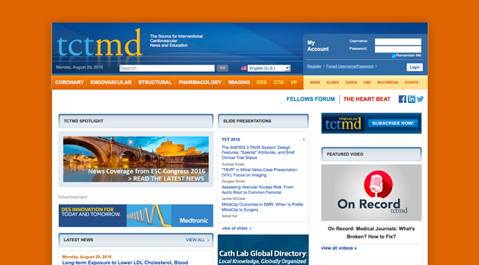
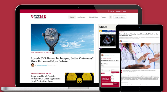
Heart disease touches each one of us at some point in our lives. The statistics on heart disease in America are staggering. It is the leading cause of death in the United States and globally. In America, 26.6 million people are diagnosed with heart disease each year. Every 34 seconds, an American will have a coronary event and over 600,000 will die from one each year. Enter The Cardiovascular Research Foundation (CRF), the leading healthcare research nonprofit dedicated to helping doctors improve the lives of people suffering from heart and vascular disease. In need of a digital transformation strategy and a new website design for the healthcare nonprofit’s flagship online presence, The Cardiovascular Research Foundation needed a web design firm that specialized in research-driven, content-heavy website design for healthcare nonprofits.
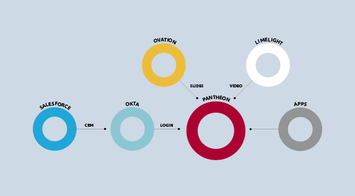
CRF had a tough challenge ahead of them.TCTMD is an enormous nonprofit website filled with thousands of pages of specialized healthcare content—healthcare research, videos, conference slide presentations, cardiovascular healthcare news, and more. While it was filled with valuable content, the site’s infrastructure was complex, complicated, and out-of-date. A paid member-driven website, TCTMD required deep integration with multiple platforms like Salesforce, Okta and Britecove, meaning making sense of the technical terrain would be tough before any website design work could begin. And everything had to be done in 6 months for CRF’s largest annual conference.
So, with no time to waste, both of our teams jumped in with two feet to remake the nonprofit healthcare leader’s website—and, in doing so, transform how it advanced its mission.
Before Redesign: A Nonprofit Healthcare Research Website in Need of Serious Treatment
With just one significant redesign in its 16-year history, TCTMD was a healthcare nonprofit website from a bygone era. On the back-end, CRF’s data was stuck on an expensive, proprietary Ektron CMS that made it impossible for the healthcare research nonprofit’s editorial team to publish and manage content on their website. TCTMD’s system failed to support the complexity of its content relationships, site search was ineffective, and integration with Salesforce for gated member-only content was clunky and error-prone. To users, the content-heavy website suffered with a confusing taxonomy and navigation that made finding content a chore, visual design made scanning pages and long-form reads uninspiring, and the TCTMD brand failed to embody front-of-field interventional cardiology news and education.
A New Digital Strategy to Drive Engagement With Specialized Healthcare Research Content
TCTMD is truly an encyclopedic website, with tens of thousands of slide presentations, news articles, and videos. The key to success in designing content-heavy nonprofit websites starts with digital strategy and content strategy. And with thousands of pieces of content to make sense of, we quickly got to work understanding the nonprofit website, from multiple perspectives. Discussions with TCTMD’s leadership and editorial team informed goals, pain points, and priorities. A content audit showed how volumes of content were organized. Focus groups, user surveys, and user profiles clarified what was most important to audiences.
An in-depth analysis of CRF’s digital ecosystem detailed the network of connected systems in the nonprofit’s technology infrastructure—and opportunities for us to improve both the user experience and operational efficiencies. Peer analysis placed TCTMD in context to competitors in its space. After learning from CRF’s team, we developed a digital strategy that provided our roadmap for uniting branding, content, design and technology into an nonprofit website that would make a meaningful difference for how The Cardiovascular Research Foundation advances healthcare.
Architecting a User Experience That Delivers Greater Value and Drives Revenue
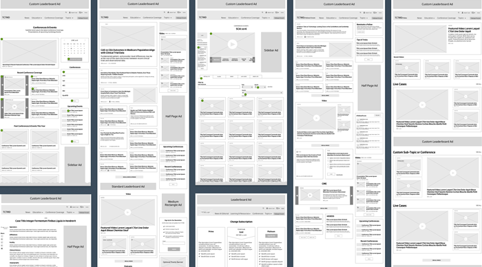
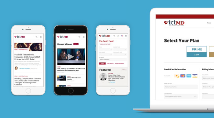
When it comes to designing research-heavy nonprofit websites, there are best practices to driving content engagement. And in designing the user experience for TCTMD, one of our top priorities was to expose readers who typically visit for one type of content to the volumes of valuable, related content that The Cardiovascular Research Foundation has to offer healthcare experts from its other departments. In particular, TCTMD is a rare membership and community nonprofit website that relies on paid advertising to drive the revenue that supports its programming. Given the volume of news and educational content in TCTMD, this meant developing a content taxonomy that supported existing content and planned for growth, displaying a breadth of relevant options in every view, and not over-stuffing pages and bombarding users to ensure a great reading experience across devices.
With thousands of pieces of specialized content for audiences to engage with, making sure that TCTMD’s website search was exceptional at delivering the results that people were looking for was critical. To ensure content accessibility, we rearchitected the nonprofit website’s search with powerful faceting and filtering search tools powered by SOLR, delivering rapid, accurate results search results.
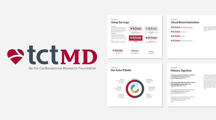
Designing a Logo & Branding That Resonates With Healthcare Experts
Like most major website redesigns, designing TCTMD for The Cardiovascular Research Foundation was both an opportunity to design a great nonprofit website for the healthcare sector and to strengthen the TCTMD brand so that it would stand out among it’s peers like TheHeart.corg by Medscape. Working within CRF’s master brand guidelines for the parent brand, we collaborated with CRF’s team on a rebranding for TCTMD that provided the visual foundation we needed. Two key considerations for designing effective nonprofit branding for The Cardiovascular Research Foundation were ensuring that TCTMD worked within CRF’s master brand, and that its new visual identity would support a brand architecture for TCTMD sub-brands and departments. The resulting design modernizes TCTMD’s brand, while a color and typography system and sub-brand identities provide the structure needed to support brand consistency across all communications in different media and venues.
Designing a Nonprofit Healthcare Website that Strengthens Connections to the Brand
With TCTMD’s new logo and branding in place to guide website design, we transformed our wireframes and technical specifications into a a content-driven nonprofit website experience that ensures legibility, accessibility, and deeper engagement with everything that The Cardiovascular Research Foundation has to offer. In keeping with TCTMD’s status as a leading nonprofit website for interventional cardiology news and education, design emphasizes best practices in news and media website design so that TCTMD stands up, stands out, and stands for something among it’s peer set of other healthcare nonprofit websites.
Because of its volumes of long-form content, in particular, Constructive’s team designed TCTMD with a careful, structured typographic hierarchy that makes content scannable, elevates top-level takeaways, and encourages readers to go deeper into the nonprofit website’s extensive content on cardiovascular healthcare. A clear and clean design that establishes a strong visual hierarchy increases usability by making clear what TCTMD’s different editorial departments, topics, and formats are to guide users through the website’s content-heavy pages. And videos and presentations, two of TCTMD’s most valuable types of content, are elevated with calls-to-action that focus attention on member-only content to help drive subscriptions.
Designing a Robust Infrastructure for Digital Transformation
Digital transformation may be all the rage in business settings, but the truth is that digital transformation for nonprofits is an enormous opportunity to streamline service and improve the brand experience. We built TCTMD in Drupal to ensure that the system could handle the large number of complex integrations with The Cardiovascular Research Foundation’s external technology infrastructure. The website makes it easy for subscribers to login using Single-Sign-On, providing tiered member accounts based on the level of subscription and centralized user management control for CRF’s staff. On the content side, TCT provides public content and members-only content access, extensive multimedia content—from video and streaming to automated presentation processing from annual conferences, SOLR search, and custom application APIs.
As one of the top-rated websites in the cardiovascular healthcare sector, TCTMD is also a website that’s visited by thousands of people every day—meaning it needed to effortlessly push all of its media content without slowing down. To meet the need, Constructive’s technology team worked closely with TCTMD to select hosting and complementary technology partners to architect a cloud-based infrastructure to handle the load and evolve with their needs—creating a highly-available, scalable infrastructure with automated deployments, elastic scaling, healing, notification, and more.
The Results
“Constructive completely understood the challenges we were facing in our space. Instead of only having one person be familiar with our project, it seemed that the entire Constructive team was fully invested in making our success be theirs, and vice versa. Their entire team made itself fully available to us, often going above-and-beyond to make our launch successful. We didn’t feel like we hired a company to perform a website redesign, but rather found a partner to work with us and bring our vision to life.”
Stephanie Gutch, Sr. Director of Digital, Cardiovascular Research Foundation
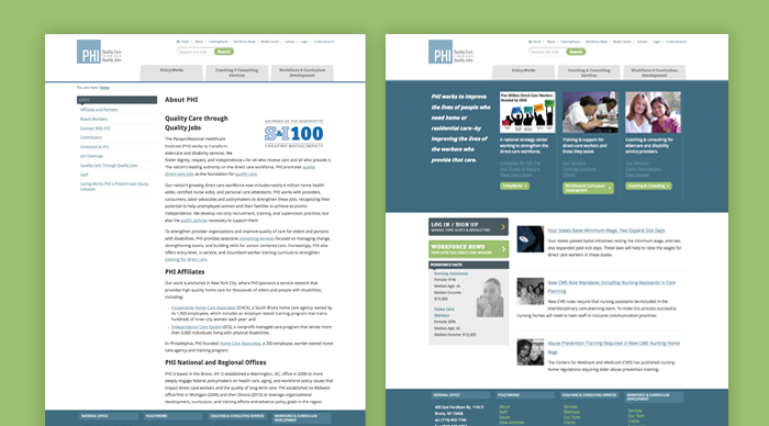
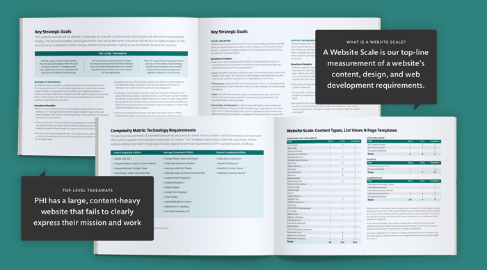
The Paraprofessional Healthcare Institute (PHI) is the leading direct care policy and advocacy nonprofit in America, transforming eldercare and disability services by fostering dignity, respect, and independence—for all who receive and provide care. In a workforce that is represented by a majority of women and people of color, PHI works as a tireless advocate for equity for direct healthcare workers. They also promote economic opportunity by increasing high-quality direct care jobs. And having just completed a strategic planning process, PHI needed to center the nonprofit’s policy and advocacy website design on its new brand strategy.
Specifically, PHI wanted their new digital strategy to help the nonprofit raise awareness of the key issues, engage a diversity of audiences, create unity across their work streams and engage a diversity of audiences to increase PHI’s policy leadership, raise issue awareness, make their research and support tools more accessible.
A Content-Heavy Nonprofit Website Design Creating Confusion
PHI’s existing website had several key problems that were holding them back. First was that the nonprofit’s website design no longer reflected their new strategic model. Rather than making it easy to understand the issues and PHI’s strategy to address them, it forced people into old, disconnected organizational silos. Second, PHI had just completed a rebranding, leaving them with a website design at odds with their identity. And third, like many content-heavy nonprofit websites, PHI’s had become cluttered. Confusing navigation and poor website search made it hard for people to find what they want and overly text-heavy pages failed to keep users engaged. And because they are a policy and advocacy nonprofit working in a specialized sector, PHI’s website used jargon rather than communicating in accessible terms.
Starting With Discovery to Design a Strategic Nonprofit Website
The nonprofit’s team, of course, had a long list of things that they wanted to change, improve, and add so that their new policy and advocacy website design would make a bigger difference in their mission. They just didn’t know where to start or what accomplishing their goals would entail. To help everyone make sense of it all, we started with a dedicated strategic discovery phase to understand the current website, establish clear goals for a new website design, and create detailed requirements to achieve them.
First, we audited the nonprofit’s website, content, and technology systems. We then led digital strategy workshops with PHI’s leadership to understand their operations, identify pain points, explore solutions, and prioritize needs. We then developed a strategic plan for policy and advocacy nonprofit website design that focuses on what matters most—detailing the strategic, creative, and technical requirements with a roadmap and budget that aligned PHI’s team and ours to support their new brand strategy.
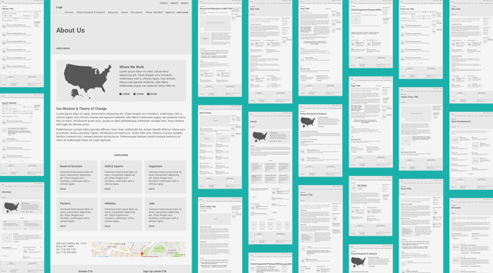
Nonprofit UX Design That Eliminates Organizational Silos and Supports Brand Strategy
PHI is a complex healthcare policy and advocacy nonprofit, providing a wide range of services that support and strengthen the direct care sector. Unfortunately, PHI’s fragmented website was siloed and failed to support their breadth and depth of services. The nonprofit’s website is also content-heavy with resources that need to be accessible and engaging to support their policy and advocacy work.
We also needed to make sure that the design of such a content-heavy policy and advocacy website made sense to real people. To design a more useful experience, we started with user research to give us valuable perspective we can’t have on our own. Analytics analysis deepened our understanding of how people were using PHI’s website, giving us an evidence-based foundation to design a new user experience.
As with all nonprofit websites, our UX strategy stayed focused on raising issue awareness. We designed a site structure that bridges PHI’s silos—organizing ideas by issues, geography, and services; and framing the issues within broader social context to focus on the mission. The result paints a clear picture of who PHI is, what they do, and why they matter—and makes their volumes of policy and advocacy resources readily available.
Nonprofit Policy and Advocacy Website Design That’s as Engaging as it is Useful
Designing brand experiences for certain research-focused policy and advocacy nonprofits presents an interesting challenge. By definition, they rely on research that’s often wonky and technical. They speak to subject matter experts and policymakers who are looking for evidence-based expertise. At the same time, every policy and advocacy nonprofit’s work is about social impact. It’s driven by values, and is ultimately about the impact on real people and the planet.
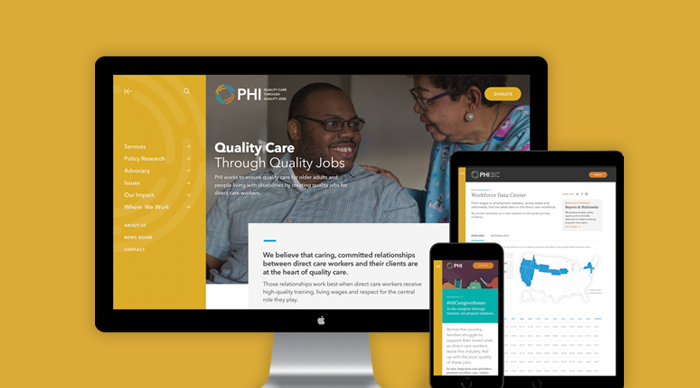
To help PHI balance these two essential aspects of their brand, we designed a website that’s both structured and dynamic. Bold brand colors set the tone within rhythmic grids that keep PHI’s long-form research content engaging. It uses authentic, representative imagery that embody the dignity and compassion that are the heart of the direct care workforce. The results are a website design for a policy and advocacy leader that both creates emotional connections to the direct care issues and people and communicates the rational rigor needed to lead on them with great credibility.
Policy and Advocacy Nonprofit Website Design That Elevates the Issues and the Experts
Central to PHI’s digital strategy is helping audiences understand complex issues facing the direct care workforce. To advance the nonprofit’s leadership at the national, regional, and state levels, we designed PHI’s website with a combination of editorial design techniques and best practices in digital storytelling for nonprofits.
Design engages both expert and lay audiences by delivering top-level takeaways and inviting deep dives into PHI’s content. PHI’s website follows through on our goal of by elevating PHI’s expertise with a library center of PHI’s reports, briefs, and multimedia—and a dedicated National Direct Care Workforce Resource Center that makes it easy for experts to leverage PHI’s research.
The result positions PHI as the leader of one of the fastest-growing sectors of the healthcare industry, delivering a wealth of expertise, insights, resources, and results. It also embodies a tireless advocate and educator for the direct care workforce, a rigorous policy research expert, and a strong voice who raises awareness.
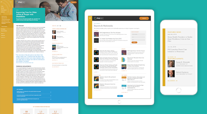
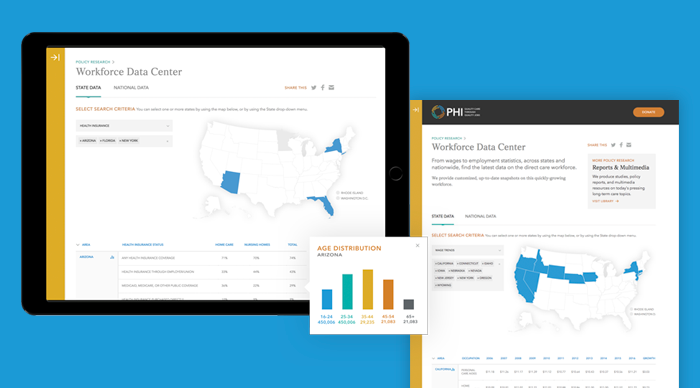
Designing Data Visualization to Deepen Understanding of the Direct Care Workforce
As the leading national expert of the direct care sector, PHI supports the work of policy and advocacy efforts with large-scale, data-driven research on wages and employment statistics for every state and nationwide. Drawing on our team’s expertise in designing data visualization indexes for nonprofit issues such as health equity, the global environment, and the economic impacts of climate change, we turned PHI’s tabular data sets into a dynamic Workforce Data Center.
The new digital data visualization tool contains one of the most comprehensive data sets in the world on the direct care workforce. The interactive data tool empowers users to create customized, comprehensive, up-to-date snapshots that explore issues from race, gender, age, and employment status, to earnings, wage trends, and insurance at the state and national levels.
The Results
“Constructive is fantastic to work with, and our entire collaboration process reaffirmed that we had chosen the right partner. They’re personable and bring a team of experts in different aspects of branding and website development to our relationship. They ask hard questions that force us to think through things we wouldn’t have otherwise. They’re thorough and solutions-oriented. They’re able to both answer high-level strategic questions and focus on executing the details. And they met our deadline, which is rare in website redesigns!” – Robert Espinoza, Vice President of Policy
When I first began as a designer, I felt like my designs had to be “complete” before I could show them to anyone. I think this vulnerability stems from a feeling that, as designers, we want to think through every element before we can call a design complete. But here’s the thing: another person on your team has likely solved similar challenges. But the concept of the solitary creative genius is a myth. The truth is that a collaborative design process—a design process that’s inclusive—emphasizes co-creation and is the best way to produce effective design. And when our design work is strategic and ethical human-centered design for nonprofits, having social impact on complex issues takes a diversity of perspectives and expertise.
Over the years, I’ve come to learn that designing collaboratively means putting your ego aside to make something that transcends the sum of its creators. A collaborative design process can be challenging at times—especially at first. But getting out of our own heads and incorporating collaboration into our design process is worth the effort because it improves our work. Especially if you’re collaborating not just with other designers, but with people who add different perspectives and lived experience that enriches our work.
I spend most of my days independently thinking through design concepts and ways to execute them with prototypes, wireframes, sketches (lots of sketches!), and of course .jpgs, .pdfs and some .sketch files. But the truth is that a computer can be one of the worst tools for problem-solving. And it’s definitely the worst place to start. That’s because we usually limit our design thinking based on what the tool can do, not what our strategic design goals are.
Design is about working with ideas—translating intangible concepts into something that can be seen or interacted with. It’s much better to start the design process by discussing design goals and outcomes. Then have regular conversations as you work to make the design process more inclusive. And grounding your design practice with brand strategy is key, because it centers our design conversations on a nonprofit’s impact strategies.
At Constructive, we use these conversations—which always start with client teams at the nonprofits we’re working with—to establish what we call “Design Principles.” By articulating 5-7 clear design principles into our work, we can be sure that what a nonprofit’s branding, communications, or website design must embody is always front of mind.
2. Embrace Internal Design Reviews
We always review internally as a team before presenting our design work to the nonprofits that Constructive works with. We spend a lot of time together discussing things both big and small—evaluating design from a micro and macro level. Talking through a nonprofit’s identity design system adds invaluable expert perspectives to your thinking that usually makes the work better.
What I’ve learned is that internal reviews are probably my most valuable time I have when designing. That’s what makes working on a team so great—you’re not on your own! Designers are experts in design language and design thinking, so they tend to know how to give good design feedback. You may not agree with all the feedback, but it’ll all be good food for thought.
After Constructive’s design team critiques my work, I’m more confident about what my next steps are. That’s because I’ve gotten feedback that lets me see things I might not see on my own. It’s easy to justify a system’s flaws in your head when you’re the only person who’s seen the design. Having someone whose opinion you respect give you honest feedback is the perfect antidote to falling in love with design ideas that aren’t working.
Constructive’s design team during one of my internal design critiques
One more note about why internal design reviews are so valuable. They’re great practice for your presentations before you present to a client. What sort of language am I using to describe the design? Are my ideas clear or I have to over-explain my rationale so that people understand the intention? If so, I probably want to make sure those things are more clear in design so that I can explain less.
3. Incorporate Prototype Testing Into Your Design Process
When most people think of design prototypes, they think of an interactive for a website design or product design. But a prototype can be almost anything—a piece of paper, a card-sorting exercise, an series of clickable static design comps, or a fully-coded interactive experience that’s used to gain insights during user testing. And prototypes don’t just have to be for things like nonprofit web design. Prototypes are one of many valuable tools for service design, which can be particularly helpful for nonprofits who use inclusive design and lived experience to design programs that are more responsive to the needs of their end beneficiaries.
When I’m uncertain about an assumption I have about a design, it helps to do some informal user testing with both designers and non-designers. Testing with members of your design team is a really helpful exercise for thinking through basic user experience patterns because everyone brings a unique understanding of web accessibility standards and how to improve usability.
For example, when Constructive was creating The Air Quality Life Index, an environmental data visualization platform and research tool, I conducted several rounds of user testing with our design team early in the design process. We developed static UX design prototypes and tested them internally before conducting user testing with our target audience. As a result, I was able to streamline the interface design for the nonprofit’s data visualization tool early and make the functionality more user-friendly. This, then made our user testing with audiences better and more valuable.
[contentupgrade id=”9329″]
4. Schedule Weekly Design Huddles
In addition to our internal design reviews that are aligned with project schedules, Constructive’s design team checks in with each other regularly throughout the week. We have design stand-ups through Slack that just allow people to let others know what they’re working on—and ask for help if they’re stuck. We also have weekly design huddles, which give us all an opportunity to have more in-deph design conversations about design process, design trends, and design inspiration.
Especially when design teams are working remotely, It’s important to come together as a group. First of all, feeling connected to one another as a team is really important—again, that’s what being part of a team is all about. It also creates the space that designers need to discuss design issues and opportunities that we’re experiencing—and get help from our teammates.
A Constructive design huddle reviewing card sorting in action!
5. Share Design Inspiration—Lots of Design Inspiration!
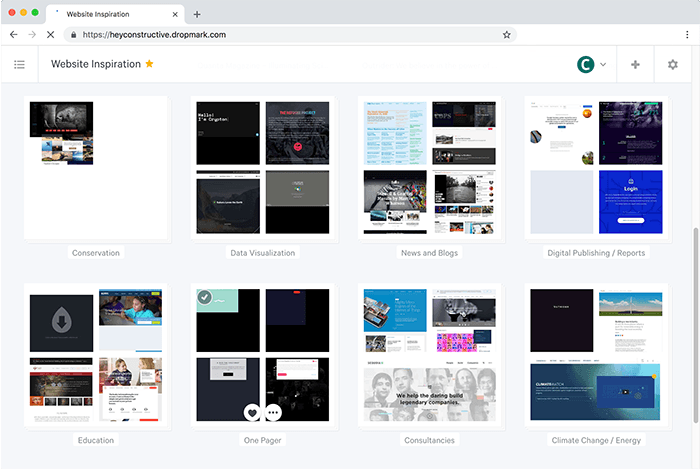
Designers need inspiration. And inspiration can come from just about anywhere! To keep our design thinking as creative and innovative as possible, Constructive’s team shares tons of examples of great design work that resonates with us keep our deign thinking innovative. We try to share and keep an organized record of all the things we see online that inspire us. We have a channel in Slack just dedicated to design, where our team shares great design throughout the day. And we also use Dropmark to categorize links to branding and website design for nonprofits that we love—as well as design work for other sectors.
Cultivating a culture of continuous learning is one of Constructive’s core values, and this practice of sharing and categorizing design inspiration is a big part of this. What makes this collective sharing of design ideas so valuable is that it keeps our team focused on what great work looks like, it expands our thinking about what great design work can be, and it help us us cultivate a design practice that’s more diverse by drawing on all of our perspective. And this, in turn, makes the design work we’re doing with the nonprofits that Constructive partners with more strategic, more creative, and more effective.
Constructive’s Dropmark library organizes our ideas and inspiration to make them easier to reference.
6. Make Sure Large Teams Are Pulling in the Same Direction
Larger design projects, such as content-heavy websites demand even more collaboration—not just between designers, but between strategists, writers, and web developers. These projects highlight the importance of a good design process and teamwork. The more people working on a project, the more complex the project, and the longer that project takes to complete; the more likely it is that your original design intent can break down.
I’ve learned that when something in a design system is bothering one person, it’s usually negatively affecting other people as well. And these impacts can make the jobs of other people on the team more difficult. That’s why you’ve got to stay aligned and make sure you’re having those conversations. Sometimes a static design comp looks great as a jpg, but it turns out that it will be far too complicated for web developers to build (or at least it could be radically simplified). Or, when it’s eventually coded, a nonprofit’s website design falls short of a nonprofit’s accessibility design goals—and as a result creates a less inclusive experience.
Working as part of a multi-disciplinary team is about process and communication. Extend collaboration to everyone on a project team, not just the designers, and large, complex web design projects will have fewer headaches—and will be more effective as a result.
Final Thoughts
Why am I telling you this? The obvious answer is that any team needs to collaborate to work successfully. That holds a nugget of truth, but the real answer goes much further. No matter your discipline—design, development, content, or strategy—I believe we get better each day as individuals by engaging in challenging conversations with each other. This, in turn, creates a much stronger, more powerful team.
Hopefully, what I’ve learned about collaboration techniques by working in Constructive’s design practice are helpful to your design process and can help you have greater social impact as a result.