Meet Twig
The biggest Drupal 8 innovation for front-end developers is use of the Twig template engine. Twig provides a simple and concise syntax for building HTML templates. Here’s a snippet of a template in the Drupal 7 theming engine (PHPTemplate):
<?php if ($page["footer"]): ?>
  <div id="footer" class="clearfix">
    <?php print render($page["footer"]); ?>
  </div>
<?php endif; ?>
Here’s the same snippet in Twig:
{% if page.footer %}
    <div id="footer" class="clearfix">
        {{ page.footer }}
    </div>
{% endif %}
Twig also features template inheritance to make it easy to reuse structures and elements in different templates, which saves time, simplifies maintenance, and enforces consistency across a website. For example, a website may use a standard page layout consisting of an image, title, intro text and body, but specific page types require slight variations to this structure. There could also be an event page with the date and location in place of the intro text and blog pages may have the author’s name above the body.
Using PHPTemplate we would create the standard layout and then copy it to two new files: one for events pages and the other for blog pages and make our modifications to earch. If a design change requires changes to structure of the page, these changes will have to be repeated in all three templates.
Twig solves this problem by letting us identify sections of a template as blocks. We can then create ‘child’ templates that inherits the parent content, so we only need to code the block that will be overwritten. For example, our event page template may look something like this:
{% extends "standard.tpl.twig" %}
{% block intro_text %}{{ content.date }} - {{ content.location }}{% endblock %}
If the parent template (in this case, standard.tpl.twig) changes, those changes are reflected in the child templates as well.
Building Our Drupal 7 Twig Theme
Thanks to René Bakx’s Twig for Drupal 7 template engine we didn’t have to wait for Drupal 8 to get started. The engine replaces the standard Drupal 7 PHPTemplate engine so Drupal 7 themes can be built with Twig.
Building the Twig theme meant translating a lot of base Drupal templates into Twig. This turned out to be the perfect opportunity to build a custom theme from the ground up, remove extra wrappers and classes that Drupal adds by default, and update page structures to use HTML5 semantic markup. All this resulted in a cleaner, lighter, and more modern base theme.
Once the base Twig theme was done the next step was to make it responsive. We have had good experiences with Zurb Foundation as a front-end framework for previous websites and decided to use it to build a responsive Twig theme. Thanks to Twig’s template inheritance feature we only had to modify the template sections that needed special Foundation wrappers. Finally we added in the Foundation library, hooked up the JavaScript and stylesheets and we were ready to roll!
The Rubber Meets the Road
All we needed now was an opportunity to try out our new theme. Fortunately we didn’t have long to wait. A client asked us to build a small, responsive website, so we fired up our Twig Foundation theme and took it for a spin. I’m happy to report that it handled beautifully. You can check out result at the Standards Institute site.
Looking to the Future
Drupal 8 is right around the corner. It’s already in beta and we hope to see a release version sometime this fall. But that’s no reason to stop improving and extending our Drupal 7 theme. Because it’s written in Twig, the templates we build today will still work with Drupal tomorrow.
Seeking new ways to increase their impact, leading nonprofits increasingly are taking a broader view of the strategic role their brand can play in driving long-term social change. In this new view, a nonprofit’s brand is much more than a tool for communications or fundraising. It is critical to organizational strategy — making that strategy tangible through a system of designed experiences that express the ideas and values the organization represents.
Such a view marks a significant departure from older, more limited perceptions of the role of a nonprofit’s brand in advancing social impact. In this new paradigm, a brand must embody critical elements such as social innovation and design thinking (as exemplified by the work of design firms such as IDEO). This view also embraces the ability of a brand to shape conversations, strengthen relationships, and increase an organization’s effectiveness. This line of thinking is best articulated in the work of Harvard professor Nathalie Laidler-Kylander and Christopher Stone — and detailed in their book The Brand IDEA: Managing Nonprofit Brands with Integrity, Democracy, and Affinity.
A New Approach to Leveraging Social Impact
Among its many insights The Brand IDEA suggests a new role for “brand” within the nonprofit organization — a role in which it is both driven by, and acts as a primary driver of, organizational strategy, exerting influence and commanding mind-share, both internally and externally, to create a virtuous cycle that strengthens and reinforces itself with each success.
Visualized, what Kylander and Stone title the “Role of Brand Cycle” in a nonprofit looks something like this:
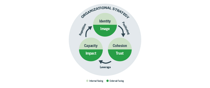
As explained in more detail in this video, it’s easy to see why, for many nonprofits, “brand” is their most valuable asset.
Managing Your Organization’s Brand Value
Of course, a nonprofit doesn’t receive the benefits of a strong brand along with its 501(c)(3) status. Those benefits are earned through a willingness to commit to and cultivate an organizational culture that prioritizes the development and nurturing of a clearly defined brand. And harnessing the potential that’s stored within your brand requires a strategic framework for thinking about, creating, and managing the different ways the brand is understood and expressed — internally as well as externally. It requires the cohesion (to use Laidler-Kylander’s phrase) needed to create organizational alignment and the consistency that all brands must embody in order to create trust and foster loyalty (something I’ve written about here).
Branding is that framework. At Constructive, we think of it as a process in which strategic and creative thinking are applied to the development of systems and tools that can help an organization bridge the gap between the place a brand occupies in the minds of its audience and the sights and sounds that make it tangible in the real world — a translation of organizational strategy into experiences.
Like any framework, branding consists of key foundational elements that work together to create a toolbox that a nonprofit can draw upon to advance its mission and increase its impact. It’s perhaps most easily understood when broken down into three parts. The first two, “brand language” (what you want to say) and “brand design” (how those messages are delivered), are used to create “brand experiences” (what happens) that resonate with your audiences.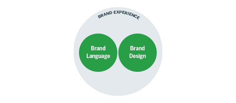
Design firms like Constructive spend a great deal of time and energy helping organizations create purpose and alignment across the things they want to say, how they present themselves, and the interactions that follow as a result. The overarching goal is to deliver meaningful brand experiences that are rooted in deeply held values, aligned with organizational strategy, and put in direct service of your mission.
Consistently Exceptional Brands
The secret of exceptional brands is perhaps best captured by Aristotle’s famous saying: “We are what we repeatedly do. Excellence, therefore, is not an act, but a habit.” Consistency is not only the cornerstone of exceptional performance, it is the key to building trust. People who are asked to engage in a relationship – whether it’s with another individual or with a brand – want to know what they can expect to receive in return. And because people crave consistency, they want to be assured that their expectations will be consistently met. When they aren’t, our confidence and trust in the organization invariably is eroded.
When it comes to nonprofit branding, being clear about what your organization stands for and why it matters, designing experiences that meet (or exceed) the needs and expectations of your audiences, and consistently delivering on your promises is the surest way to strengthen your relationships, increase your effectiveness, and, ultimately, generate greater impact.
But as Aristotle suggests, achieving brand consistency doesn’t happen by accident. It is borne out of a deliberate process designed to create predictable results as well as a framework for managing those results. What does that process look like and how does it help translate strategy (and a host of intangibles) into a valuable asset that helps a nonprofit consistently execute against its organizational strategy?
Different branding and design firms will approach things differently, but ultimately any truly effective branding process is a variation on a theme. The approach we’ve developed at Constructive over the years is designed to help us and our clients reach a collective understanding of the internal and external dynamics that shape the world in which the organization operates and then translate that understanding into a system and tools that can be employed to create consistent brand experiences. It’s a collaborative process that, while perhaps not as neat and linear as the following diagram suggests, has five primary phases:
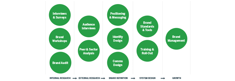
Phases 1 and 2 are dedicated to quantitative and qualitative research and discovery. Familiar activities such as stakeholder interviews, SWOT analyses, and audits provide clients and the design firm with the necessary context to develop an effective strategy and compelling creative.
As the design firm and client move forward in the process, they draw on what has been learned during the research and discovery phase to define the brand experience and create messaging and collateral materials that embody the organization’s values.
Systems thinking is the next step in the process — codifying the visual, verbal, and experiential elements of the brand into guidelines, tools, and training that turn branding into an organizational asset that can be shared and implemented consistently by all those entrusted with representing and stewarding the brand.
Last but not least, the process, which is grounded in foundational thinking, must remain open to change as the organization evolves over time. By clearly defining what the brand experience sounds, looks, and feels like, a nonprofit can make more informed decisions about what to add and subtract from its branding as the organization itself changes.
A version of this article originally appeared on Philanthropy News Digest in Constructive Founder, Matt Schwartz‘s Cause-Driven Design® column.
It used to be that nonprofits shied away from prioritizing their brands. However, over the last 10 years or so, nonprofits are becoming increasingly aware of the link between a brand’s strategic value and organizational impact. One reason for this shift, I suspect, is that competition — for funding, people’s attention, human capital — has gotten stiffer. And nowhere is that more apparent than online. When a nonprofit’s website is underwhelming, it is not only out there for the world to see, it also sends the wrong message and undercuts the organization’s mission.
What is a Brand?
Branding expert Marty Neumeier famously defines brand as “Who you are, what you do, and why you matter.” For nonprofits, this translates to your brand being a combination of your mission, values, strategy, relationships, impact — and their value to the world. It’s a gut feeling about the promises you make and your reputation for keeping (or breaking) them.
As Neumeier says: “It’s not what you say you are, it’s what they say you are.”
If a brand is essentially what others think about your organization, then branding is the application of creative thinking, design, and technology in the service of your organization’s brand strategy.
The Value of Nonprofit Brands
When it comes to driving engagement through branding, nonprofits typically face a tougher challenge than for-profits. Instead of delivering instant gratification or a useful product/service, nonprofits tend to appeal to our better angels — offering (usually) a vision of a better tomorrow for people and/or places removed from our daily routines. As a result, audiences can feel removed from the mission and may feel no urgency to act.
Because the strength of a brand is defined by the degree of trust and loyalty it elicits, this gap between action and impact places more of burden on a nonprofit’s brand to generate the kind of sustained engagement necessary to tackle complex problems. Whether the audience is individual donors, volunteers, or strategic partners, a nonprofit’s brand must convey the idea that the organization delivers on its promises — even if tangible results may be years down the road.
To do that, a nonprofit brand must be about more than the organization and its mission; it needs to address, at a deeper level, what is meaningful to an organization’s audiences. Because when people strongly identify with a nonprofit’s brand (rather than just its mission), their reasons for supporting the organization move beyond the rational to the emotional; the brand becomes part of who they are and what they value. It becomes a kind of shorthand for things about which they care deeply and reinforces their belief that they can become part of the solution through their active engagement with the organization.
Designing Effective Brand Experiences
Your brand is the sum total of all the experiences (direct and indirect) that others have with your organization. But while it lives in their hearts and minds, your organization can positively influence how your brand is perceived by combining brand strategy with creative design to deliver more meaningful and valuable experiences.
At Constructive we talk a lot about “bridging the gap between strategy and execution.” As a design firm, it’s our mission to design better brand experiences for clients that support their mission. To help our clients stand up, stand out, and stand for something, we work from the principle that there are three characteristics of the brand experience that must be present at all times:
- Strategically Informed: Every choice must tie back to the organizational/brand strategy and the specific goals for whatever it is we are creating, be it a logo, a website, or collateral.
- Exceptionally Crafted: We all know great work when we see it. It is the quality of craftsmanship in every word used and in every designed element that separates the exceptional from the merely okay.
- Consistently Executed: People want to know what to expect from brands they support. Consistent branding signals commitment, builds trust, and delivers a host of other benefits.
6 Key Components of Nonprofit Brands
To build a strategic, exceptional, and consistent brand first requires understanding the many facets of an organization that contribute to the overall brand experience. In our view, there are six key components of a nonprofit organization that define its brand:
Brand is Your Organizational Strategy. For mission-driven organizations, where you are aiming to go and how you plan to get there are the primary drivers of your brand (and, ideally, are well-defined through clear brand positioning).
Brand is Your People. Brand ideas and values must be lived by your people and be fully integrated into your organization’s culture. Strong nonprofit brands naturally attract people who will represent them well.
Brand is Your Messages. What we say and the way we say it, both in writing and in person, say a lot about who we are. Every audience is interested in hearing different things — and depending on the audience, your brand likely has different things it would like to share.
Brand is Your Interactions. Both in person (whether at the point of service or an event) and online, interactions with your audiences should be crafted to deliver on your promises and reinforce the value of their relationship with you.
Brand is Your Visual Design. People interpret much of the world through what they see. These days, especially, the quality of a nonprofit’s visual design elements greatly determines how much attention the organization receives, people’s willingness to engage with it, and, ultimately, the strength of the bonds it forges with supporters.
Brand is Your Communications Tools. To a significant degree, brand experiences are delivered through communications tools and vehicles. Because brand consistency builds trust, a cohesive design system with clear brand guidelines helps ensure that you meet audience expectations on a consistent basis.
A version of this article originally appeared on Philanthropy News Digest in Constructive Founder, Matt Schwartz‘s Cause-Driven Design® column.
It’s official—our attention span is now shorter than that of a goldfish. As far back as 1971…wait, what was I about to say? Anyway, though the goldfish statistic does oversimplify things, there’s no denying that sustaining online engagement has gotten more difficult in the last 5-7 years.
For some, this change has been a very good thing (I’m looking at you, Buzzfeed). But for nonprofits and academic institutions whose success depends on demonstrating thought leadership or advancing better policies and practices, life online has gotten a bit harder. In a world filled with infinite scrolling lists of status updates; where audiences switch between devices, apps, and browser windows like hyperactive puppies on caffeine—websites filled with research and other long-form content have an uphill battle.
But it’s not all doom and gloom if you’re into thoughtful discourse!
When it comes to creating more engaging, effective websites for the content-heavy crowd, we just need designed solutions that, in the words of Herbert Simon, turn this not-so-great situation into one that’s preferred.
A Closer Look at Audience Engagement
During research for a website redesign, it’s common to dig into a site’s Google Analytics to get a better look at how it’s performing—specifically, its engagement metrics, one of the strongest indicators of website health. What one often sees highlights the challenge facing nonprofits with content-heavy websites:
- Bounce rates north of 60%
- A precipitous drop-off between visits of 0-10 seconds and longer ones
- Average length of visits hovering around two minutes
It’s a lot harder to have a meaningful impact when 60%+ of your website’s visitors are leaving after one page, and the rest only hang around for two minutes. For policy think tanks, research organizations, academic institutions, and philanthropies, websites are not only their most effective publishing platform, they’re also how much of the world interacts with their content—and their brands.
Simply put, when your stock-in-trade is thought leadership, the more engaged audiences are with your ideas, the stronger your brand—and the more likely you are to have a meaningful impact in the real world as a result.
Designing Better Experiences
Organizations have plenty of goals for their website, such as generating donations and increasing marketing opt-in. But when it comes to evaluating content-heavy nonprofit or academic websites, our first priority should be to increase how much, and how frequently, audiences read and share their content.
Websites that perform well on these measures usually have two things in common:
- They have a well-balanced design that creates a positive emotional response, that guides readers’ eyes effortlessly, and that sets it apart from other sites in its category
- Once audiences are encouraged to continue exploring, they are rewarded for doing so with an intuitive, enlightening, and enjoyable experience
We know a website like this almost the minute it’s finished loading. And once we’ve used it, the result is more than just a great user experience—it’s a great brand experience that tells us something meaningful about the organization behind the website, makes us more inclined to seek them out in the future, and trust what they have to say.
3 Key Principles for Designing Content-Heavy Websites
Of course, there are lots of ways to achieve these goals. However, from my experience, there are common challenges that are specific to many nonprofits and academic institutions. While in a single article it would be hard to cover all of the drivers of successful content-heavy websites, here are three of the more valuable principles I’ve found are effective in helping to meet them.
1. Provide Context
Complex issues cannot be understood in isolation. Audiences crave context, both to understand their place within a nonprofits website and the big picture beyond it. Organizing websites for mission-driven organizations around issues and areas of expertise is an excellent way to accomplish both.
A user-centric website taxonomy and keyword tags based on issues and areas of expertise provides great structure and flexibility. Combined with well-designed content types, they help create a site that engages audiences with the issues while demonstrating how an organization’s efforts address them. Most importantly, they encourage exploration—exposing audiences to more of an organization’s thinking and increasing its influence.
2. Focus People’s Attention
Content-heavy websites can be particularly demanding on a reader, with lots of competing elements and complex relationships. How we focus visitors’ (very limited) attention—both site-wide and at the page level—heavily influences how comfortable they feel and how long they’ll stay.
It’s always a good idea to apply principles of good information architecture, which are vital to orienting visitors in large websites, regardless of how they entered or their interests. Through to the page level, it’s all about designing effective page grids that structure information, create consistency, meet diverse UX and content needs, and foster visual variety to keep readers engaged.
3. Structure Your Argument
The importance of good typography is hard to understate in content-heavy websites for obvious reasons. We’re asking audiences to spend a good deal of time reading our content. Typography is a robust art, science, and language unto itself whose main purpose is to make this experience more enjoyable. Not to mention that an organization’s choice of typeface tells audiences a lot about its brand.
Understanding the time-tested rules of good typographic practice and establishing strong typographic hierarchy are essential to designing for long-form content, such as research and policy reports. Type families with sufficient type styles and weights are particularly helpful to structure multiple levels of subheads, figure annotations, pull-quotes, and data—so content is easier to understand and more trusted as a result.
In Conclusion
Ultimately, each organization and each website has its own goals, challenges, and requirements. The key is to make sure the quality of the experiences we design are equal to that of the content they deliver, and give audiences plenty of opportunities and reasons to engage more deeply, both with it and the ideas it represents. For a closer look at these principles in action, have a look at some of our best examples of work with nonprofits and academic institutions whose success depends on sharing thought leadership online.
A version of this article was originally published at NTEN.org.
In my experience, communication is often the biggest impediment to a productive client/design firm relationship. It also underscores the importance of discussing the dynamics of the client/design firm relationship before exploring the nuances of the design process itself.
What do clients and design firms want and expect from each other? And what can we do to ensure that those needs and expectations are met?
Process Makes Perfect
For clients in any consultative relationship, it can be unsettling to work on an important project while navigating unfamiliar territory. You’ve got a lot invested professionally, financially, and emotionally. You have a sense of where you’d like to go, but only a basic understanding of how to get there. And to get there, you have to depend on people you only recently met.
This dynamic highlights a truism: when it comes to design, process is far more important than results. Process enables us to more consistently create effective solutions, embrace the unknown, and blend a wide range of skills and disciplines. Structured effectively, process turns design into an inclusive endeavor by inviting participants from both sides of the client/design firm divide to set expectations, establish benchmarks, and work toward a common goal.
At my firm, process is as collaborative as the work we produce. We are continuously evaluating it, getting feedback from clients, discussing it internally, and evolving how we work — all with the goal of creating the best possible experience and the best possible results. Given the complexities and competing interests inherent in collaborative design, that is no small task!
The Convergence of Business and Design
Used to be that design and business professionals operated in silos, with designers brought in at the end of a process to execute other people’s ideas. Over the last twenty years or so, however, “design” has become an integral part of the business lexicon. Clients expect to be part of the process, and designers want (and often expect) a seat at the table when strategy is being developed. This new, more collaborative “co-design” model offers great advantages. It can also bring its fair share of challenges, as individuals with shared goals but different experiences, vocabularies, and expectations are asked to work together to design solutions to complex problems.
An effective process with clearly defined phases can help strengthen this collaboration. Process, however, is only one part of the equation; for it to work, everyone must respect and be mindful of everyone else’s goals and priorities.
Rules of Engagement
To help foster this kind of open, collaborative dynamic, we at MSDS (now Constructive) have made the following principles the cornerstones of our design process. We live by them, and we look to build relationships with clients that encourage them to do the same.
Be Collaborative. Design requires the expertise and insights of multiple stakeholders with different perspectives. A successful engagement encourages input from many, recognizes the particular expertise of each person at the table, and emphasizes a shared language that avoids jargon.
Be Transparent. More than just being good-faith partners, clients and design firms should embrace transparency by clearly explaining the issues that may be outside the other partner’s area of expertise. By educating each other about what’s possible, the cause-and-effect relationship of different choices, and the tradeoffs made during a design process, we avoid nasty surprises and ensure that the process runs smoothly and efficiently.
Listen Actively. Design is all about change, and those engaged in the design process must remain open to new information and ideas. We may not always get the answers we’re looking for, but in a true collaboration new ideas are what push our own thinking forward.
Embrace Complexity. Good design synthesizes the needs of an organization, the demands of its audiences, psychology, aesthetics, and lots more — and transforms it into things that are useful, inspiring, and essential. Realizing that in design we are engaged not just in making artifacts but in creating ideas, systems, and experiences, designer and client must problem solve from multiple vantage points if they hope to develop successful, sustainable solutions.
Create in Context. If design is to be strategic (as all design should be), it requires extensive research into the needs of a client and its audiences, as well as trends within the field, the sector, and society. Only then can we explore and design solutions that work for real people in the real world.
Hit Your Marks. We’re all depending on each other to do a great job, so once a schedule has been agreed to, everyone should do their best to stick to it and deliver on their deliverables. Missed deadlines erode trust, dampen enthusiasm, and cost time and money.
Work Within Scope. Design is a process filled with unexpected discoveries and developments, good and bad. In order to innovate and create solutions to complex problems, client and designer must always remember the spirit and scope of the agreement upon which the process is based — understanding that sometimes good ideas will need to be set aside and/or resources added.
Be Accountable. In branding and design, success is often evaluated by soft or subjective metrics or metrics that can only be accurately measured over time. For the process to succeed, clients and design firms must work together to identify achievable goals (qualitative and quantitative) that inform decision making and drive progress.
As the owner of a design firm, I believe these principles are key to every successful and enjoyable client/design firm relationship. Do they resonate with you? Are they something that work with your realities as a client? Take a few minutes to think about how your brand reflects your organization’s strategy. And if it doesn’t, ask yourself, Why not? I’m pretty certain you’ll be surprised by what you discover.
Nonprofits bring passion, dedication, and expertise to the often complex problems they are trying to solve. Design firms bring a similar passion, dedication, and expertise to the work of designing experiences. While the specifics of what we do and the way we do it may be different, at our cores nonprofits and design firms share similar values and a commitment to the greater good.
What makes being part of a firm that works with nonprofits so rewarding is that every day I have the opportunity to collaborate with and learn from experts in different fields who are hard at work addressing some of the world’s greatest challenges. It’s like earning a post-graduate degree in “How the World Works.” Even better, I get to take this continuous learning and apply the skills I’ve acquired over the course of my career to collaborate on meaningful work that helps nonprofits makes a difference.
For those with whom we collaborate, a firm like ours offers an equally deep reservoir of expertise — expertise that can help them turn their missions, research, and programs into brand experiences that connect people to big ideas — and each other. We also bring a fresh set of eyes and ears, providing a valuable outside perspective on how effectively an organization’s messaging resonates with its target audiences.
A Shared Mission & Vision
If there’s one thing I’ve learned over the years, it’s that the key to a successful partnership between a client and a design firm is that both parties must engage in the spirit of active listening and share a commitment to both learn from, and educate, each other. Whether we’re working with nonprofit clients who are well versed in the principles of design or relative novices, the best partnerships hinge on whether, and how much, everyone is committed to establishing a relationship based on trust, respect, and a shared vision. You simply cannot produce effective work without it. What’s also needed is a commitment to always doing what’s best for the work — which means a willingness to challenge the ideas of others, to have your own ideas challenged, and to check assumptions and preconceived notions at the door.
So, What is Cause-Driven Design?
Before I answer the question “What is cause-driven design?”, I want to touch on a more fundamental one: “What is design?” The definition I’ve adopted, brought to my attention by branding expert Marty Neumeier, comes from Herbert Simon, a Nobel-Prize winning political scientist, economist, and sociologist:
Everyone designs who devises courses of action aimed at changing existing situations into preferred ones.
So, when we think of design, we must first recognize that pretty much everyone — and not just “creative people” — designs in one way or another. Nonprofit organizations, committed to creating positive change in the world, are continuously engaged in the act of design.
Second, when we “design,” we’re not necessarily creating actual things (like websites or annual reports). Moreover, whatever it is we are creating, it almost always involves a complex, interdisciplinary system of ideas, actions, and messaging that, with a lot of hard work and a little luck, will alter a situation from what it is to what we’d like it to be.
Organizational planning? Design. Copywriting? Design. Software development? Design. That workaround you used to fix your leaky faucet until the plumber showed up? You get the point.
Design, as every good designer knows, is nothing without context. And context, to be meaningful, requires us to look at things from a whole bunch of perspectives, then thinking them through before we sit down to “design” that report cover, tagline, data visualization, or website. To borrow an analogy from the medical field, we’ve got to diagnose the situation before we can prescribe a course of treatment.
So what is cause-driven design? As its name implies, it is a process whose central organizing principle has to do with more effectively engaging and educating audiences on and about issues, connecting them to causes they care about, and delivering more meaningful brand experiences that help advance a mission and lead to greater impact (however an organization defines “impact”). Whether the nonprofit in question operates on the front lines of an urgent social issue or works more quietly behind the scenes, it is about understanding the context in which the really important questions are formulated, then aligning every messaging effort to explain why the answers to the questions are important.
At its best, cause-driven design cuts through the clutter of our busy lives, calms our over-stimulated brains, and helps to organize the plethora of choices we all face, every day. It unites strategy, content, design, and technology in ways that enables your nonprofit to more effectively engage with its principal audiences and speak more meaningfully to their deeper needs, goals, and motivations. It’s bigger than the brand, it’s bigger than design; it’s the mission or cause we’re driven to take up.
In Part 1 of our UX prototyping software review, we took a look at hot spot-based UX design tools Marvel, InVision, and Solidify. In this post, we’ll be examining tools that allow UX designers to create rich, live wireframes and prototypes from scratch that are ready for testing.
The main advantage of full prototyping suite tools is that they allow for more robust interactions and state changes, since each element within the wireframe can be controlled individually rather than having to link to a whole new page to show changes. Obviously, the main disadvantage of this type of program is that it has a higher learning curve than the simpler hot spot based apps and if the designer (or their organization) already prefers a specific program for creating wireframes, it often can’t be integrated with the prototyping application. These programs also tend to be more expensive than hot spot based prototyping apps.
The applications we will review that fit into this category are UXPin and Justinmind.
UXPin
UXPin is a full UX design and prototyping suite developed by UX designers for UX designers. It works with a library of UI elements that can be dragged and dropped onto a canvas to design an interface. Since each element exists as a separate object, multiple events and state changes can be applied and objects can be repeated across different canvases. New features are regularly added to the program (we initially looked into UXPin a few months ago, and since then they’ve added several new features with a few more in the pipeline). UXPin seems to be integrating the best features of InVision and Solidify–live screen sharing and support for Photoshop and Sketch files were recently added and user testing is coming soon.

UXPin’s interface. The element library is on the left and includes General UI elements as well as elements from various frameworks such as Bootstrap or Foundation. Designers can set the width of their screen from a few presets in order to show responsive breakpoints. This screenshot shows the standard website view.

A high level of control is available for each element including the visual properties of the element and any interactions the designer may want to apply.

Element libraries are available for a variety of devices and frameworks.
Features:
• Extensive library of UI elements and UX patterns
• Templates for wireframes, personas, business model canvases and other deliverables
• Responsive previews
• Version control
• Photoshop and Sketch imports (with Pro account)
• Supports commenting and annotation
• Live screen sharing (with Pro Plus account)
Pros:
• Clean, user-friendly interface
• Supports other UX deliverables aside from prototypes
• Can be accessed from any browser since it’s cloud-based
• Allows for multiple events (click, hover, gesture, etc.) on a single element
• Combines the simplicity of drag and drop UI elements with the flexibility of working with layers, which is familiar to designers coming from other programs
Cons:
• Doesn’t currently support creating master elements (but apparently this feature is in the works)
• Moderate learning curve
• Support for mobile gestures is somewhat limited
Cost:
• Basic account ($15 per user per month, includes unlimited projects, storage, and revision history, advanced interactions, and export to PNG or PDF)
• Pro account ($25 per user per month, includes basic features plus export to HTML, Layers manager, password protection for shared designs, UI libraries, and 10 imports from Photoshop or Sketch)
• Pro Plus account ($40 per user per month, includes pro features plus voice calls, unlimited imports from Photoshop or Sketch, usability testing (soon), and live screen sharing)
View a sample prototype here.
Justinmind
Justinmind offers similar prototyping capabilities to UXPin, but it is desktop-based rather than browser-based. Interfaces are created through drag and drop elements from the included libraries, which contain elements for desktop and mobile UIs and are not quite as extensive as the libraries offered by UXPin.

The Justinmind Prototyper interface. The element libraries are on the left. Elements can be modified using options on the various panels at right or through the controls on top. Any interactions that have been applied can be viewed in the top right panel.
In Summary
As I mentioned in my previous post, the program you choose will depend on a number of factors: namely, the process you’re using and where prototyping and testing fits within it and the nature of the website or app you will be testing.
To the first point, a process that include wireframing and testing as two distinct phases often lends itself to the first type of tools since the designer will have a full set of screens ready to link before starting prototyping and hotspot-based tools simplify the linking process. Hotspot-based prototyping also works well with sketches, since the designer can simply take a picture of what they’ve drawn and start linking the same way they would with a JPG or PDF created in a design program.
Conversely, if wireframing and testing are occurring concurrently, a suite that allows the designer to execute the wireframes and prototype simultaneously may be preferable. It is also easier to go in and make changes with a fully integrated prototyping application based on testing feedback. With hotspot based tools, changes to the screen must be made in a separate program and then re-linked to the prototype.
For websites and apps that do not contain a lot of complex interactions of transitions, hotspot applications may work best. The more robust and complicated state changes and interactions that full prototyping tools offer work best for websites and apps that are highly interactive or involve complex user flows. It is also possible to build responsive prototypes with these tools.
The examples I mentioned are just a few of the UX prototyping tools that currently exist. UX design is a process that is continually evolving and as this process evolves, the tools available to designers evolve along with it. Each program has its own pros and cons, and what you decide to use will depend on what’s right for your project, client, and design team.
Cockroaches. They make us nervous, we don’t know what to expect from them, we stand semi-frozen waiting to see what direction they’ll dart off in next. But what do cockroaches have to do with design and branding? To me, inconsistent brands are like cockroaches. Because when brands present themselves inconsistently, we don’t know what to expect from them. And when we don’t know what to expect, our trust is eroded.
Your brand is the values that guide you, the roles you play, the relationships and interactions you have, and your impact. Your brand is a promise that your actions will always be aligned with your values. The trust you build and the reputation you have based on how well you keep this promise. And this means that inconsistent branding is a self-inflicted wound that undermines your cause and reduces social impact.
Consistent brands succeed because they meet (or exceed) expectations by aligning the experiences they deliver with organizational strategy. Design is the process through which we make these brand experiences tangible so that they create deeper meaning for audiences. And when driven by well-defined brand strategy, consistent design creates cohesive experiences that effectively engage audiences with your organization’s mission.
So how to create design consistency for your brand? Of course, there’s no silver bullet, but here are two things you simply can’t do without:
First, you need a commitment and a willingness to commit resources. The biggest reason organizations fail to translate their strategy into an effective brand is failing to prioritize and value their brand. This commitment starts at the top and works its way down.
Second, you need a design system and Brand Guidelines that make staying “on-brand” easy, by providing rules of the road and tools that help everyone understand what your brand experiences should look, sound, and feel like.
So, if design consistency is critical to successful nonprofit brands, what are five benefits it creates for your organization?
Benefit #1: Earn Trust & Increase Loyalty
Social-change organizations need great people and partners to succeed. And strong brands attract the kinds of people needed to advance their missions by consistently expressing why they matter with meaning. Talented employees looking to be a part of something for more than just money. Passionate supporters who spread the word. Committed donors who believe deeply in an organization’s potential. Strategic partners who want to collaborate to advance the cause.
By understanding the motivations of your audiences and identifying how your organization is meaningful to them, you’ll be able to develop strategic design and messaging that helps earn their trust and loyalty. And by consistently reminding people why they were attracted to you in the first place, your organization is that much more likely to remain relevant for the long run.
Brand Benefit #2: Strengthen Leadership
In branding, the pinnacle of excellence is what’s known as “the charismatic brand“—a brand for which there is no substitute. Charismatic brands create meaningful value for audiences and earn their trust. And consistent, high-quality design is critical to delivering the meaningful value and maintaining the trust needed to lead.
Great design is about the details. And when the brand experiences your organization creates are cohesive and well-designed, they create the confidence in your leadership and mission needed to have an impact. The more aligned your branding is with your organization’s mission and message, the more recognized and remembered it is for the important issues you work on—and the greater its leadership as a result.
Brand Benefit #3: Strengthen Fundraising
People’s willingness to spread the word and give more of their time, passion, and money to your cause is directly related to how positive their experiences with your brand are. Charity Water is an excellent example of an organization that consistently delivers engaging brand is experiences. And as a result, their fundraising is exceptional, in particular through social donations. This of course means increased funds for nonprofits. It also means lower operating costs, as your organization doesn’t have to work as hard to maintain engagement—and others are willing to help do some heavy lifting for you.
Since many experiences with organizations occur online, when it comes to fundraising your nonprofit’s website must be an aligned with your brand strategy. This means making sure that your messaging, design, and technology are always working together to deliver user experiences that reinforce who you are, what you do, and why it matters. Done right, nonprofit digital branding makes an organization an important part of who your audiences is, not just a place they give money to.
Brand Benefit #4: Optimize Marketing Outreach
Having a strong brand concept with design systems and tools to support it speeds the execution of high-quality, on-brand communications. It creates consistency that increases brand recall and retention and makes the sum greater than the parts. Not only is marketing more effective, but budgets are also more efficient. With tools like brand guidelines and communications templates to “operationalize” your brand, marketing efforts become more nimble and responsive—without sacrificing quality.
This combination of quality and speed extends beyond just marketing communications and visual design. It translates equally to the online user experience. Deciding what kinds of features to add to your website or application (and more important, which ones to take a pass on) becomes a lot more clear when you from a consistent point of view that’s rooted in where your value really comes from. Features that add value rise to the top, extraneous ones fall by the wayside.
Brand Benefit #5: Facilitate New Opportunities
As I stated earlier, brand consistency is about building and maintaining trust. When you’ve earned the trust of your audience, they’re of course more likely to be open to calls for support, invitations to participate, or being asked to put their name behind your brand. This means making sure the actions of everyone in your organization are strongly aligned with your brand’s values—and that the words, images, and experiences they put out into the world reinforce them. Of course, failures to consistently stay “on brand” can have disasterous results—particularly for mission-driven organizations whose brands are so deeply rooted in values.
Susan G. Komen for the Cure is a perfect example is a strong brand that did everything right to raise awareness of, and engagement with, the issue of breast cancer because they committed themselves to designing a strong brand—so much so that they practically own the color pink. This, in turn, has opened up countless opportunities for strategic partnerships and new opportunities.
However, Komen also offers us a cautionary tale of how quickly brand equity can be destroyed when an organization veers off course, in words, action, and even application of design. Komen’s Planned Parenthood kerfuffle was an embarrassing, costly, and trust-eroding example of inconsistent brand messaging and action. As was their inexplicable willingness to visually brand hydraulic fracturing drill bits. So, while earning trust and creating opportunities to increase impact is hard work, they both can be quickly destroyed when social change organizations design and deliver brand experiences that are inconsistent with their values.
A litany of tools exist to help UX designers transition from static wireframes to an interactive prototype, which can be used for testing with users to validate design decisions and help clarify how a website will function to a client. Testing a prototype using a dedicated program rather than building out a design on the web can help save time and money for both the designer and the client while checking for usability problems. The variety of UX prototyping programs available can seem daunting, but each program has its own pros and cons, and after understanding the basics of what each program offers choosing what is right for your design team will be much simpler.
In this two-part series, I will focus on the expansive world of UX prototyping tools. To help better understand what’s out there, I’ve separated the tools into two camps:
- Hot spot-based tools which take existing UX wireframes and add interactivity to them, and
- Design & prototyping tools that allow designers to create UX design from scratch.
In the this article, I’ll be taking a closer look at three of the better hot spot-based UX prototyping tools we’ve tested: Marvel, InVision, and Solidify. In the second article in this series, I’ll be examining two of the better full-blown UX design & prototyping tools. Hopefully by the end, you’ll have a better understanding of the pros and cons we see in each to help you choose the right ones for you and your projects.
With hot spot-based UX prototyping software, designers can create functional prototypes by importing existing UX wireframes designed in applications like Omingraffle, InDesign, or Illustrator then lay “hot spots” on top of them so that when users click in different places, page wireframes will transition to the next screen or state of the prototype. The main advantage of using this type of UX prototyping software is that it makes developing prototypes for user testing incredibly easy because designers can use use their program of choice for building out the wireframes they want to to test. The learning curve for these programs also tends to be lower than full-blown UX design & prototyping tools, so working prototypes can be generated quickly. The main disadvantage is that these prototyping apps are fairly limited in the types of interactions and transitions that can be shown since each element in the wireframe cannot be controlled individually.
So, with this all having been said, let’s jump right in. Here’s our quick roundup of the 3 best UX prototyping tools that use the “hot spot” approach that we’ve tested out:
Marvel
Marvel is probably the simplest prototyping app to use. It links with Dropbox and accepts JPG or PDF screens. Once a project has been uploaded to the app, it is easy to start creating hotspots and linking screens. Screens can be dragged and dropped to rearrange them. The designer can either use image files created in their design program of choice or take a picture of sketches, which makes it easy to prototype at any stage of the design process.
Marvel’s interface. Clicking on a screen brings up the editor so the designer can start creating links.
Once a screen is uploaded, the designer highlights the areas they want to become links. A sticky header or footer can be designated across multiple screens.
Features:
• Automatic syncing with Dropbox
• Common screen transitions
• Click/tap and basic mobile gestures (swipe and double tap) supported
• Hotspots can be duplicated across screens
• Wide variety of mobile frames (iPhone 4 + 5, web, iPad mini, HTC One, Lumia 900, galaxy S5, Nexus 5)
• Multiple users supported (with Pro account)
Pros:
• Bare-bones interface is very easy to use
• Unlimited projects allowed with their free account
Cons:
• Must have a Dropbox account to use the application
• Lacks the additional features of other prototyping applications (e.g. version control, commenting)
• Must have a Pro account to download prototypes
Cost:
• A basic account is free and includes unlimited prototypes.
• Pro account is $8 per person per month, with a 20% discount available if you pay yearly rather than monthly.
View a sample prototype here
InVision
InVision offers powerful features for collaboration and project management to help ensure clients and designers can communicate about prototypes. These features may be especially useful for holding a design presentation with a remote client. Invision supports both desktop and mobile interactions and gestures and uses simple hotspot screen linking to build prototypes. Designers can sync files from cloud-based services such as Dropbox, Box, or Google Drive.
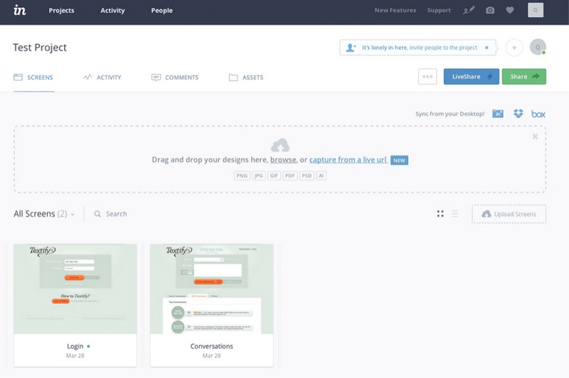
InVision’s interface. Designs can be dropped in or synced through cloud-based services. Like Marvel, InVision shows a thumbnail view of all the screens uploaded to a project. To edit, the designer clicks on one of the thumbnails to start linking screens together.
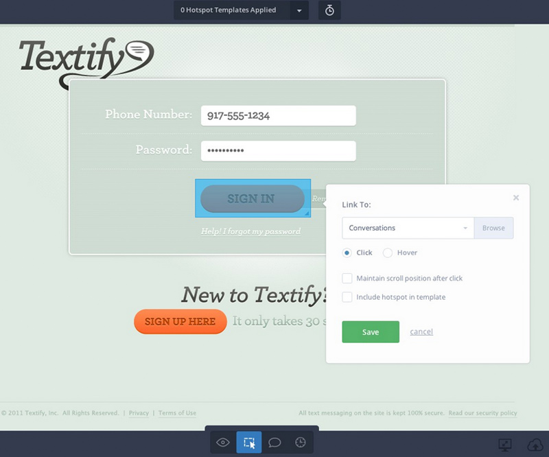
Designers can switch between Preview, Build, Comment, and History modes on the same screen. Build mode is where the designer links screens to build the prototype. Comment mode allows team members to add comments or action items to the design. History mode preserves previous versions of the screen.
Features:
• Design file syncing (Adobe Illustrator and Photoshop)
• Cloud-based syncing (via Invision Sync or Drop Box)
• Live screen sharing for collaboration
• Screen linking for desktop and mobile transitions, hover states, anchor scrolling, and external URLs
• Version control and project history
• Project statistics
• Projects can be embedded in Trello, Basecamp or Slack for easier project management
Pros: • Designed to support multiple users
• Very easy to give feedback on designs right within the app
• Screen sharing simplifies giving design presentations
• Can automatically create screens from an existing URL
Cons: • More expensive than other tools with similar capabilities
• No option to select individual elements for transitions
Cost: • 1 Project (free)
• Starter (3 projects, $15/mo)
• Professional (unlimited projects, $25/mo)
• Team (unlimited projects, $100/mo, with up to 5 team members supported)
View a sample prototype here.
Solidify
Solidify is a great tool that combines prototyping with user testing in one application. Its prototyping interface functions similarly to InVision or Marvel, and the process to set up a user test is streamlined within the flow for creating a prototype. Testing can be done remotely or in person, and can include explicitly defined user flows or tasks, or just general user feedback.
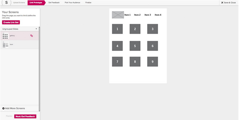
Solidify’s interface. Screens are uploaded and then edited individually and can be grouped together to help keep things organized.
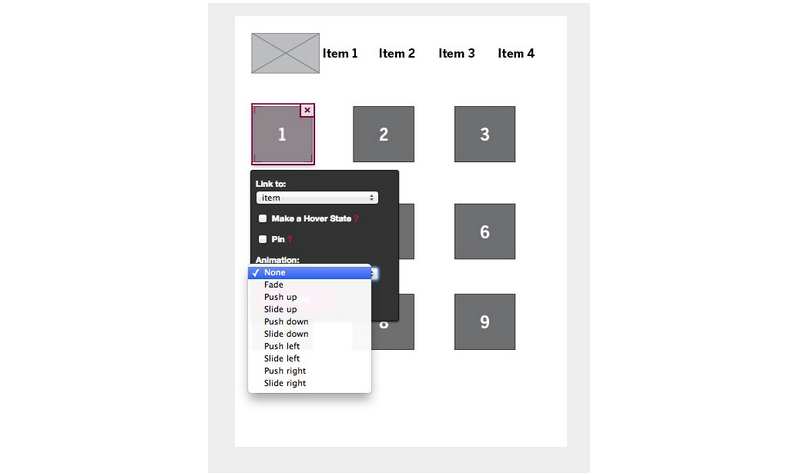
Hotspots can be links or hover states and a selection of animation styles is available. Hotspots can also be “pinned” to a location and will appear in the same spot across all screens, which is useful for repeated elements like a persistent global navigation.
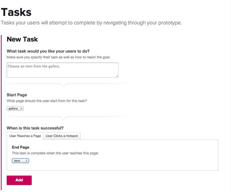
The user testing process is integrated into the prototype creation. After a prototype is created, the designer can define tasks for users to complete or just instruct users to give general feedback on specific pages or the prototype as a whole.
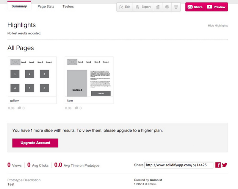
Designers can view basic analytics for their prototype. This example has no metrics since it hasn’t been tested.
Features:
• Supports desktop and mobile transitions and hover states
• Hot spots can be duplicated across screens
• Desktop and mobile testing
• Activity and usability reports for prototypes
• Demographics and custom reports (with Plus account)
• Unlimited prototypes
Pros: • Incorporates user feedback and testing
• Users can be bought from Solidify to ensure unbiased testers
• Provides built-in analytics for prototypes
Cons: Does not offer support for design program files, prototypes must be built from PDFs or JPGs No option to select individual elements for transitions
Cost:
• Basic account ($19)
• Plus account ($49/mo, includes demographic reports, logo customization, and custom reports in addition to the basic account features)
In Summary
The program you choose will depend on a number of factors: namely, the process you’re using and where prototyping and testing fits within it and the nature of the website or app you will be testing. In Part 2, I’ll take a look at some examples of full prototyping tools and compare them to the hot spot-based tools we examined here.
I recently completed brand strategy for The Pratt Center for Community Development, helping them articulate their mission, values, theory of change, differentiators; and finding ways to communicate their work and impact. A website redesignwas a core part of the engagement, and once brand strategy was complete, it was time to translate it into a user experience.
Very often, at this point, our Design Director takes the lead and I’ll support him, a UX Designer, and a visual designer (these two may be the same person). But this time, our UX designers were pretty busy, and I had just spent over a month getting to know The Pratt Center. To keep things moving, it just made a lot more sense for me to see the project through to UX and design.
I hadn’t gotten my hands dirty creating wireframes in a while, and it’s not like I need an excuse to design, so over the next few months, I worked with Pratt Center’s team to plan and design their website so our developers could then build it. The process reinforced everything I believe about why integrating brand strategy into the design process leads to a better client experience — and better results.
Looks Great, Falls on the Road
A common complaint you hear about rebranding is that it’s filled with lots of feel-good moments and insights, but that those can be fleeting. Clients are left with a lot of ideas, energy, and raw material — but unless their partner works in interactive, can have a hard time translating it into well-designed user experiences. But when it comes to creating valuable brand experiences, this translation from strategy to execution is where the rubber meets the road.
Many branding firms typically develop brand strategy and messaging, logo and identity design, and brand guidelines that clients can then use to extend their visual branding. This work might include blowing out high-level concepts that demonstrate what your a new home page might look like, but the heavy lifting of content strategy, technical strategy and user experience design are completely removed from the picture. As a result, clients working with branding firms can be left with far more questions than answers when it comes to figuring out how to design a cohesive, consistent brand experience across all of its communications.
Online Loser Experience
For years, as the interactive medium took off, lots of traditional branding agencies remained focused on their core areas of expertise. Some branding firms do have experience with the design part of interactive, maybe even UX design. But get into things like developing content strategy, taxonomies, content types, databases, mobile, and CMS architecture — everything going on under the hood to deliver online brand experiences — and it’s an entirely different ballgame.
So if you’re a nonprofit or academic institution that needs to strengthen your brand and extend this work through to web design, where does this leave you?
Most likely, you’re going to have to engage another firm to execute your brand strategy online. Your branding partner may recommend one, which definitely helps, but also seriously limits your choices. Or, you could send out another RFP and go though the process of becoming comfortable with a new partner. Either way (but particularly in the latter scenario), all the strategies, ideas, and nuances you’ve spend weeks or months uncovering — the things that make up the core of your brand — are at risk of being lost in translation. You could retain your branding firm to help quarterback the project, but this will mostly bloat your cost basis (and possibly frustrating your interactive partner).
Integrated Brand Strategy & Design
Thinking strategically about your brand, and being rigorous and focused in communicating it is critical to creating effective brand experiences for audiences. But ultimately, brands need more than strategy, messaging, and a logo to operate in the real world. They need well thought-out design systems that can be executed with consistency across an entire organization — particularly online. Because more audiences will likely experience your brand online than anywhere else, which makes an organization’s website the most strategic communications asset they own. And this means translating strategic thinking about brands into equally strategic user experiences online.
So why on earth would anyone develop brand strategy separate from the design execution that brings it to life if they didn’t have to?
This brings me back to my recent experience with The Pratt Center. After many years of building out small, agile, creative teams at Constructive that work together across these areas, it was refreshing — and reaffirming — to work directly across the bulk of a comprehensive branding and interactive engagement. It shined a spotlight on the benefits of a partnership and process that integrates brand strategy and design thinking — and the tremendous benefits they have for clients, particularly online.
I think our client summed it up best when she said this about the project:
“Working with Constructive was a bit like suddenly having our own in-house branding team. They took the time to get to know us, and acted creative experts and brand advocates. Constructive pushed us to verbalize the strategy and theory behind our work, to talk about our projects and research; then developed messaging and a website that reflect it all. It’s been a challenging, yet immensely rewarding experience.”
When branding and design firms collaborate with clients to develop ideas and strategies that help provide insight and focus; then stay with them for the long haul to help them bring it to life with a systems-based design that creates consistency online and off, the result is a far more meaningful, far more effective brand experience for audiences.
And because we’re so close to the strategies and thinking behind the brand experiences that must be designed to be delivered, we’re also able to respond more quickly and execute more effectively. We internalize the things that matter to our clients’ organization and their audience as much as they do. We design in context — drawing on every insight gained by learning about what makes an organization tick — and create more thoughtful, more meaningful, more valuable experiences as a result.
More efficient, more effective, and a better client experience? If you ask me, it doesn’t make sense to do it any other way.


