Bonny Colville-Hyde is a User Experience Architect in Bristol, UK, and a regular speaker at design and technology events. We first met at the Future of Web Design conference in London, and I was fascinated by her work with comics as a user experience communications tool. This month, I interviewed her about UX comics, effective communication, and dream projects.
Tell us about what you do, and the path you took to get there.
I’m a UX Architect at Immediate Media, a publishing company. I work with the Sports team and we develop two of the biggest cycling sites in the sector: BikeRadar.com and Cyclingnews.com. I started my career at cxpartners (a UX consultancy) after I finished my degree in Media Practice, and I spent about seven years working for digital agencies and freelancing before I decided I really wanted to be part of a product’s development for longer.
I do miss the constant challenges and speed of working in an agency, however right now I am still enjoying being part of a product team and getting to see the sites improve over time.
Where did the idea of UX comics come from? Was it hard to get away from more “traditional” research methods?
It was actually really easy as a client asked for some comics to be amended for them, and I got the job. eBay were using comics as part of a user research project and they needed them ‘translated’ from American English to British English, which I did and then ran the research. I’d never heard of using comics in research before, but I was blown away by how well participants responded to them. Since then I have used comics in a variety of ways throughout projects.
I went on to make comics for other clients, sometimes without them asking. I’d make them if I felt they they would help the process. I had a lot of success with this because these clients went on to ask for more, and I’ve had a few change jobs and then ask for comics to be made for their new company.
People respond very well to comics because they are different and they’re visual. This makes them powerful communication tools, as they attract people rather than repel them (like dry documentation and reports do). I’ve found people are keen to engage with comics because they show people, not just words.
Human communication is so much more than words – comics allow us to use body language, facial expressions and a whole host of visual clues to share information and build empathy. Even a single panel comic can communicate a massive amount of subtle data!
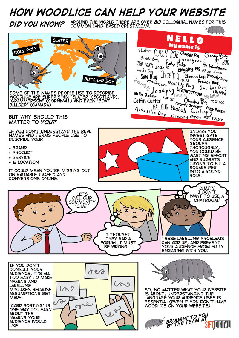
A UX comic created for Sift Digital that explains the value of audience research when labeling content.
You speak regularly at conferences and your talks often mention “death by documentation”- can you tell us what that means?
Well, it refers to a few things really. First of all, I think everyone gets bored quite easily. Our clients and team members are no different. If you want to really engage them you’ve got to produce work that doesn’t make them want to fall asleep. Who can say they enjoy reading long reports over their lunch hours (or worse, in bed)? Who likes sitting through PowerPoint presentations? The way we package up our thinking and ideas makes a difference to how they’re consumed.
Secondly, there is a bit of an entitlement culture in UX, which I think is a load of rubbish. We often can think a bit too highly of ourselves and the work we produce and expect others to think the same and be prepared to read our waffle. The quality of the work is in the measurable results it produces, not the paperwork it generates.
It also comes from selling a process rather than an outcome. If we’ve sold a particular process and a client is paying for it, we feel the need to produce some sort of documentation to justify the price tag for each stage. This is not in the best interest of the client, users, or long term product value.
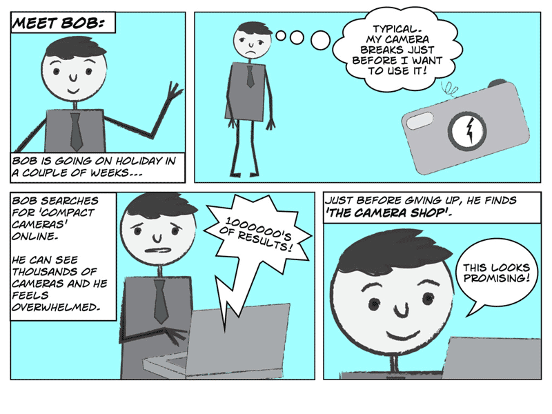
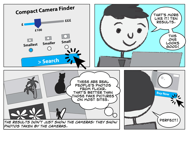
A UX comic showing Bob, a typical customer, navigating through a checkout process. His internal dialogue and impressions are clearly spelled out, making the user experience clear and humanized.
Ultimately, death by documentation is when we forget what we’re really trying to do and instead expend energy on documents that nobody will want to read. Thankfully, a lot of organisations are maturing in their approach to communicating user experience and are open to trying new techniques. Last year I ran a comic workshop for the .GOV UX team in London, who were keen to look at the ways they share their research data more productively with their extended across the UK government.
What sorts of organizations do you think would benefit most from this approach?
Organisations that struggle to share information up and down their chain of command can benefit from using alternative types of documentation most. If the top level managers fail to understand the work that is being done by the lower level ‘troops’, that can be problematic. For example, I once worked for a client whose Managing Director thought having a talking robot on their site would solve their customer experience problems better than resolving their fundamental information architecture mess. Getting him to empathise with their audience and understand their information needs better made him see that adding an animated robot on the broken site would be like putting a gold tooth in a rat.
It could be argued that out of all organisation types, charities and not-for-profits should be the most user centred, as their remits dictate this. However, I’ve seen this get lost when it comes to balancing their approach to digital and more traditional offline marketing activities. A lack of digital literacy amongst senior decision makers can really harm the service offering provided to the end users of a charity, and waste limited funds. That lack of digital literacy can be accommodated for, however, as long as there are tools to support decisions involving digital strategies that staff can easily access and use collaboratively.
For instance, I created a set of comics and personas for a children’s charity in the UK based on user research work done by a colleague. By bringing the service recipients, their families, teachers and fund raisers to life, senior staff were able to understand the opportunities they had to build a digital service that could work alongside their traditional offline service, and fit into the context of the user’s lives as their needs changed.
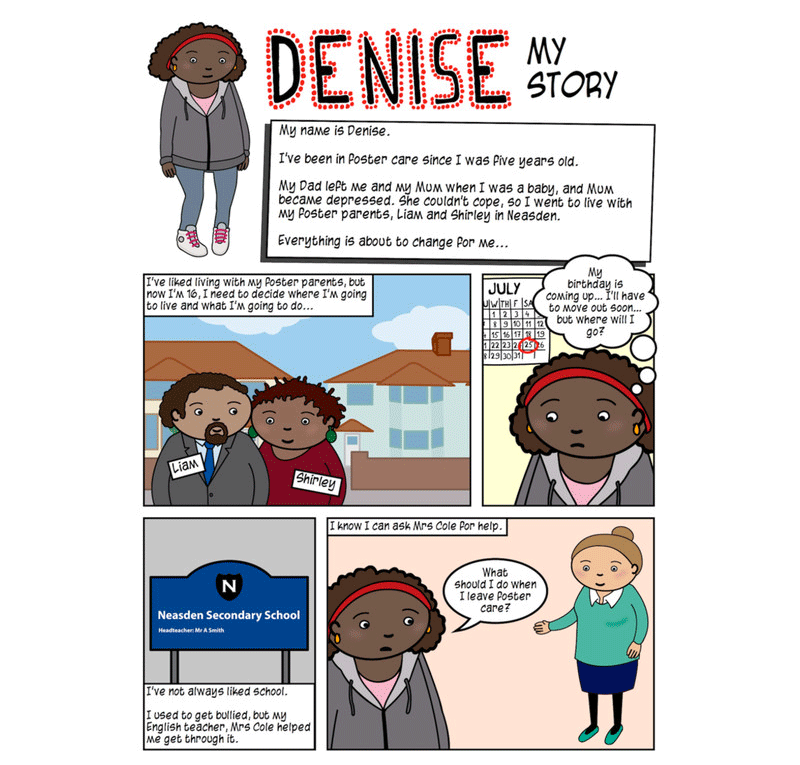
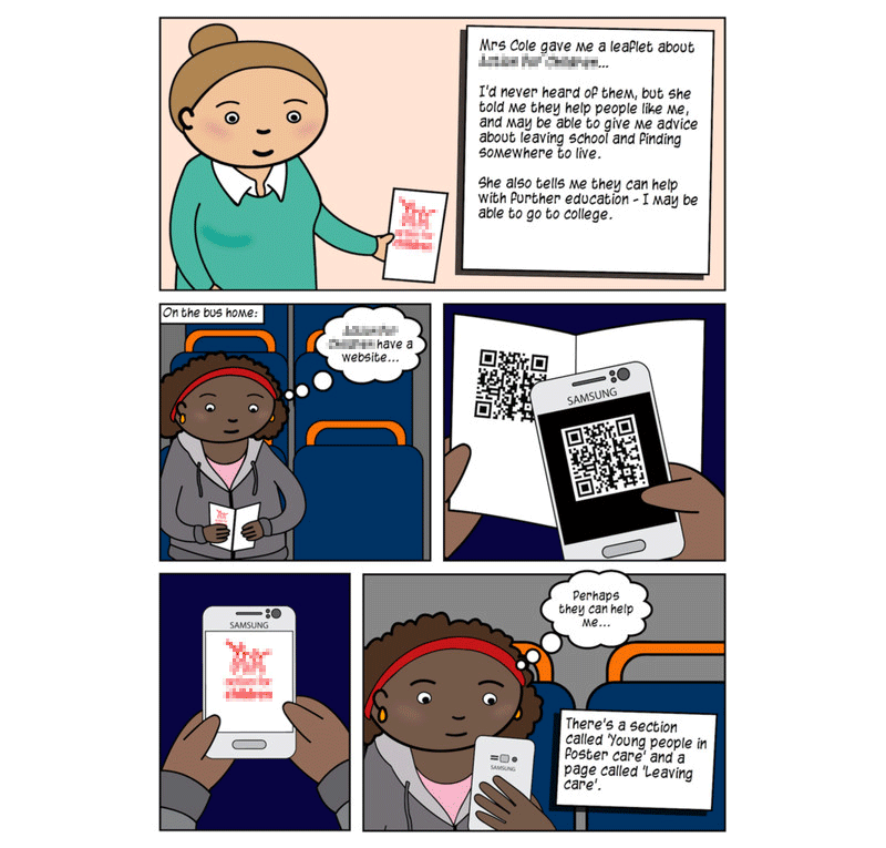
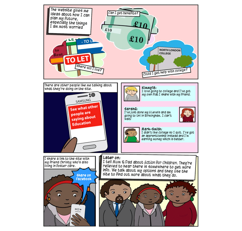
Denise tells her story of using a non-profit’s website, clearly explaining how it fits into her offline life.
Describe some of the reactions your comics have had when you show them to clients (and users).
Smiles. The most common reaction to looking at a comic is a smile. How many other types of documentation have that effect?
The best results are when a team sticks the comics up on the wall: they attract lots of attention. I’ve seen how comics can travel virally within companies, with different teams using them within their departments outside of the original scope of work.
What would be your dream project to use UX comics with?
I think it would be very interesting to use comics within healthcare research and service design, especially around the design of care for the elderly, or side effects of prescription medication. I believe the mix of narrative storytelling and imagery could generate increased compassion and empathy as well as improved understanding of the social effects healthcare has alongside scientific results.
End of life care is an area that could be improved enormously for the families of lost loved ones. Death comes with a lot of paperwork. When I lost my father to dementia 18 months ago, I remember my whole family had to hold back on the grieving process until we had managed to complete all of the administration required of us. Improving this experience for people could make a huge difference to the emotional lives of the population.
I’d love to see governments and healthcare providers look at their service design so that trauma and stress associated with forms and paperwork could be reduced.
If you were going to give advice to a creative team that wants to use this technique, what would you say?
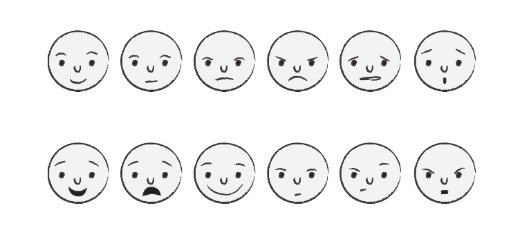
You don’t have to be good at art to be able to make meaningful comics, with a bit of practice drawing the basics you can communicate a lot! Focus on learning to draw facial expressions as these will bring your story to life and help your audience empathise with your characters.
Go ahead and do it, don’t wait to sell it to someone. Most clients or team members won’t know they want comics until they see them and use them.
Bonny, thanks for taking the time to answer a few questions about your experience and how UX comics can be used effectively. This have been really informative. If people want to learn more, are there any books or sites you recommend checking out?
If you would like to learn more about comics, Understanding Comics by Scott McCloud is perfect. If you want to try your hand at making comics, I cannot recommend Cartooning: Philosophy and Practice by Ivan Brunetti enough: it’s a tiny book, but it’s packed full of witty and insightful tips. Scott McCloud’s Making Comics is also a great primer.
If you want to know more about user experience comics though, See What I Mean by Kevin Cheng is required reading! I wish I’d had his book when I started making comics.
You can find Bonny online at: http://www.almostexact.com/
Hi! I imagine if you’re reading this article, you’ve likely run into at least one scenario where it wasn’t entirely clear if you needed an out-of-the-box or custom developed WordPress plugin to fulfill your innermost WordPress desires. Besides design, it’s the usual reason why clients end up calling 1-800-WEB-NERD.
A Stakeholder’s POV
“I need my site to make my content sing and help visitors find exactly what they want the way I would like for them to.” This might be something a client would be thinking and saying during a website design and build project. While they will know that Content Management Systems such as WordPress exist, and that it helps manage their content — they may not know that some of the features they want aren’t built into WordPress (or aren’t exposed outright).
This is where WordPress plugins are supposed to swoop in and save the day. In a perfect world, plugins would adhere to the WP Coding Standards, always use best-practices, and provide developers with flexible options for configuring their looks and functionality — saving time and money. Unfortunately, we live in a world where design and development firms and their clients face insurmountable odds to complete seemingly simple tasks with plugins that are focused on completing one cookie-cutter goal.
A Web Design and Development Studio’s POV
The client says, “It says on the tin it can do X, Y and Z!” Your developers say, “The output of this plugin is unmanageable and buggy!” Your graphic and UX designers say, “Why doesn’t the plugin do what my designs tell it to do?”
The above is typical of what happens when a specialized feature is meant to be bundled into a new site. The plugin you thought might solve a problem isn’t up to the challenge of meeting everyone’s expectations, and there’s a reason for that. Very few WordPress plugins are meant to work for a specific, specialized feature. The ones that do typically cost you or your client a license fee, and the creator may frustratingly charge you for additional or “advanced” features.
Still, there are some shining examples of great commercial WordPress plugins. Gravity Forms and Advanced Custom Fieldsare two that come to mind. They work well, have support from other plugin vendors, and look to have a long life ahead of them. These are things you should really be looking for when you lay your reputation on the line for a plugin. Remember that what’s in the feature bullet list isn’t always what you were expecting to get, so do your homework.
You Get What You Pay For
Nothing is for free and this is painfully obvious with many off-the-shelf plugins. Some free plugin authors really do care about the WordPress community at large and have been developing their plugins for years. I can only think of a few that have stuck around on this model (one being Contact Form 7). In some cases, the long-lived free plugins actually change hands as developers donate their time after a previous author takes leave of the project.
This leaves a lot to be desired when you’re planning on your site being operational for at least five years or more before a new project comes around. That’s why I usually turn to commercial plugins as a more future-proofed solution for WordPress sites. The authors have a vested interested in seeing their plugin continue to fill the coffers and that translates (usually) into quality and longevity. That’s exactly what we’re looking for. But, unfortunately…
Sometimes Plugins Suck
And you won’t know it until you’re half way through a project trying to meet the needs of the client, UX documentation, design comps and developers’ sanity. This is something our teamrecently got a good dose of during a couple of projects. The plugin in question was supposed to do this one thing really well, and to be fair, it does that thing pretty darned well. What it doesn’t do is adhere to those WP Coding Standards, follow good practices, and most definitely doesn’t spit out quality markup for our designers and developers to work with. Total fail. #questioningmyabilitiesandlifechoices #ithadagoodrating #whywhywhy
In our line of work we hope that a piece of web software will output some nice HTML markup for us to style and animate. In this case, we weren’t getting any of what we wanted and by my estimates, we more than doubled the time we needed to complete our tasks; forcing us to spend more time crafting workarounds and clever concessions when it should have just worked. The WordPress plugin clearly wasn’t targeted at our studio or the missions we had for our sites.
To make matters worse, this particular plugin altered their HTML markup output after an update, dashing our work on multiple projects against the rocks and crushing our dreams that the plugin would serve us well.
Maybe We Should Have Developed Our Own Plugin?
You’re right we should have! And as always, hindsight is 20/20. Lessons were learned quickly and we made a move to create our own software to do what we wished the other plugin should have done for us.
And that’s the crux of this dilemma: Does the WordPress plugin developer know what you and your team do? Do they know your workflow? Do they share the same values of design and development? Do they offer you tools to change the experience of the software? Do they empower you and your website to do their jobs better? If they don’t, you must consider developing your own software.
And that’s just what we did… or, are doing. More on that later!
For anyone in the position of examining their organization’s communications and business strategies, a new year means shoring up plans and budgets in support of ambitious organizational goals. Every new year presents us with the opportunity to build on successes from the year prior, and to also take a critical eye to the effectiveness of our efforts, pivot, or press restart altogether.
Depending on the state of your nonprofit’s brand, you may be looking to embark on a large-scale initiative like a rebranding or website redesign. Or you may be targeting ways to optimize, strengthen, and extend the materials you already have in place. Whatever the case, to help you increase the impact of your nonprofit’s communications in the year ahead (and beyond), here are seven of the most common, high-value areas the organizations I meet with are interested in exploring.
Brand Strategy
If your organization has never committed itself to a brand strategy engagement, it’s hard for me to understate the value of a branding process for surfacing insights, sharpening your communications focus, and strengthening your case for support (whatever form that takes). Similarly, if you have a brand strategy that is a few years old, here are some things you can do to make sure it still conveys who you are, what you do, and why what you do matters.
Listen to your audience. If your organization works on complex issues that are hard to unpack or lend themselves to jargon-laden language, reaching out and listening to members of your audience provides invaluable feedback and a much-needed perspective. An effective research interview process designed to explore core strategic questions is an incredibly effective way to evaluate how well-aligned your organization and its goals are with the expectations of your audience. It’s also a great way to gain insights into how your target audience uses language to frame the issues you all care about — ensuring that your communications strategy is focused on your audience, speaks to it, and rings true.
Strengthen your sense of identity. If your nonprofit has a clear mission but the ways you go about making change have evolved over the years, clearly communicating that evolution is essential. Because a nonprofit’s brand is as much about internal cohesion and capacity as it is about words and images, spending some time and money on developing an internal-facing brand handbook for your nonprofit that distills your mission, vision, and values can create an asset that, when shared with staff and partners, will strengthen the organization’s culture and sense of purpose while providing an actionable blueprint for the kind of compelling messaging and experiences folks in your organization are asked (and expected) to deliver.
Design
Deliver a consistent point of view. If your nonprofit’s communications lack consistency and cohesion, it’s a good bet you’re sending out mixed messages that undermine its mission. Creating well-defined brand guidelines is one way to ensure your organization presents a unified image that speaks well of its effectiveness. And if you already have brand guidelines but they feel a bit dated and/or do not support new types of collateral such as data visualizations and infographics, a quick refresh of the guidelines is a great way to maintain brand continuity while making sure your communications keep pace with innovation both in and beyond your organization.
Increase your communications efficiency. Speaking of consistency and cohesion, if your organization has a variety of presentation decks, event materials, and program collateral that has been developed over the years by different people, it’s likely it has less of what I’d call a communications design system and more of what can only be called a communications hodge-podge. Spending some time and money on developing a suite of tools and templates that are easy to use and which work together not only will provide the kind of brand consistency every organization needs, it will increase productivity and help you respond more effectively to opportunities by speeding up production of the kind of high-quality communications your organization deserves.
Website
Understand your users. If your organization is about to embark on a website design/redesign, starting with an effective UX research process is a great way to make sure the site’s content, features, and user experience align with what your audiences want and expect. And if you launched a new site recently and think it’s great but haven’t asked your target audiences for feedback, focused UX research is a great way to uncover and target high-value improvements that can boost your presence and strengthen your overall communications strategy.
SEO and analytics. Assuming search engine optimization matters to your nonprofit, developing an SEO strategy that starts with an analysis of your site’s build to see how well it is optimized for SEO, along with an evaluation of things like backlinks and social media strategy, is an excellent way to identify and fix areas that are negatively affecting your site’s organic search performance. Similarly, if you’ve implemented Google Analytics or another web analytics package, you already have volumes of valuable information that can be used to figure out where to target your usability and design dollars. It just requires a team to identify what you want to understand, then digging in.
Learn from what your peers are doing. If you’re planning to evaluate your site to determine whether a complete overhaul is called for or not, market research on peer organization websites is an excellent complement to user interviews and analytics analysis. For example, best practices for designing content-heavy websites call for a certain approach. If your organization is looking to disseminate knowledge to a wider audience, evaluation aimed at understanding what’s effective (and what isn’t!) will make it a lot easier to see where your site is performing well and where there is room for improvement.
Looking Ahead
With 2016 upon us, every organization needs to make choices – and the sooner the better – about how best to allocate resources in ways that advance its strategy. Communications is just one piece (albeit a very important one) of the pie. Hopefully the above suggestions have provided some good ideas and food for thought about how to increase the effectiveness of your communications—as well as arguments that support your case for being given the resources to do so!
In the meantime, a happy and healthy 2016 to everyone!
When you’re talking about steps for innovation and growth at a company, you can’t ignore culture as part of the equation. A company’s culture defines the context in which it operates, how it is perceived in the wider world, and how successful it can be. It can be both an enabler as well as a hindrance at all levels within an organization, and no level is immune. IT Services have long past reached a point where it can no longer be an afterthought to product development and corporate vision with its own silo and mysterious culture. IT Services are an integral part of the modern company and the culture in which it finds and creates for itself is extremely important to the overall effectiveness of a company and its brand. IT Services solve problems and solving problems is the core of design.
A lot has been said and written lately about design-driven culture in organizations. In fact, according to a study by the Design Management Institute, over the past 10 years design-driven companies have outperformed the S&P 500 by 228 percent. Companies like Nike, Apple, IBM, Ford, and Starwood understand that design has tactical, organizational, and strategic value. Carry this understanding inward to the various parts of a company and its relationships and you see that by embracing these design values, IT Services has an even more tremendous role to play as part of driving innovation and growth. It is all part of a design culture maturity model that any company can achieve. While there is no one path to success here, there are a few patterns.
Champion the User
The most over-arching pattern is to always champion your users. What are their needs and goals? What are they trying to accomplish and how are you helping them do that? How are you hindering?
You should be defining “user” in a much broader sense and with more distinction than just a customer interacting with your apps or services. A user can also be a customer talking to a rep on the phone or in person, or even just seeing an ad for your company in print. It could be a potential client, meeting you for the first time, or an existing one further along in the business relationship. They could also be someone inside your organization accessing internal applications, systems, and IRL services.
Technology serves all of this and is part of a broader system of your company that goes way beyond the screen, and technology should not be separate from the user’s experience of it. IT Services has as much opportunity to be a champion of the user experience as any other part of a design-driven company and often has better insight into the possibilities and constraints of what technology can do to serve users’ needs. Sharing your experience and knowledge can only help drive creativity. Foster a culture focusing on the user throughout your organization and everyone benefits.
There Are No Islands
Another pattern is that there are no islands in a design-driven company. In working together to solve the needs of your users it is the connection between teams and individuals where magic can happen. In a recent interview, Phil Schiller (senior VP of worldwide marketing at Apple) said of the various Mac teams, “Today, those teams are not only integrated and designing something together, they’re actually thinking of features that could only exist because of that integration and solving problems that could only be solved because of that unique advantage.”
He was talking about the unique capabilities that each team and individual brought to the table, something that does not happen if teams are segregated. In a design-driven company not everyone has to be a “designer” in the traditional sense just like not everyone need be an engineer or analyst — it is the coming together to solve a problem that counts, and on that trip you may be surprised at what you can accomplish.
IT Services should not only be immersed in the collaborative process, it should be thinking about tools and technologies to help nurture and drive collaboration within the company and without. Your customers should always be an integral part of the conversation and giving them the tools to do so will help enrich their experience with your company and brand.
Learn as You Go
You are going to fall down and that is OK. This is a pattern too. You may be going down a path the users won’t follow. Projects and initiatives do fail. This is a good thing as it is part of the process of solving the problem of where you’re going with your users, as a company, and as a team.
Whether a good or bad outcome from a project or initiative, you should always debrief the team to understand what happened and don’t forget to include your customers in the process. IT Services should pull together a team to design and build or customize a way to capture this knowledge and make it readily available to the rest of the company so that everyone benefits. Don’t be afraid to transform your organization as your environment changes, or to change course, or to take a step back and start again.
At the end of the day, we are making products and creating services that people will use. IT Services plays an important role in a design-driven company to achieve this. Championing the user, embracing open collaboration, and codifying and taking to heart lessons learned are a few ways to create a culture from which innovation and growth emerge.
This article is featured in the January 2016 issue of CIO Review magazine.
If you follow Drupal at all you’ve probably heard about the release of Drupal 8 and that it’s a Really Big Deal™. But if terms like OOP, REST and WAI-ARIA make your head spin, you may be wondering whether it’s really a big deal for you.
In Part 1 of this series of articles we’ll take a look at some of the changes that Drupal 8 will bring for both website visitors and maintainers. In Part 2 we’ll explore what the release of Drupal 8 means for you – whether you already have a Drupal site built on a previous version, or are planning to build a new website and are wondering if Drupal 8 is the right choice.
Front End – The Visitor Experience
Responsive, Right of the Box
When Drupal 7 was released at the beginning of 2011 responsive web development was still in its infancy. Mobile browsing was already making a dent, but the most common way of handling small screens was to create a separate website designed specifically for them. This had the advantage of letting designers tailor layouts and interfaces specifically for mobile devices, but this also meant that website owners now had to support and maintain two separate websites. Responsiveness – the idea that a website could present itself differently depending on the shape and size of the browser – was an exciting new concept, but not yet an established practice.
In the intervening years the ubiquity of mobile devices and proliferation of screen sizes has transitioned responsiveness from “nice to have” to “must have”. And Google’s announcement this past April that mobile friendliness would improve ranking in mobile searches gives it more urgency than ever.
Drupal 8 adds a new level of sophistication to responsive theming. Not only are all of the Drupal base themes now responsive, images can also be set up for different screen sizes directly from the display properties:
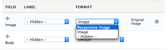
This makes it possible to automatically deliver appropriately sized images to different devices, which helps to speed page loads on smaller screens.
And speaking of speed…
Performance
Drupal’s always been pretty fast when it came to serving relatively static pages for anonymous users. Smaller sites could rely on Drupal’s internal caching system alone, while larger ones might need to leverage the additional power of external tools like Varnish or a CDN. The one place performance could be a problem is with highly dynamic or interactive pages – when pages or parts of pages changed too quickly caching would break down and there wasn’t much anyone could do to recover the desired speed – until now.
Dries Buytaert, the creator of Drupal, has an excellent (if rather technical) explanation of enhanced caching and other performance optimizations in Drupal 8. The bottom line is that with Drupal 8 you can make even the most dynamic pages fly.
Back End – The User Experience
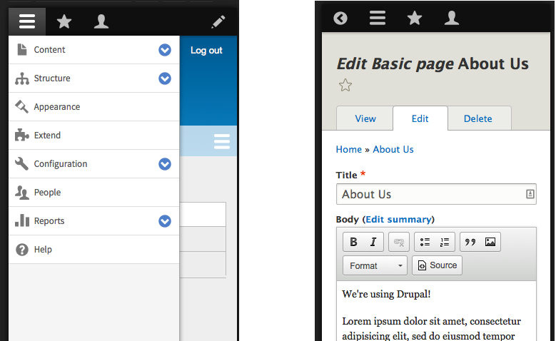
Responsive Administration
Responsiveness isn’t only for visitors. Website maintainers and content creators often use mobile devices, and Drupal 8 has made it easy to update your website on the go with mobile-friendly edit and configuration screens:
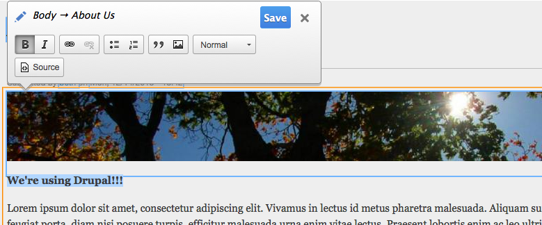
Content Preview and In-Place Editing
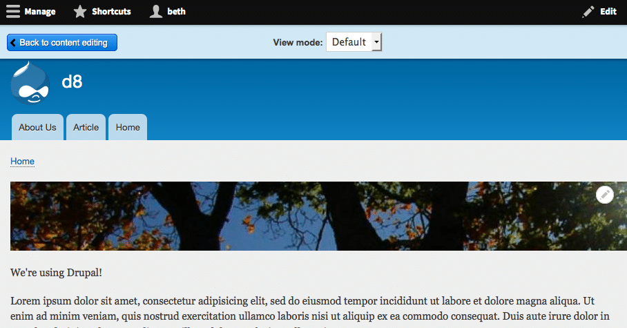
One of the more annoying elements of Drupal 7 for backend users was the Preview function. People often want to see what the changes they’ve made will look like before they publish, and naturally expected preview to provide that. But because the preview screen used the back end theme, it could show the elements that would appear – cropped images, text, etc. – but without the fonts and positioning that the live page used.
Drupal 8 has taken care of that with a completely revamped preview screen that can show you the page as it will appear when it’s published:
And if the content appears in a different context using a different layout, e.g., Teaser Mode, you can preview that too: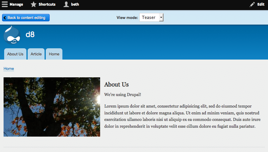
But what if you’re just making a small edits – updating a page title or correcting a typo in an article? Wouldn’t it be nice to be able to make the change directly on the page without loading an edit or preview screen at all? Drupal 8’s new in-place editing feature lets you do just that.
Mouse over the content you want to edit. You’ll see a contextual edit icon (pencil) in the upper right corner of the content area. Click to show the contextual menu:
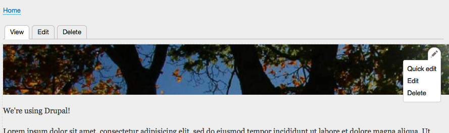
Choose “Quick edit” from the menu then just click on the field you want to edit (title, image, text area, etc.) and you’re ready to go:
Conclusion
Drupal 8 involved a major rewrite of the Drupal codebase, integrating modern coding standards and API’s to help developers build stronger, more stable CMS applications. But you don’t have to be a techie to appreciate the new Drupal. In this article, we’ve barely scratched the surface in exploring some of the features and functionality that improve the look and feel of the website for visitors and maintainers. In Part 2 of this series we’ll take a look at some of the issues you need to consider when deciding whether Drupal 8 is right for you.
If you want to learn more about Drupal 8 or how we can help you, Get in Touch!
When there’s a tight deadline to develop a website it’s tempting to jump right in and start building. It’s best to take a step back and take some time to plan in order to save time and effort in the long run. In rebranding our firm to coincide with ComNet15, we were faced with the daunting task of going from no name to having a new website in three months—an audacious goal where a lot had to happen in tandem in order to get things right. In this article, I’ll explore three techniques our web developers used along the way that really helped us hit our launch date: creating re-usable modular pieces of code, using CSS naming conventions, and collaborating closely with our designers as they generated content.
Keep Code Organized and Re-usable
The key to any successful web project is organization, especially when the development deadline is aggressive. When you’re working quickly, file structure, PHP includes, JavaScript, and Sassall need to be easily readable and decoupled (i.e. modifying one piece of code should not affect another.) This was especially important for our team because we had two developers simultaneously developing on the same code base. We divided up responsibilities in an effort to not step on each others toes: Quinton Mosley handled most of the back end work while I focused on the front end.
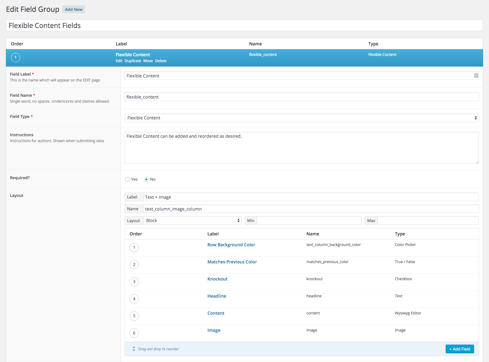
Of course, organization goes beyond the code you write; it extends to the way you represent the building blocks for site content in your CMS. At Constructive, we love Open Source CMSs like WordPress and Drupal, and because we apply design thinking in web development, almost all of the WordPress sites we build make heavy use of the Advanced Custom Fields (ACF) plugin. ACF is a great tool out-of-the-box, but when you use advanced features like flexible content fields, your page templates can get a little crazy. To keep things neat and organized and help speed up development we created some reusable patterns with ACF.
In the backend we created one field group that would house all of our flexible content groups:
Then in one file we wrote:
<?php if (have_rows( $acf_flexible_content )) : $row_count = 0; ?>

   <?php while (have_rows( $acf_flexible_content )) : the_row(); $row_class = 'fc-row-' . ++$row_count; ?>

      <?php if (get_row_layout() == 'text_column_image_column' ) : ?>

         <?php include(locate_template('/flexible_content/acf-text-image.php')); ?>

      <?php elseif (get_row_layout() == 'large_image' ) : ?>

         <?php include(locate_template('/flexible_content/acf-large-image.php')); ?>

      <?php elseif (get_row_layout() == 'image_gallery' ) : ?>

         <?php include(locate_template('/flexible_content/acf-image-gallery.php')); ?>

      <?php elseif (get_row_layout() == 'text_block' ) : ?>

         <?php include(locate_template('/flexible_content/acf-text-block.php')); ?>

      <?php endif; ?>

   <?php endwhile; ?>

<?php endif; ?>
The above code loops through the flexible content fields and locates the appropriate template part to use for that group.
In another file, we created a template:
<?php $matchesPrevious = get_sub_field('matches_previous_color'); ?>

  <section class="fc-text-image row <?php the_sub_field('order'); ?>
    <?php echo $row_class; ?>
     <?php if ($matchesPrevious == 1 ) :?>row--matches-previous<?php endif; ?>"
    <?php echo acf_background_color_style('text_column_background_color'); ?>>

    <div class="container">

      <?php

        $headline = get_sub_field('headline');

        $content = get_sub_field('content');

      ?>

      <?php if (!empty($headline) || !empty($content) ) { ?>

        <header <?php if(get_sub_field('knockout')): ?> class="fc-knockout-text" <?php endif; ?>>

          <h2><?php the_sub_field('headline'); ?></h2>

          <?php the_sub_field('content'); ?>

        </header>

      <?php } ?>

      <div class="fc-image__column fc-text__column--image"
<?php echo acf_background_color_style('image_background_color'); ?>>

        <img src="<?php echo acf_image_url('image', 'text-with-image-thumbnail'); ?>"
alt="<?php the_sub_field('subheading'); ?>" />

      </div>

    </div>

</section>
We could now use any of our fields in whatever template we wanted and have all the power of flexible content fields.
<?php
  $acf_flexible_content = 'flexible_content';
  include(locate_template('/flexible_content/acf-flexible-content.php'));
?>
Block, Element, Modifier
Lately we’ve been warming to the idea of using BEM syntax for all our styling.
This was especially important for our project because we had UI, UX, coding and content development all happening on at once.
Keeping the CSS modular and clean was essential. Here’s a small sample of how we styled the flexible content field groups:
.fc-carousel {}
.fc-carousel__image {}
.fc-carousel--browser {}
The fc prefix, is given to all the styles. In this example, carousel is the element and browser is the modifier.
We also made use of Sass @extends wherever possible so that we weren’t repeating ourselves. Here’s how we did links for fctext blocks:
%fc-text-links {
   color: $body;
   position: relative;
   display: inline-block;
   transition: all 0.3s ease-in-out;
   @include font-serif;
   &:after {
     content: " ";
     display: block;
     position: absolute;
     height: 1px;
     width: 100%;
     bottom: 2px;
     border-bottom: 1px dotted $body-dark;
   }
   &:hover {
     &:after {
       border-bottom: 1px solid $body-dark;
     }
   }
}

.fc-header {
   a {
      @extend %fc-text-links;
   }
}
Collaborating and Catching Edge Cases
A benefit of designing, developing, and generating content at the same time is you can discover edge cases and address them immediately. Our project pages have several different layouts and options that can be combined in a number of different ways.
We decided early on that we wanted to give content editors some control over the look and feel of the page they are creating it, as the create it. As our Director of Technology, Ian Mariano, often says, “Admins are users too” – a topic worthy of its own article and more. Keeping that in mind, we included a color picker on all flexible content groups so that they can use an appropriate color for a particular project. But this presented a problem: what if the color the editor selects clashes with the sites body text color? Checkboxes to the rescue! The simplest way to solve this problem was to add a checkbox to the field group that will add a class when selected. We could then target that class in the CSS and take care of the clashing color issue.
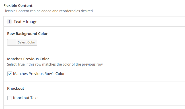
Here we opted to give the editor the option to select “Knockout Text.” This adds the class .fc-knockout-text to that group and we change the text color to white in the CSS.
You’ll notice in the previous image there is also a checkbox labeled “Matches Previous Row’s Color.” This brings us to another edge case. Like any well built site there are default styles set. In our case we have 90px’s of padding on each of our rows of content. In some cases there will be two consecutive rows that the editor wants to be the same color. Remembering that we have 90px of padding top and bottom on all our rows and in this scenario we’ll end up with 180px of padding on top. That doesn’t look so hot. In comes another checkbox. Basically, it tells us if this row matches the previous row’s color. If that is true, remove the padding from the top of that row.
Moving Forward
Keep it simple. All projects present numerous challenges. When there’s a tight deadline and you’re doing design, development, and design all at once, the complexity of these challenges can escalate exponentially. Surprisingly, my blood pressure stayed under control during this one and I think that’s largely because we maintained tight collaboration and organization. The tools we used enabled us to also focus on the Admins’ user experience and more easily collaborate with our whole team. For example, our founder, Matt Schwartz, could enter content into a new field group and then pop over to my desk to work through a design problem that needed to be addressed. Adding new field groups was easy because of all the ground work we did and styling them was simple with our naming conventions.
Of course, the above examples came from our experience with an in-house project; client projects present another layer of complexity. But regardless of whether we are working on an internal project or a client project, many of these lessons hold—and we’ve incorporated many of the techniques and approaches developed in this project to our core WordPress Distro and client work flow.
A nonprofit’s branding and messaging are the translation of its strategic plan or operating model into tangible design and content. They’re the foundation upon which all nonprofit communications are built. But how do we translate all the complex ideas like a theory of change and program strategies into brand experiences that engage audiences?
As I noted in an earlier article, maximizing a brand’s potential requires “a strategic framework for thinking about, creating, and managing the different ways the brand is understood and expressed.” This starts with an organization having an understanding of itself and its relationship to the individuals, organizations, and networks that comprise its ecosystem.
Nonprofits typically define and understand themselves through a mission and theory of change, using them as a foundation for organizational strategy. Branding is the way this understanding is reinforced and communicated. It both informs and articulates this foundation by establishing conceptual clarity and creating greater intentionality in the experiences the brand delivers — whether they occur online, in print, or in person.
At Constructive, it’s our mission to bridge this gap between branding theory and practice by aligning an organization’s ideas, actions, and culture with its use of design, messaging, and technology. We help translate concepts and dynamics into a clear narrative and engaging experiences that reinforce a nonprofit’s value. And like much of the work nonprofits do, this process calls for a systems-based approach.
Seeing the Forest and the Trees
In order to create engaging brand experiences, designers, copywriters, and technologists must apply their skills to the difficult job of translating complex issues and an organization’s efforts to address them into something that resonates with a public that, in most cases, has only a passing knowledge of them. To accomplish this, we apply synthetic thinking to unite the conceptual and tangible elements of a nonprofit’s brand to create a whole that is greater than the sum of its parts — and whose individual parts also function effectively on their own, in any context.
This dynamic is important for many reasons, not least of which is the fact that branding takes many forms. Branding can be experienced holistically (e.g., a website or report), or as individual elements ( a tagline or logo). Understood this way, a systems-based approach is critical to developing a framework that helps all stakeholders more easily and effectively manage a nonprofit’s brand.
So, what goes into this framework, and how do its different parts work together?
The Foundations of Verbal and Visual Branding
Branding provides an organization with two important things: a messaging platform that articulates its organizational/brand strategy and a design system to communicate that strategy visually. Here’s an overview of how we, at Constructive, work to develop them.
Brand Messaging Architecture
To develop strong connective thread that runs from an organization’s mission through to the types of experiences those who interact with the organization are, the key concepts should flow from one to the other, providing answers to the following questions:
Mission: What is the organization’s reason for being?
Vision: What does the world look like when the mission is successfully executed?
Challenges: What are the challenges that stand in the way of getting there?
Theory of Change: How is change possible and how will it happen?
Audiences: Who’s engaged, directly or indirectly, in advancing the mission?
Beliefs & Values: What are the principles that guide the organization and its people while working to advance its mission?
Roles & Functions: What are the key activities in which the organization engages?
Differentiators: What makes the organization qualified to play these roles?
Attributes: What’s the personality of the brand and what kinds of experiences is it trying to create for different audiences?
Building a nonprofit messaging platform with the answers to these questions empowers us to communicate vital aspects of the brand in ways everyone can easily understand, making it easier to develop compelling brand narratives from multiple vantage points. It provides a reservoir of content that can be drawn on for a broad range of business and marketing communications.
Visual Identity Architecture
Unlike with language, which uses the same element (words) to communicate the ideas behind a brand, visual branding uses multiple different design elements to communicate these ideas and add greater meaning than words alone can create. Most people are familiar with many of these elements (Logo, Typography, Color, Photography, etc), however, their nuances are often less clear to some.
When designing nonprofit branding, firms like Constructive look to balance the functional and emotional attributes that elements of a visual identity system offer the brand. We test and evaluate how effectively they help an organization accomplish its goals by asking countless questions along the way. The answers may be as much about a subjective aesthetic consideration that needs to be rationalized as they may be about measurable, objective criteria that can clearly be evaluated. For example:
Logo Design: Subjectively, how well does the mark embody the attributes or values that have been identified during brand strategy? Objectively, how well will a proposed design retain its clarity and legibility at different sizes in different contexts?
Color: Subjectively, what does a proposed color palette communicate emotionally about the brand? Objectively, does the color palette support the range of functional demands an organization’s content calls for, such as data visualization?
Typography: Subjectively, what does the design of a proposed set of typefaces say about the personality of an organization when communicating its ideas? Objectively, do the typeface families chosen provide the functional support to deliver specific types of content with legibility in all contexts and mediums?
By evaluating all elements within a nonprofit’s visual branding both subjectively and objectively, we’re not only more likely to design branding that is a more accurate reflection of all the intangible ideas and values that it stands for, we’re also much more likely to develop a toolset that is more effective in delivering communications and that makes operations more efficient.
Recently at the 2015 Digital Project Managers Summit I had a chance to talk to a number of attendees and speakers from all over North America and Europe. They spanned a wide range of types of firms dealing with building websites for clients. Some were focused on UX and design, some on implementation, and some were a bit of both. I’d worked for many years at companies that were heavy implementation shops with little design thinking where myself and a few others were the only voices championing the value of user experience. Having tired of that, I made the move back into a design-driven environment. At the DPM summit it was interesting to chat with everyone in a concentrated context and to compare approaches. One recurring theme in these conversations was the value of a user-centric, design-driven firm.
Ahead of the summit, we had recently rebranded and relaunched our company, Constructive. It was something our founder Matt Schwartz had desired and thought about for a number of years and finally decided to do. A hard deadline was set, coinciding with our sponsorship of The Communications Network‘s 2015 conference. We were now in a familiar situation: a client (us!) with a huge to-do list: coming up with an execution strategy, redefining the brand, and designing and building the experience online, in print, and in person. The timeline? Three months in which to accomplish, well, everything.
On the technical side, we knew we were going to build the new site in WordPress and it reminded me of a certain temptation I’d seen before: to use some off-the-shelf CMS theme and/or templates and customize it for the site design. The temptation to adapt a cookie-cutter approach is greater at a high-volume firm, where a handful of these kinds of templates are used to cover most of the sites that need to be developed rather than consciously crafting sites around user needs, specific intent, UX, and visual design. One might pursue this route due to cost, a lack of technical skill or bandwidth, turnaround time, or other any number of other reasons. To be fair, responsive websites for creative agencies are often quite similar, and there are a number of products out there that have been created to service this exact market need.
That’s precisely why we never considered going with this approach. For one, it can promote a culture of laziness, sameness, and a lack of empathy. From there, design is hamstrung, client goals get subordinated, and the whole experience suffers—hurting the brand and the user. Where’s the value in that?
For us, cutting corners and reducing value doesn’t work because design isn’t a product—it’s a process, and this process and culture of user focus and collaboration that permeates the whole organization forestalls that. I’m not saying all players involved need to be UX, visual designers, technologists, product managers, system thinkers, or brand strategists rolled into one – rather the team should understand what everyone else does, how they can solve problems (design!) together, and what they can contribute to the overall project goals whether for their own business or for their clients. And it’s a culture that can be created at any tech company if you want it.
Sam Barnes gave a great talk at the DPM summit, “You Can Do Well, or You Can Do Good”, where he said that you should be as much a champion for your client as your own company. Similarly, Paul Boag’s session on “The User Experience Delusion” explored this theme, and the importance of not just technology plugging the gaps between systems, but about going deeper. To think beyond the screen, to focus on empathy, to fight for a better product, to champion the user.
At Constructive, this is what design-driven means and how we approach working with clients and projects in the nonprofit and higher-education space. Operating this way for ourselves we were able to shift worrying about the timeline, specific technology, and other needs around the Constructive rebrand to focusing on what needed to be done to achieve appropriate goals and how to continue to build upon them. We trust each other to solve problems as they arise and bring together diverse and sometimes seemingly unrelated skills of our team and of our clients to do so, creating a better journey and experience for everyone along the way. Design is the process and trusting the process can lead you to amazing places. This is where the value lies.
When it comes to mission implementation for most nonprofits, things like conducting research, operating programs, building partnerships, and fundraising are front-and-center. Equally important, but sometimes undervalued, is the role that a nonprofit’s website plays in making tangible contributions to this work. Yes, a nonprofit’s website is critical to success in branding and communications—raising awareness, sharing knowledge, and generating support. They are also much more than just a platform for telling people about the issues and a nonprofit’s work. They’re also platforms for doing something about these issues and actively supporting the work. They are also integral to operations; tied into mission-critical systems such as CRM, document management, and member management.
If we agree that strategic nonprofit web design is the key to effective engagement online, then what are digital strategies that nonprofits can use to move their websites beyond being just vehicles for communications and storytelling (both essential, BTW), to becoming a more holistic representation of their entire organization that supports communications and operations?
At the epicenter of organizational strategy, nonprofit websites are brand ambassadors that welcome in audiences; making the crucial first impression, helping them understand an organization, and nurturing ongoing relationships. They are also trusted advisors, providing leadership and resources to the field. And they are operations managers help make sure everything’s running smoothly.
Common Website Problems
Unfortunately, after years of reviewing RFPs, speaking with clients, and researching the field, it’s clear to me that too many nonprofits suffer from websites that hinder—rather than help—their efforts. What’s worse the list of things nonprofits say are problems with their websites are so consistently similar:
- Confusing and difficult to navigate
- Content that fails to engage
- Underwhelming design
- A CMS that’s painful to use
- Clunky systems integration
- A poor representation of the brand
But aren’t these the most basic things a good website should accomplish? Can you imagine if people had similar complaints about how well other areas of their organization achieved their most fundamental goals? It would be a miracle if anything got done! So, why do so many nonprofits continue to invest in websites that fail to support fundamental strategic objectives?
Well, there are a lot of reasons. Sometimes design firms, for whatever reason, just do a bad job executing. Whether it’s cutting corners or not being strategic enough, I’ve had many nonprofits approach us over the years in the unfortunate position of having to re-do their website just a year or two since paying to have it redesigned. However, many nonprofits do under-invest in their website—which is understandable when programs and people are where the majority of investment should go. And even when a good design firm is paired with a client who’s properly prioritized their website, a lack of strategic collaboration can undermine execution.
The Risks in Getting it Wrong
As Stanford’s Web Credibility Research demonstrates, websites have tremendous power to persuade, and to change what people think and do. Every part of a website—it’s content, design, and technology—contributes to how strongly audiences believe in an organization. And for organizations seeking to elevate issues and generate support to create meaningful social change, the negative effects of a bad website are profound:
A Weak Message. When a website fails to engage audiences with an organization’s story, speaks in organizational terms and jargon, or simply isn’t written for online reading, the result is a brand that lacks clarity of purpose, doesn’t resonate, and fails to engage.
Damage to the Brand. When a website is difficult to use, is hard to read, or just suffers from poor design, the bad user experiences that it creates undermine an organization’s credibility—eroding valuable trust in its brand and belief in the mission.
Operational Inefficiency. When websites suffer from clumsy integration with business systems or CMSs that are just frustrating to use, it does real harm to operations—making websites a cost center rather than a tool that improves efficiency.
Of course, if an ineffective website creates so many problems, an effective one can deliver equally profound benefits: greater clarity of purpose, better brand alignment, deeper engagement, increased efficiency, and ultimately, greater social impact.
What It Takes to Get It Right
So what can social change organizations do to make sure that the considerable time, money, and effort put into websites is well spent? Obviously, hiring a web design firm that has proven expertise in translating nonprofit strategy into effective user experiences is a good start! Equally important to hiring a team with the skills and knowledge to get the job done is a good client/design firm relationship—one built on listening, transparency, collaboration, and accountability—so that everyone can execute at the highest level.
Over 16 years of collaborating with social change organizations, we’ve created a process that delivers on both fronts—bridging knowledge gaps across teams and increasing learning to translate strategic priorities into exceptional websites.
A New Approach to Strategic Collaboration
Every website is created with four essential ingredients: brand, content, design, and technology. If you’re a practitioner in any one of them, there’s no shortage of resources to help perfect your craft. But what if you’re a designer who needs to understand how your choices will impact the work of web developers? What if you’re a developer who needs to understand how your code needs to execute a brand strategy?
And what if you’re a client trying to make sense of this all when you barely speak the language?!
Too often, discussions about what’s important and necessary to accomplish goals in any one discipline are self-contained. And in a web design and development process that spans months, important decisions, both big and small, are made before fully understanding the impacts on other areas of the project. Simply put, individual strategies aren’t enough. What’s needed is a foundational strategy that bridges the four core ingredients of user experience to increase awareness of how our choices work together and impact a website’s scope, budget, and effectiveness.
How it Works
The 4 Strategic Foundations to Effective Websites is a multi-disciplinary approach that’s been refined by many at Constructive through 16 years of hard work (and hard lessons) helping develop nonprofit websites that strengthen brands and support organizational strategies.
It is driven by two core principles:
- Establish a set of strategic organizing principles that focuses all decision making on supporting and translating a nonprofit’s organizational strategy into an online experience
- Prioritize cross-disciplinary collaboration and build a team culture of shared learning that leads to better choices, more efficient process, and more effective work
To deliver the best results, The 4 Strategic Foundations of Effective Websites builds essential elements of the brand strategy process into digital strategy and design. After all, branding is a translation of organizational strategy, and as I’ve stated, websites are critical to executing it.
By generating a deeper understanding of a nonprofit’s organization as the central organizing principle, everyone is able to contextualize their individual expertise and collective thinking and focus it in service of the brand. With a shared vision for how an organization’s website will support and strengthen the brand, design firm teams and clients can then explore ideas and collaborate more effectively across disciplines in service of this mission.
So, briefly, how do each of the four core website strategies work together?
Brand Strategy for Nonprofits
In my opinion and experience, nonprofit brand strategy is the foundation of all web design. And, as I’ve written in the past, nonprofits will have far better websites if they start with brand strategy. Starting with a deep understanding of organizational strategies and how a nonprofit’s brand translates into experiences is the foundation upon which everything is built. Brand strategy workshops uncover critical insights and questions, identify organizational goals, and clarify what mission success looks like. Summarized in a Strategic Brief, specific goals for content, design, and technology development are then contextualized for how they will support organizational strategy. It’s easy to see how, if you start a nonprofit web design project by focusing on your brand strategy and making sure that everything you do is in service of that strategy, you’ll have a more effective website.
Content Strategy for Nonprofit Websites
While audiences may need design to actually see and interact with a nonprofit website, what they are really there for is the content. Trick is, developing content is probably the most time-consuming and important part of most website redesigns (especially for content-heavy websites). That’s where content strategy and content design come in. Content strategy makes the process of a website redesign much easier by answering questions like “What content do we have?,” “How good is it?,” and “How will new content be produced?” Once you know the answers to these questions—and you’ve evaluated this content based on how well it supports your brand strategy (and the needs of your audiences), you’re well on your way toan engaging website. But because content development will likely happen throughout the design process, firm up things that are unlikely to change and make sure everyone understands where it’s likely adjustments will need to be made as things progress.
Technology Strategy for Nonprofit Websites
Online, it’s up to hardware, strings of code, and syntax to bring nonprofit brand ideas to life online and to empower teams. Your website’s CMS connects to the back-office systems that run your organization. It’s also tools that your team will use regularly to manage and maintain your nonprofit’s website. Start by making sure your web development team prioritizes creating a user-friendly nonprofit CMS that supports your team. And, whatever you do, don’t wait to bring developers in until the end! Holistic work means making sure that developers understand the content strategy, taxonomies, and content modeling so that they can build tools that support them. Developers can also help streamline inevitable design inefficiencies by pointing out how to make components more repeatable—before it’s too late. Proactive engagement with the web development team throughout the design process is critical to making sure budgets don’t get blown up or corners get cut. It also makes sure that the website you build actually works like you expect it to.
Design Strategy for Nonprofit Websites
Last but not least, design is what makes all our ideas, words, and code tangible—synthesizing the strategies that inform them all to create brand experiences audiences can engage with. That’s a heavy lift! Without great design to engage an audience and allow them to interact with nonprofits online, all of our brand ideas, content strategies, and use of technology are pretty useless. Getting desgin right takes two things: 1) a really good brand identity design system that you can build with, and 2) referring back to our Strategic Brief, making sure that web design is effectively supporting the needs of our brand, content, and technology. Again, with a strong focus on the needs and aspirations of our audience. And as I alluded to when discussing technology, design should be regularly reviewed by everyone on the team to make sure that the website we’re designing will also meet the needs of each team’s work on the project, tat it will stay within budget, and that it can be delivered on time.
Moving Forward
A website serves as a gateway for audiences to experience and embrace a social change brand and support its mission. They are vehicles for helping the world make progress on some of our most significant challenges. This demands that design firms be as strategic and ambitious in their efforts as the nonprofits they work with are in advancing their missions. The 4 Strategic Foundations of Effective Websites helps us all reach higher and achieve more by uniting brand, content, technology, and design to accomplish ambitious goals and achieve significant social impact.
Let’s face it: content development is a pain in the web-development butt. Although seemingly a straightforward task, anyone who has broached the task knows how both nuanced and broad you must be, how provocative and affable, how articulate and modest. Selecting images to accompany written text is equally challenging, and often greatly underemphasized to the website’s ultimate peril—because nothing forges an emotional, empathic connection or imbues a site with credibility better than a well-chosen, well-placed image.
Nonprofits often face an especially uphill challenge in this realm. While they are often very active in their fields, they seldom have documentation that successfully tells the story of their efforts, or their mission is more often related to abstract policy and systems than tangible situations. And let’s be honest: photos of strategy meetings can only be so interesting, regardless of how interesting the actual meeting may have been.
In an ideal world, you would commission an expensive professional photographer to shoot photos of employees active in the field, in perfect lighting, capturing the comprehensive diversity, process, and impact of their work.
In the real world, the practical alternative (and one which we recommend to many clients out of respect of budget and logistics) is to develop a spec sheet and invest in a mid-range camera that any employee with a decent eye can execute. Even then, companies of all scopes need to use stock imagery to fill the gaps, and can do so with terrific impact.
No matter your particular situation, you can manage the image selection process with more finesse and greater impact if you approach it through three clear perspectives: honoring the larger concept and brand; considering visual design and functionality; and embodying the perspective of a potential visitor.
1. Honoring the Company’s Brand
Before you even begin searching, consider what kinds of images and situations will best convey both the overarching message of the site and the specific message of each individual page.
Content (people versus objects or context)
- Photographs of a person, object, or environment each communicate different emotions, so select carefully.
- When describing a function of an object or idea, show the object being put to use by a person to provide context and relatability.
- Photos of environments put readers in more meditative and passive states, thereby drawing more attention to the written content on the page, so apply these when the content is most important.
- Get creative, especially when trying to convey an idea or emotion. Think in metaphors, what kind of allusion will activate viewer’s attention and really resonate with them, and remember that like a Greek tragedy, action is often best off-stage. When an image inspires a viewer to imagine the emotions and sensory feeling of the story you’re telling, they’ll be more engaged.
NewsCred provides this helpful example:

Image A offers a fine shot of a cookie but tells no narrative; image B shows some function, but ultimately doesn’t evoke a strong emotion around what it’d be like to eat the cookie; image C puts the viewer into an imaginative mindset, wondering what it was like for the person off stage to have enjoyed that bit of cookie. It creates a human element to the photograph that the viewer can relate to.
Brand Relevance
By customizing photographs through color adjustments, gradient overlays, and cropping, you can recall the company’s logo, tone, or messaging. Images also help build a snapshot of the size and demographic of an organization, and offer an authentic depiction of where and how the company works. Decide what kinds of photos best convey the feeling of your cause, and indeed whether most of them are actually photographs, or another type of visual, such as illustration.
Consistency
Be intentional about the content of the photographs and how you customize them by repeating particular customization choices. This symmetry can help create cohesion previously unconnected photos.
And between the repetition and consistency, be sure to shake things up when called for. Disrupting the flow of a site will draw attention to itself, which, when executed tactfully, can successfully give dynamics to a particular part of your website and your message overall.
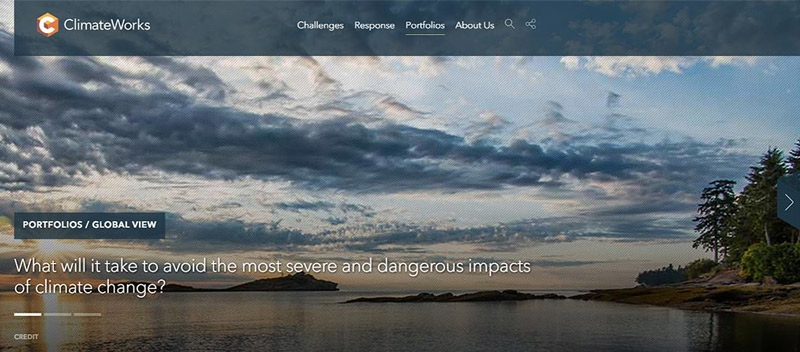
When creating the website for ClimateWorks, for example, our team overlaid a gray texture atop images of vast, natural landscapes at the top of the page, providing a comment in and of itself related to climate change; overtop, viewers simultaneously read blurbs about the organization. The Constructive team consistently selected captivating images of natural scenery to keep the focus on the environment and a diverse groups of workers to visually connect the dots between how the environment affects real people worldwide. This textured treatment of carousel images and textual information appears on nearly every branch of the website. By breaking from the consistency in just a couple of sections, the website becomes an information-rich hub about ClimateWorks and its impact on an important topic that viewers can easily relate to, while also conveying a distinguished brand presence.
2. Considering the Design
A designer’s job with regards to photo selection is to integrate the graphic elements of a site to effectively and efficiently relay a larger idea to the audience. With our clients, we aim to use design solutions to inform viewers about the organization via references to their portfolio, process, and logo; and equally importantly, to inform them about the larger cultural issue they address.
Quality of the Photo
It matters. Even with a winning set-up, a subpar quality photo will always ultimately flop.
Watch out for:
- Color Quality
- Cropping
- Exposure
- Focus
- Composition
- Perspective
Some of these elements can (and often should) be adjusted with Photoshop with consideration to the photo’s function, content and purpose. But there’s no magic wand to turning a mediocre quality photo into something great. To help filter out subpar shots, use photography terms in your search field; images tagged with this taxonomy are more likely to have been taken by professionals and meet a base minimum of quality.
Helpful terms:
- Low/wide/High Angle
- Defocused
- Depth of Field
- Motion Blur
- Long Exposure
- Selective Focus
- Silhouette
- Portrait / Panoramic / Full Frame / Close-Up
- Still Life
- Copy Space
Customization
In addition to customizing photos to help brand a site, you can do so to create visual design anchors on your pages. If the color of an element in the shot can be adjusted to visually guide the viewer’s eye, or if blurring or using masks can interact with the typography on the page, then photographs can become not just placed images, but designed graphical elements; offering subtle cues that enhance the narrative of the written copy as well as the navigation.
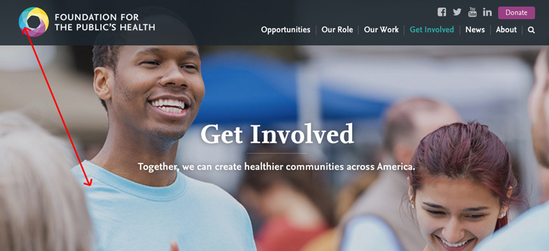
While selecting images for The Foundation for the Public’s Health (http://tfph.org) for example, we darkened the color of this person’s t-shirt to match TFPH’s logo, helping create a call and response between visual identity and image.
Be Specific
As mentioned, one of the challenges for many nonprofits and mission-driven organizations is how to communicate abstract ideas about their ethics and the systematic and cultural issues it aims to address. That’s a tall, intangible order for photographs to deliver. But keeping things simple and specific can help.
- identify a feeling you want to relay;
- identify where and through what interactions such feeling transpires;
- determine what kinds of photographic qualities could most powerfully achieve such a story
- get specific and minimal with both the subject and backgrounds of photos. Although someone won’t pay conscious attention to the background of an image or a small detail in the foreground, he/she will be affected by it.
Responsive Abilities
Enlarge each photo selection to 4 times its size, and then reduce it by 4 as well. If the resolution suffers on the bigger perspective or you lose focus and impact on the smaller, the photo may not work in today’s world of myriad screen sizes. This practice can also help ensure that your selections are indeed simplified to allow their impact to resonate.
Typography is Visual
Consider what written content will be displayed and in what dimensions or placement while searching for images in case they can relate to one another, as if in a creative magazine spread. You can use the term “copy space” in your search box if you want to overlay typography with the image.
3. Considering Your Audience
When a photo seems to hit all the marks within the designer and branding realms, that’s when the true test comes to play: look at the photo, and its use in the website overall, from the perspective of the audience you are trying to target.
Your Potential Visitors
If you were part of your site’s target audience, would you relate to the images you’ve chosen? Be mindful of what kind of demographic you are reaching out to, and what kinds of subtle cues in a photograph will help them create a particular bond with the image, or break that potential. For example, a medical services website geared toward residents in a young, diverse community in South L.A. will not have an emotional response to the following photograph, but middle-income older professionals in the Midwest might.

Emotions
Ultimately, you are choosing photographs that will be seen and experienced by a busy human being, passing through your site searching for the quickest route to their desired content. So aiming for the guttural, human chord will ultimately trump any of the more intentional guidelines you set for yourself. After all of that focused and exacting hunting, stepping into the role of the user requires you to wipe the slate clean, and approach your photos thoughtlessly, just how (admit it!) we surf through websites. Put your selections in your dummy site and scroll through the page as naively as possible. Do you feel anything? Is what you feel helpful to the message you want to convey on that page? If not, keep searching.
Lastly, it’s important to remember that while brand, design, and audience orientations are critical to achieving effective individual images, narrative context is perhaps the most important consideration of all. It’s never about just one picture; it’s about how all the pictures relate and come together to create an experience that communicates deeper meaning and connection to the people and mission of the organization.


