


In 2026, nonprofits are facing increasing pressure to demonstrate impact and clearly communicate how their work makes a difference. An annual report is your organization’s opportunity to reflect on what you’ve accomplished, stay accountable to your community, and create meaningful connections between your mission, your impact, and the people who make your work possible. More than a list of achievements, it should tell the story of your impact and inspire confidence in the work ahead.
Over the past several years, we’ve compiled annual reports and impact reports that highlight what great nonprofit storytelling looks like in practice. And now, as many organizations navigate tighter budgets, smaller teams, shifting priorities, and growing demands for transparency, the need for a strong annual report is greater than ever.
The reports included in this recap caught our attention for different reasons. Some use immersive digital storytelling and interactive design. Others take a simpler, more traditional approach that’s clear and impactful. There’s no single formula for creating an effective annual report. Together, these examples (listed in alphabetical order) offer inspiration and ideas for nonprofits looking to strengthen their own annual reporting in the year ahead.
8 Great Examples to Inspire Your Nonprofit Annual Report
- Code for America 2025 Impact Report: Built for This
- Dana Foundation: Celebrating 75 Years of Impact
- Dig Deep 2024 Annual Report
- Khan Academy SY 24-25
- The Nature Conservancy Annual Report: For All Generations
- National Park Foundation 2025 Annual Report: A Legacy Worth Protecting
- World Vision International 2024 Annual Report
- World Wildlife Foundation 2025 Annual Report
Code for America 2025 Impact Report: Built for This
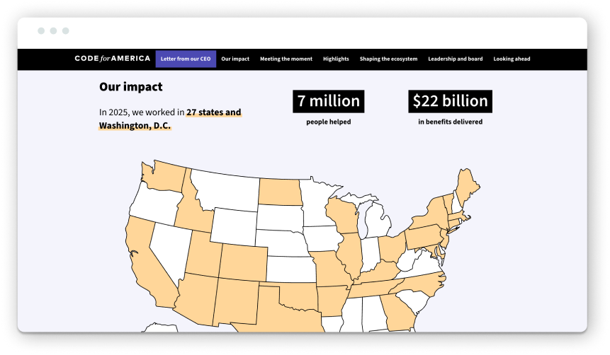
We featured Code for America in last year’s roundup, and we’re including them again for good reason! Year over year, the organization creates annual reports that feel deeply connected to its brand, mission, and the realities of the current moment.
This year’s report opens with a simple, yet powerful statement: Built for This. The message is reinforced in CEO Amanda Renteria’s opening letter: “In 2025, we didn’t step back. We built. We adapted. We helped states respond in real time.” From the start, the report acknowledges the complex landscape nonprofits operate within, from shifting political priorities to rapid technological change, while making a clear case for why its work matters more than ever for the people it serves.
From a visual standpoint, the report is Code for America-branded. Vibrant colors, clean design, and subtle motion guide and engage users throughout the reading experience without being too distracting. The top-level navigation makes it easy to jump between sections and explore topics based on your interest rather than forcing you to read linearly. Of course, we’d expect the report’s UX to be spot-on, given that it comes from a civic tech design org.
What stood out in this report is how CFA addresses the elephant in the room: AI. It outlines how it uses AI responsibly to improve government services and expand access, while staying transparent about its approach and true to its mission.
Through all the change and challenges, the report closes on an optimistic note, reinforcing the idea that in times of uncertainty, organizations can still make meaningful progress. It’s a strong example of how an annual report can simultaneously acknowledge challenges, celebrate successes, and inspire confidence in what comes next.
Dana Foundation: Celebrating 75 Years of Impact
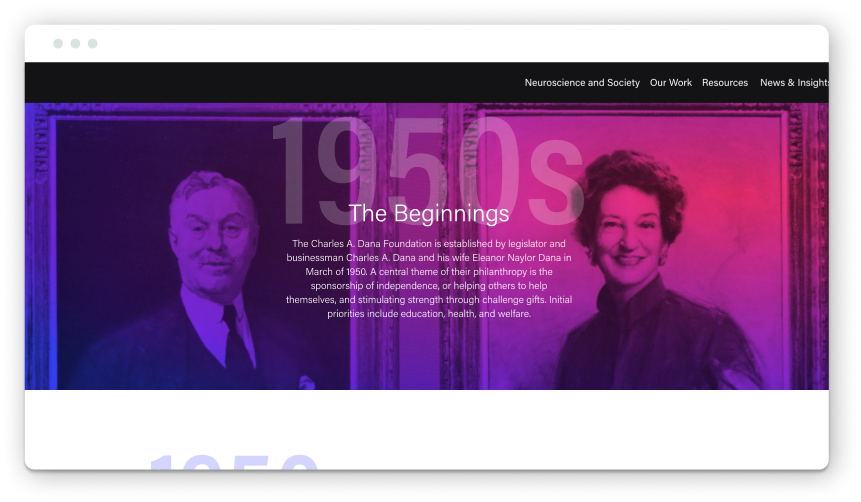
While this isn’t technically an annual report, this example from Dana Foundation showcases how organizations can celebrate milestones through digital storytelling. As your organization reaches a major anniversary, an annual report may not provide enough space to fully convey how much you’ve accomplished. If this is the case, you can consider creating an interactive timeline or web page like Dana’s to tell the bigger story of your legacy and impact.
To mark the Dana Foundation’s 75th anniversary, our team partnered with Dana to create an interactive timeline exploring its history and contributions to neuroscience over the past seven decades. Rather than presenting history as a long list of milestones, the landing page organizes content by decade, allowing readers to explore different eras of its work. In doing so, this effectively visualizes just how long Dana has been making an impact within the community.
Content and text are organized so each milestone is front and center on your screen, with the year the milestone took place nicely animating into the background for context and visual interest. The experience also highlights the Dana Foundation’s rich photographic archive, using historical imagery to bring key moments and achievements to life.
The timeline organizes a significant amount of historical content in an engaging format. For organizations approaching a major anniversary, this example highlights the value of looking beyond a single year-in-review to showcase lasting impact.
Explore the timeline and see our work with the Dana Foundation
Dig Deep 2024 Annual Report
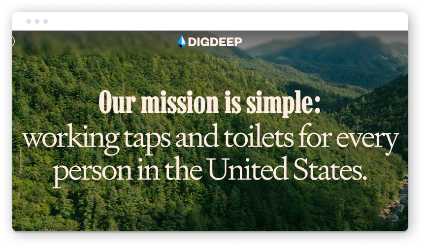
DigDeep’s annual report is a powerful reminder that impact data becomes far more meaningful when it’s paired with compelling visual and community-based storytelling. Imagine this same content presented as a static PDF filled with dense walls of text and confusing charts … it would certainly be less impactful. Through immersive video, photography, and thoughtful storytelling, DigDeep creates an experience that invites readers in to learn more about its mission and connect more deeply (no pun intended).
As we’ve said, the report’s visual identity is strong. Bold color, typography, photos, and video pack a punch. As you move through the report, it’s almost like you’re transported to the communities and project sites where the work is happening, making the impact feel real and tangible.
From a content strategy perspective, we appreciate that the report is broken down into sections based on their impact model: Advance Community-Led Solutions, Develop an Evidence Base, Mobilize America, and Build an Ecosystem of Change. These unique sections ground the impact outlined in the report in the organization’s broader strategy for systems change.
Another small detail we appreciate is that the letter from the CEO is available in both written and audio formats, with the CEO reading the message himself. It adds a bit more personality and humanity to the report. They even designed their financials section to be both engaging and transparent. We usually see financial data added at the end of reports, buried in plain text to be glossed over. All in all, this example absolutely delivers on immersive annual reporting.
Khan Academy SY 24-25
“Imagine a world where every learner thrives.”
This statement opens Khan Academy’s 2024-2025 report and immediately establishes its aspirational tone. From there, the report delivers a polished experience that’s aligned with its brand: credible and grounded in the belief that learning should be accessible and engaging.
What makes this report stand out is its more traditional approach to annual reporting. Not every organization needs a highly interactive microsite or immersive storytelling experience. For many nonprofits, a clear, well-structured report that prioritizes impact, outcomes, and key takeaways is exactly what you need! Khan Academy demonstrates how this approach is effective when it’s paired with strong branding and thoughtful content design.
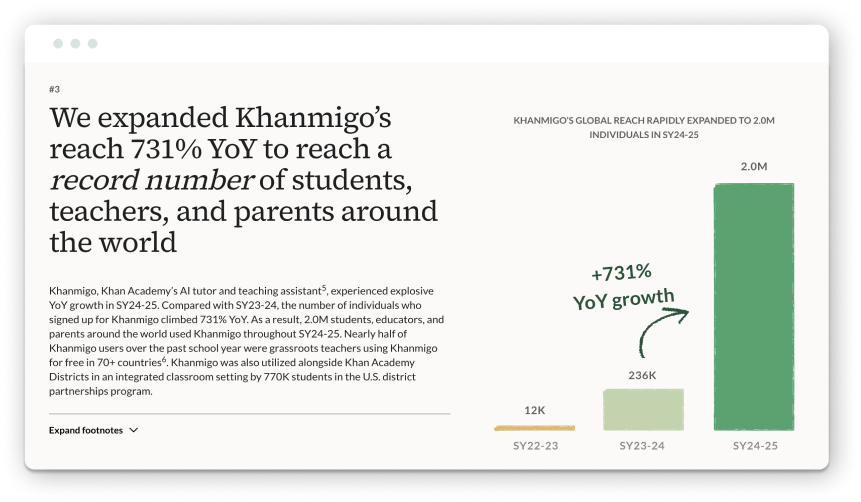
The report’s design does a nice job of balancing professionalism and playfulness. We enjoy the design touches like hand-drawn chart treatments, pencil underlining, and other subtle illustrated elements that are rooted in education but still appear polished. Photography also plays an important role in this report. Images of students and educators in the classroom help connect the organization’s work to tangible, real-world outcomes.
The report also succeeds in communicating impact through a series of 7 declarative statements. Numbered highlights throughout the report make key achievements easy to scan at a glance. The report ends on one word: Onward! It’s simple, but effective. This aspirational tone is fitting for an upbeat education organization that works with students. Overall, this gives readers a feeling of momentum and possibility of what’s to come.
The Nature Conservancy Annual Report: For All Generations
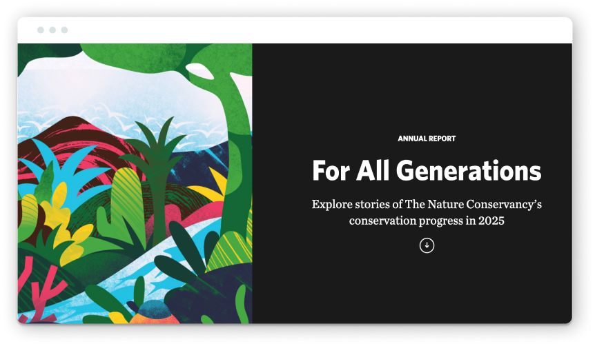
As environmental organizations continue to work within an impossible landscape, The Nature Conservancy’s 2025 annual report shows how to communicate large-scale impact on large-scale issues concisely without overwhelming readers. The overall UX is clean, easy to navigate, and offers ways for audiences to engage in deeper levels depending on their interest.
One of the report’s standout features is its interactive conservation map, which allows users to explore conservation stories around the world through location-based snapshots. The report also features a carousel component that highlights moments that stood out most in 2025, including New York’s largest climate investment and $1 billion for TNC’s Nature Bonds Program.
We appreciate the report’s approach to audience engagement, which offers it in both digital and PDF formats. While a downloadable PDF is available for readers who want additional detail, the core content lives directly on the website, making it more discoverable, searchable, and easier to engage with. PDF downloads are also offered in multiple languages, helping connect international audiences to its work.
This is also one of the few reports we explored that includes a clear call to action (CTA) for readers to subscribe to their newsletter, which is a great opportunity to capture folks interested in learning more about what you do.
National Park Foundation 2025 Annual Report: A Legacy Worth Protecting
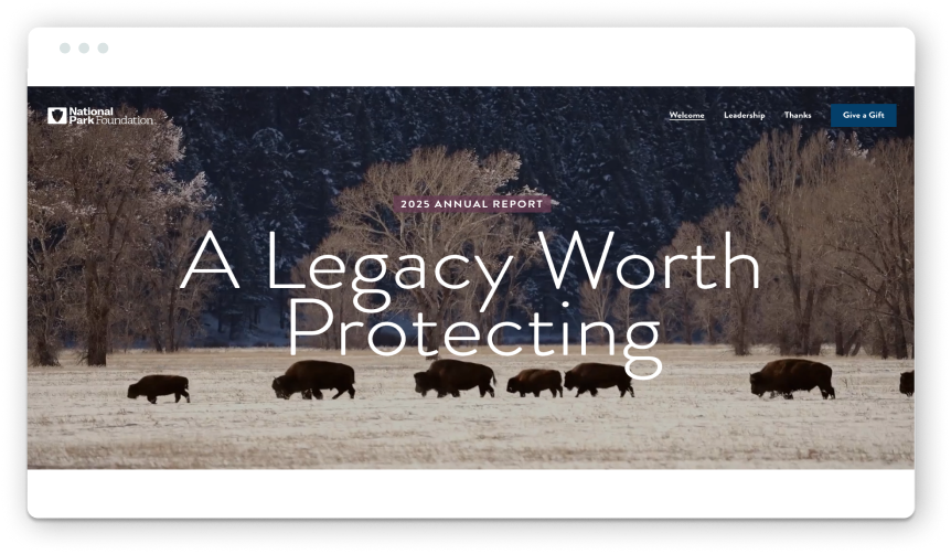
This year was especially trying for the National Park Service and the National Park Foundation, with conversations around funding, staffing, and the future of America’s public lands. Despite this, the Foundation’s annual report makes a compelling case for why our parks matter and are worth protecting.
The report begins with a small but memorable detail: a loading screen that serves as a welcome before readers enter the report. Once the screen has loaded, the first thing you see is a cinematic video showcasing the diversity of America’s parks, from sand dunes to the Lincoln Memorial.
Again, it’s no surprise that photography and videography are crucial to this report’s impact, given the nature of their work. The imagery creates an emotional connection that reinforces the importance of protecting the land and natural beauty. Subtle motion and bold stats guide readers on the journey, with carousels allowing them to dive deeper if they’re interested in the topic.
When the future of support for national parks feels increasingly uncertain, the report serves as a powerful reminder of what’s at stake.
World Vision International 2024 Annual Report
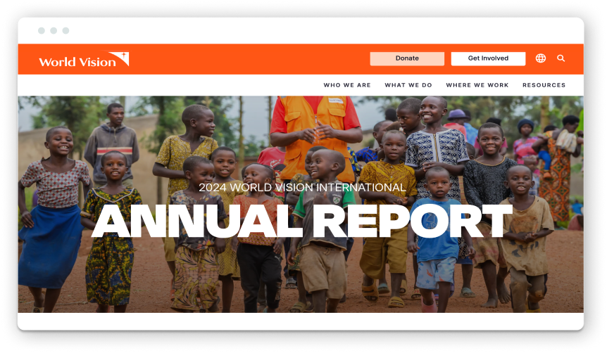
World Vision’s 2024 annual report is a masterclass in immersive storytelling. From the moment you start scrolling, full-screen imagery transitions through a simple sequence: “We. Are. World Vision.” before introducing the statement: “Our work reaches children no matter their background or where they live.” It’s an effective opening that quickly communicates its scale and commitment.
The report helps readers understand the breadth and depth of their work. Rather than assuming audiences are already familiar with the organization, it provides pathways to explore its global strategy and long-term goals. A world map further reinforces the organization’s reach, helping audiences visualize the communities and regions where World Vision is working. Key sections focused on global impact, emergency response efforts, and the We Are Global campaign create a cohesive narrative about what it means to operate as a truly international organization.
One suggestion for improvement would be better report navigation. While the scrolling experience is engaging at first, the report covers a significant amount of content, and it starts to get tiring after a while. A table of contents or jump navigation would make it easier for readers to explore specific topics without having to scroll back and forth through the whole experience.
World Wildlife Foundation 2025 Annual Report
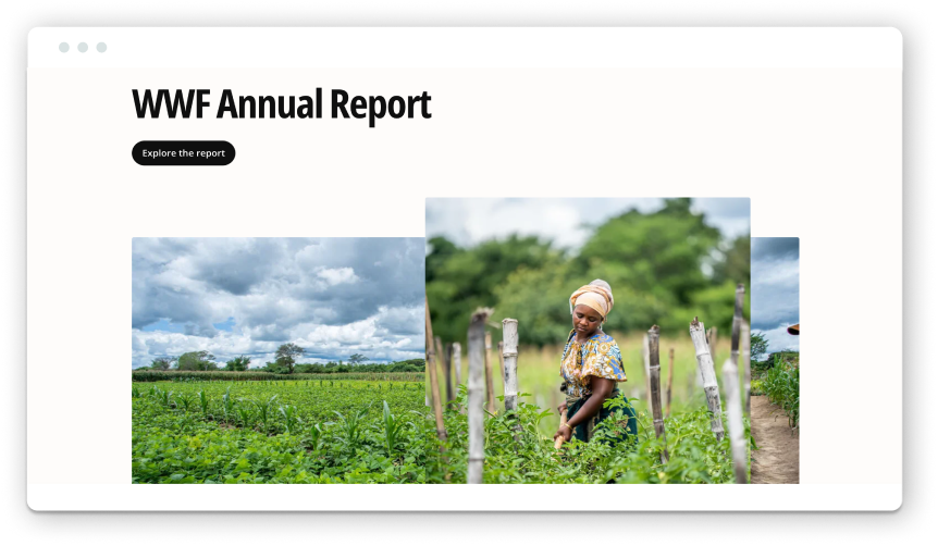
While we generally recommend publishing annual reports as HTML pages on your website to improve accessibility and SEO performance, WWF’s 2025 report proves that strong storytelling can still shine through a more traditional pamphlet-style report. Instead of just linking to the report, they support it with a dedicated landing page that provides context and highlights past reports.
A standout feature of this report is its storytelling. A recurring map-pin graphic helps ground stories in specific locations, reinforcing both the local and global scale of the organization’s impact. Readers gain a clearer understanding of how conservation efforts connect across regions, ecosystems, and communities worldwide. The report also does a really nice job of balancing narrative and data. Bold stats stand out at a glance, while focused themes and stories on each page create a clear structure that keeps readers engaged.
One statement captures the sense of urgency and purpose: “Nature provides everything that makes our lives possible. And this year, perhaps more than ever, nature needs us now.” WWF builds on that messaging by outlining 2025 Insights: Progress Toward a More Sustainable Planet. By connecting annual accomplishments to broader environmental trends and goals, the report helps readers understand what they accomplished and why it matters in the larger conservation context.
Other Reports Worth Checking Out
- American Red Cross 2025 Annual Report: Bringing Communities Hope
- Burton D. Morgan Foundation 2023 Annual Report: Charting a Course
- Girls Who Code 2024 Annual Report
- Midwest Food Bank Annual Impact Report
- REI Co-Op Impact Report 2025: Making our Mark
- Task Force for Global Health 2025 Annual Report: Before & After
- UNICEF Annual Report 2024: Staying and delivering for children
Interested in Exploring More for Your Nonprofit’s Annual Report?
Check out our past annual roundups with inspiration from 2020, our favorites from 2022, standout examples in 2023, and who made the cut in 2025. You might recognize a few repeat appearances, which speaks to these organizations’ ongoing commitment to creating reports that are both tailored to each year and aligned with their long-term brand strategy.
And if you want to explore the potential of building a great report for your organization, reach out anytime to work together. Maybe your report will make this list next year!
Kaylee Gardner, Senior Digital Strategist at Constructive, contributed to this roundup!
