


As political rhetoric and uncertainty ramps up, nonprofits face pressure to show (and not just tell) how they’re making a difference in the world. Supporters, funders, and even your own team are looking for transparency that connects the dots between your values and actual results.
Enter: The annual report. This still remains one of the most essential tools in your nonprofit communications toolkit. It’s your chance to zoom out, celebrate your community, demonstrate your impact, and make the case for continued support—with clarity and conviction.
Our team explored a variety of digital annual reports and impact reports that rose to the challenge. If you’re planning your next impact report or are looking to sharpen your approach, we hope this roundup gives you some fresh perspectives to learn from. Here are the reports from 2023/2024 that stood out to our team (in no particular order).
Code for America 2024 Impact Report: Ready, Responsive, Resilient
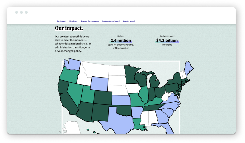
Code for America’s 2024 impact report immediately signals that it’s not just recapping the year. The opening letter from CEO Amanda Renteria sets the tone: “2024 was a year marked by change—some of it exhilarating, some of it daunting, but all of it underscoring the urgency and importance of Code for America’s mission.” Acknowledging the challenging ecosystem grounds the report and shows how the organization is responding to the times, not just reporting on the numbers.
The report uses vibrant colors, illustrations, and subtle motion to guide users through the experience while keeping it engaging. The scroll experience is super smooth (if you want to read from start to finish), but we also appreciate that the report includes a table of contents with jump links at the top so readers can navigate to specific sections based on their needs.
Bold headlines bring the narrative to life and showcase their highlights at a glance, such as “modernizing government services to deliver better for all.” The report also does a nice job of breaking content into digestible bites to reduce cognitive load and improve readability. Code for America weaves a compelling story throughout and reinforces itself as a leader in the civic tech space. It ends strongly with the final CTA, inspiring readers to take action: “Now, our charge is to keep the momentum going even as the world around us changes.”
Take a look and see why this report made the list
REI Co-op Impact Report 2024: Everybody Outside
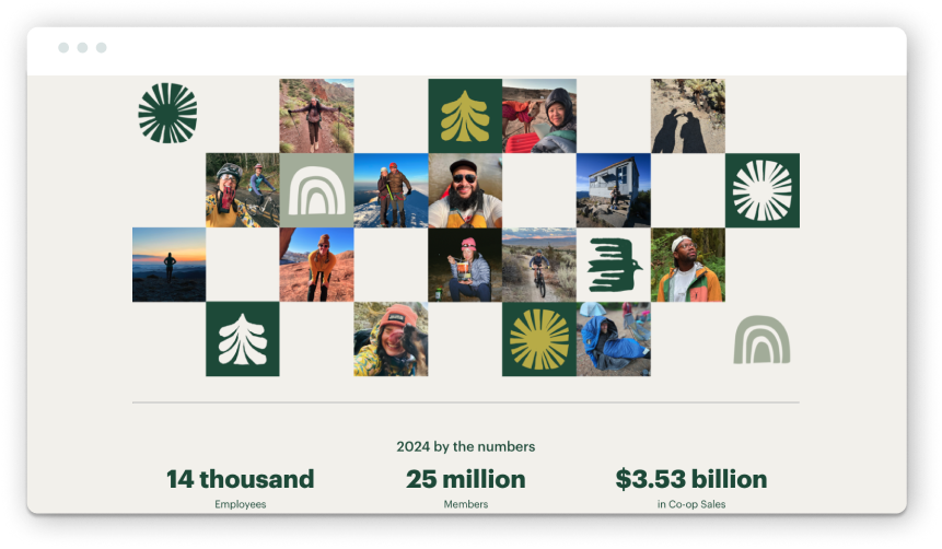
Nonprofits looking to elevate their annual reports shouldn’t just turn to other nonprofits for inspiration. We also highly recommend taking a look at B-Corp and socially responsible businesses. REI Co-op’s 2024 impact report is proof of why! And yes, while organizations like REI most likely have a heftier production budget for their reports, there is still plenty to learn from how they structure content and create immersive experiences.
From the start, the report pulls you in. A full-width hero video brings us right into the fold (literally) by showing REI team members gathering in a huddle. This makes it feel like we’re also part of the community and shared purpose. Instead of opening with a letter from their CEO, this bold statement sets the tone for the report: “We’re on a mission to get everyone outside. And every single one of us plays an essential part. The proof is right here in this report. It’s a living, breathing tapestry of individual stories that make up our collective drive onward and upward as a co-op.”
That sense of collective impact is reinforced throughout. Candid photography sourced from REI team members at events and enjoying the outdoors adds a feeling of authenticity. Design elements like fonts, colors, and iconography are cohesive and rooted in REI’s outdoor aesthetic.
We also really appreciate the report’s structure. While many digital reports opt for the simplicity of a long-scroll microsite, REI uses a multi-page approach to allow deeper exploration. Readers can jump from impact stats, community work, and sustainability milestones or dive into stories that bring the data to life. The navigation—guiding users clearly and quickly from section to section while also offering a sidebar table of contents—ensures that the reader can explore any chapter in the report without necessarily forcing them to go through every section.
The report also does a great job of balancing narrative and numbers. Clean charts and infographics make the data digestible, and curated stories give readers a sense of the people behind the impact. At the end of the report, they include a content block that links to past reports going back to 2006. It’s a simple but effective way to provide historical context and transparency, which we don’t often see done well in annual reporting.
Explore the report for yourself to see why it stands out
CARESTAR Foundation 2023 Annual Review: Elevating Communities, Transforming Care
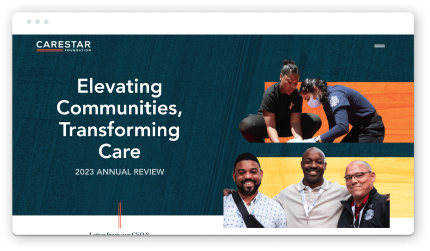
We’re proud to include this report in the roundup, and not just because we had the privilege of working on it! CARESTAR’s first-ever impact report is an excellent example of what it looks like when brand, strategy, and storytelling align.
CARESTAR Foundation came to Constructive at a pivotal moment. After six years of learning and growth advancing racial equity and community-led action, they were ready to reflect on their progress and share a vision for what comes next. The goal: create an impact report that honors where they’ve been and outlines where they’re going.
We began the process with a staple of Constructive’s research and discovery process: the Learning Conversation. This facilitated dialogue brings all stakeholders together to share perspectives, align on goals, and define what success looks like. In those early conversations, CARESTAR’s four brand values emerged as the foundation for the report content strategy: Equity, Compassion, Unity, and Hope.
From there, we built the narrative structure around those brand values. Each content section connects directly to one of the guiding principles and features tangible stories of impact with grantee highlights, research insights, and community resources.
Visually, the report is warm, vibrant, and expressive. A new palette of bright, complementary colors adds energy, while introducing a serif typeface adds legibility and a human touch. Background textures and field photography add depth and emotion, rooting the design in real stories and CARESTAR’s community.
As you can see with this example, impact reports are essential for organizations of all sizes and stages to consider, even if they aren’t created annually. We designed this report to be a reflective report capturing 6 years of progress and a forward-facing tool to engage funders and inspire grantees in the months and years ahead. An annual report does more than look back—it builds momentum for the future.
Read more about our work together and check out the report.
The Rainforest Alliance 2023 Impact Report: Destination Regeneration
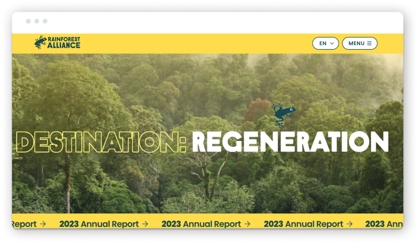
Did we include this report because of the animated jumping tree frogs? (Maybe). But that’s not the only reason it made the list. You’re brought right into the rainforest when you land on this landing page. The scrolling “2023 Annual Report” banner at the top also catches your attention.
What’s working well on the design front: A rainbow of colors reflects the organization’s global biodiversity work, playful animation adds personality, and oversized type creates an easy reading (and scanning experience).
From a functionality standpoint, one feature that’s helpful for this report (as it references a whole host of other reports and case studies) is a simple expanding accordion so that content is nested and doesn’t clutter the experience, but users can expand to read more if they’re interested in the topic. This click-to-expand option makes content scannable, elevates the highlights, and allows audiences to choose which details they want to immerse themselves in.
From the name of the report (Destination: Regeneration) to the copy throughout and the colorful design, the whole experience feels hopeful. We often see organizations in the climate space lead with doom and gloom, so we appreciate that the Rainforest Alliance takes a different approach here by focusing on progress and regeneration. This positive framing inspires the audience to take action instead of becoming immobilized by anxiety.
Jump into the Rainforest Alliance’s report
NPR’s 2023 Annual Report
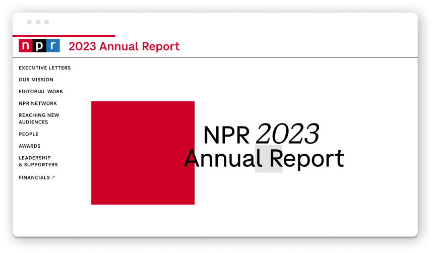
This one from NPR is fun—and we don’t usually say that about annual reports! It’s as engaging as it’s informative and substantive. They do a great job of balancing editorial polish with interactivity. The report is structured like a well-crafted editorial feature with body copy, pull quotes, and multi-media content to guide the reader.
We enjoy the on-brand (and intentional) use of color throughout the report, along with subtle motion as you scroll (both vertically and horizontally). A nice touch: photography features local reporters and Member Stations, grounding NPR’s national presence in local communities. From a messaging perspective, there’s a strong emphasis on what’s made possible with public support. Readers learn their contributions helped the team serve 42 million readers weekly, produce 12,000 newscasts, create 120 tiny desk concerts, and publish over 14,500 podcast episodes. There’s a sense of shared accountability and success.
And, of course, it aligns with what NPR is known for: high journalistic standards, public service, and storytelling. In our books, this report lives up to their reputation.
Check out NPR’s 2023 annual report
GoFundMe: Year in Help 2024
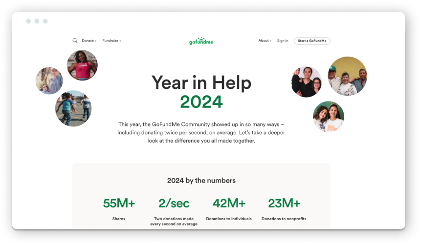
“Let’s take a deeper look at the difference you all made together.”
This report example from GoFundMe isn’t an organizational annual report per se but more of a celebration of community impact. And it works. It’s an interesting approach for platform-based organizations that operate to help their audience take action through fundraising, volunteering, or advocacy. By shifting the spotlight on the community by saying, “You made a difference,” GoFundMe shares the collective impact.
The report jumps right into 2024 by the numbers, showing just how widespread the impact is (with two donations happening every second, on average). That momentum sets the stage for the stories to follow. Yes, the big performance numbers are impressive. But what stands out is the report’s ability to zoom in and balance individual stories of neighbors stepping in to help one another when tragedy strikes.
A few design moments stand out: Branded graphics of maps show the most generous states and cities. Clean, modular content blocks and card-like modules break sections into digestible bites. Images of real people from real fundraisers, short videos, and quotes bring the community stories front and center. It’s a long page, but it doesn’t feel like one.
“In moments of uncertainty, there was generosity.” It’s a powerful theme, and the report delivered on it.
Explore GoFundMe’s report to see for yourself
Dr. Bronner’s 75 Years of All-One Report
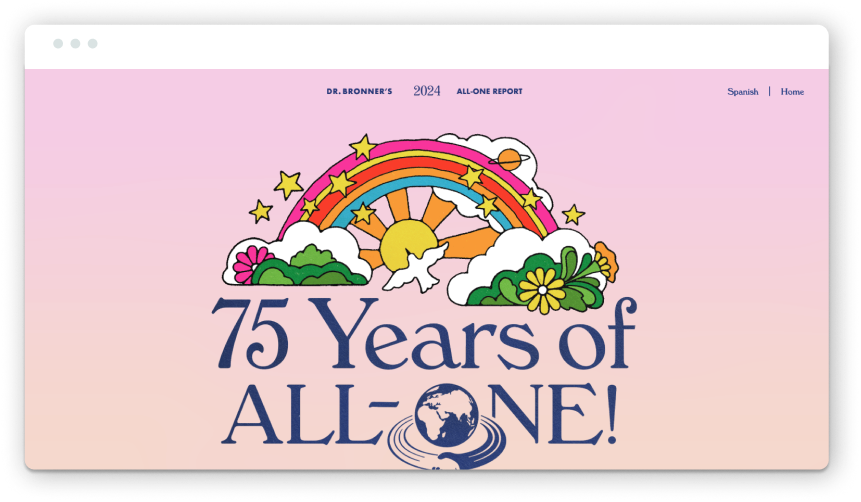
If you’ve ever picked up a bottle of Dr. Bronner’s soap and read the label, you know exactly what to expect from their report. It’s just as detailed and eccentric (maybe not as wordy).
Can we say a soap brand’s annual report is … refreshing? Vibrant color, whimsical illustrations, collages, subtle animation, and joyful photography all come together in a design that’s as bold and values-driven as the brand itself. It feels like a uniquely Dr. Bronner’s experience through and through.
The report structures its content around the company’s Cosmic Principles, a set of guiding values that drive the entire business. Each principle anchors a report section, paired with real stories and measurable impact. (It’s a structure that reminded us of how we approached CARESTAR’s annual report).
Every design and content decision feels intentional. Copy blocks are expandable, letting readers skim or dive deep. They decided to present stats and charts in carousels, which invites users to scroll through without overwhelming them. And in a particularly on-brand move, their revenue breakdown is visualized in the shape of a soap bottle. Delightful.
Underneath all of the creativity, this report is radically transparent. We need more storytelling and accountability like this.
Explore the report to see what makes it different
Habitat for Humanity 2024 Annual Report: A Blueprint for a Better Future
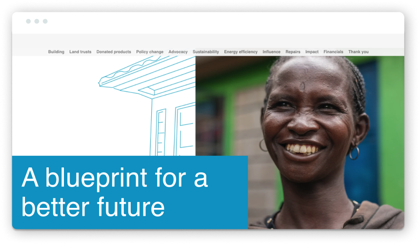
We’ll start by saying that this report from Habitat for Humanity doesn’t check all of our best practice boxes, but we think it’s worth spotlighting what it does do well. There’s no such thing as a “perfect” annual report, and this one gets plenty of the essentials right.
The report is rich with stories, program updates, and performance numbers. And maybe it’s a little bit too content-rich. A few sections could be trimmed a bit to make the content more digestible and less dense. That said, at its core, the messaging effectively communicates organizational progress and centers the people it serves.
The interactive map at the end stood out to us the most from a functionality standpoint. As you scroll, the map displays data by region and shows the scale of the organization’s impact worldwide. Helper text and table labels provide additional clarity without cluttering the screen. And the use of motion while you scroll makes it feel immersive.
The title of the report and the blueprint-style linework and background textures all tie together nicely to ladder back up (sorry, pun intended) to Habitat’s work and mission. The connection between building together and collective impact comes through both in their messaging and their photography.
Read more about Habitat for Humanity’s impact
Interested in Exploring More for Your Nonprofit’s Annual Report?
Check out our past annual roundups with inspiration from 2020, our favorites from 2022, and standout examples in 2023. You might recognize a few repeat appearances, which speaks to these organizations’ ongoing commitment to creating reports that are both tailored to each year and aligned with their long-term brand strategy.
And if you want to explore the potential of building a great report for your organization, reach out anytime to work together. Maybe your report will make this list next year?
Kaylee Gardner, Digital Strategist at Constructive, contributed to this roundup!
