When I tell people I work on nonprofit brand strategy, I get a lot of blank stares and raised eyebrows. I get it: brand strategy is a bit of a buzzword these days and it’s not exactly easy to define or understand. Adding to the confusion, there’s a lingering perception that brand strategy belongs exclusively to the corporate world, that it’s something mega brands like Nike, Coca Cola, and Starbucks leverage to woo new customers in a crowded marketplace.
So this article is for all those interested in, confused by, or skeptical about nonprofit brand strategy. It’s my answer to the raised eyebrows, a proclamation of my firmly held conviction that a well-articulated brand strategy can be transformative for organizations working to create social change.
Agreeing on a Definition
Our team has written a lot about brand theory already, and my aim in this article is to move beyond theory and discuss some of the tangible outcomes of a successful nonprofit brand strategy. But to make sure we’re all on the same page, I’d like to quickly review what brand and brand strategy are.
There are many definitions of brand, but for our purposes let me define it as the collective perception of an organization shared by its customers or constituents. Brand lives in the minds and experiences of all the different people who come into contact with an organization, including staff, board members, donors, beneficiaries, etc. As branding/design/all-around genius Marty Neumeier notes, your brand is not what you say it is, it’s what they say it is.
Brand strategy is an organization’s articulation of how its brand is meant to be understood and expressed. At Constructive, we break down brand strategy into the ideas that drive and position an organization, the messages that express them, and the designed experiences that translate these ideas into more tangible deliverables such as a visual identity, communications collateral, and digital presence.
So with that out of the way, how does a successfully defined brand strategy actually help social change organizations accomplish their mission?
A Gut Check
In my opinion, some of the greatest benefits to be gained from a brand strategy engagement come from the process itself, not only from the final deliverables.
Nonprofit brand strategy engagements typically (and always should) begin with extensive research and analysis of the organization and its existing brand. At Constructive, this phase is known as “discovery,” and our research can take the form of interviews with internal and external audiences, surveys, peer analyses, and workshops with organizational leadership and staff. The culmination of this phase is a brand assessment that articulates the organizational goals for the brand strategy engagement, the perceived weaknesses and strengths of the organization’s current brand, and a plan for mitigating challenges and leveraging opportunities.
Regardless of the exact nature of this up-front research and assessment phase, the value-add is the same: invaluable insights on how people — from junior staff to leadership, donors to beneficiaries — perceive your brand. It’s a rare opportunity to gain visibility into how all these audiences think about and value your work.
These perspectives can be incorporated into organizational strategy as well as brand strategy, helping organizations address internal challenges that emerge down the road or adjust their priorities based on audience feedback. For what it’s worth, I’ve never worked on a nonprofit brand strategy engagement that didn’t illuminate organizational challenges and help inform leadership’s response to those challenges.
An Authentic, Democratized Identity
At Constructive, we often say brand strategy should be built from the ground up and embraced from the top down. Why? Because brands that reflect the ideas and perspectives of only a few at the top of the organization and/or a small team of consultants are far less likely to resonate with a wider audience — including the staff and volunteers responsible for sustaining most nonprofit organizations.
Hey, nonprofits-that-have-messaging-and/or-visual-branding-that-either-has-never-resonated-or-no-longer resonates-with-staff, I’m speaking to you! You know what you also have? Staff who might feel demoralized and disconnected from the organization. Staff usually bear the burden of an outdated or dysfunctional brand because they’re the ones tasked with developing bespoke communications material from scratch or visual workarounds to overcome the fact that the organization’s brand is no longer an asset but an affliction. And that, understandably, can lead to frustration, resentment, and reduced productivity.
For external audiences, outdated visual branding is always a turn-off, especially given the level of visual sophistication that most of us, in the age of Behance and Instagram, have come to expect. By the same token, if a nonprofit’s messaging no longer accurately reflects the work it is doing, its audiences are going to be confused. And who needs that?
Because it’s built on the perspectives of many, not just a few, a well-executed brand strategy engagement ensures that a nonprofit’s brand resonates with both internal and external audiences. And by understanding what motivates staff to do the work, donors to donate, and partners to engage, an organization will find itself in a much better position to communicate these key ideas in its messaging and designed experiences, transforming its brand into one of its greatest resources.
Bringing Clarity to the Cause
Many of our clients come to us for help because their external audiences seem to struggle to understand what they do and why it matters. They know that a well-articulated brand strategy can provide clarity to folks outside an organization, helping them understand the change an organization is seeking to create, how it plans to accomplish its goal(s), and how they can engage with the organization to bring about that change. It almost goes without saying that the more clarity a nonprofit can provide its audiences, the better positioned it will be to capture their attention, change their hearts and minds, and galvanize them to act.
That said, a related benefit of brand strategy that’s often overlooked is the clarity of purpose it provides internal stakeholders.
Having worked in nonprofit leadership, I’ve seen first-hand the disparate ideas floating around about brand values/roles/personality/logos/etc. Board meetings that touched on brand issues were a particular pleasure. (Not.) Now that I’ve switched to consulting, it never surprises me when nonprofit staff, leaders, and board members offer different versions of their organization’s vision and goals, not to mention the path forward for achieving them. It’s understandable — the business of change is complex, and lots of nonprofits go at it through different programs, services, and initiatives. It’s sort of like the parable of the blind men and the elephant, with each person describing that part of an organization’s work with which they are most familiar.
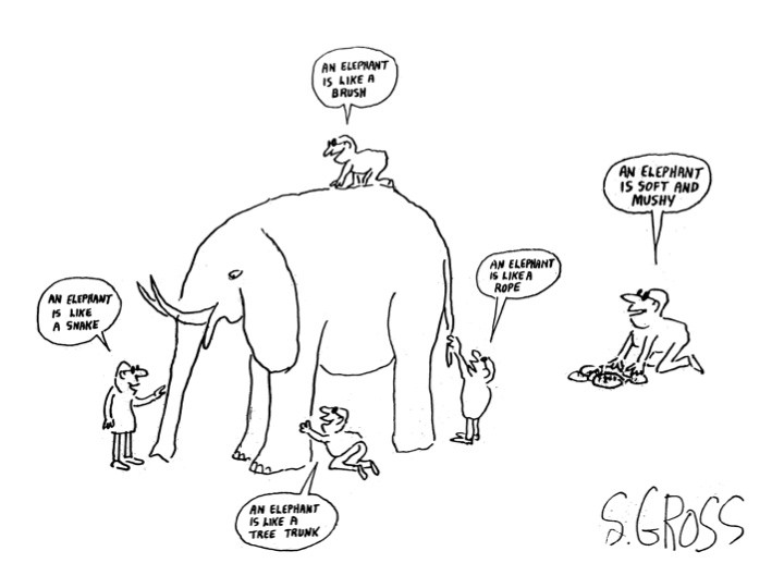
Again, one of the most transformative benefits of a successful brand strategy engagement is that the process, when executed well, brings together a range of unique perspectives that, in their totality, articulate the shared ideas that drive the organization’s programs and motivate its people.
When staff, leadership, and board members feel that their perspectives have been heard, and their ideas (and concerns) are reflected in a vision and brand narrative that captures that totality, they are better able to understand how their specific piece of the puzzle fits into the bigger picture (or, to continue the analogy; how each elephant part is attached to the others). That kind of unity and shared understanding can be enormously valuable for organizations used to struggling with programmatic silos, miscommunications, duplicated effort, and staff frustration and burnout.
Greater Consistency — and Trust
We’ve all heard the phrase “that’s not on brand,” an expression that inspires eye rolls from even committed brand enthusiasts. But if nonprofits hope to convey consistency and build trust, they need to be able to assess what does (and doesn’t) fit their brand. Here, too, an effective brand strategy can provide a much-needed framework.
Consistency is key to building trust with audiences. Humans tend not to like surprises and feel most comfortable when they know what to expect from others. We tend to like—and trust—people who are dependable (even if they’re dependably flaky), and whose responses in a range of situations are more or less predictable. The same applies for brands — to build trust with your audiences, you want them to feel confident about what they can expect from you.
This idea is especially important in a nonprofit context, as organizations routinely ask supporters and potential supporters to put a great deal of faith in them: they ask us to give them our attention over many other worthy causes, ask to be trusted as thought leaders, and ask for our hard-earned dollars. But every time someone perceives an inconsistency in a nonprofit’s brand — maybe they notice different versions of a logo on a website, or come across different versions of a mission statement in collateral, or land on a donation page that doesn’t work properly — it undermines their confidence and trust in an organization.
That’s why nonprofits need to take the idea of projecting consistency seriously. It’s not just the job of a communications manager to make sure the team is using the correct logo. You need a brand strategy that articulates a coherent messaging framework and provides internal stakeholders with everything they might need in the way of brand guidelines to convince your supporters and potential supporters that yours is a consistent, dependable organization.
Nonprofit Brand Strategy Increases Capacity and Impact
Let’s be real: the most brilliant nonprofit brand strategy will not boost an organization’s impact by itself. No, the value of an effective brand strategy lies in its usefulness to the real heroes of the show — the people who do the work.
People—committed, talented staff who bring their expertise to the hard work of creating positive change—are the most important assets a nonprofit possesses. And, in most cases, their job shouldn’t require them to think about the organization’s brand; their job is to create impact. By providing them with consistent brand messaging, compelling collateral, and a clear set of brand guidelines, brand strategy can be an invaluable tool that supports and amplifies their work.
So when people ask me what nonprofit brand strategy is good for, I tell them this: brand strategy is a sort of North Star that helps inform an organization’s strategies and ensures that its talented staff arrive safely at their destination. By articulating messaging and brand experiences that express shared ideas, it helps organizations communicate with clarity and consistency to their audiences, and, in turn, helps audiences better understand a nonprofit’s vision and how they can engage with it to advance a good cause.
And the end result of all that? Greater impact. So there.
This Insight was originally published on the Philanthropy News Digest.
So, your organization decided to redesign its website to ensure your digital presence more accurately represents the impactful work you do. Great! You’ve officially made it through the discovery phase, where new ideas were brought to the table and a cohesive strategy was developed to guide the website redesign. During the information architecture phase, you narrowed in on your site’s overall structure and gained a firm grasp on how users will navigate through your new site.
Everyone is excited to finally enter the design phase of the project, but to keep things on track, you can’t forget the importance of your new website’s content! It’s really easy (and very common) for our clients to overlook this step in the redesign process and assume that the content on their old site will fit seamlessly into the new one. In reality, developing the content and sourcing images for your new site can be quite the undertaking.
Don’t worry—there are some key steps you can take to make this process run more smoothly. We’ve developed a brief guide based on our experience that’ll help you manage a successful content development and image selection process:
Step #1: Establish a Plan
Developing an organized and thoughtful plan for tackling your site’s content needs is critical to ensuring a smooth experience overall. So start this step early! It’s best to begin organizing and writing website content as soon as your site’s information architecture (a website’s content blueprint) is finalized. That way, you can start drafting content for the different pages of your site in advance, using the wireframes as a guide, and finalizing content once the design has been fully fleshed out.
Organize your content:
- Decide what content, if any, you will be carrying over from your old site. This might be less content than you initially expected一when the design of a site changes drastically, so too do the content needs. Once you’ve identified what will be carried over, determine what new content you’ll need to fill in the gaps. We recommend using a content matrix to identify and keep track of all the content you’ll need to enter into your content management system (CMS)一from headers to introduction text, body copy and even button text. A content matrix is basically just a fancy word for a spreadsheet that tracks and organizes the new content your site needs.
Organize your images:
- Don’t forget about images一they’re content too! The image selection process can take time, and some images might need to be cropped and treated. You can use the wireframes to identify where on the site you’ll need images, and come up with a plan to source them. Does your organization have a big library of photos? Will you need to source new images? There are many resources for free photos online (for example, Unsplash) and purchasing stock images is also an option. Again, we recommend using an image matrix to stay organized.
Pick your people.
- You’ll need to determine who will be writing your content, who will be editing and reviewing your content, and who will be responsible for entering it into the CMS. Don’t underestimate the time it takes to develop engaging content and enter it into the CMS. Make sure you have plenty of people on the job!
Step #2: Start Executing
Once you have a solid plan laid out, it’s time to start actuallydeveloping, editing, and reviewing your content. Which, we know, can be a lot easier said than done. We recommend determining when your project is scheduled to begin Quality Assurance (QA)一the phase of the project when you’ll begin testing the site to get it ready for a successful launch一and then working backwards to create a content development schedule that hits this deadline.
Begin Writing
- One of the most common reasons for delayed launches for our clients is that final content is not ready. Consider scheduling a weekly or bi-weekly meeting to assess how your content is developing and to stay on track.
Get Your Content Reviewed
- Don’t let stakeholder review creep up on you! Make sure whoever at your organization needs to approve your website content has ample time to review and make changes. This is why we suggest picking your people in Step #1一if everyone’s up to speed on who’s doing what and why, the review process can run a lot smoother.
Step #3: Enter Your Content & Images
Congratulations! You finally have your content drafted, approved, and ready to be entered into your new site’s CMS. At Constructive, we provide our clients with a full CMS training to help orient their team to the backend of their new site, and instruct them on how to add their new copy and images. If you don’t have access to training, or still need some support, here are a few tips to keep in mind:
- Use a text editor to strip content of formatting if you are copy/pasting from another source, such as your content matrix or a word document.
- While most content management systems like WordPress allow you to crop images within them, we generally find it’s more effective to crop images using tools like Sketch or Photoshop first, and then uploading the images into the CMS.
Conclusion
The website redesign process can be an exciting, yet somewhat intimidating time for organizations一especially if they’ve forgotten to prioritize their new site’s content! But by starting early and coming up with an organized plan to tackle your site’s content needs, the big task of developing content and entering it into the CMS can be much less daunting!
The Headache
You’re on a tight project deadline, when you receive feedback from your client. They like the design direction you’re going in, but believe if you “just change X,Y, and Z” the project will feel more complete. You’re already approaching design revision 2,999,999 and BAM—just like that you’re back at square one.
How to Design Strategies for Success
At Constructive, we’ve learned that the trick to avoid these design headaches is to set up strategies for success at the start of each project. While our clients are incredibly intelligent and capable in their given fields, design is often new and unfamiliar territory. In recognizing that the design process can feel daunting and subjective, we have developed a few strategies to help us lay a strong foundation for success.
1. Ask Questions
A great way to ensure a project fails is to come in with assumptions about what your client wants. Designers may be eager to dive into designing great work, but if you don’t understand the problem your client is trying to solve how can you design a solution? To avoid potential miscommunication and design errors, start by checking your assumptions at the door. Spend the first few meetings asking questions and conducting research on your client, the problem(s) they are trying to solve, and the questions that need to be answered. Designers who take more time to understand their clients’ needs will make more informed choices throughout the process. This will increase decision-making efficiency and build a strong sense of trust and mutual understanding with your client. During this stage of project design, here are some questions we try to answer:
Do we understand the big idea?
This helps us clarify the problem our client is trying to solve, as well as the goals they hope this project will accomplish.
- Example Questions: What is the challenge that our client is trying to tackle? How does this problem relate to their overall mission? Why is this problem significant? What is the purpose of the project? Will this design project solve the problem? Who are our client’s audiences and what are their needs? How will the project help them?
How well do we know our client?
This helps develop a deeper understanding of who you are working with and what matters to them.
- Example Questions: Who are they? What do they do? Why do they exist? What is their mission? What are their values? Is our client trying to retain their image, or reshape it? What are their short and long-term organizational goals? What are the backgrounds of the team members you will be working with? Has our client worked on design projects before? Does our client understand the design process?
What is our client’s competitor landscape?
Our goal here is to make our client stand out and be seen as a trusted and valuable source. By understanding our client’s competitor landscape, we are able to better differentiate and position them.
- Example Questions: Who are our clients competitors? Who are our client’s partners? What platforms and modes of social communication does the competitor use to stand out? What does the competitor’s messaging and position look like? Who has the competitor collaborated with on their projects? What differentiates our client from the competitor?
2. Communicate Project Expectations
By documenting project goals, strategies for achieving them, and a plan of action, project teams and clients can create a shared understanding and point of reference for all subsequent choices. Establishing expectations provides the goalposts that everyone can work towards to determine if the project is successful, and it allows everyone to know their role in achieving that success.
Develop or Edit the Design Brief
Create a clear and concise project brief that outlines client problems, big ideas, objectives, goals, and competition. The questions asked in the research phase should allow designers, strategists, and other team members to develop a strategic brief that will guide all subsequent phases of the project and can be referenced by other team members to make decisions and justify choices. This brief should be communicated and discussed across all parties, agreed upon, and understood by your client and your design team.
Delegate Internal and External Team Roles
Within the design team or agency, make sure to establish roles, priorities, and goals for each member of the team. These roles should be communicated to your client, and your client should understand their role in the process as well. It sounds simple, but this step is often overlooked or assumed. By keeping your team’s tasks organized, you ensure that everyone knows who is responsible for what.
Create Realistic & Transparent Timelines
Set clear project deadlines and milestones from the start that allows room for flexibility and inevitable setbacks. Still, you should remain firm to the deadlines that require hard turnarounds or project development. Project managers should be responsible for reminding both clients and designers about approaching deadlines and deliverables.
3. Create a Roadmap for Collaborative Feedback
“Should we make this box red or blue?” is a conversation most designers try to avoid with their clients. Depending on what stage you are in the design process, designers often look to understand if a concept or design is resonating based on the strategic priorities of a project. When this type of feedback is needed, back and forth conversations on minute design details hinders the workflow and delays the process. To make the most of design feedback sessions, designers should help frame how their client reviews designs. In return, the client should trust their designer’s process to find the right solutions.
Educate Your Client on Your Designer Toolkit
Ask your client which design tools and programs they are currently familiar with, and any tools they are not. Educate your client (where appropriate) on the tools they will be expected to use and become more familiar with (e.g., Basecamp, InVision, Adobe InDesign, Google Docs).
Ensure that your clients are familiar with the design language that is relevant for critiquing design, but leave out any unnecessary design jargon from the conversation. Taking time to educate your client on the basics of design feedback and lingo will increase the fluency and ease of communication between designer and client.
Educate Your Client on Design Feedback
Take time to educate your client on your design process. We suggest presenting your client with a list of questions and expectations before meetings, as well as suggesting the types of feedback that will be helpful moving forward. While questions don’t have to be provided upfront, centering the conversation around how the design relates to strategy, communication, usability, etc. is essential to achieving actionable results.
Feedback sessions should feel more like a conversation than a lecture or show-and-tell. Designers should ask questions or prompt their client to give their opinion on layouts and design, and clients should feel free to ask questions of their own. The goal of a design feedback session is to identity what’s working, what’s not working, what can be improved upon or added, and what things remain unclear in relation to the project goals.
Concept Testing
In the beginning stages of the design process, establishing a solid visual direction is crucial. At this stage, the designer should start visual research and turn what they learned from earlier stages into visual assets and directions. In our design process, we often use mood boards to show our clients how these visual examples (e.g., color, type, concept) relate to their brand, messaging, problem, and solution. Creating a word bank or using your client’s language from their strategic brief in meetings is another great way to show your client that you are meeting and listening to their needs.
Your client should have an active voice in selecting a design direction for the project, but once your client picks a direction, the designer and project manager should hold their client accountable to their choice. Changing visual directions once the design assets are created delays the whole process—and increases the budget and scope of the project. To avoid this, budget enough time in your project to establish a solid visual direction that everyone is behind. If communication ever seems unclear, return back to the signed off agreements and briefs that prompted these decisions.
Summing Up
A successful project design starts at the beginning of the process. By knowing a few key strategies and tools upfront, both client and designer can focus on the greater task at hand – creating beautiful and effective work!
Web Developers: You’ve heard of them. You’ve seen them in movies and tv shows. You’ve probably even observed one while checking out at the grocery store. Perhaps you think of us as elusive, sunshine-starved individuals who keep the internet alive and overflowing with cat videos. While you’re not wrong, in reality, we’re actually pretty normal. We’re not magicians or mad keyboard scientists; we just know how to tweak code.
A Quick History Lesson
A little more than 40 years ago, computer coding wasn’t an actual job; it was a skill you picked up as part of your career. In the early days of the modern computing revolution, a scientist might be required to learn how to code a program to complete their research tasks. It wasn’t the computer part that was important, but the task at hand that defined the job. I look at web development today in the same way. I’m in the business of creating solutions for an organization and their audience on the web. Coding is merely the means I use to accomplish the task.
Open Source Coding
Obviously, a lot has changed, and much of the “development revolution” has come from collective efforts of thousands of developers, working on open source projects through bug reports, suggestions, code pull requests and evangelism. Thanks to endless hours of hard work by developers across the globe, on softwares such as Javascript, Node.js, npm, webpack, git, WordPress, Drupal (and countless other softwares), I am able to deploy code to a live website, through a controlled process, within seconds. From there, I’m working on top of what others have already figured out.
Community efforts almost always lead to exponential leaps in coding performance and reliability. Take the PHP language for instance—today it’s used to power a significant portion of the web, but it wasn’t always well-suited for enterprise solutions. Then Facebook came along. It ran on PHP and worked around much of PHP’s flaws. Part of that focus brought about great change for PHP and further legitimized its reputation on the web. Much of the work was open source and available to the community.
We Come in All Shapes and Sizes
The term “web developer” is an umbrella term that describes professionals with very different backgrounds, who work on very different kinds of projects. Some web developers have experience in design, support, and other technical coding work, while others come from different professions completely. I have experience in IT support, sysadmin, and a bit of design. Before that, I took a shot at a music career and wanted to be a comic book penciler in high school.
The polymath is the exactly the type of person that gets into web development and makes a living from it. And for that reason, I don’t think you’ll be surprised to discover there are many ways to be a web developer.
Frontend Some developers are experts in frontend development and style what you see on a website and how it works. Honing in on the right visual feel and experience is their bread and butter. This work takes a creative eye, and consequently, many frontend developers tend to have some sort of arts background.
Backend Developers that work on the backend like to handle data, connect the dots, and automate testing for bug free code, the latter of which clients and other developers depend upon. This skillset is easy for developers from other computing languages and sectors to pick up. These folks are the backbone of the web.
Site Builders Some developers are equal parts designer, dabbling in web technology and able to take a WordPress site from start to finish with out-of-the-box tools (and a little know-how when needed). Many freelancers fit this bill. They typically have varying levels of coding and scripting experience.
Sysadmins A “sysadmin” is a technologist experienced in different systems needed to host and serve web technologies.This skillset isn’t necessarily a standard focus for most web developers, but it’s incredibly important in the web and internet as a whole when it comes to complex deployments.
Et al The above skills are the most commonly applied in web, and certainly not an exhaustive list. There are also those that cover testing, spoken language, compliance, data science and many others.
We Work Well with Others
Many people imagine web developers sit in rooms or cubicles by themselves, coding away in a vacuum. But in reality, most websites require considerable collaboration and a multi-disciplinary approach. As a website developer who works at a creative agency, I work closely with designers, project managers, and other developers. When I’m solving problems, I’m usually doing it with the help of these fine people.
Designers Here’s an oversimplified explanation of how we work together: The designers make designs and then hand them off to the developers. That’s how some teams do it, via a linear production line. While it may work for some, this method doesn’t make sense for a tight production team. Instead, we share ideas. We think about the possibilities. We equally divvy up success and failure. Without Visual and UX Design, developers are missing key points of focus.
Project Managers I couldn’t do my job without talented project managers (PM). They keep me sane and schedule time for the many mishaps that come with web development. I’ve worked with the good and the bad, always making sure to let PMs know I appreciate what they do. I like to think of my PM as a good football coach that keeps all the teams within the team working together to win the day.
Other Developers Sharing code, helping another developer solve a tough problem, or simply offering kind words when it feels like there’s no end in sight — Developers helping other developers is what makes the fight worth fighting.
The Cat is Out of the Bag
Web development isn’t a mysterious or complicated profession. The coding can be, but our ultimate goal is simple: We work with the rest of our team to build a product that [hopefully] satisfies the client’s vision. Often times, it takes different types of developers to successfully see a project through, but we’re all working towards the same objective, just doing so from behind the computer screen.
My last article on this subject focused generally on website cost and technology, but from conversations with colleagues and clients, it’s become clear that there’s a need to shift the thinking around the total cost of technology. This article is the first of four where I’ll discuss which specific drivers impact cost. In future articles, I will provide framework, tools, and processes to accompany this expanded view.
Total Cost: An Overview
We need to alter the way we think about the total cost of technology and what drives it. As I said at my 17NTC session on the same subject, the total cost of technology is comprised of financial, time & human capital, opportunity, and brand impact. Let’s pick this statement apart and examine these aspects of total cost.
Financial
Money and budgets are what people generally refer to when they think about the cost of technology. What are my capital expenditures here? What up front (financial) costs do I need to take on to get my project done, or to support initiatives? What will it cost to host and maintain my website?
Time and Human Capital
It’s not enough to think exclusively about a flat project expenditure. Instead, how many people (and for how long) does it take to get something done? How hard are the tasks? What’s the impact on the schedule? Do we have the right people to do this? What are we paying them? What work is being diverted or ignored by involving our staff in this project? Do we need outside help? Is the technology we’re using the right technology to support or hinder our people?
Opportunity
It’s important to keep in mind opportunity cost when planning the execution of your website. Is it worth expending the time and resources to develop a new website? What will we be giving up in order to do this? Will the outcome be worth the reallocation of assets, resources, and results? Content is a great example. Often times flashy website features, while exciting and enticing, don’t outweigh the cost of construction. (For a comprehensive explanation, check out this article by one of our web developers!)
Brand Impact
Successful execution vs. poor execution, both technically and organizationally, can impact your brand and its goals. It can make a difference whether or not people trust or mistrust your brand. Additionally, this has cost implications not only financially, but also in your ability to accomplish your mission effectively.
Drivers to Total Cost
Broadening the way you think about the total cost of technology, along with understanding what drives cost, will help you to better plan and advocate for your needs in order to accomplish your goals.
Open Source vs. Paid
While open source software is free, you can opt to pay for software services in the form of managed services, subscriptions, support and training. That being said, commercial products don’t always equate to higher quality or usability. As your needs evolve, you need to make sure the tech you choose evolves with you.
Think about what kind of development will be needed for an open source vs. a commercial proprietary platform. Proprietary systems require specialized skills and development costs can be higher because of this. What about customizations to a platform to ensure it meets your functional goals? Are they easily accomplished or will they become an entity requiring hacking around limitations? (Generally, hacks are not sustainable over time and cost more in the long run.)
Even when choosing open source over something commercial, there may be a difference in development costs based on the system. For example, Drupal development tends to be higher cost (in time & money) than WordPress because of the nature of its underlying CMS architecture. But don’t let that discourage you from choosing Drupal if it’s the right fit for your organization’s goals, especially if you have complex enterprise integrations or functional needs.
Lastly, while not an immediate cost, what if in the future you need to migrate infrastructure from one commercial platform to another or to an open source platform? Getting your data out of a proprietary system and migrated might not be an easy lift or even possible.
And if you feel overwhelmed reading this and you have no idea how to choose a platform, rest assured—we’ll discuss how to get answers and make decisions in series 2-4!
Integrations
Integrations can be one of the most significant drivers of cost. What systems does your website need to integrate with?
Externally, not all systems’ interfaces (APIs) are created equally. This rings particularly true with CRM (Customer Relationship Management) systems. Zoho integration is not the same as Salesforce. They require different levels of effort to ensure they play nice with your website. Leaving your website and clicking out to an external CRM (a ‘Click Here to Donate’ button that brings you to an entirely new website) is “cheaper” from a budget, time, and effort perspective, but is it what you want experientially for your users? Are you choosing the right CRM for your organization’s needs? Is it overkill operationally? Financially?
Internally, you can think of integrations as the relationship between content within your website. How are you relating internal content and how do you surface those relationships? Is your site search simple or complex? Are related items to a piece of content manually curated, dynamically surfaced, or both? The lift in implementing these relationships and features can drive cost, especially if you choose a CMS that isn’t specifically friendly to complex relationships.
Timing
Timing can be a big driver to cost. Website launches that are tied to event-driven initiatives are a good example. Website redesigns demand significant attention from internal staff, do you have the organizational capacity and schedule availability to meet the event deadline? If you’re not planning with enough lead time, costs can and often escalate: late nights, premium costs for rush development from agencies etc. What happens if you miss the deadline? What does that cost you?
Hosting
Hosting a website might be obvious (it has to live somewhere!), but you need to understand the impact to cost. How “managed” is the hosting—are updates to servers handled by the hosting company or are you on the hook to do them? If you’re using internal IT, what kind of timing and costs are associated?
You also need to think about the costs outside the web server. What about network management, i.e database servers, backups, and maintenance? Are you using a Content Delivery Network, and if so, what are the bandwidth costs? Similarly, what about your website availability and failover needs? If you’re asking for high uptime, availability, and full disaster recovery capabilities, be prepared for the price tag to go up.
Operations
It’s not often thought of or budgeted for when planning your website, but there are operational costs once it’s up and running. Content needs to be produced and managed. Have you planned for that? What resources and what amount of time is going to be needed? Is it easy to manage your content or is the back-end of your website causing additional overhead and stress for staff?
The website also needs to be maintained from a technical perspective. Who’s going to do that? And what about the administrative overhead in coordinating your website operations?
Going Forward
There’s a lot to think about once you’ve expanded your view on the total cost of technology and what drives it. Thinking about total cost in this manner might give you a headache initially, but it will also give you a clearer sense of what you’re realistically getting into, where your gaps in knowledge around costs are, and help you be better prepared to advocate for more budget, time, and resources to accomplish your organization’s mission.
In part 2/4 of this series, I will build upon this thinking, providing a framework and tools for evaluating and estimating total cost, as well as a practical process for implementation.
Selecting images that capture the spirit of your content and brand has become an increasingly important aspect of maintaining a digital brand. We need to do this to keep our brand fresh, and to make sure that new communications are paired with striking, on-brand imagery. For brands whose communications rely heavily on the use of photography , as opposed to illustration or infographics, this requires constant photo research which can often be stressful and time-consuming. There are, however, some simple and effective techniques you can use to make the process easier. There are types of photos to avoid, and types of photos that will make your content stand out. Let’s take a look at a few of those techniques.
Photography to Avoid
Avoid people staring
Photography that features subjects staring directly at the camera usually feels more appropriate for advertising. (The general exception to this is headshots of staff members.) While custom photography with “regular” people, not models, is a way to avoid this, the cost is beyond the reach of most organizations. Additionally, cheaply-shot stock photos will typically stand out as inauthentic.

Avoid over-smiling people
Stock photography is often filled with people having far too good a time doing everyday things, resulting in images that feel staged and unrealistic. Think of how often your audience actually laughs or has “fun” in these types of situations and look for photographs with subjects who have facial expressions that appropriately match the tone of your content.

Avoid staged studio photos
While studio photos can sometimes be hard to identify, there are a few giveaways that you can look for, and then avoid. Look at the lighting—photos shot with staged lighting will often have too few shadows, brightness on the wrong sides of objects, or feel very washed out. Photos filled with props such as office equipment, construction workers in spotless hardhats, or perfectly staged backgrounds or on white backgrounds rarely feel authentic.

Avoid overly stylized images
Avoid using images that incorporate unrealistic photo imaging, color adjustments that are likely to be off-brand, or photos that rely on clichés to communicate their concepts. Additionally, after a number of years with stock photo sites on the web, there is a type of image that is a “stock” stock photo. One is the cartoony, “3D business-man” doing different things. Avoid these at all cost. It is better to use no image than one of these.

Avoid cultural clichés
Another type of image that often is used for non-profits is the “savior” image. It’s of a wealthier donor or volunteer surrounded by smiling recipients, usually African children. These photos feel staged, and display an extreme power dynamic that is almost always at odds with the true nature of the communities being photographed. Speaking from personal experience growing up in Nigeria, scenes of children crowding around a visitor do of course happen in West Africa. But they also happen in schools in the U.S., at playgrounds in Japan, and on streets in India.

Other cultural cliches, like Africans in stark poverty, colorful Mardi Gras/Carnival celebrations in Louisiana, or clogged Indian cities should also be avoided. While these images often reflect realities, it’s important not to reinforce unintentionally negative stereotypes of countries or cultures. Instead, choose images that portray them with the same complexity and humanity we accord our other subjects.
Photography to Include
Make the image relatable to your audience
Choosing images that are relatable to your audience depends on, well, your audience. If possible, look at your brand handbook and positioning statements for a clue. Also examine your site analytics to see where traffic is coming from, and what articles perform the highest. After this, compile a list of keywords and phrases that describe your content and search for photos with these attributes.
Make the image distinct
As a brand manager or marketing director, seeing your carefully chosen stock image used on another site or ad can be cringe-inducing. For your audience, it can dilute your brand and message significantly, especially if the image is used on a competitor or related site! If you have an image that you’d like to use, start by doing a reverse image search. While this will never be exhaustive, it tells you generally how others are using the image, and how common it is online. Not happy with what you see? Widen your search parameters and go for something with more personality that is less common online.
Make sure the image is legally available
It’s easy to grab an image from Google or Bing Images. You can find great high resolution images just waiting to be downloaded and imported into your site or presentation. The catch is, you likely don’t have the rights to them! For nonprofits and social change organizations on small budgets, copyright infringement lawsuits should be avoided at all costs. Luckily, there are a few sites already working on making this rights process as painless as possible. They specialize in high-quality free or no copyright photography.
Make the image accessible
Beyond ensuring your images are visually appealing, you also must also ensure your images are accessible for the visually impaired. The National Federation for the Blind estimates that around 9% of all adults in the United States have some sort of visual impairment. These users often use screen reader software that translates the text and content displayed on the computer screen as a speech synthesizer or braille display. These programs rely on descriptive text attached to images that describes the actions taking place in them. This is called alt text, since it’s inside an HTML “alt” tag.
Let’s look at an example.

Good example of alt text: Two female colleagues chatting at a table with computer in front of them
Bad example of alt text: Two people at work
Good alt text includes detailed information about the photo, allowing for a more specific search and find. The bad alt text is less specific and therefore less informative about the nature of the photo.
Conclusion
Finding images that keep your brand up-to-date and memorable can be a huge challenge. There are types of images we absolutely must avoid, ones that your audience will immediately note as stock or cliched. Instead, the most effective imagery on your site will be relatable, accessible, distinct, and legally available. While this may feel daunting at first, if you follow a few simple steps, doing this is easier than you think!
If you do a quick survey of design-forward websites you’ll most likely find that motion and web animation has become a common feature—images and text appear to fade into the page, sign-up blocks slide in and out from offscreen, buttons morph in response to our clicks. Aside from being in vogue, animation offers designers and developers a powerful tool for increasing engagement with users. However, it also presents a challenge: despite being visually interesting, animations can actually distract and confuse our users. So how do we use animation to serve our content and create a greater connection between our audience and our websites?
What exactly is web animation?
Let’s first establish a common vocabulary; web animation is not to be confused with cinema animation—we’re not talking about Mickey Mouse here. The term web animation broadly covers many different methods of animation, such as user interface (UI) animation, CSS animation, and JavaScript animation. It can refer to anything from making a button shake when clicked to designing a complex digital game. At its most basic though, web animation is changing a property over a period of time. So while most people think of animation elements in motion, it also includes changing the opacity or color of an object.
Finding the Sweet Spot
One of the first things to consider when designing animations is the duration of a given action—i.e. how long does it take for an object to move or morph? Though it sounds simple, getting the timing right can be tricky; too fast and the animation will be abrupt and shocking, too slow and you risk boring or frustrating your users.
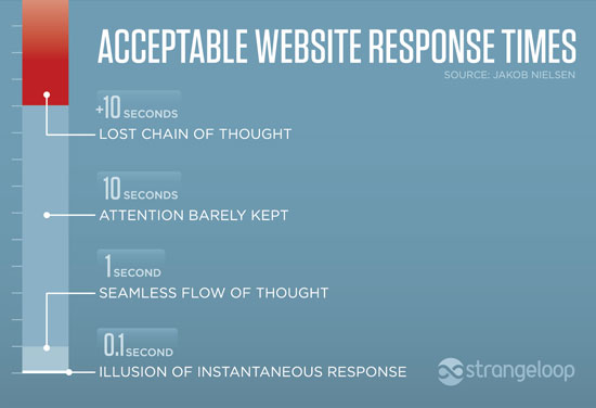
Fortunately, we have studies and best practices to guide our decision-making. Jakob Nielson’s seminal usability study on the interaction between humans and computers revealed three response time limits that are now as used as goalposts for animation timing. The study found that in 0.1 second (100 milliseconds) a computer response will appear instantaneous to a user—so an animation lasting 100ms would be imperceptible to most people. As the computer response time increased, the study showed that at 1 second, users’ attention was maintained but after 10 seconds, most users become disconnected or bored.
Studies also show that humans’ ability to perceive and process visual stimuli, known as a temporal beat, varies from person to person. Some people are naturally capable of perceiving very quick visual movement or changes. But as we age our temporal beat slows, making it more difficult to process quick visual stimuli. In other words, someone with a quick temporal beat might be able to see change as quickly as 70ms, whereas an older person might be able to see that same change in 700ms. To account for this significant gap in processing time, animations should be timed around the 100ms to 1 second “sweet spot” to ensure users are able to perceive the animation without being confused, but are not slowed down or pulled out of their flow of engagement with the content.
An example of the same website with and without animations. The gif on the right shows how animations help reorient the user to the new page.
Loading Animations
As users transition from one website page to another, we can use the sweet spot to help optimize their experience and the perceived performance of the site. Perceived performance is a measure of how long a user feels like they have been waiting for a website to load. Though one might assume the faster the better, we know from Nielson’s study that anything less than 100ms will appear to be an instantaneous jump cut from one page to another. Jump cuts can be confusing for users and overwhelm their cognitive load. We want a speedy website but not at the expense of our users’ ability to process the information on the page. So to signal transitions without boring users with a blank loading page, designers are increasingly using loading animations.

Google’s branded loading page animation
As well as helping to reorient the user to the new page, loading animations offer a chance to do something creative that further engages audiences. Viget ran an experiment to see how long users were willing to wait for a page to load with branded versus generic animations. They found that users were willing to wait longer and the abandon rate was lower with branded animations. The colorful and creative branded animations were intriguing to users, offering something they weren’t accustomed to seeing on other sites.
Eases
In addition to optimizing the duration of animations and page transitions, it’s important for animations to mimic the laws of physics so that they feel natural and intuitive to users. This becomes particularly important when setting up an animation’s rate of acceleration or deceleration, known as easing. Linear easing, i.e. animations that moves at a steady pace, are rarely used because in the natural world, objects either speed up, slow down, or remain stationary.

An example of changing a linear ease to a decelerating ease
In addition to mimicking the acceleration and deceleration of the natural world, easing choices should be based on whether or not the user is expecting an action. Humans perceive changes and movement differently based on whether they believe they have initiated the change or the change is unexpected. Easing should make the user feel like the website or interface is reacting to their actions. So if the response is user-initiated, for example a click or a hover, the animation should begin quickly and decelerate–the user will not be confused by the initial speed because they will be expecting an action.
An example of a user-initiated decelerating ease
On the other hand, if the animation is not something a user asked for, like a sign-up modal, we must be mindful of not surprising the user. The element should come onto the page slowly, giving the user time to process its appearance, and then accelerate as disappears from the page.
An example of a decelerating ease for a sign-up modal
Design for Your Users
Your primary objective for using web animations should be to make websites feel more responsive and intuitive to your users. Designed thoughtfully, animations can be a powerful tool for helping your audience achieve their goals and feel engaged with your content. Using our understanding of human perception, we can avoid the pitfalls of designing animations that despite their creative application, ultimately distract, confuse, or frustrate our user. Remember, the more comfortable our audience is on our site, the longer they will stay, the more opportunity to reach them and make an impact.
Developing Brand Voice & Tone
It can be difficult to get your nonprofit’s brand voice right online, but studies show that it has a significant impact on people’s perceptions of your organization. Simply put, getting your brand voice and tone right for digital content is essential to keeping audiences engaged with your ideas. It starts with having a clear, distinctive voice for your nonprofit that reflects your brand’s personality, and then adjusting your tone to use depending on the channel you are using (website, newsletter, Twitter, etc) and what you’re trying to accomplish (educate, inspire, call-to-action, etc). If you’re developing branded digital content for your nonprofit, here are a few key points to keep in mind:
- Use the active voice—it helps your writing seem less stuffy, cuts down on the length of content, and strengthens search engine optimization.
- Avoid jargon! Just because a term is common in your organization, doesn’t mean it is well known outside of it. If you want to connect with your audience, use their language.
- Have people in your organization or your agency’s team with different backgrounds give you feedback! A second pair of eyes is invaluable in refining and word-smithing content.
Creating Editorial Structure
It’s hard to under-state how important it is to use a hierarchical system for structuring your content. Content structuring also extends into how you unveil the information you’re conveying in your content (i.e. editorial structuring). The approach that fits best with how audiences read on the web is called the “inverted pyramid” style. In short, using the inverted pyramid-style means that you’ll present the most important information at the beginning and work your way down to the details.
- Stating the main idea of the passage not only helps readers decide whether to engage further with the writing, it also ensures that if they do not read further, they will at least remember the central idea of the passage.
- This style of writing can also help you structure your content effectively by breaking into smaller portions.
- Front-loading your content with keywords not only helps your readers understand the central point of your writing, it also has SEO benefits since search engines rank articles with keywords at the beginning of the article higher.
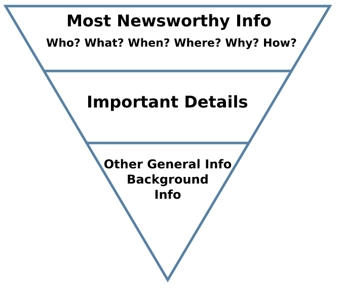
The inverted pyramid illustrated. From Wikipedia
Improving Content Readability
The” readability” metric refers to the complexity of sentences in individual word choices and sentence structure. Basically, it determines how easy it is to understand your text. While the level of complexity you need to use varies greatly depending on the audience you’re trying to reach, almost all writing can benefit from simplicity and directness.
- Aim for middle school level (7th/8th grade in the USA), if you are trying to reach a broad audience.
- Use Word’s grammar proofing function or Hemingway editor to analyze readability. Seeing the complexity of your writing is an illuminating experience that will help you understand patterns in your writing and be more conscientious about its complexity in the future.
- Keep in mind that writing clearly and intelligibly is your primary goal. Readability tools can only analyze your text, they can’t tell you why your content may be hard to understand. For more information, consider performing a Cloze test on your copy with real users to determine how well readers can comprehend your text.
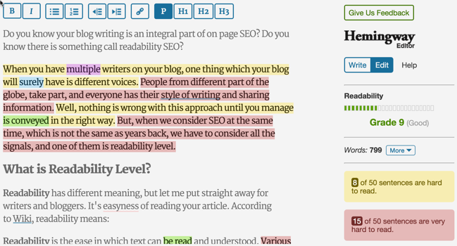
An example of a piece of text analyzed with Hemingway Editor. Complexity is conveyed through the red or yellow highlight, while suggestions specific words and phrases are given in blue, purple, and green. Example via ShoutMeLoud
Writing with Emphasis
Emphasis is essential to helping your reader understand the relative importance of information within your text, and helps reinforce and build upon the voice and tone established in your writing. Breaking up long passages of text with emphasized words or phrases also supports important points and increases the legibility and readability of your text.
- Let your defined text styles do the work for you. If you have a style guide set up for your headings, styles for emphasis, etc., stick to it.
- Don’t try to emphasize specific text too much, use italics and bolding sparingly—if your copy is well-structured with short paragraphs and well-defined sections, you won’t need it. As a rule, less than 10% of your text should be emphasized.
- It may be tempting to mix emphasis styles (for example, combining bold and italic on one piece of text to show that it’s really really important), but generally this is a bad idea. Combining styles interrupts the reader and looks awkward, which can undermine the credibility of your content. If your readers misunderstand your intent or can’t find important information in your text, it means you have a content structuring problem. If you’re unsure, try getting feedback from your users to find the problems with your content.
- Avoid using ALL CAPS in your body text. All-cap text is much harder to read than mixed or lowercase text. Additionally, many readers interpret all-cap text as the equivalent of yelling and it can be perceived as overbearing or rude, which is the wrong kind of emphasis you want on your writing! Note that all caps text is different than small caps text, which can be used quite effectively for emphasis, often as a heading style (your design team will figure out if this style is appropriate for your project).
This example from Smashing Magazine shows the correct way to emphasize text. Note that italicized text is best for emphasis when the reader is actively reading a passage, while using bold text brings attention to individual words while the reader is scanning a longer section of text for keywords.
Tying it All Together
Effective writing for the web involves more than just stylistic finesse and is an important part of developing a strong nonprofit’s brand. Choosing the appropriate voice, tone and structure, ensuring your text isn’t too complex for your audience to understand, and emphasizing the right content all go a long way towards ensuring your ideas make an impact on your online audience—and advance your nonprofit’s mission.
When The Communications Network contacted Constructive to design the most recent addition of its biannual print publication, Change Agent, we were flattered. We’re a proud member of ComNet and have always appreciated its ability to elevate important issues at the intersection of strategic communications and social change. The opportunity to help push thinking and connect readers to fresh ideas naturally appealed to us. That we’d be given creative license to redesign the issue from the ground up was icing on the cake.
All good design exercises begin with discovery, and our engagement with The Communications Network was no different. We discussed collaboration—the idea that even with both of our teams on the project being relatively small, a partnership built on trust would enable us to accomplish some truly ambitious goals. We discussed the concept behind Change Agent—that it’s not just a series of one-off publications, but something that’s continuously evolving. We discussed the content—deep, inspiring narratives from leaders across the field, stories that deserve telling and retelling so that audiences can apply vital insights to their own work. And of course, we discussed design—the notion that to be effective, design must be purposeful, and it must meet the audience where they are, in whatever medium they prefer.
We can’t emphasize the importance of this last point enough. According to a 2016 study by Nielsen, we now spend almost 11 hours consuming digital media each day. Tablets, smartphones, and PCs are leading this growth, with 63 percent, 60 percent, and 21 percent year over year increases, respectively. So, from the very start of this engagement, it was obvious to all that for Change Agent to be effective as a design solution, it had to honor its name and change significantly—from a printed artifact into a transmedia experience that reaches audiences wherever they are.
Putting printed matter online isn’t a particularly innovative idea. The problem thus far with conventional approaches is that they aren’t actually designed for the web. This may seem obvious, but we believe the implications are deeper than many may realize. Most attempts to bring print content online involve posting a low-resolution PDF on a website or embedding it in an online PDF viewer such as Issuu. While we may all get a kick out of those skeuomorphic page transitions, there are serious limitations to this approach—namely, that the content is still locked up in a PDF! That translates to a poor content consumption experience for smartphones and tablets, with none of the baseline benefits that web-native content offers, such as navigability, shareability, and analytics.
Figure 1: Average Time Spent per Adult per Day Based on the Total U.S. Population
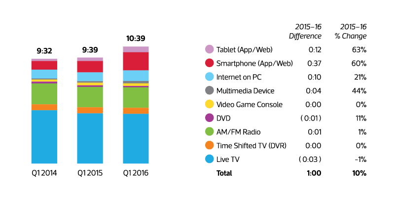
Source: Nielsen Q1 2016 Audience Report, accessed 11.07.16 online at Adweek
Thus came our dilemma with designing Change Agent; authors contributed some amazing, engaging content, and it would have been a crime to lock it up in a PDF where no one would find it. The content deserved to be appealing, interactive, and accessible; it deserved to be print-native and web-native at the same time; it deserved to be transmedia.
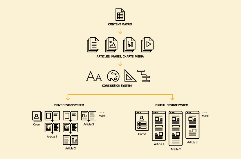
The key to creating an effective transmedia experience is to start with a medium-agnostic, content-centric process. Rather than designing a print product and attempt to retrofit that to the web, or vice versa, we focused on developing a core design system, with type, colors, content structures, design patterns, and media that could be adapted to both print and web.
Of course, it’s impossible to create a universal design system that is 100 percent consistent across print and web; each medium offers different strengths and weaknesses. Print is suited to long-form narratives, with high-resolution media, sophisticated layouts, and a linear, horizontal reading experience. Digital products, on the other hand, lend themselves toward shorter, more digestible narratives; with interactive media, simpler layouts for smaller screens, and a non-linear, vertical reading experience. So creating a cohesive design across media required first drawing on our collective experience across each medium to establish the common core of a design system, and then leveraging each medium-specific design system to its fullest expression.
Figure 2: Transmedia Production Process
In print, production is relatively straightforward; you design a document, print it, and distribute it. Online, production is far more challenging. To shorten our runway, we relied on Exposition™, a long-form publishing platform Constructive debuted in late 2016. Designed to support immersive, responsive experiences for long-form narratives, we felt this WordPress-based platform was ideally suited to meet the challenge of making Change Agent more accessible, engaging, and extensible.
To streamline the content development and population with our design systems, we devised a custom workflow integrating commonly available applications and processes. Google Apps served as our transmedia content management system: we used Spreadsheets to organize everything in a content matrix, Docs to collaborate and update various articles in real time, and Drive to share all of the media files. We then integrated these with the print application (Adobe InDesign) and web technology (Exposition / WordPress) in such a way that we could flow and reflow content dynamically—ensuring that print and web always matched. By integrating the content deployment in this way, our team could focus its attention where it added the greatest value: applying the core design to the print and digital systems and maximizing their native strengths.
We love working on projects that challenge us to innovate and not only design deliverables, but also design the processes that allow us to collaborate with multiple teams and work across mediums. Fortunately, ComNet trusted us enough to allow us to stretch our legs and run as far and as fast as we could. That, in turn, translated to a better outcome. We hope you agree that it shows.
Check out the digital version of Change Agent here to see the final result!
I have certainly been blown away by fancy websites with their well-intentioned and occasionally well-thought-out animations and functionality. Be it a smart filter for a mountain of content, a complex and flashy history timeline or beautifully-fitted tabbed content in a compact space, replete with sliding animations and other eye candy. At best, my mind is blown and I took home an insight I didn’t have before. At worst, I missed the point of both the presentation and the content. Content is King, but you don’t necessarily need a tiger or something crazy like that.

Even a visualization can be represented as simply as a flat image with no animation. A text heading can be just as impactful in place rather than rising up from the ether. A single photograph can be worth a thousand words.
Now, you may already be sensing that I’m here to crush your dreams – and I have to be honest, I totally am.
Let’s take a look at a few popular website features and explore why you might consider ditching them in favor of something else.
The Features
The Slideshow Banner or Otherwise Hidden Content
Fairly ubiquitous on the web these days, the slideshow banner typically has at least three slides with an image, copy and a call-to-action button that directs the user elsewhere. One word: outdated. Still, it’s a popular choice for combining a group of different messages in one block.
The same effect happens with tabbed panels or any sort of expanding content. The user is not getting the message unless they take the time to use the controls.
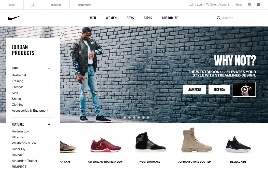
In this Nike example, there are 7 different slides with their own copy, buttons and even videos. A lot of work went into this that perhaps could have been spent on a grid as seen lower on the page. After all, they all lead to a landing or purchase page.
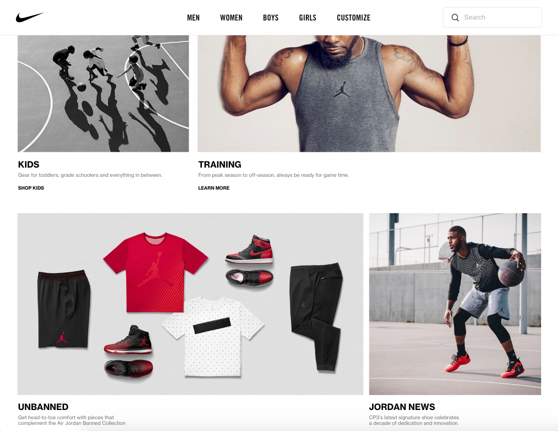
Is it effective? Doubtful. The primary issue with a slideshow is they only allow you to see one thing at a time and most users simply move on and don’t see more slides after the first couple.
Could it be better done better? For sure it could. Sometimes all you need is a row or two of promoted content with headings, supporting text below and a call-to-action button to get the user moving where they want to go (and where you want them to go).
Potential savings? Some savings might be gained by leaning towards a static presentation, but the primary gain by going static over a slideshow is that all your important promoted content and focal points are visible 100% of the time.
The Underutilized Content Filter
Filters are a handy way of getting through hundreds, if not thousands, of content items quickly and effectively. When you’re shopping on Amazon, filtering is a big win. However, when you’re trying to filter through 20 content items, it’s quite possibly a waste.
We recently developed a Drupal site that filters thousands upon thousands of content items of a few types, each with different facets. The system works great and was of high value to the client; it made sense given their goals and content, and was well worth the investment.
However, if you’re dealing with a limited number of content items, it may be worth thinking about if you’ll be adding enough in the near future to justify a filter. You very well may not need a filter if a keyword search does the trick or content can be presented in a way that exposes what people want exactly where they expect to find it.
Is it effective? It definitely can be if the need is there. The big question: is the need there?
Could it be done better? I’d dare say trust that your users can find what they’re looking for if they’re just perusing through five pages of indexed items. The chances that they’ll find what they’re looking for with or without a filter when dealing with a relatively small site should be about the same.
Potential savings? If an unnecessary filter is ditched in favor of allocating budget for content enhancing services, significant savings. No development, testing and retesting are needed for all the important parts it takes for a filter to function.
Non-Interactive Animated Visualization
If you’re selling a luxury product like $200 running shoes or an industrial design laptop, featuring a single purpose animated visualization can make a lot of sense. You can generate hype about the products’ features and create excitement amongst potential customers.
Animation for interactive visualizations can also be extremely effective, however, without the interactive element it’s totally possible to use simple flat images or a very basic animation to pull attention to your visualization and still get the message across.
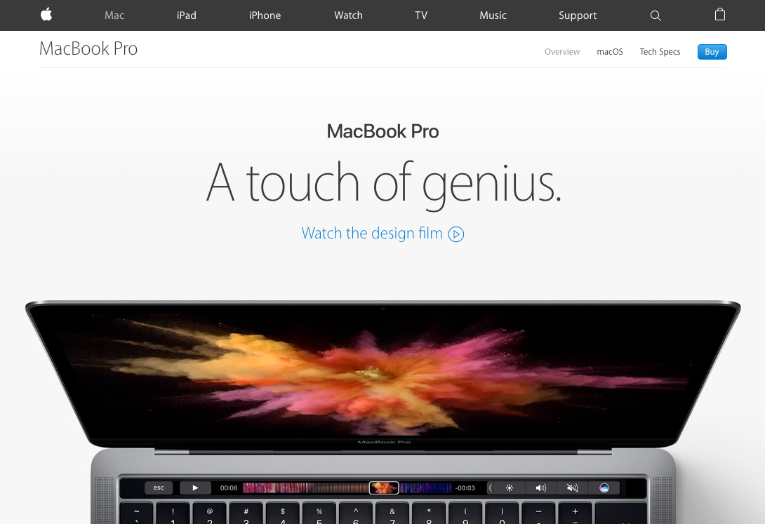
Apple’s animated presentation of their new Macbook Pro line is definitely smooth and sophisticated. Here it’s showing off the functionality of their new Touch Bar when the page is scrolled. It undoubtedly took a good amount of time to design and develop.
Is it effective? Animated visualizations can be stunning to the eye and mind. However, the end message of the animated visualization versus the static version will be much the same.
Could it be done better? In this case, I wouldn’t say it could be done better, but often a flat image can definitely speak to the same concept as an animated one and will be more easily sharable on the web.
Potential savings? Extra design and development time will dramatically inflate the cost of such a presentation. On a limited budget, it could be a huge loss for your content.
The Proof is in the Pudding
I think it’s important to take a look at a couple of excellent examples of social change organizations that spent their time and money on quality content (including copy and imagery) instead of expensive dramatic visual features. One is by our team here at Constructive and the other another party.
Bold and Beautiful Content
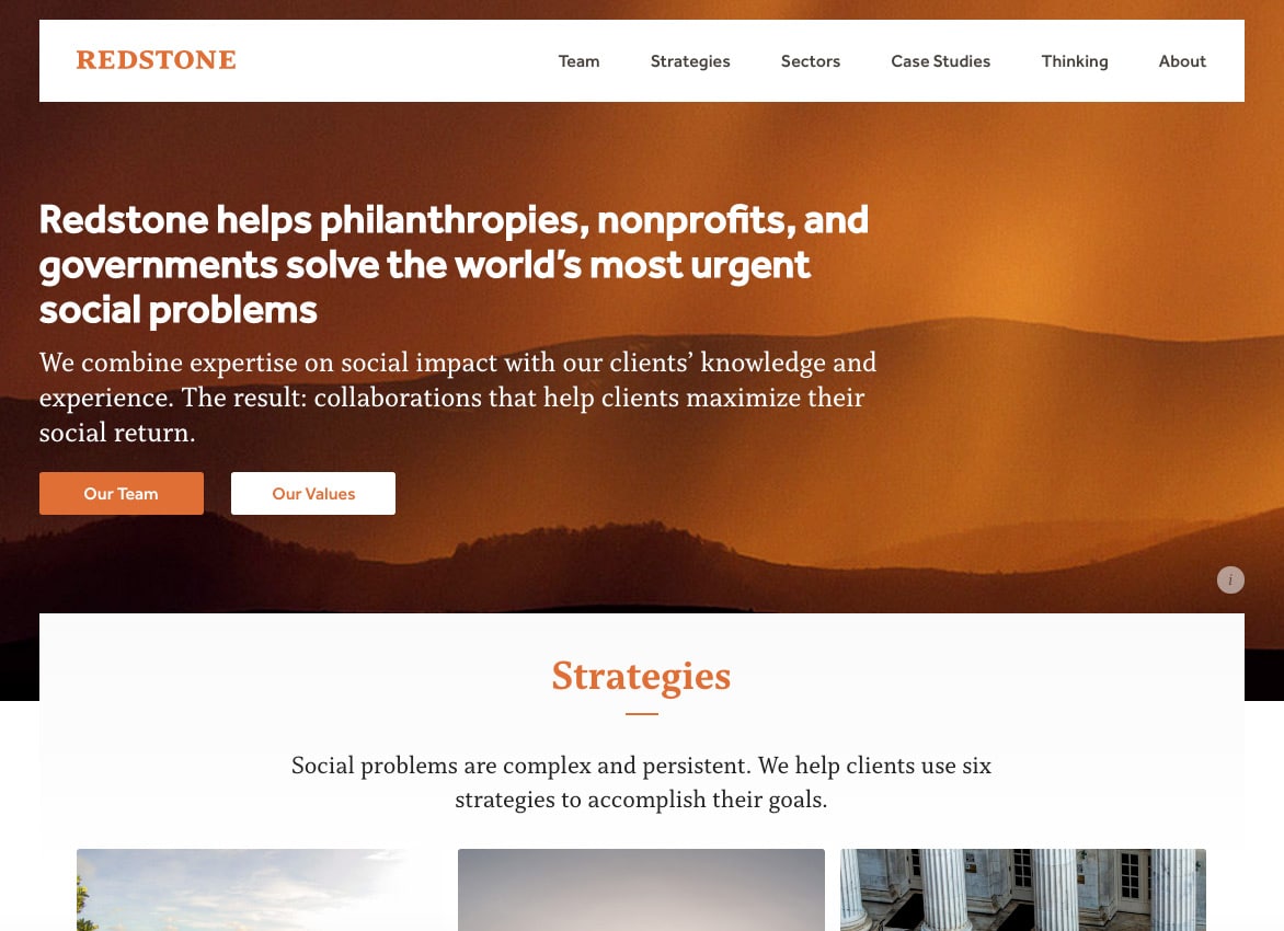
http://www.redstonestrategy.com/
This site has hardly any moving parts and is static for the most part. The top banner says what it needs to say, directions to the two primary hubs describing the mission (Strategies and Sectors) are presented as beautiful static blocks with all the information you need.
Less Can Be More
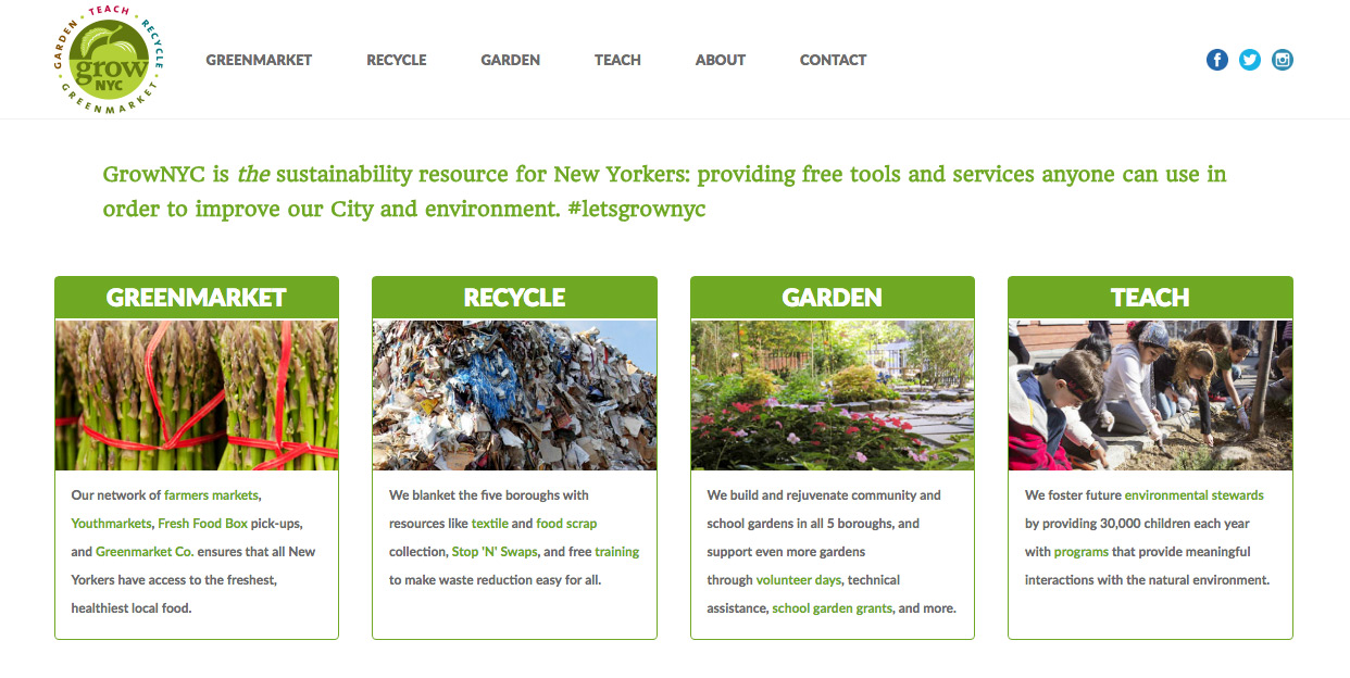
https://www.grownyc.org/
This is definitely not the fanciest or most modern site on the web, but the heading on the homepage says it all. This is what we’re doing and why. There’s no giant slideshow. There isn’t a hip video background, fading in and out elements or animated visualizations.
One could easily have loaded the four blocks below the heading into a slideshow, but here the content is available all at once.
Hear My Roar!
Like Shiva the tiger from The Walking Dead, your content wants to let its presence be known. You have important things to say and there are many ways to say them. As a developer, I’m on the tail end of many animation and visual complexity discussions (and intimidating tiger requests) that come up.
It Helps to Know How to Deal with Content-Heavy Websites
In my experience, investing in your content is the best bang for your buck. You can enhance your content by investing in content strategy, copywriting, quality stock images to supplement your existing images, and assistance with your overall messaging. When a client works with us on those tasks, the result is head and shoulders above a site whose content didn’t get due attention.
Common reasoning against investing in content assistance might be that “our team can take care of that,” or “it can be taken care of later.” I’d suggest that instead of thinking that way, think of your content first and any fancy features can be added later. The burden of content can be overwhelming for even the most talented and well-staffed internal teams and it shouldn’t be underestimated.
I mentioned previously that serving the content and user experience are sacred goals. Content must be the dominant focus of any website – especially for a social change organization. As much fun as animations and interactive elements can be, content can be more potent and user experience more natural when content becomes the twinkle in our eyes and all else takes a back seat.
I might have said I was setting out to crush dreams, but maybe I should have said my primary message to anyone wishing to redesign their site is that your content almost always will need a redesign as well. When undertaking a website overhaul, find a partner who can look beyond the feature set, but can also help with your content and overall message!