


I have certainly been blown away by fancy websites with their well-intentioned and occasionally well-thought-out animations and functionality. Be it a smart filter for a mountain of content, a complex and flashy history timeline or beautifully-fitted tabbed content in a compact space, replete with sliding animations and other eye candy. At best, my mind is blown and I took home an insight I didn’t have before. At worst, I missed the point of both the presentation and the content. Content is King, but you don’t necessarily need a tiger or something crazy like that.

Even a visualization can be represented as simply as a flat image with no animation. A text heading can be just as impactful in place rather than rising up from the ether. A single photograph can be worth a thousand words.
Now, you may already be sensing that I’m here to crush your dreams – and I have to be honest, I totally am.
Let’s take a look at a few popular website features and explore why you might consider ditching them in favor of something else.
The Features
The Slideshow Banner or Otherwise Hidden Content
Fairly ubiquitous on the web these days, the slideshow banner typically has at least three slides with an image, copy and a call-to-action button that directs the user elsewhere. One word: outdated. Still, it’s a popular choice for combining a group of different messages in one block.
The same effect happens with tabbed panels or any sort of expanding content. The user is not getting the message unless they take the time to use the controls.
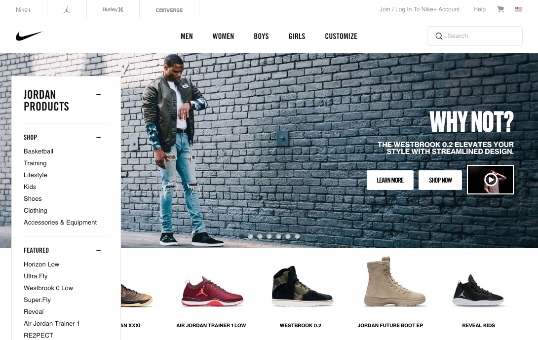
In this Nike example, there are 7 different slides with their own copy, buttons and even videos. A lot of work went into this that perhaps could have been spent on a grid as seen lower on the page. After all, they all lead to a landing or purchase page.
Is it effective? Doubtful. The primary issue with a slideshow is they only allow you to see one thing at a time and most users simply move on and don’t see more slides after the first couple.
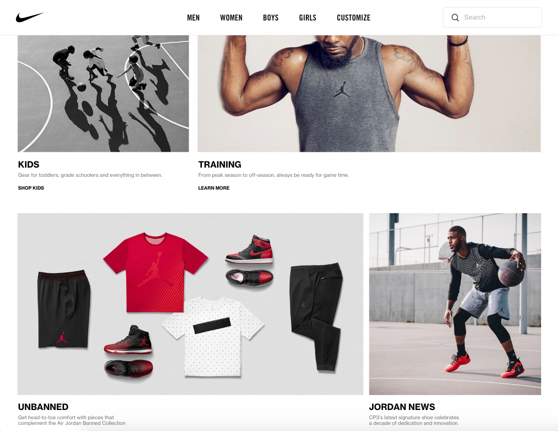
Could it be better done better? For sure it could. Sometimes all you need is a row or two of promoted content with headings, supporting text below and a call-to-action button to get the user moving where they want to go (and where you want them to go).
Potential savings? Some savings might be gained by leaning towards a static presentation, but the primary gain by going static over a slideshow is that all your important promoted content and focal points are visible 100% of the time.
The Underutilized Content Filter
Filters are a handy way of getting through hundreds, if not thousands, of content items quickly and effectively. When you’re shopping on Amazon, filtering is a big win. However, when you’re trying to filter through 20 content items, it’s quite possibly a waste.
We recently developed a Drupal site that filters thousands upon thousands of content items of a few types, each with different facets. The system works great and was of high value to the client; it made sense given their goals and content, and was well worth the investment.
However, if you’re dealing with a limited number of content items, it may be worth thinking about if you’ll be adding enough in the near future to justify a filter. You very well may not need a filter if a keyword search does the trick or content can be presented in a way that exposes what people want exactly where they expect to find it.
Is it effective? It definitely can be if the need is there. The big question: is the need there?
Could it be done better? I’d dare say trust that your users can find what they’re looking for if they’re just perusing through five pages of indexed items. The chances that they’ll find what they’re looking for with or without a filter when dealing with a relatively small site should be about the same.
Potential savings? If an unnecessary filter is ditched in favor of allocating budget for content enhancing services, significant savings. No development, testing and retesting are needed for all the important parts it takes for a filter to function.
Non-Interactive Animated Visualization
If you’re selling a luxury product like $200 running shoes or an industrial design laptop, featuring a single purpose animated visualization can make a lot of sense. You can generate hype about the products’ features and create excitement amongst potential customers.
Animation for interactive visualizations can also be extremely effective, however, without the interactive element it’s totally possible to use simple flat images or a very basic animation to pull attention to your visualization and still get the message across.
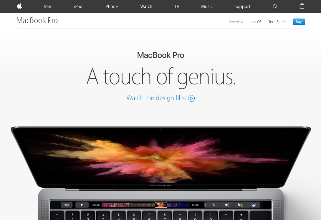
Apple’s animated presentation of their new Macbook Pro line is definitely smooth and sophisticated. Here it’s showing off the functionality of their new Touch Bar when the page is scrolled. It undoubtedly took a good amount of time to design and develop.
Is it effective? Animated visualizations can be stunning to the eye and mind. However, the end message of the animated visualization versus the static version will be much the same.
Could it be done better? In this case, I wouldn’t say it could be done better, but often a flat image can definitely speak to the same concept as an animated one and will be more easily sharable on the web.
Potential savings? Extra design and development time will dramatically inflate the cost of such a presentation. On a limited budget, it could be a huge loss for your content.
The Proof is in the Pudding
I think it’s important to take a look at a couple of excellent examples of social change organizations that spent their time and money on quality content (including copy and imagery) instead of expensive dramatic visual features. One is by our team here at Constructive and the other another party.
Bold and Beautiful Content
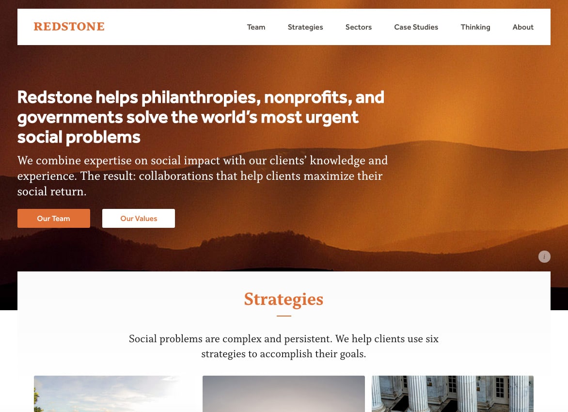
http://www.redstonestrategy.com/
This site has hardly any moving parts and is static for the most part. The top banner says what it needs to say, directions to the two primary hubs describing the mission (Strategies and Sectors) are presented as beautiful static blocks with all the information you need.
Less Can Be More
This is definitely not the fanciest or most modern site on the web, but the heading on the homepage says it all. This is what we’re doing and why. There’s no giant slideshow. There isn’t a hip video background, fading in and out elements or animated visualizations.
One could easily have loaded the four blocks below the heading into a slideshow, but here the content is available all at once.
Hear My Roar!
Like Shiva the tiger from The Walking Dead, your content wants to let its presence be known. You have important things to say and there are many ways to say them. As a developer, I’m on the tail end of many animation and visual complexity discussions (and intimidating tiger requests) that come up.
It Helps to Know How to Deal with Content-Heavy Websites
In my experience, investing in your content is the best bang for your buck. You can enhance your content by investing in content strategy, copywriting, quality stock images to supplement your existing images, and assistance with your overall messaging. When a client works with us on those tasks, the result is head and shoulders above a site whose content didn’t get due attention.
Common reasoning against investing in content assistance might be that “our team can take care of that,” or “it can be taken care of later.” I’d suggest that instead of thinking that way, think of your content first and any fancy features can be added later. The burden of content can be overwhelming for even the most talented and well-staffed internal teams and it shouldn’t be underestimated.
I mentioned previously that serving the content and user experience are sacred goals. Content must be the dominant focus of any website – especially for a social change organization. As much fun as animations and interactive elements can be, content can be more potent and user experience more natural when content becomes the twinkle in our eyes and all else takes a back seat.
I might have said I was setting out to crush dreams, but maybe I should have said my primary message to anyone wishing to redesign their site is that your content almost always will need a redesign as well. When undertaking a website overhaul, find a partner who can look beyond the feature set, but can also help with your content and overall message!
