The internet is connecting more people in more places than ever before—and yet many nonprofits focus their design efforts on WEIRD (Western, educated, industrialized, rich, and democratic) audiences. However, that doesn’t do justice to the dazzling variety of languages, perspectives, and expectations that true audiences bring. If nonprofits want to create effective design and communications for these modern, multicultural audiences, it means changing the usual ways they plan, research, and execute those projects.
But what are cross-cultural design projects when it comes to nonprofits and foundations? They are digital design or strategy projects that have a focus on communicating to an audience not your own, one that has a different culture, language, or geographic location. The project may be a small targeted messaging campaign, such as awareness around legal services for non-english speakers. It may be a larger website containing resources for volunteers working overseas, or in a culturally diverse city. It may even be redesigning a foundation’s intranet to be more usable for a large distributed team that spans cultures and languages. The possibilities are endless.
Once a communications team determines, through strategic research or audience feedback, that a digital project requires cultural knowledge or sensitivity, they will need to take active steps to ensure the project is successful. Deep cultural dives are not always necessary, however. Here are a few straightforward ways to take a cross-cultural design approach.
Technique 1: Embrace Cultural Immersion
When starting a cross-cultural design project, it’s important to surround yourself with the culture you are designing for. With many countries and cities dealing with social-distancing and severely restricted movement right now, that may sound difficult.. However, it’s entirely possible to conduct cultural immersion digitally.
Start by looking at digital media like movies, radio, and TV shows. Signing up for newsletters and other hyper-focused publications is also a great way to immerse yourself in a culture, and one that builds over time. For instance, for a project focused on building technical capacity and digital communities in West Africa, signing up for the Tech Cabal newsletter will offer a very focused view of the startup and venture capital world there, and as it is a daily newsletter, will offer a very nuanced picture the longer you read it.
There are also vibrant design communities in every part of the world, each one addressing unique, culturally relevant design problems. Cultural immersion can mean tapping into and working with these communities, to gain deeper insight into the design challenges we face.
But how to do this? Well, see what creative practitioners from your target culture are working on. Do filtered searches on sites such as Behance, or Twitter, to see what other communities are doing, and what they are talking about. This has the added benefit of giving you a list of potential expert contacts, should you ever need them for a project!
This digital immersion should not be treated as a substitute for actual research, but when current events, budgets, or timelines mean you can’t travel or conduct ethnographic field work, it’s a low-cost, immediate way to learn about a culture. Keep in mind that you are first and foremost an observer, not an expert. Be humble and introspective, and embrace the immersion.
Technique 2: Question Your Assumptions
Our biases and assumptions, when left unaddressed, are a huge risk to design projects. Ignoring how they creep into our work unconsciously is how we get work filled with incorrect ideas, and digital experiences that gloss over what our audiences actually need. The second cross-cultural technique means examining those assumptions.
In my new book Cross-Cultural Design, I laid out a straightforward methodology for how to push back against your biases. It starts with being clear and as honest as possible about your assumptions—to yourself, to your team, and to your clients or stakeholders:
Start by documenting your assumptions about your project and the audience it is for. Do this by yourself first, and then again in a larger team, if you are part of one. Put it in a strategy document. But what gets documented as an assumption, and what stays as a statement of fact? Here’s an example: when working on a design project for users in an emerging market, someone on your team might say “We know this audience is going to access our site from cheaper feature phones…” That sentence is an assumption, and you should determine later, through research, if it is true or not.
Next, share your assumptions with all your stakeholders, however uncomfortable it might make you. So it is not too awkward or confrontational, explain that you want to review some assumptions with leaders and subject matter experts as part of the strategy phase. As you share, be clear about what outcome you want: Do you want an open discussion? A focus for your brand research?
Lastly, turn those assumptions into a list of questions to guide your team on the upcoming project. Our example assumption was, “We know this audience is going to access our site from cheaper feature phones.” We can refashion that into a question- “What devices do our audience use most often?” Put all the questions up in a Google doc or other accessible place, so your research and strategy phases can be directed by inquiry, instead of error-prone assumptions.
Don’t forget— it’s a good thing to speak with team members and experts who disagree with parts of your ideas and questions. Skeptical voices provide a crucial check on our impulse to go along with a popular viewpoint. That dissent, especially coming from people who know all about the culture we are designing for, can tell us a lot about how a project will be received in a different culture.
Technique 3: Prioritize Flexibility
As you begin to work on communications and design artifacts such as templates, content, icons, and color systems, you want to make sure they are designed in an open, collaborative way. But what does that really look like? Well, a flexible, shareable artifact will be something that can be iterated on, tested, and discussed by your team and your nonprofit’s audience. Here are some suggestions for getting there:
Start by documenting the thinking behind your design choices, whether it’s happening quietly at your desk or in the field! Communicate your intent with members of your team, by describing what you are creating and why. There’s an added benefit—in the future, you can use this to explain your work, in presentations and marketing. It can help as you build relationships with new funders, partners and audience members who appreciate and seek out your expertise delivering cross-cultural communications.
Next, begin with some small, low-stakes prototypes. You need time to work through cultural blind-spots. Any components we design, from the simplest paper experiments to complex interactive systems, are based on aesthetic rules and cultural ideas we’ve picked up through our lives. That means they are culturally constructed. Lets say you are doing rough sketches during a wireframing workshop. Native English speakers will tend to indicate blocks of text by drawing lines from left to right, in the same direction the language flows. However, prioritizing flexibility means identifying and challenging these (often subconscious) habits. If our design work will also be used for an Arabic-speaking audience, we should also sketch those blocks of text right-to-left, as that is the way Arabic flows.
Finally, make sure to document design variants or options. It’s not uncommon for branding systems to have slightly different color palettes for different markets or cultures. If this is what you are working on, make sure you explain how your team should correctly use your brand colors in those cultures, and why.
For nonprofits, often widely different audiences mean that flexibility and adaptability is critical in designed communications, products, and strategies. By keeping the cultural needs of our audiences in mind with a malleable design process, we can ensure a more culturally responsive digital experience, one audiences will support and understand.
Conclusion
Getting started with cross-cultural design might feel a bit nerve-wracking, and teams might wonder if they are doing it ‘right’, or being accidentally insensitive. These actions won’t give you all the answers, or tell you exactly how to design for your multicultural audiences. But I do hope they make you feel more confident in your decision-making.
Use these ideas as a place to begin designing culturally adaptable products and experiences. I hope they help you think through how culture and design intersect. The wonderful thing about design is the power we have to decide how information is presented, how it is shared with the world, and what we empower our audiences to do with it. Nonprofits and foundations have a huge responsibility to be thoughtful and ethical about those design decisions, especially when they span culture, language, and national borders.
The scale of systemic problems that the coronavirus pandemic has exposed and exploited is staggering and unprecedented. America’s federal government has failed to marshal and coordinate the necessary resources and hundreds of thousands of nonprofits have, once again, stepped in to meet the challenge. Faced with serious social needs across so many different sectors of society, 24/7 pandemic coverage on every channel, and the fatigue that’s now setting in, many nonprofits are wondering how they can attract attention and draw the support they need during this crisis? Adding to this challenge is that in a time of social distancing, things like community-based events and providing direct service are needed more than ever but are harder than ever to do. It’s a perfect storm that can make it very hard for nonprofits to deliver on their missions and demonstrate why they are so relevant during this crisis.
But, there’s a silver lining in all of this. In times of crisis, people reassess what really matters to them. We rethink and reorder our priorities. One thing that usually gets renewed attention during a crisis is how we feel about the nonprofits we support and are a part of—whether that’s our local shelter or a global health organization. Another positive development is that in times of crisis new heroes emerge. And right now, people are finding their heroes on the frontlines helping people in need and behind-the-scenes reforming the policies and systems that contributed to this crisis. Speaking of systems, a pandemic is also pretty clarifying when it comes to understanding how interconnected our social and economic systems are and deciding what we want to make them properly function for us.
This intersection of American values, social systems, and service is exactly where nonprofits thrive. But to thrive, nonprofits need support. And when the need is so great, they need even more support, whether that’s people’s time, donations, or energy. This is the connected opportunity and challenge for nonprofit brands that the coronavirus crisis has created. People are rethinking, reassessing, and coming to grips with what this all means while living in isolation with great pain and anxiety. There’s an urgent need for action, both to meet immediate needs and solve serious long-term problems. I’d also like to think that all of our shelter-in-place, pent-up energy and anger means that people are highly motivated to change the course in which we are headed as a nation—tilting the nation towards the values that many of America’s best nonprofits have always embodied.
So, how can nonprofits rise to the moment and attract support during the coronavirus pandemic? How can they continue to do their important work while America is practicing social distancing? And, with approximately 1.6 million nonprofits in America, what lessons can the coronavirus pandemic teach us about what it means for a nonprofit’s brand to remain relevant—both to those who support it and to those it supports?
Strong Nonprofit Brands Always Remain Relevant
“Strong brand” may feel vague or like a communications buzzword. So, what is it? After years of describing what it means to have a strong brand in different ways, I’ve come down to this simple description: a brand’s strength is determined by how relevant it is. Because for anyone to care about something, it has to be relevant to them. What do I care about? What do I value? Which nonprofits best embody these things? Which ones offer me the best opportunities to live my values through a relationship with them, whether I’m a donor, volunteer, or strategic partner? For a nonprofit to be relevant, the answers to these questions must, at a minimum, make me support the mission, feel aligned on values, and believe the organization delivers the impact I’m hoping for.
To answer these kinds of questions and navigate choices in a world filled with them, humans created brands. Brands are a kind of shorthand for our brains that help us identify, categorize, and associate with organizations, products, and even people that matter to us. And in the case of nonprofit brands, whose impact is often indirect to those who support it, these relationships give us the opportunity we seek to contribute to a better world and, as a result, a better us. And so long as our connection to, and belief in a nonprofit’s brand remains strong, then that nonprofit remain relevant to us.
This pandemic, if it favors anything, favors nonprofits with strong brands that stand for something and can demonstrate their ability to deliver on it. Society needs nonprofits right now in a major way. Millions of people are looking for reasons and ways to contribute. They are looking for partners to build capacity and amplify their efforts. They are looking for help in their time of need. And the nonprofits with strong, relevant brands are very likely the ones having the greatest success, both in attracting support and delivering on their promises.
The reasons are fairly simple. Nonprofits with strong internal brands have a strong identity. Their people are more aligned with a common vision. They are more cohesive and have greater capacity—critical during this crisis when speed and coordination are required. Externally, strong nonprofit brands naturally attract attention because it’s clear who they are, what they stand for, and how they make a difference. Their message is focused, making it easier to appeal to donors with a refreshed reason for support. And whether their efforts are focused on the grassroots or grasstops, strong nonprofit brands have earned the trust and credibility needed to mobilize people, make decisions, and lead the effort.
Nonprofit Engagement Online During Social Distancing
If it wasn’t clear already, social distancing has shined a spotlight on how vital an effective digital strategy is to a nonprofit’s success. So many of our normal out-of-the-house activities and interactions are being conducted online during this crisis. While this situation may change as states open up, the process will be slow and there’s a good chance that many of us will be revisiting social distancing in the fall. It’s also not as if this trend online is a new development, so a strong digital strategy will increase in importance no matter how this crisis is resolved.
When it comes to online engagement, while social media is important to many organizations, the hub of almost every nonprofit’s digital efforts is its website. It’s a primary way that many people engage with a nonprofit. For some people, it may be the only direct experience they have. And a nonprofit’s website serves as a single source of truth for who they are, what they do, and why it matters. It’s a powerful brand ambassador that’s can share every facet of a nonprofit’s story, that facilitates communication, and that’s always ready to help anyone who visits.
People may visit to learn about an organization’s mission or do a deep dive into program strategies. They may visit to access resources to support their own work. They may need to access benefits, services, or important information. Whatever the reason, a website is the thing that facilitates this relationship and makes a nonprofit relevant to audiences in every moment the engagement takes place.
The stakes are always high when people visit a nonprofit’s website. People form an opinion about your brand very quickly and there’s no one there to directly interact with them. This means that the kind of experience they have ultimately comes down to how well you know your audiences, how well you know yourself, and how well you understand how meaningful value is created in the relationships between you. So, during a time of pandemic, social distancing, and significantly increased digital engagement, it’s safe to say that having a great website that’s aligned with a great brand strategy is more important than ever for nonprofits looking to rise above the din of this crisis, increase their relevance, and achieve their goals.
In my next article, I’ll be providing ideas and examples for how different types of nonprofits can increase their brand’s relevance to audiences by delivering more valuable experiences for their audience. In the meantime, I hope you and your loved ones are healthy and cared for in this really challenging time.
The coronavirus pandemic sure feels like a watershed moment that’s permeating just about every facet of society. Things have been escalating rapidly and we’re living it together, simultaneously around the globe. As I write this, over 330,000 people have been diagnosed positive and nearly 15,000 people have lost their lives. Millions more lives have been completely upended in a matter of weeks, if not days. The ground feels like it’s shifting beneath our feet—for many people more than just a bit—and it’s a lot to absorb and process. None of us knows what the future holds, but one thing we can say for sure is that when we get through this, the world will be a different place. We will be changed, in ways both small and profound.
As I continue to think about what this all means, two words that keep coming to mind are “partners” and “partnership.” When you break it all down, a healthy civil society depends fully on partners and partnerships, at every level. The unwritten social contracts that guide every society and that help shape cultures are built on the concept of partnership. For institutions and organizations to work well together depends on partnership. The employee/employer relationship is a partnership. Our friendships are partnerships. And, of course, families are created by partners. In every instance, the common theme of partnership is people working together with shared values toward common goals.
When I think of the philanthropies and larger nonprofits that have engaged Constructive over the years, I’ve been reminded how many bring people together in partnership through approaches that leverage collective impact. As one of our clients in the environment space who works through a collective impact model rhetorically asked last week, “How do you advance your mission in such overwhelmingly uncertain times?” She shared, and I agree that it starts with solidarity. Finding common ground. If ever there were a time to put aside petty differences and work together in partnership, the coronavirus pandemic is it.
“Partner” also shares its roots with “participation.” Almost every nonprofit is built on core values that require some form of participation. It’s not possible to have true diversity, equity, and inclusion without it. At Constructive, our approach is deeply rooted in a participatory process. Because we understand that to find new solutions—as Herbert Simon said, taking “existing situations and turning them into ones that are preferred”—we must collaborate and co-create. This is not possible without good partners. Looking back at Constructive’s many clients and projects, our best work is invariably the result of a great relationship.
And these relationships are always grounded in a strong sense of partnership.
Four years ago, I wrote an article called “Design Vendors are Destroying Nonprofits!” I did so to share perspective on a framing problem that I saw in the nonprofit and education sectors. The gist of it was that what we call things matters. Too often, nonprofits use the term “vendor” to describe a branding or design agency in RFPs and conversations. And it’s my belief that the “v-word” undermines the value that partnerships can create.
“Vendor” unwittingly signals that a limit is being placed on a relationship of what each party should expect from the other. Vendors are purely transactional. They’re certainly not strategic. And no one should be under the illusion that they and their vendor are “in this together.” None of this is done with malice, of course. Nonprofits don’t want transactional vendors to help improve their brand strategy, create more effective communications, or design a new website. They want partners who will bring all of their best to the relationship every day.
On the flip side, pretty much every agency talks about being partners of their clients, especially when you read our proposals or websites. These are certainly the kinds of relationships Constructive likes to cultivate. But this sentiment can be challenged in an environment that’s heavily defined by fixed-bid projects. Projects almost always have a start-date and end-date. To make sure they are profitable, agencies must keep their time spent within what was estimated—especially if every new project a client needs help with is put out to RFP, making it very hard to know if there will be more to do together once the current project is over. It also means you need to continuously stay focused on winning new projects instead of delivering greater value through existing relationships.
Which brings me back to partners and partnerships—and why now, when we’re all living through a global pandemic (did I actually just say that?!), I’m so glad to both have and contribute to them. Things are scary right now. The world has been turned upside-down. That’s when you need partners the most. In Constructive’s case, we’re fortunate that about one-third of all of our work is done through our Partner Services agreements—annual retainers in which both we and our clients commit to being there for one another. This predictability is a beacon in unsettling times like these, both for us and the organizations we work with. And never has this been more apparent to me than now.
For the nonprofits we work with, while it may feel like the world’s on pause, there are important things related to their branding, communications, and websites that need to get done. In many cases, social sector organizations have even more to do because of the crisis. Lives may actually be on the line. Some organizations are scrambling and situations are changing by the day, sometimes the hour. Now is a time when nonprofits need nimble partners that are ready to act and adapt with them.
For me personally, and for our team, this is where I’m so thankful for the long-term relationships we’ve cultivated over the years. Because of Partner Services, our clients know that Constructive’s team is here for them—and will continue to be here. They know they have our full attention. And through our partner network, we have colleagues that we trust to add expertise and capacity when we and our clients need it. As a result, everyone engaged has greater trust, knows what to expect, and understands how to work together effectively—increasing certainty of execution and reducing risk. We all also know that, because of our commitment to one another and our history together, everyone is willing to going above-and-beyond when the stakes are high. Like they are right now.
Partnerships make us a stronger company in these incredibly uncertain times. And in Constructive’s case, our team is extremely grateful for them. So, on behalf of all of us here, thank you. We deeply appreciate the opportunities to work with you and your trust and support—and we are here, ready and always eager to help. The coronavirus crisis is testing us all—and it will continue to test us. And when we overcome it, those individuals, organizations, communities, and nations that have strong partners are likely to be the ones that will best be able to rise to the challenges, whatever they may be, and come out stronger on the other side.
When it comes to nonprofits who publish long-form reports online such as research reports, policy reports, annual reports, frameworks, and toolkits, there are two standard options: post a PDF online and promote downloads on their site via search, social media, and other channel strategies. Or, nonprofits looking to move beyond the limitations of the PDF that publish reports can take a “digital-first” approach to producing reports using HTML, which allows them to supplement content with a number of interactive elements that can deepen engagement and impact. Each approach to publishing long-form content reports has pros, cons, and trade-offs when it comes to workflow, cost, accessibility, design experience, and analytics. So, if you’re a nonprofit looking to publish your reports online, what is the best approach?
In Part 1 of this series, we explored the traditional PDF-first approach to publishing reports online. Beyond traditional approaches, we also recommended a few ways that nonprofits can make their PDF reports better so that they are more effective. Here, in Part 2 of this series, we’ll explore the pros and cons of the HTML-first approach to long-form nonprofit report publishing, and then suggest best practices for nonprofits looking to do more with the reports they publish.
The HTML-first approach is growing in popularity, both among shorter publications and longer publications with high-value audiences. At its core, the approach is simple: rather than posting a PDF of your report to your website, your website is the report. That digital experience often means deeper scrolling sites and the structure could be anything from a single-page site to a multi-page mini-site broken down by chapter and section. There are a lot of benefits to this publishing workflow, especially when it comes to accessibility and flexibility—but there are some drawbacks as well.
The Benefits of Publishing HTML-First Reports
Ready for anything. Perhaps the biggest difference between PDF-first and HTML-first online reports is that the latter is designed to be consumed online and can be responsive. That’s critical, given that the majority of our time is spent on mobile devices, which have historically been a poor user experience for consuming PDF content.
Increased “findability” and SEO. In addition to being more accessible to humans, HTML-first reports are also more accessible to machines. Not only are they easier to index and navigate, but mobile-friendly sites and content typically rank higher for popular search engines like Google.
More shareable. With HTML-first reports, nonprofits can significantly increase the visibility of their content through social media. First, a nonprofit can share any page from a research report, policy report, or annual report in its feed, directing users to specific content (instead of just the whole report). Social media platforms will then display the meta-content for the page, providing greater insight into what the page offers audiences. Even better, with social sharing built into a nonprofit’s report, audiences can spread the word for them.
Greater accessibility. When it comes to ADA compliance (see section 508), though PDFs have made great strides in accessibility, it’s much easier to maintain accessibility standards with live HTML content. Being able to design responsively means that mobile-friendly web content will also reach a wider audience. What’s more, support for screen readers and other assistive technologies are built right into operating systems like iOS and Android.
Always up-to-date. One drawback of online PDFs is that once they are released, they’re out there; users download once, and that’s generally it. With HTML reports, content can be updated and refreshed, providing a more natural environment for living content and continued audience engagement.
Greater insights. With PDF reports, the download represents the final trackable event for audience engagement; with online reports, technologies like Google Analytics and Clicktale can get valuable insights throughout the content consumption process, so you know who’s interacting with what report content and for how long. That’s an invaluable feedback mechanism for publishers, and can also provide extensive insight into how reader-focused initiatives like social media campaigns might influence engagement and other goals.
More engaging. Last, but not least, nonprofits who create their reports as interactive websites instead of static HTML can make their content far more engaging. From standard things like animated transitions and calls-to-action that help keep readers engaged to more advanced features like data visualization and integrated donations and marketing opt-in, interactive reports create a richer, more rewarding experience.
The Drawbacks of Publishing HTML-First Reports
HTML-first requires an investment. While most publishing teams can easily support a PDF-first workflow, HTML-first can be a bit of an adjustment. It requires authors to think as web designers and structure their content around an engaging user experience rather than a pleasant PDF-based experience around the content. Until the team gets up to speed with a new workflow, the HTML-first approach can mean greater overall effort, time, and budget than creating an equivalent PDF-based experience.
Printing is second nature. PDFs are meant to be printed; HTML is meant to be consumed online. It’s not always possible to print web-based content with high quality, so it requires one of two approaches. Publishers can create a direct-to-PDF workflow that translates web content to PDFs via print style sheets or javascript-based technologies like jsPDF; the caveat here is that unless you are working with non-interactive, lossless graphics like SVGs, the results may be compromised. Alternatively, you could create a parallel PDF-output workflow from a source application like InDesign and post your PDF alongside the HTML report, but that means developing content in two separate environments, requiring additional time and money.
Long, sophisticated reads are more challenging online. Online users have notoriously short attention spans—most readership drops precipitously after about 500 words. Longer reads can compound the cognitive load, especially when the sophistication of the content requires information to be processed contextually. The best way to counter any adverse effects on the user experience is to chunk content into bite-sized pieces, create a navigable and intuitive structure, and offer callouts and takeaways to create a more visually robust presentation.
Printable PDFs feel more permanent. There is a persistent perception that while anyone can post any content online, PDFs are official and somehow more permanent. Even when the content is exactly the same, PDFs are the “digital hard copy, “and that probably won’t go away anytime soon.
Given these pros and cons, we believe that many nonprofits would be well served by the HTML-first approach. It’s an excellent option for organizations with smaller and simpler publications that can adapt well-designed graphics to web layouts and complement them with web-only formats like video. It’s also a great option for organizations that publish longer reports for large audiences that could benefit from robust interactive elements and analytics, such as the IPCC’s National Climate Assessment. While the rationale for adopting the HTML-first approach may be different for each organization, there are clear best practices that allow any organization to adopt to maximize the impact and engagement their reports generate with their audiences.
Best Practices for HTML-First
Whatever your preferred approach, it’s a good idea to start with some solid ground rules. While it probably merits a larger discussion that’s based on your specific needs, here are a few things we’ve found helpful when helping nonprofits publish their reports online.
Break your content down into bite-sized pieces. How do you eat an elephant? One bite at a time, of course. Chunk your reports into small pieces; make them as appealing as possible by offering provocative graphics, pull quotes, and other visual devices. The public has a voracious appetite for online content— we just need to make it easier for them to nourish themselves.
Embrace the familiar. Common mental models and content structures can help decrease the cognitive load and help users focus on what matters most. When in doubt, it’s hard to beat the standard three-act structure to ensure your reports have a beginning (setup), middle (confrontation), and end (resolution).
Set your content free. Great content wants to be shared; make it easy to share your content by creating content blocks for images, stats, pull quotes, charts, and other graphics. Off-the-shelf technologies like ShareThis provide an easy way to configure sharing for multiple media platforms and provide a fairly robust analytics layer so you can see how these resources are performing beyond your website.
The user is always right. While the HTML-first approach has great value for mobile users and the publishing organization, some readers simply prefer PDFs and print. Make it easy for them by providing prepackaged PDF versions of the report and make sure that they do justice to the HTML version; there’s nothing worse than making users feel like second-class citizens based on their format preference.
Nudge users towards preferred behaviors for continued engagement. Speaking of preferences, don’t forget that a well-placed call to action can bridge the gap between audiences who are merely informed and those who advocate. With a PDF report, the best you may get is to have someone pass the report on; with an HTML report, you can have users share content through social media and directly with contacts; they can sign petitions, contact stakeholders, and make donations to drive impact for your cause.
Of course, there are a lot of ways to approach publishing reports online if you’re a nonprofit looking to share research, thought leadership, or a year to remember. If you’d like to have a conversation to explore how we can help, please get in touch!
Publishing reports is often something that many nonprofits focus on throughout the year. For some, it may just be a matter of publishing a great annual report once a year. For other nonprofits such as think tanks and policy/advocacy organizations and nonprofit research institutes publishing policy reports, research reports, frameworks, and toolkits is an ongoing activity that’s core to their mission. When thinking about the best way to publish reports for your nonprofit, there are essentially two options: you can design a PDF and publish it online, or you can develop the report online in HTML, which allows you to supplement copy with a number of interactive elements that can deepen engagement and impact. Each approach has pros and cons as it relates to workflow, cost, accessibility, design experience, and measuring results.
In this article, we’ll explore the pros and cons of the PDF-first approach to publishing nonprofit reports. The PDF-first approach to publishing reports is a popular, low-cost one that most people are pretty familiar with. At its core, it’s straightforward: design a PDF of your nonprofit’s report from an application such as InDesign, then post it online for audiences to download and/or read in their browser. There are a lot of benefits to this publishing workflow—most notably efficiency and cost—but there are drawbacks as well.
The Benefits of Publishing PDF-First Online Reports
Portable, universal, and consistent. PDF does, after all, stand for “portable document format.” PDFs are compressed for portability to pretty much any device, platform, or output format. With PDF, what you see is universally what you’ll get, even in print.
Aligns with conventional publishing workflows. Let’s face it: publishing usually begins in standard software from Microsoft, Google, or Adobe, which is then exported for print and web release. The PDF is one of the only publication formats that works for both.
Geared for long reads and detailed graphics. When it comes to long reads and detailed visuals, books are pretty much the most time-tested user experience ever. PDFs attempt to adapt this format to screens, and they work especially well on larger, high-res displays.
Cost effective. When cost is a consideration, it’s much cheaper to post a PDF than to invest time and money into translating your publication to a thoughtful online experience. That goes double for organizations with volumes of legacy documents that can’t easily be adapted to new media.
The Drawbacks of Publishing PDF-First Online Reports
One size does not fit all. Here, the format’s strength can also be a weakness. A PDF may be portable, but it’s also one big, all-inclusive file that is less efficient to navigate than a well-designed online experience. For example, users can’t easily jump straight to the portions that are relevant to them.
Plays well with others but on its own turf. Because the PDF is self-encapsulated, interaction and utility are limited to your PDF reader’s feature set. This means functions like social sharing (Twitter) or inline commenting (Medium) aren’t natively available.
Limited analytics. Because PDFs lack analytics and tracking, they provide little visibility into how audiences are using content. Unless you’re working with a platform like Issuu, which allows you to embed PDFs for onscreen viewing and track basic usage, you won’t get much insight into how your content is being consumed—if at all.
Given these pros and cons, many nonprofits may be well-served by the PDF-first approach to publishing research reports or annual reports. It’s excellent for those with lean teams and budgets who must get their content out quickly and efficiently. It’s also great for niche organizations that have small but loyal audiences who eagerly read the bulk of their content. While there are a lot of benefits of HTML-first publishing, Constructive works with many organizations whose primary audiences are just a lot more comfortable with PDFs.
PDF-first could also be a good fit for organizations whose audiences aren’t always online but may benefit from portable documents that can be used in the field (e.g., educators, advocates working off-the-grid, etc). There’s also something to be said for printing out long-form reports and highlighting and making notes in the margins the old-fashioned way. While the rationale for adopting the PDF-first approach may be different for each organization, there are some measures any organization can take to maximize impact and engagement for reports with their audiences.
Best Practices for PDF-First Online Reports
Be user-centric and plan ahead. Think of your PDF report the way your readers experience them: as an extension of your website. The PDF should provide a seamless transition—both in terms of design and content—from the website into screen and/or print. Although the PDF may precede the online experience in the author’s development workflow, it shouldn’t feel that way to the reader. At Constructive, we are constantly working to equip our clients with the tools and templates they need to streamline their editorial workflow and enhance the presentation quality to their audiences.
Provide highlights and top-level takeaways. “Post and pray” is not a publishing strategy; the best way to ensure PDF content is consumed is to promote it. Provide summaries, pull quotes, stats, and graphic excerpts like charts and figures. Whet the reader’s appetite with a preview, and then deliver with great content in the PDF. Here’s a great example of how the Annie E. Casey Foundation provides audiences with various takeaways from their reports that entice audiences to download them and learn more.
Make highlights and takeaways shareable. Just because the content inside your PDF can’t easily be shared doesn’t mean you don’t want people to share it. Liberate salient content like statistics by creating individual graphics for Twitter, Facebook, and Pinterest. Better yet, integrate tools like ShareThis to capture analytics that can help you track just how far your reach has been extended.
Make PDFs searchable. Don’t let PDFs be the place where great content goes to hide; modern search platforms like Solr or SearchWP make it relatively easy to index PDF content and surface more relevant results for users. Make sure you embed metadata and author information directly into your PDF to increase its visibility to search engines, and don’t forget to add PDF metadata to the web page in your CMS to provide an extra boost to search engine optimization.
Choose the right download link style. Can’t stress this enough—download buttons are crucial. If you’re looking at a report page that has lots of teaser content and other elements that can potentially distract the user, there’s not much that’s more effective than a big red button in the center of the screen that explicitly says, “Download Report.” But in some cases, bold is not what you want; you may be promoting a direct download in a list of other publications or file types. In that case, it’s important to respect the context and work with secondary button styles, icons, or even text links if the application calls for it. If PDF downloads are your main conversion activity, it’s an excellent opportunity to A/B test your options.
There are many other ways to make the PDF-first report approach work for your organization, it just depends on your specific needs and audience. Next up, for those looking to move beyond the PDF, we’ll dive into how to produce HTML-first online reports for your nonprofit. In the meantime, if you’d like to discuss how we can help your nonprofit broaden and deepen the impact of your research reports, policy reports, or annual reports, please get in touch!
The web continues to grow in complexity. Every day, people are juggling more digital information from video, text, images, and other media. With all that on people’s screens, it can be hard for nonprofit communicators to get their message to consistently stand out. And when there’s such a race to create and share content, organizations’ visual brands might start to suffer. Because of this, many organizations, from small start-ups, to Fortune 500 companies, and also nonprofits, are turning to design systems to define how their brand, communications, and websites work effectively together, and to present a consistent look and feel. But what are design systems? And what exactly are the benefits of design systems for nonprofits?
Let’s take a look at what they are and how they can help you in your day to day work.
What are Design Systems?
You may be familiar with brand guidelines, a document that sets out specific rules on how brand elements work. These guidelines are very commonly a simple PDF or webpage that briefly lays out logos, fonts, colors, and other core visual elements. But in terms of exploring the relationships between these elements and how we’re supposed to use them, brand guidelines fall short. When it’s crunch time, and you have to create a full report or a social media campaign, it’s helpful to have more guidance than brand guidelines provide. That’s where design systems come in. They provide your team with robust guidance on using your brand assets across communications.
Technically speaking, “ a design system is a collection of reusable components, guided by clear standards, that can be assembled together to build any number of applications.” And while they can be used across lots of platforms, they’re often targeted at websites and digital contexts.
Emmet Connolly, Director of Product Design at Intercom, says a design system is “… more than just a pile of reusable UI [user interface] elements. It has structure and meaning. It’s not a generic web page, it’s the embodiment of a system of concepts.” It is that embodiment, the real-world examples, that you can use immediately to create communications material, presentations, web pages, and even full sites.
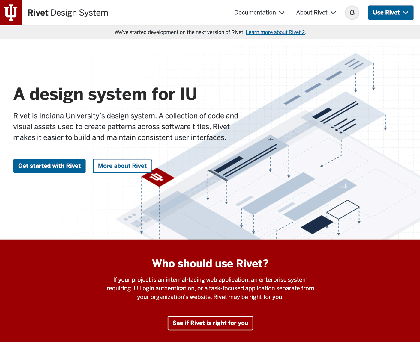
When we look at how Indiana University defines its design system, Rivet, they describe it as “a collection of code and visual assets used to create patterns across software titles [that] makes it easier to build and maintain consistent user interfaces.”
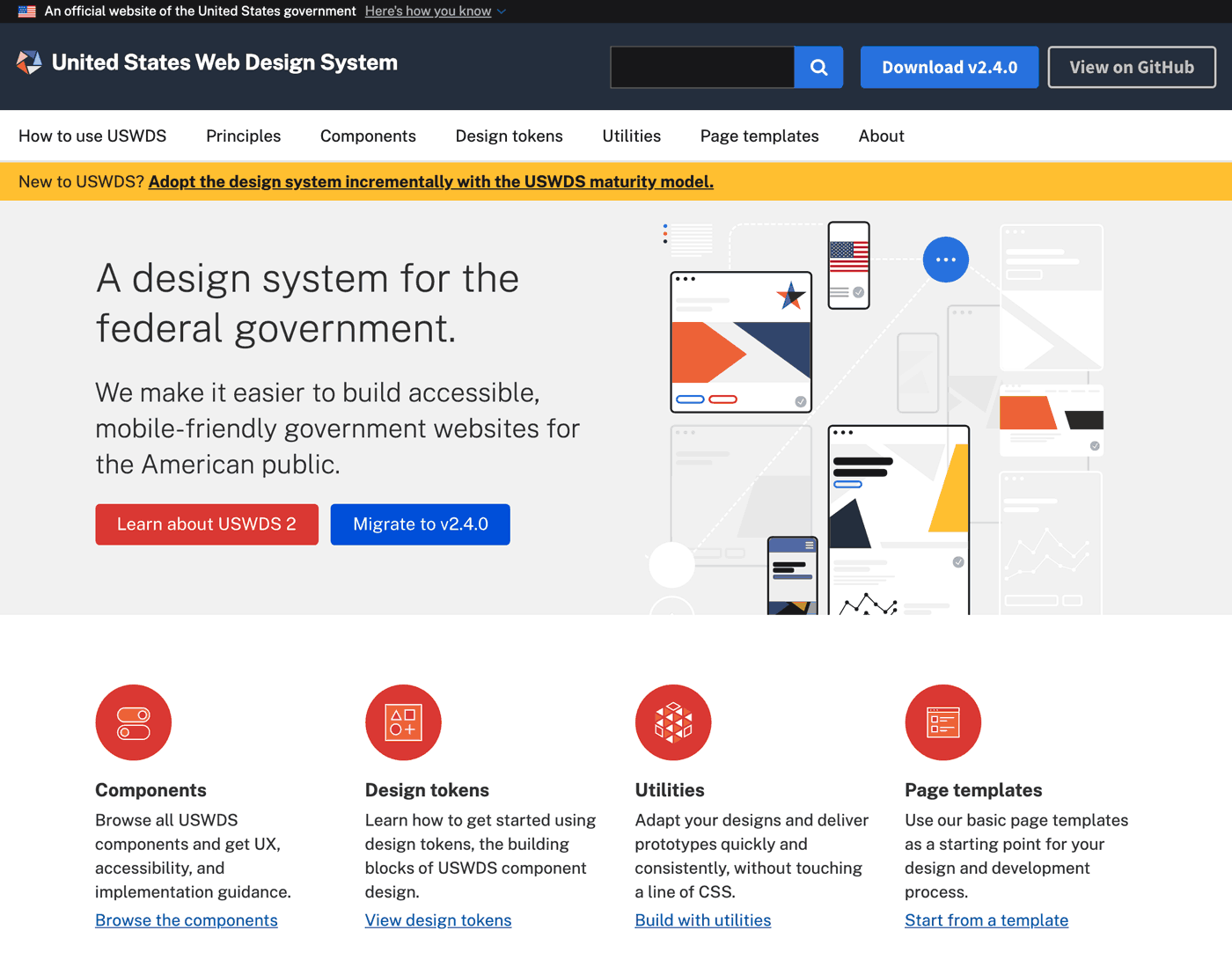
USWDS, the design system for the US Government, calls their system “a library of code, tools, and guidance to help government teams design and build fast, accessible, mobile-friendly government websites backed by user research and modern best practices.”
In each case, their emphasis is on creating systems that prioritize consistency, efficiency, speed, and collaboration. A design system can help your organization in the same way.
How Design Systems Help Nonprofit Communications Teams
At first, talk about managing design and setting up a system like this can seem like a lot. Especially for nonprofit professionals who might not be regularly involved in the design process. But fear not, brand and design experts in every part of the industry are working to make design systems a part of their standard process.
It’s about creating a set of visual, interface, and brand standards that entire organizations can use effectively. The standards will become a structure you can rely upon without too much manual intervention or back-and-forth with your team or freelancers. Design systems solve a number of problems for those in nonprofits and foundations: they create consistency, improve your team’s efficiency, and make it easier to collaborate and work together on design projects. Let’s take a look at what this means in detail.
They Create Visual Consistency
Over time, without guidance and structure, everything we design starts showing wear and tear. In design, that means inconsistent styles, colors, and templates creep in. We’ve all been there. But this ad-hoc management means that visual consistency will be hard to achieve, and even harder to maintain. The longer this goes on, and as more content needs to be looked through to find something that can be “repurposed”, the more chaotic it will get.
If you haven’t defined a standard upfront, it becomes a big challenge to keep things organized and consistent moving forward as you design new extensions of your brand. A good design system will give you some key patterns about your brand typography. These patterns describe a problem that occurs over and over again, in this case how headers and content work together. The description on how to use the pattern also helps frame how it achieves a purpose, and advances your mission as a mission-driven organization. These are most effective when we are creating digital experiences.
Nowhere does this show up more than in how brands use (or misuse) typography. Before considering images, logo, or color, choices around content have a huge effect on your brand expression. Offering both rules and reusable, pre-made components will help get started on a path to maintaining consistent typography.
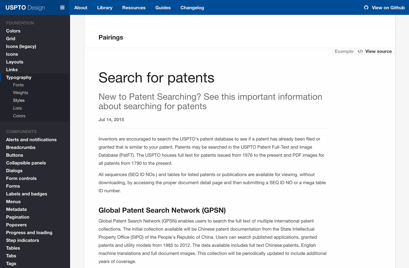
The U.S. Patent and Trademark Office User Experience Division has a Typography Pairings section, showing a full set of patterns for web typography. It gives their team guidelines on how headers and body copy should be paired on the screen, along with the ability to view the source code if necessary to communicate with a developer.
Imagine that a communications manager has just joined your team. Their first task is to put together a set of social media cards for a short report written by one of your subject matter experts. Instead of working with what they have, copying templates from older materials or looking online for something better, you send them directly to your design system for guidance.
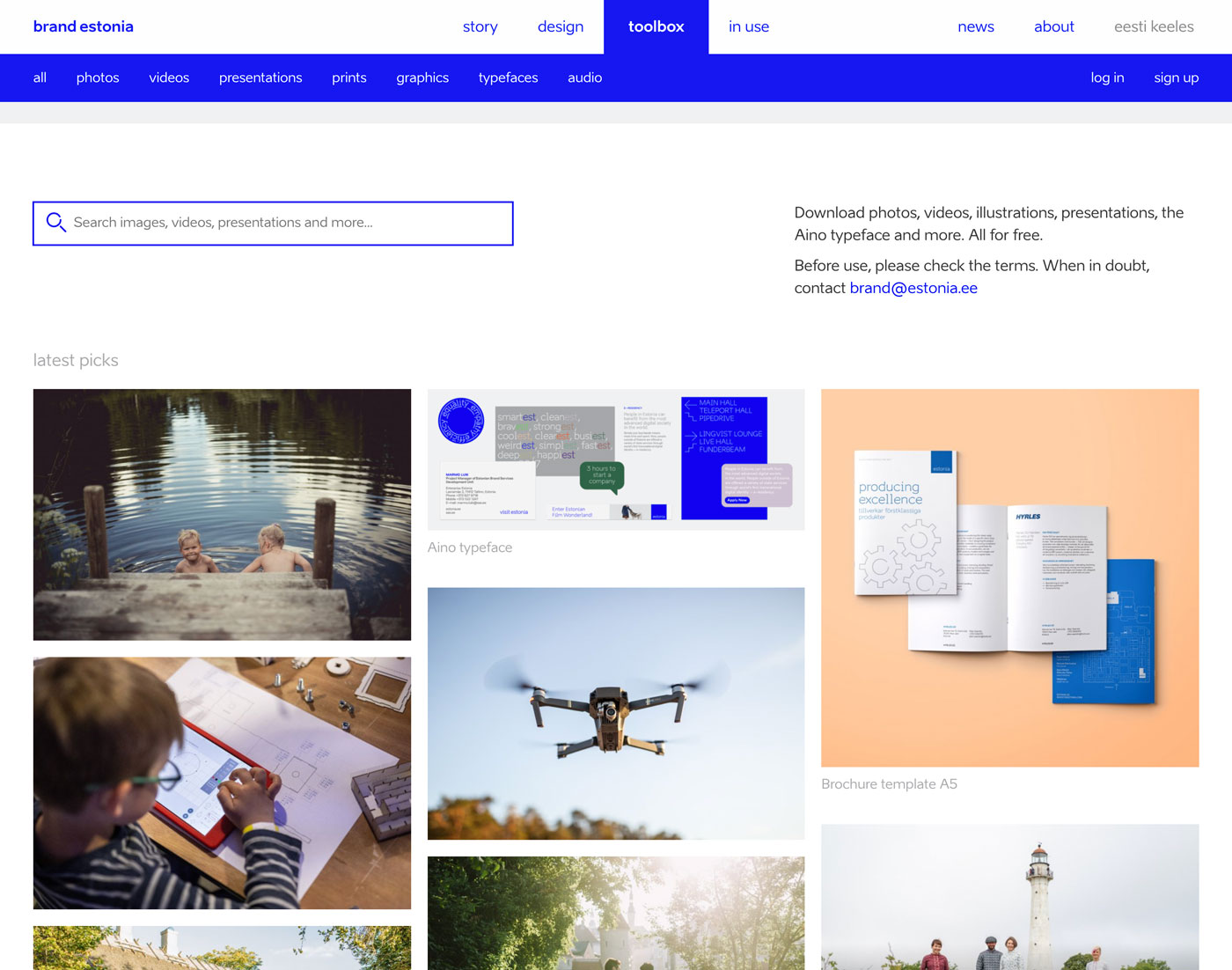
They find the set of social media templates and the instructions on how typography and images work together. They also find images that match the topic and add one to the template. They were able to go to a single source of truth, find assets that required them to be visually consistent, and quickly accomplish their task. The brand and design system for the country of Estonia does just that, offering its users a set of curated, effective images that can be used across all communications.
Over time, this same scenario can play out with other materials and other campaigns, building are reinforcing what your comms team is doing.
They Improve Efficiency on a Limited Budget
For nonprofits, limited communications budgets can (unfortunately!) be a common fixture, but it doesn’t have to result in poor design decisions. There are some clear ways to become more efficient with your design budgets and resources. Design systems help with this and help define rules for drafting microcopy—the text we commonly see used across web pages and interfaces.
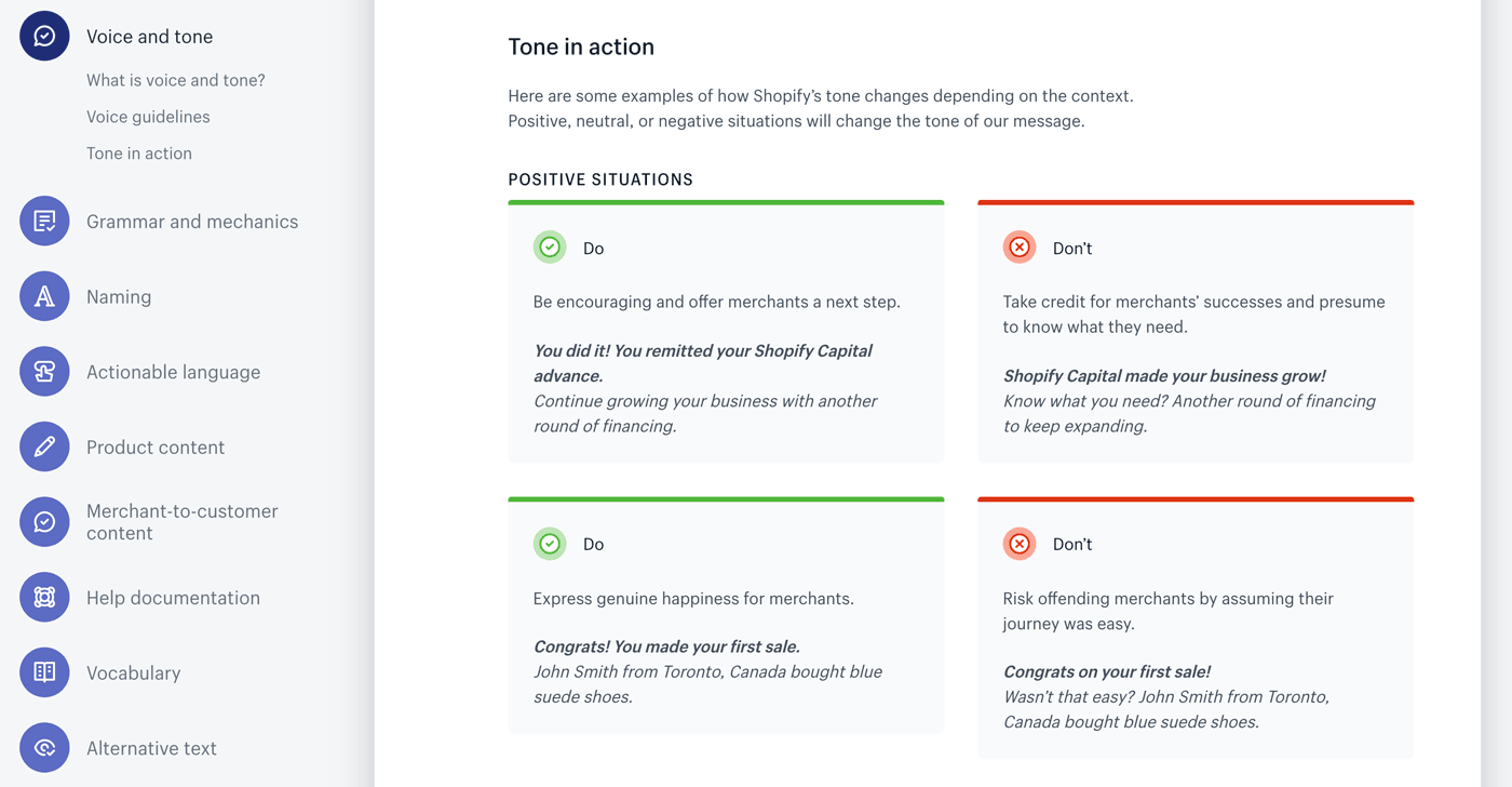
Shopify’s Polaris design system explores Voice & Tone in some detail. First, they offer the global principles (1) Confident, not Arrogant 2) Empathetic, not Overprotective 3) Transparent, not Blunt) that guide all the messages within their branded interface, and then they offer concrete examples of how positive, neutral, or negative situations will change the tone of their message.
A core set of reusable visual or content patterns for the web can be used to assemble digital experiences that are on brand and simple to create. Along with the guidelines and templates showing how they are to be used in practice, much of the guesswork is removed from your voice & tone, meaning decision-making is minimized and your budget can be preserved for other larger tasks. Each of these text components can be copy-pasted into an existing project.
Since entire pages or views can be generated with maximum consistency — and since design decisions are minimized — even people with little design background (e.g., admins or project managers) can test hypotheses with users before committing to large financial investments.
They Improve Collaboration
Another critical aspect of design systems is how they create opportunities for your team to work together. When making a decision about elements like copy or message, you want to disentangle them from conflicting styles.
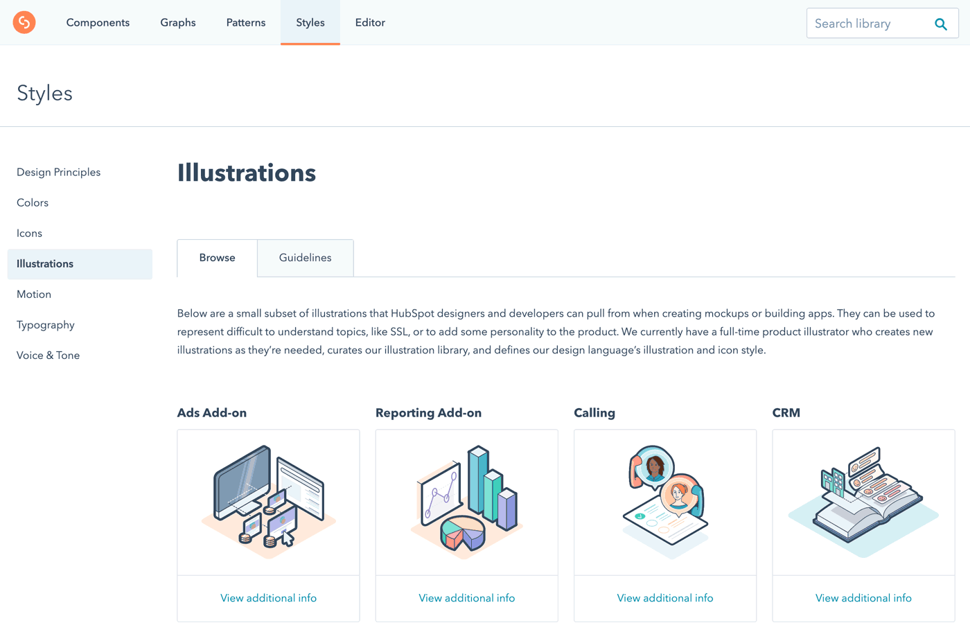
Design systems improve collaboration in two ways. Often, open-ended discussions of branding and design that take precedence over your communications strategies mean there is an increased burden of negotiation and feedback on your team. Design systems can standardize the ways you communicate and collaborate internally with your team, giving you more time to focus on getting those messages and programs out. A design system also means your team speaks to your audience with a unified voice. In the case of Hubspot, their design system is very clear about the types of illustrations to be used in their digital interfaces, and why it matters.
The Hubspot Illustration guide presents very clear information about the purpose and intended use-case of their illustrations. In the Guidelines section, they state what the organization wants, what they want to avoid, and when to use certain illustrations.
Secondly, this effective collaboration also extends to how you interact with your organization’s leadership. Showing them the design system you are using, and how your team is collaborating more effectively, helps them understand how it is making the team better and more cohesive.
A Shared Vision for Your Organization
Design systems are there to help you, not make your life harder. As the world gets busier and more full of competing messages, we all need to ensure our brands are visually consistent, that budgets and time are used efficiently, and that our teams have a shared set of rules and objectives when working together. The results of incorporating design systems at your nonprofit can be transformative—both for internal efficiency and external impact.
In the design field, we often hear the word “empathy” thrown around a lot. It’s especially important when designing nonprofit brands and designing nonprofit websites, because to be effective, nonprofit design has to connect with people’s hopes and aspirations. But what does design empathy actually mean with regards to achieving our project goals? By definition, “empathy” is the ability to be aware of and sensitive to the feelings, thoughts, and emotions of another. The ability to be empathetic is an innate quality we all possess. And when it’s employed in an office or team project, it can greatly improve the harmony of a group dynamic. However, while the essential need for design empathy might seem like a no brainer, putting it into practice with design work is often easier said than done. My experience designing the website for The Vermont College of Fine Arts drove home some lessons in best practices for design empathy for nonprofit brands.
As designers, the solutions we create cannot be self-serving, but instead must meet the challenges and goals of the client and end-user (e.g., the person or group of people who use the final product). Empathy holds us accountable throughout the design process. It forces us to evaluate and measure the effectiveness of the solutions we’re creating. When Constructive teamed up with the Vermont College of Fine Arts (VCFA) to redesign their website, the relationship had a comfortable fit from the start. We’re a team of brand strategists and designers, so working with a higher education art institution felt like a match made in heaven—after all, most of us were once art and design students ourselves! But as we soon learned, shared experience doesn’t give us cart blanche to make assumptions about their users.
While empathy is something I’d like to think comes naturally to me, sometimes we all need reminders and wake up calls. When we’re working with clients in industries less familiar to us—like education, law, or policy organizations—it’s easy to be empathetic. We need to test our assumptions because we know we’re not the experts in these issue areas. Working with VCFA gave me the opportunity to stretch my “empathetic muscles” and challenge my own art and design school biases and assumptions.
Along the way, our team (re)learned valuable insights about designing with empathy that Constructive has since woven into our design process. Here’s are 5 takeaways that really made a difference.
Tips & Tactics for Designing with Empathy
1. Keep an Open Mind
You might come into the room with a lot of knowledge and experience, but when you’re starting a design project it’s important to enter the conversation with an open mind. While we were working with VCFA, this was something I had to be acutely aware of because the start of a project is often the most exciting time for me. However, during this stage, it can be easy to get carried away with the magnitude of knowledge you want to contribute. Having received my BFA in Communications Design and Photography, I had a lot of my own thoughts about the “ideal” user experience and design system for VCFA. Yet while I could relate to the needs of the site based on my own experiences, I still needed to empathize with VCFA’s needs by asking the right questions and taking a backseat in conversation. By allowing the client to navigate the conversation with their expertise, needs, and desires, our team was able to begin developing UX and visual directions that started to fit what VCFA was hoping to accomplish.
2. Adopt Humility
During our early ideation and prototyping phases, our design team found itself spinning our wheels with a design direction that simply put wasn’t working. Sometimes it’s good to push the envelope, but in the midst of the prototyping phase, we were beginning to go down paths that weren’t on-brand for the client. We created systems that were more in line with how we defined “art school” or proposing unique ideas just to be “different.” In theory, these abstract design directions sounded strong, but in moving past the mood board and ideation phase these design systems began to fall apart. It took a heavy dose of humility to admit we needed to rethink where we were headed. This vulnerability ultimately instilled greater trust between VCFA and our team.
As cliche as this sounds, achieving great design is a process. It’s a lot of trial and error, and accepting that sometimes you’re going to be wrong or reach a dead end. When moments like this happen in the design process, it’s important not to get discouraged or be too steadfast in your initial approach. While unconventional to popular belief, my experience as a designer and working with VCFA has taught me failure is not always bad. It’s what you take away from those lessons and create in the future that matters more. After all, it’s better to fall forward than to stay stuck where you are.
3. Don’t Make Assumptions
While trial and error is inevitable, learning ways to avoid making assumptions creates an easier design process. In a 1990 study conducted by Elizabeth Newton at Stanford University, the phrase “curse of knowledge” was coined to explain the phenomena that happens when individuals unwittingly assume that other individuals can piece together and understand their logic and way of thinking. For example, a designer might assume their client knows how to use a program like InVision, which is a platform we use to review and annotate wireframes. Since the designer uses this program every day, it can be easy to overlook some basic functions that could be confusing to an unfamiliar client. Continuing with this example, if the designer never fully communicates the difference between a static (non-clickable) page layout and one that is interactive, the client might begin to formulate their own understanding of how interactions will function on their new site. As you can imagine, this could lead to major miscommunications and headaches down the road.
To avoid this, it’s important to test assumptions through user testing or prototyping. In other words, as you create design elements or aspects of the website, you should test your assumptions and interview your client (and/or end-users) to make sure every design decision is meeting their needs. Taking this approach allows us to keep healthy checks and balances on our ideas in relation to the overall health of the project. After all, when all the information is on the table there’s no more room for assumption because everyone understands the end goals and together can work on meeting them.
4. Actively Listen & Observe
When things weren’t working with our original designs for VCFA, we took a step back to revisit our notes from past conversations with their team. Sometimes going down the wrong path in a design project is the result of not listening well. But sometimes, as in this case, it’s because we’re following through on the wrong observations.
Moving past our assumptions, we realized that in many ways VCFA’s existing brand and design system were a solid foundation for us to build from. And before you ask “wait, why didn’t you start with that?!” We did. But at first glance, the brand was not modern and not communicating the vibrancy of their school’s experience. When we took a closer look at the intent behind their current brand, we found elements of a design system that could be emphasized in their new identity. It was hard to tell on their existing site, but VCFA had started to turn these elements into a design system of colored transparencies, overlapping images, and elements that broke out from a grid layout. It took time to realize we didn’t need to reinvent the wheel. But once we did, we had a much stronger foundation from which to build a brand that ultimately helped VCFA reach their larger goal: to effectively reach out and communicate with prospective and current students.
When empathy enters our design process it becomes easier to actively listen and observe because understanding the client’s needs becomes our sole focus. VCFA came to us seeking a design refresh that provided a better reflection of their growing student and faculty needs, as well as a more effective way to promote their programs and navigate their site. In addition to managing the client’s expectations, our final benchmark of success was our measurement of how well we understood the end-users’ needs. In an empathy-driven process, when the client is working to serve the end-users, the end-users become the “other client” in the room. By actively listening and observing what both parties have to say, we can create solutions that more effectively meet everyone’s needs.
5. Genuinely Care
At the end of the day, our team was committed to creating the best product for VCFA, and VCFA was committed to collaborating with us to get there. When you genuinely care about solving your client’s challenges, you’re able to invest more time and energy in getting through the inevitable highs and lows of a project. It’s important to remain patient with the process because genuine and vested interest might not happen right away. It takes time to build trust and create a mutual understanding between a creative team and a client. In order for this to happen successfully, a designer should spend time to get acquainted with the client’s work, who they are, their missions, values, etc. When a project is approached from this angle, you’ll naturally find impactful solutions are the ones that keep empathy in mind.
Designers, It’s Your Turn to Put Empathy into Practice
Practicing authentic empathy and then utilizing it in your workflow takes time. Luckily, there are a lot of great resources and tips out there on how to cultivate empathy on your teams, in your projects, and in your workflow. There’s no algorithm for practicing design empathy—that’s what makes it so great. With enough practice, you’re bound to find the strategies that work best for you.
Internet connections keep getting faster and faster, allowing sites to load almost instantly. In spite of these higher speeds, there can be instances where a page takes nearly a minute *gasp!* to fully load. Page load time is still a crucial aspect of your website’s build. If your page loads slowly, you’re guaranteed to lose visitors from your site.
Imagine this scenario: after months of hard work, your communications team is ready to launch your organization’s new website. It’s well thought out, ticking off all of the boxes from good UX to being accessible to users with disabilities. You’re excited (and maybe a little bit nervous) to see your colleagues’ reactions throughout the organization. You get lots of positive feedback, and everyone compliments the new design and structure. The launch is a success!
For a couple of months, things seem to be going well. You track visitors to your site and the numbers are up. Sooner or later, however, the honeymoon period ends. You start to notice the numbers drop off. You return to your beautiful site with critical eyes and realize that it loads pretty slowly.
Startled as you may be, slow load times are not inevitable! Everything from the images on your site, to the way it was built have an impact on your website’s performance. Here’s how to address the issues that might be slowing down your site, and ultimately, drive traffic numbers back up.
5 Ways to Boost Site Performance: From Crisp Images to Stray Javascript
1. Set a Performance Budget for Your Site
When it comes to page load time, think of a user’s connection like a pipeline. Only so much data can flow through the pipe before it becomes clogged. A bigger pipeline, or better connection, allows more information to flow through and for a page to load faster and vice versa. This is how your performance budget should work. Like a financial budget, a performance budget is the baseline maximum amount that you set for a page’s total content size. It is the highest amount of information you are willing to let pass through any given pipeline.
Since load time varies widely depending on different pipeline sizes, you should try to optimize your site so that the data can fit through the smallest pipeline that users may be taking. These days, more and more users browse mainly using their phones, therefore we should optimize websites for a 1.6 Mbps connection, or Mobile 3G Fast connection.
Your site should take about 10 to 15 seconds to fully load. This performance budget tool helps you to calculate what your budget is for line items such as images, CSS, and Javascript. This will give you a max file size to work toward when making adjustments to your site.
2. Use the Right File Types for Your Images
Now that you’ve determined how much budget you have to work with, you can review the images that you are using. There are many ways that you can save an image: JPEG, PNG, SVG, GIF, but which do you use?
PNG: Vector-focused, simple photos with less colors
GIF: Text-heavy images
JPEG: Anything with a lot of photos or colors
SVG: Text (If not live-coded), logos, icons
MP4: Screen recordings & video
WEBP (optional): WebP is an image file format that is smaller than regular JPEG and PNG files and can help you save on your bandwidth budget, but are not compatible with some browsers. If you do use them, you’ll also have to ensure that JPEGs and PNG files are available for browsers that do not support WebP images.
[contentupgrade id=”5606″]
3. Reconsider Redundant Images
Do you have lines, circles, or squares on your site that are loaded as SVG images? Samples of typography that are loaded as JPEGs? Laptop or tablet mockups to show how an app works? Background colors added as an SVG?
HTML, CSS, and Javascript can be used to create a log of these design elements. By eliminating the use of image files, you can reduce the amount of information that needs to flow through your pipeline in order for your page to fully load. As a result, you’ll significantly reduce load time. In turn, you can make your website feel more dynamic since coding these visual elements allows you to add animation to them.
To make this feel more real, check out this case study for our work with Unbounded. See the colored quote boxes throughout? We’re in the process of changing those elements from static images into live text boxes built with code.
4. Incorporate Flex & CSS Positioning
When using HTML and CSS to create elements of your website, Flex and CSS Positioning are powerful tools that allow you to create interesting layering and parallax effects without the need to load heavy images. Flex is a CSS property that defines how elements of different sizes stack and align. CSS Positioning is a set of CSS Properties that manipulates how elements on a page are positioned, relative to each other.
Let’s imagine you were designing a portfolio site. Without Flex and CSS Positioning, you might be forced to export a large full-width image to show a group of three overlapping objects. Flex and CSS Positioning allow you to improve load time. It does so by first breaking the larger image down into three smaller sized image files. Then, it uses the available CSS Positioning properties to place the images relative to each other and skew them to the left, right or any other direction.
5. Inspect Your Site for Faulty Code
It’s great that you have started utilizing more HTML, CSS, and Javascript to create your site. Things function smoothly and still look great, but under the hood, you have to make sure the machine is well-oiled. In the same way that images are loaded and take up some of your budget, we need to allot some of our performance budget to loading code.
Work together with your web developer to make sure there is no erroneous code floating around. For example, a lot of people build websites using a WordPress template builder. These templates allow you to create a site rather quickly but sometimes they create multiple CSS and JQuery files in the process. Some of these builders will also add miscellaneous white space in the code that increases file size. The good news is you can work with your developers to identify these files and minify them, or combine multiple files of code into one file. Minifying the files will reduce the file size, decreasing the chances of your pipeline getting clogged up.
There’s Nothing Stopping You Now!
Follow these steps and you will be able to keep the data flowing quickly through the pipeline. Images are both a blessing and a curse. By knowing how to set the images up and serve them to your users, you can create a rich experience that will bring visitors back to your site and keep them there.
We talk to a lot of folks at nonprofits who aren’t happy with their organization’s website. Usually, the site is failing to connect with audiences and accurately reflect who they are. Oh, and in almost all cases, it looks dated and stale. As a result, organizations sometimes ask us to “refresh” or “reskin” their website. In other words, they want the design of their site updated so it looks more modern, but want the existing structure, navigation, and technology to remain in place. While there’s nothing wrong with wanting your site to look better, asking for a design refresh like this can be a band-aid fix for much deeper problems.
Every website is built on four foundations: brand, design, technology, and content. If your site isn’t performing, you need to invest in a redesign that takes all four of these elements into account—assessing how each serves your users’ needs and impacts their experience of your website. Why? Because on average, users only spend 10-20 seconds on a web page before they leave, and according to a 2006 study, they can develop an opinion of your organization after as little as 50 milliseconds of being on your site. That means it needs to make a good impression on all fronts quickly, or else you risk losing potential advocates. If your website has been “refreshed” to look modern, but users still can’t find the information they’re looking for, they’re not likely to stay interested for long.
“Okay,” you’re thinking, “that’s all well and good, but what if I don’t have the budget for such a big overhaul right now?”
Start with something you know. Content is one of the most important elements of a good website, and if you work for a nonprofit, chances are you and the people around you are adept communicators. So why not rewrite the content on your website? We like to call it content design—and we offer it as a unique service—because the way you write, format, and structure the words on your is site should have as much intention behind it as visual design. This quote by designer Jeffrey Zeldman says it all: “Content precedes design. Design in the absence of content is not design, it’s decoration.”
In fact, if you know your organization wants to more fully redesign its website in the future, getting your hands dirty with content now will give you a good understanding of what’s currently on your site, and in what ways it might be falling short. So if your site’s visual design isn’t compelling enough to make a quick impression, and you don’t currently have the budget for a full redesign, try putting your communications skills to work by redesigning your website’s content. Here’s how:
Before you Start…
First off, you’ll need access to and familiarity with your website’s content management system (CMS). If you’re unfamiliar, most CMS’s offer tutorials for making changes and open source platforms like WordPress and Drupal have plenty of educational resources.
Assuming you’re good to go there, you’ll want to start prioritizing your content. Rewriting the content of your website is no small feat, especially if you’re dealing with a large, information-heavy website. Start with the pages that users visit the most: your homepage, your about page, etc. If your organization tracks analytics, even better! You can check which of your pages are visited most and add those to the high-priority list.
You’ll also want to gather a team to help rewrite the content. Try to choose staff who work in different areas of your organization, with varying areas of expertise so the content is as accurate as possible. Just make sure that one person is tasked with being the final eyes on content, and is responsible for entering content into the CMS. That way, you can better ensure that the content voice and style across pages stays consistent. We typically recommend using a spreadsheet like this one to keep track of the process.
Know Your Audiences
A clear understanding of audiences is the key to determining how you should write and present the content on your site. Who are you writing it for? Keep in mind that this will likely vary page by page.
When your team is prioritizing the pages to rewrite, it can be helpful to note which of your audiences will be frequenting each page. If you’re an organization that provides emergency health services, for example, a ‘Get Help Now’ page would likely be most commonly visited by clients. Think about their content needs when they visit this page of your site. What do they need to know? What content is most important to them?
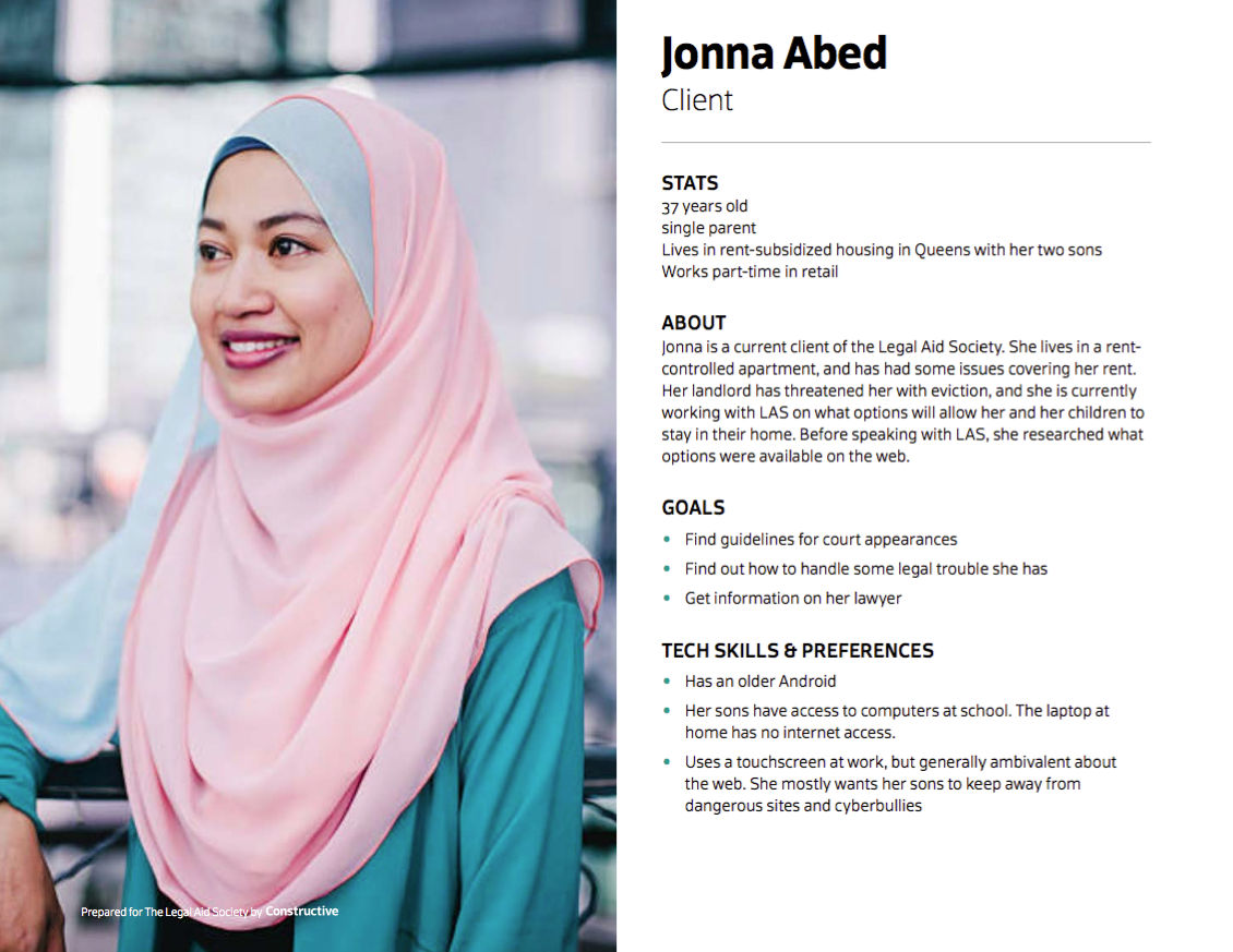
When we work with clients, we conduct surveys and interviews to learn about an organization’s core audiences. From there, we extensively research those audiences in order to build out in-depth user personas to guide the information architecture, content strategy and visual design of a site. Here’s an example persona:
Scannable Content vs. Long-Form Content
Have you ever stumbled upon a webpage with large blocks of dense text and thought “Wow, this looks SO interesting! I can’t wait to read it all!” If you’re like us, probably not—you’ve likely found it daunting!
One of the simplest ways you can make your website more effective is by breaking up large, dense blocks of text whenever possible. In other words, stop writing so much! This holds especially true for more general landing pages, like your homepage and about page. These pages should be easy to scan, so users can quickly understand who you are, and then learn more by digging deeper into your site.
One of our favorite books on this topic一appropriately named Content Design一details the ways in which the human brain reads and processes text. Spoiler alert: we’re not really reading every word. In reality, people only read about 20-28% of a page’s content online. We look for patterns and words we understand in order to comprehend content as quickly as possible. You can nerd out more about how people read online here, but suffice to say that the less words you can use to inform a reader, the better they’ll retain information and the more interested they’ll remain in exploring your site further.
When users take the time to explore your site deeper than overview pages, you can and should display long-form content, like published research or program descriptions. Such content doesn’t lend itself well to being shortened, so don’t stress yourself out thinking all the content on your site needs to be scannable. While design is a key asset in making long-form content like this more digestible, there are also some content design techniques you can adopt to maximize engagement with this more complex content.
The main takeaway here is that by making the more general pages of your site quicker and easier to read, you increase the likelihood that users will be more interested in reading your longer-form content, learning more about your organization in the process.
Formatting for the Win
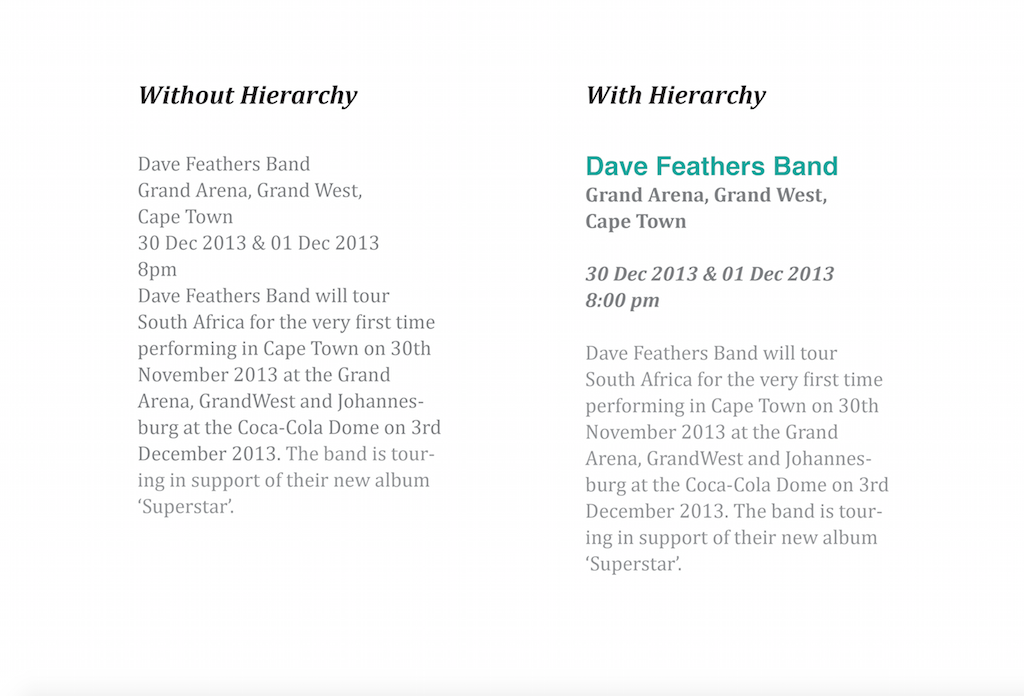
Rewriting and trimming down your content will only get you so far. Without proper formatting, the text on your site might still be difficult to parse through. By establishing typographic hierarchies, you can establish an order of importance for your content with different text sizes, colors, and/or emphasis. This makes it easier for readers to quickly skim and digest your content. Plus, when text is properly formatted, it encourages users to read more, and engage more deeply with the rest of your site.
Don’t believe us? Here’s an example that makes the power of formatting pretty clear. Which content block is easier to digest? For more tips on writing and formatting for the web, check out our complete guide.
Via Kaboom Design
Incorporate Hyperlinks
Once you’ve revised and reformatted your content, you’ll want to make sure users can find all that great information you worked so hard to redesign. By incorporating hyperlinks into the content of various pages of your site, you can encourage users to explore more of your work in different areas of your site. For example, if someone is reading your programs page, they might also be interested in reading some client stories, annual reports, or learning about ways they can volunteer. Have you noticed us using hyperlinks throughout this article?
To Conclude
By now, you should have all the tools you need to start redesigning the content of your website. Of course, content alone won’t fix all your website woes. Brand, design, and technology are equally important elements of a great website. But addressing content concerns will help make the information on your site more digestible, and increase engagement with your audiences as a result. Plus, the more you work on your content now, the better off you’ll be when you secure the budget to begin a full website redesign project.
Great content is essential to helping people understand the issues that nonprofits work on, particularly policy and advocacy nonprofits and research institutes that work on complex, systemic challenges. And this content is usually sophisticated, nuanced, and….long. Which can make it really inaccessible for most audiences. Unfortunately, the way this important content is designed in content-heavy nonprofit websites contributes to making ideas less accessible, which can make audiences uninterested in engaging—and as a result, undermine change. So, when a nonprofit’s content cannot be simplified without compromising it, how do we keep people engaged with our ideas and get educated on the issues? Turns out good design is a writer’s best friend. Because sometimes the best content strategies aren’t about the words you use, it’s how you use them. Or better put, it’s how well you design content-heavy website experiences to keep people engaged for longer online reads.
It’s a core belief of mine that for any nonprofit whose mission hinges on providing perspective and thought leadership on important social issues, if how their content is designed isn’t on par with the quality of the nonprofit’s expertise, then they’re just cheapening their work. But don’t just take my word for it: research has proven that design has a significant impact on credibility. People come to quick conclusions about an organization while visiting their website—and (sorry, designers) audiences ultimately come to websites for the content.
But design matters. A lot! For nonprofits like think tanks and research institutes whose missions are advanced by producing and sharing knowledge, the design quality of their content says a lot about what audiences can expect from it. With more content just a click away, if that design does not hold up, audiences will likely leave and find other places to get the content they want.
So, whatever content your nonprofit publishes, content design and time-tested editorial design techniques hold the keys to success in engaging audiences online. Thoughtful, strategic design allows nonprofits with content-heavy websites to communicate clearly and effectively—encouraging audiences to visit, engage with our ideas, become educated on issues, explore more, and most importantly, act. We’ve talked about the key principles for effective content-heavy website design before. Now let’s look at these content design strategies put into use in your nonprofit’s website.
Designing for Different Types of Content-Heavy Nonprofit Websites
Complex Academic Language and Text
Academic language and research can often contain complex words, sentence structure, and ideas. While it’s good practice to reduce jargon in your nonprofit website to make it more accessible, nonprofits like think tanks and research institutes advance work that is oftentimes geared toward academics, scholars, scientists, and government officials. So, knowing that your audience may be more comfortable with complex language, we can still analyze the complexity of our content. Use The Flesch-Kincaid Scale to measure how difficult your nonprofit’s content is (in English) by measuring its readability score and grade level. For example, it seems appropriate that The New York Times is about a 10th-grade (US) reading level, offering insight into how its editors tailor their content to reach a wide audience.
However, not all the content we put online is meant to be read at an easier reading level, especially in the world of research and policy, where content is often quite academic and complex in nature. This can mean larger words, scientific context and charts, and other dense, scholarly material that expert audiences need to access. For example, this introductory text to a report preview on a website Constructive designed for ClimateWorks Foundation comes out at a grade of 17 on the readability scale.
ClimateWorks’ content is most appropriate for people who read at a post-graduate level. That’s pretty heavy reading, especially for a single paragraph! But in speaking succinctly to the expectations and sensibilities of expert audiences, we establish an accurate, compelling preview of what the reader can expect as they explore further. This creates a better user experience that strengthens the brand. In cases where your content is going to be complex, then it’s a good idea to lean into it—specifically by making sure your nonprofit website’s SEO is attracting people looking for that valuable jargon!
Bibliographies and Linked References
Even when reports and research are specifically written for the web and published in smaller chunks, it’s still important to cite sources by including bibliographies and references. In historical reference sites or research pages, we can see long sections of links and bibliographic text. While the more casual reader will skip over this, researchers, managers, and analysts not only need to access this material, but they may also judge the credibility of the content they’re reading based on what they find here. They have their own papers and content to produce as well, after all! The bibliographic listings on the Qatar Digital Library do a great job with this.
Open, Diverse Tagging and Grouping Systems
Often, the more complex digital content requires more complex tagging systems. Overly complicated tags can be difficult for any team to manage in a CMS and fiendishly difficult for your audience as they browse your site. In a paper about tagging and usability, HP stated tagging is fundamentally about sense-making, a process in which information is categorized, labeled, and meaning emerges.
There are a few ways to bring this meaning to the surface clearly on content-heavy websites by using proven interaction design patterns and applying them to a broader UX design strategy. For example, our search features can intelligently display suggested results as users type, letting those complex tagging systems work their magic in the background.
Typographic fundamentals of spacing, proximity, and rhythm can create visual relationships between tags and key text. When we arrange tags near content, we make the entire site more easily scannable and heighten reading comprehension. Most importantly, open and clearly designed tagging systems help the audience get a good idea of the types of content on the site, and then select a topic or category to read more about.
Visually Grouping and Reusing Text
In content-heavy websites, it’s crucial to establish context and help audiences find and explore content related to their interests. As a designer, it’s my job to create greater meaning from separate or discrete pieces of content by stringing a connective thread across a user’s experience at a website; we do this by grouping those pieces together in a process called “design chunking.” In the higher parts of the site, such as the homepage or section hubs, this means designing elements like “teaser” blocks and planning to add short titles and intros to pages with longer titles and more dense content.
It’s important to standardize what these teasers look like, creating a small design system for them. This gives our audience a very good idea of what they will find when they tap one of the teaser blocks and navigate to a page. In order to do this, I reference my design system and typographic choices, unifying similar content and text styles. I keep elements like dates, tags, and author names very similar across the entire site. I want to make sure the audience has a visual pattern to understand – once this has been established, the content becomes more visually aligned with the knowledge it contains.
Provide Breathing Room
With the amount of text and links on these content-heavy websites, the human eye needs a place to rest. Too much content on a page overwhelms the user and means that nothing is readable, a sure way to force your audience to click away. This is where open or white space becomes important to the site experience. By interspersing the content groups we looked at above with open spaces, we increase retention, clarify relationships, and make sure they are visually eye-catching. This is especially true for complicated or technical subject matter, like in this example from academia.edu.
Design-Linked WayFinding Systems
Even after visually grouping content and designing effective white space, we are still left with sites that have a lot of pages and content. Working with knowledge-driven organizations, that is a common challenge. One of our key goals is to design a meaningful path for audiences to follow as they navigate around these sites. These paths, often called wayfinding systems, are the same as what you might find in a large museum or tourist-friendly city. They operate the same way, too.
Digital wayfinding patterns focus on the main menu, breadcrumbs, faceted navigation, search bars, and clear site links in the footer. Dennis Kardys calls this network of available pathways the circulation system. If there is a chance your audience will get overwhelmed in content-heavy website, designing a clear wayfinding system saves them time and energy. It’s an extra layer of context that we deliberately design for, giving your audience a memorable experience as they navigate and read through dense content. Careful design choices in the main menus and navigation of a site elevates the brand in the eyes of your audience, making the site a credible place to revisit and learn from.
Wrapping Up Best Practices for Content-Heavy Nonprofit Web Design
Design plays an essential role in the readability and, therefore, the reach of a nonprofit’s content online—especially when it’s dense research or policy. So, when designing nonprofit websites that are filled with lots of text and dense content like policy reports, issue briefs, and tool kits, be mindful of how much information a person’s eyes can take in and make the experience effortless.
Thoughtful visual and UX design enables us to discover ways to present dense content clearly and effectively, encouraging our audience to visit, download, and read what we have to offer. Simple best practices like clearly grouping items, designing open, accessible tagging systems, and making sure that navigation and wayfinding promote easy exploration will make your nonprofit’s website—and, therefore, its ideas—more welcoming and engaging.