User Acceptance Testing, or UAT, is the phase of a website redesign project where the people who will actually use it in the wild get to test it out and accept it before “Release” or “Go-Live.” It goes by many names, depending on whether you follow one formal methodology or another, but the basic idea is always the same: this is the last push, and the last chance we have to prepare for Launch. UAT is a critical part of every project, and one that I’ve seen many clients struggle with – more than any other phase of the project. Whatever your process, whatever your style, the knowledge and understanding of these five “Facts of UAT” could mean the difference between having a very positive or a very, very unpleasant experience as the project winds down to a close.
1. The product will not be perfect!
This is a “first draft” of your website and content management system, and now we’re in Editing mode. Software is a fickle and complex medium. Every new system has bugs, just like every new manuscript has typos. This process is designed to root them out and fix them before we can call the thing done.
2. Procrastination will not serve us well
In the beginning of this project we allocated a certain number of weeks for testing. I assure you, we will need them (All of them). Referring back to point #1 above, this process is designed to root out issues and fix them before the site is launched. The deeper we look, the more issues we’ll find. The object of this game is to find and fix all of bugs within a specific amount of time. Dominant Strategy says that instead of easing into it, you should dive as deeply into the system as possible, as early in the process as possible, thereby maximizing the time we have to address the found issues. The later a problem is discovered, the more likely it is to put the entire project at risk.
3. This is not the time for design improvements
In the course of going through the site, new ideas will be had. Changes in functionality will be desired. The whole thing may feel a lot like previous iterations of information architecture or prototype testing, where the goal was to adjust and refine the design. But UAT is not the time for add-ons or design improvements. We’re validating and verifying adherence to an existing, agreed-upon design. I know the idea of further refinement is tempting, but that’s exactly how deadlines get missed and budgets blown. Only the features defined in the approved IA and Specifications documentation should be expected. Everything else can still happen! Just not right now: right now, we’ve got a deadline to meet.
4. Communication is Critical
But you knew this already – or at least you thought you did. Now you’ve been testing all day. You’re opening tickets, you’re retesting, you’re closing tickets. You’re like a machine! There’s no time for definite articles! “Charts not news page,” you furiously type into the description field of our issue tracking system, moving steadfastly onto the next test without even pausing to congratulate yourself on finding an obscure but critical bug.
Unfortunately, we have no idea what “Charts not news page” means. If we had any idea what you were doing when you typed it, or what page of the site you were on at the time, or any context at all, it might make perfect sense to us. But right now, we’re kind of scratching our heads. We ask you for more information, which to you is obvious, and you begin to feel like we’re passing the buck. We begin to question our own sanity. No one is happy.
I know this sounds very specific, but I have seen this scenario play out literally hundreds of times over the course of my career, on completely different projects, between completely different people, across a wide range of organizational structures and cultures. The bottom line is this: be thoughtful about the level of detail you include when reporting an issue. Take the time necessary to explain exactly how you came to discover this issue and what part of the design/specifications it conflicts with.
5. UAT is a real bummer 🙁
Look, I’ll be honest with you. User Acceptance Testing is probably the least fun part of this whole software development process. Unlike the honeymoon phase of Discovery & Planning or the excitement and creativity of User Experience Design, UAT requires us to dial back our ambitions a bit, and start driving the thing home. We must carefully manage scope, or run the risk of “Beta limbo,” where we are forever creating and designing and enhancing, never quite achieving some vaguely defined ideal of perfection, and thus never enjoying the satisfaction of actually launching the website and putting all of the great work that’s already been done out into the world.
After weeks of intentionally focusing on flaws and suppressing the impulse to be creative, what mortal wouldn’t be discouraged? Just try to remember: your new site is closer to launch than ever, and almost no one who sees it will ever know about the bugs you’re finding today. If that doesn’t help with perspective, try taking a break from testing and browse around your current/old site for a little while. I guarantee you’ll start to remember all the great improvements the new site represents. 😉
Building something you can be proud of takes vision, dedication, and elbow grease. Getting it out the door takes focus, compromise, and a little bit of faith. Approach the UAT process with these things in mind, and before you know it we’ll all be basking in the glow of a wildly successful site launch.
Or are there people who roll their eyes at the mention of the project, or just don’t care at all? Your project has a much better chance of success if everyone impacted by it is involved and interested from the get-go. Here are some tips for mobilizing your stakeholders and turning them into important allies.
Engage Early, Engage Often
Imagine this: A friend or family member comes to you and says, “We should take a trip together this summer.” You say, “Oh, that sounds nice…”, but instead of brainstorming about where you might go, how long you might stay, and what you might do, your friend says, “Great! I’ve already booked us two flights to Mexico. We’re staying for the first week of July at a hotel about a mile from the amusement park, and my sister and her husband are coming, too.” Are you more excited or less excited about the trip now? Maybe you love Mexico and you know and get along with these additional people, and maybe you happen to be free that whole week and the budget is perfectly fine. But more likely, you would have preferred to have been involved in the planning at least a little bit.
Even if you have a clear picture in your mind of what the new website should be and what problems it needs to solve, chances are that most others at your organization have ideas about it, too. That doesn’t mean that you need to run the project like a pure democracy and end up with a product that fairly represents every opinion. (In fact, that’s a great way to end up with a TERRIBLE product!) But it does mean that before getting too far ahead in the planning process, you should reach out to all stakeholders to get their perspective. This can be done informally through conversation for smaller organizations, or for larger groups, use SurveyMonkey to set up a free online survey whose responses can then be downloaded as an excel spreadsheet.
Always Be Transparent (even when the news isn’t good)
Is the project running late? Is there not enough budget to achieve all of your most ambitious goals immediately? Don’t be afraid to tell people. Every project has its challenges and derailments. It’s how you react to and recover from them that people will remember. If communicated thoughtfully, disappointing news can help pull stakeholders together and result in valuable suggestions and feedback from your community.
Sharing bad news is a lot easier when you have a mechanism in place for sharing news in general, so set up a communication plan for the project that has transparency built right into it. For example, you could post a weekly or monthly status report written for general audiences that’s posted on your organization’s intranet, or even just stored as a document on a shared server somewhere that everyone can access. Make sure every iteration includes sections for what’s been “Accomplished,” “Goals for Next (Week/Month),” and “Challenges.” Your Challenges section should ALWAYS have something in it, even if it’s just anticipating how things might go wrong and what mitigating steps or preparation is being done.
In addition to that passive step to keep the project transparent, you can also actively send an email or post a memo that explicitly asks for feedback/ideas about specific items. And then the hard part: Follow Through! Did you end up implementing someone’s suggestion, or were you inspired by an idea somehow? Let them know! Even if it was something that was already planned before they mentioned it, letting them know that you heard them has an enormous impact on people’s willingness to support and participate in your project.
Tailor Your Approach
You’ve probably already broken your stakeholder list down by “type,” identifying project owners, subject matter experts, different types of customers, and so on. But there’s another set of categories that can be helpful to keep in mind informally, and tailor your communication as follows:
- Cheerleaders: If you’re lucky, there will be some people at your organization who are THRILLED that there’s going to be a change. Recruit them! If they don’t happen to have role that formally involves them in the project, ask if they would be willing to to serve on an informal committee to help communicate about the project to your wider audience. The more people that are talking about the project with genuine enthusiasm, the better. Optimism is contagious.
- Naysayers: Unfortunately, pessimism is contagious, too. Naysayers are best met head-on. Have an honest and direct conversation about their concerns. Usually one of two things happens: One possibility is that they reveal legitimate red flags about a project, or shed light on an area that will need attention if the project is to be successful. If so, that’s great! Turn a Naysayer into a Cheerleader by recruiting them to that area of the project, as formally or informally as circumstances allow. The other likely possibility is that they fear the change that this project represents, which is normal and understandable. The solution to this is education— what does their job look like when this project is done? How will processes change, and what do they need to know to be prepared? When you can’t imagine how the world will work after an expected change, it’s human nature to anticipate the worst. Help them to envision the new reality, and fear will begin to dissipate.
- Ostriches: These are the folks who will be impacted by the project, but don’t want to know anything about it. Sometimes they’re actually naysayers who are too polite to reveal themselves as such. Pose as many questions as you can to this group to get them thinking and talking. For example, “Did you know you’ll be able to schedule a blog post to publish in the future with the new site?” or, “What’s the most challenging part of your job right now, and is there a way we can leverage technology to make it easier for you?” Ostriches often need a little help getting the wheels turning, and then will start to fall into one of the two groups above.
Recruit Quality Control Worker Bees
You can never do too much User Acceptance Testing! Once you’ve moved from a place of requirements gathering and design into validation and testing, keep the momentum going with your stakeholders by inviting them to participate in User Acceptance Testing. There are two ways that anybody who knows how to use a browser can help, and you can modify the type of involvement you ask for based on each person’s strengths and availability:
- Follow Test Scripts: This usually requires a bit of a time investment, and requires following step-by-step instructions for how to achieve some kind of user goal or complete a transaction. (You have been creating test scripts throughout the design process, haven’t you?) Try to assign test scripts that are relevant or interesting to the person testing, and be mindful of how much time they have to dedicate. If you can schedule a meeting and have people in a conference room with laptops, you’ll get focused attention and better results overall than if you ask people to squeeze testing in at their desk in between their actual jobs.
- Explore the Site: For those who can’t dedicate the time to executing formal test scripts and documenting any issues that arise, it’s always a good idea to allow some testers to move through the site without a clearly defined structure or path of action. The kind of feedback you’ll get from this type of testing is a bit different: you’ll find that some areas you thought were well-written are actually a bit confusing when seen by a user for the first time, or you may hear lots of ideas on how a page or function can be improved. Take all non-critical feedback and form a list called “Phase II Considerations,” and use it to start conversations about the next phase of your project.
Overall, don’t underestimate the level of time and attention it takes to keep people informed and invested in the project. It isn’t always easy to get people on board with something that isn’t in front of them every day like it is for you, but it’s definitely worth it.
Recently, the American Association for the Advancement of Science (AAAS) released a report designed to settle the perceived disputes surrounding the evidence of climate change once and for all. Titled “What We Know”, the product was hailed by Justin Gillis in the New York Times as “sharper, clearer and more accessible than perhaps anything the scientific community has put out to date.”
Having read the report, I agree that the language is compelling. While it is essentially a survey of existing evidence, that information has been amassed and ruthlessly edited down to the clearest and most concise points. For a piece representing almost exclusively “recycled” content, the editorial product isn’t just remarkably refined and comprehensive—it’s kind of refreshing.
But however great it may be for what it is, it’s not nearly enough to save it from falling on the deaf ears of the common man. And there’s a simple reason for that: it is drier than California’s Central Valley.
The report avails itself of few best practices of modern communications design. It contains no graphics or data visualizations. With the exception of the image of a scientist surveying an landscape on the cover, it’s almost 28 pages of double-spaced yawn. No illustrations depicting the recession of glaciers. No charts plotting the explosive growth in CO2 emissions, no photos of wildfires, droughts, or calamitous storms and their effects on the peoples’ lives. In the era of immersive, multimedia TED talks, these guys threw up a simple splash slide and phoned it in for 7800 words—the equivalent of 60 minute lecture.
I don’t mean to demean the accomplishment. Distilling the evidence on climate science—perhaps the most data rich of all the sciences—to an hour-long lecture is no small feat. But the goal wasn’t just to survey and summarize the evidence climate change once and for all—it was to dispel the perception that the jury is still out. As Dr. Anthony Leiserowitz, director of the Yale Project on Climate Change Communication, noted in a recent interview: the strategy of the climate change opposition is to “sow doubt.” It’s the very same strategy tobacco companies had used to forestall “consensus” on the overwhelmingly conclusive data on health effects of smoking. As the defacto jury of its scientific peers, the AAAS needs to do more than weigh the evidence; they need to read the verdict loud and clear in terms that everyone can easily understand.
We are a visual species. Thirty thousand years ago—long before the dawn of written language—man drew pictures on cave walls. Illustration was technologic breakthrough; with just a few shapes and forms, we found we could tell rich, vibrant stories about the world around us. Data visualizations can help us tell stories about our world with shapes and forms as well—they just happen to tell stories that can’t immediately be observed by the naked eye. The omission of visualization devices from a such an aspirational report is more than a missed opportunity; it’s the evolutionary equivalent of competing in the 100-yard dash while crawling on all fours.
It’s frustrating to rely on prose alone when we have such a rich visual language at our disposal. Not only is the public well versed in graphics and data visualizations—they demand them, and declare fierce loyalty to brands that provide them best. From high-brow news publications like the New York Times to celebrity rags like US Weekly, everybody seems to avail themselves of data visualizations and infographics in one way or another. And it makes sense: in the era of mass communication, wary audiences rarely believe what you simply tell them. To convince and convert, you have to show them.
I’m hopeful that a more immersive, accessible, visually engaging report will be coming soon. There is too much at stake to allow so much low-hanging fruit to wither on the vine. In the meantime, we’d all do well to remember that if we want to address the challenges of climate change, we’ve got to address the challenges of communicating about climate change first.
Here are five ways the next effort can succeed where this one did not:
Don’t just tell them—show them. Climate change is an abstract concept; the proof lies not in a single heat wave or a polar vortex, but in macro trends that can’t easily be seen or felt. As a people, Americans are wary of being misled on big, expensive endeavors. So undecideds won’t be converted by yet another study or more partisan reassurances; they will be won over when they see full, incontrovertible evidence. We need to show it to them.
A chart is worth a million stats. As the saying goes, “There are three types of lies: lies, damned lies, and statistics.” Statistics are like anecdotal evidence; they can be compelling, but more often than not, they’re cherry-picked and perverted to support an argument. Data visualizations don’t abstract—they present a fuller view of the evidence, and allow the data to speak for itself with a veracity that a statistic alone can’t match.
Global trends deserve global context. Charts and graphs help translate data from a series of abstract measurements to visually recognizable trends. Maps, in turn, can bring information one step closer to reality by overlaying information onto a representative illustration of our world.
Infographics connect issues and audiences. The AAAS has distilled all the evidence into a 7800 word report; why not take the next step and distill that into visually rich infographics? Not only are they perfect for synthesizing complex information through data visualization and graphic narrative, but the best ones go viral through social media. That can really help the message resonate beyond believers to the undecided.
Use footnotes, not endnotes. Sure, footnotes add another element to the page design that can interrupt the flow of the narrative, but they make up for it by allowing the reader to directly verify each and every point as they read rather than hunt for a source at the end of the document. If transparency, accessibility and veracity are your goals, there’s no better practice than citing research on the same page as the argument.
I recently had a seriously hectic week of attending and presenting at 2 conferences that were somewhat inconveniently scheduled on opposite sides of the country 1 day apart from one another: The Nonprofit Technology Network Conference (NTC) and The Grant Managers Network Conference. So while my sleep schedule didn’t appreciate it too much my mind did because, as always, the conferences were a fantastic opportunity to connect with and share ideas with people both in the nonprofit design/development industry and at nonprofits across the world.
All-in-all, 4 days of great experiences that left me with 2 memorable takeaways:
First are the differences between presentations and panel discussions, and how both offer great opportunities for learning. Niki Hammond, our Technical Strategist, and I participated on a really invigorating panel discussion at the NTC on Branding, UX and Technical Strategy with folks from Big Duck, and Joleen Ong moderating. What made the session so rewarding was that an entire room full of people came eager and armed with questions on all sorts of topics. So rather than the usual 1+ hour presentation with 15 minutes of questions at the end from just a few people, everyone got the opportunity to really share ideas, which created a stimulating back-and-forth. The room was a-buzz and the Twitter activity at #ntcbrand during the session was much more intense than the usual presentation. Just seriously a lot of fun for everyone.
In addition to us offering insights from our collective experience to the room, we Niki and I both got so much more out of the session than in a typical presentation. When you give a presentation there’s a great opportunity to go in-depth into a subject and share a lot of your expertise. Done well, they really give people a lot to think about. But it’s obviously a one-way dialogue, if you can call it that. The panel discussion had the added benefit of giving us both a great deal of perspective and also allowed for a more organic exploration of topics of specific interest to the audience. As a result, Niki and I walked away with an enormous amount of fresh perspective based on the audience’s interests. You just never get that in a presentation and it made me wanting to make sure presentations we give in the future allow for much more of that kind of back-and-forth.
Second was because of the significantly different audiences at the 2 conferences, how the presentations were valuable to each in different ways. At NTC, there are a lot of folks who are very well versed in the issues and processes that nonprofits and design firms collaborate on. At the GMN Conference, I was presenting new ideas that were added specifically to help open some new avenues of thinking for folks who don’t normally think about issues relating to user experience, branding and communications.
As a result, at NTC, the ability to talk from an industry perspective in ways that would intuitively make sense was obviously easy. It also meant that bringing the same ol’ standard fare and twice-baked-over insights wasn’t going to cut it. Great, because that challenge always pushes your own thinking. Meanwhile at the GMN Conference, I first needed to make sure things I might take for granted were never left unexplained. I also needed to make sure the presentations were relevant to the interests of an untraditional audience, so focusing on fundamentals to educate, but doing so from a perspective that would be actionable to an audience not likely to be involved in their nonprofit’s website or communications.
Spending 4 consecutive days pushing my thinking in 2 totally different directions was challenging, never mind the jet lag and cross-country travel. But I left thankful for the opportunity to share insights with both expert and lay audiences, and new appreciation for how both panel discussions and traditional presentations allow everyone in the room to walk away learning a tremendous amount from each other. The result is greater chances for more effective collaboration and ultimately, that’s what it’s all about.
We’re presenting back-to-back double-headers at the Nonprofit Technology Network Conference in D.C. and Grant Managers Network Conference in San Diego. We’ll be sharing insights on Branding, UX, Design for Mobile and Data Visualization to help nonprofits deliver more effective brand experiences.
2014 Nonprofit Technology Conference
March 13th 2014 – March 15th 2014, Washington, D.C.
Better User Experiences: From Brand Strategy to Online Execution
Session Time: Friday, March 14th, 3:30pm – 5:00pm
Session Hashtag: #14NTCbrand
Session Description: Brand strategy built on the values that drive your nonprofit is essential to making sure everyone on the inside is communicating effectively. But how do you translate your ideals into a powerful user experience that connects people on the outside to your cause? And what about designing technical solutions that not only power your site, but also support and strengthen your organization’s culture and operations? In this panel discussion, experts from Big Duck and Matthew Schwartz Design Studio will show you how to create a connective thread, from brand strategy to online execution, by building a brand from within, and designing interactive experiences that turn users into advocates.
Session Moderator: Joleen Ong, NTEN
Session Speakers: Niki Hammond and Matthew Schwartz, Constructive; Sarah Durham and Farra Trompeter, Big Duck
Make it Mobile!
Session Time: Saturday, March 15th, 1:30pm – 3:00pm
Session Description: Want your message to reach people on the go? This panel discussion will give you the low-down on the pros and cons of mobile apps vs. responsive design, and walk you through the process of ensuring that your website is mobile-device friendly. Whether you’re launching a new project or trying to retrofit an existing site, you’ll come away from this session with a clearer picture of the path ahead.
Session Hashtag: #14NTCmobL
Session Speakers: Niki Hammond, Constructive; Tim Arnold, Beaconfire Consulting
Grants Managers Network 9th Annual Conference
March 17th, 2014 – March 19th, 2014; San Diego, CA
The Strategic Foundations of Effective Nonprofit Websites
Session Time: March 17th, 1:45 pm – 3:15 pm
Session Description: Does your nonprofit’s website do a poor job of communicating your mission, educating audiences about the key issues, showcasing your impact and generating support? Are you flooded with questions from people about information that’s already on your site? Is your site incredibly hard to update and an operational drain? In this session, Constructive Founder and Director of Strategy will be sharing insights on how to apply the 4 strategic foundations for delivering more effective, mission-driven user experiences that help nonprofits engage audiences, strengthen their brand and achieve greater impact.
Session Speakers: Matthew Schwartz, Constructive
No More Noise! Communicating Data with Clarity and Purpose
Session Time: March 18th, 2:00 pm – 3:30 pm
Session Description: Nonprofits are awash in data, increasingly relying on it to make their case and influence audiences to make choices. But how do you make metrics more accessible and foster more informed decisions? How do you use cold, hard facts to connect the head and the heart to create a shared understanding that inspires action? Learn the fundamentals of good data design and how to put your numbers to work supporting both you and your grantees.
Session Speakers: Matthew Schwartz, Constructive
One of the most fascinating applications for the index is the non-profit sector. Intuitively, the non-profit sector seems like the last place you’d see an index. Indexes are, after all, built on value; well-established ones like the Consumer Price Index take a vast array of consumer good prices and pack them into a neat little number, which can then be tracked historically to give us a barometer inflation. But now non-profits are leveraging vast troves of data on elusive but important issues like economic freedom and even quality of life—and it’s changing the way we look at many of our greatest challenges.
To understand how numbers can help non-profits tell better stories and ultimately affect more meaningful change, it’s important to understand some history. It used to be that when non-profits focused on issues like hunger or emergency aid, institutions like UNICEF or the Red Cross often raised awareness and compelled action on issues with accounts of those who needed help. Images of starving children helped drive home a reality that even the most removed audiences found hard to ignore. Need to sound the alarm on climate change? Roll out a photo of a polar bear on a lonely, melting iceberg and you had the ingredients for an old-school non-profit marketing campaign.
Well, not anymore. While images can be powerful, causes have evolved quickly since the dawn of the information age. Audiences have become more educated and far more sophisticated. They also expect a lot more transparency when it comes to understanding the issues. More likely than not, donors won’t be convinced by narratives or anecdotal evidence alone. Cause-driven organizations can’t just ask audiences to take their word for it. For audiences to support a cause, they need two things: to understand it, and to see the evidence for themselves.
Understanding the Issue
To be sure, non-profit organizations have made great headway on the former. Constructive has built a practice around helping cause-driven organizations articulate who they are, what they do, and why they matter with greater eloquence and efficacy. And communicating the cause from a strongly-branded perspective pays dividends with audiences that are increasingly demanding and impatient. To truly scale your impact on an issue, you’ve got to compete for your share of audience mind-space along with everyone else, and the best way to succeed remains delivering a consistent, compelling brand experience that resonates with your audience and effortlessly transforms amateurs into experts.
Supporting the Cause
But what about turning cynics into advocates? That’s where the data comes in: sophisticated audiences demand hard evidence. But therein lies the problem—the more data you present, the more meaningful / less accessible it becomes. This paradox helped spawn the infographic boom: organizations were awash in data, and needed to find a way to package it and make it more appealing. The result has been an explosion in designs integrating qualitative and quantitative content with statistics and data visualizations. Some of these are little more than cosmetic enhancements with colorful icons to decorate the information, but at their best, effective infographics distill complex information and help audiences appreciate a new perspective. There are some great benefits to infographics, but they’re often driven by a narrative, which comes with its own implied point-of-view or agenda. But now, non-profits have discovered a new way to present data and it promises to be even more succinct and useful than the ubiquitous infographic.
One advantage of the index is that it simplifies the complex. Indexes harness vast amounts of data across a variety of segments and represent them as a single value. So instead of asking audiences to digest volumes of data, they get the gist in a neat little bite-sized piece. For example, the Yale EPI measures environmental performance for 178 countries across 9 issue areas and 20 different indicators. By itself, the raw data they’ve amassed is all but incomprehensible. But distill all these numbers down to a series of scores via a robust and transparent index methodology, and all the sudden you have an elegant system that allows you to compare apples to apples for a wide variety of criteria.
This leads us to the second key advantage: indexes provide empirical context for complex systems and dynamics—lowering resistance to the facts and resulting in better policies and practices in the process. By themselves, raw statistics don’t mean much. You say that some country put X million tons of C02 into the atmosphere last year? That sounds like a hell of a lot, but as a lay person, I really wouldn’t know. But roll that data into an index score, and you can tell not just how well a certain country is doing right now, but how their performance compares to their peers and their own historical performance. By creating an environment of greater context and useful comparison, organizations unleash the power of data to create competition and promote progress towards meeting our greatest challenges.
As one of our clients once told us, “stories get their interest, but metrics get their buy-in.” Imagery, narrative and anecdotal evidence are an important part of communicating your cause. But when you unleash the meaning behind data with an index that simplifies the complex and create context, you democratize the information and allow your audiences to combine data with their own assumptions and experience and draw their own conclusions. Then the metrics cease to just get buy-in; they tell a story of their own. Now that’s a powerful idea.
To see these ideas in application, take a closer look at 3 projects Constructive recently helped to produce for non-profit organizations: the Environmental Performance Index for Yale University; the Oil Security Index for SAFE & Roubini Global Economics; and the Justice Index for the National Center for Access to Justice at Cardozo Law School.
For many nonprofits, interactive maps are a really effective way to communicate about their work and impact. Whether it’s showing where a member-driven nonprofit’s chapters are located, where a philanthropy’s place-based initiatives or community development nonprofit’s programs operate, or a nonprofit policy and advocacy think tank or research institute highlighting where policies or campaigns are, interactive maps are a valuable part of the digital communications toolbox. And, in the last few years alone, we’ve seen exponential growth in interactive mapping software that can present data in all sorts of amazing ways. But if you’re a nonprofit that wants to incorporate interactive mapping into your website, all this product and feature clutter definitely makes it hard to choose which platform to use.
When we work with organizations that want to design an interactive map feature for their website, our first question is not “What kind of map do you need?” but is instead always “What are you trying to say?” While interactive maps can be really cool, it’s important not to lose yourself in trees of features and, as a result, miss the forest of what interactive maps are often about: a type of digital storytelling for your nonprofit’s brand. And once we understand what messages a nonprofit would like to communicate through geographic data, we can make more informed, more strategic decisions about what type of interactive map can best help tell that story—and the more well-equipped we are to dive into the sea of interactive features at our disposal.
So, let’s say you are a nonprofit that wants to add an interactive map to your website. How should you ideally approach thinking about the project? What kinds of options do you have at your disposal? And which ones are best to help you achieve your digital communications goals? Assuming you may not have had time to navigate the world of online mapping software and could use a little help designing for impact with geographic data, we hopefully can offer some insight gained over years of helping clients use interactive maps in their digital storytelling efforts.
3 Things to Consider Before You Dive In
It’s tempting to just jump into checking out all the different types of interactive mapping. But, before we do, a few important things to keep in mind when you’re making decisions about interactive mapping projects:
Your Story: Before you get too fixated on what type of map you’d like or what tool you’d like to use, take a step back and think about your audience. What do you want to tell them, and how will they find it meaningful? Getting this part right first will save you a ton of time choosing mapping technologies and techniques down the road.
Your Data: What kind of data do you have? Is it hierarchical and heavily relational, or more singular and straightforward? Will it change over time, or is it more of a static snapshot? What format do you keep it in? The quantity, quality, depth, and format of your data have a significant influence on what types of mapping software are appropriate for you.
Your Budget: We know, interactive maps are like eye candy, and you feel like a kid in a candy store! Like anything, choosing an interactive mapping tool involves trade-offs, and budget is usually a big factor. Save yourself the time (and heartbreak) of falling in love with an incredible interactive map technique that’s beyond your budget by starting with a clear idea of how much time and money you want to invest in bringing your data to life with maps.
Common Mapping Goals and 6 Great Examples
While there’s no shortage of interactive mapping tools and techniques, the goals of most of the clients we work with seem to fall into one of two pretty clear groups:
1. Displaying location-specific information about the activities of their organization
2. Displaying geo-specific data that tells a story about an issue, goals, progress and/or impact
With these two groups alone, there are a lot of really exciting and innovative ways to bring this data to life. Each offers different benefits. Here are just a few approaches to interactive mapping that can be really effective, with examples of tools that we think have a lot to offer.
1a. Simple Designed Map Markers
This most basic interactive map technique is ideal when you need an easy way to highlight different points of interest, and just want to visually differentiate the markers (or “pins”). It’s also an opportunity to make useful, branded information design part of the experience through color and iconography.
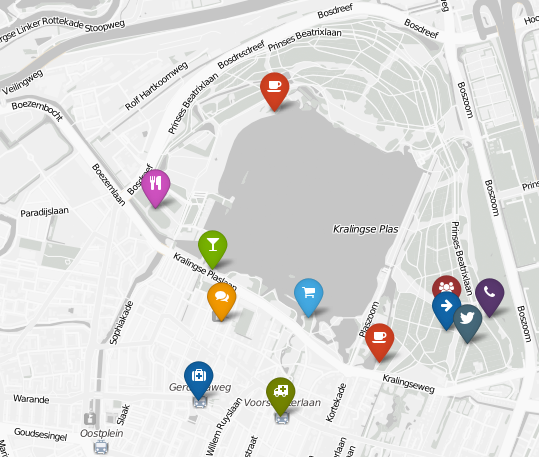
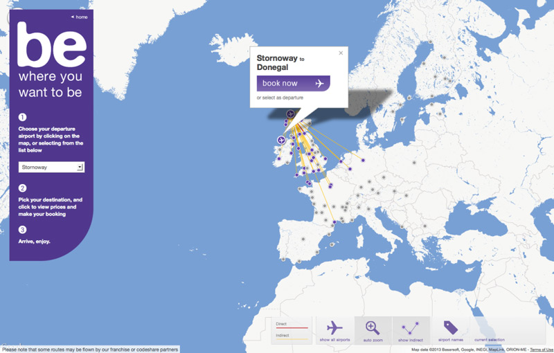
Customized, photographic markers for each point:
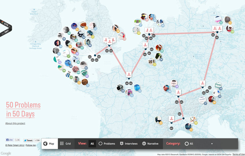
1b. Map Markers with Detailed Information
This technique is perfect if you want to quickly share detailed information about a geographic area, from summaries to pictures and links that give users greater context. Most mapping tools give you a great deal of design control over your detail “hover boxes,” so this is a great way to present top-level summaries, provide useful navigation, and integrate the look and feel of your map with your brand.
This map displays specific project information with links to project pages:
These info boxes allow you to book a flight right from the map:
1c. Map Markers with Quantity Groups
I know, rolls off the tongue, doesn’t it? But, say you operate a lot of programs in one close area, and you want to display them without presenting a confusing mess. Quantity Groups let you display a cluster of map points as one marker…until the user zooms in to get more detail. This way, users can get a feel for the big picture, and they can investigate each individual point.
An excellent quantity group function:
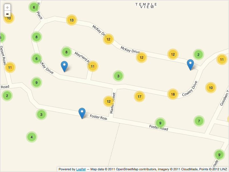
Using quantity groups to organize a large number of points:
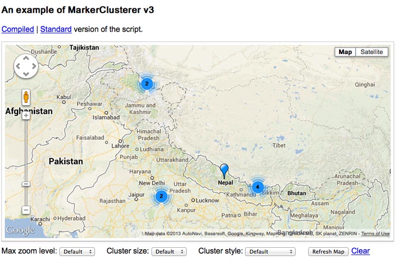
Google Maps’ standard way of displaying groups, called Marker Clusterer:
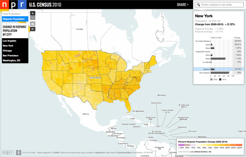
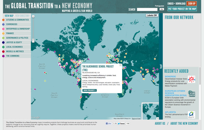
2a. Choropleth Map
We’ve all seen choropleth maps but maybe didn’t know that was what they were called. They are those maps that show variations in data by displaying color variations—like a map that shows all the states in the country color-coded by something like election results. Choropleth maps are a great way to communicate large amounts of data, as the color coding allows users to easily digest patterns and trends in your data.
Using choropleth maps to display election data, state by state:
Using a standard shape to more accurately display information:
Displaying census data is a great way to use a choropleth map:
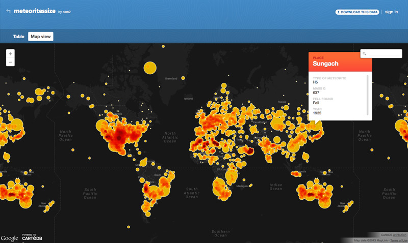
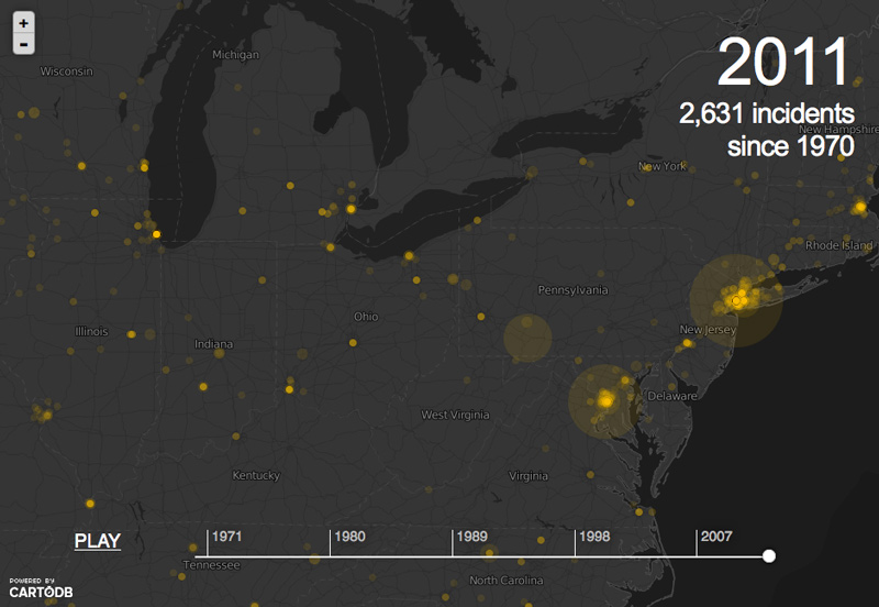
2b. Clustering Maps
Say you want to give audiences an idea of relative density for population, energy use, or just about anything across a geographic area. Clustering maps are an incredibly easy and effective way to get the point across, allowing you to customize the view in all sorts of ways, presenting data points as clusters of different sizes to indicate density.
A clustering map of all meteorites that have fallen to Earth:
A dynamic cluster map showing a data trend over time:
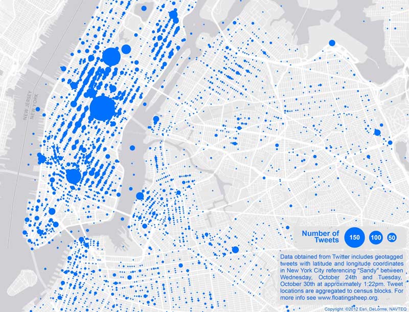
Showing social media density in New York City after Hurricane Sandy:
2c. Heatmap
Heatmaps are technically another type of Choropleth map, using color to communicate the relative concentration of a range of data values. But say you want to share information such as how people move their mouse on a webpage or statistics that are not delineated by geographic boundaries; a heatmap’s organic display (i.e. lacking any predefined bounds) is a great way to visually communicate relative concentrations.
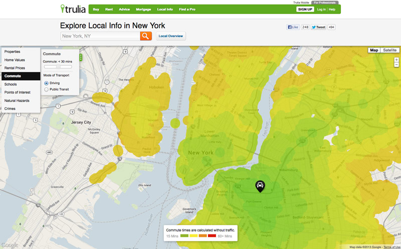
Visualizing local information, like commuting times, with heatmaps:
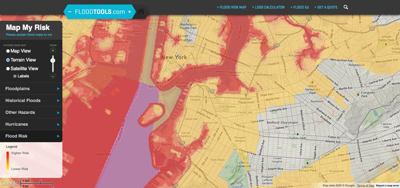
Statistics, like flood data, can be visualized well with a heat map:
Using color-coded contour lines to visualize elevation:

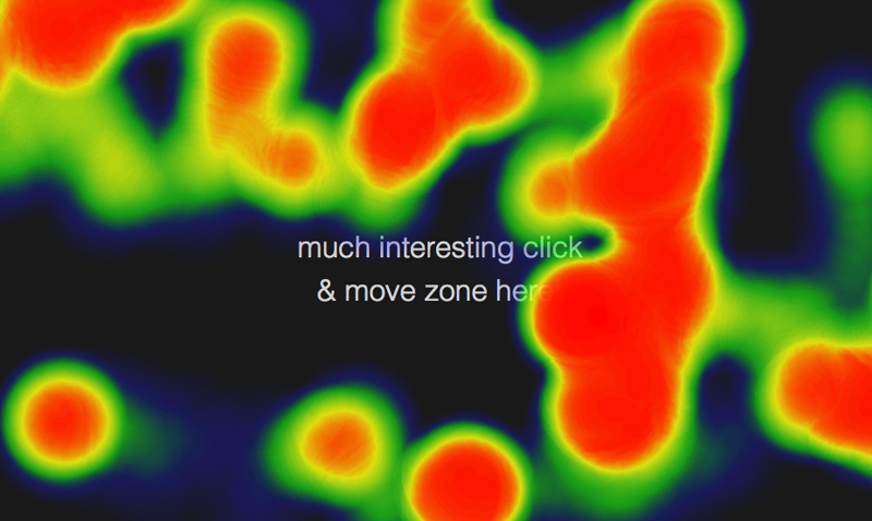
Here’s a real-time example of a mouse movement heat map:
A Note About Base Map Styles
In addition to displaying your data in certain ways on a map, there is also a lot of flexibility with how the map itself looks. There are some absolutely incredible tools out there for base map styling. Here are a couple of fun links that illustrate just how much latitude (pun intended…) there is when it comes to choosing a base map style.
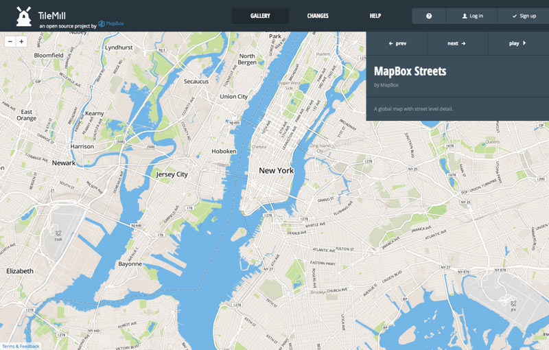
TileMill offers an astounding number of options for map styling:
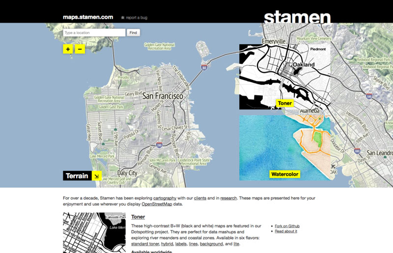
Stamen offers some interesting styles as well:
The Tip of the Iceberg
This is just a peek into a few examples from an incredible range of options out there for visualizing data on maps. The best part is that most of the tools used to create the examples above are open-source and freely available to test and use. None of them uses Flash, making them very flexible for desktop and mobile display, and new tools are being created all the time. What this means for you, is that if you want to communicate using interactive maps and data, it’s easier than ever to integrate them into your website. Do so in a strongly-branded way, and your point will come across more effectively.
If you’re a business or nonprofit engaging in a website redesign, you’ve probably prioritized a list of specific things you’d like addressed–from a dated design that’s gotten embarrassing to making it easier for people to find things, or a content management system that actually works for you, not against you (something we’ve recently given some advice on).
You’ve created an RFP outlining your needs: Business Development has its set of must haves, the folks in Marketing have their wish list, and Program Directors have theirs. While needs like these are important, too often they’re viewed tactically, but are symptomatic of broader strategic problems. Effectively tackling them requires an approach rooted in more than good website design process, by taking a brand-centric approach to problem solving.
The field of User Experience Design (UX) has come a long way in the last decade, formalizing a process that helps clients, designers, writers, and developers balance business goals with audience needs to create more useful and usable websites. Too often, however, clients engaging in a website redesign are led by web design firms through a process geared mostly towards meeting website-specific goals. The result may be a great-looking, and incredibly well-functioning website, but one that falls flat when it comes to meeting the broader strategic imperatives that are at the heart of owning an effective brand.
UX often does focus on answering questions similar to brand strategy to better understand audiences and the business. But they are two different disciplines with different methodologies and goals. UX is primarily focused on taking a rigorous approach to executing a successful online project—a project that serves critical business goals, but a project nonetheless. What UX does very well is help clients and designers better understand website users, then successfully address the needs they’ve identified (and likely discover a few they didn’t know they had).
But websites are just one (incredibly important) part of how brands engage with their audiences. Brand Strategy provides the necessary framework for applying critical thinking and problem solving, by focusing on intrinsic brand value, relying on insights from things like SWOT and PEST analysis to align design thinking with business strategy. Even if clients don’t have the budget (or stomach) for a formal branding engagement, approaching the website design process from a brand-centric creates better results by providing a broader, more far-reaching view of where a company is (and where it’s going), so that clients and web design teams are hunting in the right places as they design websites.
For design teams, brand strategy helps us ask more meaningful questions, and provide ideas and explanations in the language of business, instead of the subjective (and usually confusing to clients) realm of design. For clients, it orients the (also often confusing) web design process around more familiar business goals, focusing your people on what’s really important, placing choices in context, and clarifying decision making. And for everyone, it strengthens the working relationship by helping us pull in the same direction–working within a more meaningful business strategy to effectively differentiate the brand and be more meaningful to audiences.
The most successful nonprofits and businesses are those that understand that every communications initiative, from logo design to online experiences, is part of an interconnected branding effort. By designing our websites with this in mind, together we move from problem solving exclusively in the realm of web design to designing websites that are built to last by meeting the fundamental needs of executing an effective brand and business strategy.
More than two weeks after its debut, healthcare.gov continues to cause frustration for its users and potentially career-ending criticism of its leaders. In fact, members of congress have started calling for the resignation of Kathleen Sebelius, Secretary of Health and Human Services, and there are now two House committees investigating the website.
While many of the problems are technical in nature, such as lack of optimization and challenges integrating with legacy systems, much of the failure and subsequent negative press could have been avoided through better communication and user experience design. A few days after healthcare.gov was launched, Forbes reported that only 1% of site visitors ended up enrolling. I see that number as not only a sign of performance failure, but also a sign that they failed to accurately identify and accommodate use cases beyond “Enroll in the Exchange.” The following are some usability suggestions that don’t require monster servers or technical genius to implement. (Ms. Sebelius, feel free to bring these ideas to your web development team and present them as your own. You’ve had a rough week.)
1. Filter out the users who don’t need to be there.
Healthcare.gov is the online Federal exchange for Obamacare. However, some states have their own exchange. In New York, for example, you can visit nystateofhealth.ny.gov. As soon as there was any indication that the federal site was overwhelmed with traffic, options to funnel people to their state exchanges should have been put in place to reduce the load. The nice thing about a simple “What state are you browsing from?” filter is that it can direct some users to other sites without hitting the healthcare.gov servers again.
2. Allow and encourage users to browse for plans anonymously.
Server optimization is an art and a science, and I don’t doubt that the people responsible for optimizing performance on healthcare.gov are among the top in the field. The expected peak of simultaneous sign-ups was 60,000, but the actual peak was as high as 250,000. The original assumption of 60,000 was based on a workflow where users would create an account when they were ready to buy, which is typical of most eCommerce websites. However, a late decision was made to require users to log in before browsing for plans, because they didn’t want to give people sticker-shock by showing plan pricing without factoring in the subsidies an individual might be eligible for. You can only give someone an accurate quote if you already have their information.
There’s a simple solution to this that auto-dealers and insurance companies employ constantly: the “as low as” price tag. For anonymous users, show not just the raw cost of a plan, but the lowest cost or perhaps low-average cost of a plan, and THEN prompt people to create an account to get their specific rate. This would reduce the number of simultaneous account creations two ways: First, fewer people would need to sign up for an account. Second, since account creation options are presented over time throughout the browsing process and not as the sole gateway to the rest of the site, the chances of so many accounts being created at the exact same moment are greatly reduced.
3. Foster transparency AND accessibility.
When confronted with criticism that healthcare.gov “hides the price tag” of plans behind a log in, administration officials point out that all information is available in its raw form on data.healthcare.gov. There are two problems with this argument. First, who would know that? There are two major calls to action on the healthcare.gov homepage, Apply Now and Start Here, both of which start by asking you for information. There is not a single link to data.healthcare.gov from the main healthcare.gov homepage. (I checked the HTML code to verify this.)
Second, once you do find out about the site (likely via an administration official defending himself against accusations of lack of transparency) you visit and quickly realize it’s about the least user-friendly thing you’ve ever seen. There are tons of “datasets,” huge spreadsheets with file descriptions like, “This CSV contains the Table C data contained in each submitted Part 1 Rate Summary Form.” I almost got excited when I saw that on the left side bar, you could view Charts, Maps, and Calendars. However, upon clicking on each of them, it turns out there are no charts, no maps, and no calendars. Basically, the site is useless for the average person who just wants to know what their options are.
There is a technique called “secrecy via obfuscation,” where sensitive information is weakly protected by being buried within mounds of useless or irrelevant data. That’s likely not the intention of data.healthcare.gov, but to Obama’s critics and political opponents, it might as well be. Transparency isn’t achieved by simply making information available. It has to be targeted, clear, and concise. This is an issue of content strategy and usability, not technology.
I don’t envy the folks tasked with cleaning up this mess, but I hope that in the midst of network optimization and system integration, some attention is paid to these user experience issues. After all, the whole point of Obamacare and healthcare.gov is to help folks who’ve already been failed by a complex, incomprehensible healthcare system, right?
Some days, it feels like we’re completely overwhelmed. Health, energy, poverty, development, the environment: these are monumental challenges, which dedicated organizations have been working on around the clock to achieve the most modest of gains. Unfortunately, it seems we’re past the point where one organization can hope to deal with anything alone. Our most stubborn challenges can’t be solved by wielding a bigger hammer; the world’s “wicked problems” require a smarter toolset and a better organized crew.
Historically, America has relied on government as its Mr. Fixit. But the public sector is paralyzed by partisanship, with a negative feedback loop of austerity measures prohibiting it from tackling anything meaningful. In the private sector, corporations have shown but a cosmetic commitment to responsibility, while for-profits operating in human services seem content to milk challenges for whatever they’re worth. (After all, the money’s in treatment, not the cure.)
Then there’s the nonprofit sector, which has traditionally taken the lead on social and environmental challenges. The heroic dedication of nonprofit organizations notwithstanding, the math just isn’t there. Research from the Urban Institute highlights the challenge: for every dollar of GDP, about 24¢ goes to the public sector while only 5¢ goes to philanthropy. Even under the best of scenarios, it’s hard to imagine how philanthropists can possibly fill the gap.
So how do we tackle these biggest challenges? I’m no Tom Friedman, so I’ll spare you sweeping roadmap to Camelot 3.0 and cut to the obvious: it’s going to require collaboration, lots of creative solutions, and experimentation to see what works best. In short, we’ll need design thinking —and lots of it.
Design thinking is not new, though it is enjoying a resurgence everywhere from the business world to education reform. The key difference between design thinking and it’s more conventional, scientific cousin is that rather than focusing on the parameters of the problem, it focuses on the context of the solution. It asks what our unmet needs are, explores a variety of creative ways to satisfy them, then tests them before implementing the one that works best.
Consider health care. Conventional thinking says, “We want to be healthy. So let’s use the technologies we already have (insurance companies, hospitals, etc) and set up a system so we see a doctor when we get sick.” Design thinking says, “We want to be healthy. So let’s look at all the factors that go into making people healthy, then create the most effective, efficient possible system to achieve that.” The beauty of this process is that it isn’t hemmed in; rather than focusing on the set of tools we have to work with, it focuses on the tools we might need to get the job done right. It enables us to design systems where incentives are aligned, which in turn makes them more sustainable.
One of the most promising applications of design thinking to affect social change has been in Public Private Partnerships (PPP). We’ve learned a lot about PPP’s over the last few years, designing for nonprofits such as World Cocoa Foundation, Touch Foundation, and The Institute for Industrial Productivity, all of whom bring together the private and public sector to help create sustainable change across a range of critical issues. While there are a variety of schemes and structures PPPs can take, these collaborations between public and private sector offer a variety of benefits, and serve as a model for tackling tough challenges large and small.
Here are a few of the ways PPPs use design thinking to drive social change:
- They enhance collaboration. Like all good design processes, PPPs convene stakeholders and experts across a range of industries, both public and private. This helps mix deep analytic thinking with broad, synthetic understanding to help address challenges in ways that haven’t been thought of before.
- They are designed to be more sustainable. Not only do PPPs convene diverse range of stakeholders, but they can also be structured in a way that aligns incentives for each partner within the context of the greater goal. By creating an engagement where incentives are aligned, they can drive solutions that can be more sustainable and scalable.
- They iterate more quickly. Designers often practice rapid iteration to explore concepts and arrive at solutions. But when it comes to the public sector, rapid doesn’t exactly come to mind. PPPs can change that. Some enterprises, such as social impact bonds, are designed to pilot new approaches in discrete programs. More short, fast programs make for a faster exploration process, creating a broader range of workable options.
- They are driven by results. Just as design is driven by measurable goals, PPPs are driven by quantitative and qualitative impact. This helps evaluate alternatives during the exploration phase, and ensure that the implemented solutions continue to evolve and perform.
Of course, there are many other of other applications for design thinking in tackling social challenges. And design thinking, in and of itself, doesn’t guarantee success. But by adopting some of its principles and techniques, together we can begin to fail faster—with each failure bringing us one step closer to success.