


For many nonprofits, interactive maps are a really effective way to communicate about their work and impact. Whether it’s showing where a member-driven nonprofit’s chapters are located, where a philanthropy’s place-based initiatives or community development nonprofit’s programs operate, or a nonprofit policy and advocacy think tank or research institute highlighting where policies or campaigns are, interactive maps are a valuable part of the digital communications toolbox. And, in the last few years alone, we’ve seen exponential growth in interactive mapping software that can present data in all sorts of amazing ways. But if you’re a nonprofit that wants to incorporate interactive mapping into your website, all this product and feature clutter definitely makes it hard to choose which platform to use.
When we work with organizations that want to design an interactive map feature for their website, our first question is not “What kind of map do you need?” but is instead always “What are you trying to say?” While interactive maps can be really cool, it’s important not to lose yourself in trees of features and, as a result, miss the forest of what interactive maps are often about: a type of digital storytelling for your nonprofit’s brand. And once we understand what messages a nonprofit would like to communicate through geographic data, we can make more informed, more strategic decisions about what type of interactive map can best help tell that story—and the more well-equipped we are to dive into the sea of interactive features at our disposal.
So, let’s say you are a nonprofit that wants to add an interactive map to your website. How should you ideally approach thinking about the project? What kinds of options do you have at your disposal? And which ones are best to help you achieve your digital communications goals? Assuming you may not have had time to navigate the world of online mapping software and could use a little help designing for impact with geographic data, we hopefully can offer some insight gained over years of helping clients use interactive maps in their digital storytelling efforts.
3 Things to Consider Before You Dive In
It’s tempting to just jump into checking out all the different types of interactive mapping. But, before we do, a few important things to keep in mind when you’re making decisions about interactive mapping projects:
Your Story: Before you get too fixated on what type of map you’d like or what tool you’d like to use, take a step back and think about your audience. What do you want to tell them, and how will they find it meaningful? Getting this part right first will save you a ton of time choosing mapping technologies and techniques down the road.
Your Data: What kind of data do you have? Is it hierarchical and heavily relational, or more singular and straightforward? Will it change over time, or is it more of a static snapshot? What format do you keep it in? The quantity, quality, depth, and format of your data have a significant influence on what types of mapping software are appropriate for you.
Your Budget: We know, interactive maps are like eye candy, and you feel like a kid in a candy store! Like anything, choosing an interactive mapping tool involves trade-offs, and budget is usually a big factor. Save yourself the time (and heartbreak) of falling in love with an incredible interactive map technique that’s beyond your budget by starting with a clear idea of how much time and money you want to invest in bringing your data to life with maps.
Common Mapping Goals and 6 Great Examples
While there’s no shortage of interactive mapping tools and techniques, the goals of most of the clients we work with seem to fall into one of two pretty clear groups:
1. Displaying location-specific information about the activities of their organization
2. Displaying geo-specific data that tells a story about an issue, goals, progress and/or impact
With these two groups alone, there are a lot of really exciting and innovative ways to bring this data to life. Each offers different benefits. Here are just a few approaches to interactive mapping that can be really effective, with examples of tools that we think have a lot to offer.
1a. Simple Designed Map Markers
This most basic interactive map technique is ideal when you need an easy way to highlight different points of interest, and just want to visually differentiate the markers (or “pins”). It’s also an opportunity to make useful, branded information design part of the experience through color and iconography.
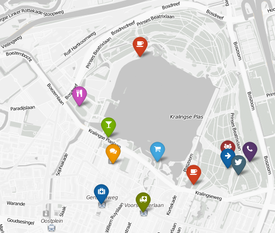
Customized, photographic markers for each point:
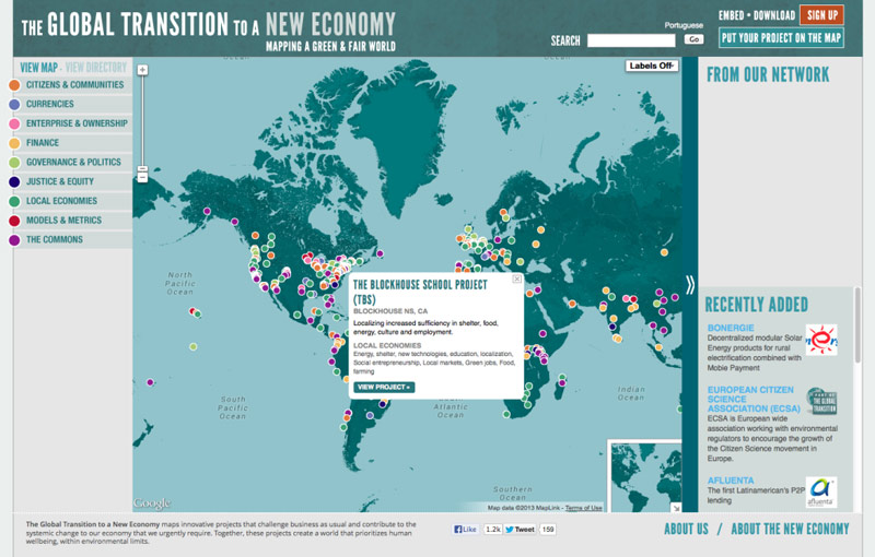
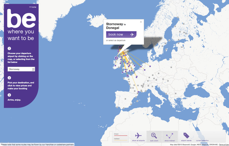
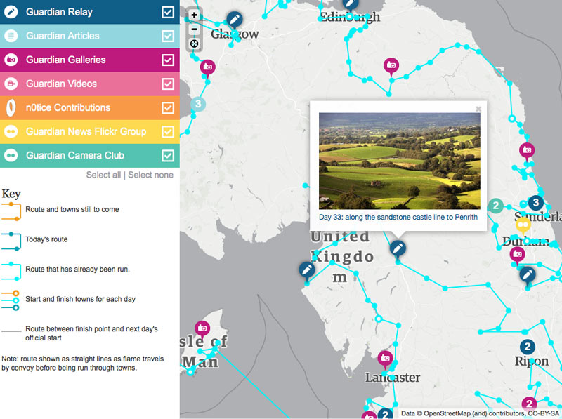
1b. Map Markers with Detailed Information
This technique is perfect if you want to quickly share detailed information about a geographic area, from summaries to pictures and links that give users greater context. Most mapping tools give you a great deal of design control over your detail “hover boxes,” so this is a great way to present top-level summaries, provide useful navigation, and integrate the look and feel of your map with your brand.
This map displays specific project information with links to project pages:
These info boxes allow you to book a flight right from the map:
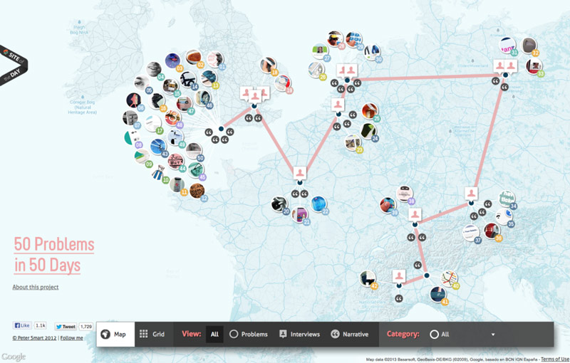
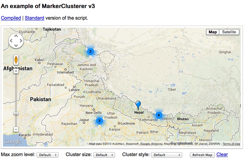
1c. Map Markers with Quantity Groups
I know, rolls off the tongue, doesn’t it? But, say you operate a lot of programs in one close area, and you want to display them without presenting a confusing mess. Quantity Groups let you display a cluster of map points as one marker…until the user zooms in to get more detail. This way, users can get a feel for the big picture, and they can investigate each individual point.
An excellent quantity group function:
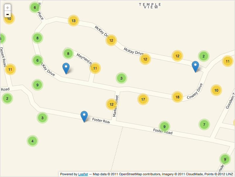
Using quantity groups to organize a large number of points:
Google Maps’ standard way of displaying groups, called Marker Clusterer:
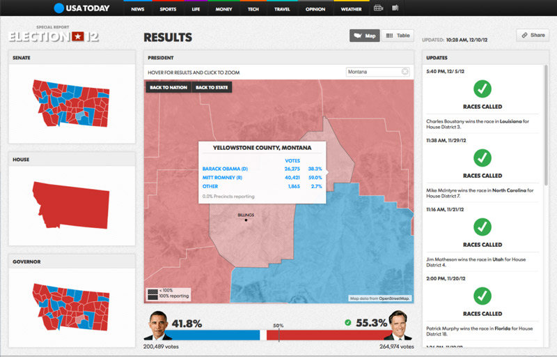
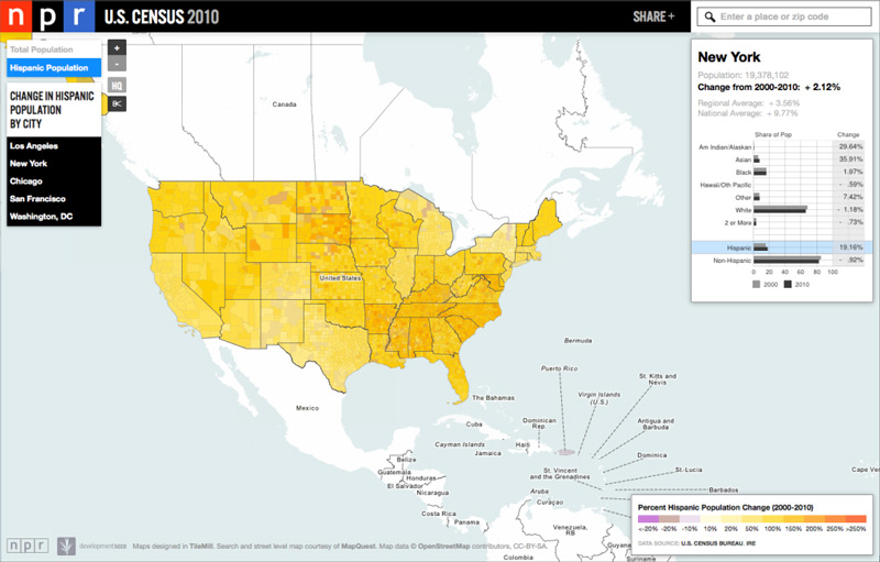
2a. Choropleth Map
We’ve all seen choropleth maps but maybe didn’t know that was what they were called. They are those maps that show variations in data by displaying color variations—like a map that shows all the states in the country color-coded by something like election results. Choropleth maps are a great way to communicate large amounts of data, as the color coding allows users to easily digest patterns and trends in your data.
Using choropleth maps to display election data, state by state:
Using a standard shape to more accurately display information:
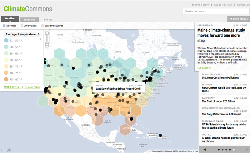
Displaying census data is a great way to use a choropleth map:
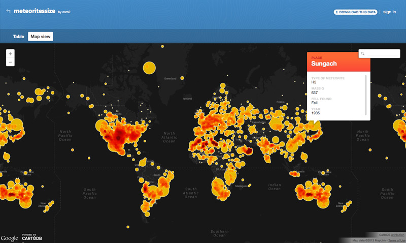
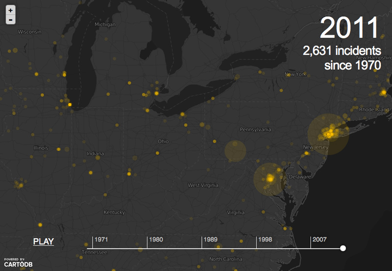
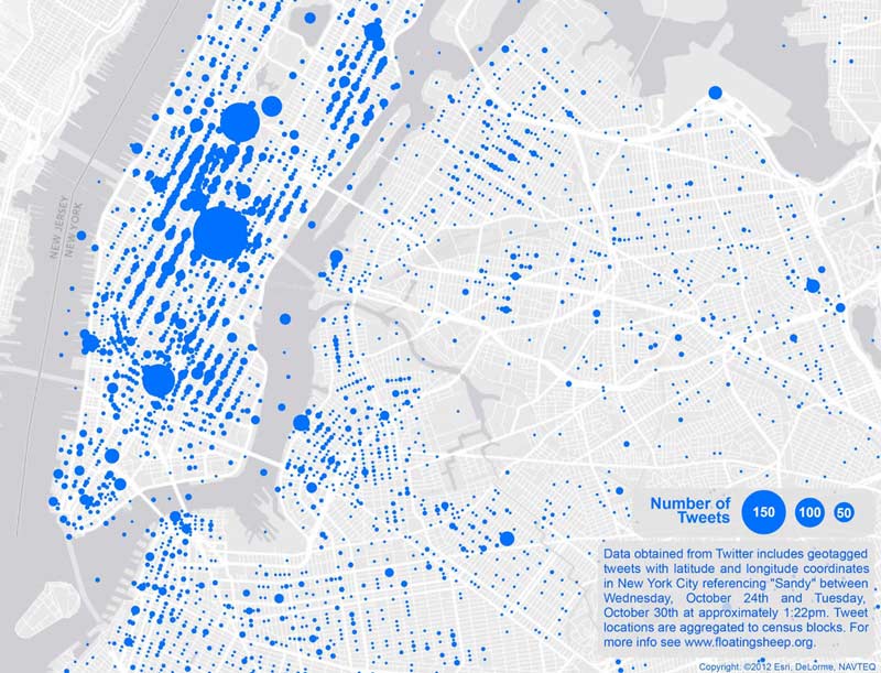
2b. Clustering Maps
Say you want to give audiences an idea of relative density for population, energy use, or just about anything across a geographic area. Clustering maps are an incredibly easy and effective way to get the point across, allowing you to customize the view in all sorts of ways, presenting data points as clusters of different sizes to indicate density.
A clustering map of all meteorites that have fallen to Earth:
A dynamic cluster map showing a data trend over time:
Showing social media density in New York City after Hurricane Sandy:
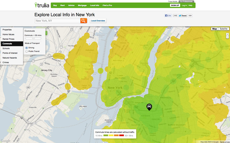
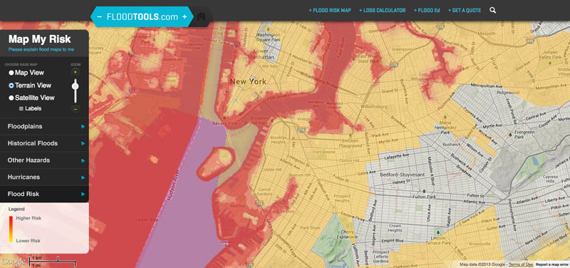
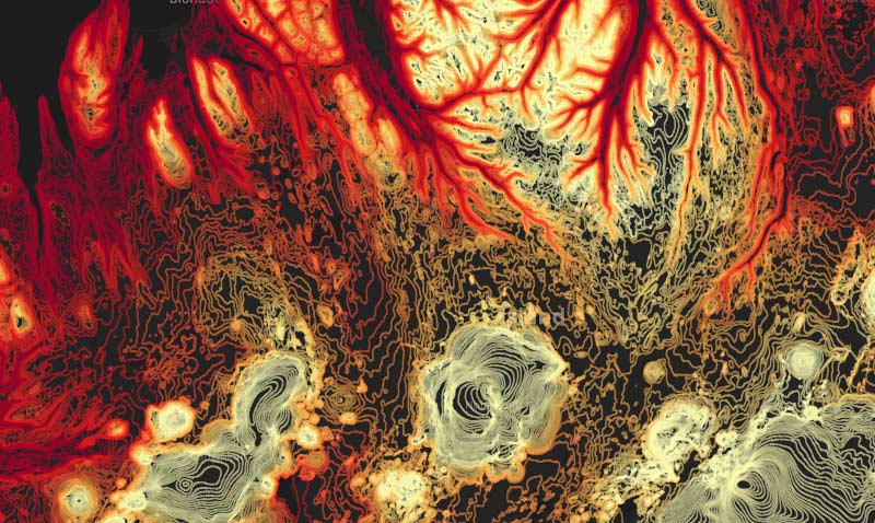
2c. Heatmap
Heatmaps are technically another type of Choropleth map, using color to communicate the relative concentration of a range of data values. But say you want to share information such as how people move their mouse on a webpage or statistics that are not delineated by geographic boundaries; a heatmap’s organic display (i.e. lacking any predefined bounds) is a great way to visually communicate relative concentrations.
Visualizing local information, like commuting times, with heatmaps:
Statistics, like flood data, can be visualized well with a heat map:
Using color-coded contour lines to visualize elevation:
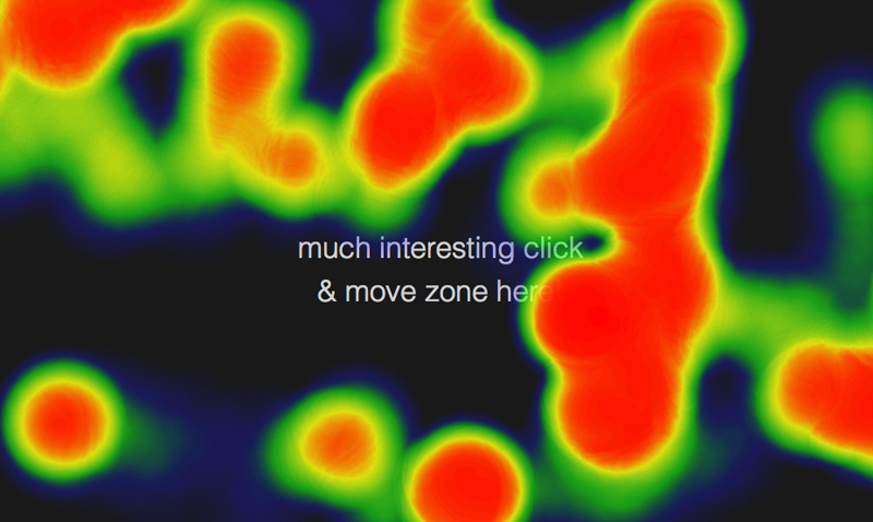
Here’s a real-time example of a mouse movement heat map:
A Note About Base Map Styles
In addition to displaying your data in certain ways on a map, there is also a lot of flexibility with how the map itself looks. There are some absolutely incredible tools out there for base map styling. Here are a couple of fun links that illustrate just how much latitude (pun intended…) there is when it comes to choosing a base map style.
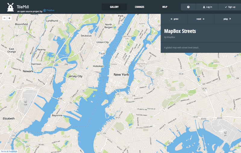
TileMill offers an astounding number of options for map styling:
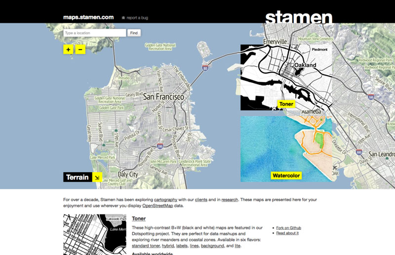
Stamen offers some interesting styles as well:
The Tip of the Iceberg
This is just a peek into a few examples from an incredible range of options out there for visualizing data on maps. The best part is that most of the tools used to create the examples above are open-source and freely available to test and use. None of them uses Flash, making them very flexible for desktop and mobile display, and new tools are being created all the time. What this means for you, is that if you want to communicate using interactive maps and data, it’s easier than ever to integrate them into your website. Do so in a strongly-branded way, and your point will come across more effectively.
