


When there’s a tight deadline to develop a website it’s tempting to jump right in and start building. It’s best to take a step back and take some time to plan in order to save time and effort in the long run. In rebranding our firm to coincide with ComNet15, we were faced with the daunting task of going from no name to having a new website in three months—an audacious goal where a lot had to happen in tandem in order to get things right. In this article, I’ll explore three techniques our web developers used along the way that really helped us hit our launch date: creating re-usable modular pieces of code, using CSS naming conventions, and collaborating closely with our designers as they generated content.
Keep Code Organized and Re-usable
The key to any successful web project is organization, especially when the development deadline is aggressive. When you’re working quickly, file structure, PHP includes, JavaScript, and Sassall need to be easily readable and decoupled (i.e. modifying one piece of code should not affect another.) This was especially important for our team because we had two developers simultaneously developing on the same code base. We divided up responsibilities in an effort to not step on each others toes: Quinton Mosley handled most of the back end work while I focused on the front end.
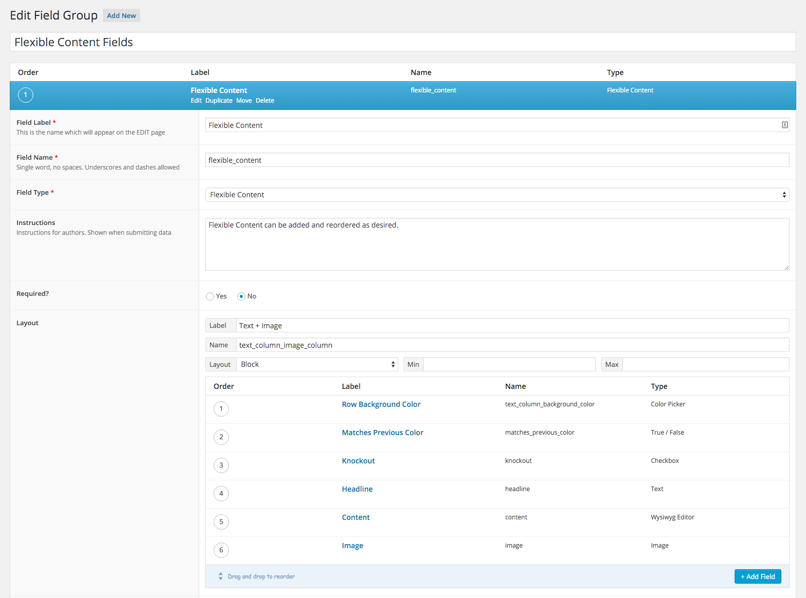
Of course, organization goes beyond the code you write; it extends to the way you represent the building blocks for site content in your CMS. At Constructive, we love Open Source CMSs like WordPress and Drupal, and because we apply design thinking in web development, almost all of the WordPress sites we build make heavy use of the Advanced Custom Fields (ACF) plugin. ACF is a great tool out-of-the-box, but when you use advanced features like flexible content fields, your page templates can get a little crazy. To keep things neat and organized and help speed up development we created some reusable patterns with ACF.
In the backend we created one field group that would house all of our flexible content groups:
Then in one file we wrote:
<?php if (have_rows( $acf_flexible_content )) : $row_count = 0; ?>

   <?php while (have_rows( $acf_flexible_content )) : the_row(); $row_class = 'fc-row-' . ++$row_count; ?>

      <?php if (get_row_layout() == 'text_column_image_column' ) : ?>

         <?php include(locate_template('/flexible_content/acf-text-image.php')); ?>

      <?php elseif (get_row_layout() == 'large_image' ) : ?>

         <?php include(locate_template('/flexible_content/acf-large-image.php')); ?>

      <?php elseif (get_row_layout() == 'image_gallery' ) : ?>

         <?php include(locate_template('/flexible_content/acf-image-gallery.php')); ?>

      <?php elseif (get_row_layout() == 'text_block' ) : ?>

         <?php include(locate_template('/flexible_content/acf-text-block.php')); ?>

      <?php endif; ?>

   <?php endwhile; ?>

<?php endif; ?>
The above code loops through the flexible content fields and locates the appropriate template part to use for that group.
In another file, we created a template:
<?php $matchesPrevious = get_sub_field('matches_previous_color'); ?>

  <section class="fc-text-image row <?php the_sub_field('order'); ?>
    <?php echo $row_class; ?>
     <?php if ($matchesPrevious == 1 ) :?>row--matches-previous<?php endif; ?>"
    <?php echo acf_background_color_style('text_column_background_color'); ?>>

    <div class="container">

      <?php

        $headline = get_sub_field('headline');

        $content = get_sub_field('content');

      ?>

      <?php if (!empty($headline) || !empty($content) ) { ?>

        <header <?php if(get_sub_field('knockout')): ?> class="fc-knockout-text" <?php endif; ?>>

          <h2><?php the_sub_field('headline'); ?></h2>

          <?php the_sub_field('content'); ?>

        </header>

      <?php } ?>

      <div class="fc-image__column fc-text__column--image"
<?php echo acf_background_color_style('image_background_color'); ?>>

        <img src="<?php echo acf_image_url('image', 'text-with-image-thumbnail'); ?>"
alt="<?php the_sub_field('subheading'); ?>" />

      </div>

    </div>

</section>
We could now use any of our fields in whatever template we wanted and have all the power of flexible content fields.
<?php
  $acf_flexible_content = 'flexible_content';
  include(locate_template('/flexible_content/acf-flexible-content.php'));
?>
Block, Element, Modifier
Lately we’ve been warming to the idea of using BEM syntax for all our styling.
This was especially important for our project because we had UI, UX, coding and content development all happening on at once.
Keeping the CSS modular and clean was essential. Here’s a small sample of how we styled the flexible content field groups:
.fc-carousel {}

.fc-carousel__image {}

/* for carousels with a browser container graphic */

.fc-carousel--browser {}
The fc prefix, is given to all the styles. In this example, carousel is the element and browser is the modifier.
We also made use of Sass @extends wherever possible so that we weren’t repeating ourselves. Here’s how we did links for fctext blocks:
%fc-text-links {
   color: $body;
   position: relative;
   display: inline-block;
   transition: all 0.3s ease-in-out;
   @include font-serif;
   &:after {
     content: " ";
     display: block;
     position: absolute;
     height: 1px;
     width: 100%;
     bottom: 2px;
     border-bottom: 1px dotted $body-dark;
   }
   &:hover {
     &:after {
       border-bottom: 1px solid $body-dark;
     }
   }
}

.fc-header {
   a {
      @extend %fc-text-links;
   }
}
Collaborating and Catching Edge Cases
A benefit of designing, developing, and generating content at the same time is you can discover edge cases and address them immediately. Our project pages have several different layouts and options that can be combined in a number of different ways.
We decided early on that we wanted to give content editors some control over the look and feel of the page they are creating it, as the create it. As our Director of Technology, Ian Mariano, often says, “Admins are users too” – a topic worthy of its own article and more. Keeping that in mind, we included a color picker on all flexible content groups so that they can use an appropriate color for a particular project. But this presented a problem: what if the color the editor selects clashes with the sites body text color? Checkboxes to the rescue! The simplest way to solve this problem was to add a checkbox to the field group that will add a class when selected. We could then target that class in the CSS and take care of the clashing color issue.
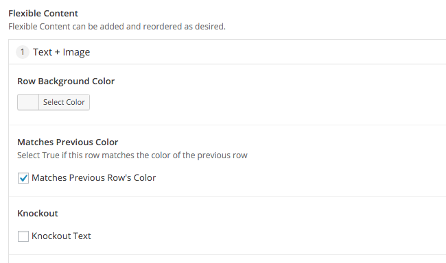
Here we opted to give the editor the option to select “Knockout Text.” This adds the class .fc-knockout-text to that group and we change the text color to white in the CSS.
You’ll notice in the previous image there is also a checkbox labeled “Matches Previous Row’s Color.” This brings us to another edge case. Like any well built site there are default styles set. In our case we have 90px’s of padding on each of our rows of content. In some cases there will be two consecutive rows that the editor wants to be the same color. Remembering that we have 90px of padding top and bottom on all our rows and in this scenario we’ll end up with 180px of padding on top. That doesn’t look so hot. In comes another checkbox. Basically, it tells us if this row matches the previous row’s color. If that is true, remove the padding from the top of that row.
Moving Forward
Keep it simple. All projects present numerous challenges. When there’s a tight deadline and you’re doing design, development, and design all at once, the complexity of these challenges can escalate exponentially. Surprisingly, my blood pressure stayed under control during this one and I think that’s largely because we maintained tight collaboration and organization. The tools we used enabled us to also focus on the Admins’ user experience and more easily collaborate with our whole team. For example, our founder, Matt Schwartz, could enter content into a new field group and then pop over to my desk to work through a design problem that needed to be addressed. Adding new field groups was easy because of all the ground work we did and styling them was simple with our naming conventions.
Of course, the above examples came from our experience with an in-house project; client projects present another layer of complexity. But regardless of whether we are working on an internal project or a client project, many of these lessons hold—and we’ve incorporated many of the techniques and approaches developed in this project to our core WordPress Distro and client work flow.
