The core promise of the information age isn’t more data—it’s more useful data. Perhaps its fitting that the era’s prodigal company, Google reflects this ideal so audaciously in its mission: “organizing the world’s information.” But there’s another organization—one far more archaic, with domestic revenues 250 times greater than those of Google—that has a far greater capacity to impact our lives with more useful information. And it has only just begun to wield its influence.
With three branches, fifteen departments, and hundreds of bureaus and agencies, there are few corners of the economy that the U.S. Federal government doesn’t monitor in some way. For years, the FDA, EPA, DOT, and DOE have served the public interest by establishing standards for wide range of consumer products, using labels and disclosures to educate the public about what’s in them and how they work. Over the past few years, there’s been a shift with regard to the function of these communications: rather than just deliver basic product information, they have begun to use design to present this information in increasingly meaningful ways. What’s more, it seems to be making a difference. Here are a few ways that the government has used design to help Americans make better-informed consumer choices.
Using Design to Make Daily Nutrition Simpler
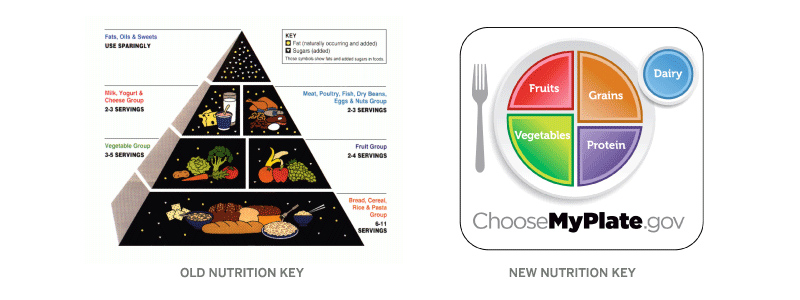
Looking at the design of the old food pyramid, one wonders whether it was designed to reflect dietary recommendations or the pecking order for food industry lobbyists in Washington. The cosmic food illustrations, cumbersome layout, and cryptic serving unit scale (has anyone ever portioned out 6-11 servings of grain per day?) made this a graphic only a nerdy nutritionist could love.
The new graphic is everything that the old one is not. It’s accessible—there are no obscure units or silly drawings, just a simple, graphic representation of recommended food group proportions. If, as the saying goes, “people tend to eat with their eyes,” what could be more useful than demonstrating portion size based on how they consume—on a plate? While this does not encapsulate everything you need to know about balanced nutrition, it achieves the core goal of presenting a simple, memorable device to help Americans make healthier eating decisions in their busy day-to-day lives.
All Products are Created Equal, But Some May Be More Equal than Others
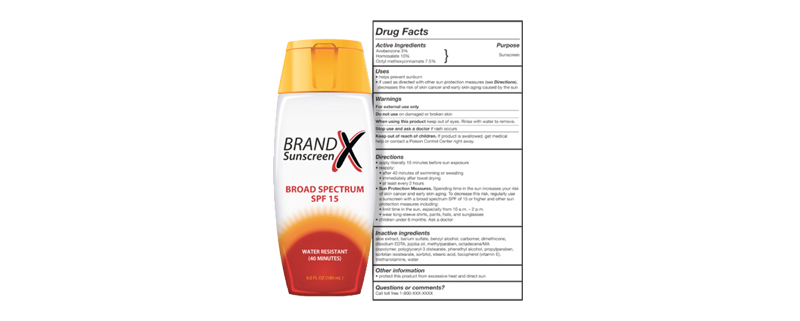
For the past 30 years, options for sunscreen products have multiplied; in addition to the Sun Protection Factor (SPF), products are covered with soft claims about product performance such as “Non-Greasy, Ultra Sweatproof Formula!” As many people know, this information be misleading as some sunscreens—even those of the same underlying SPF factor—perform very differently based on how and how often they are applied, among other things. (This infographic from David McCandless explains the issue quite nicely.)
So how can we balance the need for accessibility (simple, standardized product information) with utility (more useful information on product performance)? How can the FDA help us to evaluate these products, both at a glance and upon closer inspection?
The new labels, as it turns out, have got it just about right. The FDA mandated that manufacturers strip away misleading claims and focus the product information on proven benefits, the SPF factor, whether the product is water resistant, and how long it lasts. On the back side, you’ve got standard directions on how to apply the product along with all the other requisite disclosures and ingredients. The key is that these regulations greatly simplify the product presentation; no longer must we stare blankly down the sunscreen aisle and wonder if one brand’s product is any more effective than another’s. By leveling the playing field, packaging rules are pushing manufacturers to create more effective products, helping consumers make more informed choices, and addressing a major public health concern.
Five-Figure Apples vs. Oranges
Atop the consumer market sits one industry that outspends all others on product marketing. Its products represent the largest investments most families will make outside their home, and how they buy affects not only their pocketbook, but the global economy, the environment, and beyond.
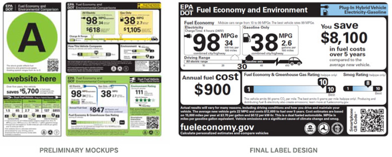
Cars are incredibly advanced products to begin with, and these complexities only compound when you consider the dizzying array of vehicle models available. Consider that these models run on a diverse range of fuels, all of which have different impacts on efficiency, operating cost, and exhaust emissions, and you begin to grasp what a prospective buyer is up against: a seemingly endless array of products, with product information that deliberately resists useful comparison. Given all this, how can labels help consumers make decisions that better address their needs, their budget, and their impact on the environment?
As it turns out, it’s tougher than it sounds. In redesigning new car labels, the EPA/DOT released a number of initial design directions for public comment. The first label system assigned a letter grade to each vehicle model based upon predetermined criteria; this approach oversimplified the comparison, introduced the potential for bias, and was rightly dismissed early on in the process. The other options were more promising, as they presented less subjective metrics to help consumers draw useful comparisons. After a period of public debate (which included a simpler, more coherent system designed by Constructive in collaboration with prominent energy policy group SAFE(secureenergy.org), the EPA released the final design required on all 2013 models.
While it shows a marked improvement over the initial designs, a number of critical issues remain. They expose common challenges for labels in the consumer product market, especially as they relate to consumer durables. Here are a few takeaways to help labels perform even better:
1. Labeling Should Always Be Consumer-Centric
When it comes to everyday purchases such as food, consumers make quick decisions and so labels must be simple enough to take in at a glance. When it comes to larger purchases such as appliances or vehicles, consumers deliberate more intently and are sensitive to subtle differences in performance and quality. Effective label design requires presenting information in a format that caters to what consumers want to know at the point of purchase.
2. Ruthless Efficiency and Simplicity
What’s better than a really informative label? A really informative label that takes less time to read and understand. Content should be curated to deliver the most critical metrics, and design should work to organize this information into intuitive, logical structures that deliver information to the consumer. As labels often have limited display space to deliver their message, efficiency is paramount.
3. Transparency is Key
In the hyper-competitive, commoditized markets, manufacturers must use every technique at their disposal to differentiate their brands and demonstrate comparative advantage. Regulatory labels are often the only place consumers can get an honest take in black & white. Agencies should respect this public trust by demanding transparency in reported information and eschewing potentially biased or derivative metrics—such as letter grades—and any other devices that may be perverted to influence buying behavior.
4. Comparing Apples to Oranges
Choosing between fundamentally different products can be a difficult task; standardized metrics help consumers understand fundamental measures of quality & performance and make meaningful comparisons. When products don’t have standardized units of measure (e.g., comparing fuel efficiency for gas cars to electric cars) this means means creating a basis of comparison (average operating costs, tailpipe emissions, etc.) that treats all product lines consistently and a design that facilitates functional comparison.
5. Beware Design by Committee
The bureaucracies which create standards often contain many layers, each catering to a wide array of stakeholders. Agencies would do well to create a design/revision process that protects the integrity of the result by separating approval (committee vote) from content and design decision-making. Death by committee doesn’t just apply to legislation, or we’d have had truthful labels on tobacco products a long, long time ago.
Of course, there are a number of other factors to take into consideration when devising label designs for consumer products. But by taking advantage of these basic design principles, we can make labels just a bit more useful, make the products just a little bit better, and help even the most dysfunctional bureaucracies deliver on the promise of the information age in the process.
Anyone who is involved with building websites these days has probably heard the term “responsive web design.” Responsive web design (RWD) is a term coined by Ethan Marcotte in his A List Apart article that refers to using various techniques and technologies to serve different visual presentations of a website to various devices.
What this really means to most of us right now is: we can use RWD to create mobile versions of our websites.
And we can! With a combination of CSS3 media queries, smart, flexible front-end coding and maybe a bit of Javascript, we can now realistically serve the same HTML to various devices (with various screen sizes) and customize the layouts to look and work how we’d like them to in those environments. Very cool!
Here’s a nice example of some swell responsive web design: CSS Tricks. Open this in your browser and then reduce the window size and check it out! The layout for the narrowest window (for a smartphone) would look great on a phone. And watch how the navigation and page layout changes as you open the window back up. Really well done.
Responsive web design brings with it some new challenges and ways of thinking. Here are a few things to consider:
1. We’re Building Experiences
For a long time, we have had one main goal: to create a website that looks great and works perfectly in desktop browsers. We’ve spent years learning CSS and Javascript tricks and slicing up graphics to get our sites “pixel perfect” in the browser. There were definitely fluid sites out there but, at least in my experience, fixed-width sites, with an almost obsessive eye for pixel detail, has been the name of the game. But, this kind of thinking looks to be on its way out.
Instead of thinking about creating a “website” that looks good in a desktop web browser, we need to start thinking about creating good “experiences.” We want our users to have a good experience in a desktop browser but, when they visit our site on a smartphone, we also want them to have a good experience. Anyone who has visited a normal website on a smartphone has experienced the frustration of trying to tap impossibly small links or having to zoom in on elements to find out what they are. Not a good experience.
So we need to think about what kind of experiences can we build for our users.
2. More Research and Planning
We’ve always done research and planning when we’ve started a web project but now we’ve got a few more things to think about. We now need to be sensitive to how our users are accessing our site. We can review our analytics and see where our traffic is coming from. You’re probably starting to see an uptick in mobile browser access. And the prevailing wisdom is that mobile web access is on the rise and will only keep growing in the future.
After identifying how our users are accessing our site, we need to decide what kind of devices we plan to make layouts for and how those layouts are going to be structured. This means wireframes for each layout for each device. It is just good to plan for the fact that you may be creating 2 or 3 times more wireframes than before.
3. Time to Consider Dynamic Prototyping
Static wireframes are common in planning a website. But my feeling is that static wireframes will eventually be phased out in favor of dynamic prototypes. A dynamic prototype is built with HTML and CSS and, like a wireframe, is a very simplistic model of the site. And by making this prototype responsive, the different layouts will show the client the layouts intended for each screen size.
There are some fantastic tools out there to get things started. Among the best I’ve seen:
Twitter Bootstrap
Foundation
Less Framework
320 and Up
And it must be mentioned that, since you are wireframing in HTML/CSS code, you are getting a head start on your theming/front-end coding work. For some projects, this could be a massive development time saver.
4. Grids
If you haven’t been using a CSS grid system before now, you’ll probably want to start. A flexible grid system is extremely useful for RWD projects as it is a framework to build your various layouts upon. A lot of the benefits to be found in the prototyping tools above are due to the grid systems they employ. There is not one grid system that is better than another – they all have their strengths and weaknesses. But it is fair to say that if you are taking RWD seriously, you’ll want to learn about grid systems.
Some grid systems (all of the prototyping frameworks above have grids too):
960 Grid System
CSS Grid
Frameless
Skeleton
5. Mobile Layout Considerations
There are many things to consider when you’re wireframing and designing your mobile layouts. This is a large topic unto itself but I’ll hit a few points that will definitely come up:
What do your mobile users do on your site?
The needs, wants, and habits of your mobile users should influence your mobile layouts. The most useful and pertinent information or actions need to be front and center.
Navigation
Navigation takes up a lot of screen-space. You’ll want to think about ways to get it out of the way so it doesn’t degrade your user’s experience.
Touch
People using touch screens are using their fingers to click on items. Items need to big enough to click and spaced apart enough to prevent mis-clicks. Also, people are becoming familiar with touch gestures (for example, swiping, dragging, pinching, etc). These can be used to enhance your user’s experience.
Images
This is a big can of worms right now. There is no perfect way to deal with the serving of smaller images to bandwidth-constrained users. But, as time goes on, a de facto standard will emerge as a way to solve this issue. But, for now, you’ll want to consider what to do about large images and their impact on bandwidth-constrained users.
There are many other considerations, of course. For an in-depth look, please buy and read the books at the end of this article.
Conclusion
This is certainly an exciting time to be building and using websites. How very cool it is to be served layouts that are customized to your device! We have come a long way since the days of content and presentation being garbled together in one, impossible-to-maintain, HTML table. Now we can take one HTML document and serve up as many variations as we want. This is the promise of CSS at its best and it will be very exciting to see how responsive web design grows and improves in the coming years.
Must-Read Resources:
Responsive Web Design by Ethan Marcotte
Mobile First by Luke Wroblewski
If you’ve been discussing a website redesign with just about anyone these days, you’ve no doubt heard the term “Responsive Design” come up one, or a hundred times. Responsive Design, one of the more effective ways to approach designing websites for mobile devices, is all the rage. And rightfully so.
Every design and development decision made during the process of designing a user experience for a website ultimately ties back to your main goal: creating a relevant, intuitive, and impactful experience for your audience. And with the latest projection having mobile audiences, whether on phone, phablet (really large phones), or tablet, outpacing their desktop brethren this year, not having a plan to meet mobile audiences on their terms is a surefire way to deliver a crummy user experience that frustrates audiences and undermines your brand.
But, whereas, even just a few years ago, designing for mobile audiences was viewed as a luxury, and meant accounting for just a few types of devices, thanks to the unrelenting pace of innovation (have you SEEN how many phones Samsung offers?!), website design today means delivering user experiences to a seemingly infinite variety of screen sizes and resolutions.
This is where Responsive Design comes into play.
In short, Responsive Design is a very efficient, cost-effective way to make your website’s layout adjust on the fly for hundreds of different screen sizes your information can be displayed on. With a little bit of smart front-end coding, and thoughtful user experience design planning, a Responsive website will customize how it presents content and delivers the user experience for an almost infinite user base.
As they say, anything worth having takes hard work. And as with any designed solution, there’s a difference between good and great. So what exactly goes into executing a successful Responsive Design plan for mobile websites? To help answer this question, I’ve pulled together a non-technical primer to hopefully provide some insight into to key issues to be aware of if you’re planning a website redesign that includes Responsive Design.
Your Content
Too often, content is added to a website far after design comps have been approved and site development is in full swing (if not completed). But as I’ve discussed before, Designing with the Real Deal, aka, your content, is invaluable in helping designers and developers plan and create a user experience, especially for mobile, that effectively helps you reach your goals.
Unless your design firm is creating your content for you, it’s probably going to be hard to get your content ready early on in a website redesign (after all, you’ve got a job to do that isn’t designing websites). But having the content early in the initial design phase pays big dividends and makes it far more likely that the design solution you fell in love with will translate properly when real content is added.
Limiting Functionality
Mobile phones have limited capabilities compared to desktop computers, so while designing mobile-friendly wireframes and design comps early in the process tells you what your content will look like on a mobile device, what about making sure key features of your desktop site actually work on a phone? Design processes like mobile-first attempt to address this by limiting initial planning only to what’s possible on mobile, and then adding from there.
We prefer not to design for mobile-first, but rather be mindful of decisions we’re making during initial design, and simply have a plan for dealing with them as we translate to mobile devices. This often means turning off certain features that won’t translate well to mobile. Whatever process you prefer, as long as you keep in mind how you plan to deliver a great experience across all platforms by working with what they offer, you’ll be fine.
Responsive Frameworks
As interactive design for mobile has taken off over the last few years, responsive “frameworks,” custom libraries of code, like Foundation and Twitter Bootstrap, have been introduced to speed up the process. What they do is instantly provide a grid or general foundation for rapid prototyping of different mobile layouts and functionality, letting designers spend their time on the details of an effective brand experience (that’s what separates you from the crowd, after all).
We’ve taken this a step further by creating a fantastic base for site development that integrates Foundation with our customized Drupal installation. The result is an incredibly powerful CMS and mobile framework that gives designers great flexibility to design with the brand in mind first, not the device.
Image Sizes
I knew you’d ask about CSS Media Queries! With an incredible range of screen sizes and resolutions, websites need a way to deliver images effectively to everything from a 27” iMac to a Samsung Galaxy II. In a nutshell, CSS Media Queries are little pieces of code that analyze the size of the user’s browser window, then instantly deliver the proper code for that specific browser. Here’s a great example of media queries in action – just click at the top of the page and watch the site resize images on-the-fly. Pretty cool!
Retrofitting Responsive
You have a website you’re happy with, but just want it to be mobile friendly? Absolutely doable, but be prepared to engage in a meaningful discovery process and make some compromises. Depending on the current design and structure of the website, this could be straightforward, or could require some intensive cosmetic surgery. It all depends on how your site’s HTML and CSS are written, and how well your site’s design lends itself to mobile layouts. The only way to find out is to audit your site’s existing code and discuss priorities and potential complications.
A word of caution with retrofitting: expect the unexpected. When you retrofit website code, there are usually unexpected surprises, and things may take longer than estimated. Choices about functionality that may have worked perfectly on a desktop also may turn out to be non-starters in a mobile environment. While retrofitting is not an ideal approach, it’s likely to be more cost-effective than remaking your entire site. So if you’re happy with your site’s design and have no user experience or CMS issues to address, retrofitting may be a good approach.
If I had only one piece of advice to give though, it would be that like any successful design and development engagement, planning thoroughly and thoughtfully for Responsive Design process early on is the best way to ensure fewer hiccups at the end of the project. It’s also the best way for your brand to deliver a great user experience to every audience, no matter where they are.
We recently began a website redesign for a nonprofit foundation in the arts using a unique process: we’re going to develop the CMS for the site first and work on IA and design later. It may sound a bit backwards, but given this client’s particular needs, we’re pretty excited about the potential.
Since this is so different from our usual process, I thought I’d keep track of the project and share the ups and downs.
How is this different?
Every site I’ve worked on has gone through a planning and information architecture stage that laid out, at the very least, a sitemap, some wireframes, and functional specifications. This way designers and developers start out on the same page.
With the increase in sophisticated, user-friendly web development tools, though, this is no longer necessarily the case. When it comes to designing the presentation layer of the site (i.e. what elements appear on what page and where), there is now a lot more flexibility.
So, with this new project, we decided to skip past the wireframe stage and jump right into database and CMS development. I’m not suggesting that this is a great idea for every project, but in this case we felt we could make important headway, and gain important insights for user experience design, by getting content into the system, understanding the needs of this content, and letting what we learned along the way inform site functionality and structure.
How’s it going?
In short, it is going well. Several things, right off the bat, that I found different and interesting:
Development First
We started building the Content Management System first, creating buckets for all the information that needed to be displayed, the creating rudimentary, unstyled HTML pages. We set up basic navigation, created some listing pages, and started to see the site take some shape. We also created some taxonomies and other methods of tying related information. Issues came up, we resolved them right away, and gained a lot of valuable insight along the way.
Content Early
The reason we decided to build the site framework first, and deal with UX and visual design later, is that the client was not positive what shape their content would take. This is actually a pretty common situation that is addressed during content strategy.
But this time, our client wanted to start adding content first so we could identify issues (e.g. missing buckets, incorrect data types, information relationships) early on. I’ve written before on the problems that can arise when content is entered late in the game. And Ross Berenson, our lead front-end developer, wrote a great article about the pros and cons of waiting to get content to begin design. So it’s been pretty cool to start with an almost completely populated database.
Co-Development
This, for me, has been the most educational part of our little experiment. The client and I sat together as I set up the CMS. Talk about crazy! As I installed Drupal and did the initial CMS configuration, he analyzed his needs, kind of the way a developer or UX Designer would: What content types do we need? What relationships need to be created between them? What are we doing with images and media files? A huge benefit here: our client has a much better understanding of how the site was built, and why.
Real Output
We’ve gotten a good way into completing the back-end. Our client’s entered a lot of content and we’ve fixed some snags along the way. At this point, he’s almost fully trained on the CMS, and the website is almost fully populated with content, with very simple pages outputting real HTML on each page.
Now, we’re bringing in the Design Team to turn all this raw data and HTML into a great user experience. What’s great is they get to start with real content and content relationships that reflect the client’s needs. There’s no gray area as to what the content will be or what needs to appear on each page. As a result, our designers can focus on creating a user experience that effectively meets the goals of our client and their users.
Modern Page Building Tools
We’re using the Display Suite module to extend Drupal 7’s control of the HTML output. This system is so flexible and easy-to-use, almost anything the Design Team comes up with can be implemented. And it’s so straightforward that our client, with no Drupal or CMS experience, picked up on it right away.
Here’s a taste of what you can do with Display Suite’s drag-and-drop interface:
- choose which elements are displayed
- change the order of elements
- put elements into single or multi-column layouts
- control the output of display in different contexts (e.g. what is displayed in a listing view versus a full page view)
- control the specific output of a field (e.g. show the thumbnail image here, show the full size image there)
Pretty good stuff!
So what’s the rub?
Everything in life involves trade-offs, right? There are, naturally, some downsides to this approach. A few that I’ve experienced at this point:
Budget
Working this way is certainly less predictable from a budget perspective. Without up-front planning and architecture, how do you get a handle on project scope? This is a real problem that most likely requires a client with some budget/scope flexibility.
Client Availability
Most clients are not going to have the time to sit down with a developer each day and work through the site build. They’ve got jobs, too! But I’ve learned that the higher level of client participation in this process is incredibly beneficial. Developing for weeks with just the IA and specs gets the job done, but it can be challenging to explain everything to clients once development is done. It also can be time-consuming to make adjustments after things are fully baked.
But what’s it going to look like?
Seeing site designs early in the process is very reassuring to everyone. All the stakeholders get a great feel for what the finished product will look and feel like. Working in this abstract world of content types and unstyled HTML output can be a tough sell. Even in this experiment, I had to throw in some basic CSS to style it up a bit to make it palatable to the client stakeholders.
Organization of Complex Sites
The site we’re working on in this experiment is relatively straightforward. More content-heavy websites often have more complex needs, and therefore a lot more up-front planning. In this project, it was pretty clear we could move forward without as much planning. It’ll be interesting to see where the inflection point is for us in terms which websites we feel would benefit from this approach.
So, where are we headed?
Here are the top level takeaways of where we stand with our experiment:
- As the developer, I’m pleased because I feel the client is totally on-board with every development decision that has been made (a level of transparency that is normally difficult to achieve);
- The client is happy because he has a tangible tool that he is using to codify and enter his content and can already see the power and utility of the Drupal CMS;
- The client at this point is very informed about the structure, capabilities and limitations of the site and the CMS;
- I think the information architect and designer will be happy to know that they’re working with the real content to inform their decisions;
- The front-end coder will be happy because they can work on the actual site HTML
As I mentioned before, this is not a one-size-fits-all kind of thing. But, for me, I’m excited to see the potential gains as we progress through the remaining phases of the project.
Check back with us later, and we’ll let you know when our design team finishes their work, and they can let you know how the process helped or hindered them. Onward!
Responsive Design
Responsive Design is a technique where a website’s layout and elements automatically shrink, stack, and expand to fit the space they’re in, all through the HTML/CSS. Once the upfront effort of defining breakpoints and handling navigation is complete, responsive design is very low-maintenance. Responsive Design works best for sites whose contents are relatively simple and consistent. Tabular data, dynamic infographics, data visualization, and complex user interfaces can be problematic, however, and if your site has lots of rich media or special features, it can be difficult translate them to small screens with responsive design alone.
Responsive Design offers a great way to give a relatively customized user experience while maintaining the same back-end code base. It offers an experience that’s specifically formatted for, and can be slightly customized for, mobile devices, while making long-term maintenace easy, since there’s only one back-end to maintain.
Mobile Websites
When Responsive doesn’t cut it, a completely different version of a web page can be served to mobile devices. For example, you may have a very graphic-heavy, media rich page that works well on a desktop, but takes forever to load on a phone or just isn’t readable on a small screen. By creating a mobile-specific site, you can deliver a more streamlined version that loads faster and is easier to digest for someone on the go.
Mobile-specific sites are a great way to create a fully customized experience to mobile audiences, because you can modify features and functionlity along with your HTML/CSS to deliver exactly what you want. The main downside is cost—both in initial development, and ongoing maintenance of a separate back-end.
Hybrid Apps
Development tools like PhoneGap and Titanium allow programmers to package up web content and treat it like an app. Why would you want to do such a thing? Well, the most common reason is that apps are available offline, allowing your audience to browse content even when they have no internet connection. If some of your content is exclusive and you want to charge for it, or even if you just want the marketing benefit of having a presence in the iTunes store, a hybrid app may be a good choice.
On the downside, a hybrid app won’t operate as efficiently as a native one, and in many ways will still feel like a browser experience when the user may be expecting something that feels more like their mobile device’s native controls. Since it’s effectively a website masquerading as an app, you won’t be able to make direct use of the hardware, like the camera. So if you feel you absolutely need a dedicated mobile app, a hybrid approach offers you some of the benefits, with lower costs.
Native Apps
Where hybrid apps have a wrapper sandwiched between the content and operating system, native apps run directly on the OS. This makes them faster and more efficient, and generally creates a more seamless experience for the user. Native apps offer the greatest potential for device interactivity, such as interfacing directly with GPS and SMS functions, as well as pre-installed apps like the address book, calendar, music player, and so on.From a mobile perspective, in many ways, the holy grail. Everything you’d like a mobile experience to be for your audience, leveraging all the built-in technologies devices have to offer. From a cost perspective, potentially the least efficient approach if your interactive strategy also includes a separate site.
Still not sure what the right parth for you is? Every situation is different, and there are plenty of other factors and nuances to work through. I’ve created the decision tree below to help you think through the basics. Of course, at some point, it makes sense to speak with an experienced design & development partner to help you weigh the pros and cons of each approach.
Way back when, if you wanted to write something important down, you generally had two choices: cave drawings or stone tablets. Permanent, yes, but also impractical. Eventually, scrolls were invented, providing the first continuous, editable medium. Ancient egyptians used scrolls for record-keeping, while Judeans were the first to adapt the format to literature with their all-time best seller, the Torah. It wasn’t until the first century AD that the bound book came about, and it would be almost two thousand more years before the genesis of the modern medium, the digital screen.
The most interesting aspect of this evolution is how the medium continues to shape the message, and vice versa. Caves and tablets were conducive to artistic depictions and decorative narratives with limited written copy. Scrolls were just the opposite: well-suited to long, linear narratives, but with limited decoration. Bound books physically segmented scrolls’ continuous medium into individual pages, which in turn spawned content structures such as parts, sections, and chapters.
If anything, the digital screen has brought the segmentation and structuring content a step further. By providing logical and organized navigation schemes, users have the freedom to explore websites according to their individual needs. Interactive has liberated the reader from the constraints of the linear narrative.
And yet, even as the digital screen has embraced alternative content formats and multimedia, it continues to rely on concepts rooted in the physical world. With individual content presentations called “pages,” the web has literally taken a page from books. Non-dynamic sites with evergreen content are commonly referred to as “brochureware.” And one of the most popular trends in digital design— skeuomorphism— is based on adapting the form and function of physical devices to digital applications, much the way Apple has done with the address book and calendar in iOS.
So it should be no surprise that scrolling pages are all the rage again. It’s understandable; deep, immersive pages provide healthy respite from the attention-deficit glut of tweets and other bite-sized content. By relying on the linear narrative rather than a navigation scheme, they provide a more directed reader experience that strengthens understanding. And in the right context, deeper site pages also help create a more intuitive experience, especially on mobile devices, that keeps audiences engaged helps the medium get out of the message’s way.
WIth this in mind, here are a few examples of sites that successfully marry design and content to enhance the user experience with deep, scrolling pages:
Linear Narrative
NYT Turmoil in the Sahara
A fantastic job connecting events across time and space to their impact. With a persistent timeline header at the top of the page, this design tethers together a series of articles on Turmoil in the Sahara, offering top-line synopsis of each event alongside a link the article. In doing so, the NYT reinforces a synthetic understanding of a sequence of events, while allowing audiences to investigate individual events at their discretion.
Linear Process
World Cocoa Foundation Value Chain
Ok, a small plug for us. Developed at Constructive for World Cocoa Foundation, this page offers a detailed look into every step of the chocolate production process, from farmer to consumer. A simple, step-by-step progression on the left provides context for the greater whole, while the content invites the reader to investigate each step of the process, from growing to refining and production.
Interactive Process
The Dangers of Fracking
Conceptually, the content—illustrating the perils of drilling for natural gas—is perfectly suited to the scrolling format. This site uses a technique referred to as “Parralax,” which shifts the position of different onscreen elements at different speeds to create the illusion of user-controlled animation. The result is a site that takes us on a visual journey of the fracking process, layering on animation and interesting information as we go.
Interactive Online Report
Mailchimp 2012
This micro-site takes scrolling to the next level by integrating parallax scrolling techniques into its online report. This quant-heavy narrative is built from a variety of illustrated stats collected throughout the year; by grouping these by category, the report paints an unconventional but surprisingly meaningful picture of how the company, its customers, and the market have evolved over the past year.
One Page Website
Cambridge Healthcare
In contrast to other pages which simply present a linear narrative, this site does something different—it repurposes what might otherwise be a normal, segmented brochureware site into one contiguous narrative. For all the redundant content that we normally see in such sites, this one is remarkably efficient and immersive in its presentation.
The relationship between content and design is an intricate puzzle for most designers and developers. Should the website be designed around the content, or should we design first using placeholder text? Although working with real content is always ideal for designers and developers, we must consider the unique issues presented by the amount of content, types of content, and project deadlines. Regardless of how we handle content, we can all agree that it becomes a crucial variable in the successful and timely execution of the final website.
Pros:
Accurate Representation
When designers and developers are not at liberty to use real content to create website comps, it becomes a guessing game. Placeholder text can be altered to fit and function in the perfect spaces we create, often leaving us feeling “married” to the design. It becomes a real disadvantage once we begin flowing in the actual content and realize that it does not fit as anticipated. Working with real content prevents a situation where time is spent creating a design that can’t accurately be duplicated down the road.
Time Savings
Designers and developers save a lot of time when working with real content because issues can be detected early and reworked before the project becomes more complex. Eliminating problems in the project’s early stages means more focus on each issue at hand and less reworking after the content is in place.
Opens Focus
When the design becomes the primary force behind the content of the website, the User Experience often begins to unravel. Our job as designers and developers is to make the content easily accessible and engaging. Design should enhance the content, not become a distraction or limitation. Often times, designers, developers, and clients lose sight of the relationship between design and content, resulting in a time-consuming process at the expense of the User Experience.
Re-designing the World Cocoa Foundation’s website opened our eyes to how the end product is affected by the availability of content. For example, we were presented with a heavy amount of content for the Cocoa Value Chain page, which allowed us to approach problem solving in a more thoughtful and efficient manner. Because we had access to the content early on in the design and development process, we were able to present the provided information in an easily accessible, organized, and aesthetically pleasing way.
Planning for the Future
Awareness of the nature and format of the content allows the designers and developers to anticipate for future designs and consider including elements that could be crucial to effective branding and messaging.
Cons:
The Waiting Game
We understand that generating thoughtful, consistent content on a deadline is no easy feat. Waiting for the real content can pose problems in the project’s timeline and cause delays.
Early Input
Clients frequently ask to see the designs before submitting content because they feel it helps them “fit” the content to the design. The design and content should have a symbiotic relationship for the site to function smoothly, and seeing the design will end up giving clients the sense that they are restricted.
Exception to the “Rule”
We can’t view content vs. design as a black and white area. For example, In the case of a content-heavy site, the content should take precedent over the design. The success of a website is about balancing the project’s priorities and goals; not just following guidelines. Remember what’s important: clear, effective messaging delivered in a manner that is easy to access and navigate.
When it comes to web design, content can be a real game-changer. However, it’s clear that when designers and developers receive content early in the design and development process, it’s easier to stay focused and organized, and ultimately allows us to create better products for the client. Designers and developers saving time and money while creating an amazing product…isn’t that every client’s dream?
With open-source content management systems like WordPress, Joomla, Drupal, DotNetNuke, and dozens more available to choose from, it’s possible to get a website up and running with little to no programming expertise, even inexpensively. Quality of result is another matter, but there’s no doubting that these tools have enabled individuals, small businesses, and local non-profits to set up a basic website relatively easily.
But what if you’re a large, research-driven nonprofit organization, educational institution, or a business that relies on publishing high volumes of content? What if instead of being a marketing presence, your website is really a delivery platform for a body of knowledge and thought leadership that includes reports, research, interactive maps, and other dynamic online tools?
Can an open-source CMS accommodate content-heavy websites with large audiences, multiple contributors and very specific data displays? More important, how do you go about properly planning to develop a content-rich website and content management system to support it—and how do you make sure that not only your users get the experience they’re looking for, but that your organization has a tool that’s designed to easily create it for them?
Many of the best nonprofit websites are built on CMS platforms such as WordPress or Drupal. Not only do they handle common tasks like editing web content, updating menu items and uploading images very well, they can also be customized to support very specific content requirements and editorial processes.
At their best, CMSs are custom designed to be flexible, dynamic asset management databases that support all your content, which integrate flawlessly with CRM and other systems, and offer an intuitive user interface that makes it easy for non-technical people to use. Unfortunately, our experience has been that too many organizations suffer with inflexible CMSs that work against them instead of for them—creating inefficiencies, requiring too much external support, and making life just plain miserable.
So if you’re a business or nonprofit with publishing-heavy needs, how do you turn a basic, vanilla open-source CMS into a robust platform that supports the ongoing operations of your whole organization?
Well, just as a great website is the result of a thorough discovery, strategy, and design process, a great CMS is the result of rigorous business analysis and systems requirements processes. And just like great design, success with technology is all about context—creating solutions that work flawlessly to meet specific needs, challenges, and goals.
Here are three of the biggest factors Constructive considers when we partner with nonprofits and businesses to build publishing-rich environments for content-heavy websites:
1. Your Editorial Process
A successful editorial workflow is all about understanding how your organization works. All it takes is asking the right questions during planning. Does your organization have a team of writers who produce web-ready content? Or is research development a distributed process that relies on external experts, then collects and funnels it through a central web manager? Do you often prepare major announcements such as events or press releases in advance, needing them to be auto-published at as soon as the clock strikes 12 AM? Do you have experts or staff who are responsible for managing specific sections within your site? Who has the authority to update the homepage, versus the company blog or data that appears in chart form?
What it all boils down to is that workflows, approval hierarchies and scheduled publishing need to be governed by business rules that make sense for your organization.
2. Types and Uses of Data
Speaking of data that appears in chart form, how is your content presented to various audiences? Do you have extensive data-rich research to share with your audience? Is it generated internally or sourced externally? Here’s where the effectiveness of a CMS’s design is directly informed by the quality of your content strategy. Any old CMS lets you to put text on a page. But great data-rich websites that are informative and deliver a great experience often make frequent use of data visualization. If you’ve got a lot of data and your content is updated frequently, the right tools can help make the process of updating your website much more efficient.
With a recent client, Catalyst.org, for example, Constructive developed a system using Drupal and Highcharts to create visualizations of data stored in Google Spreadsheets, not only delivering flexible live data to Catalyst’s audience but making the workflow of doing so a snap for Catalyst’s research team.
3. Branding and Marketing Requirements
Once the “meat and potatoes” of your content has been identified and accounted for, it’s time to take a close look at all of the supplementary editorial content necessary to provide a useful, branded experience for your users. Once again, understanding all the parameters and designing a solution that supports them all is key.
Are the titles of your research papers often 15 words long, but you’d like a shorter title to featuring them on the homepage or sidebars? Should an event be treated visually different when it’s being promoted than when it’s already past? In cases like these, effective design to promote and present your content and activities is a matter of planning for manual curating, automated display by the CMS, or some combination of the two.
CMSs are tools that support entire organizations—and which large teams of people often need to use. Getting it right not only delivers a great experience for your audience, it creates efficiency and saves both time and money. By taking a brand- and business-centric approach to ask the right questions, then developing a CMS in parallel with content strategy and the design process, you can create an incredibly powerful system that makes efficient use of “off the shelf” features while providing customized solutions where it matters most to your organization.
Facebook, Twitter & Pinterest are changing the face of supporter engagement and the road that leads to the most desirable form of participation—donations. So far, most nonprofits have responded to the challenge by including social media as just another outreach tool in a crowded kit that includes direct mail, PSAs, personal outreach, and more.
But social media isn’t just another channel. It’s a full-fledged platform for audience engagement that facilitates increasing levels of participation over a period of time—that is, if organizations can move beyond the paradigm of “like,” “follow” “share” and “tweet,” and begin building a brand experience that creates a deeper connection that allows nonprofits to innovate around their audience.
Filling in the Gaps
Many people in the nonprofit world have reasonable reservations about social media’s effectiveness in fundraising based on the performance they’ve seen so far. Social media is strongly associated with the “slacktivist,” a low-engagement supporter who does little more than like and share, but never donates—a stereotype that isn’t backed-up by the evidence. But like any donation outreach, it’s incumbent on the nonprofit, like any brand, to connect with the audience in ways that are meaningful to deepen the relationship. An effective engagement platform must build on the things social media does best, and vice-versa, while filling in the gaps where it’s ineffective.
Take Facebook, for example. Its strength is in content distribution—getting the word out, whether they’re messages, images or video. It leverages existing human networks exceptionally well, taking advantage of our natural desire to connect, contribute and influence one another.
Its weakness lies in offering only limited and non-committal support activities (i.e. sharing content) at the expense of more desirable ones (donating). It fails to cultivate a sense of cumulative participation, personal impact, or create a path from low to high engagement.
So, how can we overcome these limitations?
Follow Your Role Models!
When it comes to nonprofits increasing awareness and adoption, why reinvent the wheel when you can just grease it? There are countless innovative examples from the business world of companies that are successfully harnessing the strengths of existing social platforms we can learn from; companies who create value with brand experiences that are more meaningful and memorable to their audience.
Here are just a few, with the behavioral science principles they’re leveraging.
Connecting Around What We Love: Spotify
This hugely successful music service has managed to turn a somewhat individual activity (listening to music) into a shared, connected experience via tight integration with Facebook. Users see what their friends are listening to and can share tracks with any Facebook friend. Audience listening behavior is public in the form of wall posts—increasing Spotify’s brand awareness every time users play a song, and building a music community that identifies their love of music with the Spotify brand, who makes it all possible.
Nonprofits may find that by offering supporters easy ways and goal-relevant reasons to connect with each other, they can follow a similar path to increasing participation and awareness to help advance their missions and make their brand synonymous with it at the same time.
Cultivating a Sense of Sustained Participation: Farmville
The 3-year-old farming simulation game has been particularly adept at using psychology to create long-term participation. Frequent, low-commitment actions by users unlock new levels and content—and the feeling of progress and a psychological reward that keeps players in a trajectory towards higher commitment.
The lesson for nonprofits? Engagement platforms that offer a sense of increasing commitment and impact build a relationship with supporters and can facilitate them coming back for more.
Gamification & Rewards: Foursquare
The location-based social networking site provides users with badges and other rewards for the completion of tasks. Badges are prized by the community, with 58% of users in one study reporting that they are “very likely” to complete a task (such as do a “check-in” at a location) in order to win a badge.
The lesson? Badges and other forms of acknowledgement are an effective way to usher users through a path of engagement that can be tailored to an organization’s goals, much like digital acquisition marketers do to increase conversion.
Valuing Influence: Klout
The website Klout measures social media users’ ability to influence their peers and awards them a score based on that influence. Its new Klout Perksprogram turns a high Klout score into rewards such as gift cards.
Nonprofits can easily find inspiration in the idea of valuing influence, providing users with easy tools to expand their influence, then rewarding high-influence supporters is a variety of ways.
Putting it All Together
One thing all these approaches have in common (with the possible exception of Spotify) is that the behaviors they use (great social experiences, gamification, rewards) aren’t ends in and of themselves—they’re techniques designed create meaningful experiences and emotional connections with the brand in everyday activities, easing the path to adoption and conversion, creating deeper engagement, and making each brand synonymous with the activity they facilitate. These brand-loyal users are more likely to maintain their engagement over a long period of time and become brand evangelists, influencing their own peers to participate.
At Constructive, we’d love it if all new business could be won without going through the RFP dance, but it’s a reality we have to contend with working with clients in the nonprofit and higher education space. Rather than talk about how we respond to RFPs, I’d like to take some time here to talk about the reverse—how you, as a client, construct RFPs and subsequently evaluate the proposals that are returned, and how important it is that you have someone technical on your team as part of your process.
So You Want a…Wait, What?
We often receive RFPs where the goals of what the client desires are poorly articulated, or are so broad that it’s difficult to estimate the level of effort necessary to meet the goals of the proposed project. Sometimes you don’t know specifically what goals and needs you have for your new website, or product—only that you need something built. That’s fine, but if what you really need is a strategic partner that can help guide you to find those goals and needs, then that’s what your RFP should be about. And if that partner can also design and build it for you—even better—as they will intimately know your brand, your audience, goals, and needs.
Be Clear
You should be as clear as possible when describing your project: its goals, requirements, timeline, measures of success, and budget. You don’t have to dive into every requirement, but there should be enough detail to give responders a sense of what you want accomplished, and the level of effort to do so. At Constructive, we use these details as a jumping-off point for questions to refine our understanding of what a client is asking for. Including a budget is extremely important as it helps us, as a potential partner, be aware of your expectations on what the work will cost.
Sometimes, through discussions with clients about their RFP, we find that they’ve underestimated the cost because of one factor or another, and we always explain our opinion why. Often, it’s underestimating the technical effort. This is why it is important to include someone technical in your RFP writing process, making sure that they note:
- Your current platform (CMS, Database, Operating Systems)
- Hosting and whether or not you desire to stay on your current hosting
- Publishing workflows
- Security requirements, authentication and authorization
- A breakdown of the types of your content and content volume
- Any significant integrations with your platform to be aware of such as
- Enterprise systems
- CRM, like Salesforce, Zoho, Microsoft Dynamics, etc.
- Email, and campaign systems like Mailchimp, Constant Contact, etc.
- CDN, Media streaming services like YouTube, Vimeo, etc.
- Single Sign On, Directory services
- Anything else of note
Along with an overview of your organizational structure and environment, technical aspirations and constraints for the project should also be noted along with any future technology plans. Having this information up front is crucial to those responding to your RFP understanding the ecosystem in which to evaluate the effort to accomplish your goals.
Evaluate Constructively
Potential partners should have questions for you, and you should have questions for them. If a firm doesn’t reach out with questions to refine their understanding of your needs—that should be a warning sign. Be responsive to requests to discuss your RFP in more detail. Take note of the kinds of questions that are asked, the preliminary ideas and explorations on how to achieve your goals, and the demeanor of the team you’re speaking with.
Having a technical person on your team able to distill proposed solutions presented in the responses you receive is key to understanding if a potential partner is truly aware of your needs, and that they can deliver the goods as expected. Don’t be put off if a response is outside the budget you originally intended. Ask why. If it’s because the technical or some other lift is greater than you thought, discuss this with your potential partner to see if it’s justified, or if there are ways to reduce the effort, or if there’s a way to build a platform where the challenges can be deferred appropriately to a following phase of your project. If they’ve done their homework, they’ve already thought about this and this can help guide you on possible solutions—and this ability to guide is an important factor when selecting a partner.
If you are seeking such a partner, or if you want to learn more, please get in touch!


