


The core promise of the information age isn’t more data—it’s more useful data. Perhaps its fitting that the era’s prodigal company, Google reflects this ideal so audaciously in its mission: “organizing the world’s information.” But there’s another organization—one far more archaic, with domestic revenues 250 times greater than those of Google—that has a far greater capacity to impact our lives with more useful information. And it has only just begun to wield its influence.
With three branches, fifteen departments, and hundreds of bureaus and agencies, there are few corners of the economy that the U.S. Federal government doesn’t monitor in some way. For years, the FDA, EPA, DOT, and DOE have served the public interest by establishing standards for wide range of consumer products, using labels and disclosures to educate the public about what’s in them and how they work. Over the past few years, there’s been a shift with regard to the function of these communications: rather than just deliver basic product information, they have begun to use design to present this information in increasingly meaningful ways. What’s more, it seems to be making a difference. Here are a few ways that the government has used design to help Americans make better-informed consumer choices.
Using Design to Make Daily Nutrition Simpler
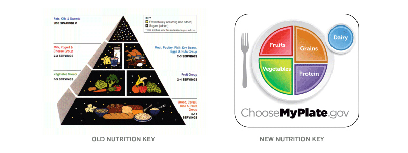
Looking at the design of the old food pyramid, one wonders whether it was designed to reflect dietary recommendations or the pecking order for food industry lobbyists in Washington. The cosmic food illustrations, cumbersome layout, and cryptic serving unit scale (has anyone ever portioned out 6-11 servings of grain per day?) made this a graphic only a nerdy nutritionist could love.
The new graphic is everything that the old one is not. It’s accessible—there are no obscure units or silly drawings, just a simple, graphic representation of recommended food group proportions. If, as the saying goes, “people tend to eat with their eyes,” what could be more useful than demonstrating portion size based on how they consume—on a plate? While this does not encapsulate everything you need to know about balanced nutrition, it achieves the core goal of presenting a simple, memorable device to help Americans make healthier eating decisions in their busy day-to-day lives.
All Products are Created Equal, But Some May Be More Equal than Others
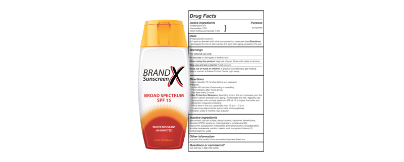
For the past 30 years, options for sunscreen products have multiplied; in addition to the Sun Protection Factor (SPF), products are covered with soft claims about product performance such as “Non-Greasy, Ultra Sweatproof Formula!” As many people know, this information be misleading as some sunscreens—even those of the same underlying SPF factor—perform very differently based on how and how often they are applied, among other things. (This infographic from David McCandless explains the issue quite nicely.)
So how can we balance the need for accessibility (simple, standardized product information) with utility (more useful information on product performance)? How can the FDA help us to evaluate these products, both at a glance and upon closer inspection?
The new labels, as it turns out, have got it just about right. The FDA mandated that manufacturers strip away misleading claims and focus the product information on proven benefits, the SPF factor, whether the product is water resistant, and how long it lasts. On the back side, you’ve got standard directions on how to apply the product along with all the other requisite disclosures and ingredients. The key is that these regulations greatly simplify the product presentation; no longer must we stare blankly down the sunscreen aisle and wonder if one brand’s product is any more effective than another’s. By leveling the playing field, packaging rules are pushing manufacturers to create more effective products, helping consumers make more informed choices, and addressing a major public health concern.
Five-Figure Apples vs. Oranges

Atop the consumer market sits one industry that outspends all others on product marketing. Its products represent the largest investments most families will make outside their home, and how they buy affects not only their pocketbook, but the global economy, the environment, and beyond.
Cars are incredibly advanced products to begin with, and these complexities only compound when you consider the dizzying array of vehicle models available. Consider that these models run on a diverse range of fuels, all of which have different impacts on efficiency, operating cost, and exhaust emissions, and you begin to grasp what a prospective buyer is up against: a seemingly endless array of products, with product information that deliberately resists useful comparison. Given all this, how can labels help consumers make decisions that better address their needs, their budget, and their impact on the environment?
As it turns out, it’s tougher than it sounds. In redesigning new car labels, the EPA/DOT released a number of initial design directions for public comment. The first label system assigned a letter grade to each vehicle model based upon predetermined criteria; this approach oversimplified the comparison, introduced the potential for bias, and was rightly dismissed early on in the process. The other options were more promising, as they presented less subjective metrics to help consumers draw useful comparisons. After a period of public debate (which included a simpler, more coherent system designed by Constructive in collaboration with prominent energy policy group SAFE(secureenergy.org), the EPA released the final design required on all 2013 models.
While it shows a marked improvement over the initial designs, a number of critical issues remain. They expose common challenges for labels in the consumer product market, especially as they relate to consumer durables. Here are a few takeaways to help labels perform even better:
1. Labeling Should Always Be Consumer-Centric
When it comes to everyday purchases such as food, consumers make quick decisions and so labels must be simple enough to take in at a glance. When it comes to larger purchases such as appliances or vehicles, consumers deliberate more intently and are sensitive to subtle differences in performance and quality. Effective label design requires presenting information in a format that caters to what consumers want to know at the point of purchase.
2. Ruthless Efficiency and Simplicity
What’s better than a really informative label? A really informative label that takes less time to read and understand. Content should be curated to deliver the most critical metrics, and design should work to organize this information into intuitive, logical structures that deliver information to the consumer. As labels often have limited display space to deliver their message, efficiency is paramount.
3. Transparency is Key
In the hyper-competitive, commoditized markets, manufacturers must use every technique at their disposal to differentiate their brands and demonstrate comparative advantage. Regulatory labels are often the only place consumers can get an honest take in black & white. Agencies should respect this public trust by demanding transparency in reported information and eschewing potentially biased or derivative metrics—such as letter grades—and any other devices that may be perverted to influence buying behavior.
4. Comparing Apples to Oranges
Choosing between fundamentally different products can be a difficult task; standardized metrics help consumers understand fundamental measures of quality & performance and make meaningful comparisons. When products don’t have standardized units of measure (e.g., comparing fuel efficiency for gas cars to electric cars) this means means creating a basis of comparison (average operating costs, tailpipe emissions, etc.) that treats all product lines consistently and a design that facilitates functional comparison.
5. Beware Design by Committee
The bureaucracies which create standards often contain many layers, each catering to a wide array of stakeholders. Agencies would do well to create a design/revision process that protects the integrity of the result by separating approval (committee vote) from content and design decision-making. Death by committee doesn’t just apply to legislation, or we’d have had truthful labels on tobacco products a long, long time ago.
Of course, there are a number of other factors to take into consideration when devising label designs for consumer products. But by taking advantage of these basic design principles, we can make labels just a bit more useful, make the products just a little bit better, and help even the most dysfunctional bureaucracies deliver on the promise of the information age in the process.
