


Despite how important reading is to college and career readiness, literacy rates for K-12 students in America lag behind other western nations. The Carmel Hill Fund Education Program is an innovative education technology nonprofit that’s reversing this decline to close the education equity gap and increase opportunity for students in America. Carmel Hill combines teacher training and education technology to help schools increase literacy rates for over 40,000 American students. Unfortunately, the education technology nonprofit’s branding and website design were far less innovative and effective than their work on child literacy.
Having seen our work to launch another education technology nonprofit pioneer, UnboundEd, Carmel Hill reached out to Constructive to design branding and a website for the education nonprofit that would help them in their mission to support more teachers and make a difference in the lives of more students.
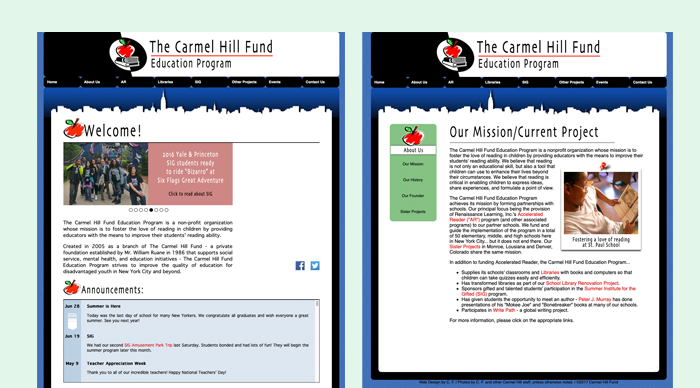
An Innovative Education Nonprofit With a Failing Brand
When Carmel Hill’s team reached out to us, they were stuck with a brand and website that hardly presented them as the nonprofit education technology innovator that they are. However, Carmel Hill’s team agreed that effective nonprofit branding helps increase impact. So we set out to make sure that Carmel Hill’s new branding would equal the education technology nonprofit’s reputation for innovation. They also knew that their website needed to do a much better job serving the schools they partner with if they were going to achieve their goals. Taken together, the nonprofit’s leadership wanted to leave behind a brand they felt was drab and that failed to express their innovative. And online, Carmel Hill’s website needed to be bold, focused on results, and be more connected to the classroom experience.
Designing Uplifting Education Nonprofit Branding to Take Flight
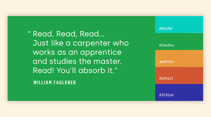
Carmel Hill wanted their nonprofit’s brand identity design to be friendly, welcoming, and trustworthy. This meant making it both familiar to early childhood educators and sophisticated to reinforce credibility to lead. We brainstormed logo concepts until we created something everyone loved—an open book taking flight—inviting audiences into the brand and how Carmel Hill’s nonprofit literacy programs helps unlock opportunities for a lifetime.
Carmel Hill’s new color system takes a traditional early education palette and adds vitality with saturation and brightness. And for the brand’s type system, we chose three typefaces for specific content needs and create visual variety. Flama Condensed makes key numbers and facts stand out; Silka creates bold headlines and statements bold statements; and Museo Slab is references classic schoolbook type for Carmel Hill’s core content.
A New Framework for Digital Brand Storytelling
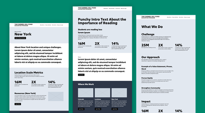
Like many nonprofit websites, Carmel Hill’s needed content strategy and information architecture to better articulate their mission, explain their programs, and demonstrate results. Because of their work in different states, it also needed to support the independent work in Colorado, Louisiana, and New York much better.
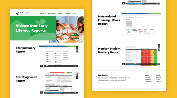
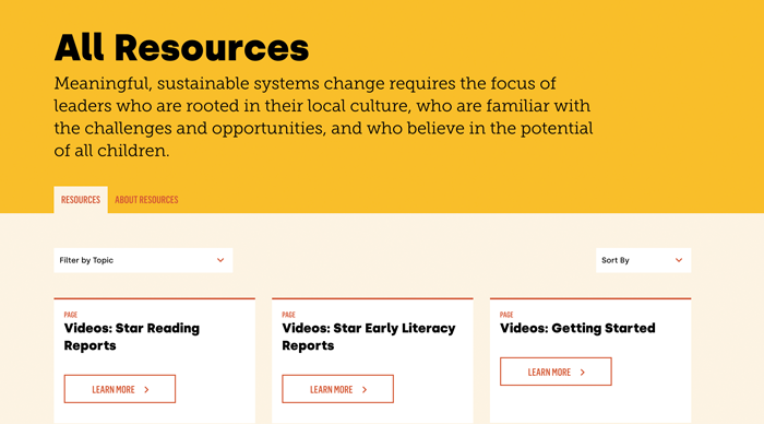
We first designed the user experience to make sure that the nonprofit’s website design was structured to both tell its brand story and educate audiences on the issues. Content strategy places Carmel Hill’s work in the context of both national and state-specific literacy trends. And to support teachers in each state, a private resource hub makes Carmel Hill’s proprietary implementation tools easily accessible to educators with their public school partners
Creating a Colorful and Structured Education Nonprofit Website Design That Tells a Story.
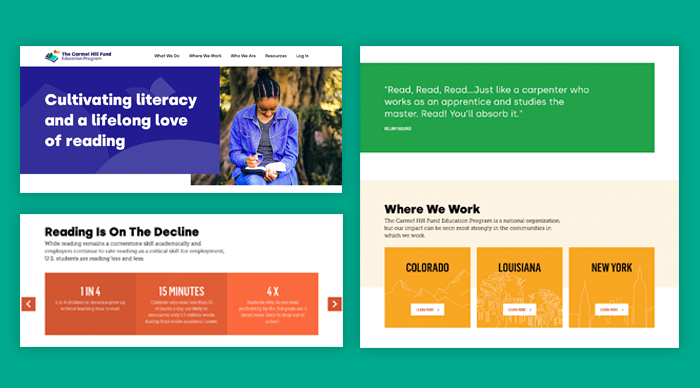
Educators in public schools can sometimes feel overwhelmed, so Carmel Hill wanted their website to feel open and empowering. We strategically used the brand’s bold typography and vibrant colors to create an uplifting experience that creates confidence. Color supports specific content, with yellow for locations; blues to indicate positive trends, red for negative trends, and green for resources, quotes, and stories. And carefully selected, representative images reflect the classroom experience and embody Carmel Hill’s mission to advance education equity and child literacy.
At its core, Carmel Hill’s website is a storytelling platform—one that shares who they are and elevates the stories of the educators and children they exist to serve. Carmel Hill’s social impact strategy and state-based programs are detailed, with success stories celebrated throughout. And central to Carmel Hill’s vision is the life of their founder, Bill Ruane, providing an origin story that adds vital history to the organization they are today.
Empowering Educators to be Local Leaders
Critical to Carmel Hill’s work is providing professional development and program implementation support for its proprietary tools and technology. We created a private workspace for educators to access geographically-tailored resources and training videos—putting the tools they need to successfully implement Carmel Hill’s child literacy programs and make a dramatic difference in the lives of their students.
Learn More About Our Work
Get an up-close and detailed look at this project in our visual case study or explore Constructive’s branding and design for education nonprofits.
