



Climate change is one of the most complex issues to illustrate at a glance. Understanding where emissions come from, how industries contribute to them, and which solutions have the greatest potential to reduce them requires navigating enormous amounts of information. Yet the people making decisions, from investors and business leaders to journalists and educators, often need to understand and communicate that complexity quickly.
This is the challenge we set out to solve with Columbia Business School’s Climate Knowledge Initiative (CKI).
Part of the Tamer Institute at Columbia Business School, CKI translates complex climate and decarbonization research into practical insights that help organizations accelerate the transition to net zero. Their work helps business leaders identify the technologies, sectors, and investment opportunities with the greatest potential to reduce global emissions.
To better communicate this research, Constructive partnered with the CKI team to evaluate their existing data visualizations, identify opportunities to improve the user experience, and reimagine how audiences could explore complex climate data. Together, we designed and developed an interactive data visualization experience that explores global CO2e emissions and abatement pathways across sectors and technologies.
Embedded directly on the Columbia Business School website, the experience enables users to move from a high-level understanding of global emissions to deeper exploration of specific sectors, technologies, and abatement opportunities over time—making complex climate data more accessible and actionable.
Research & Discovery: Designing for the People Behind the Data
Every successful data visualization begins with understanding the needs of its users.
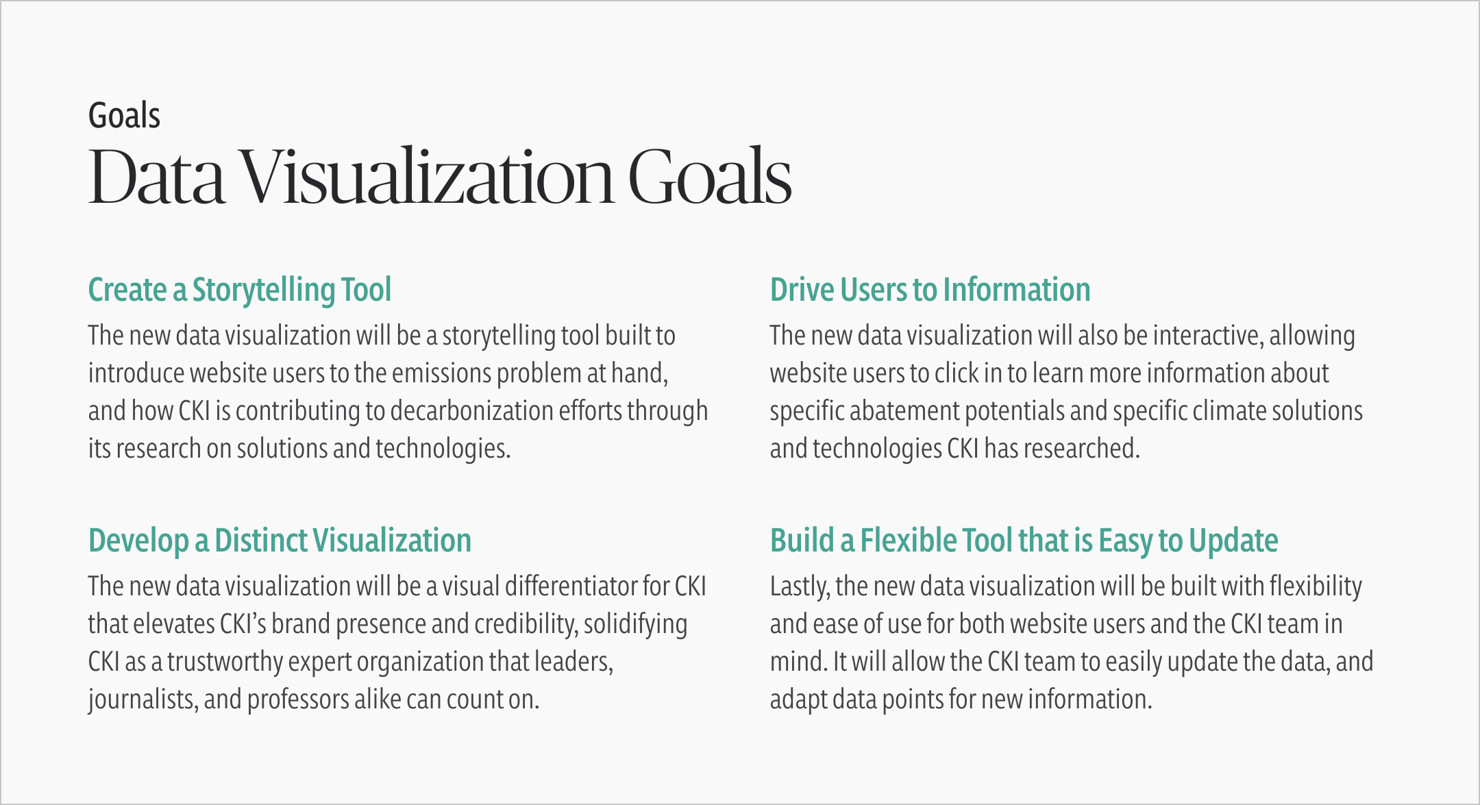
Through an initial learning conversation with the CKI team and continued collaborative working sessions, we learned that the visualization needed to serve several audiences with different goals but similar expectations. Business leaders needed to be able to utilize the tool to identify where investments could have the greatest impact. Journalists needed trustworthy, evidence-based information to support their reporting. Professors would benefit from a resource they could bring directly into the classroom. Across each audience, people were looking for rigorous information that was easy to understand and act on.
Rather than presenting climate data as an isolated snapshot, the visualization needed to tell a complete story. It needed to introduce the scale of global emissions, explain why certain sectors matter, and guide users toward the decarbonization opportunities CKI has researched most deeply.
That story begins with the scale of global emissions. Today, the world produces roughly 50 billion tonnes of CO2e emissions each year. Reaching net zero will require significant investment in the sectors and technologies with the greatest potential to reduce those emissions. Through its research, CKI highlights opportunities across industries and technologies—including cement, energy storage, green hydrogen, solar, sustainable proteins, steel, and wind—that can help accelerate decarbonization.
UX & Visual Design: Turning Complex Climate Data into an Intuitive Experience
At the start of the project, the CKI team came to us with an older Mekko chart built in Tableau and were looking for new ways to present the data. Early in the design process, we explored several alternative visualization concepts that emphasized readability and made it easier to compare sectors at a glance. While these approaches simplified the data, they also stripped away much of the context and nuance that makes CKI’s research so valuable.
Through multiple rounds of exploration with the CKI team, we arrived at a different conclusion: rather than replacing the Mekko chart entirely, we could expand it, building on its strengths. The chart already communicated the scale of global emissions effectively. The opportunity then was to make it easier to explore and provide deeper pathways into CKI’s many available resources.
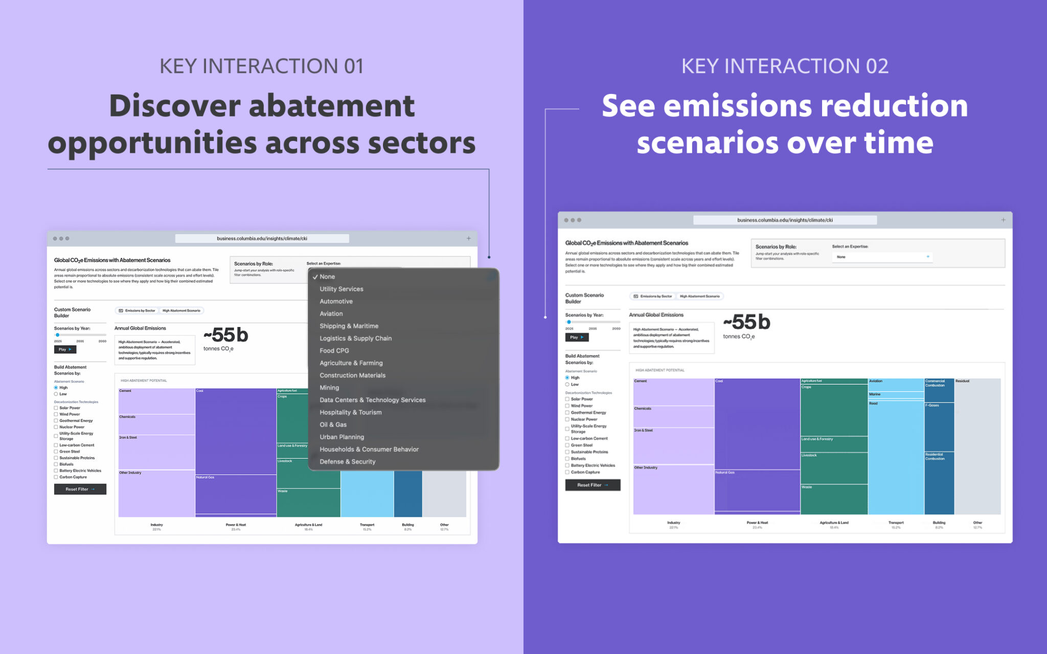
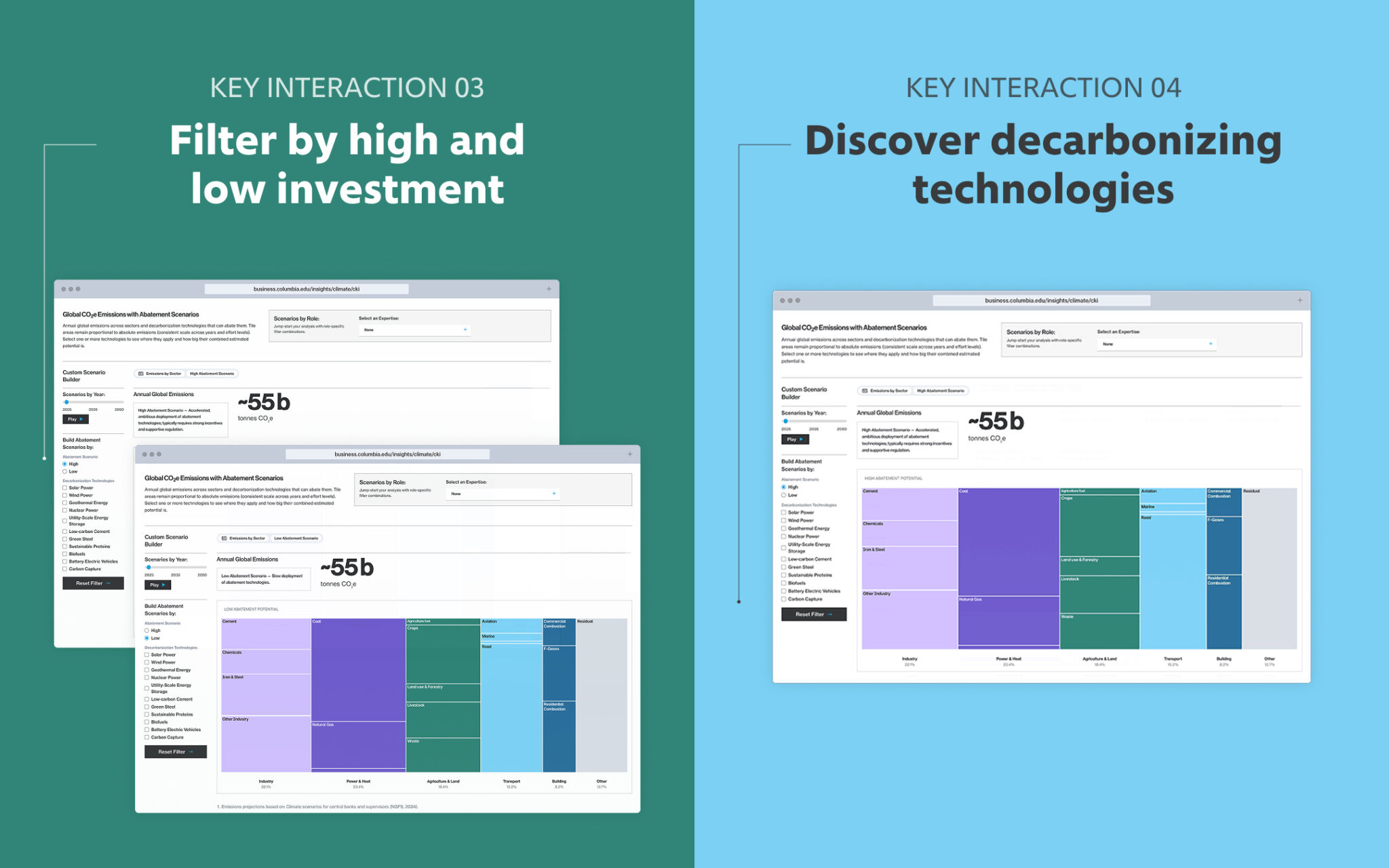
To preserve the richness of CKI’s research without overwhelming users initially, we designed a layered experience that reveals information to users progressively. Visitors can explore sectors, technologies, investment scenarios, and timelines through interactive controls, while contextual insights, expandable details, and supporting resources provide deeper understanding exactly when they’re needed.
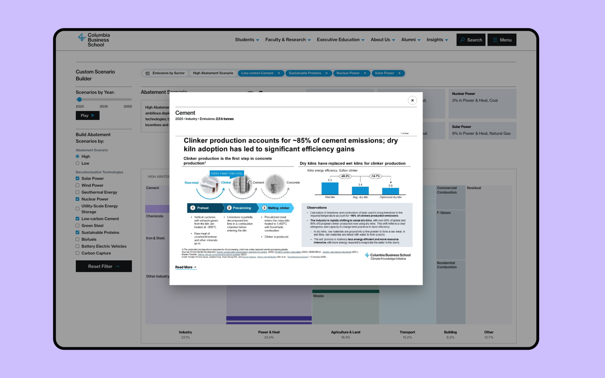
Throughout the experience, thoughtful UX details help users stay oriented as they navigate increasingly complex information. Interactive tooltips go beyond displaying data labels by providing context about decarbonization scenarios and technologies, helping users better understand what they’re seeing. Breadcrumb navigation makes it easy to track active filters and exploration paths at a glance while allowing users to quickly reset or refine their view. As users drill into specific technologies, contextual calls to action connect them directly to related CKI research, creating a seamless path from high-level data exploration to deeper learning.
For users who would rather see the visualization move on its own, we created a play button that allows the Mekko chart to grow or shrink in size over time depending on the chosen abatement scenario. And for users who may just want to peek at the initial data visualization view, we developed an immediately engaging and detailed Mekko chart of the current state of CO2e emissions that both emphasizes the true size of the problem (with a large total emissions number above the chart) and visualizes what sectors and sub-sectors are contributing the most towards emissions.
Working within Columbia Business School’s brand system, we designed an experience that makes a complex visualization feel approachable. Clear hierarchy, purposeful use of color, and generous whitespace help users focus on the relationships within the data rather than feeling overwhelmed by it.
Development: Building a Visualization That Evolves with the Research
In climate research, oftentimes new technologies emerge, projections change, and better data becomes available. To ensure the visualization remained valuable over time, it also needed to fit seamlessly within Columbia Business School’s technical ecosystem and evolve alongside CKI’s growing body of research.
Our team worked closely with Columbia’s developers to understand the institution’s technical requirements and identify the best approach for implementation. Rather than introducing a new framework, we designed the visualization to integrate with Columbia’s content management system and existing component architecture, ensuring it could be maintained within their established workflows.
Together with the CKI and Columbia tech, we developed a strategy for storing and accessing visualization data that balances flexibility with security, making it possible to update, expand, and correct information with little to no technical support.
Outcomes: Delivering a More Engaging Entry Point into Climate Research
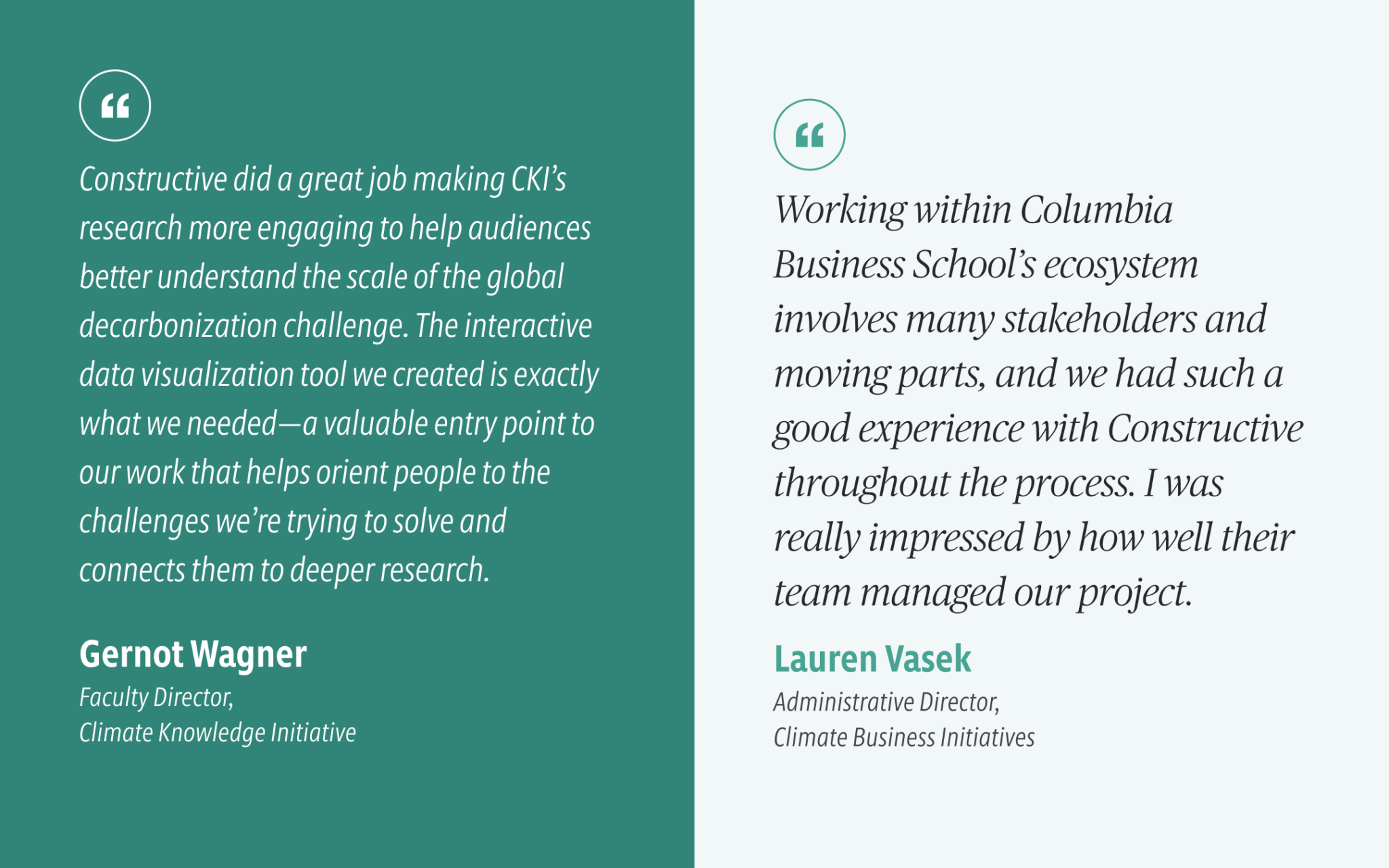
Today, the interactive visualization serves as one of the primary entry points into CKI’s work. Instead of asking visitors to navigate dozens of reports or slide decks on their own before understanding the organization’s research, the experience provides an accessible overview of the global decarbonization challenge while encouraging deeper exploration into individual sectors and technologies.
It helps connect the scale of the problem with the opportunities for meaningful action—making complex climate research more engaging without sacrificing its rigor.
Want to bring your organization’s data to life? Whether you’re communicating research, impact, or complex systems, we help mission-driven organizations create digital experiences that turn data into stories people can understand and act on. Get in touch to learn how we can help!
