


How good a nonprofit website looks and feels from the public-facing side (aka: “the front-end”) is important. It’s something design firms, of course, think about a lot. And when you envision your website in your mind, you may naturally think of how it works and looks. Now think about the backend—the stuff working behind-the-scenes to deliver those great user experiences for audiences, like your content management system (or “CMS”). What comes to mind? Is it a frustrating, time-consuming mess or is it as easy as a walk in the park?
Well, when it comes to the world of websites, what’s under the hood matters. All CMS’s are decidedly not created equal. And depending on how thoughtful a web design agency is, this could mean winding up with a website that delights your audiences, but creates nothing but headaches for you and your staff. Based on the feedback we hear from organizations looking to redesign their current websites, far too many nonprofit website CMS’s are cluttered and unnavigable, leaving site managers with more questions than answers. How do I create a new page? How do I change the layout without breaking things? Is the “Featured Image” really a” Featured Image”? What is a “Featured Image”?! What goes where?!
But it doesn’t have to be this way! In fact, it shouldn’t. It’s our philosophy that website admins are users too. In fact, site managers spend way more time on a nonprofit’s website than most users. So, if you believe in user-centric design like we do, then you should take the time to plan and design an intuitive CMS with logical publishing workflows that make it easy for people to visualize, create and edit content. Unfortunately (at least judging by the level of frustration with nonprofits when they ask us about redesigning their websites), not enough agencies do. The result is clients who are left holding the bag with a clunky, frustrating CMS that is a constant source of pain for staff.
Well, fear not! We’re here to help fix this problem by starting a dialog on what goes into creating a great CMS (in this case, WordPress, though we also work in Drupal) that people will absolutely love to use.
Impact on Content Curators
The most important people around the web are the ones who make web content. When it comes to content creator workflow, time equals money, and in the case of websites with a constant flow of new content, the speed and simplicity of their workflow is paramount. Using buckets or fields for content is a straightforward way to enable consistent results. In addition, you’re also reducing training burden, complex formatting rules for content entry, and cognitive load. Reducing the cognitive load leaves more room for creating and editing rather than figuring out how to use the site. If you’ve ever tried to learn a new version of Microsoft Word or Excel after a major update, you know exactly what a high cognitive load feels like.
Impact on Website Maintenance
Backend layout semantics can also have a significant effect on maintenance costs. When documentation is scarce and a new developer or administrator is brought on to maintain or enhance the site, hunting for options and how they relate to one another takes valuable time and can lead to confusions and ultimately misconfiguration.
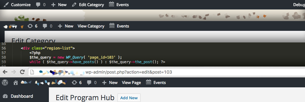
Nothing is worse than not being able to find where you edit a page without digging into code to discover where something is linked up. In the example below, the way to edit this page is in a seemingly unrelated part of the backend compared to the frontend. It looked as if one would be editing a category, but that wasn’t the case—we had to go digging into code to find where to edit the target content. Frustrating for site managers and frustrating for content creators.
Planning a User-Friendly CMS Backend as a Complete Thought
The best policy when planning how the backend works is…do what feels right? Well, sort of. What we’re trying to say is that options for the blog section of a site should be filed under the Posts section for your blog posts or perhaps a theme options page that clearly categorizes blog-related options and features. Extending the WordPress experience is preferable to stacking on another layer.
As with shopping for a new car, you’re expecting controls to be where you’d suspect they should be in the interior. It might drive great, but if the A/C, Heating, and Vent controls are under the passenger seat, your expectations for an easy to use ride are not being met. For developers—as the car designer and manufacturer in this example—it’s their responsibility to make an enjoyable and user-friendly ride.
Semantic Organization: The hallmark of any smart visual design, UX design or development is semantic organization – or categorical and top to bottom semantics to be more precise. This goes here and that goes there because it makes sense, right? Make it easy to use and understand. Categorical organization in the backend should be easily understood right when you log in to WordPress. Here’s where we go to create a new blog post. There’s the place to add another staff member. Easy peasy!
Top-to-bottom organization should be a logical flow from top to bottom when editing any type of post or page. Page title for WordPress. Check! Second the custom heading, then the banner image. Maybe after that some introductory copy. Perhaps there’s a section for teaser content used through the site below that. Afterward, you should see the main body content. Other options like SEO customizations? We think those might go great up top for this client, but maybe the next client needs those down below. Either way you look at it, it’s a meaningful client-oriented design that makes sense to those crafting and entering the content.
Iconography: To tie into the concept of easily finding relevant content controls: relaying a quick message can be as simple as representing section or content type with an icon cue. It’s not a secret at all that icons are powerful communicators. Better yet, WordPress makes it easy to implement these for Custom Post Types (Insights, Reports, Projects, Blog Posts, etc) or any major menu section with their dashicons. The icons help guide users in the right direction with visual cues. Paired up with a concise label, it’s easy to find exactly what you’re looking for. In the case of a complex site architecture, iconography can make an even bigger difference.
Naming Conventions
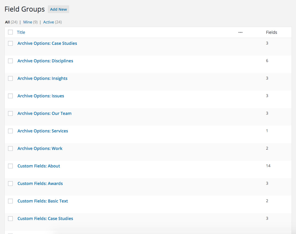
We like to stay organized and aid developers and content creators by leveraging tools like Advanced Custom Fields to make creating and editing content, as well as software development, more straightforward. Names of any sort, code, scripting or template files should be sorted logically and labelled to aid finding what you need. Take this list of custom field groups for content created in Advanced Custom Fields for example.
When it comes to updating or adding visual rows of content on our own site, they’re organized by row to allow us to focus on one template file and one set of files instead of getting lost in fields or files we don’t need. This translates to content entry in the same regard. New rows of content are added and organized as the author wants to present them on the frontend. They’re easy to find and the names of each row make sense as to what they do.
Documentation: When all else has been done to create a user-friendly journey through the CMS backend, there is one more tool that can make or break an experience: documentation. While it should be standard practice to document how to use a piece of software, even a simple reference guide can make a tremendous difference.
However, the trick is getting people to actually read directions. To make content entry easier for creators who are not tech savvy, don’t read documentation, don’t follow the rules, or who are coming back and just need a quick refresh, inline directions or tips that assist content entry should be included.
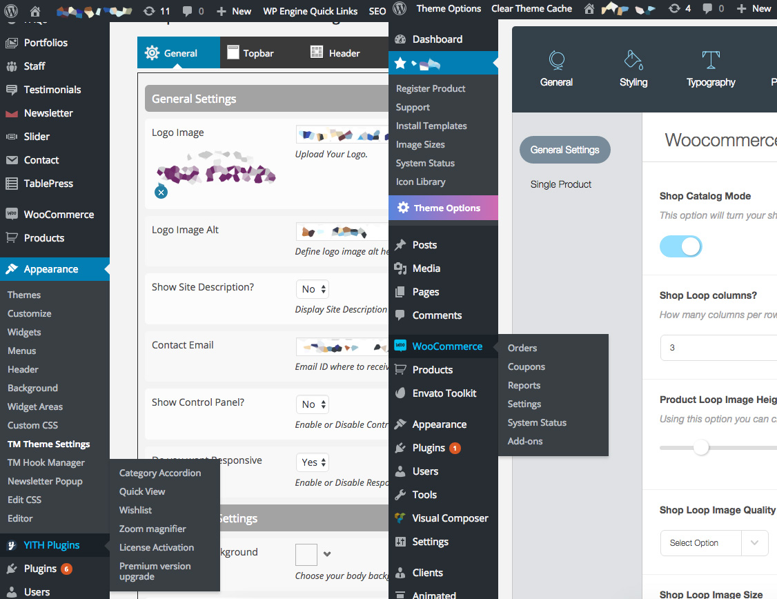
3rd Party Software Minefield: WordPress plugins can aid in developing a great site with little work, but they can really trash up a backend. A couple of good examples of confusing backend layout would be two off-the-shelf WordPress themes we recently had the “pleasure” of evaluating. Both are built to work with a popular WordPress Ecommerce plugin. Options for common elements of the public facing website can be strewn across multiple parts of the backend. Required plugins clutter up the site with way too many menu options and panels.
Unfortunately, not everyone believes in less being more. It’s common to see this kind of “menumania” in off-the-shelf super themes and bloated plugins. If the authors had been watching Good Eats with Alton Brown, they’d know they should have better ‘multi-taskers’ in the kitchen.
You have a voice and we should make it easier to be heard
I hope this increases the awareness for how important a user-friendly CMS backend architecture is to WordPress users. If a website were to be held up by legs as on a tripod, one leg would be content, another presentation, and the last the content entry workflow. Each are important to holding up the message a website is projecting.
Don’t take the design of a good CMS backend for granted. It takes time and effort, and should be created with the same TLC as the website your audiences visit. And it should make it easy and intuitive for site administrators and content creators to understand how the work they are doing will live when published. Putting in the time up-front will save countless valuable hours of staff struggling with a frustrating, poorly designed CMS (not to mention headaches!).
Have questions about how we’d approach creating a CMS that works for you instead of against you as part of a website redesign? Just let us know by getting in touch here!
