Data visualization design is the process of taking a complex structure and breaking it down in a way that the reader can easily comprehend. It’s a powerful tool used to translate complex data into more understandable and accessible information that audiences can understand and relate to. Data visualization for nonprofits—particularly research-driven nonprofits—is an equally powerful way to strengthen communications—breaking down complex systems, dynamics, and situations so that they connect audiences to important social impact issues and ways to address them.
Recently, we were engaged by World Economic Forum to develop a series of data visualizations for several global issues. The content they gave us to work with was complex and needed to not only be simplified, but delivered in a compact format that would keep readers engaged. In this Field Note, we’ll explain the four critical steps we took to create a visualization to turn this complexity into simplicity to help World Economic Forum more effectively share its insights.
Step 1: Decipher the Data
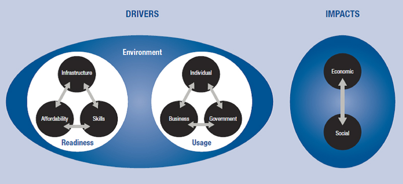
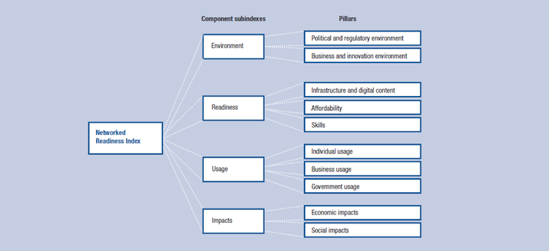
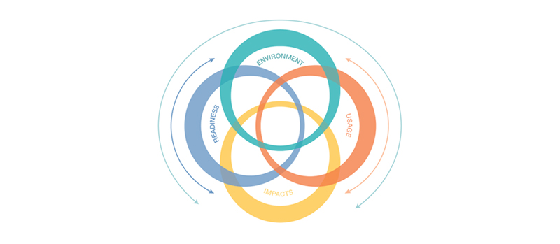
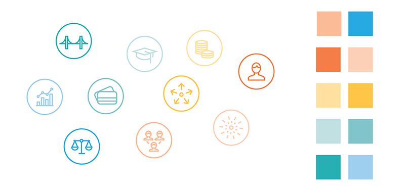
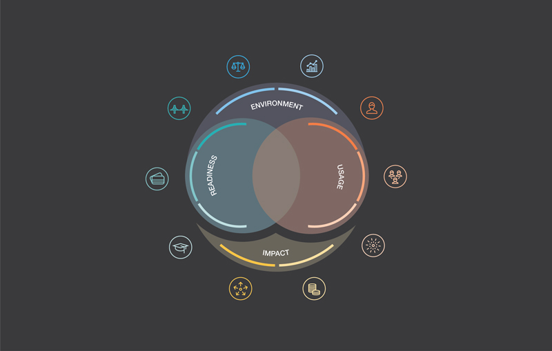
As with every design process, the first step in data visualization begins with establishing clear goals and then unpacking all of the information/data to understand how they can best support this goal. The priority is to unederstand what problem you are trying to solve and, from there, start to conceptualize a solution. In the case of World Economic Forum, our task was to decipher the data provided regarding The Networked Readiness Index (NRI). This is a complex global data set, comprised of four sub-indexes and ten pillars. The first two images are some of the information we were originally provided to design new data visualizations for. Our design challenge was to integrate both of these competing concepts into a singular visualization, which is displayed afterwards.
Step 2: Iterate…Iterate…Iterate
Iterative design in data visualization is essential because, when you’re working with complex research and information that needs to be communicated faithfully, you have to test assumptions before committing to a solution. We know that we very well may not get it right the first time—or even the second. We embarked on an iterative process exploring a variety of design structures before we reached a solution where the viewer could unquestionably discern the data. Design iteration allows us the opportunity to explore until we ultimately arrive at a solution that works.
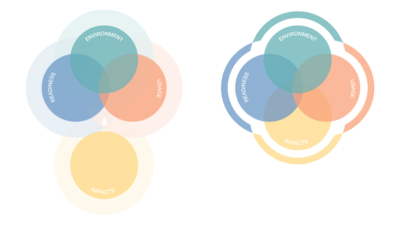
There are many different types of graphs which can be used for data visualization. We explored two types for this project: the radial partition and the Venn diagram. The radial partition graph displays hierarchical data on a radial system by splitting up the sectors of a simple pie chart on different rings. Venn diagrams are specially designed diagrams that show all possible logical relations and capture the relationships between different categories and levels of information. Through the process of iteration, we discovered that the Venn diagram seemed to capture the information more accurately than the radial partition graph.
Step 3: Create a Graphic Narrative
Once we understood the message we needed to communicate, we then needed to create the visual language to articulate it. Curating the appropriate visual elements is critical, as the goal of any effective visualization is to allow the viewer to interpret information rapidly. A graphic narrative may contain a variety of visual elements. For example, color can be used as an indicator to accent data points or create classes of separation, and iconography can be utilized to support user comprehension. It is critical that whichever visual language you choose, it should always minimize the viewer’s time to interpret the data. The choice of visual representation, whether it is an illustration, icons, visual elements, or graphs, is that it is effective and aligns to telling the story accurately.
The goal of a graphic narrative should be to make a subject accessible to the user. It is about delivering clarity without diluting the data’s complexity. Rather, it should be made more digestible through elegant presentation.
Step 4: Completion Checklist
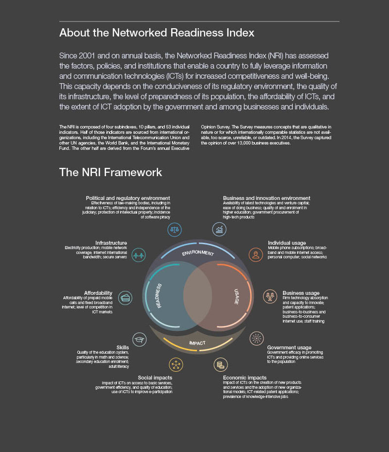
A successful visualization should: a) clearly translate the message, b) reduce cognitive overload through visual language, and c) engage the viewer. In other words, the key for a successful visualization or infographic is to clearly and concisely tell the story. Here is our final visualization, which integrated the supplied sketches and included a Venn diagram and use of icons and color to communicate the framework for The Networked Readiness Index (NRI).