


The National Head Start Association (NHSA) s an iconic education nonprofit and tireless advocate for education equity. Established as part of The Great Society, NHSA is the leading voice for the Head Start community, supporting hundreds of schools, a membership of thousands, and countless families across America. They are a vital force in improving teaching practice and education policy that increase education equity. After developing a new strategic plan that re-organized its practice areas, NHSA needed a design firm with expertise in branding and website design for education nonprofits to design a new way forward for their brand.

An Education Nonprofit Brand Stuck in the Past
Rebranding an iconic organization like NHSA is a big responsibility. It’s also an exciting challenge, and our team saw a lot of opportunity to transform the nonprofit’s image with a more effective brand strategy and brand architecture. The education nonprofit’s branding made NHSA look dated—much more like a 20th-century laggard than a progressive leader for education quality, and education equity in the 21st century. As a result, NHSA’s leadership and credibility to solve the education challenges facing families today were being undermined.
Online, the situation wasn’t any better. Websites for nonprofit associations and member-driven nonprofits have a bigger responsibility than those of most other nonprofits. That’s because the value of membership to the community—and so, the brand’s value itself—is heavily based on the quality of the experiences nonprofit association websites create for members. In the case of NHSA, they were stuck with a cluttered, decade-old website that violated best practices in content-heavy website design and was built on a clunky CMS with poor Salesforce integration.
Education Nonprofit Branding That Changes Perceptions
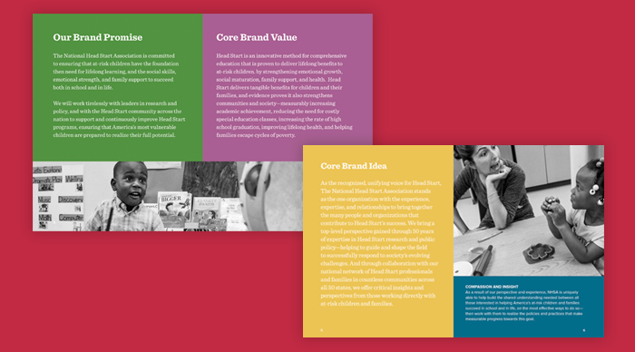
The NHSA’s history gave their brand strengths and some weaknesses. Their pioneering legacy of improving education equity was unquestioned. But after 50 years, NHSA was challenged to be seen as a modern innovator among other k-12 education nonprofits. We set out to develop a unified brand message and identity for NHSA that would retain and amplify the nonprofit’s history of innovation that made it a respected leader, while reinventing the brand to spoke to education in the 21st century education.
We started with brand strategy, partnering with NHSA’s leadership in workshops to explore their history, mission, and values—and then place their new strategic plan within this important context. Framing research on K-12 education complemented this strategy by re-centering everyone on the intersectionality of education equity and social justice—and in doing so, provided the relevant issue we needed to connect with NHSA’s legacy.
When it came to designing a new branding for the education nonprofit, our priority was the same—retain what makes NHSA’s brand part of the American landscape while updating it for a new era. We refreshed NHSA’s iconic logo with a more streamlined, contemporary design, more sophisticated colors, and a new brand typeface—retaining the nonprofit’s substantial brand equity while positioning them to lead the future of education equity.
UX Design for a More Valuable Nonprofit Association Website
NHSA’s website was seven years old and, not surprisingly, was difficult to navigate, filled with confusing content, and made it painful for people to find what they were looking for. With many of these people being members of the National Head Start Association, this meant that the nonprofit’s website was failing to serve the people that it is most responsible to.
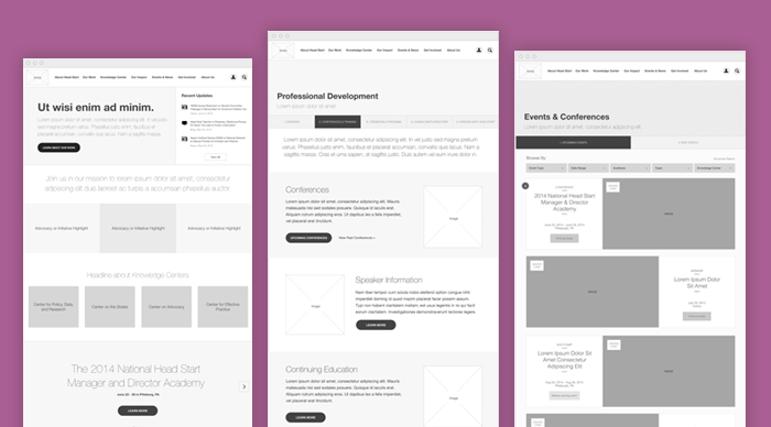
By leveraging our brand strategy in our UX design, our digital team and NHSA’s had clear alignment on who the nonprofit’s audiences were and what was most important to them. We audited the nonprofit’s website to catalog content and assessing it for quality. Then, we conducted user research and testing to understand how well community features were working for the association’s members.
With our UX research done, we then designed integrated information architecture and content strategy that both NHSA’s brand story, makes it easy to explore their different areas of work, and makes sure that members and non-members have easy access to content and resources.
A New Website Designed to Honor the National Leader in Education Equity
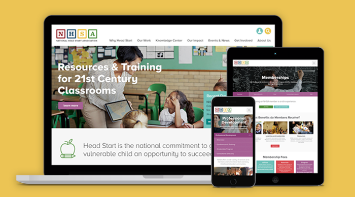
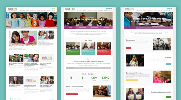
It was finally time to turn our brand strategy, visual branding, and user experience design into a vibrant nonprofit association website that would create a true sense of community. The NHSA’s new website is designed with a colorful vibrancy that embodies the endless potential in every child with a smart, clean, and structured design system that that reinforces NHSA’s evidence-based, results-driven focus.
The NHSA’s new color palette hints at classic education colors, but gives them a new look that feels more in line with contemporary education brands. photography places a central role—celebrating the educators that NHSA represents and bringing the work of their community to life online.
Most important, because NHSA is a nonprofit member association, their new website needed to not only support teachers in its network, it also had to invite in new educators. We created membership pages that represent NHSA’s diverse community and elevate membership benefits to grow the network.
A Nonprofit Association Website Experience that Delivers Greater Value to Members
For NHSA, their website represents much more than a marketing presence. It’s also the central destination for thousands of NHSA members across the nation. NHSA members turn to the nonprofit association website not just for information, but also to interact with association, register for important events, get professional development resources, and access other member benefits.
To make sure that NHSA’s website created great experiences for their members, our web engineers architected a Drupal CMS that’s integrated with Salesforce. The integrated system makes it easy for NHSA’s national membership to access their website with single sign-on. Customizable profiles allow members to keep their information current and access information that they previously had to contact NHSA directly to get. And custom publishing workflows make website management easy for NHSA’s staff, increasing efficiency while they keep their website current.
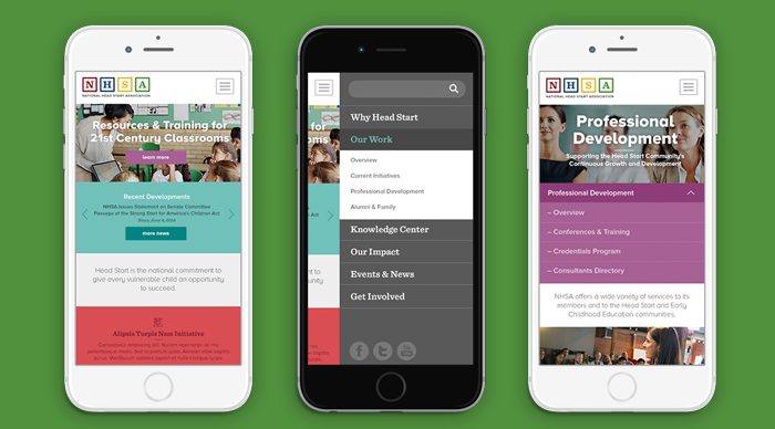
A Responsive Nonprofit Website, Designed for People on the Go.
To make sure that NHSA members, educators, and parents are well-supported however they visit the education nonprofit’s new website, we paid extra attention to responsive design best practices to deliver a great mobile experience. Teachers, school leaders, and families on the go are better served by a more accessible, more inclusive website that’s customized for mobile screens.
The resulting nonprofit website design gives users full access to NHSA’s content, events, and more so that educators, families, and NHSA work together more effectively to make a difference in the lives of children across America.
Learn More About Our Work
Get an up-close and detailed look at this project in our visual case study or explore Constructive’s branding and design for education nonprofits.
