


The caregiving sector is one of the most essential in American society. According to the latest Caregiving in the US report from AARP and the National Alliance for Caregiving, about 63 million Americans, or a quarter of adults over 18, have a family member at home who needs care. And nearly 1 in 4 caregivers report providing 40+ hours of care per week.
Unfortunately, despite their importance, when it comes to caregivers and the caregiving workforce as a whole, both are too often under-recognized and under-supported. The COVID-19 pandemic helped raise awareness of and appreciation for caregivers as essential workers, creating a long-overdue movement that increased national visibility. Still, America has a long way to go to establish the necessary systems and policies to truly support caregivers and recognize them for the economic value they provide for this nation.
For nearly 30 years, The National Alliance for Caregiving (NAC) has been at the forefront of this push for greater recognition and reward for the caregiving sector. Their research and advocacy work have been vital to advancing equitable systems of support for family caregivers across America—translating grassroots experience into evidence-based policy and research that strengthens and supports the sector as it stands shoulder to shoulder with caregivers.
Approaching its 30th anniversary as an organization, NAC saw this as a critical opportunity to reimagine its brand to meet the moment and speak to the next 30 years of impact. It was clear the organization needed a brand identity that reflected both its grassroots origins and its credibility as a national thought leader. NAC partnered with Constructive to develop a brand that reflects their momentum and sets the tone for the future of care in America.
Discovery & Research: Understanding NAC’s History & Future Aspirations
Every strong brand begins with a clear understanding of who they are as an organization, what they stand for, and how they want to be perceived by their stakeholders and audiences. For NAC, that meant beginning the process with one of Constructive’s core exercises: the Learning Conversation.
This structured discovery session provides leadership with an opportunity to reflect on the organization’s past and its future direction. With nearly three decades of impact and national momentum building around caregiving, NAC was at an inflection point. Stakeholders shared how the existing brand felt outdated, unmemorable, and no longer reflected their sophistication. They voiced that the overall colors and impression, “aren’t necessarily conducive to who we are and what we want to promote in terms of our mission, our vision, and our compassion.”
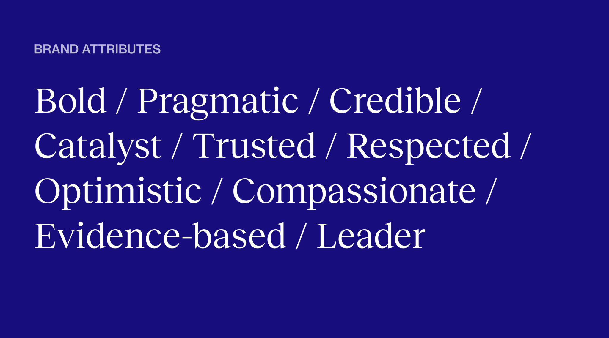
To articulate the brand’s personality and positioning, we facilitated a word-based exercise to capture the attributes NAC wanted their audience to associate with the brand. To help drive our visual ideation, we compiled examples from within and outside the health sector to understand what resonated and why. This visual exercise is especially helpful for stakeholders who are less fluent in design language, as it enables them to offer their reactions or impressions when discussing color, visuals, and typography preferences.
Stemming from our conversations, the following principles served as our North Star as we moved into visual design:
- Be bold and visionary: Challenge outdated perceptions of caregiving and advance a future where family caregivers are valued, supported, and empowered.
- Be a catalyst for systems change: Stand strongly with partners and speak with credibility and authority about the need for sector transformation.
- Be rigorous and rooted in evidence: Speak with authority and credibility to policymakers, advocates, and alliance members about the policies needed and the evidence that supports this transformation.
- Be a voice for caregivers: Authentically amplify real caregiver voices and experiences to drive advocacy and inspire action.
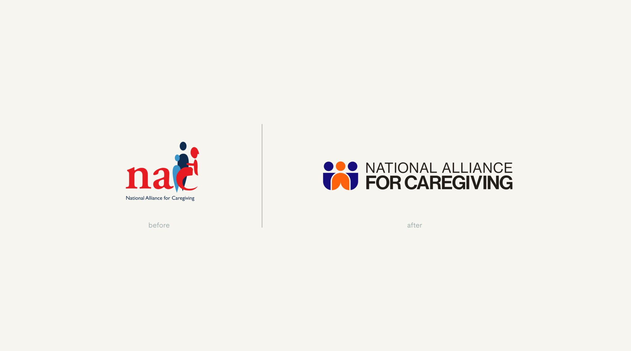
From Dated to Durable: Reimagining the Brand Logo & Mark
One of the first noticeable changes we made when reimagining the brand identity was ensuring the organization’s full name was clearly legible in the logo, which helps with overall brand awareness. We moved away from using NAC as a shorthand to avoid diluting the strength of the organization’s name. The previous mark, once considered progressive for its symbolic nod to disability through a wheelchair-like figure, wasn’t necessarily discernible at a glance. We responded with a bold, geometric logo system rooted in clarity and accessibility. The new typographic mark strikes a balance between the gravity of policy work and the warmth and community that caregiving represents. Central to the design is the trio of human figures—symbolizing not just an individual caregiver but also the broader community of support that surrounds them.
Embracing Boldness: A Stronger Spectrum of Color & Typography
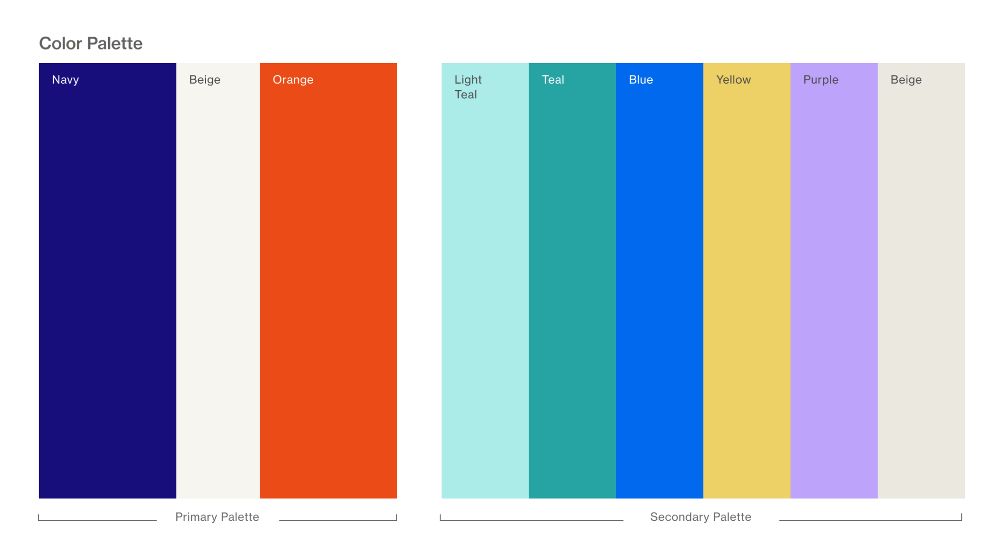
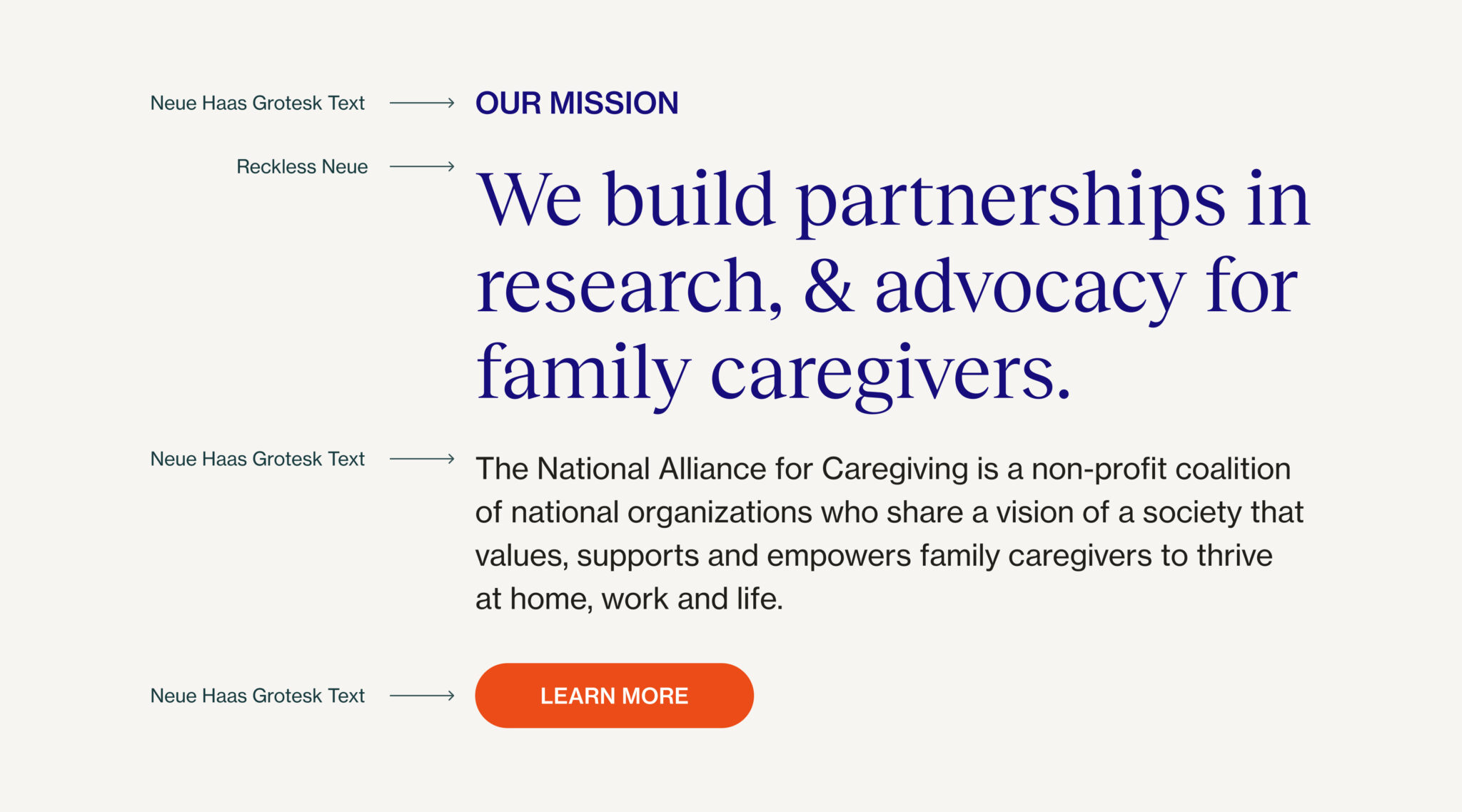
During our discovery sessions, the NAC team shared that they wanted this rebrand to feel “different and durable.” To visually express the duality of NAC’s brand—uplifting caregiver voices and driving policy change—the new brand centers on a deep blue that conveys credibility and leadership. We chose a vibrant orange to bring warmth and urgency to the front, supported by a broader palette of human-centric tones. This resulting palette is both flexible and uplifting, allowing for a range of expressions, from strong and reassuring to vibrant and optimistic. When considering typeface, we prioritized accessibility and legibility. We chose a sans-serif typeface as the workhorse font—something clean, durable, and super legible that could reliably handle our body text, interface elements, and functional content. Our serif font plays a more specific role, appearing in headlines and key messaging where its personality adds warmth and a human touch to the brand.
Ethical Visual Storytelling: Putting Caregivers in the Spotlight
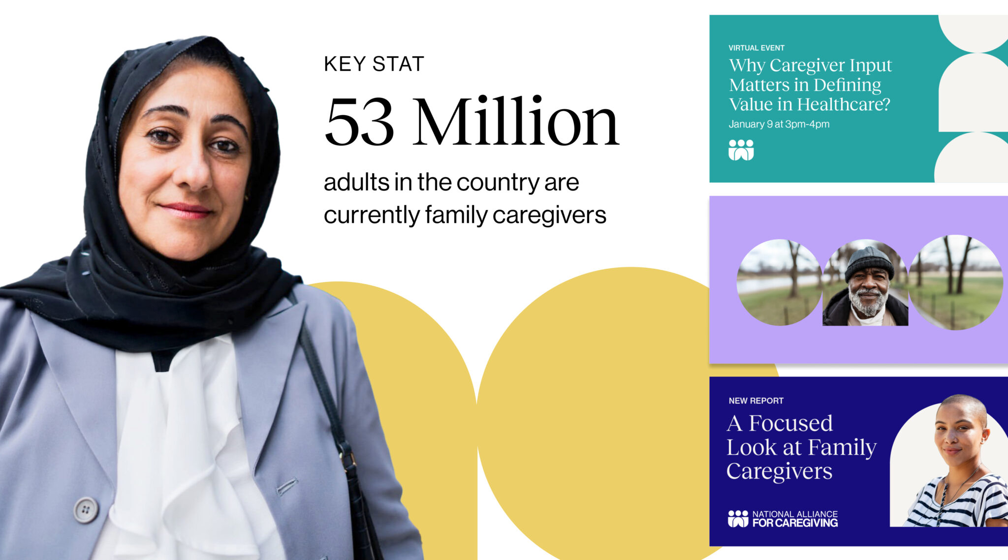
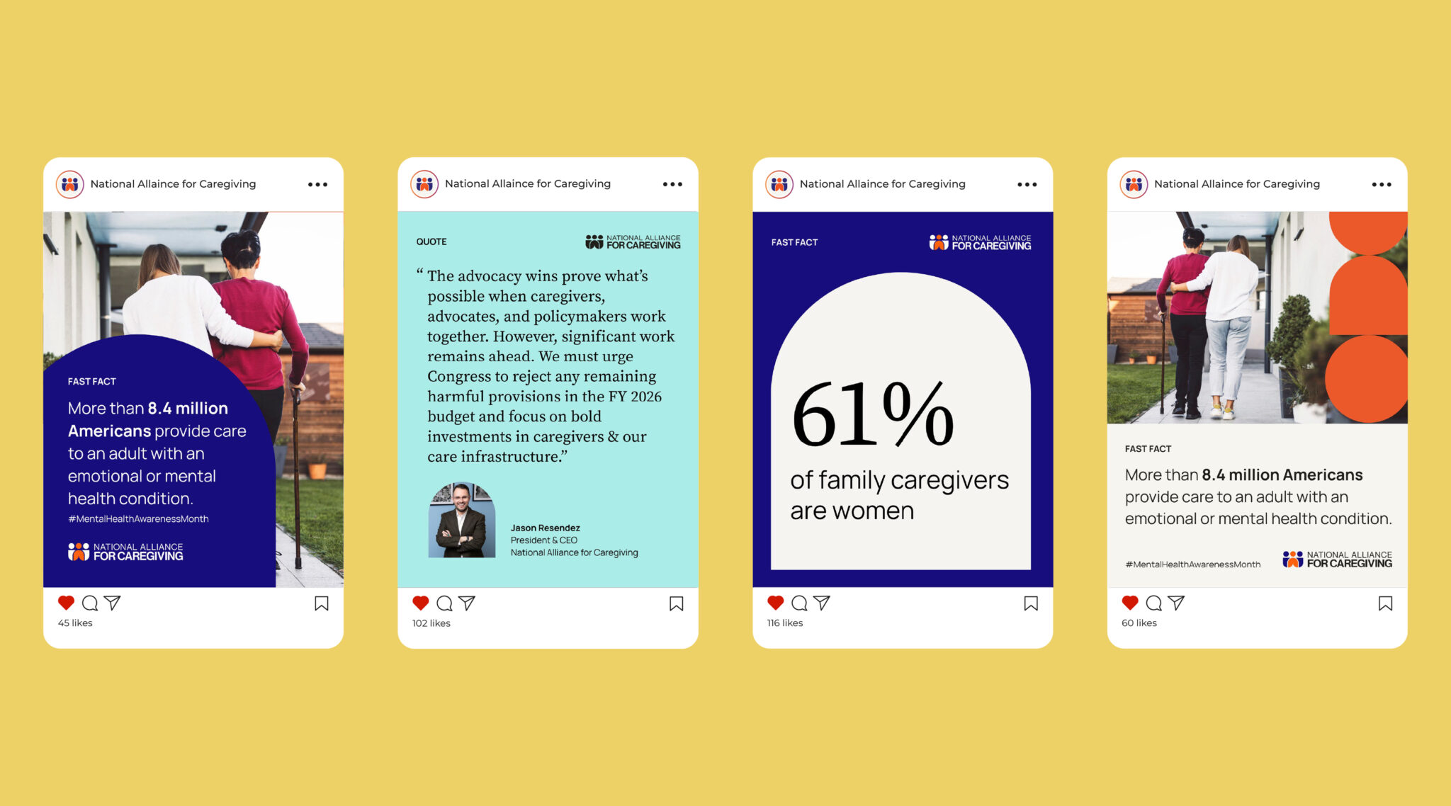
Caregiving is inherently human and extremely personal, so the rebrand’s photography needed to reflect this carefully. NAC’s new visual direction emphasizes natural lighting, neutral poses, and diverse caregiver stories in authentic environments. While many images are stock due to geographical and logistical constraints, we prioritized selecting images that prioritize realism over polish. We aimed to create a library of photo assets that felt honest, intimate, and inclusive, while portraying vulnerable populations in an ethical and dignified manner. We ensured we chose images of smiling figures and scenes that respected the humans in the process while demonstrating their strength and dignity. For portrait cutouts, we isolated images of caregivers in front of bold background colors to allow these individuals to really stand out and shine.
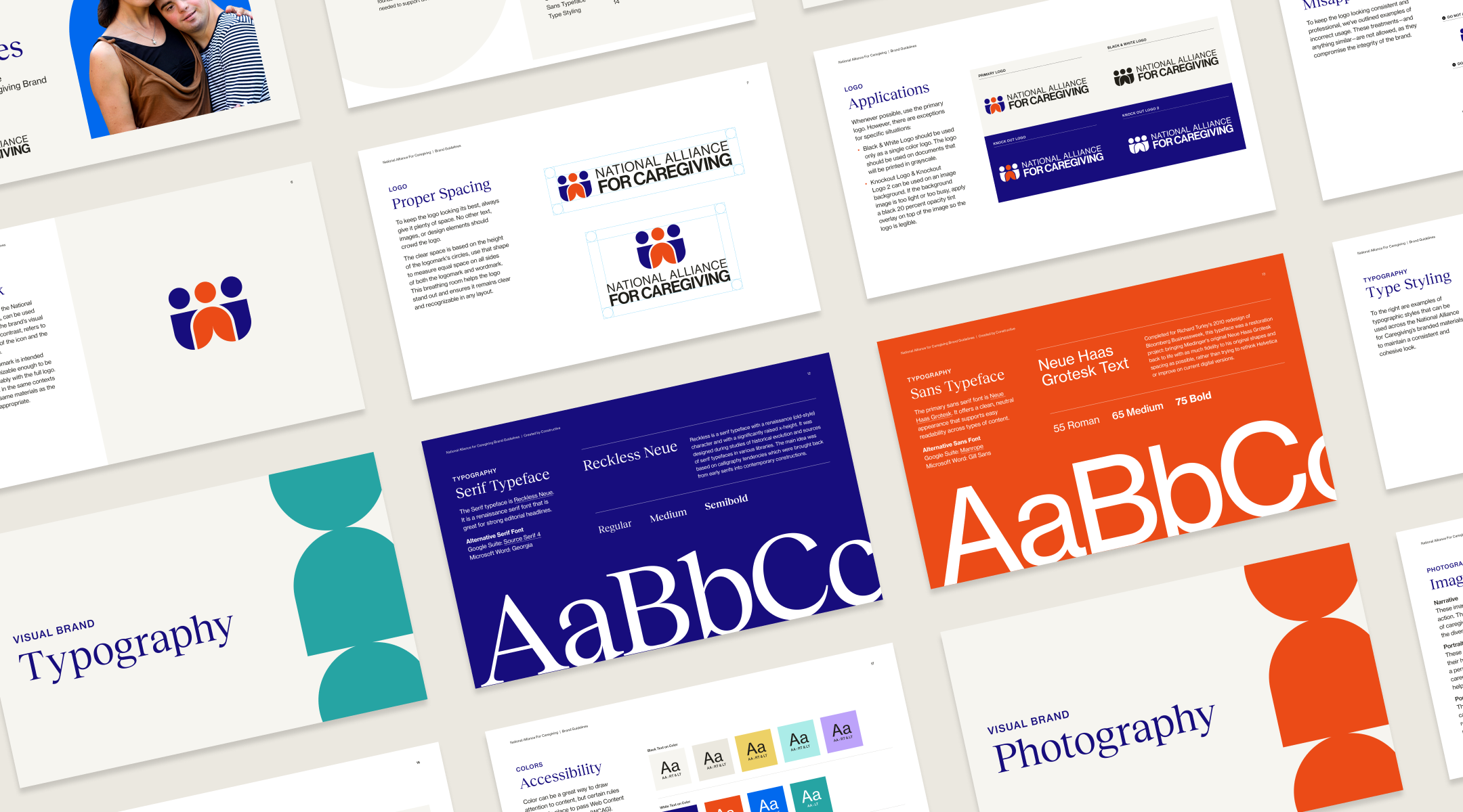
Brand Guidelines: Delivering a Cohesive Brand System for Scale
One of the key points that emerged during our early conversations with the team was the need to streamline and scale content production to live within the same brand umbrella. NAC emphasized the need for a system that staff and stakeholders would actually want to use. We developed a brand book that brings clarity and flexibility to NAC’s communications. A strong foundation of shapes, color, and typographic hierarchies allows the brand to adapt without sacrificing consistency or starting from scratch every time. These guidelines are designed to establish a strong visual foundation while allowing for the creative flexibility needed to support their diverse communication needs.
Beyond Web: Extending the Brand Across Channels
To support consistent, real-world application of the new brand, our team delivered a suite of branded templates and materials for the NAC team to customize, including:
- Social media templates to customize in Canva
- Presentation templates
- Business cards
- Letterhead
- White paper and report layouts
These templates will help NAC communicate clearly and confidently within the new design system, regardless of where the content appears.
Ready to transform your nonprofit brand? Get in touch to see how we can partner with you!
