


Great content is essential to helping people understand the issues that nonprofits work on, particularly policy and advocacy nonprofits and research institutes that work on complex, systemic challenges. And this content is usually sophisticated, nuanced, and….long. Which can make it really inaccessible for most audiences. Unfortunately, the way this important content is designed in content-heavy nonprofit websites contributes to making ideas less accessible, which can make audiences uninterested in engaging—and as a result, undermine change. So, when a nonprofit’s content cannot be simplified without compromising it, how do we keep people engaged with our ideas and get educated on the issues? Turns out good design is a writer’s best friend. Because sometimes the best content strategies aren’t about the words you use, it’s how you use them. Or better put, it’s how well you design content-heavy website experiences to keep people engaged for longer online reads.
It’s a core belief of mine that for any nonprofit whose mission hinges on providing perspective and thought leadership on important social issues, if how their content is designed isn’t on par with the quality of the nonprofit’s expertise, then they’re just cheapening their work. But don’t just take my word for it: research has proven that design has a significant impact on credibility. People come to quick conclusions about an organization while visiting their website—and (sorry, designers) audiences ultimately come to websites for the content.
But design matters. A lot! For nonprofits like think tanks and research institutes whose missions are advanced by producing and sharing knowledge, the design quality of their content says a lot about what audiences can expect from it. With more content just a click away, if that design does not hold up, audiences will likely leave and find other places to get the content they want.
So, whatever content your nonprofit publishes, content design and time-tested editorial design techniques hold the keys to success in engaging audiences online. Thoughtful, strategic design allows nonprofits with content-heavy websites to communicate clearly and effectively—encouraging audiences to visit, engage with our ideas, become educated on issues, explore more, and most importantly, act. We’ve talked about the key principles for effective content-heavy website design before. Now let’s look at these content design strategies put into use in your nonprofit’s website.
Designing for Different Types of Content-Heavy Nonprofit Websites
Complex Academic Language and Text
Academic language and research can often contain complex words, sentence structure, and ideas. While it’s good practice to reduce jargon in your nonprofit website to make it more accessible, nonprofits like think tanks and research institutes advance work that is oftentimes geared toward academics, scholars, scientists, and government officials. So, knowing that your audience may be more comfortable with complex language, we can still analyze the complexity of our content. Use The Flesch-Kincaid Scale to measure how difficult your nonprofit’s content is (in English) by measuring its readability score and grade level. For example, it seems appropriate that The New York Times is about a 10th-grade (US) reading level, offering insight into how its editors tailor their content to reach a wide audience.
However, not all the content we put online is meant to be read at an easier reading level, especially in the world of research and policy, where content is often quite academic and complex in nature. This can mean larger words, scientific context and charts, and other dense, scholarly material that expert audiences need to access. For example, this introductory text to a report preview on a website Constructive designed for ClimateWorks Foundation comes out at a grade of 17 on the readability scale.
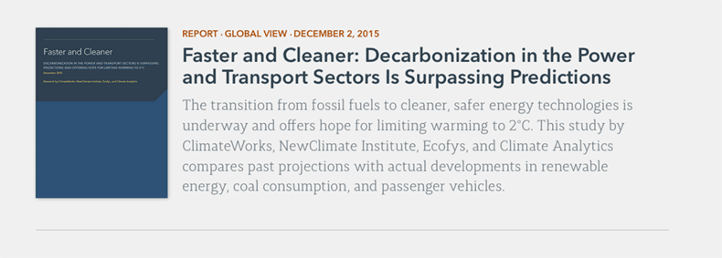
ClimateWorks’ content is most appropriate for people who read at a post-graduate level. That’s pretty heavy reading, especially for a single paragraph! But in speaking succinctly to the expectations and sensibilities of expert audiences, we establish an accurate, compelling preview of what the reader can expect as they explore further. This creates a better user experience that strengthens the brand. In cases where your content is going to be complex, then it’s a good idea to lean into it—specifically by making sure your nonprofit website’s SEO is attracting people looking for that valuable jargon!
Bibliographies and Linked References
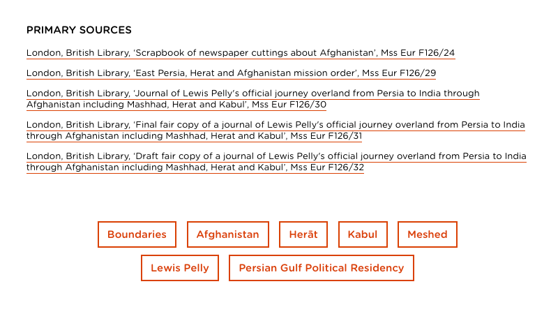
Even when reports and research are specifically written for the web and published in smaller chunks, it’s still important to cite sources by including bibliographies and references. In historical reference sites or research pages, we can see long sections of links and bibliographic text. While the more casual reader will skip over this, researchers, managers, and analysts not only need to access this material, but they may also judge the credibility of the content they’re reading based on what they find here. They have their own papers and content to produce as well, after all! The bibliographic listings on the Qatar Digital Library do a great job with this.
Open, Diverse Tagging and Grouping Systems
Often, the more complex digital content requires more complex tagging systems. Overly complicated tags can be difficult for any team to manage in a CMS and fiendishly difficult for your audience as they browse your site. In a paper about tagging and usability, HP stated tagging is fundamentally about sense-making, a process in which information is categorized, labeled, and meaning emerges.
There are a few ways to bring this meaning to the surface clearly on content-heavy websites by using proven interaction design patterns and applying them to a broader UX design strategy. For example, our search features can intelligently display suggested results as users type, letting those complex tagging systems work their magic in the background.
Typographic fundamentals of spacing, proximity, and rhythm can create visual relationships between tags and key text. When we arrange tags near content, we make the entire site more easily scannable and heighten reading comprehension. Most importantly, open and clearly designed tagging systems help the audience get a good idea of the types of content on the site, and then select a topic or category to read more about.
Visually Grouping and Reusing Text
In content-heavy websites, it’s crucial to establish context and help audiences find and explore content related to their interests. As a designer, it’s my job to create greater meaning from separate or discrete pieces of content by stringing a connective thread across a user’s experience at a website; we do this by grouping those pieces together in a process called “design chunking.” In the higher parts of the site, such as the homepage or section hubs, this means designing elements like “teaser” blocks and planning to add short titles and intros to pages with longer titles and more dense content.
It’s important to standardize what these teasers look like, creating a small design system for them. This gives our audience a very good idea of what they will find when they tap one of the teaser blocks and navigate to a page. In order to do this, I reference my design system and typographic choices, unifying similar content and text styles. I keep elements like dates, tags, and author names very similar across the entire site. I want to make sure the audience has a visual pattern to understand – once this has been established, the content becomes more visually aligned with the knowledge it contains.
Provide Breathing Room
With the amount of text and links on these content-heavy websites, the human eye needs a place to rest. Too much content on a page overwhelms the user and means that nothing is readable, a sure way to force your audience to click away. This is where open or white space becomes important to the site experience. By interspersing the content groups we looked at above with open spaces, we increase retention, clarify relationships, and make sure they are visually eye-catching. This is especially true for complicated or technical subject matter, like in this example from academia.edu.
Design-Linked WayFinding Systems
Even after visually grouping content and designing effective white space, we are still left with sites that have a lot of pages and content. Working with knowledge-driven organizations, that is a common challenge. One of our key goals is to design a meaningful path for audiences to follow as they navigate around these sites. These paths, often called wayfinding systems, are the same as what you might find in a large museum or tourist-friendly city. They operate the same way, too.
Digital wayfinding patterns focus on the main menu, breadcrumbs, faceted navigation, search bars, and clear site links in the footer. Dennis Kardys calls this network of available pathways the circulation system. If there is a chance your audience will get overwhelmed in content-heavy website, designing a clear wayfinding system saves them time and energy. It’s an extra layer of context that we deliberately design for, giving your audience a memorable experience as they navigate and read through dense content. Careful design choices in the main menus and navigation of a site elevates the brand in the eyes of your audience, making the site a credible place to revisit and learn from.
Wrapping Up Best Practices for Content-Heavy Nonprofit Web Design
Design plays an essential role in the readability and, therefore, the reach of a nonprofit’s content online—especially when it’s dense research or policy. So, when designing nonprofit websites that are filled with lots of text and dense content like policy reports, issue briefs, and tool kits, be mindful of how much information a person’s eyes can take in and make the experience effortless.
Thoughtful visual and UX design enables us to discover ways to present dense content clearly and effectively, encouraging our audience to visit, download, and read what we have to offer. Simple best practices like clearly grouping items, designing open, accessible tagging systems, and making sure that navigation and wayfinding promote easy exploration will make your nonprofit’s website—and, therefore, its ideas—more welcoming and engaging.
