


While dual-language learners are a large and growing part of California’s young student population, tests and state assessments reveal that dual-language children are at a greater disadvantage in the state’s education system. Seeking to understand why, Heising-Simons Foundation developed a groundbreaking education advocacy framework and toolkit to increase education equity for dual-language learners. Once the nonprofit’s research was ready, Heising-Simons asked Constructive to design a print and nonprofit digital report design with an interactive toolkit to help educators could put their work into practice.
Together, we created California’s Gold— a groundbreaking digital education equity toolkit for educators that uncovers the issues driving education inequities in California and provides a novel framework of solutions to help it and other states both learn from and overcome them.
Starting with Brand Identity Design
California’s Gold was a nonprofit research report that would stand alone as its own brand, separate from the philanthropy that funded it. And while it’s a serious report and an important framework for maximizing the opportunities of dual-language learners, California’s Gold also needed to capture the spirit of the children who it helps make a difference for.
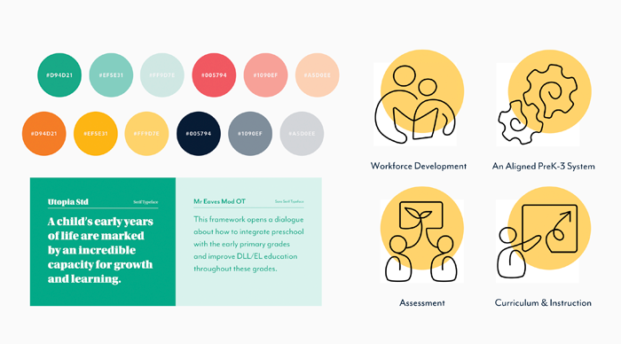
So, we started our process by designing strong branding for the advocacy framework that would feel at home in the K-12 nonprofit education equity space and also resonate with educators and policymakers that it needed to engage. Our visual identity for California’s Gold combines colors that express the optimistic exuberance of young learners, includes custom illustrations that add rhythm and personality, and uses a structured design system that reinforces the framework’s evidence-based approach.
Designing a Nonprofit Research Report That Keeps Audiences Engaged
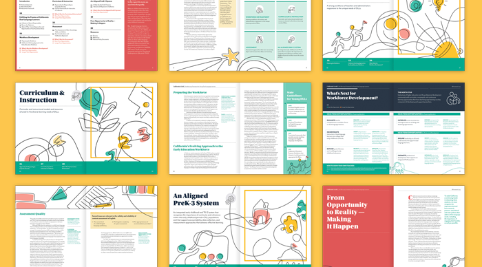
Since we were designing both a print and digital nonprofit report for California’s Gold, we decided to start with the print version. Like most nonprofit research reports, California’s Gold is content-heavy and filled with expert content. Our challenge was to balance designing a report that had the vitality and optimism that Heising-Simons wanted while making sure that the research itself was presented as rigorous and credible.
Our design strategy prioritizes best practices for Print and PDF report publishing—establishing an strong structure, yusing editorial design techniques to maintain an active reading rhythm, and making sure that typography maximized legibility. The resulting nonprofit research report design system is built with grid system that structures information and provides space for call-outs and key takeaways. Bold headlines attracting attention and elevate key themes, while the supporting typography creates a clear information hierarchy that makes content scannable. And the brand’s vibrant colors and illustrations complement the research to establish a strong brand identity for California’s Gold.
Designing Toolkit Tearsheets That Make Research Actionable
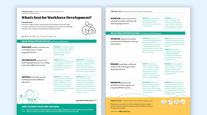
California’s Gold is an education advocacy toolkit designed with four key action areas. To complement the depth of detail for each area that’s covered fully in the report itself, we worked with Heising-Simons’ team to design complementary “Toolkit Tearsheets” for each action area.
Each tearsheet is designed for accessibility to make it easier to put the education framework into action—quickly delivering key information with sequenced information and data visualizations that quantify important information to give teachers, policymakers, community members, and activists the information they need.
Building the Blueprint for a Digital Nonprofit Report and Advocacy Toolkit
While Heising-Simons Foundation’s communications strategy for California’s Gold lead with a print report that would be distributed to policymakers and education sector experts, they also knew that digital report design was an important part of engaging a wider audience. We started the digital strategy process by focusing on best practices for digital research reports that would create a rich and useful experience for people reading California’s Gold.
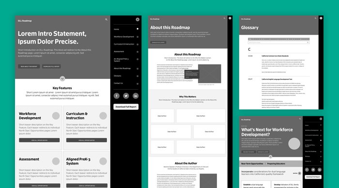
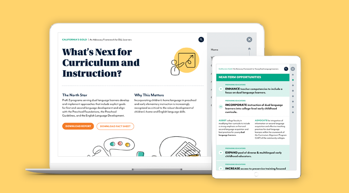
Our UX design team then translated the linear print report experience into a dynamic digital report that empowers audiences to explore the nonprofit’s research through different pathways. The result makes it easy for education experts to explore the research content, learn about California’s Gold‘s education advocacy framework, and use the toolkit resources to put the ideas into action.
A Nonprofit Digital Report Website Design That Stands Out
To make sure we designed a cohesive brand experience for audiences on any platform, visual design for the digital version of our nonprofit research report stayed closely aligned with the print version. Where we made the digital report design experience stand out was through animation and interactive elements and animations that bring the information to life.
The advocacy toolkit is designed to deliver a great experience on desktop and mobile, with responsive design prioritizing legibility on small screens. And to increase usability, we added way-finding navigation that makes it easy for audiences to know where they are within the larger research report on any page. Website animations add a bit of delight, embody the optimism of California’s Gold and capture audiences’ attention by bringing the report’s illustrations to life online.
Increasing Accessibility for Expert and Non-Expert Audiencees
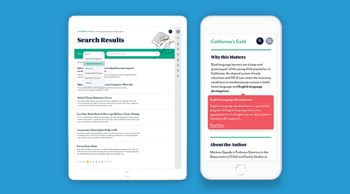
Nonprofit research reports like California’s Gold that address complex social issues are notorious for being dense and filled with jargon and acronyms that can alienate readers. But when the research is specialized and academic in nature, that jargon is important.
To make California Gold’s jargon-heavy content more accessible to a wider audience—and as a result, increase the reach and impact of the education advocacy framework—we added an interactive glossary that explains unfamiliar terms as people are reading. And to satisfy issue area experts who expect rigor and a proper method when evaluating research, we added on-hover footnotes that cite and link to the source material in California’s Gold.
Learn More About Our Work
Get an up-close and detailed look at this project in our visual case study or explore Constructive’s branding and design for education nonprofits.
