


Updated March 7, 2025
The average visitor spends less than 15 seconds on a website before leaving for another site. Think about the last time you visited a website for the first time. Did it pass the 15-second rule? If not, why’d you click away? Was it missing information? Was it confusing to navigate or maybe too slow to load? When you think about your nonprofit website, why might users not give it a passing grade in 15 seconds?
Evaluating the user experience on a webpage you designed is like proofreading your own writing. Proximity is the enemy of objectivity. You, the creator or manager, have a lot more context on your organization’s website. Your brain just might be too familiar with your work to catch errors. Our views, habits as website users, and biases often affect our nonprofit websites. The cure? User testing.
User experience testing helps demonstrate the successes and flaws of your site. The best users to test with are real-life members of your nonprofit audience. This includes members, funders, donors, partners, and other stakeholders. Websites are often the primary way we connect with the communities we serve, so user testing is key. It’s even more critical for nonprofits with niche target audiences, like specific regional communities.
There are plenty of tools to track user experience and on-page website analytics. At Constructive, we use Crazy Egg to track our clients’ website data to improve digital design, content, and the overall website user experience. To make your nonprofit website as user-friendly as possible, we need to understand:
- Who makes up your website audience?
- Does your website’s navigation work for users?
- What are your website’s goals?
- What is your current website’s ability to meet those goals?
If you can answer these questions, you can optimize your site through on-page analytics. Let’s explore what we can learn from Crazy Egg and other tracking tools to make your nonprofit website’s user experience seamless.
What Are On-Page Website Analytics?
On-page website analytics help you understand how visitors interact with specific elements on your website. Are people scrolling down on the page? Are they utilizing informational carousels or expanding prompts? Are they clicking on button elements—or mistakenly trying to click on elements that aren’t interactive?
Tools like Crazy Egg and other similar platforms provide detailed insights into these interactions by tracking user behavior in real-time. Unlike traditional user testing, which requires recruiting participants, these tools collect data from your actual website visitors, offering a more accurate picture of how people navigate your site.
To get started, we add a tracking code to your web page and begin tracking the experiences of your website visitors. This generates a snapshot of user behavior, allowing us to analyze trends and identify areas for improvement.
In this article, we’ll explore key on-page metrics and how you can use this data to enhance your website’s user experience.
Measuring Your Nonprofit Website Analytics
Using Heatmaps on Nonprofit Websites

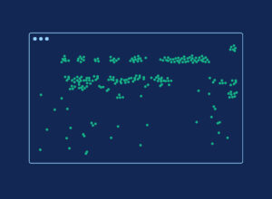
Heatmaps are exactly what they sound like: infrared colored heat maps showing the areas of your website where visitor clicks are the most concentrated. The closer to white a heated area is, the more visitors have clicked on that portion of your web page.
The heatmap is an intuitive and visual way to understand what parts of your web page people are engaging with and parts being completely ignored. In this way, it can immediately identify glaring differences between how you designed the page and how website visitors use it. This can give you actionable insights into how to increase your web page’s user experience.
For instance, in looking at a homepage heatmap for a client, I saw an interesting phenomenon: Website visitors were hardly utilizing the website’s primary navigation system but instead scrolling all the way to the bottom of the homepage and clicking around the footer. The heatmap clearly showed us that users struggled to understand the website’s navigation. With these insights in hand, we recommended navigation changes that would optimize people’s experiences moving from their homepage to other pages on the website.
Using Scrollmaps to Analyze Your Site

Scrollmaps go hand in hand with heatmaps. They show us how and if users are scrolling down your page and what areas of your web page garner the most impressions (views on the screen). Similar to the heatmap, the scrollmap shows us impression levels using a color heat spectrum.
The scrollmap gives us great insight into whether people are really looking at your web page past the average fold, which is the average place across different devices where the initial view of your web page ends.
So, if your page impressions are dropping off here (something I see on a lot of web pages), it means that very few website visitors are scrolling down your page at all. Instead, they’re just looking at the page header and either interacting with that or immediately leaving the page (also known as bouncing).
If there is a clear place on the page where users are losing interest and dropping off, we can identify this and make recommendations for moving page elements or reducing the page length. For instance, in recently looking at a web page for a client on both desktop and mobile, I noticed that on desktop, the scrollmap for the page was strong. Users were scrolling all the way to the bottom. While on mobile, users dropped off about halfway down the page—and steeply. The mobile page was much longer due to stacking images and elements, and we could see how this current configuration was encouraging users to abandon the page. We could then recommend creating a streamlined version of the web page. In this shorter version for mobile, the site would reduce the amount of users who don’t scroll to the end of the page while making users’ experiences better.
Understanding Dead Clicks and Rage Clicks
Two of the most interesting on-page website analytics that we also can look at when utilizing Crazy Egg are “dead clicks” and “rage clicks.”
Dead clicks represent when website visitors are clicking on non-interactive elements on your web page. So, for example, they click something that they think is a button but is really just a non-interactive element. These clicks suggest that visitors expect these elements to be interactive.
Rage clicks similarly exhibit user frustration with your website. Rage clicks represent when users are repeatedly clicking on an element, which means that this element is not reacting the way that they expect. (Rage clicks are essentially dead clicks that people are repeating over and over).
Together, these metrics allow us to understand what parts of your web page are pain points for website users, and thus, we can reduce these areas of frustration.
I came across an eye-opening example of dead and rage clicks while tracking a small events calendar page for a client. On Crazy Egg, we could see large clusters of rage clicks all across the calendar, specifically on the dates where events were listed. This calendar element was non-responsive. Still, users assumed it was an interactive element that they could click into to learn more information about the future events. After clicking the area once and not getting a response, users kept clicking the area out of frustration over and over again. But, thanks to these analytics, we were able to recommend making this calendar responsive, with active links and expansions.
Detailed Click Reports
In addition to the higher level view of the heatmap, Crazy Egg also offers us multiple more detailed click reports so we can see just about every place on our webpage a user has pressed down on their cursor.
The confetti click report allows us to segment clicks based on multiple categories. We can sort based on referral origins, user country, visiting frequency, search engine origins, and many other categories (this report is also where we can pull out dead and rage clicks!).
The overlay report shows the web page with an overlay describing the exact number of user clicks shown over each element on the page.
And the list report allows us to look at a stacked list of the highest engaged with and lowest engaged with elements on the page along with the percentage of overall clicks they make up.
The list report I often find especially helpful in giving detailed information on web pages. Recently, in looking at a resource page for a client, this report allowed me to give them a stacked list of the exact number of people who clicked on each of their educational resources on the page. I could then let them know which resources users were most interested in and which topics they could confidently continue to publish new content on. I could also help them to brainstorm ways to better elevate and present resources that were receiving less engagement from users.
Page Loading Speed, Page Bounce Rate, and Page Errors
Page load speed, page bounce rate, and page errors all let us know whether our web page is working correctly or has any technical issues. Before we dive deeper into these metrics, let’s clarify some terms:
- The median page load speed represents the average amount of time it takes for your web page’s initial elements to appear.
- Bounce rate represents the percentage of users who immediately leave your web page without completing any actions.
These two metrics work hand in hand. The higher your median page load speed is, the more likely your bounce rate is to be high because people get impatient and give up on your website. Crazy Egg will also let us know if there were any significant technical errors taking place on our page. Sometimes, Crazy Egg will even save you a recorded video of a user who experienced an error’s website session so you can understand what went wrong with your page.
I recently saw a web page with a surprisingly low amount of web sessions given the general traffic trend of this website. Upon looking at the page load speed and bounce rate, I began to understand the small number of sessions more; the page was loading slowly, leading website users to abandon it before it even loaded. We were able to recommend that elements on the page (looking out primarily for image and video sizing!) be looked at closely to determine the cause of the slow loading and fix it.
Clicks Engagements by Channel and User Type
When I review nonprofit websites, I also like to look at the overall number of clicks on a web page. Crazy Egg breaks down clicks by categories, such as the channel users are coming from, whether a user is new or returning, which search engine users are coming from, and more.
I find that looking at clicks this way helps to explain what type of users most of your engagements are coming from, rather than just what types of users your page views are coming from. For example, if you have swaths of users coming from organic search with low click engagement, you should consider how to better capture their interest.
The new vs. returning metric specifically really helps us to determine whether people are finding a web page useful (and thus returning to it later). With one partner, we found that most of their site’s pages had a vast majority of click engagements from first-time users. Their one resource page showed the exact opposite. More than 75% of the clicks on this page were from returning users. This page is extremely valuable to folks noting it down and returning later to continue looking for new resources. We recommended making the navigation to this page across the website very clear so that people looking for the page could easily find it. In doing so, we elevated a very valuable page for them.
Now That We Know What to Measure, Here’s What We Should Consider
While on-page analytics may seem a little granular (because they are!), the insights they provide can have critical implications for your website, your digital service design, and your brand. Once you understand your heatmaps, scrollmaps, dead or rage clicks, and more, you can target and specialize your optimization.
Beyond simple changes that on-page analytics can suggest we make (such as moving elements up and down the page, altering element sizes or style, etc.), these analytics can give us insights into how people are using your website more widely. They get us thinking about things like:
Who exactly is your nonprofit website audience?
On-page analytics might show that the user types engaging with your work the most might not be who you expect. Whether users are originating from unexpected channels, or skipping sections of your web pages, one snapshot on Crazy Egg can show you that your website audiences might be worth discussing or reevaluating.
Is your website navigation working for users?
On-page analytics can bring to light a lot of interesting learnings into how users are navigating through your web page. Which links to other pages and information are users utilizing, and which are they ignoring? I have seen analytics on a single website page convince an organization to completely rethink their website’s main navigation system. The easier it is for people to navigate to your most valuable pages, the more likely people will make it there and complete your goals for them.
What are your website goals? Is your website meeting these goals?
This is a bit obvious, but looking at on-page analytics allows us to return to discussing the overall goals of each of your web pages and your website as a whole. Is your goal to increase donation conversion? To publish your research widely? To create public awareness about an issue? Your users’ experience on your website will determine whether you’re meeting these goals.
Conclusion
To answer any questions we have about our website, or even know which questions to ask in the first place, we need to start with data. Crazy Egg and other website visitor behavior software tools make this extremely accessible for a nonprofit of any size. With analytics that go deeper than the surface level, we can now understand even more intimately how what we’re presenting to the world is being engaged with, and by whom.
The beauty of working in the nonprofit space is that your role as an organization with a website is one of a connector. You connect members and donors with a cause they care about. You connect your audiences with information. You connect valuable resources to the issues you care about. Your nonprofit website is the epicenter of that ecosystem and for all of those connections. To make sure that every stakeholder you interact with can swiftly, painlessly access whatever they’re coming to you for, we have to make our websites friendly to their needs—and adapt them whenever we find pain points.
So, if your website is your nonprofit’s home base, tracking your user experience and on-page analytics will play a critical role in making that home as friendly, comprehensible, and inviting as possible.
